---
comment: |
This is an auto-generated file. DO NOT EDIT THIS FILE DIRECTLY.
To edit this file, modify the source file in the 'web/overview/' directory, then run the 'copy-abyss-info' script to regenerate this file.
id: abyss-overview
title: Abyss Overview
hide_table_of_contents: true
---
---
comment: |
This is an auto-generated file. DO NOT EDIT THIS FILE DIRECTLY.
To edit this file, modify the source file in the 'web/overview/' directory, then run the 'copy-abyss-info' script to regenerate this file.
id: about
title: About Abyss
---
## What is Abyss?
## How Abyss works
## We support adoption
## Guiding principles
## We maintain assets
## The Abyss team
---
comment: |
This is an auto-generated file. DO NOT EDIT THIS FILE DIRECTLY.
To edit this file, modify the source file in the 'web/overview/' directory, then run the 'copy-abyss-info' script to regenerate this file.
id: abyss-version-2
title: Abyss Version 2
hide_table_of_contents: true
---
## Abyss Design System version 2
## V2 prep for designers
## V2 prep for developers
## Stay connected
---
comment: |
This is an auto-generated file. DO NOT EDIT THIS FILE DIRECTLY.
To edit this file, modify the source file in the 'web/overview/' directory, then run the 'copy-abyss-info' script to regenerate this file.
id: releases
title: Releases
hide_table_of_contents: true
---
---
comment: |
This is an auto-generated file. DO NOT EDIT THIS FILE DIRECTLY.
To edit this file, modify the source file in the 'web/overview/' directory, then run the 'copy-abyss-info' script to regenerate this file.
id: contact-us
title: Contact Us
hide_table_of_contents: true
---
## Support
## Requests
---
id: brandmark
category: Brand
title: Brandmark
description: Logos/Brandmarks for Optum brands.
pagination_prev: web/brand/optum/get-started
sourceIsTS: true
---
```jsx
import { Brandmark } from '@uhg-abyss/web/ui/Brandmark';
```
```tsx example
() => {
return (
);
};
```
## Brand
Use the `brand` property to adjust which brand is being selected.
```tsx example
() => {
return (
);
};
```
## Size
Use the `size` property to adjust the size of the brandmark.
The size property sets the _width_ of the image. It can be a number of pixels, like `200px`, or a percent value, like `100%`.
It can also be a string such as `sm`, `md`, or `lg` to choose from a menu of pre-defined sizes.
The `sizes` property controls this menu of pre-defined sizes. By default, it is set to this:
```
{
sm: '100px',
md: '150px',
lg: '200px',
}
```
```tsx example
() => {
return (
);
};
```
## Affiliate
Use the `affiliate` property to select the required brandmark affiliates.
```tsx example
() => {
return (
);
};
```
## Variant
Use the `variant` property to select the required brandmark variants.
```tsx example
() => {
return (
);
};
```
## Color
Use the `color` property to select available brandmark colors.
```tsx example
() => {
return (
);
};
```
### Brandmark Props
## Brandmark Props
| Prop | Type | Description | Default | Required |
|------|------|-------------|---------|----------|
| `affiliate` | `string` | Set the affiliate of the Brandmark. Within a brand, there are affiliates that have their own logo. For example, if `brand` is set to `"optum"`, an example of an affiliate option is `"optum_financial"` | `-` | Yes |
| `brand` | `'uhc' \| 'optum' \| 'uhg' \| 'surest' \| undefined` | The brand to use for the Brandmark. If not specified here, the brand will be determined by the theme set in the application's `ThemeProvider` or `AbyssProvider`. | `-` | No |
| `color` | `string` | Set the color of the Brandmark | `-` | Yes |
| `size` | `string \| number \| undefined` | Set the size of the Brandmark | `-` | No |
| `sizes` | `Record \| undefined` | Defines a set of sizes to choose from | `'{
sm: '100px',
md: '150px',
lg: '200px',
},'` | No |
| `title` | `string \| undefined` | Sets the alt (alternative text) value of the image. Important for accessibility. | `-` | No |
| `variant` | `string` | Set the variant of the Brandmark. For certain `brand` and `affiliate` combinations, there are one or more variants of the Brandmark. | `-` | Yes |
### Brandmark Classes
## Brandmark Classes
| Class Name | Description |
|------------|-------------|
| `.abyss-brandmark` | Brandmark root element |
```tsx example
() => {
return Brandmarks;
};
```
The source for these brandmarks can be found in the [Brandmark Library](https://brand.optum.com/content/wordmark-library-resources).
You can use the search functionality to find the required brandmark. Brandmarks can be searched using their affiliates, variants or colors.
---
id: icon-brand
slug: /web/brand/optum/icon-brand
category: Brand
title: IconBrand
description: Used to implement Brand icons and adapt their properties.
design: https://www.figma.com/design/TlKDpeSY68pCS8OyghIiCM/Docs---Web-Global?node-id=3-15099
SourceIsTS: true
---
```jsx
import { IconBrand } from '@uhg-abyss/web/ui/IconBrand';
```
```tsx example
() => {
return (
);
};
```
## Usage
Use `Icon` to implement custom SVG icons.
Use `IconSymbol` to implement Google's Material Design based icons.
Use `IconBrand` to implement Optum brand icons and adopt their properties.
An icon is a graphical representation of an object, place or idea. Whereas, an IconBrand clearly communicates a brand's personality and identity.
## Icons
Use the `icon` property to adjust which icon is being selected.
:::tip
When using TypeScript, the `icon` property only accepts valid icon names. If an invalid icon name is provided, an error will be thrown. To verify that a given value is a valid icon name, use the [isValidAssetName tool](/web/tools/is-valid-asset-name) or use the `ValidIconBrandName` type:
```ts
import { ValidIconBrandName } from '@uhg-abyss/web/ui/IconBrand';
let iconName: ValidIconBrandName;
```
:::
```tsx example
() => {
return (
);
};
```
## Size
Use the `size` property to adjust the size of an icon by setting it to a specific number. The default size is set to 24.
```tsx example
() => {
return (
);
};
```
### IconBrand Props
## IconBrand Props
| Prop | Type | Description | Default | Required |
|------|------|-------------|---------|----------|
| `brand` | `'uhc' \| 'optum' \| 'uhg' \| 'surest' \| undefined` | The brand of the icon If not specified here, the brand will be determined by the theme set in the application's `ThemeProvider` or `AbyssProvider`. | `-` | No |
| `icon` | `ValidIconBrandName` | The icon name | `-` | Yes |
| `size` | `number \| string \| undefined` | The size of the icon | `24` | No |
| `title` | `string \| undefined` | The icon title | `-` | No |
| `variant` | `'twotonedarkcircle' \| 'twotonelightcircle' \| 'twotone' \| 'onetonedarkcircle' \| 'onetonelightcircle' \| 'onetone' \| undefined` | The variant of the icon | `'twotonedarkcircle'` | No |
### IconBrand Classes
## IconBrand Classes
| Class Name | Description |
|------------|-------------|
| `.abyss-icon-brand` | IconBrand root element |
| `.abyss-icon-brand-wrapper` | IconBrand wrapper element when variant requires a circle background |
## Meaningful or Control Icons
If the icon is being used in a setting where it is the only element providing meaning, then that same meaning should be conveyed to screen reader users. The below implementation provides examples of situations in which the `title` property is required and should describe the purpose of the image.
Example 1: An alert icon is used to convey a sense of urgency; there is adjacent text ("There is a data outage") but the text doesn't include any words that convey urgency. So, in this case, the icon should have a text alternative such as "Alert" or "Warning".
```tsx example
() => {
return (
There is a data outage
);
};
```
Example 2: An "X" material icon is used as a close button on a modal dialog. There
is no adjacent text, so the icon should have a text alternative of "close" or "close
window".
```tsx example
() => {
return (
);
};
```
## Decorative Icons
If the icon is being used in a setting in which it is just a decorative element (which is the default case for icons), then the icon should be ignored by screen readers. The below implementation provides examples of which situations would be classified as decorative.
Example 1: An alert icon is used next to an urgent message and the word "Alert" is included in the adjacent text. In this case, the icon becomes decorative in nature and should be ignored by screen readers.
```tsx example
() => {
return (
Alert: There is a data outage
);
};
```
Example 2: An "X" material icon is used as a close button on a modal dialog; the
word "Close" appears to the right of the button. In this case, the icon should be
considered decorative and ignored by screen readers.
```tsx example
() => {
return (
Close
);
};
```
## Useful Resources for Image Accessibility
- [Image accessibility](https://uhgazure.sharepoint.com/sites/accessibility-knowledge-center/SitePages/Image-accessibility.aspx)
## Icon, IconBrand, and IconSymbol examples
Samples of all three icon components with and without titles (alt text):
```tsx example
() => {
return (
Decorative: No title
Icons that duplicate or reinforce text contentGithub sourceAlert: Issues found!Close window
Icon-only: Require title (alt text)
Icons conveying information that is not part of the text (if any).
SourceIssues found!
);
};
```
## Brand Icons
Abyss uses Brand's branded iconography that is designed to aid wayfinding, draw attention and support messaging.
The source for these design icons can be found in the [Brand Icons Library](https://brand.optum.com/content/iconography).
---
id: illustrated-icon-brand
slug: /web/brand/optum/illustrated-icon-brand
category: Brand
title: IllustratedIconBrand
description: Used to implement Optum brand illustrated icons and adapt their properties.
design: https://www.figma.com/design/TlKDpeSY68pCS8OyghIiCM/Docs---Web-Global?node-id=3-15099
sourceIsTS: true
---
## Unavailable
Illustrated icons for Optum are currently unavailable. Please see the docs for [UHC](/web/brand/uhc/illustrated-icon-brand) for available illustrated icons.
---
id: illustration-brand
slug: /web/brand/optum/illustration-brand
category: Brand
title: IllustrationBrand
description: Used to implement Brand illustrations and adapt their properties.
sourceIsTS: true
design: https://www.figma.com/design/TlKDpeSY68pCS8OyghIiCM/Docs---Web-Global?node-id=3-15099
pagination_next: null
---
```jsx
import { IllustrationBrand } from '@uhg-abyss/web/ui/IllustrationBrand';
```
```tsx sandbox
{
component: 'IllustrationBrand',
inputs: [
{
prop: 'brand',
type: 'select',
options: [
{ label: 'optum', value: 'optum' },
{ label: 'uhc', value: 'uhc' },
],
},
{
prop: 'illustration',
type: 'string',
},
{
prop: 'size',
type: 'string',
},
{
prop: 'color',
type: 'select',
options: [
{ label: 'primary', value: 'primary' },
{ label: 'pacific', value: 'pacific' },
{ label: 'white', value: 'white' },
]
},
{
prop: 'variant',
type: 'select',
options: [
{ label: '1', value: '1' },
{ label: '2', value: '2' },
],
},
{
prop: 'altText',
type: 'string',
},
],
}
// Disclaimer: The color and variant props are only applicable to UHC illustrations
```
## Illustration
Use the `illustration` prop to select the illustration to display.
:::tip
When using TypeScript, the `icon` property only accepts valid icon names. If an invalid icon name is provided, an error will be thrown. To verify that a given value is a valid icon name, use the [isValidAssetName tool](/web/tools/is-valid-asset-name) or use the `ValidIllustrationBrandName` type:
```ts
import { ValidIllustrationBrandName } from '@uhg-abyss/web/ui/IllustrationBrand';
let illustrationName: ValidIllustrationBrandName;
```
:::
```tsx live
```
## Brand
Use the `brand` prop to adjust which brand is selected. By default, the brand is set to the same brand as the brand used in the `ThemeProvider`.
```tsx live
{/* This will change based on the theme selected in the navbar */}
```
## Size
Use the `size` property to adjust the width of the illustration. This can be either a number (i.e. a pixel value) or a string. The default value is `"100%"`. The height of the illustration will scale proportionally to the width.
```tsx live
```
## Alt text
Use the `altText` property to provide an accessible description of the illustration. This text should be descriptive enough to convey the meaning of the illustration. See the [Accessibility tab](/web/brand/optum/illustration-brand?tab=accessibility) for more information.
```tsx live
```
### IllustrationBrand Props
## IllustrationBrand Props
| Prop | Type | Description | Default | Required |
|------|------|-------------|---------|----------|
| `altText` | `string \| undefined` | The alt text for the illustration. | `-` | No |
| `brand` | `'uhc' \| 'optum' \| 'surest' \| undefined` | The brand to use for the illustration. | `-` | No |
| `color` | `IllustrationColor \| undefined` | The color of the illustration. Applicable only to UHC illustrations. | `'white'` | No |
| `illustration` | `UhcIllustrationBrandName \| OptumIllustrationBrandName \| SurestIllustrationBrandName` | The name of the illustration. | `-` | Yes |
| `size` | `string \| number \| undefined` | The width of the illustration. | `'100%'` | No |
| `variant` | `IllustrationVariant \| undefined` | The color variant for illustrations with multiple variants on the same background color. Applicable only to certain UHC illustrations. | `1` | No |
### IllustratedIconBrand Classes
## IllustratedIconBrand Classes
| Class Name | Description |
|------------|-------------|
| `.abyss-illustration-brand-root` | IllustrationBrand root element |
## Screen Reader Support
Brand illustrations are intended to be used as [decorative images](https://www.w3.org/WAI/tutorials/images/decorative/) and as such, are ignored by screen readers by default. However, should a case arise in which an illustration needs to be accessible, use the `altText` prop to provide accessible alt text to the image. This text should be descriptive enough to convey the meaning of the illustration.
```tsx live
```
## Illustration Source
The source for these illustrations can be found in the brand libraries.
[UnitedHealthCare Library](https://unitedhealthcare.gettyimages.com/s/3f79xfhwgtcsc8t3t79hfc9)
[Optum Library](https://brand.optum.com/content/illustration-library-resources)
---
id: colors
title: Colors
category: Brand
description: Colors of the Optum brand.
design: https://www.figma.com/design/TlKDpeSY68pCS8OyghIiCM/Docs---Web-Global?node-id=1-16&node-type=canvas&t=9Oze02yWZcioUONN-0
---
## Overview
Color differentiates our brands and helps create consistent experiences across our digital products. We use color to help our users know exactly what they need to focus on.
We are committed to complying with the Web Content Accessibility Guidelines (WCAG) AA standard contrast ratios. To do this, choose primary, secondary, and extended colors that support usability by ensuring sufficient color contrast between elements.
---
## Brand palette
Primary colors communicate brand identity. They are widely used across interactive elements, but only used sparingly for text, namely CTA labels and headings.
```tsx example
() => {
return (
);
};
```
---
## Neutral
Use neutrals for text, borders, and backgrounds.
```tsx example
() => {
return (
);
};
```
---
## Semantic
Semantic colors communicate status and urgency. Use saturated colors for both text and high-emphasis backgrounds and tint variations for backgrounds only.
```tsx example
() => {
return (
);
};
```
---
## Accent
Use for emphasis and to communicate function. Does not have hierarchy.
```tsx example
() => {
return (
);
};
```
## Data visualization
Used in our Data Visualization components.
```tsx example
() => {
return (
);
};
```
---
## Accessibility
Color choices that are accessible ensure everyone can not only see every element on a page, but also understand a specific, intended meaning. Everyone should be able to see the difference between two colors right next to or on top of each other.
Color contrast refers to the perceived difference between foreground and background colors. People with low vision, color blindness, or who have difficulty seeing the differences between colors can have trouble seeing where one element ends and another begins. As we age, the shape of our eyes changes affecting both how we perceive color and how well we can distinguish variations in color. If the contrast between different elements is too low, some people may not be able to see them at all.
Color contrast is expressed as a ratio with the first number representing the foreground color and the second representing the background color. For example, 3:1 means the foreground item color is three times more intense or visible than the background value. Contrast rules apply to text as well as any content that conveys meaning, including icons, graphics, and form elements. Tools such as [TPGi's Colour Contrast Analyser](https://www.tpgi.com/color-contrast-checker/) or [WebAIM's online color contrast tool](https://webaim.org/resources/contrastchecker/) are useful for verifying contrast ratios.
Color and contrast choices within a digital experience are accessible when people can:
- See UI elements and content
- Understand and interpret information
- Take action
Our aim is to provide a contrast ratio that can be perceived by all users. For this reason, UnitedHealthcare has embraced a minimum contrast ratio of 4.5:1 (foreground vs. background) for UI elements and content that convey meaning.
Recommendations
- Include color combinations, good contrast and poor contrast, in design documentation
- Communicate meaning with more than just color, such as with color and descriptive text
- Give focus indicators a unique presentation that meets contrast requirements on all backgrounds
Test for a minimum contrast ratio of 4.5 to 1 for:
- Non-bolded text smaller than 24 pixels (18 points)
- Bold text smaller than 18 pixels (14 points)
- Essential icons that are close to body text size
Test that non-text elements that communicate information meet a minimum
contrast ratio of 3 to 1 for all states:
- Icons
- Data visualizations
- Focus indicators
- Controls, including their borders or boundaries
- Non-bolded text at or above 24 pixels (18 points)
- Bold text at or above 18 pixels (14 points)
Don't worry about contrast for logos and disabled elements. Watch out for using color alone to communicate meaning. People who are color blind or blind cannot perceive the meaning by color alone.
Useful Resources for Color Accessibility
- [Color and contrast accessibility](https://uhgazure.sharepoint.com/sites/accessibility-knowledge-center/SitePages/Color-and-contrast-accessibility.aspx)
- [Accessibility testing for color contrast](https://uhgazure.sharepoint.com/sites/accessibility-knowledge-center/SitePages/Accessibility-testing-color-contrast.aspx)
---
id: get-started
category: Brand
title: Optum Brand
description: ''
pagination_prev: null
pagination_next: web/brand/optum/brandmark
hideHeaderActions: true
---
:::info Optum brand refresh in progress
The Optum brand is currently undergoing a refresh, and efforts are underway to apply the new brand styles across digital platforms. For the latest updates, please visit the [Optum Brand Center](https://brand.optum.com) or contact the [Help Desk](https://brand.optum.com/helpdesk) for support.
:::
## Brand guidance
---
id: brandmark
category: Brand
title: Brandmark
description: Logos/Brandmarks for UHC brands.
pagination_prev: web/brand/uhc/get-started
sourceIsTS: true
---
:::warning Disclaimer
Not all affiliate variant/color combinations are applicable, and some may not be available. Inapplicable combinations will render as empty.
:::
```jsx
import { Brandmark } from '@uhg-abyss/web/ui/Brandmark';
```
```tsx example
() => {
return (
);
};
```
## Brand
Use the `brand` property to adjust which brand is being selected.
```tsx example
() => {
return (
);
};
```
## Size
Use the `size` property to adjust the size of the brandmark.
The size property sets the _width_ of the image. It can be a number of pixels, like `200px`, or a percent value, like `100%`.
It can also be a string such as `sm`, `md`, or `lg` to choose from a menu of pre-defined sizes.
The `sizes` property controls this menu of pre-defined sizes. By default, it is set to this:
```
{
sm: '100px',
md: '150px',
lg: '200px',
}
```
```tsx example
() => {
return (
);
};
```
## Affiliate
Use the `affiliate` property to select the required brandmark affiliates.
```tsx example
() => {
return (
);
};
```
## Variant
Use the `variant` property to select the required brandmark variants.
```tsx example
() => {
return (
);
};
```
## Color
Use the `color` property to select available brandmark colors.
```tsx example
() => {
return (
);
};
```
### Brandmark Props
## Brandmark Props
| Prop | Type | Description | Default | Required |
|------|------|-------------|---------|----------|
| `affiliate` | `string` | Set the affiliate of the Brandmark. Within a brand, there are affiliates that have their own logo. For example, if `brand` is set to `"optum"`, an example of an affiliate option is `"optum_financial"` | `-` | Yes |
| `brand` | `'uhc' \| 'optum' \| 'uhg' \| 'surest' \| undefined` | The brand to use for the Brandmark. If not specified here, the brand will be determined by the theme set in the application's `ThemeProvider` or `AbyssProvider`. | `-` | No |
| `color` | `string` | Set the color of the Brandmark | `-` | Yes |
| `size` | `string \| number \| undefined` | Set the size of the Brandmark | `-` | No |
| `sizes` | `Record \| undefined` | Defines a set of sizes to choose from | `'{
sm: '100px',
md: '150px',
lg: '200px',
},'` | No |
| `title` | `string \| undefined` | Sets the alt (alternative text) value of the image. Important for accessibility. | `-` | No |
| `variant` | `string` | Set the variant of the Brandmark. For certain `brand` and `affiliate` combinations, there are one or more variants of the Brandmark. | `-` | Yes |
### Brandmark Classes
## Brandmark Classes
| Class Name | Description |
|------------|-------------|
| `.abyss-brandmark` | Brandmark root element |
```tsx example
() => {
return Brandmarks;
};
```
The source for these brandmarks can be found in the [Brandmark Library](https://brand.uhc.com/content/logo-brandmark-library).
You can use the search functionality to find the required brandmark. Brandmarks can be searched using their affiliates, variants or colors.
---
id: icon-brand
slug: /web/brand/uhc/icon-brand
category: Brand
title: IconBrand
description: Used to implement Brand icons and adapt their properties.
design: https://www.figma.com/design/TlKDpeSY68pCS8OyghIiCM/Docs---Web-Global?node-id=3-15099
SourceIsTS: true
---
```jsx
import { IconBrand } from '@uhg-abyss/web/ui/IconBrand';
```
```tsx example
() => {
return (
);
};
```
## Usage
Use `Icon` to implement custom SVG icons.
Use `IconSymbol` to implement Google's Material Design based icons.
Use `IconBrand` to implement UHC brand icons and adopt their properties.
An icon is a graphical representation of an object, place or idea. Whereas, an IconBrand clearly communicates a brand's personality and identity.
## Icons
Use the `icon` property to adjust which icon is being selected.
:::tip
When using TypeScript, the `icon` property only accepts valid icon names. If an invalid icon name is provided, an error will be thrown. To verify that a given value is a valid icon name, use the [isValidAssetName tool](/web/tools/is-valid-asset-name) or use the `ValidIconBrandName` type:
```ts
import { ValidIconBrandName } from '@uhg-abyss/web/ui/IconBrand';
let iconName: ValidIconBrandName;
```
:::
```tsx example
() => {
return (
);
};
```
## Size
Use the `size` property to adjust the size of an icon by setting it to a specific number. The default size is set to 24.
```tsx example
() => {
return (
);
};
```
## Brand icon variants
Use the `variant` property to change the style of Brand icons. Available variants are `twotonedarkcircle`, `twotonelightcircle`, `twotone`, `onetonedarkcircle`, `onetonelightcircle`, and `onetone`. The default variant is `twotonedarkcircle`.
```tsx example
() => {
return (
onetonedarkcircle
onetonelightcircle
twotonedarkcircle
twotonelightcircle
onetone
twotone
);
};
```
### IconBrand Props
## IconBrand Props
| Prop | Type | Description | Default | Required |
|------|------|-------------|---------|----------|
| `brand` | `'uhc' \| 'optum' \| 'uhg' \| 'surest' \| undefined` | The brand of the icon If not specified here, the brand will be determined by the theme set in the application's `ThemeProvider` or `AbyssProvider`. | `-` | No |
| `icon` | `ValidIconBrandName` | The icon name | `-` | Yes |
| `size` | `number \| string \| undefined` | The size of the icon | `24` | No |
| `title` | `string \| undefined` | The icon title | `-` | No |
| `variant` | `'twotonedarkcircle' \| 'twotonelightcircle' \| 'twotone' \| 'onetonedarkcircle' \| 'onetonelightcircle' \| 'onetone' \| undefined` | The variant of the icon | `'twotonedarkcircle'` | No |
### IconBrand Classes
## IconBrand Classes
| Class Name | Description |
|------------|-------------|
| `.abyss-icon-brand` | IconBrand root element |
| `.abyss-icon-brand-wrapper` | IconBrand wrapper element when variant requires a circle background |
## Meaningful or Control Icons
If the icon is being used in a setting where it is the only element providing meaning, then that same meaning should be conveyed to screen reader users. The below implementation provides examples of situations in which the `title` property is required and should describe the purpose of the image.
Example 1: An alert icon is used to convey a sense of urgency; there is adjacent text ("There is a data outage") but the text doesn't include any words that convey urgency. So, in this case, the icon should have a text alternative such as "Alert" or "Warning".
```tsx example
() => {
return (
There is a data outage
);
};
```
Example 2: An "X" material icon is used as a close button on a modal dialog. There
is no adjacent text, so the icon should have a text alternative of "close" or "close
window".
```tsx example
() => {
return (
);
};
```
## Decorative Icons
If the icon is being used in a setting in which it is just a decorative element (which is the default case for icons), then the icon should be ignored by screen readers. The below implementation provides examples of which situations would be classified as decorative.
Example 1: An alert icon is used next to an urgent message and the word "Alert" is included in the adjacent text. In this case, the icon becomes decorative in nature and should be ignored by screen readers.
```tsx example
() => {
return (
Alert: There is a data outage
);
};
```
Example 2: An "X" material icon is used as a close button on a modal dialog; the
word "Close" appears to the right of the button. In this case, the icon should be
considered decorative and ignored by screen readers.
```tsx example
() => {
return (
Close
);
};
```
## Useful Resources for Image Accessibility
- [Image accessibility](https://uhgazure.sharepoint.com/sites/accessibility-knowledge-center/SitePages/Image-accessibility.aspx)
## Icon, IconBrand, and IconSymbol examples
Samples of all three icon components with and without titles (alt text):
```tsx example
() => {
return (
Decorative: No title
Icons that duplicate or reinforce text contentGithub sourceAlert: Issues found!Close window
Icon-only: Require title (alt text)
Icons conveying information that is not part of the text (if any).
SourceIssues found!
);
};
```
## Brand Icons
Abyss uses Brand's branded iconography that is designed to aid wayfinding, draw attention,
and support messaging.
The source for these design icons can be found in the [Brand Icons Library](https://brand.uhc.com/content/iconography).
---
id: illustrated-icon-brand
slug: /web/brand/uhc/illustrated-icon-brand
category: Brand
title: IllustratedIconBrand
description: Used to implement UHC brand illustrated icons and adapt their properties.
design: https://www.figma.com/design/TlKDpeSY68pCS8OyghIiCM/Docs---Web-Global?node-id=3-15099
sourceIsTS: true
---
```jsx
import { IllustratedIconBrand } from '@uhg-abyss/web/ui/IllustratedIconBrand';
```
```tsx sandbox
{
component: 'IllustratedIconBrand',
inputs: [
{
prop: 'icon',
type: 'string',
},
{
prop: 'size',
type: 'string',
},
{
prop: 'color',
type: 'select',
options: [
{ label: 'none', value: undefined },
{ label: 'gold', value: 'gold' },
{ label: 'orange', value: 'orange' },
{ label: 'multicolor', value: 'multicolor' },
]
},
{
prop: 'altText',
type: 'string',
},
],
}
// Disclaimer: Not all icon/color combinations are applicable; inapplicable combinations will display as empty
```
## Icon
Use the `icon` prop to select the illustration to display.
:::tip
When using TypeScript, the `icon` property only accepts valid icon names. If an invalid icon name is provided, an error will be thrown. To verify that a given value is a valid icon name, use the [isValidAssetName tool](/web/tools/is-valid-asset-name) or use the `ValidIllustratedIconBrandName` type:
```ts
import { ValidIllustratedIconBrandName } from '@uhg-abyss/web/ui/IllustratedIconBrand';
let iconName: ValidIllustratedIconBrandName;
```
:::
```tsx live
```
## Size
Use the `size` property to adjust the width of the illustrated icon. This can be either a number (i.e. a pixel value) or a string. The default value is `"100%"`.
```tsx live
```
:::tip
By default, the image will scale its size based on the width of its container. If you need it to remain a fixed width regardless of available space, you can add a style override as shown below. Try shrinking the screen and compare how the example above behaves compared to the one below.
:::
```tsx live
```
## Color
Use the `color` property to select available illustrated icon colors. The available colors are `"gold"`, `"orange"`, and `"multicolor"`.
:::warning Important
Not all illustrated icons have any color variants. In such cases, omit the `color` prop; otherwise, the icon will not display.
:::
```tsx live
```
## Alt text
Use the `altText` property to provide an accessible description of the illustrated icon. This text should be descriptive enough to convey the meaning of the icon. See the [Accessibility tab](/web/brand/uhc/illustrated-icon-brand?tab=accessibility) for more information.
```tsx live
```
### IllustratedIconBrand Props
## IllustratedIconBrand Props
| Prop | Type | Description | Default | Required |
|------|------|-------------|---------|----------|
| `altText` | `string \| undefined` | The alt text for the illustrated icon. | `-` | No |
| `color` | `'gold' \| 'orange' \| 'multicolor' \| undefined` | The color of the illustrated icon. Applicable only to certain assets. | `-` | No |
| `icon` | `ValidIllustratedIconBrandName` | The name of the illustration. | `-` | Yes |
| `size` | `string \| number \| undefined` | The width of the illustration. | `'100%'` | No |
### IllustratedIconBrand Classes
## IllustratedIconBrand Classes
| Class Name | Description |
|------------|-------------|
| `.abyss-illustrated-icon-brand-root` | IllustratedIconBrand root element |
## Screen Reader Support
Illustrated icons are intended to be used as [decorative images](https://www.w3.org/WAI/tutorials/images/decorative/) and as such, are ignored by screen readers by default. However, should a case arise in which an illustrated icon needs to be accessible, use the `altText` prop to provide accessible alt text to the image. This text should be descriptive enough to convey the meaning of the illustrated icon.
```tsx live
```
## Illustrated Icon Source
The source for these illustrated icons can be found in the brand libraries.
[UnitedHealthCare Library](https://unitedhealthcare.gettyimages.com/s/3f79xfhwgtcsc8t3t79hfc9)
You can use the search functionality to find the required illustrated icons. Icons can be searched using their title or colors.
---
id: illustration-brand
slug: /web/brand/uhc/illustration-brand
category: Brand
title: IllustrationBrand
description: Used to implement Brand illustrations and adapt their properties.
sourceIsTS: true
design: https://www.figma.com/design/TlKDpeSY68pCS8OyghIiCM/Docs---Web-Global?node-id=3-15099
pagination_next: null
---
```jsx
import { IllustrationBrand } from '@uhg-abyss/web/ui/IllustrationBrand';
```
```tsx sandbox
{
component: 'IllustrationBrand',
inputs: [
{
prop: 'brand',
type: 'select',
options: [
{ label: 'optum', value: 'optum' },
{ label: 'uhc', value: 'uhc' },
{ label: 'surest', value: 'surest' },
],
},
{
prop: 'illustration',
type: 'string',
},
{
prop: 'size',
type: 'string',
},
{
prop: 'color',
type: 'select',
options: [
{ label: 'primary', value: 'primary' },
{ label: 'pacific', value: 'pacific' },
{ label: 'white', value: 'white' },
]
},
{
prop: 'variant',
type: 'select',
options: [
{ label: '1', value: '1' },
{ label: '2', value: '2' },
],
},
{
prop: 'altText',
type: 'string',
},
],
}
// Disclaimer: Not all brand/color combinations are applicable; inapplicable combinations will display as empty
```
## Illustration
Use the `illustration` prop to select the illustration to display.
:::tip
When using TypeScript, the `icon` property only accepts valid icon names. If an invalid icon name is provided, an error will be thrown. To verify that a given value is a valid icon name, use the [isValidAssetName tool](/web/tools/is-valid-asset-name) or use the `ValidIllustrationBrandName` type:
```ts
import { ValidIllustrationBrandName } from '@uhg-abyss/web/ui/IllustrationBrand';
let illustrationName: ValidIllustrationBrandName;
```
:::
```tsx live
```
## Brand
Use the `brand` prop to adjust which brand is selected. By default, the brand is set to the same brand as the brand used in the `ThemeProvider`.
```tsx live
{/* This will change based on the theme selected in the navbar */}
```
## Size
Use the `size` property to adjust the width of the illustration. This can be either a number (i.e. a pixel value) or a string. The default value is `"100%"`. The height of the illustration will scale proportionally to the width.
```tsx live
```
## Color
Use the `color` property to select available illustration colors. The available colors are `"primary"`, `"pacific"`, and `"white"`. The default color is `"white""`.
```tsx live
```
## Variant
Some UHC illustrations have multiple variants of accent colors on the same background color. Use the `variant` prop to select the color combination. Valid values are `1` and `2`.
```tsx live
```
## Alt text
Use the `altText` property to provide an accessible description of the illustration. This text should be descriptive enough to convey the meaning of the illustration. See the [Accessibility tab](/web/brand/uhc/illustration-brand?tab=accessibility) for more information.
```tsx live
```
### IllustrationBrand Props
## IllustrationBrand Props
| Prop | Type | Description | Default | Required |
|------|------|-------------|---------|----------|
| `altText` | `string \| undefined` | The alt text for the illustration. | `-` | No |
| `brand` | `'uhc' \| 'optum' \| 'surest' \| undefined` | The brand to use for the illustration. | `-` | No |
| `color` | `IllustrationColor \| undefined` | The color of the illustration. Applicable only to UHC illustrations. | `'white'` | No |
| `illustration` | `UhcIllustrationBrandName \| OptumIllustrationBrandName \| SurestIllustrationBrandName` | The name of the illustration. | `-` | Yes |
| `size` | `string \| number \| undefined` | The width of the illustration. | `'100%'` | No |
| `variant` | `IllustrationVariant \| undefined` | The color variant for illustrations with multiple variants on the same background color. Applicable only to certain UHC illustrations. | `1` | No |
### IllustratedIconBrand Classes
## IllustratedIconBrand Classes
| Class Name | Description |
|------------|-------------|
| `.abyss-illustration-brand-root` | IllustrationBrand root element |
## Screen Reader Support
Brand illustrations are intended to be used as [decorative images](https://www.w3.org/WAI/tutorials/images/decorative/) and as such, are ignored by screen readers by default. However, should a case arise in which an illustration needs to be accessible, use the `altText` prop to provide accessible alt text to the image. This text should be descriptive enough to convey the meaning of the illustration.
```tsx live
```
## Illustration Source
The source for these illustrations can be found in the brand libraries.
[UnitedHealthCare Library](https://unitedhealthcare.gettyimages.com/s/3f79xfhwgtcsc8t3t79hfc9)
[Optum Library](https://brand.optum.com/content/illustration-library-resources)
You can use the search functionality to find the required illustration. Illustrations can be searched using their title, variants, or colors.
---
id: colors
title: Colors
category: Brand
description: Colors of the UHC brand.
design: https://www.figma.com/design/TlKDpeSY68pCS8OyghIiCM/Docs---Web-Global?node-id=1-16&node-type=canvas&t=9Oze02yWZcioUONN-0
---
## Overview
Color differentiates our brands and helps create consistent experiences across our digital products. We use color to help our users know exactly what they need to focus on.
We are committed to complying with the Web Content Accessibility Guidelines (WCAG) AA standard contrast ratios. To do this, choose primary, secondary, and extended colors that support usability by ensuring sufficient color contrast between elements.
---
## Brand palette
Primary colors communicate brand identity. They are widely used across interactive elements, but only used sparingly for text, namely CTA labels and headings.
```tsx example
() => {
return (
);
};
```
---
## Neutral palette
Use neutrals for text, borders, and backgrounds.
```tsx example
() => {
return (
);
};
```
---
## Semantic palette
Semantic colors communicate status and urgency. Use saturated colors for both text and high-emphasis backgrounds and tint variations for backgrounds only.
```tsx example
() => {
return (
);
};
```
---
## Accent palette
Use for emphasis and to communicate function. Does not have hierarchy.
```tsx example
() => {
return (
);
};
```
## Data visualization
Used in our Data Visualization components.
```tsx example
() => {
return (
);
};
```
---
## Accessibility
Color choices that are accessible ensure everyone can not only see every element on a page, but also understand a specific, intended meaning. Everyone should be able to see the difference between two colors right next to or on top of each other.
Color contrast refers to the perceived difference between foreground and background colors. People with low vision, color blindness, or who have difficulty seeing the differences between colors can have trouble seeing where one element ends and another begins. As we age, the shape of our eyes changes affecting both how we perceive color and how well we can distinguish variations in color. If the contrast between different elements is too low, some people may not be able to see them at all.
Color contrast is expressed as a ratio with the first number representing the foreground color and the second representing the background color. For example, 3:1 means the foreground item color is three times more intense or visible than the background value. Contrast rules apply to text as well as any content that conveys meaning, including icons, graphics, and form elements. Tools such as [TPGi's Colour Contrast Analyser](https://www.tpgi.com/color-contrast-checker/) or [WebAIM's online color contrast tool](https://webaim.org/resources/contrastchecker/) are useful for verifying contrast ratios.
Color and contrast choices within a digital experience are accessible when people can:
- See UI elements and content
- Understand and interpret information
- Take action
Our aim is to provide a contrast ratio that can be perceived by all users. For this reason, UnitedHealthcare has embraced a minimum contrast ratio of 4.5:1 (foreground vs. background) for UI elements and content that convey meaning.
Recommendations
- Include color combinations, good contrast and poor contrast, in design documentation
- Communicate meaning with more than just color, such as with color and descriptive text
- Give focus indicators a unique presentation that meets contrast requirements on all backgrounds
Test for a minimum contrast ratio of 4.5 to 1 for:
- Non-bolded text smaller than 24 pixels (18 points)
- Bold text smaller than 18 pixels (14 points)
- Essential icons that are close to body text size
Test that non-text elements that communicate information meet a minimum
contrast ratio of 3 to 1 for all states:
- Icons
- Data visualizations
- Focus indicators
- Controls, including their borders or boundaries
- Non-bolded text at or above 24 pixels (18 points)
- Bold text at or above 18 pixels (14 points)
Don't worry about contrast for logos and disabled elements. Watch out for using color alone to communicate meaning. People who are color blind or blind cannot perceive the meaning by color alone.
Useful Resources for Color Accessibility
- [Color and contrast accessibility](https://uhgazure.sharepoint.com/sites/accessibility-knowledge-center/SitePages/Color-and-contrast-accessibility.aspx)
- [Accessibility testing for color contrast](https://uhgazure.sharepoint.com/sites/accessibility-knowledge-center/SitePages/Accessibility-testing-color-contrast.aspx)
---
id: get-started
category: Brand
title: UHC Brand
description: The partnership with the UHC brand team solidifies the foundation of Abyss digital assets which unify our brand experience.
hideHeaderActions: true
pagination_prev: null
pagination_next: web/brand/uhc/brandmark
---
## Latest updates
:::tip
Abyss supports both Enterprise Sans and UHC Sans. The default font is UHC Sans. To use Enterprise Sans, refer to our [createTheme docs](/web/theme-customization/tokens/create-theme#font-configuration).
:::
## Brand assets
---
id: components
title: Components
---
Browse Abyss web components.
:::tip
Scroll down within the Viewport Width to see more components.
:::
---
id: overview
category: DataTable
title: DataTable - Overview
sidebar_label: Overview
pagination_prev: null
description: Displays a matrix of information with columns, rows, and information that can operate dynamically.
design: https://www.figma.com/design/TlKDpeSY68pCS8OyghIiCM/Docs---Web-Global?node-id=12638-189
sourcePath: ui/DataTable/DataTable.tsx
---
```jsx
import { DataTable } from '@uhg-abyss/web/ui/DataTable';
import { useDataTable } from '@uhg-abyss/web/hooks/useDataTable';
```
Welcome to the new `DataTable` component! This is almost a complete rewrite of the V1 `DataTable` component, designed to be more flexible, customizable, and performant.
Please refer to the [Table of Contents](/web/data-table/overview/?tab=table+of+contents) if you are looking for something specific.
## Getting started
`DataTable` requires usage of the `useDataTable` hook. All available props are displayed within the [Integration tab](/web/data-table/overview/?tab=integration). The return value from `useDataTable` should be supplied to the `tableState` prop within the `DataTable` component.
## Title and description
The required `title` and optional `description` props provide names and additional information to several parts of `DataTable`:
- **Title (`title` prop, required):**
Labels multiple component elements for accessibility and clarity.
- **`` (with `aria-label`):**
Groups all related component contents, including slots, under a labeled section for improved accessibility.
- **Heading landmark (``, visible or hidden):**
Use the `headingLevel` prop to set the correct heading level for page content.
- Default is 3, rendering as `
`.
- To visually hide the heading, set `hideHeader` to `true`.
- **`
` with visually hidden `
`:**
The table uses a visually hidden caption to ensure screen reader accessibility.
- **Description (`description` prop, optional):**
Provides additional information after the heading in a paragraph (`
`).
- If `hideHeader` is set, the description is also visually hidden, making it useful for describing complex implementations to screen reader users (who will still hear this information).
```jsx
```
## Subcomponents
`DataTable` is broken into multiple sub-components that can be used to customize the layout above and below the table.
All sub-components must be nested within the `DataTable` component.
```jsx
```
- `DataTable.DownloadDropdown`
- `DataTable.Table`
- `DataTable.GlobalFilter`
- `DataTable.TableSettingsDropdown`
- `DataTable.Pagination`
- `DataTable.BulkActionsDropdown`
- `DataTable.SlotWrapper`
## Layout organization
Teams have complete control over what is placed below and above the `DataTable.Table`.
To help with spacing between elements, teams can use the `DataTable.SlotWrapper` subcomponent. This is a styled flexbox `
` with some built-in spacing. Using it is not required; it is simply a convenience.
```tsx
{/* ... */}
{/* ... */}
{/* ... */}
{/* ... */}
{/* ... */}
```
Use the `css` prop to add additional styling to the `DataTable.SlotWrapper` component:
```tsx
{/* ... */}
```
Teams looking for design guidance should use the default Figma link inside the Abyss Design Library.
```tsx example
() => {
const { data } = dataTableUtils.useDocMockData(25, 4);
const [hideHeader, setHideHeader] = useState(false);
const columns = useMemo(() => {
return [
{
header: 'Column 1',
accessorKey: 'col1',
footer: 'Footer 1',
},
{
header: 'Column 2',
accessorKey: 'col2',
footer: 'Footer 2',
},
{
header: 'Column 3',
accessorKey: 'col3',
footer: 'Footer 3',
},
{
header: 'Column 4',
accessorKey: 'col4',
footer: 'Footer 4',
},
];
}, []);
const dataTableProps = useDataTable({
initialData: data,
initialColumns: columns,
paginationConfig: {
enablePagination: true,
},
});
return (
);
};
```
## useDataTable hook
The `useDataTable` hook serves as the foundation for the `DataTable` component, centralizing table state management and providing a comprehensive API for controlling table behavior.
Please refer to the [Integration tab](/web/data-table/overview/?tab=integration) for a list of props that can be provided to the `useDataTable` hook. Below is an example of the hook's return value.
```tsx example
() => {
const { data } = dataTableUtils.useDocMockData(5, 4);
const columns = useMemo(() => {
return [
{
header: 'Column 1',
accessorKey: 'col1',
},
{
header: 'Column 2',
accessorKey: 'col2',
},
{
header: 'Column 3',
accessorKey: 'col3',
},
{
header: 'Column 4',
accessorKey: 'col4',
},
];
}, []);
const dataTableProps = useDataTable({
initialData: data,
initialColumns: columns,
});
return (
);
};
```
## Best practices
Before beginning development, please do the following:
**Ensure your design is aligned with the Abyss Design System.** This helps ensure consistency and usability across all components and prevents you, the developer, from having to recreate the wheel.
**Spend some time familiarizing yourself with `DataTable` documentation.** This will help you understand the capabilities and foundations of the component. There are many examples and use cases to help you get started.
**Test out features and functionality.** All examples are live and can be modified to see how the component behaves; this is a great way to learn how the component works and what features are available.
The data table headers accurately describe the data contained in the rows and columns.
If the data table has labels, they should be clear and concise.
Resources:
- W3C WAI-ARIA Authoring Practices Table Design Pattern covers the usage of ARIA names, state and roles, as well as the expected keyboard interactions.
- W3C Tutorial - Table Concepts covers the usage of various tables, headers, and captions.
IBM Accessibility Requirements:
- 1.3.1 Info and Relationships (WCAG Success Criteria 1.3.1)
- 1.3.2 Meaningful Sequence (WCAG Success Criteria 1.3.2)
- 2.1.1 Keyboard (WCAG Success Criteria 2.1.1)
- 2.4.3 Focus Order (WCAG Success Criteria 2.4.3)
- 2.4.6 Headings and Labels (WCAG Success Criteria 2.4.6)
- 2.4.7 Focus Visible (WCAG Success Criteria 2.4.7)
- 4.1.2 Name, Role, Value (WCAG Success Criteria 4.1.2)
```tsx example
() => {
const doc = AdditionalLibs.pdfCreater();
const [sorting, setSorting] = useState([]);
const [resizeMode, setResizeMode] = useState('onChange');
const [columnVisibility, setColumnVisibility] =
useState({
col1: true,
col2: true,
col3: true,
col4: true,
col5: true,
col6: true,
});
const highlightedRows = useMemo(() => {
return [
{ rowId: '00', color: '#eedef2' },
{ rowId: '01', color: '#eedef2' },
{ rowId: '02', color: '#eedef2' },
{ rowId: '08', color: '#eedef2' },
{ rowId: '09', color: '#eedef2' },
{ rowId: '11', color: '#eedef2' },
{ rowId: '12', color: '#eedef2' },
{ rowId: '13', color: '#eedef2' },
{ rowId: '14', color: '#eedef2' },
{ rowId: '15', color: '#eedef2' },
{ rowId: '16', color: '#eedef2' },
{ rowId: '17', color: '#eedef2' },
];
}, []);
const toggleColumnVisibility = (columnKey: string) => {
setColumnVisibility((prevVisibility) => {
return {
...prevVisibility,
[columnKey]: !prevVisibility[columnKey],
};
});
};
const individualActions = [
{
onClick: ({ deleteRow, row }) => {
deleteRow(row);
console.log('Deleted row: ', row);
},
icon: ,
label: 'Delete Row',
isSeparated: true,
},
{
onClick: ({ modifyRow, row }) => {
modifyRow(row, { col4: 'Modified Cell' });
},
checkDisabled: (row) => {
const value = row.getValue('col4');
return value === 'Completed';
},
label: (row) => {
const value = row.getValue('col4');
return value === 'Completed'
? `Can't modify (${value}) cell`
: `Modify column 4 cell (${value})`;
},
icon: (row) => {
const value = row.getValue('col4');
return ;
},
},
{
onClick: ({ modifyRow, row }) => {
modifyRow(row, {
col1: 'Modified Col 1',
col2: 'Modified Col 2',
col3: 'Modified Col 3',
col4: 'Modified Col 4',
col5: 'Modified Col 5',
col6: 'Modified Col 6',
});
},
label: 'Modify Row',
icon: ,
},
];
const dropdownConfig = {
label: 'Options',
iconOnly: (
),
outline: false,
};
const columns = useMemo[]>(() => {
return [
{
header: () => {
return (
);
};
const dataTableProps = useDataTable({
initialData: data,
initialColumns: columns,
paginationConfig: {
enablePagination: true,
},
expandColumnConfig: { expandMode: 'subRows' },
tableConfig: {
filterFromLeafRows: true,
enableColumnFilters: true,
state: {
columnFilters,
expanded: expanded,
},
onColumnFiltersChange: setColumnFilters,
onExpandedChange: setExpanded,
// @ts-ignore
DISABLED_enableGrouping: true,
DISABLED_onGroupingChange: setGrouping,
DISABLED_state: {
grouping: grouping,
},
},
DISABLED_expandColumnConfig: {
expandMode: 'subComponent',
renderSubComponent,
subComponentHeight: 60,
},
});
return (
);
};
```
---
id: migrating
category: DataTable
title: DataTable - Migration Guide
sidebar_label: Migration Guide
description: Displays a matrix of information with columns, rows, and information that can operate dynamically.
design: https://www.figma.com/design/TlKDpeSY68pCS8OyghIiCM/Docs---Web-Global?node-id=12638-189
sourcePath: ui/DataTable/DataTable.tsx
---
```jsx
import { DataTable } from '@uhg-abyss/web/ui/DataTable';
import { useDataTable } from '@uhg-abyss/web/hooks/useDataTable';
```
This is a migration guide from V1 `DataTable` to the new `DataTable`. `DataTable` is a complete rewrite of the V1 `DataTable` component. While this means migrating will require more effort compared to other V2 components, the benefits of the new `DataTable` are worth it.
Before digging into the details, here are some of the changes and benefits of the new `DataTable`:
## Benefits
### Sub-componentization
- `DataTable` is now broken up into sub-components. This will allow for more flexibility and customization.
List of sub-components:
- `DataTable.DownloadDropdown`
- `DataTable.Table`
- `DataTable.GlobalFilter`
- `DataTable.TableSettingsDropdown`
- `DataTable.Pagination`
- `DataTable.BulkActionsDropdown`
- `DataTable.SlotWrapper`
### Column filtering
- Filtering can now be achieved at the column level. This means you no longer need to open a modal dialog to filter an individual column. Instead, you can filter directly from the column header.
- There are now two types of column filtering: `'basic'` and `'advanced'`.
- Basic filtering provides a `TextInput`, `SelectInput`, or a `DateInput` depending on the column type.
- Advanced filtering uses a `Popover` that allows for multiple conditions to be added.
- We have also added the ability to use the disjunctive operator (OR) in addition to the conjunctive operator (AND) when applying multiple conditions to a single column.
### Custom filtering and sorting logic
- Custom global or column filtering and sorting logic can be seamlessly integrated into the `DataTable` component. If the built-in logic does not work for your use case, you can simply provide your own functionality.
### Editable cells
- Cells within the table can now be made editable, meaning that users can edit the contents of a cell directly within the table.
- These editable cells are able to be a `TextInput`, `SelectInput`, or `DateInput`, depending on the column type.
### Virtualization
- Virtualization is completely built into the table. This allows for a smoother experience when working with very large datasets.
### Server-side pagination
- We have completely reworked the server-side API. Instead of using a built in `apiPaginationCall` function as before, we now provide teams complete control over the API logic.
- This allows for a more seamless experience when working with server-side data and gives you full control over the API call(s) and loading state.
- We recommend teams use [TanStack Query](https://tanstack.com/query/latest) for server-side data fetching, as much of the `DataTable` is built on TanStack libraries, but you are free to use any other library you prefer.
### Sticky/pinned columns
- Columns can now be pinned to the left or right side of the table. This allows for a more seamless experience when working with datasets with many columns.
- Pinned columns will always be visible, even when scrolling horizontally.
### Drag-and-drop columns
- Columns can now be reordered by dragging and dropping them, just as rows could be reordered in the V1 `DataTable`.
- The ability to reorder rows is still available.
---
## Migrating
As noted above, migrating to the `DataTable` will require more effort than migrating to other components. After reading through the benefits above, it should be clear why.
:::tip
Before beginning the migration, we recommend reading through the `DataTable` documentation to get a better understanding of how the new component works.
:::
### Troubleshooting
If you encounter any issues during the migration process, please post your questions, problems, or findings on GitHub Discussions. This will allow all teams to see, respond to, and benefit from shared solutions. If someone has already asked a similar question, consider adding your insights or upvoting the existing discussion rather than creating a duplicate. This helps keep the conversation organized and makes it easier for everyone to find relevant information.
[Go to the V2DataTable - Migration Support Discussion](https://github.com/uhc-tech/abyss/discussions/4873)
---
id: data
category: DataTable
title: DataTable - Data
sidebar_label: Data
description: Displays a matrix of information with columns, rows, and information that can operate dynamically.
design: https://www.figma.com/design/TlKDpeSY68pCS8OyghIiCM/Docs---Web-Global?node-id=12638-189
sourcePath: ui/DataTable/DataTable.tsx
---
```jsx
import { DataTable } from '@uhg-abyss/web/ui/DataTable';
import { useDataTable } from '@uhg-abyss/web/hooks/useDataTable';
```
## Initial columns and data
The `initialColumns` property specifies the columns to display in the table on the first render. It accepts an array of objects, each of which must contain the `header` and `accessorKey` values.
```tsx
{
header: string;
accessorKey: string;
}
```
The `initialData` property determines the entries to display in the table on the first render. It accepts an array of objects, where each object represents a row. Each row must have a unique identifier field. By default, the table expects this field to be named `uniqueId`, but you can specify a different field name using the `rowIdKey` prop.
```tsx
{
uniqueid: string; // Default identifier field
[accessorKey: string]: any; // Other properties can be added as needed
}
```
Here is an example using the default `uniqueId` field:
```tsx
[
{
uniqueid: '1dc47178-a614-4fcf-8511-ae05bc9bf511',
col1: 'Col 1/Row 1',
col2: '12/31/2022',
col3: 0,
col4: 'Completed',
},
{
uniqueid: '4109763d-9cea-4cbc-8a17-973b01c484e2',
col1: 'Col 1/Row 2',
col2: '1/1/2023',
col3: 1,
col4: 'In Progress',
},
];
```
### Using a custom ID field
If your data uses a different field name for the unique identifier, specify it with the `rowIdKey` prop:
```tsx
// Data with custom ID field
const data = [
{ applicationGuid: 'abc-123', col1: 'Row 1', col2: 'Data' },
{ applicationGuid: 'def-456', col1: 'Row 2', col2: 'Data' },
];
const dataTableProps = useDataTable({
initialData: data,
initialColumns: columns,
rowIdKey: 'applicationGuid', // Specify your custom ID field
});
```
:::warning Important
When using TypeScript, `rowIdKey` is automatically **required** if your data type lacks a `uniqueId` field. This compile-time enforcement prevents configuration errors. See [Types documentation](/web/data-table/types#row-identification-and-type-safety) for details.
:::
### Why row identifiers matter
The unique identifier field (whether `uniqueId` or a custom field via `rowIdKey`) is critical for `DataTable` to efficiently track and manage row state. It's used for:
**Direct features:**
- [Highlighting rows](/web/data-table/row-operations/#row-highlighting)
- [Selecting rows](/web/data-table/row-operations/#programmatically-select-rows)
- [Editing rows](/web/data-table/editable-data/#programmatically-edit-cells)
**Behind the scenes:**
- [Drag-and-drop rows](/web/data-table/drag-and-drop/#drag-and-drop-rows)
- [Bulk actions](/web/data-table/actions/#bulk-actions)
If using data from a remote API, ensure your back-end provides a stable unique identifier for each row.
### Basic example
Use the `initialData` and `initialColumns` in combination to set the initial state of your `DataTable`.
```tsx example
() => {
const { data } = dataTableUtils.useDocMockData(10, 4);
const columns = useMemo(() => {
return [
{
header: 'Column 1',
accessorKey: 'col1',
},
{
header: 'Column 2',
accessorKey: 'col2',
},
{
header: 'Column 3',
accessorKey: 'col3',
},
{
header: 'Column 4',
accessorKey: 'col4',
},
];
}, []);
const dataTableProps = useDataTable({
initialData: data,
initialColumns: columns,
});
return (
);
};
```
A second parameter of type `boolean` can be passed to `setColumns` and `setData` to skip page reset; the default is `false`.
:::note
If you click the "Update Data (Skip Page Reset)" button in the example below, you will see an issue with it staying on a blank page. The reason for this is that skipping the page reset can cause the table to display outdated or incorrect data, leading to potential issues with data consistency and user experience.
:::
```tsx example
() => {
const { data } = dataTableUtils.useDocMockData(20, 4);
const { data: newData } = dataTableUtils.useDocMockData(5, 4);
const [pagination, setPagination] = useState({
pageIndex: 1,
pageSize: 10,
});
const columns = useMemo(() => {
return [
{
header: 'Column 1',
accessorKey: 'col1',
},
{
header: 'Column 2',
accessorKey: 'col2',
},
{
header: 'Column 3',
accessorKey: 'col3',
},
{
header: 'Column 4',
accessorKey: 'col4',
},
];
}, []);
const dataTableProps = useDataTable({
initialData: data,
initialColumns: columns,
paginationConfig: {
enablePagination: true,
},
tableConfig: {
state: {
pagination,
},
onPaginationChange: setPagination,
},
});
const handleUpdateData = (skipPageReset: boolean) => {
dataTableProps.setData(newData, skipPageReset);
};
return (
);
};
```
## Downloading data
The `DataTable.DownloadDropdown` sub-component provides a dropdown menu for downloading data from the table. It can be used to export data in CSV format, and it can be customized with various download options.
```tsx
```
### Standard export options
Abyss has three built-in export options:
- `'exportAllData'` - Exports all data in the table.
- `'exportVisibleData'` - Exports all visible data displayed. If using [pagination](/web/data-table/pagination), it will export only the current page.
- `'exportFilteredData'` - Exports data with [sorting](/web/data-table/sorting) and [filtering](/web/data-table/filtering) rules applied. If using pagination, it will export all pages.
```tsx
const dropdownMenuItems = [
{
title: 'Example Data',
onClick: 'exportAllData', // 'exportAllData' | 'exportVisibleData' | 'exportFilteredData'
csvFilename: 'example_data.csv',
icon: ,
},
];
;
```
:::note
When using [drag-and-drop columns](/web/data-table/drag-and-drop/#drag-and-drop-columns), the current column order will be reflected in the exported CSV file. [Hidden columns](/web/data-table/columns/#column-display) will not be included in the exported CSV file.
:::
Refer to the [Custom download options](#custom-download-options) section below to learn more about advanced export configuration.
```tsx example
() => {
const { data } = dataTableUtils.useDocMockData(50, 4);
const columns = useMemo(() => {
return [
{
header: 'Column 1',
accessorKey: 'col1',
},
{
header: 'Column 2',
accessorKey: 'col2',
},
{
header: 'Column 3',
accessorKey: 'col3',
},
{
header: 'Column 4',
accessorKey: 'col4',
},
];
}, []);
const dataTableProps = useDataTable({
initialData: data,
initialColumns: columns,
paginationConfig: {
enablePagination: true,
},
tableConfig: {
enableSorting: true,
enableColumnFilters: true,
},
selectColumnConfig: { selectionMode: 'multi' },
});
const dropdownMenuItems: DownloadDropdownMenuItem[] = [
{
title: 'Download All Data',
onClick: 'exportAllData',
csvFilename: 'AllData.csv',
icon: ,
},
{
title: 'Download Current Page',
onClick: 'exportVisibleData',
csvFilename: 'CurrentPageData.csv',
icon: ,
},
{
title: 'Download Filtered Data',
onClick: 'exportFilteredData',
csvFilename: 'FilteredData.csv',
icon: ,
},
];
return (
);
};
```
### Remove CSV columns
Use the `removeCsvColumns` prop to remove columns from the built-in export options. This prop accepts an array containing the `accessorKey` values from the columns you would like removed.
:::note
Predefined columns such as the row reordering handle, row selection checkboxes, individual action buttons, etc. will be removed by default.
:::
```tsx
```
```tsx example
() => {
const { data } = dataTableUtils.useDocMockData(50, 4);
const columns = useMemo(() => {
return [
{
header: 'Column 1',
accessorKey: 'col1',
},
{
header: 'Column 2',
accessorKey: 'col2',
},
{
header: 'Column 3',
accessorKey: 'col3',
},
{
header: 'Column 4',
accessorKey: 'col4',
},
];
}, []);
const dataTableProps = useDataTable({
initialData: data,
initialColumns: columns,
paginationConfig: {
enablePagination: true,
},
tableConfig: {
enableSorting: true,
enableColumnFilters: true,
},
selectColumnConfig: { selectionMode: 'multi' },
});
const dropdownMenuItems: DownloadDropdownMenuItem[] = [
{
title: 'Download All Data',
onClick: 'exportAllData',
csvFilename: 'AllData.csv',
icon: ,
},
{
title: 'Download Current Page',
onClick: 'exportVisibleData',
csvFilename: 'CurrentPageData.csv',
icon: ,
},
{
title: 'Download Filtered Data',
onClick: 'exportFilteredData',
csvFilename: 'FilteredData.csv',
icon: ,
},
];
return (
);
};
```
### Custom CSV cell
The `customSetCellCsv` property is a function that returns the cell value (within a value property) when downloading the table data CSV file. Use this whenever you're performing any custom rendering within the cell to ensure the data is also properly rendered within the CSV.
```tsx
const renderColData = (value) => {
const { colName, rowName } = value;
return `${colName} / ${rowName}`;
};
{
header: 'Column 1',
accessorKey: 'col1',
cell: (props) => {
const value = props.getValue();
const renderedValue = renderColData(value);
return renderedValue;
},
meta: {
customSetCellCsv: ({ value }) => {
return renderColData(value);
},
},
},
```
Download the CSV file example below to see the use case of prop and how the column without `customSetCellCsv` attempts to render the full object.
```tsx example
() => {
const { data } = dataTableUtils.useDocMockData(10, ['index', 'index']);
const columns = useMemo(() => {
return [
{
header: () => {
return (
Home Column
);
},
accessorKey: 'col1',
meta: {
customSetCellCsv: ({ value }) => {
return `Custom ${value}`;
},
// This will be displayed in the downloaded CSV file
headerLabel: 'Custom CSV Column 1',
},
},
{
header: 'Column 2',
accessorKey: 'col2',
},
];
}, []);
const dataTableProps = useDataTable({
initialData: data,
initialColumns: columns,
paginationConfig: {
enablePagination: true,
},
tableConfig: {
enableSorting: true,
enableColumnFilters: true,
},
selectColumnConfig: { selectionMode: 'multi' },
});
const dropdownMenuItems: DownloadDropdownMenuItem[] = [
{
title: 'Download All Data',
onClick: 'exportAllData',
csvFilename: 'AllData.csv',
icon: ,
},
{
title: 'Download Current Page',
onClick: 'exportVisibleData',
csvFilename: 'CurrentPageData.csv',
icon: ,
},
{
title: 'Download Filtered Data',
onClick: 'exportFilteredData',
csvFilename: 'FilteredData.csv',
icon: ,
},
];
return (
);
};
```
### Custom download options
Teams looking for anything more advanced than the basic exports should be looking at this section. Teams are free to export the data however they see fit. One option is to use the [downloadCsv](/web/tools/download-csv) utility from `@uhg-abyss/web/tools/downloadCsv`.
To create a custom download option, provide a function to the menu item's `onClick` property. The handler receives the table instance for advanced exports.
:::warning
Using a custom function means that you will be responsible for handling the data export logic. This means the `csvFilename` and `removeCsvColumns` props are not applicable.
:::
```tsx
const dropdownMenuItem = {
title: 'Custom Export Example',
onClick: (tableInstance) => {
// Use the tableInstance to access the current state of the table, including selected rows, columns, filters, etc.
downloadCsv({
columns: //...,
data: //...,
filename: 'custom-download-csv',
});
},
icon: ,
};
```
The example below uses Abyss's [`downloadCsv` tool](/web/tools/download-csv) to generate a CSV and the [jsPDF](https://github.com/parallax/jsPDF) library to generate a PDF. Try selecting some rows and then clicking the "Custom PDF Export" or "Custom CSV Export" options in the download dropdown to see how it works!
:::warning Disclaimer
The PDF generated in this example is not accessible. Teams looking to implement a proper PDF export should work with their accessibility teams to ensure the generated file meets accessibility standards.
:::
```tsx example
() => {
const { data } = dataTableUtils.useDocMockData(50, 4);
// jsPDF is a library that allows you to generate PDF files
const doc = AdditionalLibs.pdfCreater();
const columns = useMemo(() => {
return [
{
header: 'Column 1',
accessorKey: 'col1',
},
{
header: 'Column 2',
accessorKey: 'col2',
},
{
header: 'Column 3',
accessorKey: 'col3',
},
{
header: 'Column 4',
accessorKey: 'col4',
},
];
}, []);
const dataTableProps = useDataTable({
initialData: data,
initialColumns: columns,
paginationConfig: {
enablePagination: true,
},
initialStateConfig: {
initialSelectedRows: {
0: true,
1: true,
},
},
tableConfig: {
enableSorting: true,
enableColumnFilters: true,
},
selectColumnConfig: { selectionMode: 'multi' },
});
const handleCsvExport = (tableInstance) => {
const excludedColumnIds = new Set(['abyss-select']);
const selectedData = tableInstance
.getSelectedRowModel()
.flatRows.map((row) => {
return Object.fromEntries(
Object.entries(row.original).filter(([key]) => {
return !excludedColumnIds.has(key);
})
);
});
const selectedColumns = tableInstance
.getAllLeafColumns()
.filter((column) => {
return !excludedColumnIds.has(column.id);
})
.map((column) => {
return {
id: column.id,
header: column.columnDef?.header,
};
});
downloadCsv({
columns: selectedColumns,
data: selectedData,
filename: 'custom-download-csv',
});
};
const dropdownMenuItems: DownloadDropdownMenuItem[] = [
{
title: 'Download All Data',
onClick: 'exportAllData',
csvFilename: 'AllData.csv',
icon: ,
},
{
title: 'Custom CSV Export',
onClick: handleCsvExport,
icon: ,
},
{
title: 'Custom PDF Export',
onClick: (tableInstance) => {
const selectedRows = tableInstance
.getSelectedRowModel()
.flatRows.map((row) => {
return row.original;
});
let yPosition = 10; // Initial y position
const pageHeight = doc.internal.pageSize.height; // Page height
selectedRows.forEach((row, rowIndex) => {
Object.keys(row).forEach((key, keyIndex) => {
if (yPosition > pageHeight - 10) {
// Check if we need to add a new page
doc.addPage();
yPosition = 10; // Reset y position for new page
}
doc.text(`${key}: ${row[key]}`, 10, yPosition);
yPosition += 10; // Move y position down for the next property
});
yPosition += 10; // Add extra space between rows
});
doc.save('DataChecked.pdf');
},
icon: ,
},
];
return (
);
};
```
## Component Tokens
:::tip
Click on the token row to copy the token to your clipboard.
:::
### DataTable Tokens
---
id: columns
category: DataTable
title: DataTable - Columns
sidebar_label: Columns
description: Displays a matrix of information with columns, rows, and information that can operate dynamically.
design: https://www.figma.com/design/TlKDpeSY68pCS8OyghIiCM/Docs---Web-Global?node-id=12638-189
sourcePath: ui/DataTable/DataTable.tsx
---
```jsx
import { DataTable } from '@uhg-abyss/web/ui/DataTable';
import { useDataTable } from '@uhg-abyss/web/hooks/useDataTable';
```
## Column properties
### Header
You can modify the displayed header by using the `header` property in the column configuration. This accepts either a string, for a basic header, or a function, for more customization.
:::warning Important
If `header` (or the function return value) is not a string value, you _must_ also use the `headerLabel` property for accessibility and configuration reasons.
:::
```tsx
{
header: () => {
return (
Home Column
);
},
accessorKey: 'col1',
meta: {
headerLabel: 'Home Column',
},
}
```
```tsx example
() => {
const { data } = dataTableUtils.useDocMockData(5, 2);
const columns = useMemo(() => {
return [
{
header: () => {
return (
Home Column
);
},
accessorKey: 'col1',
footer: 'Footer 1',
meta: {
headerLabel: ' Home Column',
},
},
{
header: 'String Header',
accessorKey: 'col2',
footer: 'Footer 2',
},
];
}, []);
const dataTableProps = useDataTable({
initialData: data,
initialColumns: columns,
});
return (
);
};
```
### Row headers (accessibility requirement)
For accessibility purposes, you will need to define which column best labels the contents of its row. This changes cells in that column from `
` to `
` to help screen reader users more clearly understand data in that row.
```tsx
const dataTableProps = useDataTable({
// ...
initialColumns: [
{
header: 'Name',
accessorKey: 'name',
meta: {
isRowHeader: true,
},
},
// ...
],
// ...
});
```
### Cell
Use the `cell` property to modify the display value of the cells in a column. If the `cell` property is not used, the cell will simply display the data value.
:::info
By default, all built-in sorting and filtering is performed on the underlying data itself. Refer to the [Cell filtering and sorting](#cell-filtering-and-sorting) section for more information.
:::
```tsx
{
header: 'Column 1',
accessorKey: 'col1',
cell: (props) => {
const value = props.getValue();
return (
{value}
);
},
}
```
```tsx example
() => {
const { data } = dataTableUtils.useDocMockData(5, ['index', 'index']);
const columns = useMemo(() => {
return [
{
header: 'Modified Cell',
accessorKey: 'col1',
cell: (props) => {
const value = props.getValue();
return (
{value}
);
},
footer: 'Footer 1',
},
{
header: 'Unmodified Cell',
accessorKey: 'col2',
footer: 'Footer 2',
},
];
}, []);
const dataTableProps = useDataTable({
initialData: data,
initialColumns: columns,
});
return (
);
};
```
### Footer
Use the `footer` property to add a footer to the column. Like `header`, this accepts either a string, for a basic footer, or a function, for more customization.
```tsx
{
header: 'Column 1',
accessorKey: 'col1',
footer: 'Footer 1',
}
```
By default, the column footer is not sticky. To enable this behavior, set the `stickyFooter` prop to `true` on the table component.
```tsx
return (
// ...
// ...
);
```
```tsx example
() => {
const { data } = dataTableUtils.useDocMockData(
75,
[
{ type: 'number', accessor: 'age', min: 21, max: 50 },
{ type: 'number', accessor: 'visits', min: 0, max: 10 },
{
type: 'status',
accessor: 'status',
statuses: ['relationship', 'complicated', 'single'],
weights: [0.4, 0.15, 0.45],
},
],
true
);
const [stickyFooter, setStickyFooter] = useState(true);
const columns = useMemo[]>(() => {
return [
{
header: 'Age',
accessorKey: 'age',
footer: (props) => {
const rows = props.table.getRowModel().rows;
const values = rows.map((row) => {
return row.getValue(props.column.id);
});
const numberValues = values.filter((v) => {
return typeof v === 'number' && !isNaN(v);
});
const avg = numberValues.length
? numberValues.reduce((acc, val) => {
return acc + val;
}, 0) / numberValues.length
: 0;
return (
Avg: {avg.toFixed(1)}
);
},
},
{
header: 'Visits',
accessorKey: 'visits',
footer: (props) => {
const rows = props.table.getRowModel().rows;
const values = rows.map((row) => {
return row.getValue(props.column.id);
});
const numberValues = values.filter((v) => {
return typeof v === 'number' && !isNaN(v);
});
const avg = numberValues.length
? numberValues.reduce((acc, val) => {
return acc + val;
}, 0) / numberValues.length
: 0;
return (
Avg: {Math.round(avg * 100) / 100}
);
},
},
{
header: 'Status',
accessorKey: 'status',
footer: (props) => {
return (
Status
);
},
},
];
}, []);
const dataTableProps = useDataTable({
initialData: data,
initialColumns: columns,
paginationConfig: {
enablePagination: true,
},
});
return (
);
};
```
## Cell filtering and sorting
When using only the `cell` property to format display values, all built-in sorting and filtering operations will still use the original underlying data. For formatted values (like dates or currency) to work properly with sorting and filtering, use the `accessorFn` property to transform the data at the source level.
Here are two examples that show it being used and working correctly and the other not working correctly (not using `accessorFn`).
:::tip
`cell` should primarily be used for display purposes only. If you need to format the data for sorting or filtering, use `accessorFn` instead.
:::
```tsx
// Correct setup
{
header: 'Formatted Date',
accessorKey: 'col2',
accessorFn: (row) => dayjs(row.col2).format('MMMM D, YYYY'),
},
// Incorrect setup
{
header: 'Formatted Date',
accessorKey: 'col2',
cell: ({ getValue }) => {
return dayjs(getValue()).format('MMMM D, YYYY');
},
},
```
Still need more control over filtering and sorting? Refer to our custom sorting and filtering examples
- [Custom global filtering](/web/data-table/filtering/#custom-global-filtering)
- [Custom column filtering](/web/data-table/filtering/#custom-column-filters)
- [Custom sorting](/web/data-table/sorting/#custom-sorting)
```tsx example
() => {
const { data } = dataTableUtils.useDocMockData(
50,
[
{
type: 'date',
minDate: dayjs('2026-02-01'),
maxDate: dayjs('2026-04-01'),
},
],
true
);
const [globalFilter, setGlobalFilter] = useState('March');
const columnsWorking = useMemo(() => {
return [
{
header: 'Formatted Date',
accessorKey: 'col1',
accessorFn: (row) => {
return dayjs(row.col1).format('MMMM D, YYYY');
},
cell: ({ getValue }) => {
return getValue();
},
},
];
}, []);
const columnsNotWorking = useMemo(() => {
return [
{
header: 'Formatted Date',
accessorKey: 'col1',
// Missing accessorFn
cell: ({ getValue }) => {
return dayjs(getValue()).format('MMMM D, YYYY');
},
},
];
}, []);
const dataTablePropsWorking = useDataTable({
rowIdKey: 'uniqueId',
initialData: data,
initialColumns: columnsWorking,
paginationConfig: {
enablePagination: true,
},
tableConfig: {
state: {
globalFilter,
},
onGlobalFilterChange: setGlobalFilter,
},
});
const dataTablePropsNotWorking = useDataTable({
initialData: data,
initialColumns: columnsNotWorking,
paginationConfig: {
enablePagination: true,
},
tableConfig: {
state: {
globalFilter,
},
onGlobalFilterChange: setGlobalFilter,
},
});
return (
);
};
```
## Column configuration
### Column width
By default, all columns have a width of `175px`. To override this default value and/or to specify minimum or maximum widths, use the `tableConfig.defaultColumn` property. This property accepts an object with the following properties:
- `minSize`: The minimum width of the column.
- `size`: The default width of the column.
- `maxSize`: The maximum width of the column.
```tsx
const dataTableProps = useDataTable({
// ...
tableConfig: {
defaultColumn: {
size: 200,
minSize: 100,
maxSize: 300,
},
},
// ...
});
```
`maxSize`, `size`, and `minSize` can also be provided to individual columns for more granular adjustment.
```tsx
{
header: 'Column 1',
accessorKey: 'col1',
minSize: 100,
size: 150,
maxSize: 300,
}
```
```tsx example
() => {
const { data } = dataTableUtils.useDocMockData(5, 4);
const columns = useMemo(() => {
return [
{
header: 'Overriding Default - 500px',
accessorKey: 'col1',
},
{
header: 'Default Width - 175px',
accessorKey: 'col2',
size: 175,
},
{
header: 'Max Width - 300px',
accessorKey: 'col3',
maxSize: 300,
},
{
header: 'Min Width - 200px',
accessorKey: 'col4',
minSize: 200,
},
];
}, []);
const dataTableProps = useDataTable({
initialData: data,
initialColumns: columns,
tableConfig: {
defaultColumn: {
size: 500,
},
},
});
return (
);
};
```
### Customizing column order
To change the order of the columns, use the `initialColumnOrder` property of the `initialStateConfig` object.
:::note
`initialColumnOrder` should be an array of _all_ column IDs. Columns managed by Abyss will be prefixed with `'abyss-'`.
:::
```tsx
const dataTableProps = useDataTable({
// ...
initialStateConfig: {
initialColumnOrder: ['col4', 'abyss-reorder-row', 'col3', 'col2', 'col1'],
// ...
},
});
```
To programmatically change the column order, use the `setColumnOrder` method.
```tsx
const dataTableProps = useDataTable({
// ...
});
const reorderColumns = () => {
const newOrder = ['col4', 'col3', 'col2', 'abyss-reorder-row', 'col1'];
dataTableProps.columnOrderState.setColumnOrder(newOrder);
};
// ...
return ;
```
:::note
[Sticky/pinned columns](#stickypinned-columns) will always appear to the left or right of the table regardless of the specified column order. For instance, in the example below, the `abyss-reorder-row` column will always be the first column in the table.
:::
```tsx example
() => {
const { data } = dataTableUtils.useDocMockData(10, 4);
const columns = useMemo(() => {
return [
{
header: 'Column 1',
accessorKey: 'col1',
},
{
header: 'Column 2',
accessorKey: 'col2',
},
{
header: 'Column 3',
accessorKey: 'col3',
},
{
header: 'Column 4',
accessorKey: 'col4',
},
];
}, []);
const dataTableProps = useDataTable({
initialData: data,
initialColumns: columns,
dragAndDropConfig: {
enableRowReorder: true,
},
initialStateConfig: {
initialColumnOrder: ['abyss-reorder-row', 'col4', 'col3', 'col2', 'col1'],
},
});
const shuffleArray = (array) => {
let shuffledArray = array.slice();
for (let i = shuffledArray.length - 1; i > 0; i--) {
const j = Math.floor(Math.random() * (i + 1));
[shuffledArray[i], shuffledArray[j]] = [
shuffledArray[j],
shuffledArray[i],
];
}
return shuffledArray;
};
const reorderColumns = () => {
const newOrder = shuffleArray([
'col4',
'col3',
'col2',
'abyss-reorder-row',
'col1',
]);
dataTableProps.columnOrderState.setColumnOrder(newOrder);
};
return (
);
};
```
## Column display
### Table settings dropdown
The `DataTable.TableSettingsDropdown` subcomponent provides a dropdown menu for editing column visibility and order as well as [table density](/web/data-table/row-operations#table-settings-dropdown).
```tsx
```
By default, empty columns—columns with no content in the cells—are visible by default. This can be changed by setting `defaultSettingsConfig.hideEmptyColumns` to `true`.
```tsx
const dataTableProps = useDataTable({
// ...
defaultSettingsConfig: {
hideEmptyColumns: true,
},
// ...
});
```
:::info
It is not required to use `DataTable.TableSettingsDropdown` to take advantage of `defaultSettingsConfig.hideEmptyColumns`. Currently, `DataTable.TableSettingsDropdown` does not contain a way for users to toggle the visibility of empty columns, so this must be done [programmatically](#programmatically-change-column-visibility).
:::
```tsx example
() => {
const { data } = dataTableUtils.useDocMockData(10, [
'index',
'date',
'status',
'number',
]);
const columns = useMemo(() => {
return [
{
header: 'Column 1',
accessorKey: 'col1',
},
{
header: 'Column 2',
accessorKey: 'col2',
},
{
header: 'Column 3',
accessorKey: 'col3',
},
{
header: 'Column 4',
accessorKey: 'col4',
},
];
}, []);
const dataTableProps = useDataTable({
initialData: data,
initialColumns: columns,
defaultSettingsConfig: { rowHeight: 'compact' },
});
return (
);
};
```
#### Hide sections
You can hide the "Column visibility & order" or "Row height" sections of the dropdown by setting the `hideColumnVisibility` or `hideDensity` props to `true`.
:::warning Important
Do not set both props to `true` simultaneously, as this will result in an empty dropdown. Instead, simply don't render the `DataTable.TableSettingsDropdown` component if you don't need either section.
:::
```tsx example
() => {
const [selectedValue, setSelectedValue] = useState('');
const { data } = dataTableUtils.useDocMockData(10, [
'index',
'date',
'status',
'number',
]);
const columns = useMemo(() => {
return [
{
header: 'Column 1',
accessorKey: 'col1',
},
{
header: 'Column 2',
accessorKey: 'col2',
},
{
header: 'Column 3',
accessorKey: 'col3',
},
{
header: 'Column 4',
accessorKey: 'col4',
},
];
}, []);
const dataTableProps = useDataTable({
initialData: data,
initialColumns: columns,
});
return (
{
setSelectedValue(e.target.value);
}}
>
);
};
```
### Programmatically change column visibility
To programmatically change the visibility of columns, provide a function to the `tableConfig.onColumnVisibilityChange` property and set the `state.columnVisibility` property; we recommend using `useState` for this, as shown below.
```tsx
const [columnVisibility, setColumnVisibility] = useState({
columnId1: true,
columnId2: false,
columnId3: true,
});
const dataTableProps = useDataTable({
//...
tableConfig: {
onColumnVisibilityChange: setColumnVisibility,
state: {
columnVisibility,
},
},
// ...
});
```
The `enableHiding` property can also be provided to individual columns for more granular adjustment.
```tsx
{
header: 'Column 4',
accessorKey: 'col4',
enableHiding: false,
}
```
:::tip
When `enableHiding` is set to `false`, the column visibility checkbox in the table settings dropdown will be disabled. However, it is still possible to hide the column programmatically. To prevent this, you will need to ensure that the column is not included in the `columnVisibility` state when updating it.
:::
```tsx example
() => {
const { data } = dataTableUtils.useDocMockData(5, [
'date',
'empty',
'number',
'status',
]);
const [columnVisibility, setColumnVisibility] =
useState({
col1: true,
col2: false,
col3: true,
col4: true,
});
const columns = useMemo(() => {
return [
{
header: 'Column 1',
accessorKey: 'col1',
},
{
header: 'Column 2',
accessorKey: 'col2',
},
{
header: 'Column 3',
accessorKey: 'col3',
},
{
header: 'Column 4',
accessorKey: 'col4',
enableHiding: false,
},
];
}, []);
const toggleColumnVisibility = (columnKey) => {
setColumnVisibility((prevVisibility) => {
return {
...prevVisibility,
[columnKey]: !prevVisibility[columnKey],
};
});
};
const toggleAllColumnsVisibility = () => {
const allVisible = Object.values(columnVisibility).every((visible) => {
return visible;
});
setColumnVisibility({
col1: !allVisible,
col2: !allVisible,
col3: !allVisible,
col4: !allVisible,
});
};
const dataTableProps = useDataTable({
initialData: data,
initialColumns: columns,
tableConfig: {
onColumnVisibilityChange: setColumnVisibility,
state: {
columnVisibility,
},
},
});
return (
);
};
```
## Component Tokens
:::tip
Click on the token row to copy the token to your clipboard.
:::
### DataTable Tokens
---
id: row-operations
category: DataTable
title: DataTable - Row Operations
sidebar_label: Row Operations
description: Displays a matrix of information with columns, rows, and information that can operate dynamically.
design: https://www.figma.com/design/TlKDpeSY68pCS8OyghIiCM/Docs---Web-Global?node-id=12638-189
sourcePath: ui/DataTable/DataTable.tsx
---
```tsx
import { DataTable } from '@uhg-abyss/web/ui/DataTable';
import { useDataTable } from '@uhg-abyss/web/hooks/useDataTable';
```
## Row selection
To enable row selection, use the `selectColumnConfig.selectionMode` property. This accepts either `'single'` or `'multi'`.
```tsx
const dataTableProps = useDataTable({
// ...
selectColumnConfig: { selectionMode: 'multi' },
// ...
});
```
The `dataTableProps.rowSelectionState.getSelectedRows` function returns all information about the currently selected rows.
The `dataTableProps.rowSelectionState.getSelectedRowIds` function returns an array of the selected rows' IDs. These IDs are the `uniqueId` values provided for each row; refer to the [Table data](/web/data-table/data#initial-columns-and-data) section for further information.
### Single row selection
Single row selection allows users to select only one row at a time using radio buttons.
```tsx example
() => {
const { data } = dataTableUtils.useDocMockData(20, 4);
const columns = useMemo(() => {
return [
{
header: 'Column 1',
accessorKey: 'col1',
},
{
header: 'Column 2',
accessorKey: 'col2',
},
{
header: 'Column 3',
accessorKey: 'col3',
},
{
header: 'Column 4',
accessorKey: 'col4',
},
];
}, []);
const dataTableProps = useDataTable({
initialData: data,
initialColumns: columns,
tableConfig: {},
selectColumnConfig: { selectionMode: 'single' },
paginationConfig: {
enablePagination: true,
},
});
return (
);
};
```
### Multi-row selection
Multi-row selection allows users to select multiple rows at once using checkboxes. The selection column header contains a "Select All" checkbox that allows users to select all rows on the current page at once.
:::note
The "Select All" checkbox only selects rows on the current page. This is intentional because it provides a better user experience and avoids issues that can arise from accidental bulk actions across pages users haven't viewed.
:::
Teams wanting to select rows across all pages should implement their own logic to handle this use case. Can reference the [programmatically select rows section](/web/data-table/row-operations#programmatically-select-rows) to learn more.
```tsx example
() => {
const { data } = dataTableUtils.useDocMockData(50, 4);
const columns = useMemo(() => {
return [
{
header: 'Column 1',
accessorKey: 'col1',
},
{
header: 'Column 2',
accessorKey: 'col2',
},
{
header: 'Column 3',
accessorKey: 'col3',
},
{
header: 'Column 4',
accessorKey: 'col4',
},
];
}, []);
const dataTableProps = useDataTable({
initialData: data,
initialColumns: columns,
selectColumnConfig: { selectionMode: 'multi' },
paginationConfig: {
enablePagination: true,
},
});
return (
);
};
```
## Display settings
### Table settings dropdown
The `DataTable.TableSettingsDropdown` subcomponent provides a dropdown menu for editing the table density (i.e., the height of the rows) as well as [column visibility and order](/web/data-table/columns#table-settings-dropdown).
```tsx
```
The available options are "Comfortable" (48px), "Cozy" (40px), or "Compact" (34px). The default value is "Comfortable", but this can be overridden with the `defaultSettingConfig.rowHeight` property.
```tsx
const dataTableProps = useDataTable({
// ...
defaultSettingsConfig: { rowHeight: 'compact' },
// ...
});
```
:::info
It is not required to use `DataTable.TableSettingsDropdown` to take advantage of `defaultSettingsConfig.rowHeight`. Not using it simply means that users will not be able to configure the row height.
:::
```tsx example
() => {
const { data } = dataTableUtils.useDocMockData(10, [
'index',
'date',
'status',
'number',
]);
const columns = useMemo(() => {
return [
{
header: 'Column 1',
accessorKey: 'col1',
},
{
header: 'Column 2',
accessorKey: 'col2',
},
{
header: 'Column 3',
accessorKey: 'col3',
},
{
header: 'Column 4',
accessorKey: 'col4',
},
];
}, []);
const dataTableProps = useDataTable({
initialData: data,
initialColumns: columns,
defaultSettingsConfig: { rowHeight: 'compact' },
});
return (
);
};
```
#### Hide sections
You can hide the "Column visibility & order" or "Row height" sections of the dropdown by setting the `hideColumnVisibility` or `hideDensity` props to `true`.
:::warning Important
Do not set both props to `true` simultaneously, as this will result in an empty dropdown. Instead, simply don't render the `DataTable.TableSettingsDropdown` component if you don't need either section.
:::
```tsx example
() => {
const [selectedValue, setSelectedValue] = useState('');
const { data } = dataTableUtils.useDocMockData(10, [
'index',
'date',
'status',
'number',
]);
const columns = useMemo(() => {
return [
{
header: 'Column 1',
accessorKey: 'col1',
},
{
header: 'Column 2',
accessorKey: 'col2',
},
{
header: 'Column 3',
accessorKey: 'col3',
},
{
header: 'Column 4',
accessorKey: 'col4',
},
];
}, []);
const dataTableProps = useDataTable({
initialData: data,
initialColumns: columns,
});
return (
{
setSelectedValue(e.target.value);
}}
>
);
};
```
### Row highlighting
#### Configurable row highlighting
Use the `rowConfig.highlightConfig` prop of the `DataTable.Table` sub-component to highlight rows. This prop accepts an object with the key `rowsHighlighted`, which is an array of objects with the row id to highlight (`rowId`). The `rowId` value should match the `row.id` used by the table (which is based on `rowIdKey`). If no color is provided, the default highlight color will be used.
:::info[Migration from `uniqueId`]
If you're using `uniqueId` in your `highlightConfig`, update it to `rowId`. The `uniqueId` property is deprecated and will be removed in a future release.
**Before:**
```tsx
rowsHighlighted: [{ uniqueId: '0', color: 'blue' }];
```
**After:**
```tsx
rowsHighlighted: [{ rowId: '0', color: 'blue' }];
```
:::
```tsx
const highlightConfig = {
rowsHighlighted: [
{
rowid: '0',
},
{
rowid: '1',
color: 'blue',
},
{
rowid: '2',
},
{
rowid: '3',
color: 'yellow',
},
];
};
//...
;
```
```tsx example
() => {
const { data } = dataTableUtils.useDocMockData(10, 4);
const [highlightedRows, setHighlightedRows] = useState([
{ rowId: '0' },
{ rowId: '4', color: '#73d0ff' },
{ rowId: '6' },
{ rowId: '9', color: '#FFAD66' },
]);
const columns = useMemo(() => {
return [
{
header: 'Column 1',
accessorKey: 'col1',
},
{
header: 'Column 2',
accessorKey: 'col2',
},
{
header: 'Column 3',
accessorKey: 'col3',
},
{
header: 'Column 4',
accessorKey: 'col4',
},
];
}, []);
const dataTableProps = useDataTable({
initialData: data,
initialColumns: columns,
});
const highlightRandomRow = () => {
const randomRowId = String(Math.floor(Math.random() * 10));
const randomColor = ['#73d0ff', '#dfbfff', '#f27983', '#FFAD66'][
Math.floor(Math.random() * 4)
];
const shouldApplyColor = Math.random() > 0.5;
const highlightedRow = {
rowId: randomRowId,
...(shouldApplyColor && { color: randomColor }),
};
setHighlightedRows([highlightedRow]);
};
return (
);
};
```
#### Highlighting on hover
Additionally, you can enable or disable highlighting on hover with the `highlightConfig.highlightRowOnHover` property.
```tsx
const highlightConfig = {
highlightRowOnHover: true;
};
/// ...
;
```
:::note
If a row is highlighted by default using `rowsHighlighted`, its highlight color will be overridden on hover.
:::
```tsx example
() => {
const { data } = dataTableUtils.useDocMockData(10, 4);
const highlightedRows = useMemo(() => {
return [
{ rowId: '0' },
{ rowId: '4', color: '#73d0ff' },
{ rowId: '6' },
{ rowId: '9', color: '#FFAD66' },
];
}, []);
const columns = useMemo(() => {
return [
{
header: 'Column 1',
accessorKey: 'col1',
},
{
header: 'Column 2',
accessorKey: 'col2',
},
{
header: 'Column 3',
accessorKey: 'col3',
},
{
header: 'Column 4',
accessorKey: 'col4',
},
];
}, []);
const dataTableProps = useDataTable({
initialData: data,
initialColumns: columns,
});
return (
);
};
```
## Component Tokens
:::tip
Click on the token row to copy the token to your clipboard.
:::
### DataTable Tokens
---
id: sorting
category: DataTable
title: DataTable - Sorting
sidebar_label: Sorting
description: Displays a matrix of information with columns, rows, and information that can operate dynamically.
design: https://www.figma.com/design/TlKDpeSY68pCS8OyghIiCM/Docs---Web-Global?node-id=12638-189
sourcePath: ui/DataTable/DataTable.tsx
---
```jsx
import { DataTable } from '@uhg-abyss/web/ui/DataTable';
import { useDataTable } from '@uhg-abyss/web/hooks/useDataTable';
```
Sorting is disabled by default. To enable sorting for all columns, set `tableConfig.enableSorting` to `true`.
```tsx
const dataTableProps = useDataTable({
// ...
tableConfig: {
enableSorting: true,
},
// ...
});
```
The `enableSorting` property can also be provided to individual columns for more granular adjustment.
```tsx
{
header: 'Column 1',
accessorKey: 'col1',
enableSorting: true,
}
```
To manage the sorting state, provide a function to the `tableConfig.onSortingChange` property and set the `state.sorting` property; we recommend using `useState` for this, as shown below.
```tsx
const [sorting, setSorting] = useState([]);
const dataTableProps = useDataTable({
// ...
tableConfig: {
enableSorting: true,
onSortingChange: setSorting,
state: {
sorting,
},
},
// ...
});
```
## Built-in sorting
By default, there are six built-in sorting functions to choose from:
- `'alphanumeric'`: Sorts by mixed alphanumeric values without case-sensitivity. Slower, but more accurate if your strings contain numbers that need to be naturally sorted.
- `'alphanumericCaseSensitive'`: Sorts by mixed alphanumeric values with case-sensitivity. Slower, but more accurate if your strings contain numbers that need to be naturally sorted.
- `'text'`: Sorts by text/string values without case-sensitivity. Faster, but less accurate if your strings contain numbers that need to be naturally sorted.
- `'textCaseSensitive'`: Sorts by text/string values with case-sensitivity. Faster, but less accurate if your strings contain numbers that need to be naturally sorted.
- `'datetime'`: Sorts by time; use this if your values are `Date` objects.
- `'basic'`: Sorts using basic JavaScript value comparison. This is the fastest sorting function, but may not be the most accurate.
To specify the sorting function for a column, use the `sortingFn` property.
```tsx
{
header: 'Column 1',
accessorKey: 'col1',
sortingFn: 'alphanumeric',
}
```
```tsx example
() => {
const { data } = dataTableUtils.useDocMockData(50, 4);
const [sorting, setSorting] = useState([]);
const columns = useMemo[]>(() => {
return [
createColumn({
header: 'Column 1',
accessorKey: 'col1',
}),
createColumn({
header: 'Column 2 - Datetime sorting',
accessorKey: 'col2',
sortingFn: 'datetime',
}),
createColumn({
header: 'Column 3',
accessorKey: 'col3',
}),
createColumn({
header: 'Column 4 - Cannot be sorted',
accessorKey: 'col4',
enableSorting: false,
}),
];
}, []);
const dataTableProps = useDataTable({
initialData: data,
initialColumns: columns,
paginationConfig: {
enablePagination: true,
},
tableConfig: {
enableSorting: true,
state: {
sorting,
},
onSortingChange: setSorting,
},
});
return (
          Sorting:
          {JSON.stringify(sorting, null, 2)}
);
};
```
## Custom sorting
There may be times when the built-in sorting functions do not meet your needs. In these cases, you can create your own custom sorting functions.
```tsx
const myCustomSortingFn = (rowA, rowB, columnId) => {
/*
* This is just a simple example to show how to create a custom sorting function,
* but it is generally not recommended to allocate new objects in sorting functions.
* Especially when working with large data sets, this can cause a noticeable performance hit.
* In this example, it would be best if the row data contained `dayjs` objects instead of strings.
*/
const dateA = dayjs(rowA.original[columnId]);
const dateB = dayjs(rowB.original[columnId]);
return dateA.diff(dateB);
};
// ...
{
header: 'Date',
accessorKey: 'col2',
sortingFn: myCustomSortingFn,
},
```
:::info
See the [TanStack Table sorting docs](https://tanstack.com/table/v8/docs/api/features/sorting) for more details.
:::
The example below demonstrates the `'datetime'` sorting function not working correctly when the leading zeros are removed from the months and days in the dates and a custom sorting function to sort the dates correctly.
:::danger The following is an example only
We recommend **not** using what's in this example to display dates (i.e., directly formatting the date as a string in the column data). Instead, use the [`cell` property](/web/data-table/columns/#cell) of the column to format the date for display. The `'datetime'` sorting function works on the underlying data, not the displayed value, so it will sort correctly regardless of how the date is displayed.
:::
```tsx example
() => {
const { data } = dataTableUtils.useDocMockData(50, ['date', 'date']);
const [sorting, setSorting] = useState([]);
const myCustomSortingFn = (rowA, rowB, columnId) => {
const dateA = dayjs(rowA.original[columnId]);
const dateB = dayjs(rowB.original[columnId]);
return dateA.diff(dateB);
};
const columns = useMemo[]>(() => {
return [
{
header: 'Date (custom function)',
accessorKey: 'col1',
sortingFn: myCustomSortingFn,
},
{
header: 'Date (datetime)',
accessorKey: 'col2',
sortingFn: 'datetime',
},
];
}, []);
data.forEach((item) => {
['col1', 'col2'].forEach((col) => {
if (!item[col] || typeof item[col] !== 'string') return;
// Parse the date string in MM/DD/YYYY format and reformat it to M/D/YYYY
item[col] = dayjs(item[col], 'MM/DD/YYYY', true).format('M/D/YYYY');
// This can also be done manually by splitting the date string and removing leading zeros like so:
// const dateParts = item[col].split('/');
// const month = dateParts[0].replace(/^0/, ''); // Remove leading zero from month if it exists
// const day = dateParts[1].replace(/^0/, ''); // Remove leading zero from day if it exists
// const year = dateParts[2];
// item[col] = `${month}/${day}/${year}`; // Convert to MM/DD/YYYY format
});
});
const dataTableProps = useDataTable({
initialData: data,
initialColumns: columns,
paginationConfig: {
enablePagination: true,
},
tableConfig: {
enableSorting: true,
state: {
sorting,
},
onSortingChange: setSorting,
},
});
return (
          Sorting:
          {JSON.stringify(sorting, null, 2)}
);
};
```
## Multi-column sorting
Multi-column sorting is disabled by default. To enable multi-column sorting, set `tableConfig.enableMultiSort` to `true`. This requires `tableConfig.enableSorting` to be `true` as well.
```tsx
const dataTableProps = useDataTable({
// ...
tableConfig: {
enableSorting: true,
enableMultiSort: true,
},
// ...
});
```
The `enableMultiSort` property can also be provided to individual columns for more granular adjustment.
```tsx
{
header: 'Column 1',
accessorKey: 'col1',
enableMultiSort: true
}
```
```tsx example
() => {
interface Data extends DataTableRowData {
uniqueId: string;
col1: string;
col2: string;
col3: dayjs.Dayjs;
}
const createData = (count: number) => {
const fruits = ['Apple', 'Banana', 'Cherry'];
const baseDate = dayjs('2024-01-15');
const data: Data[] = [];
for (let i = 0; i < count; i++) {
data.push({
uniqueId: `${i}`,
col1: fruits[i % fruits.length],
col2: fruits[(i + 1) % fruits.length],
col3: baseDate.add(i * 45, 'days'),
});
}
return data;
};
const [sorting, setSorting] = useState([]);
const columns = useMemo[]>(() => {
return [
{
header: 'Column 1',
accessorKey: 'col1',
enableMultiSort: true,
},
{
header: 'Column 2',
accessorKey: 'col2',
sortingFn: 'datetime',
enableMultiSort: true,
},
{
header: 'Column 3',
accessorKey: 'col3',
cell: ({ getValue }) => {
// The value is a `dayjs` object
return getValue().format('MM/DD/YYYY');
},
},
];
}, []);
const data = useMemo(() => {
return [...createData(10)];
}, []);
const dataTableProps = useDataTable({
initialData: data,
initialColumns: columns,
tableConfig: {
enableSorting: true,
enableMultiSort: true,
state: {
sorting,
},
onSortingChange: setSorting,
},
});
return (
          Sorting:
          {JSON.stringify(sorting, null, 2)}
);
};
```
By default, the Shift key is used to trigger multi-column sorting. You can change this behavior with the `tableConfig.isMultiSortEvent` function. This function receives the event as an argument and should return a boolean value indicating whether the event should trigger multi-column sorting.
```tsx
const dataTableProps = useDataTable({
// ...
tableConfig: {
isMultiSortEvent: (e) => {
return true; // Always trigger multi-column sorting
},
// or
isMultiSortEvent: (e) => {
return e.ctrlKey || e.shiftKey; // Use the Control or Shift keys to trigger multi-column sorting
},
},
// ...
});
```
By default, there is no limit to the number of columns that can be sorted at once. Use the `tableConfig.maxMultiSortColCount` property to specify a limit.
```tsx
const dataTableProps = useDataTable({
// ...
tableConfig: {
maxMultiSortColCount: 2, // Only allow up to two columns to be sorted at once
},
// ...
});
```
Here is an advanced multi-column sorting example with a limit of two columns and with multi-column sorting enabled on click.
```tsx example
() => {
interface Data extends DataTableRowData {
uniqueId: string;
col1: string;
col2: string;
col3: dayjs.Dayjs;
}
const createData = (count: number) => {
const fruits = ['Apple', 'Banana', 'Cherry'];
const baseDate = dayjs('2024-01-15');
const data: Data[] = [];
for (let i = 0; i < count; i++) {
data.push({
uniqueId: `${i}`,
col1: fruits[i % fruits.length],
col2: fruits[(i + 1) % fruits.length],
col3: baseDate.add(i * 45, 'days'),
});
}
return data;
};
const [sorting, setSorting] = useState([]);
const columns = useMemo[]>(() => {
return [
{
header: 'Column 1',
accessorKey: 'col1',
enableMultiSort: true,
},
{
header: 'Column 2',
accessorKey: 'col2',
sortingFn: 'datetime',
enableMultiSort: true,
},
{
header: 'Column 3',
accessorKey: 'col3',
cell: ({ getValue }) => {
// The value is a `dayjs` object
return getValue().format('MM/DD/YYYY');
},
},
];
}, []);
const data = useMemo(() => {
return [...createData(10)];
}, []);
const dataTableProps = useDataTable({
initialData: data,
initialColumns: columns,
tableConfig: {
isMultiSortEvent: (e) => {
return true;
},
maxMultiSortColCount: 2,
enableSorting: true,
enableMultiSort: true,
state: {
sorting,
},
onSortingChange: setSorting,
},
});
return (
          Sorting:
          {JSON.stringify(sorting, null, 2)}
);
};
```
## Component Tokens
:::tip
Click on the token row to copy the token to your clipboard.
:::
### DataTable Tokens
---
id: filtering
category: DataTable
title: DataTable - Filtering
sidebar_label: Filtering
description: Displays a matrix of information with columns, rows, and information that can operate dynamically.
design: https://www.figma.com/design/TlKDpeSY68pCS8OyghIiCM/Docs---Web-Global?node-id=12638-189
sourcePath: ui/DataTable/DataTable.tsx
---
```jsx
import { DataTable } from '@uhg-abyss/web/ui/DataTable';
import { useDataTable } from '@uhg-abyss/web/hooks/useDataTable';
```
Abyss supports two types of column filtering:
- Basic filtering allows for one filter per column.
- Advanced filtering allows for multiple filters per column.
:::warning Disclaimer
The Abyss Design System supports only advanced filtering. Developers can still use basic filtering, but it is not supported by the design system.
:::
The setup is very similar between the two.
Filtering is disabled by default. To enable filtering for all columns, set `tableConfig.enableColumnFilters` to `true`.
```tsx
const dataTableProps = useDataTable({
// ...
tableConfig: {
enableColumnFilters: true,
},
// ...
});
```
The `enableColumnFilter` property can also be provided to individual columns for more granular adjustment.
```tsx
{
header: 'Column 1',
accessorKey: 'col1',
enableColumnFilter: true
}
```
To manage the filter state, provide a function to the `tableConfig.onColumnFiltersChange` property and set the `state.columnFilters` property; we recommend using `useState` for this, as shown below.
```tsx
const [columnFilters, setColumnFilters] = useState([]);
const dataTableProps = useDataTable({
// ...
tableConfig: {
enableColumnFilters: true,
onColumnFiltersChange: setColumnFilters,
state: {
columnFilters,
},
},
columnFilterConfig: {},
// ...
});
```
## Column filtering configuration
All column filtering configuration is done through the `columnFilterConfig` property. Columns can be configured independently using the `columnFilterConfig.individualSettings` property, which accepts an object where the keys are the column `accessorKey` values.
### Default filters
To set default filters, provide an initial value for the `state.columnFilters` property. This is an array of objects, where each object contains the `id` (i.e., the `accessorKey`) of the column and an array of filter objects. Each filter object contains a `value` and a `condition`. See the [Condition options](#condition-options) section for a list of available conditions.
When using basic filtering, the `value` object contains a single filter in the filters array.
```tsx
const [columnFilters, setColumnFilters] = useState([
{
id: 'col2',
value: {
filters: [
// `value` can be a singular string or an array of two strings, depending on the `condition`
{ value: ['20', '40'], condition: 'between' },
],
},
},
]);
```
When using advanced filtering, the `value` object can contain multiple filter objects in the filters array. The `matchType` property accepts either `'all'` or `'any'` and determines how the filters are applied—whether all conditions must be met or only one must be met. The default is `'all'`.
```tsx
const [columnFilters, setColumnFilters] = useState([
{
id: 'col1',
value: {
filters: [
{ value: '10', condition: 'contains' },
{ value: 'Col 1/Row 10', condition: 'notEqual' },
],
},
},
]);
```
### Filtering mode
By default, column filters are set to `advanced`. To apply `basic` filtering for all columns, set `defaultSettings.filterMode` to `basic`.
```tsx
const dataTableProps = useDataTable({
// ...
columnFilterConfig: {
defaultSettings: {
filterMode: 'basic',
},
},
// ...
});
```
The `filterMode` property can also be provided to individual columns for more granular adjustment.
:::tip
It is recommended to pick one filter mode per table for consistency and simpler configuration.
:::
```tsx
const dataTableProps = useDataTable({
// ...
columnFilterConfig: {
defaultSettings: {
filterMode: 'basic',
},
individualSettings: {
col1: {
filterMode: 'advanced',
},
},
},
// ...
});
```
### Case sensitivity
By default, column filters are not case sensitive. To enable case-sensitive filtering for all columns, set `defaultSettings.caseSensitive` to `true`.
```tsx
const dataTableProps = useDataTable({
// ...
columnFilterConfig: {
defaultSettings: {
caseSensitive: true,
},
},
// ...
});
```
The `caseSensitive` property can also be provided to individual columns for more granular adjustment.
```tsx
const dataTableProps = useDataTable({
// ...
columnFilterConfig: {
defaultSettings: {
caseSensitive: true,
},
individualSettings: {
col1: {
caseSensitive: false,
},
},
},
// ...
});
```
### Input type
Column filters can be configured to use different input types with the `inputConfig` property. The available input types are:
- `text`: Utilizes [TextInput](/web/ui/text-input)
- `date`: Utilizes [DateInput](/web/ui/date-input) and [DateInputRange](/web/ui/date-input-range)
- `select`: Utilizes [SelectInput](/web/ui/select-input-single)
#### Text Input
```tsx
{
type: 'text', // This is the default and could be omitted
},
```
```tsx example
() => {
const { data } = dataTableUtils.useDocMockData(50, ['index']);
const [columnFilters, setColumnFilters] = useState([]);
const columns = useMemo(() => {
return [
{
header: 'Column 1',
accessorKey: 'col1',
},
];
}, []);
const dataTableProps = useDataTable({
initialData: data,
initialColumns: columns,
columnFilterConfig: {
individualSettings: {
col1: {
inputConfig: {
type: 'text', // This is the default and could be omitted
},
},
},
},
paginationConfig: {
enablePagination: true,
},
tableConfig: {
enableColumnFilters: true,
state: {
columnFilters,
},
onColumnFiltersChange: setColumnFilters,
},
});
return (
{dataTableUtils.ColumnFilterDisplay(columnFilters)}
);
};
```
#### Date Input
```tsx
{
type: 'date'
},
```
```tsx example
() => {
const { data } = dataTableUtils.useDocMockData(50, ['date']);
const [columnFilters, setColumnFilters] = useState([]);
const columns = useMemo(() => {
return [
{
header: 'Column 1',
accessorKey: 'col1',
},
];
}, []);
const dataTableProps = useDataTable({
initialData: data,
initialColumns: columns,
columnFilterConfig: {
individualSettings: {
col1: {
inputConfig: {
type: 'date',
},
},
},
},
paginationConfig: {
enablePagination: true,
},
tableConfig: {
enableColumnFilters: true,
state: {
columnFilters,
},
onColumnFiltersChange: setColumnFilters,
},
});
return (
{dataTableUtils.ColumnFilterDisplay(columnFilters)}
);
};
```
##### Date Format
By default the date filter uses `MM/DD/YYYY` format. To use a different format (e.g. `DD/MM/YYYY`), set `dateFormat` on the column's `meta` object. The format string uses [Day.js tokens](https://day.js.org/docs/en/parse/string-format).
:::warning Important
The format must be compatible with the [Day.js library](https://day.js.org/docs/en/display/format). Due to the input mask used, `DateInput` does not support any substrings that would require non-numeric characters.
:::
Of the available formatting substrings, only the following are supported:
| Format | Description |
| :------- | :------------------------------------ |
| `'YY'` | Two-digit year |
| `'YYYY'` | Four-digit year |
| `'M'` | The month, beginning at 1 |
| `'MM'` | The month, 2-digits |
| `'D'` | The day of the month |
| `'DD'` | The day of the month, 2-digits |
| `'d'` | The day of the week, with Sunday as 0 |
```tsx
{
header: 'Date',
accessorKey: 'col1',
meta: { dateFormat: 'DD/MM/YYYY' },
}
```
The `dateFormat` in `meta` is shared across both filtering and editing, so you only need to define it once per column.
```tsx example
() => {
// Data is stored in DD/MM/YYYY — day values 15+ are unambiguous proof the format is respected
const data = useMemo(
() => [
{ id: 0, col1: '15/01/2023' },
{ id: 1, col1: '20/03/2023' },
{ id: 2, col1: '10/06/2023' },
],
[]
);
const [columnFilters, setColumnFilters] = useState([]);
const columns = useMemo(() => {
return [
{
header: 'Date',
accessorKey: 'col1',
meta: { dateFormat: 'DD/MM/YYYY' },
},
];
}, []);
const dataTableProps = useDataTable({
initialData: data,
initialColumns: columns,
rowIdKey: 'id',
columnFilterConfig: {
individualSettings: {
col1: { inputConfig: { type: 'date' } },
},
},
tableConfig: {
enableColumnFilters: true,
state: { columnFilters },
onColumnFiltersChange: setColumnFilters,
},
});
return (
);
};
```
#### Select Input
To use a SelectInput with predefined options, provide an array of objects with `value` and `label` properties to the `options` property.
Multi-select is also supported. See [multi-select](#multi-select) for details.
```tsx
{
type: 'select',
options: [
{ value: 'Not Completed', label: 'Not Completed' },
{ value: 'In Progress', label: 'In Progress' },
{ value: 'Completed', label: 'Completed' },
],
},
```
For API filtering with SelectInput, you'll need to provide additional properties:
```tsx
{
type: 'select',
options: searchResults, // Array of options from API response
onInputChange: handleSearch, // Function to handle search input changes
isLoading: isLoading, // Boolean to indicate loading state
},
```
For more details on API filtering implementation, see [SelectInput](/web/ui/select-input-single#api-filtering-with-debounce).
```tsx example
() => {
const { data } = dataTableUtils.useDocMockData(50, ['status', 'status']);
const [columnFilters, setColumnFilters] = useState([]);
// State management for SelectInput API filtering
const [searchResults, setSearchResults] = useState<
SelectInputConfig['options']
>([]);
const [isLoading, setIsLoading] = useState(false);
const columns = useMemo(() => {
return [
{
header: 'Predefined Options',
accessorKey: 'col1',
},
{
header: 'Api Filtering',
accessorKey: 'col2',
},
];
}, []);
// Handle API search
const handleSearch = (searchValue) => {
if (!searchValue) {
setSearchResults([]);
return;
}
setIsLoading(true);
// Simulate API call with delay
setTimeout(() => {
// Mock data
const allOptions = [
{ value: 'Not Completed', label: 'Not Completed' },
{ value: 'In Progress', label: 'In Progress' },
{ value: 'Completed', label: 'Completed' },
];
// Filter based on search term
const filtered = allOptions.filter((item) => {
return item.label.toLowerCase().includes(searchValue.toLowerCase());
});
setSearchResults(filtered);
setIsLoading(false);
}, 800);
};
// Create debounced version of the search handler
const debouncedSearch = useDebounce(handleSearch, 300);
const dataTableProps = useDataTable({
initialData: data,
initialColumns: columns,
columnFilterConfig: {
individualSettings: {
col1: {
inputConfig: {
type: 'select',
options: [
{ value: 'Not Completed', label: 'Not Completed' },
{ value: 'In Progress', label: 'In Progress' },
{ value: 'Completed', label: 'Completed' },
],
},
},
col2: {
inputConfig: {
type: 'select',
options: searchResults,
onInputChange: debouncedSearch,
isLoading: isLoading,
},
},
},
},
paginationConfig: {
enablePagination: true,
},
tableConfig: {
enableColumnFilters: true,
state: {
columnFilters,
},
onColumnFiltersChange: setColumnFilters,
},
});
return (
{dataTableUtils.ColumnFilterDisplay(columnFilters)}
);
};
```
#### Multi-select
Set `isMulti: true` on the `inputConfig` to allow selecting multiple values at once. When multiple values are selected, the filter automatically uses `matchType: 'any'`, so a row is shown if it matches any of the selected values.
```tsx
{
type: 'select',
isMulti: true,
options: [
{ value: 'Not Completed', label: 'Not Completed' },
{ value: 'In Progress', label: 'In Progress' },
{ value: 'Completed', label: 'Completed' },
],
},
```
```tsx example
() => {
const { data } = dataTableUtils.useDocMockData(50, ['status', 'status']);
const [columnFilters, setColumnFilters] = useState([]);
const columns = useMemo(() => {
return [
{
header: 'Status',
accessorKey: 'col1',
},
{
header: 'Column 2',
accessorKey: 'col2',
enableColumnFilter: false,
},
];
}, []);
const dataTableProps = useDataTable({
initialData: data,
initialColumns: columns,
columnFilterConfig: {
individualSettings: {
col1: {
inputConfig: {
type: 'select',
isMulti: true,
options: [
{ value: 'Not Completed', label: 'Not Completed' },
{ value: 'In Progress', label: 'In Progress' },
{ value: 'Completed', label: 'Completed' },
],
},
},
},
defaultSettings: {
filterMode: 'basic',
},
},
paginationConfig: {
enablePagination: true,
},
tableConfig: {
enableColumnFilters: true,
state: {
columnFilters,
},
onColumnFiltersChange: setColumnFilters,
},
});
return (
{dataTableUtils.ColumnFilterDisplay(columnFilters)}
);
};
```
### Condition options
Each input type supports different filtering conditions:
| Condition | Text | Date | Select |
| :----------------- | :------------: | :------------: | :------------: |
| `contains` | ✅ **Default** | | |
| `startsWith` | ✅ | | |
| `equals` | ✅ | ✅ **Default** | ✅ **Default** |
| `notEqual` | ✅ | ✅ | ✅ |
| `greaterThan` | ✅ | ✅ | |
| `greaterOrEqual` | ✅ | ✅ | |
| `lessThan` | ✅ | ✅ | |
| `lessOrEqual` | ✅ | ✅ | |
| `between` | ✅ | ✅ | |
| `betweenInclusive` | ✅ | ✅ | |
| `empty` | ✅ | ✅ | ✅ |
| `notEmpty` | ✅ | ✅ | ✅ |
To override the default condition for each input type, use the `defaultSettings.textDefaultCondition`,
`defaultSettings.dateDefaultCondition`, and `defaultSettings.defaultSelectCondition`
properties.
```tsx
const dataTableProps = useDataTable({
// ...
columnFilterConfig: {
defaultSettings: {
textDefaultCondition: 'contains',
dateDefaultCondition: 'equals',
selectDefaultCondition: 'equals',
},
},
// ...
});
```
The `defaultCondition` property can also be provided to individual columns for more granular adjustment.
:::note
If a condition is not available for the chosen input type, it will be ignored.
:::
```tsx
const dataTableProps = useDataTable({
// ...
columnFilterConfig: {
individualSettings: {
col1: {
defaultCondition: 'startsWith',
},
},
},
// ...
});
```
Use the `defaultSettings.textConditionMap`, `defaultSettings.dateConditionMap` and `defaultSettings.selectConditionMap` properties to specify the options that should appear in the dropdown menu for each input type as well as to specify their order.
```tsx
const dataTableProps = useDataTable({
// ...
columnFilterConfig: {
defaultSettings: {
textConditionMap: [
{ condition: 'contains' },
{ condition: 'equals' },
{ condition: 'empty' },
],
dateConditionMap: [{ condition: 'equals' }, { condition: 'empty' }],
selectConditionMap: [{ condition: 'equals' }, { condition: 'empty' }],
},
},
// ...
});
```
The `conditionMap` property can also be provided to individual columns for more granular adjustment.
```tsx
const dataTableProps = useDataTable({
// ...
columnFilterConfig: {
individualSettings: {
col1: {
conditionMap: [
{ condition: 'contains' },
{ condition: 'equals' },
{ condition: 'startsWith' },
],
},
},
},
// ...
});
```
When using basic filtering, dividers can be added to the condition dropdown by using the `isSeparated` property. If `true` for a given item, a divider will be added after that item. This applies to both the default settings as well as the individual column settings.
```tsx
const dataTableProps = useDataTable({
// ...
defaultSettings: {
textConditionMap: [
{ condition: 'equals', isSeparated: true },
{ condition: 'empty' },
{ condition: 'notEmpty', isSeparated: true },
{ condition: 'contains' },
],
},
individualSettings: {
col1: {
conditionMap: [
{ condition: 'equals', isSeparated: true },
{ condition: 'empty' },
{ condition: 'notEmpty', isSeparated: true },
{ condition: 'contains' },
],
defaultCondition: 'contains',
inputConfig: {
type: 'text',
},
},
},
// ...
});
```
:::note
The default separators will be removed if you provide your own condition maps, whether in the default settings or individual column settings.
:::
```tsx example
() => {
const { data } = dataTableUtils.useDocMockData(50, [
'index',
'index',
'date',
'date',
'number',
'number',
'status',
'status',
]);
const [columnFilters, setColumnFilters] = useState([
{
id: 'col1',
value: {
matchType: 'all',
filters: [{ value: '4', condition: 'contains' }],
},
},
{
id: 'col4',
value: {
matchType: 'all',
filters: [{ value: '', condition: 'notEmpty' }],
},
},
{
id: 'col5',
value: {
matchType: 'all',
filters: [{ value: '30', condition: 'greaterThan' }],
},
},
{
id: 'col7',
value: {
matchType: 'all',
filters: [{ value: 'Not Completed', condition: 'equals' }],
},
},
]);
const columns = useMemo(() => {
return [
{
header: 'Column 1',
accessorKey: 'col1',
},
{
header: 'Column 2',
accessorKey: 'col2',
},
{
header: 'Column 3',
accessorKey: 'col3',
},
{
header: 'Column 4',
accessorKey: 'col4',
},
{
header: 'Column 5',
accessorKey: 'col5',
},
{
header: 'Column 6',
accessorKey: 'col6',
},
{
header: 'Column 7',
accessorKey: 'col7',
},
{
header: 'Column 8',
accessorKey: 'col8',
},
];
}, []);
const dataTableProps = useDataTable({
initialData: data,
initialColumns: columns,
columnFilterConfig: {
defaultSettings: {
textDefaultCondition: 'greaterThan',
dateDefaultCondition: 'lessThan',
selectDefaultCondition: 'notEqual',
dateConditionMap: [
{ condition: 'equals' },
{ condition: 'empty' },
{ condition: 'notEmpty' },
{ condition: 'lessThan' },
],
selectConditionMap: [
{ condition: 'equals' },
{ condition: 'notEqual' },
],
},
individualSettings: {
col3: {
inputConfig: {
type: 'date',
},
},
col4: {
inputConfig: {
type: 'date',
},
},
col5: {
conditionMap: [
{ condition: 'equals' },
{ condition: 'notEqual', isSeparated: true },
{ condition: 'greaterThan' },
{ condition: 'greaterOrEqual' },
{ condition: 'lessThan' },
{ condition: 'lessOrEqual', isSeparated: true },
{ condition: 'between' },
{ condition: 'betweenInclusive' },
],
defaultCondition: 'equals',
},
col6: {
conditionMap: [
{ condition: 'lessThan' },
{ condition: 'equals' },
{ condition: 'between' },
{ condition: 'greaterThan' },
],
defaultCondition: 'between',
},
col7: {
inputConfig: {
type: 'select',
options: [
{ value: 'Not Completed', label: 'Not Completed' },
{ value: 'In Progress', label: 'In Progress' },
{ value: 'Completed', label: 'Completed' },
],
},
},
col8: {
inputConfig: {
type: 'select',
options: [
{ value: 'Not Completed', label: 'Not Completed' },
{ value: 'In Progress', label: 'In Progress' },
{ value: 'Completed', label: 'Completed' },
],
},
},
},
},
paginationConfig: {
enablePagination: true,
},
tableConfig: {
enableColumnFilters: true,
state: {
columnFilters,
},
onColumnFiltersChange: setColumnFilters,
},
});
return (
{dataTableUtils.ColumnFilterDisplay(columnFilters)}
);
};
```
## Important filtering callouts
This section contains some important callouts regarding column filtering. We strongly recommend reading through this section and viewing the examples before implementing column filtering.
:::note
These callouts apply to both basic and advanced filtering.
:::
### Initial render
On initial render, only the filters present in `state.columnFilters` will be applied.
In the example below, even though the `defaultCondition` is set to `'empty'` for `col3`, that filter will not be applied on initial render, as only the filter for `col1` is present in the `columnFilters` state value at that time.
```tsx
const [columnFilters, setColumnFilters] = useState([
{
id: 'col1',
value: {
matchType: 'all',
filters: [{ value: '4', condition: 'contains' }],
},
},
]);
const dataTableProps = useDataTable({
// ...
tableConfig: {
enableColumnFilters: true,
onColumnFiltersChange: setColumnFilters,
state: {
columnFilters,
},
},
columnFilterConfig: {
individualSettings: {
col3: {
defaultCondition: 'empty',
},
},
},
// ...
});
```
### Updating applied filters
Knowing how the `columnFilters` state is managed internally is important for teams using [server-side pagination](/web/data-table/server-side-operations) and/or creating [custom filters](#custom-column-filters).
When a user selects a condition, that column filter will be added to the `columnFilters` state. If that column has an existing filter, the existing filter will be replaced with the new one.
Say we have an initial state like this:
```tsx
columnFilters: [
{
id: 'col1',
value: {
filters: [{ value: '4', condition: 'contains' }],
},
},
];
```
After the user selects the `'contains'` condition for `col3`, our state is this:
```tsx
columnFilters: [
{
id: 'col1',
value: {
filters: [{ value: '4', condition: 'contains' }],
},
},
{
id: 'col3',
value: {
filters: [{ value: '""', condition: 'contains' }],
},
},
];
```
After the user selects the `'equals'` condition for `col1`, our state is this:
```tsx
columnFilters: [
{
id: 'col1',
value: {
filters: [{ value: '""', condition: 'equals' }],
},
},
{
id: 'col3',
value: {
filters: [{ value: '""', condition: 'contains' }],
},
},
];
```
## Advanced filtering
For advanced filtering, no `columnFilterConfig` is necessary. The default filter mode is `'advanced'`, so as long as `tableConfig.enableColumnFilters` is set to `true`, the filters will be available.
```tsx
const dataTableProps = useDataTable({
// ...
columnFilterConfig: {
defaultSettings: {
filterMode: 'advanced',
},
},
// ...
});
```
```tsx example
() => {
const { data } = dataTableUtils.useDocMockData(50, [
'index',
'date',
'number',
'status',
]);
const [columnFilters, setColumnFilters] = useState([]);
const columns = useMemo(() => {
return [
{
header: 'Column 1',
accessorKey: 'col1',
},
{
header: 'Column 2',
accessorKey: 'col2',
},
{
header: 'Column 3',
accessorKey: 'col3',
},
{
header: 'Column 4',
accessorKey: 'col4',
},
];
}, []);
const dataTableProps = useDataTable({
initialData: data,
initialColumns: columns,
columnFilterConfig: {
individualSettings: {
col2: {
inputConfig: {
type: 'date',
},
},
col3: {
conditionMap: [
{ condition: 'lessThan' },
{ condition: 'equals' },
{ condition: 'greaterThan' },
],
defaultCondition: 'greaterThan',
},
col4: {
inputConfig: {
type: 'select',
options: [
{ value: 'Completed', label: 'Completed' },
{ value: 'Not Completed', label: 'Not Completed' },
{ value: 'In Progress', label: 'In Progress' },
],
},
},
},
},
paginationConfig: {
enablePagination: true,
},
tableConfig: {
enableColumnFilters: true,
state: {
columnFilters,
},
onColumnFiltersChange: setColumnFilters,
},
});
return (
{dataTableUtils.ColumnFilterDisplay(columnFilters)}
);
};
```
### Default filters
This example contains default filter values for some columns. Note that `col1` has two default conditions.
```tsx example
() => {
const { data } = dataTableUtils.useDocMockData(50, [
'index',
'date',
'number',
'status',
]);
const [columnFilters, setColumnFilters] = useState([
{
id: 'col1',
value: {
matchType: 'any',
filters: [
{ value: '4', condition: 'contains' },
{ value: '3', condition: 'contains' },
],
},
},
{
id: 'col2',
value: {
matchType: 'all',
filters: [
{ value: ['12/13/2022', '06/20/2026'], condition: 'between' },
],
},
},
{
id: 'col4',
value: {
matchType: 'all',
filters: [{ value: 'Not Completed', condition: 'equals' }],
},
},
]);
const columns = useMemo(() => {
return [
{
header: 'Column 1',
accessorKey: 'col1',
},
{
header: 'Column 2',
accessorKey: 'col2',
},
{
header: 'Column 3',
accessorKey: 'col3',
},
{
header: 'Column 4',
accessorKey: 'col4',
},
];
}, []);
const dataTableProps = useDataTable({
initialData: data,
initialColumns: columns,
columnFilterConfig: {
individualSettings: {
col2: {
inputConfig: {
type: 'date',
},
},
col3: {
conditionMap: [
{ condition: 'lessThan' },
{ condition: 'equals' },
{ condition: 'greaterThan' },
],
defaultCondition: 'greaterThan',
},
col4: {
inputConfig: {
type: 'select',
options: [
{ value: 'Completed', label: 'Completed' },
{ value: 'Not Completed', label: 'Not Completed' },
{ value: 'In Progress', label: 'In Progress' },
],
},
},
},
},
paginationConfig: {
enablePagination: true,
},
tableConfig: {
enableColumnFilters: true,
state: {
columnFilters,
},
onColumnFiltersChange: setColumnFilters,
},
});
return (
{dataTableUtils.ColumnFilterDisplay(columnFilters)}
);
};
```
### Programmatically setting filters
This example shows how to programmatically add or update advanced filters. This is useful when using server-side pagination.
```tsx example
() => {
const { data } = dataTableUtils.useDocMockData(50, [
'index',
'date',
'number',
'status',
]);
const [columnFilters, setColumnFilters] = useState([
{
id: 'col1',
value: {
matchType: 'any',
filters: [
{ value: '4', condition: 'contains' },
{ value: '3', condition: 'contains' },
],
},
},
{
id: 'col2',
value: {
matchType: 'all',
filters: [
{ value: ['12/13/2022', '06/20/2026'], condition: 'between' },
],
},
},
{
id: 'col4',
value: {
matchType: 'all',
filters: [{ value: 'Not Completed', condition: 'equals' }],
},
},
]);
const columns = useMemo(() => {
return [
{
header: 'Column 1',
accessorKey: 'col1',
},
{
header: 'Column 2',
accessorKey: 'col2',
},
{
header: 'Column 3',
accessorKey: 'col3',
},
{
header: 'Column 4',
accessorKey: 'col4',
},
];
}, []);
const updateFilter = (
id: string,
filterValues: ValueFilterItem[],
matchType: 'any' | 'all' = 'all'
) => {
setColumnFilters((prevFilters) => {
const newFilter = {
id,
value: {
matchType,
filters: filterValues,
},
};
return [
...prevFilters.filter((filter) => {
return filter.id !== id;
}),
newFilter,
];
});
};
const dataTableProps = useDataTable({
initialData: data,
initialColumns: columns,
columnFilterConfig: {
individualSettings: {
col2: {
inputConfig: {
type: 'date',
},
},
col3: {
conditionMap: [
{ condition: 'lessThan' },
{ condition: 'equals' },
{ condition: 'greaterThan' },
],
defaultCondition: 'greaterThan',
},
col4: {
inputConfig: {
type: 'select',
options: [
{ value: 'Not Completed', label: 'Not Completed' },
{ value: 'In Progress', label: 'In Progress' },
{ value: 'Completed', label: 'Completed' },
],
},
},
},
},
paginationConfig: {
enablePagination: true,
},
tableConfig: {
enableColumnFilters: true,
state: {
columnFilters,
},
onColumnFiltersChange: setColumnFilters,
},
});
return (
{dataTableUtils.ColumnFilterDisplay(columnFilters)}
);
};
```
## Basic filtering
To use advanced filtering, set `columnFilterConfig.defaultSettings.filterMode` to `'basic'`. This will allow for multiple filters per column.
```tsx example
() => {
const { data } = dataTableUtils.useDocMockData(50, [
'index',
'date',
'number',
'status',
]);
const [columnFilters, setColumnFilters] = useState([]);
const columns = useMemo(() => {
return [
{
header: 'Column 1',
accessorKey: 'col1',
},
{
header: 'Column 2',
accessorKey: 'col2',
},
{
header: 'Column 3',
accessorKey: 'col3',
},
{
header: 'Column 4',
accessorKey: 'col4',
},
];
}, []);
const dataTableProps = useDataTable({
initialData: data,
initialColumns: columns,
paginationConfig: {
enablePagination: true,
},
columnFilterConfig: {
defaultSettings: {
filterMode: 'basic',
},
},
tableConfig: {
enableColumnFilters: true,
state: {
columnFilters,
},
onColumnFiltersChange: setColumnFilters,
},
});
return (
{dataTableUtils.ColumnFilterDisplay(columnFilters)}
);
};
```
### Default filters
This example contains default filter values for some columns as well as a different input type for each.
```tsx example
() => {
const { data } = dataTableUtils.useDocMockData(50, [
'index',
'date',
'number',
'status',
]);
const [columnFilters, setColumnFilters] = useState([
{
id: 'col1',
value: {
filters: [{ value: '4', condition: 'contains' }],
},
},
{
id: 'col3',
value: {
filters: [{ value: '30', condition: 'greaterThan' }],
},
},
{
id: 'col4',
value: {
filters: [{ value: 'Not Completed', condition: 'equals' }],
},
},
]);
const columns = useMemo(() => {
return [
{
header: 'Column 1',
accessorKey: 'col1',
},
{
header: 'Column 2',
accessorKey: 'col2',
},
{
header: 'Column 3',
accessorKey: 'col3',
},
{
header: 'Column 4',
accessorKey: 'col4',
},
];
}, []);
const dataTableProps = useDataTable({
initialData: data,
initialColumns: columns,
columnFilterConfig: {
defaultSettings: {
filterMode: 'basic',
},
individualSettings: {
col2: {
inputConfig: {
type: 'date',
},
},
col3: {
conditionMap: [
{ condition: 'lessThan' },
{ condition: 'equals' },
{ condition: 'greaterThan' },
],
defaultCondition: 'between',
},
col4: {
inputConfig: {
type: 'select',
options: [
{ value: 'Completed', label: 'Completed' },
{ value: 'Not Completed', label: 'Not Completed' },
{ value: 'In Progress', label: 'In Progress' },
],
},
},
},
},
paginationConfig: {
enablePagination: true,
},
tableConfig: {
enableColumnFilters: true,
state: {
columnFilters,
},
onColumnFiltersChange: setColumnFilters,
},
});
return (
{dataTableUtils.ColumnFilterDisplay(columnFilters)}
);
};
```
### Programmatically setting filters
This example shows how to programmatically add or update basic filters. This is useful when using server-side pagination.
```tsx example
() => {
const { data } = dataTableUtils.useDocMockData(50, [
'index',
'date',
'number',
'status',
]);
const defaultFilters: ColumnFiltersState = [
{
id: 'col1',
value: {
filters: [{ value: '4', condition: 'contains' }],
},
},
{
id: 'col3',
value: {
filters: [{ value: '30', condition: 'greaterThan' }],
},
},
];
const [columnFilters, setColumnFilters] = useState(defaultFilters);
const columns = useMemo(() => {
return [
{
header: 'Column 1',
accessorKey: 'col1',
},
{
header: 'Column 2',
accessorKey: 'col2',
},
{
header: 'Column 3',
accessorKey: 'col3',
},
{
header: 'Column 4',
accessorKey: 'col4',
},
];
}, []);
const updateFilter = (id, value, condition) => {
setColumnFilters((prevFilters) => {
const newFilter = {
id,
value: {
filters: [{ value, condition }],
},
};
return [
...prevFilters.filter((filter) => {
return filter.id !== id;
}),
newFilter,
];
});
};
const dataTableProps = useDataTable({
initialData: data,
initialColumns: columns,
columnFilterConfig: {
defaultSettings: {
filterMode: 'basic',
},
individualSettings: {
col2: {
inputConfig: {
type: 'date',
},
},
col3: {
conditionMap: [
{ condition: 'lessThan' },
{ condition: 'equals' },
{ condition: 'greaterThan' },
],
defaultCondition: 'greaterThan',
},
col4: {
inputConfig: {
type: 'select',
options: [
{ value: 'Completed', label: 'Completed' },
{ value: 'Not Completed', label: 'Not Completed' },
{ value: 'In Progress', label: 'In Progress' },
],
},
},
},
},
paginationConfig: {
enablePagination: true,
},
tableConfig: {
enableColumnFilters: true,
state: {
columnFilters,
},
onColumnFiltersChange: setColumnFilters,
},
});
return (
{dataTableUtils.ColumnFilterDisplay(columnFilters)}
);
};
```
## Basic & advanced filtering
This example demonstrates one column using the `basic` filter mode and another column using the `advanced` filter mode.
:::tip
Using multiple filter modes in a single table will require additional setup and configuration for teams. For most use cases, using either `basic` or `advanced` for the entire table is recommended.
:::
```tsx example
() => {
const { data } = dataTableUtils.useDocMockData(50, ['index', 'date']);
const [columnFilters, setColumnFilters] = useState([]);
const columns = useMemo(() => {
return [
{
header: 'Column 1',
accessorKey: 'col1',
},
{
header: 'Column 2',
accessorKey: 'col2',
},
];
}, []);
const dataTableProps = useDataTable({
initialData: data,
initialColumns: columns,
columnFilterConfig: {
individualSettings: {
col2: {
filterMode: 'basic',
inputConfig: {
type: 'date',
},
},
},
},
paginationConfig: {
enablePagination: true,
},
tableConfig: {
enableColumnFilters: true,
state: {
columnFilters,
},
onColumnFiltersChange: setColumnFilters,
},
});
return (
{dataTableUtils.ColumnFilterDisplay(columnFilters)}
);
};
```
## Custom column filters
There may be times when the built-in column filtering functions do not meet your needs. In these cases, you can create your own custom filtering functions.
The example below shows a simple fuzzy filter function. See the [TanStack Table docs](https://tanstack.com/table/v8/docs/guide/fuzzy-filtering#defining-a-custom-fuzzy-filter-function) for an example of another, more advanced custom fuzzy filter function.
First, define the custom filter function. This function should take the following parameters:
- `row`: The row object being filtered.
- `columnId`: The ID of the column being filtered.
- `filterValue`: The value being used to filter the column.
- `addMeta`: A function to add metadata to the filter.
- `isCaseSensitive`: A boolean indicating whether the filter should be case-sensitive.
```tsx
const fuzzyFilter = (row, columnId, filterValue, addMeta, isCaseSensitive) => {
let rowValue = ensureString(row.getValue(columnId));
let filterValueCopy = filterValue; // Create a copy of filterValue
// Convert both rowValue and filterValue to lowercase if not case-sensitive
if (!isCaseSensitive) {
rowValue = rowValue.toLowerCase();
filterValueCopy = filterValueCopy.toLowerCase();
}
// Split the filter value into individual search terms
const searchTerms = filterValueCopy.split(' ');
// Check if each search term appears in the row value
return searchTerms.every((term) => {
let termIndex = 0;
for (let i = 0; i < rowValue.length; i++) {
if (rowValue[i] === term[termIndex]) {
termIndex++;
}
if (termIndex === term.length) {
return true;
}
}
return false;
});
};
```
Next, add the filter to `columnFilterConfig.additionalFilters`. The key of this object is the name of the filter, which will be used as the `condition`. The value is an object containing the following properties:
- `filter`: The custom filter function.
- `label`: The label to display in the filter dropdown.
- `inputCount`: The number of inputs to display for this filter; either 0 or 1.
```tsx
const dataTableProps = useDataTable({
// ...
columnFilterConfig: {
additionalFilters: {
fuzzy: {
filter: fuzzyFilter,
label: 'Fuzzy',
inputCount: 1,
},
},
},
// ...
});
```
Finally, to enable the filter in a column, use the `conditionMap` property to place the custom filter in the dropdown.
```tsx
const dataTableProps = useDataTable({
// ...
columnFilterConfig: {
individualSettings: {
col1: {
conditionMap: [
{ condition: 'fuzzy' },
{ condition: 'equals' },
{ condition: 'startsWith' },
],
},
},
},
// ...
});
```
:::danger Names are reserved
The built-in filter function names are reserved. Any custom filter function names must be unique and must not conflict with the built-in filter function names.
:::
The built-in filter function names are:
- `'between'`
- `'betweenInclusive'`
- `'contains'`
- `'empty'`
- `'equals'`
- `'greaterOrEqual'`
- `'greaterThan'`
- `'lessOrEqual'`
- `'lessThan'`
- `'notEmpty'`
- `'notEqual'`
- `'startsWith'`
Labels, however, can match the built-in labels. The example below shows how to replace the built-in "Contains" filter with a custom fuzzy filter.
```tsx
const invalidDataTableProps = useDataTable({
// ...
columnFilterConfig: {
additionalFilters: {
// Invalid; the `contains` key is reserved for the built-in filter
contains: {
filter: fuzzyFilter,
label: 'Contains',
inputCount: 1,
},
},
},
// ...
});
const validDataTableProps = useDataTable({
// ...
columnFilterConfig: {
additionalFilters: {
// Valid; the `containsCustom` key is not reserved, even though the label is the same as the default
containsCustom: {
filter: fuzzyFilter,
label: 'Contains',
inputCount: 1,
},
},
},
// ...
});
```
```tsx example
() => {
const { data } = dataTableUtils.useDocMockData(50, ['index']);
const [columnFilters, setColumnFilters] = useState([
{
id: 'col1',
value: {
filters: [{ value: 'Row 4 Col 1', condition: 'fuzzy' }],
},
},
]);
const columns = useMemo(() => {
return [
{
header: 'Column 1',
accessorKey: 'col1',
},
];
}, []);
// Utility function to ensure the value is a string
const ensureString = (value) => {
return typeof value === 'string' ? value : value?.toString() || '';
};
const fuzzyFilter = (
row,
columnId,
filterValue,
addMeta,
isCaseSensitive
) => {
let rowValue = ensureString(row.getValue(columnId));
let filterValueCopy = filterValue; // Create a copy of filterValue
// Convert both rowValue and filterValue to lowercase if not case-sensitive
if (!isCaseSensitive) {
rowValue = rowValue.toLowerCase();
filterValueCopy = filterValueCopy.toLowerCase();
}
// Split the filter value into individual search terms
const searchTerms = filterValueCopy.split(' ');
// Check if each search term appears in the row value
return searchTerms.every((term) => {
let termIndex = 0;
for (let i = 0; i < rowValue.length; i++) {
if (rowValue[i] === term[termIndex]) {
termIndex += 1;
}
if (termIndex === term.length) {
return true;
}
}
return false;
});
};
const dataTableProps = useDataTable({
initialData: data,
initialColumns: columns,
columnFilterConfig: {
additionalFilters: {
fuzzy: {
filterFn: fuzzyFilter,
label: 'Fuzzy',
inputCount: 1,
},
},
individualSettings: {
col1: {
conditionMap: [
{ condition: 'fuzzy' },
{ condition: 'equals' },
{ condition: 'startsWith' },
],
inputConfig: {
type: 'text',
},
},
},
},
paginationConfig: {
enablePagination: true,
},
tableConfig: {
enableColumnFilters: true,
state: {
columnFilters,
},
onColumnFiltersChange: setColumnFilters,
},
});
return (
{dataTableUtils.ColumnFilterDisplay(columnFilters)}
);
};
```
## Global filtering
The `DataTable.GlobalFilter` sub-component provides an input field for filtering the entire table, allowing users to search across all columns at once.
```tsx
```
To manage the global filter state, provide a function to the `tableConfig.onGlobalFilterChange` property and set the `state.globalFilter` property; we recommend using `useState` for this, as shown below.
```tsx
const [globalFilter, setGlobalFilter] = React.useState('');
const dataTableProps = useDataTable({
// ...
tableConfig: {
// ...
state: {
globalFilter,
},
// ...
onGlobalFilterChange: setGlobalFilter,
},
// ...
});
```
The `enableGlobalFilter` property can also be provided to individual columns for more granular adjustment. If `false`, the column will not be checked when executing the global filter.
```tsx
{
header: 'Column 1',
accessorKey: 'col1',
enableGlobalFilter: false
}
```
### Built-in global filtering
There are ten built-in global filtering functions to choose from:
- `'includesString'`: Matches all cells that contain the given string (case-insensitive)
- `'includesStringSensitive'`: Matches all cells that contain the given string (case-sensitive)
- `'equalsString'`: Matches all cells that exactly match the given string (case-insensitive)
- `'equalsStringSensitive'`: Matches all cells that exactly match the given string (case-sensitive)
- `'arrIncludes'`: Matches all cells where the array includes the given item
- `'arrIncludesAll'`: Matches all cells where the array includes all of the given items
- `'arrIncludesSome'`: Matches all cells where the array includes at least one of the given items
- `'equals'`: Matches all cells that are strictly equal to the given value (e.g. `1` is not equal to `'1'`)
- `'weakEquals'`: Matches all cells that are loosely equal to the given value (e.g. `1` is equal to `'1'`)
- `'inNumberRange'`: Matches all cells where the number falls within the given range
```tsx example
() => {
const { data } = dataTableUtils.useDocMockData(50, 4);
const [globalFilter, setGlobalFilter] = useState('');
const columns = useMemo(() => {
return [
{
header: 'Column 1',
accessorKey: 'col1',
},
{
header: 'Column 2',
accessorKey: 'col2',
},
{
header: 'Column 3',
accessorKey: 'col3',
},
{
header: 'Column 4',
accessorKey: 'col4',
},
];
}, []);
const dataTableProps = useDataTable({
initialData: data,
initialColumns: columns,
paginationConfig: {
enablePagination: true,
},
tableConfig: {
state: {
globalFilter,
},
globalFilterFn: 'includesStringSensitive',
onGlobalFilterChange: setGlobalFilter,
},
});
return (
);
};
```
### onChange vs onSearch
By default, `DataTable.GlobalFilter` uses `onSearch` mode, applying the filter only after the user presses enter or clicks the search button. This is ideal for API-based filtering to avoid unnecessary requests.
Switching to `onChange` updates the filter instantly as the user types, providing immediate feedback but potentially triggering more frequent updates.
```tsx
```
```tsx example
() => {
const { data } = dataTableUtils.useDocMockData(50, 4);
const [globalFilter, setGlobalFilter] = useState('');
const [searchMode, setSearchMode] =
useState('onSearch');
const columns = useMemo(() => {
return [
{
header: 'Column 1',
accessorKey: 'col1',
},
{
header: 'Column 2',
accessorKey: 'col2',
},
{
header: 'Column 3',
accessorKey: 'col3',
},
{
header: 'Column 4',
accessorKey: 'col4',
},
];
}, []);
const dataTableProps = useDataTable({
initialData: data,
initialColumns: columns,
paginationConfig: {
enablePagination: true,
},
tableConfig: {
state: {
globalFilter,
},
globalFilterFn: 'includesString',
onGlobalFilterChange: setGlobalFilter,
},
});
return (
);
};
```
### Custom global filtering
There may be times when the built-in column filtering functions do not meet your needs. In these cases, you can create your own custom filtering functions.
:::note
The setup for custom global filtering is very similar to that of [custom column filtering](#custom-column-filters).
:::
The example below shows a simple fuzzy filter function. See the [TanStack Table docs](https://tanstack.com/table/v8/docs/guide/fuzzy-filtering#defining-a-custom-fuzzy-filter-function) for an example of another, more advanced custom fuzzy filter function.
First, define the custom filter function. This function should take the following parameters:
- `row`: The row object being filtered.
- `columnId`: The ID of the column being filtered.
- `filterValue`: The value being used to filter the column.
- `addMeta`: A function to add metadata to the filter.
- `isCaseSensitive`: A boolean indicating whether the filter should be case-sensitive.
```tsx
const fuzzyFilter = (row, columnId, filterValue, addMeta, isCaseSensitive) => {
let rowValue = ensureString(row.getValue(columnId));
let filterValueCopy = filterValue; // Create a copy of filterValue
// Convert both rowValue and filterValue to lowercase if not case-sensitive
if (!isCaseSensitive) {
rowValue = rowValue.toLowerCase();
filterValueCopy = filterValueCopy.toLowerCase();
}
// Split the filter value into individual search terms
const searchTerms = filterValueCopy.split(' ');
// Check if each search term appears in the row value
return searchTerms.every((term) => {
let termIndex = 0;
for (let i = 0; i < rowValue.length; i++) {
if (rowValue[i] === term[termIndex]) {
termIndex++;
}
if (termIndex === term.length) {
return true;
}
}
return false;
});
};
```
Next, to enable the global filter in the column, pass the `fuzzyFilter` to the `tableConfig.globalFilterFn` property. This will override the default global filter function.
```tsx
const dataTableProps = useDataTable({
// ...
tableConfig: {
globalFilterFn: fuzzyFilter, // Set the custom filter function
},
// ...
});
```
```tsx example
() => {
const { data } = dataTableUtils.useDocMockData(50, ['index']);
const [globalFilter, setGlobalFilter] = useState('Row 4 Col 1');
const columns = useMemo(() => {
return [
{
header: 'Column 1',
accessorKey: 'col1',
},
];
}, []);
// Utility function to ensure the value is a string
const ensureString = (value) => {
return typeof value === 'string' ? value : value?.toString() || '';
};
const fuzzyFilter: DataTableFilterFunction = (
row,
columnId,
filterValue,
addMeta,
isCaseSensitive
) => {
let rowValue = ensureString(row.getValue(columnId));
let filterValueCopy = filterValue; // Create a copy of filterValue
// Convert both rowValue and filterValue to lowercase if not case-sensitive
if (!isCaseSensitive) {
rowValue = rowValue.toLowerCase();
filterValueCopy = filterValueCopy.toLowerCase();
}
// Split the filter value into individual search terms
const searchTerms = filterValueCopy.split(' ');
// Check if each search term appears in the row value
return searchTerms.every((term) => {
let termIndex = 0;
for (let i = 0; i < rowValue.length; i++) {
if (rowValue[i] === term[termIndex]) {
termIndex += 1;
}
if (termIndex === term.length) {
return true;
}
}
return false;
});
};
const dataTableProps = useDataTable({
initialData: data,
initialColumns: columns,
paginationConfig: {
enablePagination: true,
},
tableConfig: {
state: {
globalFilter,
},
globalFilterFn: fuzzyFilter,
onGlobalFilterChange: setGlobalFilter,
},
});
return (
);
};
```
## Component Tokens
:::tip
Click on the token row to copy the token to your clipboard.
:::
### DataTable Tokens
---
id: pagination
category: DataTable
title: DataTable - Pagination
sidebar_label: Pagination
description: Displays a matrix of information with columns, rows, and information that can operate dynamically.
design: https://www.figma.com/design/TlKDpeSY68pCS8OyghIiCM/Docs---Web-Global?node-id=12638-189
sourcePath: ui/DataTable/DataTable.tsx
---
```jsx
import { DataTable } from '@uhg-abyss/web/ui/DataTable';
import { useDataTable } from '@uhg-abyss/web/hooks/useDataTable';
```
## Client-side pagination
The `DataTable.Pagination` sub-component utilizes the [Pagination](/web/ui/pagination) component to allow users to see a data set in a more manageable way.
```tsx
```
The simplest way to paginate data with the `DataTable` is to use client-side pagination. This means that the entire data set is loaded into the browser, and the `DataTable` handles the pagination on the client side.
:::info
For information about server-side pagination, see our [Server-side pagination docs](/web/data-table/server-side-operations).
:::
To enable client-side pagination, set `paginationConfig.enablePagination` to `true`.
```tsx
const dataTableProps = useDataTable({
// ...
paginationConfig: {
enablePagination: true,
},
// ...
});
```
The two parameters used to configure the pagination state are `pageIndex` and `pageSize`. `pageIndex` is the zero-based index of the current page, and `pageSize` is the number of rows to display per page. By default, the `pageIndex` is `0` and the `pageSize` is `10`.
To manage the pagination state, provide a function to the `tableConfig.onPaginationChange` property and set the `state.pagination` property; we recommend using `useState` for this, as shown below.
```tsx
const [pagination, setPagination] = useState({
pageIndex: 0,
pageSize: 10,
});
const dataTableProps = useDataTable({
// ...
tableConfig: {
state: {
pagination,
},
onPaginationChange: setPagination,
},
// ...
});
```
```tsx example
() => {
const { data } = dataTableUtils.useDocMockData(50, 4);
const [pagination, setPagination] = useState({
pageIndex: 2,
pageSize: 3,
});
const columns = useMemo(() => {
return [
{
header: 'Column 1',
accessorKey: 'col1',
},
{
header: 'Column 2',
accessorKey: 'col2',
},
{
header: 'Column 3',
accessorKey: 'col3',
},
{
header: 'Column 4',
accessorKey: 'col4',
},
];
}, []);
const dataTableProps = useDataTable({
initialData: data,
initialColumns: columns,
paginationConfig: {
enablePagination: true,
pageSizeOptions: [3, 5, 10],
},
tableConfig: {
state: {
pagination,
},
onPaginationChange: setPagination,
},
});
return (
);
};
```
### Extended variant
By default, the `DataTable.Pagination` sub-component uses the `'extended'` variant of the Pagination component.
```tsx
```
```tsx example
() => {
const { data } = dataTableUtils.useDocMockData(50, 4);
const columns = useMemo(() => {
return [
{
header: 'Column 1',
accessorKey: 'col1',
},
{
header: 'Column 2',
accessorKey: 'col2',
},
{
header: 'Column 3',
accessorKey: 'col3',
},
{
header: 'Column 4',
accessorKey: 'col4',
},
];
}, []);
const dataTableProps = useDataTable({
initialData: data,
initialColumns: columns,
paginationConfig: {
enablePagination: true,
pageSizeOptions: [5, 10, 15],
},
});
return (
);
};
```
### Minimal variant
The `'minimal'` variant is a more compact pagination version.
```tsx
```
```tsx example
() => {
const { data } = dataTableUtils.useDocMockData(50, 4);
const columns = useMemo(() => {
return [
{
header: 'Column 1',
accessorKey: 'col1',
},
{
header: 'Column 2',
accessorKey: 'col2',
},
{
header: 'Column 3',
accessorKey: 'col3',
},
{
header: 'Column 4',
accessorKey: 'col4',
},
];
}, []);
const dataTableProps = useDataTable({
initialData: data,
initialColumns: columns,
paginationConfig: {
enablePagination: true,
pageSizeOptions: [5, 10, 15],
},
});
return (
);
};
```
### Page size dropdown
By default, the page size dropdown is hidden. To show the page size dropdown, set `showPageSizeDropdown` in the `DataTable.Pagination` component to `true`.
```tsx
```
When enabled, the page size dropdown will display three options: `10`, `15`, and `20`. You can customize the page size options by passing an array of numbers to the `paginationConfig.pageSizeOptions` property.
```tsx
const dataTableProps = useDataTable({
// ...
paginationConfig: {
pageSizeOptions: [10, 20, 30, 40, 50],
},
// ...
});
```
To control how many options are visible before a scrollbar appears, use the `paginationConfig.maxListHeight` property. Increasing this value allows all options to be visible without scrolling.
```tsx
const dataTableProps = useDataTable({
// ...
paginationConfig: {
pageSizeOptions: [10, 20, 30, 40, 50],
maxListHeight: '250px',
},
// ...
});
```
```tsx example
() => {
const { data } = dataTableUtils.useDocMockData(50, 4);
const columns = useMemo(() => {
return [
{
header: 'Column 1',
accessorKey: 'col1',
},
{
header: 'Column 2',
accessorKey: 'col2',
},
{
header: 'Column 3',
accessorKey: 'col3',
},
{
header: 'Column 4',
accessorKey: 'col4',
},
];
}, []);
const dataTableProps = useDataTable({
initialData: data,
initialColumns: columns,
paginationConfig: {
enablePagination: true,
},
});
return (
);
};
```
## Programmatic pagination
Since the pagination state is managed externally, it is easy to programmatically change the page index. This can be useful for implementing custom pagination controls or for navigating to a specific page based on user input.
```tsx example
() => {
const { data } = dataTableUtils.useDocMockData(50, 4);
const [pagination, setPagination] = useState({
pageIndex: 2,
pageSize: 10,
});
const columns = useMemo(() => {
return [
{
header: 'Column 1',
accessorKey: 'col1',
},
{
header: 'Column 2',
accessorKey: 'col2',
},
{
header: 'Column 3',
accessorKey: 'col3',
},
{
header: 'Column 4',
accessorKey: 'col4',
},
];
}, []);
const dataTableProps = useDataTable({
initialData: data,
initialColumns: columns,
paginationConfig: {
enablePagination: true,
},
tableConfig: {
state: {
pagination,
},
onPaginationChange: setPagination,
},
});
const goToPage = (pageIndex) => {
dataTableProps.tableInstance.setPageIndex(pageIndex);
};
return (
{JSON.stringify(pagination, null, 2)}
);
};
```
## Component Tokens
:::tip
Click on the token row to copy the token to your clipboard.
:::
### DataTable Tokens
---
id: actions
category: DataTable
title: DataTable - Actions
sidebar_label: Actions
description: Displays a matrix of information with columns, rows, and information that can operate dynamically.
design: https://www.figma.com/design/TlKDpeSY68pCS8OyghIiCM/Docs---Web-Global?node-id=12638-189
sourcePath: ui/DataTable/DataTable.tsx
---
```jsx
import { DataTable } from '@uhg-abyss/web/ui/DataTable';
import { useDataTable } from '@uhg-abyss/web/hooks/useDataTable';
```
## Individual row actions
`DataTable` provides a way to perform actions on individual rows. This is useful for operations like deleting or programmatically modifying a row's data.
Use the `actionColumnConfig` property to enable the Abyss-managed "Actions" column in the table. This property accepts an object with the following properties:
- `actionMode` determines whether to display a button or a dropdown.
- `'button'` allows for a single action per row.
- `'dropdown'` allows for one or more actions per row.
- `items` is either a single action object or an array of action objects, depending on the `actionMode` selected.
Each action item has the following properties:
| Property | Description |
| :-------------- | :-------------------------------------------------------------------------------------------------------------------------------------------------------------------------------------------------------------------------------------------------------------------------------------------------------------------------------------------------------------------------------------------------- |
| `onClick` |
`row`: The row being interacted with that you'll typically pass to `deleteRow` or `modifyRow`
`deleteRow`: Function that deletes the specified row from the table
`modifyRow`: Function that updates cells in the specified row; accepts the row and an object with updates
`setRowSelection`: Function to programmatically set / clear the selected rows
`setRowLoadingState`: Sets the loading state for the given row ID
`isRowLoading`: Returns whether the given row ID is currently loading
|
| `checkDisabled` | Optional function that determines if the item should be disabled for a particular row. The action is already disabled automatically while its row is loading |
Refer to [Single action](#single-action) for more about the `items` object for `actionMode: 'button'`.
Refer to [Multiple actions](#multiple-actions) for more about the `items` object for `actionMode: 'dropdown'`.
:::tip
Both the `deleteRow` and `modifyRow` functions accept an optional boolean parameter `skipPageReset` that, when `false`, will reset the current page to the first page after the action is performed. By default, this parameter is `true` (i.e., the table will remain on the current page after the action is performed). For example:
```tsx
const dataTableProps = useDataTable({
// ...
actionColumnConfig: {
actionMode: 'button',
items: [
{
label: 'Delete',
icon: { icon: 'delete', position: 'leading' },
onClick: ({ deleteRow, row }) => {
deleteRow(row, false); // Reset to first page after deletion
},
checkDisabled: (row) => {
return row.getValue('col4') === 'Completed';
},
},
],
},
// ...
});
```
:::
### Single action
`items` when `actionMode` is `button`
| Property | Type | Description |
| :-------------- | :------------------------ | :-------------------------------------------------------- |
| `label` | `ReactNode` or `function` | The text or element displayed for this action |
| `icon` | `Object` or `function` | Refer to [Button](/web/ui/button) for more information |
| `variant` | `string` | Refer to [Button](/web/ui/button) for more information |
| `color` | `string` | Refer to [Button](/web/ui/button) for more information |
| `href` | `string` | Refer to [Button](/web/ui/button) for more information |
| `checkDisabled` | `function` | A function to determine if this action should be disabled |
| `onClick` | `function` | Handler called when the action is clicked |
In this example, the action button is disabled if the value of `col4` is "Completed". The `label` and `icon` are dynamic and will be changed based on if the row can be deleted or not.
```tsx example
() => {
const { data } = dataTableUtils.useDocMockData(50, 4);
const columns = useMemo(() => {
return [
{
header: 'Column 1',
accessorKey: 'col1',
},
{
header: 'Column 2',
accessorKey: 'col2',
},
{
header: 'Column 3',
accessorKey: 'col3',
},
{
header: 'Column 4',
accessorKey: 'col4',
},
];
}, []);
const dataTableProps = useDataTable({
initialData: data,
initialColumns: columns,
paginationConfig: {
enablePagination: true,
},
actionColumnConfig: {
actionMode: 'button',
items: [
{
label: (row) => {
const value = row.getValue('col4');
return value === 'Completed' ? "Can't delete" : `Delete Row`;
},
onClick: ({ deleteRow, row }) => {
console.log('Deleted row: ', row);
deleteRow(row);
},
icon: (row) => {
const value = row.getValue('col4');
return {
icon: value === 'Completed' ? 'lock' : 'delete',
position: 'leading',
};
},
variant: 'filled',
color: 'destructive',
checkDisabled: (row) => {
const value = row.getValue('col4');
return value === 'Completed';
},
},
],
columnSettingsOverride: {
size: 175,
minSize: 175,
maxSize: 175,
},
},
tableConfig: {
enableSorting: true,
},
});
return (
);
};
```
### Multiple actions
`items` when `actionMode` is `dropdown`
| Property | Type | Description |
| :-------------- | :--------------------------- | :----------------------------------------------------------------------------------- |
| `label` | `string` or `function` | The text displayed for this action |
| `icon` | `ReactElement` or `function` | Icon to display next to the label |
| `isSeparated` | `boolean` | If true, adds a divider after this action |
| `checkDisabled` | `function` | A function to determine if this action should be disabled |
| `checkHidden` | `function` | A function to determine if this action should be disabled based on the selected rows |
| `onClick` | `function` | Handler called when the action is clicked |
In this example, we use a dropdown to provide three actions for each row:
- **Delete Row**: Deletes the rows from the table. This action is never disabled.
- **Modify Cell**: Changes the `col4` field to "Modified Cell". This is disabled if the value of `col4` is "Completed". The `label` and `icon` are dynamic and will be changed based on if that cell can be modified or not.
- **Modify Row**: modifies the values of `col1`, `col2`, `col3`, and `col4` to "Modified Col X".
```tsx example
() => {
const { data } = dataTableUtils.useDocMockData(50, 4);
const columns = useMemo(() => {
return [
{
header: 'Column 1',
accessorKey: 'col1',
},
{
header: 'Column 2',
accessorKey: 'col2',
},
{
header: 'Column 3',
accessorKey: 'col3',
},
{
header: 'Column 4',
accessorKey: 'col4',
},
];
}, []);
const individualActions = [
{
onClick: ({ deleteRow, row }) => {
deleteRow(row);
console.log('Deleted row: ', row);
},
icon: ,
label: 'Delete Row',
isSeparated: true,
},
{
onClick: ({ modifyRow, row }) => {
modifyRow(row, { col4: 'Modified Cell' });
},
checkDisabled: (row) => {
const value = row.getValue('col4');
return value === 'Completed';
},
label: (row) => {
const value = row.getValue('col4');
return value === 'Completed'
? `Can't modify (${value}) cell`
: `Modify column 4 cell (${value})`;
},
icon: (row) => {
const value = row.getValue('col4');
return ;
},
},
{
onClick: ({ modifyRow, row }) => {
modifyRow(row, {
col1: 'Modified Col 1',
col2: 'Modified Col 2',
col3: 'Modified Col 3',
col4: 'Modified Col 4',
});
},
label: 'Modify Row',
icon: ,
},
];
const dataTableProps = useDataTable({
initialData: data,
initialColumns: columns,
paginationConfig: {
enablePagination: true,
},
actionColumnConfig: {
actionMode: 'dropdown',
items: individualActions,
},
tableConfig: {
enableSorting: true,
},
});
return (
);
};
```
You can completely remove actions from the dropdown menu using the `checkHidden` property. This is useful when an action doesn't make sense in a particular context and should not be shown at all, rather than just being disabled.
:::note
If all actions are hidden, the menu button will be disabled.
:::
In this example, we hide the "Delete Row" action if any selected row has a status of "Completed".
```tsx example
() => {
const { data } = dataTableUtils.useDocMockData(50, 4);
const columns = useMemo(() => {
return [
{
header: 'Column 1',
accessorKey: 'col1',
},
{
header: 'Column 2',
accessorKey: 'col2',
},
{
header: 'Column 3',
accessorKey: 'col3',
},
{
header: 'Column 4',
accessorKey: 'col4',
},
];
}, []);
const individualActions = [
{
onClick: ({ deleteRow, row }) => {
deleteRow(row);
console.log('Deleted row: ', row);
},
checkHidden: (row) => {
const value = row.getValue('col4');
return value === 'Completed';
},
icon: ,
label: 'Delete Row',
isSeparated: true,
},
{
onClick: ({ modifyRow, row }) => {
modifyRow(row, { col4: 'Modified Cell' });
},
checkDisabled: (row) => {
const value = row.getValue('col4');
return value === 'Completed';
},
label: 'Modify Cell',
},
{
onClick: ({ modifyRow, row }) => {
modifyRow(row, {
col1: 'Modified Col 1',
col2: 'Modified Col 2',
col3: 'Modified Col 3',
col4: 'Modified Col 4',
});
},
label: 'Modify Row',
icon: ,
},
];
const dataTableProps = useDataTable({
initialData: data,
initialColumns: columns,
paginationConfig: {
enablePagination: true,
},
actionColumnConfig: {
actionMode: 'dropdown',
items: individualActions,
},
tableConfig: {
enableSorting: true,
},
});
return (
);
};
```
You can also pass a `dropdownConfig` object to customize the dropdown trigger
By default, users will still be able to open the dropdown even if all items are disabled. To prevent this behavior, set the `disableWhenAllItemsDisabled` property to `true`.
```tsx
const dataTableProps = useDataTable({
// ...
actionColumnConfig: {
actionMode: 'dropdown',
dropdownConfig = {
iconOnly: (
),
outline: false,
disableWhenAllItemsDisabled: true,
};
},
// ...
});
```
```tsx example
() => {
const { data } = dataTableUtils.useDocMockData(50, 4);
const columns = useMemo(() => {
return [
{
header: 'Column 1',
accessorKey: 'col1',
},
{
header: 'Column 2',
accessorKey: 'col2',
},
{
header: 'Column 3',
accessorKey: 'col3',
},
{
header: 'Column 4',
accessorKey: 'col4',
},
];
}, []);
const individualActions = [
{
onClick: ({ deleteRow, row }) => {
deleteRow(row);
console.log('Deleted row: ', row);
},
icon: ,
label: 'Delete Row',
isSeparated: true,
},
{
onClick: ({ modifyRow, row }) => {
modifyRow(row, { col4: 'Modified Cell' });
},
checkDisabled: (row) => {
const value = row.getValue('col4');
return value === 'Completed';
},
label: (row) => {
const value = row.getValue('col4');
return value === 'Completed'
? `Can't modify (${value}) cell`
: `Modify column 4 cell (${value})`;
},
icon: (row) => {
const value = row.getValue('col4');
return ;
},
},
{
onClick: ({ modifyRow, row }) => {
modifyRow(row, {
col1: 'Modified Col 1',
col2: 'Modified Col 2',
col3: 'Modified Col 3',
col4: 'Modified Col 4',
});
},
label: 'Modify Row',
icon: ,
},
];
const dataTableProps = useDataTable({
initialData: data,
initialColumns: columns,
paginationConfig: {
enablePagination: true,
},
actionColumnConfig: {
actionMode: 'dropdown',
items: individualActions,
dropdownConfig: {
label: 'Options',
iconOnly: (
),
outline: false,
},
columnSettingsOverride: {
size: 80,
minSize: 80,
maxSize: 80,
},
},
tableConfig: {
enableSorting: true,
},
});
return (
);
};
```
## Bulk actions
The `DataTable.BulkActionsDropdown` sub-component provides a dropdown that allows users to perform an operation on multiple selected rows at once.
```tsx
```
:::danger Prerequisite
This feature requires [row selection](/web/data-table/row-operations/#row-selection) to be enabled.
:::
```tsx
const bulkActions = [
{
onClick: ({ deleteSelectedRows }) => {
deleteSelectedRows();
},
icon: ,
label: 'Delete Rows',
// Disable deletion for rows with col4='Completed'
checkDisabled: (rows) => {
return rows.some((row) => row.col4 === 'Completed');
},
},
];
;
```
Each bulk action item is defined similarly to the individual actions, but with some additional properties.
| Property | Type | Description |
| :-------------- | :--------------------------- | :----------------------------------------------------------------------------------------------------------------------------------------------------------------------------------------------------------------------------------------------------------------------------------------------------------------------------------------------------------------------------------------------------------------------------------------------------------------------------------------------------------------------------------------------------------------------------------------------------------------------------------------- |
| `label` | `string` or `function` | The text displayed for this action |
| `icon` | `ReactElement` or `function` | Optional icon to display next to the label |
| `isSeparated` | `boolean` | If true, adds a divider after this action |
| `isSingle` | `boolean` | If true, this action is disabled when multiple rows are selected |
| `checkDisabled` | `function` | A function to determine if this action should be disabled based on the selected rows. The bulk actions dropdown is already disabled automatically while any row in the table is loading. |
| `checkHidden` | `function` | A function to determine if this action should be disabled based on the selected rows |
| `onClick` | `function` | Handler called when the action is clicked.
deleteRow: Deletes the specified row
modifyRow: Updates cells in the specified row; accepts the row and an object with updates
deleteSelectedRows: Deletes all selected rows
modifySelectedRows: Updates cells in all selected rows; accepts an object with updates
getSelectedRowIds: Gets the IDs of selected rows
getSelectedRows: Gets the selected row objects
`setRowSelection`: Function to programmatically set/clear the selected rows
`setRowLoadingState`: Function to set the row into loading mode
`isRowLoading`: Returns whether the given row ID is currently loading
|
:::tip
Both the `deleteSelectedRows` and `modifySelectedRows` functions accept an optional boolean parameter `skipPageReset` that, when `false`, will reset the current page to the first page after the action is performed. By default, this parameter is `true` (i.e., the table will remain on the current page after the action is performed). For example:
```tsx
const bulkActions = [
{
onClick: ({ deleteSelectedRows }) => {
deleteSelectedRows(false); // Reset to first page after deletion
},
icon: ,
label: 'Delete Rows',
checkDisabled: (rows) => {
return rows.some((row) => row.col4 === 'Completed');
},
},
];
```
:::
In this example, we use a bulk actions dropdown with three actions:
- **Delete Rows**: Deletes all selected rows from the table. This action is never disabled.
- **Modify Cell**: Changes the `col4` field to "Modified Completed" for all selected rows. This action is disabled if any selected row has `col4` value of "Completed". The `label` and `icon` are dynamic and will be changed based on if that cell can be modified or not.
- **Modify Single Row**: Changes `col1` and `col2` fields to "Single Row Modified". This action is only enabled when exactly one row is selected.
```tsx example
() => {
const { data } = dataTableUtils.useDocMockData(50, 4);
const bulkActions = [
{
onClick: ({ deleteSelectedRows }) => {
deleteSelectedRows();
},
icon: ,
label: 'Delete Rows',
isSeparated: true,
},
{
onClick: ({ modifySelectedRows }) => {
modifySelectedRows({
col4: `Modified Completed`,
});
},
label: (rows) => {
const hasCompleted = rows.some((r) => {
return r.col4 === 'Completed';
});
return hasCompleted
? `Can't modify cell (one or more rows are Completed)`
: `Modify column 4 cell`;
},
icon: (rows) => {
const hasCompleted = rows.some((r) => {
return r.col4 === 'Completed';
});
return ;
},
checkDisabled: (rows) => {
return rows.some((row) => {
return row.col4 === 'Completed';
});
},
},
{
onClick: ({ modifySelectedRows }) => {
modifySelectedRows({
col1: 'Single Row Modified',
col2: 'Single Row Modified',
});
},
icon: ,
label: 'Modify Single Row',
isSingle: true,
},
];
const columns = useMemo(() => {
return [
{
header: 'Column 1',
accessorKey: 'col1',
},
{
header: 'Column 2',
accessorKey: 'col2',
},
{
header: 'Column 3',
accessorKey: 'col3',
},
{
header: 'Column 4',
accessorKey: 'col4',
},
];
}, []);
const dataTableProps = useDataTable({
initialData: data,
initialColumns: columns,
paginationConfig: {
enablePagination: true,
},
selectColumnConfig: { selectionMode: 'multi' },
});
return (
);
};
```
You can completely remove actions from the dropdown menu using the `checkHidden` property. This is useful when an action doesn't make sense in a particular context and should not be shown at all, rather than just being disabled.
:::note
If all actions are hidden, the menu button will be disabled.
:::
In this example, we hide the "Delete Rows" action if any selected row has a status of "Completed".
```tsx example
() => {
const { data } = dataTableUtils.useDocMockData(50, 4);
const bulkActions = [
{
onClick: ({ deleteSelectedRows }) => {
deleteSelectedRows();
},
icon: ,
label: 'Delete Rows',
isSeparated: true,
checkHidden: (rows) => {
return rows.some((row) => {
return row.col4 === 'Completed';
});
},
},
{
onClick: ({ modifySelectedRows }) => {
modifySelectedRows({
col4: `Modified Completed`,
});
},
label: 'Modify Cell',
checkDisabled: (rows) => {
return rows.some((row) => {
return row.col4 === 'Completed';
});
},
},
{
onClick: ({ modifySelectedRows }) => {
modifySelectedRows({
col1: 'Single Row Modified',
col2: 'Single Row Modified',
});
},
icon: ,
label: 'Modify Single Row',
isSingle: true,
},
];
const columns = useMemo(() => {
return [
{
header: 'Column 1',
accessorKey: 'col1',
},
{
header: 'Column 2',
accessorKey: 'col2',
},
{
header: 'Column 3',
accessorKey: 'col3',
},
{
header: 'Column 4',
accessorKey: 'col4',
},
];
}, []);
const dataTableProps = useDataTable({
initialData: data,
initialColumns: columns,
paginationConfig: {
enablePagination: true,
},
selectColumnConfig: { selectionMode: 'multi' },
});
return (
);
};
```
## Row loading actions
Every action's `onClick` receives `setRowLoadingState` / `isRowLoading` directly, so it can mark a row as loading during async work. `DataTable` renders a loading overlay automatically, and the action itself disables automatically while loading:
- For `actionMode: 'button'`, the button disables for that row.
- For `actionMode: 'dropdown'`, the trigger and every item disable for that row.
- For `DataTable.BulkActionsDropdown`, the trigger and every bulk action disable while _any_ row in the table is loading.
`checkDisabled` is only needed for additional custom conditions.
In this example, clicking "Delete" puts the row into a loading state, simulates an async request, then deletes the row. The button disables itself automatically while that row is loading, so it can't be clicked again mid-request.
```tsx
const dataTableProps = useDataTable({
// ...
actionColumnConfig: {
actionMode: 'button',
items: [
{
label: 'Delete',
icon: { icon: 'delete', position: 'leading' },
onClick: async ({ row, deleteRow, setRowLoadingState }) => {
setRowLoadingState(row.id, true);
try {
await fakeApiCall();
deleteRow(row);
} finally {
setRowLoadingState(row.id, false);
}
},
},
],
},
// ...
});
```
```tsx example
() => {
const { data } = dataTableUtils.useDocMockData(5, 4);
// Simulated async request (e.g. an API call to delete the row)
const fakeApiCall = (): Promise => {
return new Promise((resolve) => {
setTimeout(resolve, 1500);
});
};
const columns = useMemo(() => {
return [
{
header: 'Column 1',
accessorKey: 'col1',
},
{
header: 'Column 2',
accessorKey: 'col2',
},
{
header: 'Column 3',
accessorKey: 'col3',
},
{
header: 'Column 4',
accessorKey: 'col4',
},
];
}, []);
const dataTableProps = useDataTable({
initialData: data,
initialColumns: columns,
actionColumnConfig: {
actionMode: 'button',
items: [
{
label: 'Delete',
icon: { icon: 'delete', position: 'leading' },
onClick: async ({ row, deleteRow, setRowLoadingState }) => {
setRowLoadingState(row.id, true);
try {
await fakeApiCall();
deleteRow(row);
} finally {
setRowLoadingState(row.id, false);
}
},
},
],
},
});
return (
);
};
```
In this example, the dropdown actions "Delete Row" and "Modify Row" each put the row into a loading state while the async request is in flight — the trigger and items disable automatically for that row. The same table also includes bulk actions — selecting rows and clicking "Delete Selected" puts every selected row into a loading state before deleting them. The bulk actions dropdown disables automatically while any row in the table is loading, not just selected rows, preventing overlap with any in-flight row or bulk operation. While any row is loading, its checkbox and the header "select all" checkbox are also automatically disabled.
```tsx
const bulkActions = [
{
label: 'Delete Selected',
icon: ,
onClick: async ({ getSelectedRowIds, setRowLoadingState, deleteSelectedRows }) => {
const rowIds = getSelectedRowIds();
rowIds.forEach((rowId) => {
setRowLoadingState(rowId, true);
});
try {
await fakeApiCall();
deleteSelectedRows();
} finally {
rowIds.forEach((rowId) => {
setRowLoadingState(rowId, false);
});
}
},
},
];
```
```tsx example
() => {
const { data } = dataTableUtils.useDocMockData(5, 4);
// Simulated async request (e.g. an API call)
const fakeApiCall = (): Promise => {
return new Promise((resolve) => {
setTimeout(resolve, 1500);
});
};
const columns = useMemo(() => {
return [
{
header: 'Column 1',
accessorKey: 'col1',
},
{
header: 'Column 2',
accessorKey: 'col2',
},
{
header: 'Column 3',
accessorKey: 'col3',
},
{
header: 'Column 4',
accessorKey: 'col4',
},
];
}, []);
const dataTableProps = useDataTable({
initialData: data,
initialColumns: columns,
selectColumnConfig: {
selectionMode: 'multi',
},
actionColumnConfig: {
actionMode: 'dropdown',
items: [
{
label: 'Delete Row',
icon: ,
onClick: async ({ row, deleteRow, setRowLoadingState }) => {
setRowLoadingState(row.id, true);
try {
await fakeApiCall();
deleteRow(row);
} finally {
setRowLoadingState(row.id, false);
}
},
},
{
label: 'Modify Row',
icon: ,
onClick: async ({ row, modifyRow, setRowLoadingState }) => {
setRowLoadingState(row.id, true);
try {
await fakeApiCall();
modifyRow(row, { col1: 'Modified' });
} finally {
setRowLoadingState(row.id, false);
}
},
},
],
},
});
const bulkActions = [
{
label: 'Delete Selected',
icon: ,
onClick: async ({ getSelectedRowIds, setRowLoadingState, deleteSelectedRows }) => {
const rowIds = getSelectedRowIds();
rowIds.forEach((rowId) => {
setRowLoadingState(rowId, true);
});
try {
await fakeApiCall();
deleteSelectedRows();
} finally {
rowIds.forEach((rowId) => {
setRowLoadingState(rowId, false);
});
}
},
},
];
return (
);
};
```
## Header actions dropdown
Use the `headerActionsDropdownConfig` prop of the `DataTable.Table` sub-component to provide actions a user can perform on all cells in a specific column. This feature is useful for [hiding columns](/web/data-table/columns/#programmatically-change-column-visibility), [sorting](/web/data-table/sorting), and more.
This prop accepts an object with the following properties:
- `hideColumnActions`: An array of column IDs for which the actions should be hidden.
- `items`: An array of action objects, similar to the individual actions.
```tsx
const headerActionsDropdownConfig = {
hideColumnActions:[
'col2'
],
items: [
{
predefinedAction: 'sortAsc',
isSeparated: false,
},
{
label: 'Custom Action',
onClick: () => {
console.log('Custom action clicked');
},
isSeparated: false,
},
{
predefinedAction: 'sortDesc',
isSeparated: true,
},
];
}
```
:::info
Refer to the [Custom actions](#custom-actions) section below for more information on creating custom actions.
:::
### Built-in actions
There are eight built-in actions that can be used in the header actions dropdown:
- `clearFilter`
- `clearSort`
- `groupBy`
- `hideColumn`
- `showAllColumns`
- `sortAsc`
- `sortDesc`
- `ungroupBy`
Certain column settings will prevent certain actions from displaying in the dropdown for those columns. For example:
- If `enableHiding` is `false`, `hideColumn` will be removed.
- If `enableSorting` is `false`, `sortAsc` and `sortDesc` will be removed.
- If `enableFiltering` is `false`, `clearFilter` will be removed.
In this example, sorting and filtering are enabled by default for all columns, but `col1` has sorting disabled, `col2` has hiding disabled, and `col3` has filtering disabled. Take a look at each column's actions dropdown to see which actions are available.
```tsx example
() => {
const { data } = dataTableUtils.useDocMockData(50, 4, true);
const columns = useMemo(() => {
return [
{
header: 'Column 1',
accessorKey: 'col1',
enableSorting: false,
},
{
header: 'Column 2',
accessorKey: 'col2',
enableHiding: false,
},
{
header: 'Column 3',
accessorKey: 'col3',
enableColumnFilter: false,
},
{
header: 'Column 4',
accessorKey: 'col4',
},
];
}, []);
const dataTableProps = useDataTable({
initialData: data,
initialColumns: columns,
columnFilterConfig: {
individualSettings: {
col2: {
inputConfig: {
type: 'date',
},
},
col4: {
inputConfig: {
type: 'select',
options: [
{ value: 'Not Completed', label: 'Not Completed' },
{ value: 'In Progress', label: 'In Progress' },
{ value: 'Completed', label: 'Completed' },
],
},
},
},
},
paginationConfig: {
enablePagination: true,
},
tableConfig: {
enableSorting: true,
enableMultiSort: true,
enableColumnFilters: true,
},
});
const headerActionsDropdownConfig = {
items: [
{ predefinedAction: 'clearSort', isSeparated: true },
{ predefinedAction: 'sortAsc' },
{ predefinedAction: 'sortDesc' },
{ predefinedAction: 'clearFilter', isSeparated: true },
{ predefinedAction: 'hideColumn', isSeparated: true },
{ predefinedAction: 'showAllColumns' },
],
hideColumnActions: ['col4'],
};
return (
);
};
```
### Custom actions
There may be times when the built-in column header actions do not meet your needs. In these cases, you can create your own custom actions.
```tsx
const headerActionsDropdownConfig = {
hideColumnActions: [], // Array of column IDs to hide the actions for
items: [
{
label: 'Custom Action', // The label for a custom menu item
onClick: () => {
// The onClick handler for the custom menu item
console.log('Custom action clicked');
},
isSeparated: false, // Optional boolean to indicate if the item should be separated
},
],
};
```
In this example, we add a custom action to the header actions dropdown to clear the global filter.
```tsx example
() => {
const { data } = dataTableUtils.useDocMockData(50, 4, true);
const columns = useMemo(() => {
return [
{
header: 'Column 1',
accessorKey: 'col1',
},
{
header: 'Column 2',
accessorKey: 'col2',
},
{
header: 'Column 3',
accessorKey: 'col3',
},
{
header: 'Column 4',
accessorKey: 'col4',
},
];
}, []);
const dataTableProps = useDataTable({
initialData: data,
initialColumns: columns,
paginationConfig: {
enablePagination: true,
},
columnFilterConfig: {
individualSettings: {
col2: {
inputConfig: {
type: 'date',
},
},
col4: {
inputConfig: {
type: 'select',
options: [
{ value: 'Not Completed', label: 'Not Completed' },
{ value: 'In Progress', label: 'In Progress' },
{ value: 'Completed', label: 'Completed' },
],
},
},
},
},
tableConfig: {
enableSorting: true,
enableMultiSort: true,
enableColumnFilters: true,
},
});
const headerActionsDropdownConfig = {
items: [
{ predefinedAction: 'clearSort', isSeparated: true },
{ predefinedAction: 'sortAsc' },
{ predefinedAction: 'sortDesc' },
{ predefinedAction: 'clearFilter', isSeparated: true },
{ predefinedAction: 'hideColumn', isSeparated: true },
{ predefinedAction: 'showAllColumns' },
{
label: 'Clear Global Filter',
onClick: () => {
dataTableProps.tableInstance.resetGlobalFilter();
console.log('Custom action clicked');
},
isSeparated: false,
},
],
hideColumnActions: ['col4'],
};
return (
);
};
```
## Header display settings
When using the header actions dropdown, you may want to hide the default sorting and grouping buttons. Use the `hideSortingButton` and `hideGroupingButton` properties in `defaultSettingsConfig.headerDisplaySettings` to achieve this. Both properties are `false` by default.
```tsx
const dataTableProps = useDataTable({
//...
defaultSettingsConfig: {
headerDisplaySettings: {
hideSortingButton: true,
hideGroupingButton: true,
},
},
// ...
});
```
In this example, we remove the default sorting buttons. The header actions dropdown will still allow sorting, but the buttons will not be displayed in the header.
```tsx example
() => {
const { data } = dataTableUtils.useDocMockData(50, 4, true);
const columns = useMemo(() => {
return [
{
header: 'Column 1',
accessorKey: 'col1',
enableSorting: false,
},
{
header: 'Column 2',
accessorKey: 'col2',
enableHiding: false,
},
{
header: 'Column 3',
accessorKey: 'col3',
enableColumnFilter: false,
},
{
header: 'Column 4',
accessorKey: 'col4',
},
];
}, []);
const dataTableProps = useDataTable({
initialData: data,
initialColumns: columns,
columnFilterConfig: {
individualSettings: {
col2: {
inputConfig: {
type: 'date',
},
},
col4: {
inputConfig: {
type: 'select',
options: [
{ value: 'Not Completed', label: 'Not Completed' },
{ value: 'In Progress', label: 'In Progress' },
{ value: 'Completed', label: 'Completed' },
],
},
},
},
},
paginationConfig: {
enablePagination: true,
},
tableConfig: {
enableSorting: true,
enableMultiSort: true,
enableColumnFilters: true,
},
defaultSettingsConfig: {
headerDisplaySettings: {
hideSortingButton: true,
},
},
});
const headerActionsDropdownConfig = {
items: [
{ predefinedAction: 'clearSort', isSeparated: true },
{ predefinedAction: 'sortAsc' },
{ predefinedAction: 'sortDesc' },
{ predefinedAction: 'clearFilter', isSeparated: true },
{ predefinedAction: 'hideColumn', isSeparated: true },
{ predefinedAction: 'showAllColumns' },
],
hideColumnActions: ['col4'],
};
return (
);
};
```
## Component Tokens
:::tip
Click on the token row to copy the token to your clipboard.
:::
### DataTable Tokens
---
id: editable-data
category: DataTable
title: DataTable - Editable Data
sidebar_label: Editable Data
description: Displays a matrix of information with columns, rows, and information that can operate dynamically.
design: https://www.figma.com/design/TlKDpeSY68pCS8OyghIiCM/Docs---Web-Global?node-id=12638-189
sourcePath: ui/DataTable/DataTable.tsx
---
```jsx
import { DataTable } from '@uhg-abyss/web/ui/DataTable';
import { useDataTable } from '@uhg-abyss/web/hooks/useDataTable';
```
## Editable cells
To seamlessly integrate editable cells into your `DataTable`, use the `EditableTableCell` sub-component.
```tsx
import { EditableTableCell } from '@uhg-abyss/web/ui/DataTable';
```
```tsx
{
header: 'Column 1',
accessorKey: 'col1',
cell: (props) => {
return ; // Pass in all the props from cell into EditableTableCell
},
footer: 'Footer 1',
}
```
To display an Abyss-managed column containing buttons for editing data, set `editCellConfig.enableColumnEdit` to `true`.
```tsx
const dataTableProps = useDataTable({
//...
editCellConfig: {
enableColumnEdit: true,
},
//...
});
```
Here is a basic example with no configuration:
```tsx example
() => {
const { data } = dataTableUtils.useDocMockData(5, 4);
const columns = useMemo(() => {
return [
{
header: 'Column 1',
accessorKey: 'col1',
cell: (props) => {
return ;
},
footer: 'Footer 1',
},
{
header: 'Column 2',
accessorKey: 'col2',
cell: (props) => {
return ;
},
footer: 'Footer 2',
},
{
header: 'Column 3',
accessorKey: 'col3',
cell: (props) => {
return ;
},
footer: 'Footer 3',
},
{
header: 'Column 4',
accessorKey: 'col4',
cell: (props) => {
return ;
},
footer: 'Footer 4',
},
];
}, []);
const dataTableProps = useDataTable({
initialData: data,
initialColumns: columns,
editCellConfig: {
enableColumnEdit: true,
},
});
return (
);
};
```
This example shows how to use the value of the cell to determine if the cell should be editable or not.
```tsx
{
header: 'Column 4',
accessorKey: 'col4',
cell: (props) => {
if (props.getValue() !== 'Completed') {
return ;
}
return props.renderValue();
},
footer: 'Footer 4',
}
```
By default, when a row is not being edited, the cell value is the return value of the `renderValue` method. This example combines editable data with [custom cell rendering](/web/data-table/columns/#cell).
```tsx
{
header: 'Column 4',
accessorKey: 'col4',
cell: (props) => {
const value = props.getValue();
const table = props.table;
const row = props.row;
if (table.options.meta.editActions.rowsInEditMode[row.id]) {
return ;
}
// Custom formatting when not being edited
return (
{value}
);
},
footer: 'Footer 4',
}
```
Here is an advanced example of editable data with additional configuration.
- Columns 1 and 2 are editable.
- Column 3 uses a custom cell renderer when not in edit mode.
- Column 4 does not allow the value to be edited if the value is `'Completed'`.
```tsx example
() => {
const { data } = dataTableUtils.useDocMockData(5, 4);
const columns = useMemo(() => {
return [
{
header: 'Column 1',
accessorKey: 'col1',
cell: (props) => {
return ;
},
footer: 'Footer 1',
},
{
header: 'Column 2',
accessorKey: 'col2',
cell: (props) => {
return ;
},
footer: 'Footer 2',
},
{
header: 'Column 3',
accessorKey: 'col3',
cell: (props) => {
const table = props.table;
const row = props.row;
if (table.options.meta.editActions.rowsInEditMode[row.id]) {
return ;
}
return '(Custom Formatting) Age: ' + props.renderValue();
},
footer: 'Footer 3',
},
{
header: 'Column 4',
accessorKey: 'col4',
cell: (props) => {
if (props.getValue() !== 'Completed') {
return ;
}
return props.renderValue();
},
footer: 'Footer 4',
},
];
}, []);
const dataTableProps = useDataTable({
initialData: data,
initialColumns: columns,
editCellConfig: {
enableColumnEdit: true,
},
});
return (
);
};
```
### Async callback
`onEditCompleted` can return a `Promise`. When it does, the row stays in edit mode (with a loading indicator on the save button and row-level loading state) until the promise settles. If the promise **rejects**, the row remains in edit mode so the user can correct the data and retry. If it **resolves**, the row commits and exits edit mode as normal.
```tsx
const dataTableProps = useDataTable({
// ...
editCellConfig: {
enableColumnEdit: true,
// Set this to `true` to also show the full row-level loading overlay while saving
enableRowLoadingOverlay: true,
onEditCompleted: async (previousRow, updatedRow) => {
await myApiClient.saveRow(updatedRow);
// If this throws, the row stays in edit mode automatically
},
},
});
```
:::note
The inputs and save/cancel buttons are always disabled while `onEditCompleted` is pending.
:::
```tsx example
() => {
const statusOptions = [
{ value: 'Not Completed', label: 'Not Completed' },
{ value: 'In Progress', label: 'In Progress' },
{ value: 'Completed', label: 'Completed' },
];
const fakeApiSave = (_updatedRow: unknown): Promise => {
return new Promise((resolve, reject) => {
setTimeout(() => {
if (Math.random() < 0.5) {
reject(new Error('Server error: failed to save row'));
} else {
resolve();
}
}, 1500);
});
};
const { data } = dataTableUtils.useDocMockData(5, 4);
const { toast } = useToast();
const columns = useMemo(() => {
return [
{
header: 'Text',
accessorKey: 'col1',
cell: (props) => ,
footer: 'Footer 1',
},
{
header: 'Date',
accessorKey: 'col2',
cell: (props) => ,
footer: 'Footer 2',
},
{
header: 'Text',
accessorKey: 'col3',
cell: (props) => ,
footer: 'Footer 3',
},
{
header: 'Status',
accessorKey: 'col4',
cell: (props) => (
),
footer: 'Footer 4',
},
];
}, []);
const dataTableProps = useDataTable({
initialData: data,
initialColumns: columns,
editCellConfig: {
enableColumnEdit: true,
enableRowLoadingOverlay: true,
onEditCompleted: async (_previousRow, updatedRow) => {
try {
await fakeApiSave(updatedRow);
toast.show({
title: 'Row saved',
message: 'Your changes were saved successfully.',
type: 'success',
});
} catch (err) {
toast.show({
title: 'Save failed',
message: (err as Error).message,
type: 'error',
});
// Re-throw so the row stays in edit mode
throw err;
}
},
},
});
return (
);
};
```
## Validation
Input validation ensures data quality and consistency before saving changes. The `EditableTableCell` component provides flexible validation by accepting a custom `validate` function that receives both the cell value and the entire row data, allowing for contextual and cross-field validation.
:::note
`inputType="select"` does not allow usage of `validate` since an item will always be selected and the options provided will always be valid.
:::
### Custom Validation
To add validation to an editable cell, use the `validate` prop. This function is called on every value change and should return an error message, as a string, if validation fails, or `undefined` if the value is valid. The function receives three arguments:
- `value`: The current cell value being validated
- `row`: The original row data before any edits, useful for comparing changes
- `editedRow`: The entire row data in its current state (including edited values), enabling cross-field validation logic
```tsx
{
header: 'Status',
accessorKey: 'status',
cell: (props) => {
return (
{
// Basic required validation
if (!value || (typeof value === 'string' && value.trim() === '')) {
return 'This field is required';
}
// Minimum length validation
if (typeof value === 'string' && value.length < 3) {
return 'Must be at least 3 characters';
}
return undefined; // Validation passes
}}
/>
);
},
}
```
### Common Validation Patterns
**Pattern validation**: Enforce specific formats using regular expressions.
```tsx
validate={(value, row, editedRow) => {
if (typeof value === 'string' && value && !/^[A-Z0-9]+$/.test(value)) {
return 'Only uppercase letters and numbers allowed';
}
return undefined;
}}
```
**Cross-field validation**: Validate based on the values of other cells in the same row.
```tsx
validate={(value, row, editedRow) => {
if (!value) return 'End date is required';
const startDate = new Date(editedRow.startDate);
const endDate = new Date(value as string);
if (endDate <= startDate) {
return 'End date must be after start date';
}
return undefined;
}}
```
The save button is automatically disabled when any cell has validation errors. Clicking cancel reverts changes and clears all validation errors.
### Interactive Example
```tsx example
() => {
const { data } = dataTableUtils.useDocMockData(3, [
{ type: 'index' },
{ type: 'date', minDate: dayjs().subtract(1, 'day') },
{ type: 'number' },
]);
const columns = useMemo(() => {
return [
{
header: 'Column 1 (Required)',
accessorKey: 'col1',
cell: (props) => {
return (
{
if (
!value ||
(typeof value === 'string' && value.trim() === '')
) {
return 'This field is required';
}
return undefined;
}}
/>
);
},
footer: 'Footer 1',
},
{
header: 'Column 2 (Future Date Required)',
accessorKey: 'col2',
cell: (props) => {
return (
{
if (!value) {
return 'Date is required';
}
const selectedDate = dayjs(value);
const today = dayjs().startOf('day');
if (selectedDate.isBefore(today)) {
return 'Date must be in the future';
}
return undefined;
}}
/>
);
},
footer: 'Footer 2',
},
{
header: 'Column 3 (Numbers Only)',
accessorKey: 'col3',
cell: (props) => {
return (
{
if (value && !/^[0-9]+$/.test(value)) {
return 'Only numbers allowed';
}
return undefined;
}}
/>
);
},
footer: 'Footer 3',
},
];
}, []);
const dataTableProps = useDataTable({
initialData: data,
initialColumns: columns,
editCellConfig: {
enableColumnEdit: true,
},
});
return (
);
};
```
## Component Tokens
:::tip
Click on the token row to copy the token to your clipboard.
:::
### DataTable Tokens
---
id: server-side-operations
category: DataTable
title: DataTable - Server-Side Operations
sidebar_label: Server-Side Operations
description: Displays a matrix of information with columns, rows, and information that can operate dynamically.
design: https://www.figma.com/design/TlKDpeSY68pCS8OyghIiCM/Docs---Web-Global?node-id=12638-189
sourcePath: ui/DataTable/DataTable.tsx
---
```jsx
import { DataTable } from '@uhg-abyss/web/ui/DataTable';
import { useDataTable } from '@uhg-abyss/web/hooks/useDataTable';
```
If you have a large data set, you may not want to load all of that data into the client's browser at once, as this can cause performance issues. In this case, the best approach is to handle sorting, filtering, and pagination on a backend server. This means that the server will only send the data that is needed for the current page and the client will not have to load all of the data at once.
**However**, a lot of developers underestimate just how many rows can be loaded locally without a performance hit. `DataTable` is able to handle a significant amount of data—on the order of thousands of rows—with decent performance for client-side sorting, filtering, and pagination. This doesn't necessarily mean that your application will be able to handle that many rows, but if your table is only going to have a few thousand rows at most, you might be able to take advantage of the client-side features, which are much easier to implement.
:::warning Disclaimer
To use a back-end server, teams must handle all filtering, sorting, and pagination logic manually. This setup requires more effort and careful management to ensure optimal performance and correct behavior. We recommend reading through the documentation for [sorting](/web/data-table/sorting), [filtering](/web/data-table/filtering), and [pagination](/web/data-table/pagination) to understand how these features work before implementing them with a remote data source.
:::
## Setup
To implement server-side operations, we recommend using [TanStack Query](https://tanstack.com/query/latest). You are welcome to use any other data-fetching library you choose, but we will be using TanStack Query in these examples.
First, install the `@tanstack/react-query` package.
```bash
npm i @tanstack/react-query
```
Second, add a `QueryClientProvider` to the root of your application and provide it with a `QueryClient`.
:::danger Important
You should only have one `QueryClientProvider` and `QueryClient` in your application.
:::
```tsx
import { QueryClient, QueryClientProvider } from '@tanstack/react-query';
// Create a client
const queryClient = new QueryClient();
export const browser = () => {
return (
// Provide the client to your App
);
};
```
## Full example
This example demonstrates using sorting, filtering, and pagination with a remote data source, using TanStack Query to fetch the data. Subsequent sections will explain in more detail how to implement sorting, filtering, and pagination.
First, we need to create a function that fetches the data from the server. This function should accept parameters for pagination, filtering, and sorting, and return the data in the format expected by the `DataTable`.
- `fetchData` accepts an object with `pageIndex`, `pageSize`, `columnFilters`, `globalFilter` and `sorting` properties.
- The function should return an object with `rows`, `pageCount`, and `rowCount` properties.
```tsx
// Generate mock data; 1000 rows with 4 columns
const data = createData(1000, ['index', 'date', 'number', 'status']);
export const fetchData = async ({
pageIndex,
pageSize,
columnFilters,
globalFilter,
sorting,
}) => {
// Simulate some network latency
await new Promise((r) => {
return setTimeout(r, 1000);
});
let filteredData = [...data];
// Apply global filter
if (globalFilter) {
filteredData = filteredData.filter((row) => {
return Object.values(row).some((value) => {
return value
.toString()
.toLowerCase()
.includes(globalFilter.toLowerCase());
});
});
}
// Apply column filters
columnFilters.forEach((filter) => {
const { id, value } = filter;
filteredData = filteredData.filter((row) => {
if (!value.filters || value.filters.length === 0) {
return true;
}
const matchType = value.matchType || 'all';
const matchAny = matchType === 'any';
// Apply each filter condition
const results = value.filters.map((condition) => {
if (condition.condition === 'equals') {
return row[id] === condition.value;
}
if (condition.condition === 'contains') {
return row[id]
.toString()
.toLowerCase()
.includes(condition.value.toLowerCase());
}
// Add more filter conditions as needed (e.g., "startsWith", "greaterThan", etc.)
return false;
});
// Return based on match type ("any" uses OR logic, "all" uses AND logic)
return matchAny ? results.some(Boolean) : results.every(Boolean);
});
});
// Apply sorting
sorting.forEach((sort) => {
const { id, desc } = sort;
filteredData.sort((a, b) => {
if (a[id] < b[id]) return desc ? 1 : -1;
if (a[id] > b[id]) return desc ? -1 : 1;
return 0;
});
});
// Paginate the data
const paginatedData = filteredData.slice(
pageIndex * pageSize,
(pageIndex + 1) * pageSize
);
return {
rows: paginatedData,
pageCount: Math.ceil(filteredData.length / pageSize),
rowCount: filteredData.length,
};
};
```
Second, we need to use TanStack Query's `useQuery` hook with our `fetchData` function.
```tsx
import { keepPreviousData, useQuery } from '@tanstack/react-query';
import { fetchData } from '/path/to/fetchData';
// ...
const DataTableApiPagination = () => {
// State for pagination, filtering, and sorting
const [pagination, setPagination] = useState({
pageIndex: 0,
pageSize: 10,
});
const [columnFilters, setColumnFilters] = useState([]);
const [globalFilter, setGlobalFilter] = useState('');
const [sorting, setSorting] = useState([]);
// Retrieve data from the server
const dataQuery = useQuery({
queryKey: ['data', pagination, columnFilters, globalFilter, sorting],
queryFn: () => {
return fetchData({
pageIndex: pagination.pageIndex,
pageSize: pagination.pageSize,
columnFilters,
globalFilter,
sorting,
});
},
placeholderData: keepPreviousData,
});
const defaultData = React.useMemo(() => [], []);
const dataTableProps = useDataTable({
initialData: dataQuery.data?.rows ?? defaultData,
initialColumns: columns,
tableConfig: {
rowCount: dataQuery.data?.rowCount,
// ...
state: {
pagination,
columnFilters,
globalFilter,
sorting,
},
// ...
onColumnFiltersChange: setColumnFilters,
onPaginationChange: setPagination,
onGlobalFilterChange: setGlobalFilter,
onSortingChange: setSorting,
// ...
manualFiltering: true;
manualSorting: true;
manualPagination: true;
},
});
// If you aren't using the `isLoading` prop, the table will display the previous data until the new data is fetched.
return (
);
};
```
And now, putting it all together:
```tsx example
() => {
const [pagination, setPagination] = useState({
pageIndex: 0,
pageSize: 10,
});
const [columnFilters, setColumnFilters] = useState([]);
const [globalFilter, setGlobalFilter] = useState('');
const [sorting, setSorting] = useState([]);
// Reset `pageIndex` to 0 whenever filters or sorting change
useEffect(() => {
setPagination((prev) => {
return { ...prev, pageIndex: 0 };
});
}, [columnFilters, globalFilter, sorting]);
const dataQuery = dataTableUtils.usePaginatedQuery(
pagination,
columnFilters,
globalFilter,
sorting
);
const columns = useMemo(() => {
return [
{
header: 'Column 1',
accessorKey: 'col1',
},
{
header: 'Column 2',
accessorKey: 'col2',
},
{
header: 'Column 3',
accessorKey: 'col3',
},
{
header: 'Column 4',
accessorKey: 'col4',
},
];
}, []);
const defaultData = useMemo(() => {
return [];
}, []);
const dataTableProps = useDataTable({
initialData: dataQuery.data?.rows ?? defaultData,
initialColumns: columns,
columnFilterConfig: {
individualSettings: {
col2: {
inputConfig: {
type: 'date',
},
},
col3: {
conditionMap: [
{ condition: 'lessThan' },
{ condition: 'equals' },
{ condition: 'greaterThan' },
],
},
col4: {
inputConfig: {
type: 'select',
options: [
{ value: 'Completed', label: 'Completed' },
{ value: 'Not Completed', label: 'Not Completed' },
{ value: 'In Progress', label: 'In Progress' },
],
},
},
},
},
tableConfig: {
enableColumnFilters: true,
enableSorting: true,
rowCount: dataQuery.data?.rowCount,
state: {
pagination,
columnFilters,
globalFilter,
sorting,
},
onColumnFiltersChange: setColumnFilters,
onPaginationChange: setPagination,
onGlobalFilterChange: setGlobalFilter,
onSortingChange: setSorting,
manualPagination: true,
manualFiltering: true,
manualSorting: true,
},
});
return (
);
};
```
### Manual pagination
Manual pagination is configured very similarly to [client-side pagination](/web/data-table/pagination). The only difference is the use of `tableConfig.manualPagination` instead of `tableConfig.enablePagination`.
```tsx
const [pagination, setPagination] = useState({
pageIndex: 0,
pageSize: 10,
});
const dataTableProps = useDataTable({
// ...
tableConfig: {
state: {
pagination,
},
onPaginationChange: setPagination,
manualPagination: true;
},
// ...
});
```
`pagination` should be an object with the following structure:
```ts
{
pageIndex: 0, // The current page index
pageSize: 10, // The number of rows per page
}
```
Teams are responsible for managing the state and updating the `pageIndex` and `pageSize` values. Without updating the `pageIndex` value, the table could display an empty page if the current `pageIndex` exceeds the number of pages available. Thus, we recommend resetting the `pageIndex` to `0` whenever any filter values change, as shown below.
```tsx
useEffect(() => {
setPagination((prev) => {
return { ...prev, pageIndex: 0 };
});
}, [columnFilters, globalFilter, sorting]);
```
### Manual global filtering
Manual global filtering is configured very similarly to [client-side global filtering](/web/data-table/filtering/#global-filtering). The only difference is the use of `tableConfig.manualFiltering`.
```tsx
const [globalFilter, setGlobalFilter] = useState('');
const dataTableProps = useDataTable({
// ...
tableConfig: {
state: {
globalFilter,
},
onGlobalFilterChange: setGlobalFilter,
manualFiltering: true;
// ...
},
});
```
`globalFilter` should be a string that represents the value of the global filter.
```tsx
'17'; // The value of the global filter
```
### Manual column filtering
Manual column filtering is configured very similarly to [client-side column filtering](/web/data-table/filtering/#global-filtering). The only difference is the use of `tableConfig.manualFiltering` instead of `tableConfig.enableColumnFilters`.
```tsx
const [columnFilters, setColumnFilters] = useState([]);
const dataTableProps = useDataTable({
// ...
tableConfig: {
state: {
columnFilters,
},
onColumnFiltersChange: setColumnFilters,
manualFiltering: true;
// ...
},
});
```
`columnFilters` should be an array of objects, where each object represents a filter for a specific column.
Each filter object should have the following structure:
```tsx
[
{
id: 'col2', // The ID of the column to which the filter applies
value: {
matchType: 'all', // The type of match (e.g., 'all', 'any')
filters: [
{
condition: 'equals', // The condition to apply (e.g., 'equals', 'contains')
value: '4', // The value to filter by
},
],
},
},
{
// ...
},
];
```
### Manual sorting
Manual sorting is configured very similarly to [client-side sorting](/web/data-table/sorting). The only difference is the use of `tableConfig.manualSorting` instead of `tableConfig.enableSorting`.
```tsx
const [sorting, setSorting] = useState([]);
const dataTableProps = useDataTable({
// ...
tableConfig: {
state: {
sorting,
},
onSortingChange: setSorting,
manualSorting: true;
},
// ...
});
```
`sorting` should be an array of objects, where each object represents a sort for a specific column.
```tsx
{
"id": "col1", // The ID of the column to which the sorting applies
"desc": false // true for descending, false for ascending
}
```
## Loading state
When using a remote data source, we recommend adding a loading state to the table to prevent it from displaying stale data while new data is being fetched and to improve the user experience. Use the `isLoading` prop on `DataTable.Table` to place the table in a loading state.
```tsx example
() => {
const { data } = dataTableUtils.useDocMockData(5, 4);
const columns = useMemo(() => {
return [
{
header: 'Column 1',
accessorKey: 'col1',
},
{
header: 'Column 2',
accessorKey: 'col2',
},
{
header: 'Column 3',
accessorKey: 'col3',
},
{
header: 'Column 4',
accessorKey: 'col4',
},
];
}, []);
const dataTableProps = useDataTable({
initialData: data,
initialColumns: columns,
});
const [isLoading, setIsLoading] = useState(true);
const handleOnClick = () => {
setIsLoading(!isLoading);
};
return (
);
};
```
### Row-level loading state
Separate from the table-wide loading state above, individual rows can be put into their own loading state. This is useful when only a single row has an in-flight request and you don't want to block interaction with the rest of the table.
`useDataTable` returns `tableActions.setRowLoadingState` and `tableActions.isRowLoading` to control this. These aren't tied to any column or feature, so they can be called from anywhere in your app. When a row is loading, `DataTable` automatically renders a loading overlay/spinner on that row.
In this example, the button above the table toggles the loading state of the first row using `tableActions` directly, entirely outside of the table itself.
```tsx example
() => {
const { data } = dataTableUtils.useDocMockData(5, 4);
const columns = useMemo(() => {
return [
{
header: 'Column 1',
accessorKey: 'col1',
},
{
header: 'Column 2',
accessorKey: 'col2',
},
{
header: 'Column 3',
accessorKey: 'col3',
},
{
header: 'Column 4',
accessorKey: 'col4',
},
];
}, []);
const dataTableProps = useDataTable({
initialData: data,
initialColumns: columns,
});
const { tableActions } = dataTableProps;
const firstRowId = data[0].uniqueId;
const handleToggleRowLoading = () => {
tableActions.setRowLoadingState(
firstRowId,
!tableActions.isRowLoading(firstRowId)
);
};
return (
);
};
```
## Sub-component
Sub-component expansion allows rows to expand to show a custom sub-component. To enable it, set `expandColumnConfig.expandMode` to `'subComponent'` and provide the custom sub-component to `expandColumnConfig.renderSubComponent`. The `renderSubComponent` function receives the `row` object as a prop, which contains the data for the row being expanded.
The sub-component also requires a fixed height. Use the `expandColumnConfig.subComponentHeight` property to set this height. In the example below, the component is 50px tall, but the `subComponentHeight` is 100px; the extra space is used for padding.
```tsx
const renderSubComponent = ({ row }) => {
const { col1, col2, col3, col4 } = row.original;
const content = `On ${col2}, "${col1}" had ${col3} instances and was marked as ${col4}.`;
return (
{content}
);
};
const dataTableProps = useDataTable({
// ...
expandColumnConfig: {
expandMode: 'subComponent',
renderSubComponent,
subComponentHeight: 100,
},
// ...
});
```
For accessibility purposes, you will also need to define which column best labels the contents of its row. This changes cells in that column from `
);
};
```
## Grouping
Grouping expansion allows rows to be grouped by column values and then expanded to show all rows in the group. It is disabled by default. To enable grouping for all columns, set `tableConfig.enableGrouping` to `true`.
```tsx
const dataTableProps = useDataTable({
// ...
tableConfig: {
enableGrouping: true,
},
// ...
});
```
The `enableGrouping` property can also be provided to individual columns for more granular adjustment.
```tsx
{
header: 'Column 1',
accessorKey: 'col1',
enableGrouping: true,
}
```
To manage the grouping state, provide a function to the `tableConfig.onGroupingChange` property and set the `state.grouping` property; we recommend using `useState` for this, as shown below.
```tsx
const [grouping, setGrouping] = useState([]);
const dataTableProps = useDataTable({
// ...
tableConfig: {
enableGrouping: true,
onGroupingChange: setGrouping,
state: {
grouping,
},
},
// ...
});
```
:::info
See the [TanStack Table grouping docs](https://tanstack.com/table/v8/docs/guide/grouping) for more details and configuration options.
As noted in the TanStack docs above, "There are not currently many easy ways to do server-side grouping with TanStack Table." For this reason, we do not allow server-side grouping in `DataTable` and grouping cannot be used with [server-side operations](/web/data-table/server-side-operations).
:::
:::danger Disclaimer
Features such as [row drag-and-drop](/web/data-table/drag-and-drop#drag-and-drop-rows) are not compatible with grouping.
:::
```tsx example
() => {
const { data } = dataTableUtils.useDocMockData(
75,
[
{ type: 'number', accessor: 'age', min: 21, max: 50 },
{ type: 'number', accessor: 'visits', min: 0, max: 10 },
{
type: 'status',
accessor: 'status',
statuses: ['relationship', 'complicated', 'single'],
weights: [0.4, 0.15, 0.45],
},
],
true
);
const [grouping, setGrouping] = useState(['age']);
const columns = useMemo[]>(() => {
return [
{
header: 'Age',
accessorKey: 'age',
aggregationFn: 'mean',
aggregatedCell: ({ getValue }) => {
return getValue().toFixed(1);
},
},
{
header: 'Visits',
accessorKey: 'visits',
aggregationFn: 'sum',
},
{
header: 'Status',
accessorKey: 'status',
},
];
}, []);
const dataTableProps = useDataTable({
initialData: data,
initialColumns: columns,
paginationConfig: {
enablePagination: true,
},
tableConfig: {
enableGrouping: true,
onGroupingChange: setGrouping,
state: {
grouping: grouping,
},
},
});
return (
);
};
```
### Paginating grouped rows
By default, expanded rows are considered separate for the purposes of pagination; that is, if a row is expanded to show enough rows that there are more than the current page size, the other rows will be pushed to the next page. To prevent this behavior and to always show grouped rows on the same page as their parent, set `tableConfig.paginateExpandedRows` to `false`.
```tsx
const dataTableProps = useDataTable({
// ...
tableConfig: {
paginateExpandedRows: false,
},
// ...
});
```
```tsx example
() => {
const { data } = dataTableUtils.useDocMockData(
75,
[
{ type: 'number', accessor: 'age', min: 21, max: 50 },
{ type: 'number', accessor: 'visits', min: 0, max: 10 },
{
type: 'status',
accessor: 'status',
statuses: ['relationship', 'complicated', 'single'],
weights: [0.4, 0.15, 0.45],
},
],
true
);
const [grouping, setGrouping] = useState(['age']);
const columns = useMemo[]>(() => {
return [
{
header: 'Age',
accessorKey: 'age',
aggregationFn: 'mean',
aggregatedCell: ({ getValue }) => {
return getValue().toFixed(1);
},
},
{
header: 'Visits',
accessorKey: 'visits',
aggregationFn: 'sum',
},
{
header: 'Status',
accessorKey: 'status',
},
];
}, []);
const dataTableProps = useDataTable({
initialData: data,
initialColumns: columns,
paginationConfig: {
enablePagination: true,
},
tableConfig: {
enableGrouping: true,
paginateExpandedRows: false,
onGroupingChange: setGrouping,
state: {
grouping: grouping,
},
},
});
return (
);
};
```
## Component Tokens
:::tip
Click on the token row to copy the token to your clipboard.
:::
### DataTable Tokens
---
id: drag-and-drop
category: DataTable
title: DataTable - Drag-and-Drop
sidebar_label: Drag-and-Drop
description: Displays a matrix of information with columns, rows, and information that can operate dynamically.
design: https://www.figma.com/design/TlKDpeSY68pCS8OyghIiCM/Docs---Web-Global?node-id=12638-189
sourcePath: ui/DataTable/DataTable.tsx
---
```jsx
import { DataTable } from '@uhg-abyss/web/ui/DataTable';
import { useDataTable } from '@uhg-abyss/web/hooks/useDataTable';
```
`DataTable` provides a drag-and-drop feature that allows users to reorder rows and columns easily.
## Drag-and-drop rows
To enable drag-and-drop row reordering, set `dragAndDropConfig.enableRowReorder` to `true`.
```tsx
const dataTableProps = useDataTable({
// ...
dragAndDropConfig: {
enableRowReorder: true,
},
// ...
});
```
Use `onRowsReordered` to provide a callback function that is executed whenever rows are reordered. This function receives the following parameters:
- `oldIndex`: The index of the row before it was moved
- `newIndex`: The index of the row after it was moved
- `prevData`: The table data before reordering
- `updatedData`: The table data after the reordering
```tsx
const dataTableProps = useDataTable({
// ...
dragAndDropConfig: {
enableRowReorder: true,
onRowsReordered: (oldIndex, newIndex, prevData, updatedData) => {
console.log(`Row moved from index ${oldIndex} to ${newIndex}.`);
console.log('Previous Data: ', prevData);
console.log('Updated Data: ', updatedData);
},
},
// ...
});
```
```tsx example
() => {
const { data } = dataTableUtils.useDocMockData(10, 4);
const columns = useMemo(() => {
return [
{
header: 'Column 1',
accessorKey: 'col1',
},
{
header: 'Column 2',
accessorKey: 'col2',
},
{
header: 'Column 3',
accessorKey: 'col3',
},
{
header: 'Column 4',
accessorKey: 'col4',
},
];
}, []);
const dataTableProps = useDataTable({
initialData: data,
initialColumns: columns,
dragAndDropConfig: {
enableRowReorder: true,
onRowsReordered: (oldIndex, newIndex, prevData, updatedData) => {
console.log(`Row moved from index ${oldIndex} to ${newIndex}.`);
console.log('Previous Data: ', prevData);
console.log('Updated Data: ', updatedData);
},
},
});
return (
);
};
```
## Drag-and-drop columns
To enable drag-and-drop column reordering, set `dragAndDropConfig.enableColumnReorder` to `true`.
```tsx
const dataTableProps = useDataTable({
// ...
dragAndDropConfig: {
enableColumnReorder: true,
},
// ...
});
```
Use `onColumnsReordered` to provide a callback function that is executed whenever columns are reordered. This function receives the following parameters:
- `oldIndex`: The index of the column before it was moved
- `newIndex`: The index of the column after it was moved
- `prevColumnOrder`: The order of the columns before reordering
- `updatedColumnOrder`: The order of the columns after reordering
```tsx
const dataTableProps = useDataTable({
// ...
dragAndDropConfig: {
enableColumnReorder: true,
onColumnsReordered: (
oldIndex,
newIndex,
prevColumnOrder,
updatedColumnOrder
) => {
console.log(`Column moved from index ${oldIndex} to ${newIndex}.`);
console.log('Previous order: ', prevColumnOrder);
console.log('Updated order: ', updatedColumnOrder);
},
},
});
```
:::tip
When enabling drag-and-drop columns, it is highly recommended to use the [`DataTable.TableSettingsDropdown` subcomponent](/web/data-table/columns#table-settings-dropdown) as well, which provides an alternative way for users to reorder columns. This is especially important for keyboard users, as drag-and-drop functionality can be challenging to use without a mouse.
:::
```tsx example
() => {
const { data } = dataTableUtils.useDocMockData(10, 4);
const columns = useMemo(() => {
return [
{
header: 'Column 1',
accessorKey: 'col1',
},
{
header: 'Column 2',
accessorKey: 'col2',
},
{
header: 'Column 3',
accessorKey: 'col3',
},
{
header: 'Column 4',
accessorKey: 'col4',
},
];
}, []);
const dataTableProps = useDataTable({
initialData: data,
initialColumns: columns,
dragAndDropConfig: {
enableColumnReorder: true,
onColumnsReordered: (oldIndex, newIndex, prevData, updatedData) => {
console.log(`Column moved from index ${oldIndex} to ${newIndex}.`);
console.log('Previous Data: ', prevData);
console.log('Updated Data: ', updatedData);
},
},
});
return (
);
};
```
## Draggable rows & columns example
```tsx example
() => {
const { data } = dataTableUtils.useDocMockData(50, 4);
const columns = useMemo(() => {
return [
{
header: 'Column 1',
accessorKey: 'col1',
},
{
header: 'Column 2',
accessorKey: 'col2',
},
{
header: 'Column 3',
accessorKey: 'col3',
},
{
header: 'Column 4',
accessorKey: 'col4',
},
];
}, []);
const dataTableProps = useDataTable({
initialData: data,
initialColumns: columns,
paginationConfig: {
enablePagination: true,
},
dragAndDropConfig: {
enableColumnReorder: true,
onColumnsReordered: (oldIndex, newIndex, prevData, updatedData) => {
console.log(`Column moved from index ${oldIndex} to ${newIndex}.`);
console.log('Previous Data: ', prevData);
console.log('Updated Data: ', updatedData);
},
enableRowReorder: true,
onRowsReordered: (oldIndex, newIndex, prevData, updatedData) => {
console.log(`Row moved from index ${oldIndex} to ${newIndex}.`);
console.log('Previous Data: ', prevData);
console.log('Updated Data: ', updatedData);
},
},
});
return (
);
};
```
## Component Tokens
:::tip
Click on the token row to copy the token to your clipboard.
:::
### DataTable Tokens
---
id: miscellaneous
category: DataTable
title: DataTable - Miscellaneous
sidebar_label: Miscellaneous
description: Displays a matrix of information with columns, rows, and information that can operate dynamically.
design: https://www.figma.com/design/TlKDpeSY68pCS8OyghIiCM/Docs---Web-Global?node-id=12638-189
sourcePath: ui/DataTable/DataTable.tsx
---
```jsx
import { DataTable } from '@uhg-abyss/web/ui/DataTable';
import { useDataTable } from '@uhg-abyss/web/hooks/useDataTable';
```
This page covers additional features and utilities available in `DataTable` that don't fit neatly into the other categories.
## Scrollable focus
To enable the table container to be focusable, set the `scrollableFocus` prop on the `DataTable.Table` component to `true`. By default this is set to `false`.
This is useful for accessibility purposes, allowing keyboard users to navigate the table using arrow keys.
:::note
When `scrollableFocus` is enabled, the table will only be focusable if it has scrollbars. This prevents unnecessary focus states on tables that do not require scrolling.
:::
```tsx
return (
// ...
// ...
);
```
The first page below demonstrates scrollable focus in action; the second page does not.
```tsx example
() => {
const [pagination, setPagination] = useState({
pageIndex: 0,
pageSize: 10,
});
const { data } = dataTableUtils.useDocMockData(12, 2);
const columns = useMemo(() => {
return [
{
header: 'Column 1',
accessorKey: 'col1',
},
{
header: 'Column 2',
accessorKey: 'col2',
},
];
}, []);
const dataTableProps = useDataTable({
initialData: data,
initialColumns: columns,
paginationConfig: {
enablePagination: true,
},
tableConfig: {
state: {
pagination,
},
onPaginationChange: setPagination,
},
});
return (
);
};
```
## Scroll to top
Using the props returned by the `useDataTable` hook, it is possible to programmatically scroll to the top of the table. This is useful for scenarios where you want to reset the scroll position after a user action, such as filtering or sorting.
```tsx example
() => {
const [pagination, setPagination] = useState({
pageIndex: 0,
pageSize: 200,
});
const { data } = dataTableUtils.useDocMockData(1000, 4);
const columns = useMemo(() => {
return [
{
header: 'Column 1',
accessorKey: 'col1',
},
{
header: 'Column 2',
accessorKey: 'col2',
},
{
header: 'Column 3',
accessorKey: 'col3',
},
{
header: 'Column 4',
accessorKey: 'col4',
},
];
}, []);
const dataTableProps = useDataTable({
initialData: data,
initialColumns: columns,
paginationConfig: {
enablePagination: true,
},
tableConfig: {
state: {
pagination,
},
onPaginationChange: setPagination,
},
});
const scrollToTop = () => {
if (dataTableProps?.refs?.tableScrollContainerRef?.current) {
dataTableProps.refs.tableScrollContainerRef.current.scrollTop = 0;
}
};
return (
);
};
```
## Styling
### Using CSS Prop
This section is currently under development.
### Using Cell Function
This section is currently under development.
## data-testid
To add test identifiers for component testing, you can include `data-testid` attributes at various levels of the `DataTable` component hierarchy. Add the attribute to the `useDataTable` hook, the `DataTable` component, and any sub-components as needed. See the example below for implementation details. For more information about using test identifiers, please refer to the [Component Testing documentation](/web/developers/testing/component-testing/#data-testid).
```tsx example
() => {
const { data } = dataTableUtils.useDocMockData(5, 4);
const columns = useMemo(() => {
return [
{
header: 'Column 1',
accessorKey: 'col1',
},
{
header: 'Column 2',
accessorKey: 'col2',
},
{
header: 'Column 3',
accessorKey: 'col3',
},
{
header: 'Column 4',
accessorKey: 'col4',
},
];
}, []);
const dataTableProps = useDataTable({
initialData: data,
initialColumns: columns,
});
return (
);
};
```
## Virtualization
For all data sets, large and small, `DataTable` uses virtualization to render the data. This means that only the rows and columns that are currently visible in the table body are rendered, which improves performance and reduces memory usage.
All virtualization configuration is done through the `virtualizationConfig` property, which accepts the following values:
- `columnOverscan`: The number of columns to render beyond the visible area. Accepts either a number or the string `'all'`, which renders all columns.
- `rowOverscan`: The number of rows to render beyond the visible area. Accepts either a number or the string `'all'`, which renders all rows.
The default value for both properties is `15`. Generally speaking, smaller data sets can use a larger overscan value, while larger data sets should use a smaller one.
:::tip
The `'all'` option is not recommended for large data sets, as using it removes the benefits of virtualization.
:::
```tsx
const dataTableProps = useDataTable({
// ...
virtualizationConfig: {
columnOverscan: 15,
rowOverscan: 'all',
},
// ...
});
```
The example below uses a large data set to demonstrate the necessity of virtualization. Without it, the table would take a very long time to render, causing the browser to freeze and/or flag the page as unresponsive.
```tsx example
() => {
const [pagination, setPagination] = useState({
pageIndex: 0,
pageSize: 300,
});
const generateLargeDataset = (size) => {
return Array.from({ length: size }, (_, index) => {
const entry = { uniqueId: `${index}` };
for (let i = 1; i <= 10; i++) {
entry[`col${i}`] = `Data ${index} - Value ${i}`;
}
return entry;
});
};
const data = useMemo(() => {
return [...generateLargeDataset(2000)];
}, []);
const columns = useMemo(() => {
return Array.from({ length: 10 }, (_, i) => {
return {
header: `Column ${i + 1}`,
accessorKey: `col${i + 1}`,
};
});
}, []);
const dataTableProps = useDataTable({
initialData: data,
initialColumns: columns,
virtualizationConfig: {
columnOverscan: 'all',
rowOverscan: 5,
},
paginationConfig: {
enablePagination: true,
},
tableConfig: {
state: {
pagination,
},
onPaginationChange: setPagination,
},
});
return (
);
};
const dataTableProps = useDataTable({
initialData: data,
initialColumns: columns,
columnFilterConfig: {
defaultSettings: {
filterMode: 'basic',
},
individualSettings: {
col2: {
inputConfig: {
type: 'date',
},
},
col3: {
conditionMap: [
{ condition: 'lessThan' },
{ condition: 'equals' },
{ condition: 'greaterThan' },
],
defaultCondition: 'greaterThan',
},
col4: {
inputConfig: {
type: 'select',
options: [
{ value: 'Completed', label: 'Completed' },
{ value: 'Not Completed', label: 'Not Completed' },
{ value: 'In Progress', label: 'In Progress' },
],
},
},
},
},
dragAndDropConfig: {
enableColumnReorder: true,
enableRowReorder: true,
},
expandColumnConfig: {
expandMode: 'subComponent',
renderSubComponent,
subComponentHeight: 100,
},
tableConfig: {
enableColumnFilters: true,
state: {
columnFilters,
},
onColumnFiltersChange: setColumnFilters,
},
});
return (
);
};
```
## Component Tokens
:::tip
Click on the token row to copy the token to your clipboard.
:::
### DataTable Tokens
---
id: types
category: DataTable
title: DataTable - Types
sidebar_label: Types
description: Types and state helpers for DataTable.
design: https://www.figma.com/design/TlKDpeSY68pCS8OyghIiCM/Docs---Web-Global?node-id=12638-189
sourcePath: ui/DataTable/DataTable.tsx
---
```tsx
import { createColumn, useDataTable } from '@uhg-abyss/web/hooks/useDataTable';
import type {
ColumnFiltersState,
ColumnVisibilityState,
DataTableColumn,
DataTableRowData,
ExpandedState,
GlobalFilterState,
GroupingState,
PaginationState,
SortingState,
} from '@uhg-abyss/web/hooks/useDataTable';
```
## State types
Use the exported table state types to strongly type your `useState` hooks.
```tsx
const [columnFilters, setColumnFilters] = useState([]);
const [pagination, setPagination] = useState({
pageIndex: 0,
pageSize: 10,
});
const [sorting, setSorting] = useState([]);
const [globalFilter, setGlobalFilter] = useState('');
const [columnVisibility, setColumnVisibility] = useState(
{}
);
const [expanded, setExpanded] = useState({});
const [grouping, setGrouping] = useState([]);
const dataTableProps = useDataTable({
initialData: data,
initialColumns: columns,
tableConfig: {
state: {
columnFilters,
pagination,
sorting,
globalFilter,
columnVisibility,
expanded,
grouping,
},
onColumnFiltersChange: setColumnFilters,
onPaginationChange: setPagination,
onSortingChange: setSorting,
onGlobalFilterChange: setGlobalFilter,
onColumnVisibilityChange: setColumnVisibility,
onExpandedChange: setExpanded,
onGroupingChange: setGrouping,
},
});
```
## Typing columns
Teams looking for additional column type safety can use the `DataTableColumn` type and the `createColumn` function to define columns with full TypeScript support.
### Using DataTableColumn type
Use `DataTableColumn` to type your columns array:
```tsx
type Person = {
uniqueid: string;
firstName: string;
lastName: string;
age: number;
visits: number;
status: 'relationship' | 'complicated' | 'single';
};
const columns: DataTableColumn[] = [
{
header: 'First Name',
accessorKey: 'firstName',
cell: (info) => {
const row = info.row.original;
const existingData = row.lastName; // ✓ TypeScript knows this exists
const nonExistentData = row.pizza; // ✗ TypeScript error - property doesn't exist
return info.getValue();
},
footer: 'Footer 1',
meta: {
headerLabel: 'First Name Column',
},
},
{
header: 'Age',
accessorKey: 'age',
},
];
const dataTableProps = useDataTable({
initialData: data,
initialColumns: columns,
});
```
### Using createColumn helper
The `createColumn` function provides type inference for individual column definitions:
```tsx
type Person = {
uniqueid: string;
firstName: string;
lastName: string;
age: number;
};
const columns = [
createColumn({
header: 'First Name',
accessorKey: 'firstName', // ✓ TypeScript validates this key exists in Person
cell: (info) => {
const value = info.getValue(); // ✓ Typed as string
return value.toUpperCase();
},
}),
createColumn({
header: 'Age',
accessorKey: 'age', // ✓ TypeScript validates this key exists
cell: (info) => {
const value = info.getValue(); // ✓ Typed as number
return `${value} years old`;
},
}),
];
const dataTableProps = useDataTable({
initialData: data,
initialColumns: columns,
});
```
## Typed columns and rows
Use `DataTableColumn` and `DataTableRowData` to type your columns and data.
```tsx
type Row = {
uniqueid: string;
col1: string;
col2: string;
};
const columns: DataTableColumn[] = [
{
header: 'Column 1',
accessorKey: 'col1',
},
{
header: 'Column 2',
accessorKey: 'col2',
},
];
const dataTableProps = useDataTable({
initialData: data,
initialColumns: columns,
});
```
## Row identification and type safety
### Default: uniqueId field
`DataTable` uses a `uniqueId` field by default. When your data type includes this field,`rowIdKey` is optional:
```tsx
type Person = {
uniqueid: string; // ✓ DataTable will use this automatically
firstName: string;
lastName: string;
};
const dataTableProps = useDataTable({
initialData: data,
initialColumns: columns,
// rowIdKey is optional - uniqueId will be used by default
});
```
### Custom ID field: rowIdKey required
**TypeScript enforces** that `rowIdKey` must be provided when your data type lacks a `uniqueId` field. This compile-time type safety prevents runtime errors from missing row identifiers.
```tsx
type Person = {
applicationGuid: string; // Custom ID field
firstName: string;
lastName: string;
// No uniqueId field
};
// ❌ TypeScript error: rowIdKey is required
const dataTableProps = useDataTable({
initialData: data,
initialColumns: columns,
});
// ✓ Correct - rowIdKey specified
const dataTableProps = useDataTable({
initialData: data,
initialColumns: columns,
rowIdKey: 'applicationGuid',
});
```
### Why this matters
Row identifiers are critical for `DataTable` features like row selection, editing, drag-and-drop, and state management. The type system ensures you never forget to specify how rows should be uniquely identified, catching configuration errors at compile-time instead of runtime.
## Configuration types
The following examples show how to type all `DataTable` configuration options.
### Action column configuration
```tsx
import type {
ActionColumnConfig,
ActionDropdownItems,
} from '@uhg-abyss/web/hooks/useDataTable';
type Person = { uniqueid: string; name: string; status: string };
// Type dropdown action items
const actionItems: ActionDropdownItems[] = [
{
label: 'Edit',
icon: ,
onClick: ({ row, modifyRow }) => {
modifyRow(row, { status: 'editing' });
},
checkDisabled: (row) => row.original.status === 'locked',
},
{
label: 'Delete',
icon: ,
onClick: ({ row, deleteRow }) => {
deleteRow(row);
},
isSeparated: true,
},
];
// Type action config
const actionConfig: ActionColumnConfig = {
actionMode: 'dropdown',
items: actionItems,
dropdownConfig: {
label: 'Actions',
disableWhenAllItemsDisabled: true,
},
};
const dataTableProps = useDataTable({
initialData: data,
initialColumns: columns,
actionColumnConfig: actionConfig,
});
```
### Download dropdown menu items
```tsx
import type { DownloadDropdownMenuItem } from '@uhg-abyss/web/ui/DataTable';
const downloadMenuItems: DownloadDropdownMenuItem[] = [
{
title: 'Export All',
onClick: 'exportAllData',
icon: ,
},
{
title: 'Export Filtered',
onClick: 'exportFilteredData',
},
{
title: 'Custom Export',
onClick: (tableInstance) => {
const data = tableInstance.getFilteredRowModel().rows;
// Custom export logic with full type safety
},
},
];
;
```
### Column filter configuration
```tsx
import type { ColumnFilterConfig } from '@uhg-abyss/web/hooks/useDataTable';
const filterConfig: ColumnFilterConfig = {
defaultSettings: {
filterMode: 'advanced',
caseSensitive: false,
textDefaultCondition: 'contains',
dateDefaultCondition: 'equals',
},
individualSettings: {
firstName: {
inputConfig: { type: 'text' },
defaultCondition: 'startsWith',
caseSensitive: true,
},
birthDate: {
inputConfig: { type: 'date' },
defaultCondition: 'between',
},
status: {
inputConfig: {
type: 'select',
options: [
{ value: 'active', label: 'Active' },
{ value: 'inactive', label: 'Inactive' },
],
},
},
},
};
const dataTableProps = useDataTable({
initialData: data,
initialColumns: columns,
columnFilterConfig: filterConfig,
});
```
### Expand column configuration
```tsx
import type { ExpandColumnConfig } from '@uhg-abyss/web/hooks/useDataTable';
type Person = { uniqueid: string; name: string; details: string };
const expandConfig: ExpandColumnConfig = {
expandMode: 'subComponent',
renderSubComponent: ({ row }) => (
{row.original.name}
{row.original.details}
),
subComponentHeight: 200,
};
const dataTableProps = useDataTable({
initialData: data,
initialColumns: columns,
expandColumnConfig: expandConfig,
});
```
### Drag and drop configuration
```tsx
import type { DragAndDropConfig } from '@uhg-abyss/web/hooks/useDataTable';
type Person = { uniqueid: string; name: string };
const dragDropConfig: DragAndDropConfig = {
enableRowReorder: true,
enableColumnReorder: true,
onRowsReordered: (oldIndex, newIndex, prevData, updatedData) => {
console.log('Rows reordered', { oldIndex, newIndex });
// Save new order to backend
},
onColumnsReordered: (oldIndex, newIndex, prevOrder, updatedOrder) => {
console.log('Columns reordered', { prevOrder, updatedOrder });
},
};
const dataTableProps = useDataTable({
initialData: data,
initialColumns: columns,
dragAndDropConfig: dragDropConfig,
});
```
### Edit cell configuration
```tsx
import type { EditCellConfig } from '@uhg-abyss/web/hooks/useDataTable';
type Person = { uniqueid: string; name: string; status: string };
const editConfig: EditCellConfig = {
enableColumnEdit: true,
enableSingleRowEdit: true,
canEditRow: (row) => row.status !== 'locked',
onEditCompleted: (previousRow, updatedRow) => {
console.log('Edit completed', { previousRow, updatedRow });
// Save changes to backend
},
};
const dataTableProps = useDataTable({
initialData: data,
initialColumns: columns,
editCellConfig: editConfig,
});
```
### Select column configuration
```tsx
import type { SelectColumnConfig } from '@uhg-abyss/web/hooks/useDataTable';
type Person = { uniqueid: string; name: string };
const selectConfig: SelectColumnConfig = {
selectionMode: 'multi',
};
const dataTableProps = useDataTable({
initialData: data,
initialColumns: columns,
selectColumnConfig: selectConfig,
});
```
### Pagination configuration
```tsx
import type { PaginationConfig } from '@uhg-abyss/web/hooks/useDataTable';
const paginationConfig: PaginationConfig = {
enablePagination: true,
pageSizeOptions: [10, 25, 50, 100],
};
const dataTableProps = useDataTable({
initialData: data,
initialColumns: columns,
paginationConfig,
});
```
### Complete example with all configs typed
```tsx
import { useState } from 'react';
import { useDataTable } from '@uhg-abyss/web/hooks/useDataTable';
import type {
ActionColumnConfig,
ColumnFilterConfig,
DataTableColumn,
DefaultSettingsConfig,
DragAndDropConfig,
EditCellConfig,
ExpandColumnConfig,
PaginationConfig,
PaginationState,
SelectColumnConfig,
SortingState,
} from '@uhg-abyss/web/hooks/useDataTable';
type Person = {
uniqueid: string;
firstName: string;
lastName: string;
age: number;
status: string;
};
// Type all configurations
const columns: DataTableColumn[] = [
{ header: 'First Name', accessorKey: 'firstName' },
{ header: 'Last Name', accessorKey: 'lastName' },
{ header: 'Age', accessorKey: 'age' },
];
const paginationConfig: PaginationConfig = {
enablePagination: true,
pageSizeOptions: [10, 25, 50],
};
const columnFilterConfig: ColumnFilterConfig = {
defaultSettings: {
filterMode: 'advanced',
caseSensitive: false,
},
};
const actionConfig: ActionColumnConfig = {
actionMode: 'dropdown',
items: [
{
label: 'Edit',
icon: ,
onClick: ({ row }) => console.log('Edit', row.original),
},
],
};
const selectConfig: SelectColumnConfig = {
selectionMode: 'multi',
};
const defaultSettings: DefaultSettingsConfig = {
rowHeight: 'comfortable',
hideEmptyColumns: false,
};
// Type all state
const [pagination, setPagination] = useState({
pageIndex: 0,
pageSize: 25,
});
const [sorting, setSorting] = useState([]);
// Everything is fully typed
const dataTableProps = useDataTable({
initialData: data,
initialColumns: columns,
paginationConfig,
columnFilterConfig,
actionColumnConfig: actionConfig,
selectColumnConfig: selectConfig,
defaultSettingsConfig: defaultSettings,
tableConfig: {
state: { pagination, sorting },
onPaginationChange: setPagination,
onSortingChange: setSorting,
},
});
```
---
comment: |
This is an auto-generated file. DO NOT EDIT THIS FILE DIRECTLY.
To edit this file, modify the source file in the 'web/overview/' directory, then run the 'copy-abyss-info' script to regenerate this file.
slug: /web/ui/abyss-info/abyss-overview
id: abyss-overview
title: Abyss Overview
hide_table_of_contents: true
---
---
comment: |
This is an auto-generated file. DO NOT EDIT THIS FILE DIRECTLY.
To edit this file, modify the source file in the 'web/overview/' directory, then run the 'copy-abyss-info' script to regenerate this file.
slug: /web/ui/abyss-info/about
id: about
title: About Abyss
---
## What is Abyss?
## How Abyss works
## We support adoption
## Guiding principles
## We maintain assets
## The Abyss team
---
comment: |
This is an auto-generated file. DO NOT EDIT THIS FILE DIRECTLY.
To edit this file, modify the source file in the 'web/overview/' directory, then run the 'copy-abyss-info' script to regenerate this file.
slug: /web/ui/abyss-info/abyss-version-2
id: abyss-version-2
title: Abyss Version 2
hide_table_of_contents: true
---
## Abyss Design System version 2
## V2 prep for designers
## V2 prep for developers
## Stay connected
---
comment: |
This is an auto-generated file. DO NOT EDIT THIS FILE DIRECTLY.
To edit this file, modify the source file in the 'web/overview/' directory, then run the 'copy-abyss-info' script to regenerate this file.
slug: /web/ui/abyss-info/releases
id: releases
title: Releases
hide_table_of_contents: true
---
---
comment: |
This is an auto-generated file. DO NOT EDIT THIS FILE DIRECTLY.
To edit this file, modify the source file in the 'web/overview/' directory, then run the 'copy-abyss-info' script to regenerate this file.
slug: /web/ui/abyss-info/contact-us
id: contact-us
title: Contact Us
hide_table_of_contents: true
---
## Support
## Requests
---
comment: |
This is an auto-generated file. DO NOT EDIT THIS FILE DIRECTLY.
To edit this file, modify the source file in the 'web/overview/' directory, then run the 'copy-abyss-info' script to regenerate this file.
id: abyss-overview
title: Abyss Overview
hide_table_of_contents: true
---
---
comment: |
This is an auto-generated file. DO NOT EDIT THIS FILE DIRECTLY.
To edit this file, modify the source file in the 'web/overview/' directory, then run the 'copy-abyss-info' script to regenerate this file.
id: about
title: About Abyss
---
## What is Abyss?
## How Abyss works
## We support adoption
## Guiding principles
## We maintain assets
## The Abyss team
---
comment: |
This is an auto-generated file. DO NOT EDIT THIS FILE DIRECTLY.
To edit this file, modify the source file in the 'web/overview/' directory, then run the 'copy-abyss-info' script to regenerate this file.
id: abyss-version-2
title: Abyss Version 2
hide_table_of_contents: true
---
## Abyss Design System version 2
## V2 prep for designers
## V2 prep for developers
## Stay connected
---
comment: |
This is an auto-generated file. DO NOT EDIT THIS FILE DIRECTLY.
To edit this file, modify the source file in the 'web/overview/' directory, then run the 'copy-abyss-info' script to regenerate this file.
id: releases
title: Releases
hide_table_of_contents: true
---
---
comment: |
This is an auto-generated file. DO NOT EDIT THIS FILE DIRECTLY.
To edit this file, modify the source file in the 'web/overview/' directory, then run the 'copy-abyss-info' script to regenerate this file.
id: contact-us
title: Contact Us
hide_table_of_contents: true
---
## Support
## Requests
---
id: design-admirals
title: Abyss Admirals
---
## What is an Abyss Design Admiral?
The "Abyss Admirals" program was established in 2022, successfully piloted throughout the year, and is still ongoing. Given the success and level of contributions seen in the development space, our team is expanding this program to include Design Admirals.
Contributing to a design system involves actively participating in the development and maintenance of a shared set of design standards, guidelines, and components used by teams across an organization. Contribution can involve providing feedback on existing components, suggesting new ones, and contributing to the overall design system documentation. Designers can also contribute to the design system by ensuring that their work and final products align with established design patterns and guidelines.
```tsx example
() => {
const admiralSteps = [
{
image: 'design-contributor-step-one.svg',
title: 'Introduce yourself',
description:
'Express your interest in becoming the Design Admiral for your team.',
alt: '',
seqNo: 1,
},
{
image: 'design-contributor-step-two.svg',
title: 'Attend meetings',
description:
'Attend weekly meetings and grooming to discuss upcoming tickets and share capacity for the upcoming sprint.',
alt: '',
seqNo: 2,
},
{
image: 'design-contributor-step-three.svg',
title: 'Get started',
description:
"When you're ready, the Abyss Core Designers will create a branch for your contribution.",
alt: '',
seqNo: 3,
},
{
image: 'design-contributor-step-four.svg',
title: 'Design review',
description:
"After the work is completed on the Admiral's branch, it will be reviewed by the Abyss Core Design team or Library Lead.",
alt: '',
seqNo: 4,
},
{
image: 'design-contributor-step-five.svg',
title: 'Wait for applause',
description:
'A successful branch merge is equal to a successful contribution.',
alt: '',
seqNo: 5,
},
];
return (
Becoming a Contributor
{admiralSteps.map((step) => {
const src = utils.useBaseUrl(`img/graphics/${step.image}`);
return (
{step.seqNo}
{step.title}
{step.description}
);
})}
);
};
```
## Benefits of contributing to a design system
Product managers will be able to capitalize on the efficiencies gained by leveraging the collective knowledge and shared solutions that are accessible through the broader Abyss community. The benefits of staffing a dedicated Admiral on your delivery team include:
```tsx example
() => {
const StyledHeading = styled(Heading, {
display: 'inline-block',
fontSize: '$web.core.font-size.p.80',
lineHeight: '$web.core.line-height.140',
});
const StyledList = styled('li', {
marginBottom: '15px',
});
const admiralExpectations = [
{
title: 'Reduced Design Fragmentation:',
description:
"When individual teams are designing within disconnected, siloed environments, they'll often discover multiple different approaches to solving the same problem. Admirals can act as advisors to prevent this additional overhead from occurring by raising awareness of pre-existing solutions. Contributing to the design system helps ensure that all products or services for providers and consumers within the enterprise have a consistent look and feel, which improves the user experience and helps establish a strong brand identity.",
},
{
title: 'Promote Design Growth:',
description:
'For a designer who is eager to progress further along their career path, the Admirals program offers an elevated set of responsibilities for overseeing projects. Since this role is both highly technical and relationship-oriented, coupled with a sense of personal accountability, Admirals can leverage this experience to explore their interest in management or leadership roles. Track your contributions and retain them for your annual reviews!',
},
{
title: 'Accountability for Essential Tasks:',
description:
'Product teams are often overburdened with upkeep and maintenance-related chores because they are given a lower priority than feature work. By assigning an Admiral to each project, teams can verify that quality, versioning, accessibility, and peer review processes are being observed.',
},
{
title: 'Optimized Outcomes:',
description:
'Admirals reduce the time and cost of design through specialization and economies of scale. By tapping into a centralized community of knowledge, skills, and experience, the Admirals program can streamline access to those scarce capabilities while also facilitating balanced, cohesive design teams.',
},
{
title: 'Scalability:',
description:
'A well-designed enterprise design system can accommodate growth and change, making adapting to new technologies, products, and services easier.',
},
{
title: 'Accessibility:',
description:
'A design system can help ensure that products and services are accessible to all users, including those with disabilities, by providing guidelines and components that meet accessibility standards.',
},
{
title: 'Innovation:',
description:
'By contributing to a design system, designers and developers can explore new ideas and approaches, leading to innovative solutions that benefit the enterprise and its customers.',
},
];
return (
{admiralExpectations.map((ele) => {
return (
{ele.title}
{' '}
{ele.description}
);
})}
);
};
```
```tsx example
() => {
const admiralMeets = [
{
title: 'Weekly Check-In',
duration: '2x per sprint, 30 minutes',
purpose:
'For Admirals who are assigned tickets in the current sprint, this meeting is set up to discuss any blockers and ticket updates.',
borderColor: '#00BED5',
},
{
title: 'Design Grooming',
duration: '1x per sprint, 15-30 minutes',
purpose:
'To discuss incoming tickets, capacity allowance for the next sprint, and any final updates from the current sprint.',
borderColor: '#FF6814',
},
{
title: 'Abyss Refinement',
duration: '1x per sprint, 60 minutes',
purpose:
'To hand off current projects to the engineering team. This is the deadline for all current tickets. Components and documentation should be ready to be discussed in detail with the engineering team.',
borderColor: '#F5B700',
},
];
return (
When do Admirals meet?
Admirals meet numerous times during a sprint
The Abyss Admiral team hosts a series of three meetings throughout a
sprint to connect with designers, discuss updates, and provide support
for any blockers.
{admiralMeets.map((meet) => {
return (
{meet.title}
Duration: {meet.duration}Purpose: {meet.purpose}
);
})}
);
};
```
## Admiral expectations
An Admiral is a voluntary position with many benefits for the Admiral, the product teams, and the Abyss team. To ensure that this position is the right fit, Abyss has some general expectations for Admirals to make the best use of everyone's time.
```tsx example
() => {
const StyledHeading = styled(Heading, {
display: 'inline-block',
fontSize: '$web.core.font-size.p.80',
lineHeight: '$web.core.line-height.140',
});
const StyledList = styled('li', {
marginBottom: '15px',
});
const admiralExpectations = [
{
title: 'Time commitment',
description:
"There may be sprints where you are unable to contribute, and that's just fine. We expect there to be fluctuation between your regular product team work and the Admiral work. To maintain the status of Admiral, we ask for a minimum of one contribution per quarter (or 6 sprints). Thus, we recommend that Admirals contribute 10-30% of their sprint to Abyss (8-24 hours).",
},
{
title: 'Timelines',
description:
"Abyss has deadlines, just like product teams. To meet these, we ask that Admirals complete their tickets by the due date of the ticket and request help from a Design Lead when needed. We're happy to help!",
},
{
title: 'Attend required meetings',
description:
"If you have allotted time to contribute in the current sprint, there are required meetings that you will need to attend in order to complete the ticket. Of the capacity you allot, make sure to account for roughly 2.5 hours of meetings over the two-week sprint. If you allotted 10% (8 hours) of your sprint, that's already almost one third of your Admiral sprint time. So, if your time commitment is less than 10%, consider passing over the sprint.",
},
];
return (
{admiralExpectations.map((ele, i) => {
return (
{`${i + 1}. `}{' '}
{`${ele.title}:`}
{' '}
{ele.description}
);
})}
);
};
```
---
id: design-checklist
title: Design Checklist
---
## Overview
Welcome to Abyss! If you’re just starting out designing with Abyss, you’re in the right place. Here’s a checklist of everything you need to get up and running. Abyss design kit is available in Figma through our enterprise account (Optum/UHG)
## Create Figma account
## Using the designer toolkit
## Review updates
---
id: design-kit
title: Design Kit
---
## Overview
## Designer toolkit
## Guidance
## Accessibility
## Contact us
---
id: overview
title: Overview
---
## Design resources
## Support
---
comment: |
This is an auto-generated file. DO NOT EDIT THIS FILE DIRECTLY.
To edit this file, modify the source file in the 'web/overview/' directory, then run the 'copy-abyss-info' script to regenerate this file.
id: abyss-overview
title: Abyss Overview
hide_table_of_contents: true
---
---
comment: |
This is an auto-generated file. DO NOT EDIT THIS FILE DIRECTLY.
To edit this file, modify the source file in the 'web/overview/' directory, then run the 'copy-abyss-info' script to regenerate this file.
id: about
title: About Abyss
---
## What is Abyss?
## How Abyss works
## We support adoption
## Guiding principles
## We maintain assets
## The Abyss team
---
comment: |
This is an auto-generated file. DO NOT EDIT THIS FILE DIRECTLY.
To edit this file, modify the source file in the 'web/overview/' directory, then run the 'copy-abyss-info' script to regenerate this file.
id: abyss-version-2
title: Abyss Version 2
hide_table_of_contents: true
---
## Abyss Design System version 2
## V2 prep for designers
## V2 prep for developers
## Stay connected
---
comment: |
This is an auto-generated file. DO NOT EDIT THIS FILE DIRECTLY.
To edit this file, modify the source file in the 'web/overview/' directory, then run the 'copy-abyss-info' script to regenerate this file.
id: releases
title: Releases
hide_table_of_contents: true
---
---
comment: |
This is an auto-generated file. DO NOT EDIT THIS FILE DIRECTLY.
To edit this file, modify the source file in the 'web/overview/' directory, then run the 'copy-abyss-info' script to regenerate this file.
id: contact-us
title: Contact Us
hide_table_of_contents: true
---
## Support
## Requests
---
id: code-connect
title: Code Connect
---
## Figma Code Connect for Web
:::danger V2 only
Code Connect is only available for V2 components.
:::
Figma [Code Connect](https://www.figma.com/code-connect-docs/) is a Design-to-Code tool that aims to scaffold out the code required to implement a Figma Design.
:::note
Code Connect is currently in alpha and availability for components is changing. We invite you to discuss any enhancements or limitations in our [Github Discussion topic](https://github.com/uhc-tech/abyss/discussions/3775).
:::
## Instructions
This [demo video](https://uhgazure.sharepoint.com/teams/AbyssProductUHCProvider/_layouts/15/stream.aspx?id=%2Fteams%2FAbyssProductUHCProvider%2FShared%20Documents%2FHow%20To%20Videos%2Fabyss%2Dcode%2Dconnect%2Dweb%2Emp4&ct=1748446327629&or=Teams%2DHL&ga=1&LOF=1&referrer=StreamWebApp%2EWeb&referrerScenario=AddressBarCopied%2Eview%2Ed2c83f2e%2D669e%2D48ce%2Db519%2D80d3bbb38f22) contains an overview of how to use Abyss with Code Connect.
- Open the Figma file with the component you want to use and select the component. In dev mode, the Code Connect panel will be viewable in the side bar under "Recommended Code."
- The button "Explore component behavior" will allow you to see the component in a preview mode. You can change available props and variants from this panel.
:::warning Important
Due to Figma limitations, not all possible combinations will be available through Code Connect. Check the Abyss documentation for the full list of available props and variants.
:::
```tsx example
() => {
return (
);
};
```
#### Slot limitations
At this time, code connect does not support slots. If you need to use a slot, you will need to manually add it to the code after copying it from Code Connect. The recommended code section does not show the actual slot element's code.
```tsx example
() => {
return (
);
};
```
### Supported components
---
id: abyss-admirals
title: Abyss Admirals
pagination_prev: null
isHidden: true
---
## Who are Abyss Admirals?
An Abyss Admiral is a highly specialized role for a
software engineer who is a dedicated member of a product delivery team.
The most basic and essential function of an Admiral is to act as a bridge
between the core Abyss ecosystem and the product team leveraging the
framework.
Acting as representatives or ambassadors for their products, Admirals
enable the adoption of a{' '}
scalable, federated software development model by sharing
the Abyss community's best practices with their teams. As subject matter
experts for Abyss, Admirals are encouraged to guide and mentor their
engineering teams, empowering them to take advantage of the benefits of
working in a collaborative enterprise environment.
## Benefits for Product Stakeholders
It's very important for product stakeholders to understand that an Admiral's involvement in their new responsibilities will reduce their capacity for delivering sprint work as a standard individual contributor. However, by allocating enough time for the role, Admirals will enable engineering scrum teams to measurably improve both quality and delivery metrics. It's recommended to dedicate between **30% - 50%** of an Admiral's capacity for this role, but could be up to 100% depending on the size and scope of the project.
Product stakeholders will be able to capitalize on the efficiencies gained by leveraging the collective knowledge and shared solutions that are accessible through the broader Abyss community. The benefits of staffing a dedicated Admiral on your product include:
- **Accelerated Solution Development:**
When delivery teams are asked to identify and create solutions to common problems, they'll need to do so in between developing new features which can result in delays. An Admiral assists their product teams at critical moments by eliminating these bottlenecks and offering proven solutions, which in turn increases the speed of delivery.
- **Minimized Duplication of Work:**
The Abyss team facilitates the creation of reusable digital assets such that, when the business makes a new request, an Admiral can utilize a similar solution that was built previously for another team rather than building a new one from scratch, greatly minimizing cost and time to value.
- **Consistent Product Quality:**
It's reasonable to assume that most teams will not be evenly balanced when it comes to experience and skill levels, resulting in products being built with different techniques and standards. Admirals can ensure that the quality of development is both consistent and in accordance with the established standards of other products built with Abyss.
- **Expansive Specialist Network:**
When working with an Abyss Admiral, product stakeholders obtain access to a network of highly experienced and qualified specialists including software architects, lead engineers, UX designers, accessibility experts who are motivated to craft the best product experiences possible.
## Benefits for Engineering Managers
It's very important for engineering managers to understand that an Admiral's involvement in their new responsibilities will reduce their capacity for delivering sprint work as a standard individual contributor. However, by allocating enough time for the role, Admirals will enable engineering scrum teams to measurably improve both quality and delivery metrics. It's recommended to dedicate between **30% - 50%** of an Admiral's capacity for this role, but could be up to 100% depending on the size and scope of the project.
Engineering managers will be able to capitalize on the efficiencies gained by leveraging the collective knowledge and shared solutions that are accessible through the broader Abyss community. The benefits of staffing a dedicated Admiral on your delivery team include:
- **Reduced Software Fragmentation:**
When individual teams are developing within disconnected, siloed environments, they'll often discover multiple different approaches to solve the same problem. Admirals can act as advisors to prevent this additional overhead from occurring by raising awareness of pre-existing solutions.
- **Promote Engineering Growth:**
For an engineer who is eager to progress further along their career path, the Admirals program offers an elevated set of responsibilities for overseeing software projects. Since this role is both highly technical and relationship-oriented, coupled with a sense of personal accountability, Admirals can leverage this experience to explore their interest in management or technology leadership roles.
- **Accountability for Essential Tasks:**
Engineering teams are often overburdened with upkeep and maintenance related chores because they are given a lower priority than feature work. By assigning an Admiral to each project, engineering managers can verify that code quality, versioning, and peer review processes are being observed.
- **Optimized Outcomes:**
Admirals reduce the time and cost of development through specialization and economies of scale. By tapping into a centralized community of knowledge, skills, and experience, the Admirals program is able to streamline access to those scarce capabilities while also facilitating balanced, cohesive engineering teams.
## Admiral Assignments
- **Upgrade Abyss Versions:**
It's highly beneficial to keep your product up-to-date with the newest versions of Abyss. Inform your engineering team and product stakeholders of any new components, tools, or patterns your application can leverage.
- **Review the [release notes](/web/releases/) after a release** to determine the level of effort for upgrading to the latest version.
- **Run the command `npm run abyss`** to automatically upgrade all Abyss packages in your project.
- **Support for new features and defects** will only be included in new versions.
- **Monitor Code Quality:**
As an Admiral, the accountability of maintaining high standards for code quality starts with you. Become well-versed in JavaScript, React, ESLint, and SonarQube anti-patterns and shepherd your team away from these pitfalls, reducing the burden of unrestrained technical debt and extending the lifespan of your codebase.
- **Remediate runtime errors & warnings** observed in the browser's developer console for your product.
- **Inspect problems reported by [ESLint](https://eslint.org/docs/latest/rules)** and discuss rule modifications with other Admirals.
- **Triage issues identified by [Sonar](https://sonar.optum.com)** to ensure your product meets code quality benchmarks.
- **Manage Pull Requests:**
Within the GitHub repository for your product, you should encourage your team to open pull requests regularly. By consulting with other Admirals, you are in the most well-suited position to act as a code reviewer for your team.
- **Open draft PR's early** in the sprint to give you and your team enough time to review and offer feedback on the approach.
- **Offer comments and conduct reviews** for each PR before approving.
- **Merge PR's in a timely manner** to improve time-to-build metrics for your product.
- **Leverage Assets:**
Admirals should strive to identify all of the usable assets that exist within Abyss, as well as the network of individuals involved. Becoming familiar with the abstract concepts of a framework will elevate the engineering maturity of your team.
- **Research code developed for Abyss** to understand the patterns for consistent, repeatable software practices.
- **Review and update documentation** which demonstrates guidance for best practices, guidelines, and considerations.
- **Foster relationships with key experts** who possess very specific and unique skill-sets who can influence the growth of your product.
- **Continuous Learning:**
To be successful, Admirals should provide thought leadership, direction, and appropriate recommendations for their teams and the Admiral community. The ability to both absorb and transfer knowledge is essential.
- **Have a self-starter attitude** and a passion for growing your career by being surrounded by like-minded engineers.
- **Seek opportunities for learning** by reading developer blogs, attending tech conferences, and networking with other Admirals.
- **Familiarize yourself with industry trends** by researching and recommending techniques for application development.
- **Sustainable Software:**
When left unchecked, the sustainability of an application can continuously deteriorate. Admirals are able to counteract this by taking appropriate measures to establish a healthy development environment and extend the lifespan of a product.
- **Maintain a log of tech debt** and track the ongoing scope of maintenance tasks incurred from past sprints.
- **Conduct frequent pair programming** sessions with your team to guide current feature development.
- **Discuss upcoming requirements** with architects to establish a clear path for future stories in your product pipeline.
- **Abyss Contributions:**
With the Admiral contribution process, the development process for new assets can be accelerated by building the solution yourself as the need arises; rather than waiting for your idea to reach the top of the Abyss core backlog.
- **Determine the priority** for framework enhancements based on your product delivery schedule.
- **Discuss new ideas in [Office Hours](#abyss-office-hours)** with the core team and other Admirals.
- **Follow the [Contribution Workflow](#contribution-workflow)** shown below to share your proposals with the framework.
## Admiral Developers Guide
If an existing Abyss component doesn't meet your product's requirements, you can follow this guide for building and testing changes within your application's codebase. Start by cloning the package structure of Abyss within your product, such as `src/abyss/web/ui/Badge` demonstrated below. If you are creating a new component, you can start with a similar one as a template, otherwise cloning the existing component is the recommended approach.
```txt
└── products
└── web
├── .abyss
├── src
| ├── abyss
| | └── web
| | └── ui
| | └── Badge
| | ├── index.js
| | └── Badge.jsx
| ├── common
| ├── routes
| ├── client.jsx
| └── document.jsx
└── package.json
```
Next, replace the relative imports with absolute paths to `@uhg-abyss/web`. You can use any combination of Abyss package imports, open source libraries, and custom JavaScript dependencies to build your component.
```jsx
import React from 'react';
import PropTypes from 'prop-types';
import { styled } from '../../tools/styled';
import { useAbyssProps } from '../../hooks/useAbyssProps';
import { useVisuallyHidden } from '../../hooks/useVisuallyHidden';
```
Replace with:
```jsx
import React from 'react';
import PropTypes from 'prop-types';
import { styled } from '@uhg-abyss/web/tools/styled';
import { useAbyssProps } from '@uhg-abyss/web/hooks/useAbyssProps';
import { useVisuallyHidden } from '@uhg-abyss/web/hooks/useVisuallyHidden';
```
Finally, to test your component changes, modify your import path by changing `@uhg-abyss/web/ui/Badge` to `@src/abyss/web/ui/Badge` which will use your local Abyss component. Once you have fully verified your changes, you can submit a new Pull Request back to [Abyss](https://github.com/uhc-tech/abyss/pulls) and showcase your updates in the Abyss office hours. Once merged, your contributions will be available in the next release!
## Contribution Workflow
As an Abyss Admiral the workflow for a contribution goes as follows:
1. Office Hours: Discuss proposal for new components, designs, architecture, and tools with other Admirals.
1. Abyss Contact us: If idea can be re-used, submit a new request with Abyss "Contact Us" form.
1. Develop Locally: Follow the steps in Admiral developers guide to create re-usable asset locally in your product.
1. Abyss GitHub: Before opening a new Pull Request, ensure that all requirements are met for UX, branding, and accessibility guidelines.
1. Abyss Office Hours: Demo proposed feature with Abyss core team and other Admirals.
1. Abyss Github: Pull Request undergoes modifications from feedback, acceptance, quality checks and merge.
The contribution will end with the finalized Abyss packages
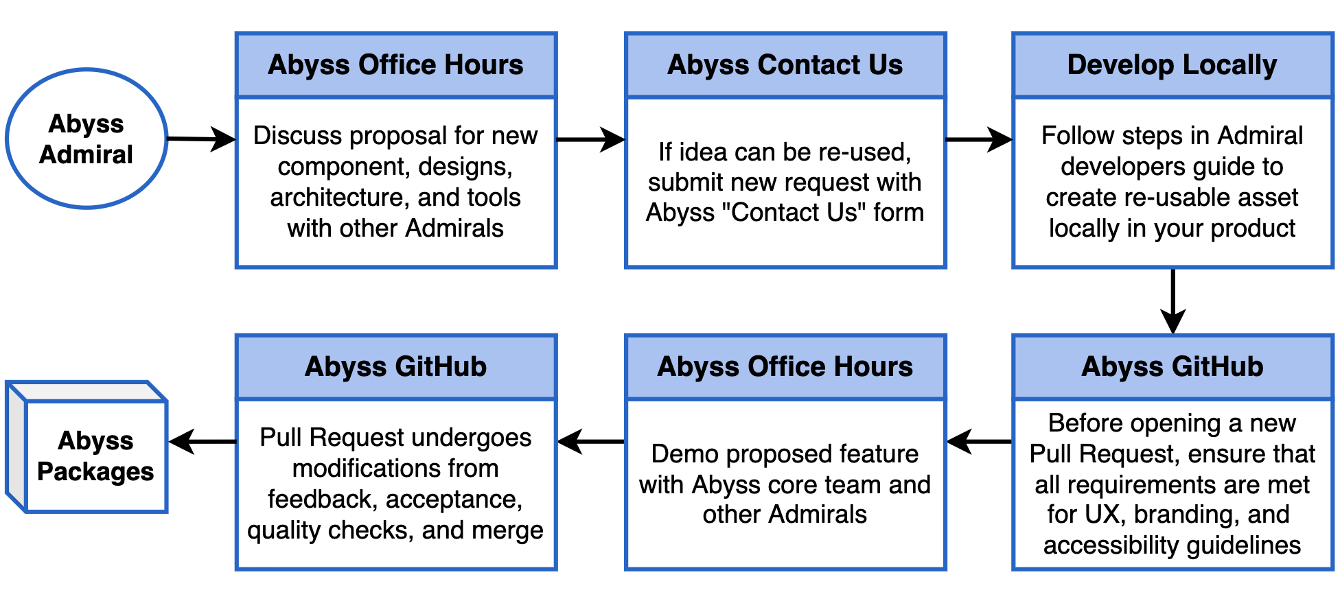
## Abyss Office Hours
| Day | Time | Meeting |
| -------------------- | ---------------------- | ------------------------------------------------------------------------------------------------------------------------------------------------------------------------------------------------------------------------------------------------------------------------- |
| Tuesdays & Thursdays | 8:30 - 9:30 AM **CST** | [Join Teams Meeting](https://teams.microsoft.com/l/meetup-join/19%3ameeting_MTdkODUwYzQtZTNiZS00M2EyLWJmOTMtOGJjMTU4YTYyNWU5%40thread.v2/0?context=%7b%22Tid%22%3a%22db05faca-c82a-4b9d-b9c5-0f64b6755421%22%2c%22Oid%22%3a%22d5140f05-c25a-491a-8c4f-ad6da5e23bad%22%7d) |
---
id: abyss-contributors
title: Abyss Contributors
---
## Overview
First of all, thank you for your interest in contributing to Abyss. All of your contributions are valuable to the project! There are several ways you can get involved in the Abyss community and become a contributor:
- **Share Abyss:** Share the link to [Abyss](https://abyss.uhc.com) with members of your product team, and we'd be happy to discuss how we can help support your application.
- **Improve documentation:** Help us improve the [Abyss Docs](https://github.com/uhc-tech/abyss/tree/main/products/abyss-docs-web) by fixing incomplete or missing sections, examples, and explanations.
- **Provide feedback:** The team at Abyss are constantly working to make the project better, please let us know what features you would like to see with the [Contact Us](/web/contact-us/) form.
## Abyss code repo
```tsx example
() => {
const Root = styled(Card, {
display: 'flex',
flexDirection: 'column',
gap: '$web.semantic.spacing.scale.md',
});
return (
The Abyss source code monorepo contains both core packages and products:
Packages:
Abyss Repo
);
};
```
### Setting up project locally
For the essential system tools to get Abyss running on your local development environment, visit our [workplace setup guide](/web/developers/workplace-setup).
To set up, clone the [Abyss repository](https://github.com/uhc-tech/abyss) to a directory of your choice:
```bash
git clone https://github.com/uhc-tech/abyss.git
```
Afterwards, install the dependencies for `abyss` on your machine:
```bash
# Go into the abyss directory
cd abyss
# Install abyss dependencies
pnpm i
```
Then you are ready to start `abyss-docs` on your machine:
```bash
pnpm run docs
```
### Commit conventions
With several contributors working on Abyss, it's important to write your commit messages to be as descriptive as possible. Abyss follows the conventional commit format to keep commits organized and searchable.
```txt
(): []
```
Examples:
```txt
docs(web): Edit Button accessibility section [US123456789]
refactor(web): Extract loading overlay logic
feat(mobile): Add new Carousel feature [US987654321]
fix(docs): Fix docs deployment script [DE1234567]
```
### Git branch names
Naming the branch you're working on helps repository maintainers understand the changes being made when the PR is opened. Using consistent branch name prefixes also allows build tools to automatically categorize the branches using labels. Branch names should be all lowercase (with the exception of `US` and `DE`) and include hyphens between words. All branches are divided into four groups:
- **story/** - Changes associated with a User Story, use the unique 7-digit number from Rally followed by a task description.
- **defect/** - Changes associated with a Defect, use the unique 7-digit number from Rally followed by a task description.
- **refactor/** - Changes to the repo that aren't documented in Rally are considered refactors, so use the task portion to add detail to your branch name.
- **release/** - Used specifically by build tools, this branch name is exclusive to release notes and documentation leading up to a new release.
Examples:
```bash
$ git checkout -b story/US2434515-developer-toolkit
$ git checkout -b defect/DE308703-button-accessibility
$ git checkout -b refactor/select-input-multi-docs
$ git checkout -b story/US1533842-use-loading-overlay
```
Branch Name Rules:
- Branch prefix must start with `story/`, `defect/`, `refactor/`, or `release/`
- Branch name may consist only of **lowercase letters**, **numbers**, and **hyphens**
- The user story or defect ID (`US###` or `DE###`) must be included in the branch name and is an exception to this rule
## Secure groups
Visit [Secure](https://secure.uhc.com) to request permissions for the following group:
- `abyss_contributors`: For write access to Abyss [GitHub repositories](https://github.com/uhc-tech/abyss)
## Developer tools
Abyss is built using a list of trusted resources. Below are links to what makes up the framework of Abyss.
```tsx example
() => {
const devLinks = [
{
name: 'React',
href: 'https://reactjs.org/',
},
{
name: 'Docusaurus',
href: 'https://docusaurus.io/',
},
{
name: 'Emotion',
href: 'https://emotion.sh/docs/introduction',
},
{
name: 'React Hook Form',
href: 'https://react-hook-form.com/',
},
{
name: 'React Router',
href: 'https://reactrouter.com/',
},
{
name: 'pnpm',
href: 'https://pnpm.io/',
},
];
return (
{devLinks.map((link) => {
return (
{link.name}
);
})}
);
};
```
If you're ready to get started with Abyss on your own, check out the Abyss StarterKit (coming soon) to get started.
## Design tools
Abyss has a dedicated team of designers creating a Design Kit on Figma. Below are some resources to help developers navigate these tools:
```tsx example
() => {
const designLinks = [
{
name: 'Abyss Design Kit',
href: 'https://www.figma.com/design/TPAabOyN3kHYQ5NFMygSFy/Web--Component-Library-%7C-UHC?node-id=0-1',
},
{
name: 'Figma for developers',
href: 'https://www.figma.com/best-practices/tips-on-developer-handoff/an-overview-of-figma-for-developers/',
},
{
name: 'UHC branding',
href: 'https://brand.uhc.com',
},
{
name: 'Optum branding',
href: 'https://brand.optum.com',
},
];
return (
{designLinks.map((link) => {
return (
{link.name}
);
})}
);
};
```
If you're a designer and want to dive deeper into the Abyss Design Kit, visit our Designer Getting Started (coming soon) page to learn more.
---
id: documentation-guide
title: Documentation Guide
---
## Overview
The documentation pages are organized under the **docs** directory shown below. When adding a new component, tool, or guide to Abyss Docs, create a new markdown.md file under the associated folder.
```txt
abyss-docs-web
└── docs
├── api
└── web
├── brand
├── developers
├── hooks
├── overview
├── tools
└── ui
```
## Markdown structure
Each markdown file should begin with the following metadata, as an example:
```md
---
id: carousel
category: Content
title: Carousel
description: Displays information through a series of slides.
design: https://www.figma.com/file/tk08Md4NBBVUPNHQYthmqp/Abyss-Design-System?node-id=3578%3A23477
pagination_prev: web/ui/card
pagination_next: web/ui/step-indicator
---
```
Every doc page is divided into three tabs: overview, Integration, and Accessibility. Within the body of the markdown file, use these tabs to group sections of information.
```
**Overview Content**
**Integration Content**
**Accessibility Content**
```
## Overview tab
###### Import statement
Add the import statement for the feature like such:
```jsx
import { Alert } from '@uhg-abyss/web/ui/Alert';
```
###### Component Sandbox
Add Sandbox after the import statement for any components that make sense
to have a sandbox. Inputs are controlled props that can be adjusted by the user using the Sandbox features. Organize the inputs alphabetically when possible, starting with the simple properties first. Each input contains `prop`, `type` and optionally: `options` and, `defaultValue`.
To create a Sandbox, use the convention below:
```tsx example
(
Lorem ipsum odor amet, consectetuer adipiscing elit. Ipsum rhoncus duis
vestibulum fringilla mollis.
);
```
###### Property examples
Following the Sandbox, it's important to show the ability of each property separate of the others. We break each one down, giving it a title, description, and jsx example showing variants of that specific property. For example, if you wanted to show the three sizes for Button, you'd write:
```jsx
() => {
return (
);
};
```
Since there are different visual variants of Button, including `primary` and `outline`, which use the same sizing convention (`'$sm'`, `'$md'`, and `'$lg'`), we can combine the two visuals under the one size example by organizing them utilizing the built-in Layout component from the Abyss library. Here's what the combined example looks like:
```tsx example
() => {
return (
);
};
```
To follow the complexity of each prop example, use the following rules to properly document the feature:
- **When organizing the list of examples,** they should be ordered from simple to complex starting with size or width
- **Start each example case** with "Use the `prop-name` property to..." followed by an explanation
- **For props with a pre-set list of variants,** add a sentence listing out the variant options "Variants include `variant-1`, `variant-2`," and so on
- **For props with a default value,** add "The default value is set to `value`"
- **For the customization example section,** include the sentence "If further customization is needed, most styles of `component-name` can be overridden using `css`"
- **Size and width examples** should include the list of Abyss style sizes (including the conversion of size to units in the label/text like $web.semantic.sizing.icon.utility.md = 24px), followed by percent, and px
- **Examples may include:** size, width, isDisabled, controlled, uncontrolled, loading, and customization. Take a look at other doc pages for examples of how to best format the component you're documenting
## Integration tab
Implementing a props table and classes table for the component, and any sub-components gives users an in-depth view of the component without having to visit the code. (The below example is modified for this template. Please refer to the Alert component for a full list of props and classes).
Follow these rules when creating a Props Table:
- **Prop name** is lowercase
- **Type** is one of the following: boolean, function, array, shape, number, string, number | string
- **Default value** is the default value from the defaultProps list, or null
- **Description** first word is uppercase, followed by a brief description of the props use
Follow these rules when creating a Classes Table:
- **Class name** starts with a period (.), is lowercase and uses dashes to separate words
- **Description** first word is uppercase, followed by a brief description of the class
#### Integration tab example
### Alert Props
## Alert Props
| Prop | Type | Description | Default | Required |
|------|------|-------------|---------|----------|
| `ariaLive` | `'assertive' \| 'polite' \| 'off' \| undefined` | Overrides the default aria-live attribute for the Alert, which is 'polite' if `status` is `'success'` or `'info'` and is not present if `status` is `'error'` or `'warning'` | `-` | No |
| `ariaText` | `string \| undefined` | Extra text for accessibility purposes; read before the title | `-` | No |
| `children` | `React.ReactNode` | The contents of the Alert | `-` | Yes |
| `cta` | `{ type: 'button'; props: AlertButton } \| { type: 'link'; props: AlertLink } \| undefined` | If present, the Alert will display a button or a link | `-` | No |
| `describedById` | `string \| undefined` | An id to associate the Alert body text with for aria-describedby | `-` | No |
| `dismissible` | `boolean \| undefined` | If true, the Alert can be dismissed | `true` | No |
| `focusAfterClose` | `React.RefObject \| undefined` | A ref to the element that should receive focus when the Alert is closed; only used when `dismissible` is true. When not provided, focus is automatically returned to the element that was focused when the Alert became visible. | `-` | No |
| `headingLevel` | `1 \| 2 \| 3 \| 4 \| 5 \| 6 \| undefined` | The heading level of the Alert title | `2` | No |
| `inline` | `boolean \| undefined` | If true, the Alert will be displayed as an inline element | `false` | No |
| `isVisible` | `boolean \| undefined` | If true, the Alert will be visible | `true` | No |
| `onClose` | `Abyss.MouseEventHandler` | Callback function executed when the Alert is closed; only used when `dismissible` is true | `-` | No |
| `showDivider` | `boolean \| undefined` | If true, the Alert will show a divider before the close button; Only used when `dismissible` is true | `true` | No |
| `status` | `'success' \| 'warning' \| 'error' \| 'info' \| undefined` | The status of the Alert | `'error'` | No |
| `timestamp` | `string \| undefined` | If present, the Alert will display a timestamp | `-` | No |
| `title` | `string \| undefined` | The title of the Alert | `-` | No |
**Type References:**
- Alert.types.ts
### Alert Classes
## Alert Classes
| Class Name | Description |
|------------|-------------|
| `.abyss-alert-live-region` | Alert aria-live region wrapper element |
| `.abyss-alert-root` | Alert root element |
| `.abyss-alert-wrapper` | Alert wrapper element |
| `.abyss-alert-icon` | Alert icon element |
| `.abyss-alert-content` | Alert main content container |
| `.abyss-alert-timestamp-container` | Alert timestamp container |
| `.abyss-alert-close-button-container` | Alert close button container |
| `.abyss-alert-text-container` | Alert text content container |
| `.abyss-alert-title-container` | Alert title container |
| `.abyss-alert-title` | Alert title element |
| `.abyss-alert-body-text` | Alert body text element |
| `.abyss-alert-timestamp` | Alert timestamp element |
| `.abyss-alert-cta-container` | Alert CTA container |
| `.abyss-alert-cta-button` | Alert CTA button element |
| `.abyss-alert-cta-link` | Alert CTA link element |
| `.abyss-alert-separator` | Alert separator element |
| `.abyss-alert-close-button` | Alert secondary button element |
| `.abyss-alert-close-icon` | Alert close button icon element |
## Accessibility tab
This tab is important to be as thorough and in-detail as possible, adhering to the WAI-ARIA design guidelines.
Follow this pattern when creating the Accessibility tab:
- **Brief description** write a description about the component, and link to the WAI-ARIA website page referring to the component
- **Sandbox** allows our A11Y partners to practice assistive technology on the component in a dedicated field
- **Keyboard interactions table** referring to the WAI-ARIA keyboard interactions, create a table with all interactions usable for the specific component
- **Additional guidance** note any additional guidance features of the component, including (but not limited to) Decorative Icons, Loading State, etc.
#### Accessibility tab example
An alert is an element that displays a brief, important message in a way that attracts the user's attention without interrupting the user's task. Dynamically rendered alerts are automatically announced by most screen readers, and in some operating systems, they may trigger an alert sound. It is important to note that, at this time, screen readers do not inform users of alerts that are present on the page before the page load completes.
Adheres to the [WAI-ARIA Alert design pattern](https://www.w3.org/WAI/ARIA/apg/patterns/alert/).
The [Alert Example](https://www.w3.org/WAI/ARIA/apg/patterns/alert/examples/alert/) provided by W3.org demonstrates the Alert Pattern.
```tsx example
() => {
const [visibleAlerts, setVisibleAlerts] = useState([true, true, true, true]);
const resetButtonRef = useRef(null);
return (
{
setVisibleAlerts([
false,
visibleAlerts[1],
visibleAlerts[2],
visibleAlerts[3],
]);
resetButtonRef.current?.focus();
}}
>
We are working to restore site operations and should be back soon.
{
setVisibleAlerts([
visibleAlerts[0],
false,
visibleAlerts[2],
visibleAlerts[3],
]);
resetButtonRef.current?.focus();
}}
>
Regular business hours are 8:00AM to 8:00PM Central Time (USA).
{
setVisibleAlerts([
visibleAlerts[0],
visibleAlerts[1],
false,
visibleAlerts[3],
]);
resetButtonRef.current?.focus();
}}
cta={{
type: 'button',
props: {
children: 'Receive notifications',
onClick: () => {
console.log('CTA button clicked');
},
},
}}
>
All information successfully received. We will contact you when your
claim is updated
{
setVisibleAlerts([
visibleAlerts[0],
visibleAlerts[1],
visibleAlerts[2],
false,
]);
resetButtonRef.current?.focus();
}}
cta={{
type: 'link',
props: {
children: 'Live support',
href: '#cta',
onClick: () => {
console.log('CTA link clicked');
},
},
}}
>
Due to technical difficulties responses may be delay one to two working
days. Live support options can help get your answers sooner.
);
};
```
### Keyboard Interactions
## Decorative Icons
The brand icon in the Emphasis Banner is considered decorative and does not require a text alternative, though one can be provided if desired.
## Close Button Guidance
If the close button is present—which it is by default—it must be keyboard accessible. A keyboard-only user must be able to tab to the button and activate it with the space bar and the enter key. When the Alert is closed, focus must be placed back where it previously was on the page.
## ARIA Properties
If `status` is `'success'` or `'info'`, `Alert` has the following ARIA properties:
- `role="status"`
- `aria-live="polite"`
If `status` is `'warning'` or `'error'`, `Alert` has the following ARIA properties:
- `role="alert"`
## BrAT Variant Behaviors
- **JAWS**
- Only announces text
- Does not announce actions or close button
- **NVDA, VoiceOver**
- Both announce all contents, though not roles (link, button)
## Common issue: Immediate announcements require adding alerts to page AFTER loading
For an `Alert` to announce immediately, they must be added AFTER the page content is loaded. This makes them a dynamic update to the page.
The examples here display them on page load. This makes them more like static banners.
### Announcing "Alert" (or "Warning," etc.) - Defining alt text for icons
Even in those cases, they will not announce as "Alerts" unless alt text is defined for the icon. Otherwise, only the displayed text will be announced.
Use the `ariaText` prop to define this text.
---
id: faq
title: FAQs
---
## Version Conflict: `react-router`
Sometimes, your application may contain several versions of `react-router`. If the version you are using elsewhere is higher than the version used in Abyss, you must override the version in Abyss via the root `package.json` file. Add the following override:
```json
{
...,
"overrides": {
"@uhg-abyss/web": {
"react-router": "7.9.5" // Match the version used in your application
}
}
}
```
Then, you will need to delete every `node_module/` folder as well as `package-lock.json` and run `npm install`.
:::danger React Router 6 only
This will only work with version 6 of `react-router` and its minor versions.
:::
## TypeError: Cannot read properties of undefined (reading 'default') at Object.interopDefault
To address the changes made in the Next.js framework, you must update the files in the `pages/` directory inside your application. See below:
```txt
└── products
└── web
├── .abyss
├── pages
| ├── _app.js
| ├── _document.js
| └── index.js
├── src
└── package.json
```
Update the following files with the updated exports:
`_app.js`
```jsx
export { default } from '@uhg-abyss/core/next-app';
```
`_document.js`
```jsx
export { document as default } from '../src/document';
```
`index.js`
```jsx
export { browser as default } from '../src/browser';
```
---
id: getting-started
title: Getting Started
---
This guide is designed to help teams seamlessly integrate Abyss into their applications, enhancing their development capabilities with our robust suite of tools and features.
Whether you're looking to improve your app's scalability, performance, or developer experience, Abyss is the right choice to elevate your project.
## Get started with a template
The easiest way to get started with Abyss is to use one of the pre-configured templates via the Abyss CLI. Use `templates find` to list all available templates, or `templates create` to scaffold a new project:
| Template | Command |
| :------------------------ | :------------------------------------------------------------ |
| Next.js 16 (App) | `npx @uhg-abyss/cli templates create next-app [project-name]` |
| Vite (React + TypeScript) | `npx @uhg-abyss/cli templates create vite [project-name]` |
## Add Abyss to an existing application
### Peer dependencies
React and React DOM are peer dependencies, meaning you should ensure they are installed before installing Abyss.
```json
"peerDependencies": {
"react": "^18.0.0 || ^19.0.0",
"react-dom": "^18.0.0 || ^19.0.0"
},
```
### Install Abyss Web
To add Abyss web to an existing application, first install the Abyss dependencies:
```bash
npm install @uhg-abyss/web
```
Then, wrap your application root component with [`ThemeProvider`](/web/ui/theme-provider).
The `ThemeProvider` enables global theming for your application, with the option to customize or rely on the default styles of Abyss components. Utilizing React's context, it distributes your theme to all nested components.
```jsx
import { ThemeProvider } from '@uhg-abyss/web/ui/ThemeProvider';
const theme = createTheme('uhc');
function Demo() {
return (
);
}
```
### Importing components
The Abyss documentation on this site gives detailed information on importing and using all components within the Abyss library. Simply search for the component you would like to use and follow the guide. Below is an example of how to import the `Button` component into a file:
```jsx
import { Button } from '@uhg-abyss/web/ui/Button';
```
## Upgrading Abyss
Abyss releases [New Versions](/web/releases/) on a biweekly basis. For further details, refer to our [Versioning Guide](/web/developers/versioning-guide).
You can upgrade Abyss by running the following command in the root of your application:
```bash
npm install @uhg-abyss/web@latest
```
```bash
yarn add @uhg-abyss/web@latest
```
Benefits to staying current with the latest version of Abyss include:
- **Adhering to Brand Guidelines**
- Align with the latest branding guidelines, ensuring your application maintains a consistent look and feel with the overall brand identity.
- **Enhanced Security**
- Address vulnerabilities and security enhancements to protect your application against emerging threats.
- **Improved Accessibility**
- As accessibility standards evolve, Abyss updates provide enhancements and fixes that help ensure your application is accessible to all users, including those with disabilities.
- **Access to New Components Features**
- Gain access to new components and features that can enrich the user experience and offer new functionality for your application.
- **Bug Fixes**
- Addresses defects that improve the stability and performance of your application.
- **Efficient Upgrades and Minimal Regression Testing**
- Staying updated with the latest version simplifies the upgrade process and minimizes related regression testing efforts.
---
id: installation
title: Installation
---
## Create a new application
If your team is starting a new application, use one of our [Abyss Templates](/web/developers/getting-started/#get-started-with-a-template) to scaffold a new app.
After creating the app, install Abyss by following [Getting Started](/web/developers/getting-started/).
## Add Abyss to an existing application
If your team already has a React codebase, install Abyss directly in your project. Learn more about adding Abyss in [Getting Started](/web/developers/getting-started/).
## Upgrading Abyss
Instructions: [Getting Started](/web/developers/getting-started/#upgrading-abyss)
Abyss releases [New Versions](/web/releases/) on a biweekly basis. For further details, refer to our [Versioning Guide](/web/developers/versioning-guide).
Benefits to staying current with the latest version of Abyss include:
- **Adhering to Brand Guidelines**
- Align with the latest branding guidelines, ensuring your application maintains a consistent look and feel with the overall brand identity.
- **Enhanced Security**
- Address vulnerabilities and security enhancements to protect your application against emerging threats.
- **Improved Accessibility**
- As accessibility standards evolve, Abyss updates provide enhancements and fixes that help ensure your application is accessible to all users, including those with disabilities.
- **Access to New Components Features**
- Gain access to new components and features that can enrich the user experience and offer new functionality for your application.
- **Bug Fixes**
- Addresses defects that improve the stability and performance of your application.
- **Efficient Upgrades and Minimal Regression Testing**
- Staying updated with the latest version simplifies the upgrade process and minimizes related regression testing efforts.
---
id: v0-to-v1-guide
title: V0 to V1 Guide
pagination_prev: null
---
This guide is intended for teams looking to upgrade from Abyss v0 to the latest release of Abyss.
Among the changes are some major architectural changes and updates, including consolidated packages, a new foundational UHC theme, new hooks and components, Figma integration, an upgraded CSS styling tool, and refactored form inputs and validation. We have also improved accessibility compliance, upgraded our application router, and made many performance updates across all areas.
When you install our newest package dependencies, you'll automatically be up to date with the latest version. Abyss takes care of maintaining a robust product development framework so your team can focus on shipping a better product faster.
## Version overview
With Abyss v1.0, we have consolidated the primary areas of application development into three main npm packages - `@uhg-abyss/web`, `@uhg-abyss/api`, and `@uhg-abyss/core`.
- `@uhg-abyss/web` represents the client-side packages, React components, hooks, and tools.
- `@uhg-abyss/api` represents the server-side packages, including the GraphQL server, Express middleware, and other libraries.
- `@uhg-abyss/core` includes the configurations for ESLint and Babel, which have been consolidated along with the dev and build scripts. This package will be shared with both client and server projects built on Abyss.
```tsx example
() => {
const columns = [
{ name: 'Legacy Abyss', key: 'old' },
{ name: 'Abyss V1.0', key: 'new' },
];
const rows = [
{
id: 1,
old: '@abyss/ui',
new: '@uhg-abyss/api',
},
{
id: 2,
old: '@abyss/ui',
new: '@uhg-abyss/web',
},
{
id: 3,
old: '@abyss/core',
new: '@uhg-abyss/web',
},
{
id: 4,
old: '@abyss/scripts',
new: '@uhg-abyss/core',
},
{
id: 5,
old: '@abyss/eslint-config',
new: '@uhg-abyss/core',
},
{
id: 6,
old: '@abyss/babel-preset',
new: '@uhg-abyss/core',
},
{
id: 7,
old: '@abyss/test',
new: 'Deprecated',
},
{
id: 8,
old: '@abyss/widgets',
new: 'Deprecated',
},
];
return ;
};
```
## Component changes
Some common UI components have changed for consistency. Below is a table comparing noticeable differences from legacy versions of Abyss to Abyss v1. This is a non-exhaustive list, and components that are not included could likely have styling updates.
Our Brand and Design teams have made strong headway to update our standards since v0. We recommend following theme defaults, but if it is necessary to maintain the exact same design for your product, external styling or theme overrides can be done.
```tsx example
() => {
const columns = [
{ name: 'Legacy Abyss', key: 'old' },
{ name: 'Abyss V1', key: 'new' },
];
const rows = [
{
id: 1,
old: 'Alert, AlertBanner',
new: 'Component Name: Alert. AlertBanner deprecated.',
},
{
id: 2,
old: 'Button',
new: 'Component Props: link variant is now tertiary, theme and width props are deprecated.',
},
{
id: 3,
old: 'Card',
new: 'Component Props: width prop deprecated, many new props and classes for increased flexibility and functionality.',
},
{
id: 4,
old: 'ExternalLink',
new: 'Component Name: Link',
},
{
id: 5,
old: 'Flex',
new: 'Component Props: No longer need to use classes Flex.Flex and Flex.Content. Alignment and behavior can simply be applied directly with props such as justify, alignContent, direction, etc.',
},
{
id: 6,
old: 'Icon',
new: 'Component Name: Icon, IconMaterial, IconBrand',
},
{
id: 7,
old: 'Link',
new: 'In some cases, Link components would be wrapped with a Button component, mostly for styling purposes. This is no longer needed, can simply create a Button component with a href prop. The Link component still exists.',
},
{
id: 8,
old: 'MaterialIcon',
new: 'Component Name: IconMaterial',
},
{
id: 9,
old: 'Modal',
new: 'Component Props: New title and footer props (can still use Modal.Footer), scrollableFocus. onRequestClose is now called onClose. Modal.Scroll and Modal.Actions deprecated classes.',
},
{
id: 10,
old: 'MultiSelectList',
new: 'Component Name: SelectInputMulti',
},
{
id: 11,
old: 'RadioGroup',
new: 'Component Props: Use label prop for the title.',
},
{
id: 12,
old: 'SelectList',
new: 'Component Name: SelectInput',
},
{
id: 13,
old: 'Switch',
new: 'Component Name: Router. For Switch, use class Router.Routes.',
},
{
id: 14,
old: 'TextArea',
new: 'Component Name: TextInputArea',
},
{
id: 15,
old: 'Toggle',
new: 'Component Name: ToggleSwitch',
},
{
id: 16,
old: 'Tooltip',
new: 'Component Name: Tooltip and Popover',
},
];
return ;
};
```
## Components unavailable
The following components are not available in v1.0. Those marked "To Be Implemented" will be part of upcoming releases.
```tsx example
() => {
const columns = [
{ name: 'Legacy Abyss', key: 'old' },
{ name: 'Abyss V1.0', key: 'new' },
];
const rows = [
{
id: 1,
old: 'ErrorMessage',
new: 'To Be Implemented',
},
{
id: 2,
old: 'ReadMore',
new: 'To Be Implemented',
},
{
id: 3,
old: 'DataViz',
new: 'To Be Implemented',
},
{
id: 4,
old: 'FormControl',
new: 'Deprecated',
},
{
id: 5,
old: 'AppProvider',
new: 'Deprecated',
},
];
return (
);
};
```
Various hooks are also now deprecated, particularly in relation to forms and styling.
Hooks relating to Redux are no longer available.
```tsx example
() => {
const columns = [
{ name: 'Legacy Abyss', key: 'old' },
{ name: 'Abyss V1.0', key: 'new' },
];
const rows = [
{
id: 1,
old: 'useField',
new: 'Deprecated',
},
{
id: 2,
old: 'useFormState',
new: 'Deprecated',
},
{
id: 3,
old: 'useAction',
new: 'Deprecated',
},
{
id: 4,
old: 'useSaga',
new: 'Deprecated',
},
{
id: 5,
old: 'useModel',
new: 'Deprecated',
},
{
id: 6,
old: 'useBounds',
new: 'Deprecated',
},
{
id: 7,
old: 'useBreakpoint',
new: 'Deprecated',
},
{
id: 8,
old: 'useColor',
new: 'Deprecated',
},
{
id: 9,
old: 'useSize',
new: 'Deprecated',
},
{
id: 10,
old: 'useStyles',
new: 'Deprecated',
},
];
return (
);
};
```
## Branding
The Abyss Design System now supports branding at a foundational level, with complete UHC, UHG, and Optum themes.
A theme is comprised of several core parts that create the building blocks of the design system. See the Brand section of our docs site for [brand colors](/web/brand/{brand}/colors), [fonts and typography settings](/web/theme-customization/typography/typography-{brand}), [icon libraries](/web/brand/{brand}/icon-brand), and several [brand-associated logos](/web/brand/{brand}/brandmark). Simply by using Abyss as a launch point for your project, you will be fully aligned with all enterprise digital brand standards and assets, with no additional setup required.
## Design integration
To help teams quickly build and adapt a beautiful user interface, we've streamlined design and development for the Abyss Design System. We're excited to announce the addition of a dedicated design team implementing best practices on components and tools for the [Abyss Design System in Figma](https://www.figma.com/file/tk08Md4NBBVUPNHQYthmqp/Abyss-Design-System?node-id=0%3A1).
With this addition, your entire product team has the power to make updates and adjustments with ease, utilizing both developer docs and design guidelines that now live in one place. On each docs page, simply press the "View Design" button in the header that links directly to the ADS in Figma. Even more so now, design, and development collaboration provides an on-brand, elevated, cohesive experience.
## CSS/styling tools
There are multiple approaches teams can take for styling. Styling can be supported inline with the `css` prop on components, which allows for targeting classes that we have mentioned in the integration tab of any docs page. While we do not explicitly support external stylesheets,
teams who already use this approach can continue doing so by applying through a `className`.
These style customizations are described further on our [Style Customization documentation](/web/theme-customization/styling/style-customization). However, our own components
are built using the [styled tool](/web/theme-customization/styling/styled-components) via Stitches.
### Stitches
We have updated our CSS-in-JS library from Styled Components to [Stitches](https://stitches.dev/). CSS-in-JS libraries have significant advantages over traditional CSS strategies by leveraging reusable variables, functions, and static code analysis.
The Stitches API shares many similarities with Styled Components; however, only object literal syntax is supported. The main benefit of Stitches over all other React CSS strategies is that nearly all CSS is generated at build time rather than runtime. This avoids unnecessary prop interpolations during the render phase, which can add up quickly when building large applications with a dynamic, theme-driven design system.
For detailed examples, review the docs for the [styled tool](/web/theme-customization/styling/styled-components). To see a full migration guide, please read [migrating from Styled Components to Stitches](https://stitches.dev/blog/migrating-from-styled-components-to-stitches).
:::info
Abyss V2 switches the styling library from Stitches to [Emotion](https://emotion.sh/docs/introduction). See the [Emotion Migration Guide](/web/developers/migration-v2/emotion-migration) for more information.
:::
## Routing
We base our routing off of `react-router-dom`. Check out their [migration guide](https://reactrouter.com/en/main/upgrading/v5) from v5 to v6, or our own [routing overview](/web/developers/routing/).
- router.push() should now be router.navigate()
- If deploying on AWS look at this [stack overflow post](https://stackoverflow.com/questions/51218979/react-router-doesnt-work-in-aws-s3-bucket) with deployment issues with routing
- Use the baseRoute in `.abyss/settings.json` if needed
```json
"baseRoute": "/YOURBASEPATH"
```
## State management
Redux is no longer built into any of our products. It can still be used alongside our products by any consuming team, but we also recommend using [Zustand](https://docs.pmnd.rs/zustand/getting-started/introduction).
## Forms refactor
Our new forms integration is entirely built on top of the [react-hook-form](https://react-hook-form.com/docs/useform) library. We have upgraded from the previous Redux implementation to a new [FormProvider](/web/ui/form-provider/), which allows child form inputs to consume the form context and methods returned from the upgraded [useForm hook](/web/hooks/use-form/). With the addition of useForm functionality, most of our hooks for form management have now been deprecated.
This means form components and their state management could be a large portion of a team's migration efforts. We have not only expanded the collection of form inputs that are supported, but we have also consulted with accessibility experts to create first-class [WCAG](https://www.w3.org/WAI/standards-guidelines/wcag/) compliant interactions.
## Build
Teams that are using AWS will need to use `browser-static` in `.abyss/settings.json`:
```json
"buildType": "browser-static".
```
This is instead of the default `browser-node`.
## Abyss Scripts migration guide
:::warning
Both paths below are deprecated. Teams should instead scaffold a new app using one of the [Abyss Templates](/web/developers/getting-started/#get-started-with-a-template).
:::
This guide is to help migrate from the old `@abyss/scripts` package to the new `@uhg-abyss/core` package. If a team is looking to use Parcels, see [our guides](/foundations/parcels/overview/) for additional information. It is recommended to integrate Parcels by using Path One.
### Path one
Lift and shift the application into a new application.
- This will provide a more up-to-date foundation that will improve development and compatibility in the long run.
- You can leverage additional Abyss tools like API and Parcels.
---
**1.** Create a new Abyss application
- Follow the [Getting Started](/web/developers/getting-started/) guide to create and set up a new application.
**2.** Bring over the old codebase
- When bringing over the code, start small and fix errors as they appear.
**3.** Migrate imports from `@abyss/ui` web components to `@uhg-abyss/web` components
- You can still use the old `@abyss/ui`, but you may encounter issues. (Support for `@abyss/ui` has ended)
- When installing the old `@abyss/ui`, you must force installation due to React version conflicts.
:::note Dependency notes
- `@uhg-abyss/web` only supports `react-router-dom` v6.
- `@uhg-abyss/web` does not support Redux; use [Zustand](https://zustand.docs.pmnd.rs/getting-started/introduction) instead.
:::
### Path two
Migrate `@abyss/scripts` to `@uhg-abyss/core`
- This option will keep you on an outdated tech stack.
---
**1.** Install packages
- `npm install @uhg-abyss/core`
- `npm install typescript`
**2.** Remove unused `@abyss` packages:
- `@abyss/babel-preset`
- `@abyss/eslint-config`
- `@abyss/scripts`
**3.** Add `prettier`, `eslintConfig`, and `bundleDependencies` configs to `package.json` (You may have to update paths):
- [https://github.com/uhc-tech/abyss-app/blob/main/products/web/package.json#L5C2-L8](https://github.com/uhc-tech/abyss-app/blob/main/products/web/package.json#L5C2-L8)
- [https://github.com/uhc-tech/abyss-app/blob/main/products/web/package.json#L23-L25](https://github.com/uhc-tech/abyss-app/blob/main/products/web/package.json#L23-L25)
**4.** Add `tsconfig.json` file to the web app root (You may have to update the `"include"` path or add additional configurations):
- [https://github.com/uhc-tech/abyss-app/blob/main/products/web/tsconfig.json](https://github.com/uhc-tech/abyss-app/blob/main/products/web/tsconfig.json)
**5.** Add `next.config.js` file to the web app root:
- [https://github.com/uhc-tech/abyss-app/blob/main/products/web/next.config.js](https://github.com/uhc-tech/abyss-app/blob/main/products/web/next.config.js)
**6.** Add the `pages/` directory to the web root:
- [https://github.com/uhc-tech/abyss-app/tree/main/products/web/pages](https://github.com/uhc-tech/abyss-app/tree/main/products/web/pages)
**7.** Add the `.abyss/` directory to the web root:
- [https://github.com/uhc-tech/abyss-app/tree/main/products/web/.abyss](https://github.com/uhc-tech/abyss-app/tree/main/products/web/.abyss)
- You can add environment variables to the `.environments.json` file: [Environments config](/foundations/overview/environments/)
## Future steps
Now that your application/product has completed the migration to V1, here are next steps for planning and executing version updates to keep your product current and leverage new functionality released by Abyss.
For more information on Abyss' release strategy, review our [versioning guide](/web/developers/versioning-guide/).
Abyss deploys biweekly minor version releases to improve our products and address any defects. It is recommended to keep up with the latest release of Abyss for the best experience.
- `npm i @uhg-abyss/web@latest` to upgrade to the latest release
- `npm i @uhg-abyss/web@1.XX.X` to upgrade to a specific version of Abyss
---
id: v1-to-v2-guide
title: V1 to V2 Guide
---
Abyss V2 is finally here! We've worked hard to make the transition from V1 as smooth as possible.
## Troubleshooting
If you encounter any issues during the migration process, please post your questions, problems, or findings on GitHub Discussions. This will allow all teams to see, respond to, and benefit from shared solutions. If someone has already asked a similar question, consider adding your insights or upvoting the existing discussion rather than creating a duplicate. This helps keep the conversation organized and makes it easier for everyone to find relevant information.
[Go to the V1 → V2 Migration Discussion](https://github.com/uhc-tech/abyss/discussions/5059)
## Getting started
The steps listed below will guide you through the migration process.
### 1. Update to the latest V1 version
Make sure your project is running on the [most recent V1 release](/web/releases) before starting any migration steps. This will help minimize potential issues during the migration process.
### 2. Update React
In Abyss V2, we have updated our peer dependencies for React and React DOM. Notably, **React 16 and 17 are no longer supported** in Abyss V2. You should ensure your application is running on React 18 or 19 before migrating to Abyss V2.
```json
// V1
- "react": "^16.0.0 || ^17.0.0 || ^18.0.0 || ^19.0.0"
- "react-dom": "^16.0.0 || ^17.0.0 || ^18.0.0 || ^19.0.0"
// V2
+ "react": "^18.0.0 || ^19.0.0"
+ "react-dom": "^18.0.0 || ^19.0.0"
```
### 3. Update component usage
**It is strongly recommended** to replacing your V1 components with their V2 counterparts before updating to Abyss V2. This way, when you move to V2, you will only need to update the import names (e.g., `V2Button` → `Button`) instead of making all the prop changes at the same time.
#### Deprecations
Below is a list of tools, hooks, and components that are no longer available in Abyss V2. To help identify these deprecated components in your codebase, we've created a [codemod detection tool](#detect-deprecated-imports) that scans your project for deprecated Abyss imports.
### 4. Update to the latest V2 version
Now that you've completed all preparation steps, you can update your project to use Abyss V2! Assuming that you have already replaced the deprecated V1 components with their recommended alternatives and switched all other components to their V2 counterparts, the migration to Abyss V2 should be straightforward.
Most of the remaining work should be **import renaming** rather than large-scale refactoring.
#### Remove the V2 prefix
We had released a number of V2 components in V1 with a `V2` prefix to allow teams to start using them early and ease the migration process. Now that you are migrating to Abyss V2, you will need to **remove the `V2` prefix** from these components in your imports. If you used an alias when importing, make sure to update that as well.
```jsx
// Before
import { V2Button } from '@uhg-abyss/web/ui/Button';
import { V2TextInput as TextInput } from '@uhg-abyss/web/ui/TextInput';
// After
import { Button } from '@uhg-abyss/web/ui/Button';
import { TextInput } from '@uhg-abyss/web/ui/TextInput';
```
#### Updating V1-prefixed components
Some existing components have been prefixed with `V1` in Abyss V2 (e.g., `DataGrid` → `V1DataGrid`). We have done this because these components are not yet tokenized and will eventually receive a new design and functionality updates, but we want them to remain available in V2 for those teams who rely on them.
Once the new versions of these components are released, teams will need to **remove the `V1` prefix** from their imports and update any props or patterns to match the new V2 design and API.
| V1 Component Name | V2 Legacy Equivalent |
| :------------------ | :-------------------- |
| `DataGrid` | `V1DataGrid` |
| `Charts` | `V1Charts` |
| `SubNavigationMenu` | `V1SubNavigationMenu` |
| `Table` | `V1Table` |
| `Flyout` | `V1Flyout` |
| `ToggleGroup` | `V1ToggleGroup` |
##### Breaking changes
The `V1` prefix approach allows teams to migrate to V2 with minimal immediate changes, keeping most existing functionality intact. However, due to dependency upgrades and API alignments, **some breaking changes still exist**. These changes are documented below so teams can address them during migration.
###### V1DataGrid
**`numericConfig.valueIsNumericString` → `numericConfig.isNumericString`**
Due to upgrading `react-number-format` from v4 to v5, the property name has changed.
```jsx
// Before
{
title: 'Percent Column',
type: 'number',
numericConfig: {
suffix: '%',
valueIsNumericString: false
}
}
// After
{
title: 'Percent Column',
type: 'number',
numericConfig: {
suffix: '%',
isNumericString: false
}
}
```
###### V1ToggleGroup
**`descriptorsDisplay` has been removed**
The `descriptorsDisplay` prop has been removed in V2. This prop was previously used to control the direction of the descriptors. All descriptors will now automatically stack vertically to improve readability and accessibility (same as `"column"` before).
```jsx
// Before
// After
```
## UHG theme
The UHG theme has been **removed in Abyss V2**. To learn more about this change and how to migrate, please navigate to the [UHG Theme](/web/developers/migration-v2/v2-uhg-theme) documentation.
## Theming
Some values in the overrides provided to the [createTheme function](/web/theme-customization/tokens/create-theme) have been removed to better align with brand design guidelines. If your project is using any of the following overrides, you will need to remove them.
### deprecatedOptumIcons
The `deprecatedOptumIcons` override has been removed as the old Optum brand icons were not aligned with the Optum brand guidelines. Removing this override will ensure that your application uses the correct icons. No changes to your codebase are necessary beyond removing this override from your theme configuration.
:::danger Remove `useDeprecated` prop
It was previously possible to override a single `BrandIcon` with the `useDeprecated` prop. This prop is no longer supported in V2 and should be removed from all `BrandIcon` instances.
:::
### deprecatedFont
The `deprecatedFont` override has been removed from the Optum theme as the deprecated Optum Sans font is no longer a part of the Optum brand. Removing this override will ensure that your application uses the correct font, Enterprise Sans, as per brand guidelines.
The UHC theme still uses UHC Sans by default. You can use Enterprise Sans instead by setting the `enterpriseFont` flag to `true` in the theme configuration.
## CSS styling with Emotion
In Abyss V2, we've replacing Stitches with Emotion for our CSS-in-JS solution. Both libraries have similar APIs, so most applications won't be significantly affected, but some breaking changes are possible depending on your current usage.
For migration steps and examples, see the [Emotion migration guide](/web/developers/migration-v2/emotion-migration).
**Why are we migrating to Emotion?**
- Stitches is no longer actively maintained and we want to use a library that is actively supported and has a strong community.
- Abyss Mobile has already migrated to Emotion and we want to maintain consistency across our products.
- Emotion provides a more flexible API.
- Emotion has better support for server-side rendering, which is important for our applications.
- Shadow DOM support
To read more, please refer to our [ADR](https://github.com/uhc-tech/abyss/blob/main/products/abyss-docs-web/docs/adrs/decisions/adr-013-stitches-replacement.md).
### CSS class name prefix (styledPrefix removal)
The `styledPrefix` configuration option has been **removed in Abyss V2**. This setting was previously used to avoid CSS class name collisions when multiple applications or Parcels were embedded on the same page.
In V2, you can now control the CSS class name prefix directly in your application code using the [StyleRootProvider](/web/ui/style-root-provider) with the `cacheOptions` prop. This provides better style isolation and is especially useful when combined with a shadow DOM.
**Before (V1):**
```json
// .abyss/settings.json
{
"styledPrefix": "my-app"
}
```
**After (V2):**
```jsx
import { StyleRootProvider } from '@uhg-abyss/web/ui/ThemeProvider';
import { ThemeProvider } from '@uhg-abyss/web/ui/ThemeProvider';
import { createTheme } from '@uhg-abyss/web/tools/theme';
const theme = createTheme('uhc');
export const MyApp = () => (
);
```
## Routing
We have upgraded our routing system from v6 to v7 of `react-router`. This upgrade brings several enhancements and new features to improve the routing experience in your application. Check out their [migration guide](https://reactrouter.com/upgrading/v6) for more details.
Here are some key changes and improvements in the routing system:
- The `react-router-dom` package has been consolidated into the main `react-router` package.
- All routing functionality is available from `@uhg-abyss/web/tools/reactRouterTools`. This package re-exports the complete `react-router` package and is meant to prevent version conflicts across projects.
## API
We have upgraded the `@uhg-abyss/api` package's `express` dependency from v4 to v5. For details on breaking changes and migration steps, see the [Express v5 migration guide](https://expressjs.com/en/guide/migrating-5.html).
## Parcels/workshop
Abyss is excited to announce that Parcels is officially out of beta!
### Dependencies
We have upgraded `@uhg-abyss/parcels` package's `storybook` dependency from v8 to v10 in order to take advantage of the latest features and improvements. Due to Storybook v10 moving away completely from CommonJS to ESM, teams will need to update their story imports to include the resolution mode.
**Before (V1):**
```jsx
import type { StoryObj } from '@storybook/react';
```
**After (V2):**
```jsx
import type { StoryObj } from '@storybook/react' with { "resolution-mode": "import" };
```
:::note
Abyss may explore moving from CommonJS to ESM in the future, but for now, this small import change ensures Storybook v10 compatibility with minimal disruption.
:::
### Shadow DOM
The `shadowDOM` flag in story configuration has been **removed in Abyss V2**. This flag was previously used to control shadow DOM behavior in Parcels, but due to limitations within Stitches, style isolation within the shadow DOM was not able to be achieved.
**Before (V1):**
```jsx
export default {
title: 'NoShadowDOMParcel',
parcel: 'my-parcel',
component: MyParcel,
shadowDOM: false, // Flag to turn shadow DOM on or off
};
```
**After (V2):**
Style isolation within the Shadow DOM is now supported in V2. The shadow DOM is now controlled directly in your Parcel component code using [StyleRootProvider](/web/ui/style-root-provider) with the `useShadowDom` prop. This provides more granular control and better integration with theming.
```jsx
import { StyleRootProvider } from '@uhg-abyss/web/ui/ThemeProvider';
import { ThemeProvider } from '@uhg-abyss/web/ui/ThemeProvider';
import { createTheme } from '@uhg-abyss/web/tools/theme';
const theme = createTheme('uhc');
export const MyParcel = () => (
);
```
For more information on Shadow DOM configuration, see the [Shadow DOM documentation](/foundations/parcels/shadow-dom).
### Mutation observer
In Abyss V1, a `disableMutationObserver` flag was available in Parcel configuration. When not disabled, the `MutationObserver` would watch for property changes on a Parcel and trigger a full remount whenever those properties changed.
In Abyss V2, this behavior has been reversed.
The `MutationObserver` is now **disabled by default** in V2 to improve performance and preserve Parcel state. To opt into the previous remount-on-property-change behavior, a new flag, `enableMutationObserver`, has been introduced.
#### Why the change?
In V1, remounting on property change often caused state loss, UI flickering, and performance issues, especially in complex Parcels.
If your V1 Parcel relied on property changes to update its UI, you will need to explicitly enable the `MutationObserver` in V2 by setting `"enableMutationObserver": true` in your Parcel's `settings.json`.
For more details and examples, see the [Updating Parcels](/foundations/parcels/updating-parcels) documentation for more information.
## Codemods and AI tools
We have created a few codemods to help with the migration process. These codemods aim to reduce the amount of manual work required to update your codebase.
### AI-powered migration
To help with component migration, we offer an AI context package that works with tools like GitHub Copilot, ChatGPT, or other AI coding assistants. This context enables the AI to understand the V1 to V2 changes and provide accurate migration assistance.
:::warning Important
Please remember that AI is not perfect. Always review the generated code to ensure it performs migration steps accurately while meeting your requirements and adhering to best practices.
:::
#### Using the AI migration info
Start by downloading the [AI migration context ZIP folder](/migration/web/ai-migration-context.zip), then extract it to your project root directory. The structure should look like this:
```text
your-project-root/
├── abyss-migration-ai-context/
│ ├── ABYSS-MIGRATION-ASSISTANT.md
| └── MigrationData.json
├── package.json
└── src/
└── ... (your project files)
```
Add the context to your AI tool of choice (e.g., Copilot, ChatGPT, etc.) referencing the folder location. Then, you can prompt the AI tool with questions like:
- "Migrate this file from V1 to V2 of Abyss."
- "Migrate the `Button` component from V1 to V2 of Abyss."
Here is an example showcasing migrating a file from V1 to V2 of Abyss using the AI tool. Given this prompt:
"Migrate `#file:HelloAbyss.tsx` from V1 to V2 of Abyss."
Copilot was able to produce the following results:
```tsx example
() => {
return (
);
};
```
### Detect deprecated imports
To help with identifying deprecated components, we provide a script that scans your codebase for deprecated Abyss imports. This script will help you identify which components need to be replaced before migrating to v2.
:::note
Abyss imports show deprecation warnings. This tool is used scan your codebase for all deprecated imports at once.
:::
```tsx example
() => {
return (
);
};
```
#### How to use the script
Start by downloading the [script's ZIP folder](/migration/detect-deprecated-imports.zip), then extract it to your project root directory. The structure should look like this:
```
your-project-root/
├── abyss-migration-tools/
│ ├── scan-imports.sh
│ ├── detect-deprecated-imports.js
| └── deprecated-imports.json
├── package.json
└── src/
└── ... (your project files)
```
Then, run the following commands to make the script executable and scan your codebase:
```bash
# Make the script executable
chmod +x abyss-migration-tools/scan-imports.sh
# Run the script to scan your entire codebase
./abyss-migration-tools/scan-imports.sh
# Or specify a specific directory to scan
./abyss-migration-tools/scan-imports.sh src/components
```
The script will scan your codebase for deprecated Abyss imports and report any findings. For example, running the script might show output like this:
```tsx example
() => {
return (
);
};
```
After identifying deprecated imports, refer to the [deprecation table](#deprecations) above for specific migration advice for each component or utility. For example, the table shows that `createStore` should be replaced with [Zustand](https://zustand.docs.pmnd.rs/getting-started/introduction) directly.
---
id: components
title: Component Changes
---
## Overview
This guide focuses on breaking prop changes to be aware of when migrating from Abyss V1 to V2. These include:
- Props that have been removed
- Props whose behavior or typings have been updated
- Props whose names have been changed but whose functionality remains the same.
This guide does **not** cover:
- New props added in V2, or
- Additional features and enhancements.
For complete documentation of all available props, including new features added, refer to each component's dedicated documentation page.
:::tip AI-Powered Component Migration
Need help with component migration? Use our [AI-powered migration tool](/web/developers/migration-v2/v1-to-v2-guide/#ai-powered-migration) to help convert V1 components to their V2 equivalents with proper prop mapping.
:::
## Accordion
## Alert
## Avatar
## Badge
## Breadcrumbs
## Button
## Card
## Carousel
### Slide
## Charts
## Checkbox
## CheckboxGroup
## Chip
## DataTable
Due to significant changes in `DataTable` we have created a separate [Migration Page](/web/data-table/migrating#migrating).
## DateInput
## Drawer
## DropdownMenu
## FileUpload
## FormProvider
## Fullscreen
## Heading
## Icon
## IconBrand
## IconSymbol
## Indicator
## Link
## LoadingOverlay
## LoadingSpinner
## Modal
## NavMenuPrimitives
## NumberInput
## PageBodyIntro
## PageFooter
## PageHeaderPrimitives
## Pagination
### ResultCount
## Popover
## ProgressBar
## RadioGroup
## Rating
## RichTextEditor
## SearchInput
## SelectInput
## SelectInputMulti
## Skeleton
## Slider
## StepIndicator
## Tabs
## Text
## TextInput
## TextInputArea
## TimeInput
## Timeline
## Toast
## ToggleSwitch
## Tooltip
---
id: emotion-migration
title: Migrating to Emotion-based Abyss Theming
description: A guide to migrating from the previous theming system to the new Emotion-based implementation.
---
This guide will help you migrate your application from the previous Stitches-based theming system to the new Emotion-based implementation in Abyss.
> **Good news!** The migration effort should be minimal for most applications. We've designed the new Emotion-based implementation to be as compatible as possible with existing code. In many cases, your application will continue to work with just a few adjustments (see [Breaking Changes](#breaking-changes) below) after installing the new version but with the following added benefits:
## Overview of changes
- [server-side rendering support](#nextjs-server-side-rendering)
- Improved style isolation for Parcels with [Shadow DOM support](#style-isolation-and-parcels)
- More consistent styling behavior across different environments and host applications
- Granular control of how styles are being processed and injected into the DOM
## Breaking changes
### ThemeProvider requirements
**Before:** CSS variables were added to the `:root` element whether or not `createTheme` or `ThemeProvider` was used and therefore some styles would still be applied to Abyss components.
**After:** In the new Emotion-based implementation [ThemeProvider](/web/theme-customization/tokens/theme-provider) + [createTheme](/web/theme-customization/tokens/create-theme) is required:
- No styles will be applied to Abyss components if they're not encapsulated within a `ThemeProvider` that includes a theme provided by `createTheme`.
- CSS variables are **only** scoped to the `ThemeProvider` wrapper elements
- No default theme is created if a `ThemeProvider` is used without a theme
### AbyssProvider requirements
`AbyssProvider` follows the same requirements as `ThemeProvider` since it uses `ThemeProvider` internally:
**Before:** `AbyssProvider` could be used without providing a theme, and components would still receive default styling.
**After:** The `theme` prop is now required. You must create and pass a theme using `createTheme`:
```jsx
import { AbyssProvider } from '@uhg-abyss/web/ui/AbyssProvider';
import { createTheme } from '@uhg-abyss/web/tools/theme';
const theme = createTheme('uhc');
;
```
### Provider props
The following props have been moved from `ThemeProvider` to `createTheme`:
- `brandAssetsCdn`
- `includeBaseCss`
**Before:**
```jsx
```
**After:**
```jsx
const theme = createTheme('uhc', {
brandAssetsCdn: 'https://example.com/assets',
includeBaseCss: false,
});
;
```
### globalCss
The `globalCss` utility from `@uhg-abyss/web/tools/styled` was part of the v1 Stitches API and has been deprecated. Please use Emotion's `Global` component from `@uhg-abyss/web/ui/ThemeProvider` to define global styles instead.
**Before:**
```jsx
import { ThemeProvider } from '@uhg-abyss/web/ui/ThemeProvider';
import { createTheme } from '@uhg-abyss/web/tools/theme';
import { globalCss } from '@uhg-abyss/web/tools/styled';
const globalStyles = globalCss({
body: {
backgroundColor: '#f0f0f0',
},
});
const theme = createTheme('uhc');
export function App() => {
globalStyles();
return Your app
}
```
**After:**
```jsx
import { ThemeProvider, Global } from '@uhg-abyss/web/ui/ThemeProvider';
import { createTheme } from '@uhg-abyss/web/tools/theme';
const globalStyles = {
body: {
backgroundColor: '#f0f0f0',
},
};
const theme = createTheme('uhc');
const App = () => {
return (
...
);
};
```
### Styling API changes
While the underlying styling engine has changed from Stitches to Emotion, we've worked hard to preserve the [styled](/web/theme-customization/styling/styled-components) utility API to ensure minimal migration work. Most of your existing styling configurations should continue to work without changes.
However, due to fundamental differences between the styling engines, some specific patterns may require updates. The following are the most common patterns we've identified, but given the potential variations and complexity of custom styling, this list isn't exhaustive:
#### Component selectors
Replace component reference selectors with class-based selectors:
```diff
- [`${StyledTrigger}[data-state=open] &`]: { ... }
+ '.abyss-accordion-trigger[data-state=open] &': { ... }
```
#### CSS pseudo-selectors
Some pseudo-selectors need updates for compatibility:
```diff
- '&:first-child': { ... }
+ '&:first-of-type': { ... }
```
#### Adjacent sibling selectors
Keep using class-based selectors for adjacent siblings:
```diff
- '& + &': { ... }
+ '& + .abyss-form-input-wrapper': { ... }
```
#### Content property
String values in the `content` property need to be properly escaped:
```diff
- content: '',
+ content: "''",
```
#### CSS property names
Use camelCase for CSS property names instead of kebab-case with quotes:
```diff
- 'align-items': 'flex-start',
+ alignItems: 'flex-start',
```
## Migration scenarios
### Basic usage
For most applications, simply update your `ThemeProvider` usage and ensure all components that need theme access are within a `ThemeProvider`:
```jsx
import { ThemeProvider } from '@uhg-abyss/web/ui/ThemeProvider';
import { createTheme } from '@uhg-abyss/web/tools/theme';
const theme = createTheme('uhc');
export default function App() {
return (
);
}
```
### Next.js server-side rendering
The Emotion-based `ThemeProvider` has built-in support for Next.js server-side rendering (SSR). It integrates with Next.js's style extraction mechanisms to prevent style flashing during hydration and ensure consistent styling between server and client. For most Next.js applications, using `ThemeProvider` alone is sufficient:
```jsx
// Basic Next.js SSR setup
import { ThemeProvider } from '@uhg-abyss/web/ui/ThemeProvider';
import { createTheme } from '@uhg-abyss/web/tools/theme';
const theme = createTheme('uhc');
export default function App({ children }) {
return {children};
}
```
For more control over style extraction and injection, use the [NextStyleProvider](/web/ui/next-style-provider) (works with both App Router and Pages Router):
```jsx
import { NextStyleProvider } from '@uhg-abyss/web/next';
import { ThemeProvider } from '@uhg-abyss/web/ui/ThemeProvider';
import { createTheme } from '@uhg-abyss/web/tools/theme';
const theme = createTheme('uhc');
// For App Router: app/layout.js
// For Pages Router: pages/_app.js
export default function App({ children, Component, pageProps }) {
const content = Component ? : children;
return (
{content}
);
}
```
### Style isolation and Parcels
Another benefit of the new Emotion-based theming system is improved style isolation for Parcels. The [StyleRootProvider](/web/ui/style-root-provider) with Shadow DOM support ensures that styles from the host application don't leak into your parcel and vice versa.
```jsx
// MyParcel.jsx
import React from 'react';
import { StyleRootProvider } from '@uhg-abyss/web/ui/ThemeProvider/StyleRootProvider';
import { ThemeProvider } from '@uhg-abyss/web/ui/ThemeProvider';
import { createTheme } from '@uhg-abyss/web/tools/theme';
const theme = createTheme('uhc');
export const MyParcel = () => (
{/* Your parcel content here */}
);
```
**Key Benefits:**
- Complete style isolation from host applications
- Consistent theming regardless of embedding context
- No class name collisions with host applications
- Styles scoped only to your parcel for better performance
## Advanced usage
For advanced use cases, refer to the documentation for:
- [StyleRootProvider](/web/ui/style-root-provider) - For applications that need fine-grained control over CSS injection or Shadow DOM isolation
- [NextStyleProvider](/web/ui/next-style-provider) - Optimized for Next.js applications with server-side rendering support
---
id: legacy-tokens-migration
title: Legacy Tokens Migration
---
For a long time, Abyss provided a set of "tokens" to allow teams to access standardized values for colors, typography, spacing, and more. These legacy tokens have been **removed** in Abyss V2 in favor of our new [design token system](/web/theme-customization/tokens/tokens-reference).
Teams that were not using these legacy tokens previously will not need to make any changes to their codebase beyond the normal [component migrations](/web/developers/migration-v2/components), but teams that were using them will need to perform some migration steps. The largest challenge is that there is not a one-to-one mapping between the legacy tokens and the new design tokens. To better align with the Abyss V2 Design System, we highly recommend that teams migrate to the new design tokens. However, for teams wanting to minimize up-front work, there is an alternative. Both methods are described below.
## Breakpoint tokens
The breakpoint tokens are the exception to the removal of the legacy tokens. While the Abyss Design System does not officially contain breakpoint tokens, we still use and support breakpoint tokens for various practical reasons, such as mobile responsive views. **However**, the token values have been updated to match the [new design standards](https://www.figma.com/design/TlKDpeSY68pCS8OyghIiCM/Web--Component-Documentation-%7C-Abyss-DS-Core?node-id=2146-5340&m=dev). The new breakpoint token values are as follows:
| Token | Legacy Value | New Value |
| ------ | :----------- | :-------- |
| `'xs'` | 0px | 0px |
| `'sm'` | 464px | 360px |
| `'md'` | 744px | 744px |
| `'lg'` | 984px | 1248px |
| `'xl'` | 1248px | (Removed) |
You will likely see some minor layout differences due to these changes. If you'd like to maintain the legacy breakpoint values, you can add them as custom tokens as described in [Method 2](#method-2-adding-custom-tokens) below. If you choose not to do this, you will need to remove all uses of the `'xl'` breakpoint token from your codebase, as it has been removed. Simply replace it with the `'lg'` token and adjust any other breakpoints as needed.
## Method 1: Mapping to new design tokens (Preferred)
The preferred method for migrating away from legacy tokens is to update your usages of them to the new design tokens. This will ensure your application is fully aligned with the Abyss V2 Design System and will benefit from any future updates to the design tokens. Additionally, as the legacy tokens have been removed, this method will make it easier for the Abyss team to provide support.
When migrating to the new design tokens, you will need to identify the appropriate design token that matches the legacy token you were using. Generally speaking, this will mean finding the closest matching [semantic token](/web/theme-customization/tokens/tokens-reference?tab=semantic+tokens) and replacing the legacy token with that semantic token. For example, if you were previously using `'$primary1'` for the background color of a `Box`, you would replace it with `'$web.semantic.color.surface.container.primary'`, as both map to the same color—the primary brand color—and semantically, the `Box` is used as a container.
```jsx
Legacy token usage
New design token usage
```
However, if you were using `'$primary1'` for the text color of a `Text` component, you would instead replace it with `'$web.semantic.color.text.content.primary'` because even though the color is the same, the semantic use of the color is different.
```jsx
Legacy token usage
New design token usage
```
:::tip Use semantic tokens
While it is possible to use [core tokens](/web/theme-customization/tokens/tokens-reference?tab=core+tokens) directly, we strongly recommend using semantic tokens whenever possible. Semantic tokens provide context for how a token should be used, which helps ensure consistency across your application.
:::
Additionally, there will likely be some cases where a direct mapping is not possible. In these cases, you will either need to:
- Use a hard-coded value that matches the legacy token (not recommended),
- Find a semantic token that is close enough, or
- Create a custom token in your theme override to match the legacy token (see [Method 2](#method-2-adding-custom-tokens) below).
See our [migration table](#legacy-tokens-migration-table) below for help finding the appropriate tokens.
### Typography
Migrating typography tokens may require additional adjustments beyond simply replacing the token. This is because the new typography tokens, particularly the font weight tokens, are based upon the font family used in the theme, thus, changing the application theme will require a change in all typography tokens. We recommend that you migrate any text using legacy typography tokens to the new [Heading](/web/ui/heading), [Text](/web/ui/text), and [Link](/web/ui/link) components. This will ensure that your typography is consistent with the Abyss V2 Design System and will automatically adapt to changes in the base theme. You can read more about the new typography system in the [Typography documentation](/web/theme-customization/typography/typography-{brand}).
```jsx
Legacy usage
New usage
```
### Data visualization colors
Since the new design token system does not yet include specific tokens for data visualization colors, we have carried the previous data visualization color legacy tokens, such as `'$primaryDvz1'`, over as an object within the `V1Charts` component.
| Before | After |
| ------------- | -------------------------- |
| '$[dvzColor]' | V1Charts.colors.[dvzColor] |
It is technically possible to access these outside of the chart components, but we recommend only using them within the context of charts to ensure consistency. Here is an example of how to migrate a chart using legacy tokens to use the new design tokens:
```jsx
import { V1Charts } from '@uhg-abyss/web/ui/Charts';
const labels = ['January', 'February', 'March', 'April', 'May', 'June', 'July'];
const data = {
labels,
datasets: [
{
label: 'Dataset 1',
data: [65, 59, 80, 81, 56, 55, 40],
// borderColor: '$primaryDvz1', // Legacy token usage
borderColor: V1Charts.colors.primaryDvz1, // New usage
backgroundColor: V1Charts.colors.primaryDvz1,
},
],
};
return (
);
```
## Method 2: Adding custom tokens
The quickest way to migrate to V2 with minimal token changes is to reintroduce any legacy tokens used in your application as custom tokens in your [theme overrides](/web/theme-customization/tokens/create-theme#theme-overrides) in the `createTheme` tool. These tokens will be added into the theme and can be used in the same way as before.
The reason we discourage this method is that it adds extra maintenance overhead for your team and is inconsistent with the Abyss V2 Design System. However, it is valid as a temporary solution to minimize up-front work and allow your team to migrate to the new design tokens over time.
## Legacy tokens reference
Below are all the legacy tokens we supported in Abyss V1. You can use this as a reference when migrating your application to use the new design tokens.
## Legacy tokens migration table
To help with your migration, we've additionally created an interactive table that shows each legacy token, its resolved value, and all matching semantic tokens in the new system. You can click on any token to copy it to your clipboard.
:::note
Some legacy tokens may not have direct semantic token matches. In these cases, you'll need to either find a semantically similar token, use a core token directly, or add a custom token to your theme.
:::
---
id: v2-uhg-theme
title: UHG Theme
---
## Overview
The `uhg` theme will be removed in Abyss V2.
**Why is the UHG theme being removed?**
The `uhg` theme does not have an official set of design tokens, which means it cannot be aligned to design standards.
## Migration
All teams currently using the `uhg` theme should migrate to the `uhc` theme as soon as possible.
:::note
All actions in this guide can/should be implemented **now** in Abyss V1.
:::
The `uhg` and `uhc` themes are very close in appearance. If UHG-specific styling is required, you can override using tokens.
**Step by-step migration instructions are provided below.**
**Step 1:** Update the theme used in your application from `uhg` to `uhc`.
```jsx
// Old usage
const theme = createTheme('uhg');
// New usage
const theme = createTheme('uhc');
```
**Step 2:** Pass the `enterpriseFont` flag in the theme override object to maintain the Enterprise Sans font
```jsx
const themeOverride = {
enterpriseFont: true,
};
const theme = createTheme('uhc', themeOverride);
```
**Step 3:** If you are using `Brandmark` or `IconBrand` components, update them to use the `brand` prop.
```jsx
```
:::tip
Teams are welcome to use the `uhc` theme assets (logos, icons) if they prefer the updated branding.
:::
**Step 4:** Override tokens (if needed)
If you need to preserve specific UHG token styling from V1, you can override tokens when creating your theme.
To learn more about overriding tokens, see the [Flatten Tokens](/web/theme-customization/tokens/flatten-tokens) and [Create Theme](/web/theme-customization/tokens/create-theme) documentation.
**Step 5:** Test your application to ensure all components have the desired appearance.
As stated above the `uhg` and `uhc` themes are very similar, so minimal changes should be needed. However, it's important to verify that everything looks correct after the migration.
:::note
Many teams may find the `uhc` theme meets their visual and functional needs without additional customization.
Unless your team has specific styling requirements or a business request for a different look, you should expect **little to no changes** beyond the theme switch.
:::
## Smooth upgrade to V2
By completing the steps outlined above **now** in Abyss V1, you will have already addressed all `uhg` changes.
When Abyss V2 is officially released, your application should have **no `uhg`-specific breaking issues**, allowing for a smooth upgrade process.
## Future of the UHG theme
There is a possibility that a fully defined UHG theme - with its own complete set of design tokens - may be created in the future.
However, this is **not currently planned** and should not be expected in the near term.
Teams should use the `uhc` theme moving forward.
---
id: nextjs
title: NextJS
---
## Recommendations for Abyss in Next 13+
If you are OK with only client-side rendering, put your pages under `/app`, and add the `"use client";` to those pages. This disables SSR and RSC streaming for those pages. \*
If you require SSR for some or all pages, put those pages under `/pages`, where you can use the old SSR model.
## Abyss SSR support in NextJS
| NextJS Version | /pages | /app |
| :------------- | ------ | :---------- |
| 12 | ✅ | N/A |
| 13, 14, 15 | ✅ | Client-only |
:::warning
In some cases, the presence of the `"use client"` directive _does not_ prevent the server from generating the HTML markup of the component! However, since the NextJS documentation contradicts this, your mileage may vary.
:::
## Background
In NextJS versions 12 and lower, routes are defined under the `/pages` directory, and have options to render on the server (SSR), or on the client. SSR is one way to speed up a user's experience, by providing them HTML before loading and running JavaScript in the browser.
In NextJS 13, an alternate way of speeding up requests was designed - React Server Components (RSC) - which allows the server to send its results bit-by-bit. This allows the faster parts of rendering server HTML to be seen by the user sooner, as parts of the page are streamed.
This new behavior is the default for pages under `/app`. However, the streaming aspect of RSC limits what kind of functionality can be rendered and streamed. In particular, Context, and Provider, can not be used, as shown in the error:
> `Error: createContext only works in Client Components.`
This happens because Abyss theming and other features are implemented using React Context - a practice which is recommended by the React team, and typical of 3rd party components.
### SSR lifecycle
The lifecycle of a typical `/pages` SSR request is:
- Page renders on the server, sending HTML to the browser
- The browser downloads the JS chunks for the page
- The browser executes the chunks, re-rendering the page in the 'hydration' process
- When hydration is complete, the static markup is now under control of React, and the page will behave as a Single-Page App, or SPA.
## References
- [NextJS: Server and Client Composition Patterns](https://nextjs.org/docs/app/building-your-application/rendering/composition-patterns)
- [NextJS: App Router](https://nextjs.org/docs/app)
- [Vercel: Context and server components](https://vercel.com/guides/react-context-state-management-nextjs)
- [Reddit: Do context providers force all child components to use client rendering?](https://www.reddit.com/r/nextjs/comments/1442a6y/do_context_providers_force_all_child_components/)
## Sample applications
A sample NextJS 14 app, with usage of `/pages` and `/app`, is located in the Abyss repo at the path:
[`/products/abyss-nextjs-14`](https://github.com/uhc-tech/abyss/tree/main/products/abyss-nextjs-14)
A sample NextJS 15 app, with usage of `/pages` and `/app`, is located in the Abyss repo at the path:
[`/products/abyss-nextjs-15`](https://github.com/uhc-tech/abyss/tree/main/products/abyss-nextjs-15)
:::danger Important
The NextJS 15 example uses React 19 and therefore requires Abyss version 1.70.0 or higher.
:::
---
id: overview
title: Overview
---
Abyss is a full-stack web application framework that enables you to build products faster and easier than ever. It features a comprehensive set of tools that weaves together the best parts of [React](https://reactjs.org) and [GraphQL](https://graphql.org). By taking common patterns and modularizing them into accessible and reusable packages, Abyss is designed to accelerate the development of production-ready React web applications.
The framework handles all heavy lifting behind the scenes, allowing you to focus on core business logic specific to your product. Automated code quality tools analyze, identify, and correct errors in the code, giving developers real-time feedback and training to standardize programming styles. With improvements in project maintainability, scalability, and source code quality, Abyss aims to deliver the best overall development experience.
Developers looking to use Abyss must have, or obtain access via Secure, to Artifactory ([centraluhg.jfrog.io](https://centraluhg.jfrog.io)).
## Advantages of Abyss
- **Adhering to Brand Guidelines**
- Align with the latest branding guidelines across Optum, UHG, and UHC.
- **Deliver Faster**
- Don't need to reinvent the wheel we got your UI covered!
- **Improved Accessibility**
- As accessibility standards evolve, Abyss follows the four principles of the WCAG Guidelines
## Learning React
Just starting your journey with React? Abyss is a framework built on top of the [popular](https://www.npmtrends.com/react-vs-@angular/core-vs-vue) React library. Visit the [React Quick Start docs](https://react.dev/learn) to learn most of what you need to know to get started.
## Developer tools
Abyss is built using a list of trusted resources. Below are links to the documentation for the tools that make up the framework of Abyss.
:::info VPN issue
Links to the npm site have been blocked on the UHG VPN. To access the npm link below, you will need to disconnect from the VPN.
:::
```tsx example
() => {
const devLinks = [
{
name: 'React',
href: 'https://react.dev/',
},
{
name: 'Emotion',
href: 'https://emotion.sh/docs/introduction',
},
{
name: 'React Hook Form',
href: 'https://react-hook-form.com/',
},
{
name: 'React Router',
href: 'https://reactrouter.com/',
},
{
name: 'npm ',
href: 'https://docs.npmjs.com/about-npm',
},
];
return (
{devLinks.map((link) => {
return (
{link.name}
);
})}
);
};
```
## Support
If you're ready to get started with Abyss for your next project, check out our [Contact Us page](/web/contact-us). Submit a new support request and let us know how we can help your team. If you found Abyss to be helpful, please [give us a star on GitHub](https://github.com/uhc-tech/abyss)!
---
id: routing
title: Routing
---
## Overview
When developing with Abyss, we highly recommend utilizing [React Router](https://reactrouter.com/en/main) to handle routing within your application. Many useful Abyss components, such as [Link](/web/ui/link) and [Breadcrumbs](/web/ui/breadcrumbs), are integrated seamlessly with version 7 and above of `react-router`. You can find examples of how to establish routing within your application using our collection of Abyss routing components and tools in the following sections.
If your application uses Next.js, see the [Next.js routing](#nextjs-routing) section below for how to integrate Next.js routing with Abyss components.
## Laying the foundation
To start off, wrap the base of your application with the [RouterProvider](/web/ui/router-provider) to enable `react-router` navigation.
Next up is generating a browser router which contains all the routes and enables client side routing for your web application. The Abyss **createRouter** tool can assist with this; import `createRouter` and provide it your `Routes` component which will hold all the individual routes for your application (more on this in the next section - [Creating Routes](#creating-routes)). `createRouter` will return a router that should then be passed into the `RouterProvider`.
```jsx
import { RouterProvider } from '@uhg-abyss/web/ui/RouterProvider';
import { createRouter } from '@uhg-abyss/web/tools/createRouter';
const router = createRouter(Routes);
export const App = ({ children }) => {
return {children};
};
```
- [Abyss - RouterProvider](/web/ui/router-provider)
## Creating routes
Before using routes in an application, they need to be defined, which is typically done within a component named **Routes**. Into this newly created Routes component, begin by importing the [Router](/web/ui/router) component along with any page components you want to associate with a particular route. Next, add a single instance of `Router.Routes`, then define individual routes using `Router.Route` (leverages `react-router` [Route](https://reactrouter.com/en/main/route/route)). Whenever the URL changes, `react-router` will reference the `path` value defined within your `Router.Route` components to find a match. If a match is found, `react-router` will render the associated component within the `element` prop.
```jsx
import React from 'react';
import { Router } from '@uhg-abyss/web/ui/Router';
import { Home } from './Home';
import { Albums } from './Album';
export const Routes = () => {
return (
} />
} />
);
};
```
- [Abyss - Router](/web/ui/router)
- [React Router DOM - Route](https://reactrouter.com/en/main/route/route)
## Dynamic routing
Dynamic segments are parts of the URL path that start with `:`. When the route matches the URL, dynamic segments are parsed from it and provided as params to other router APIs. In this example, any values after `/album/:` in the URL will be supplied to `params.albumId`. More information on accessing these parameters can be found in the next section, [Routing with Parameters](#routing-with-parameters).
```jsx
import React from 'react';
import { Router } from '@uhg-abyss/web/ui/Router';
import { Home } from './Home';
import { Albums } from './Album';
export const Routes = () => {
return (
} />
} />
} />
);
};
```
- [React Router DOM - Dynamic Segments](https://reactrouter.com/en/main/route/route#dynamic-segments)
## Routing with parameters
To access route params you'll need to first import [useRouter](/web/hooks/use-router). **useRouter** provides several methods that allow users to manage and interact with routing and navigation, including [getRouteParams](/web/hooks/use-router#getrouteparams). When **getRouteParams** is called, it returns an object of key/value pairs of the dynamic params available from the current URL.
```jsx
import React from 'react';
import { useRouter } from '@uhg-abyss/web/hooks/useRouter';
const Album = () => {
const { getRouteParams } = useRouter();
const { albumId } = getRouteParams();
console.log(albumId); // "thriller"
};
```
- [Abyss - getRouteParams](/web/hooks/use-router#getrouteparams)
- [React Router DOM - Dynamic Segments](https://reactrouter.com/en/main/route/route#dynamic-segments)
## Nested routing
Nested routing couples segments of the URL to component hierarchy and data. In this example, we have a parent route with the path of "artist" wrapping two child routes, with a path of "albums" and "about." When the URL path matches "/artist/albums" or "/artist/about," the components associated with these child routes are rendered within the Artist component using `Router.Outlet` (leverages `react-router` [Outlet](https://reactrouter.com/en/main/components/outlet)).
```jsx
import React from 'react';
import { Router } from '@uhg-abyss/web/ui/Router';
import { Artist } from './Artist';
import { Albums } from './Albums';
import { About } from './About';
export const Routes = () => {
return (
}>
} />
} />
);
};
```
Utilize `Router.Outlet` in order to render the components from the matching child routes.
```jsx
import React from 'react';
import { Router } from '@uhg-abyss/web/ui/Router';
export const Artist = () => {
return (
<>
Artist Page
// If the path matches "/artist/albums", the Albums component will be
rendered; if it matches "/artist/about", the About component will be
rendered.
);
};
```
- [React Router DOM - Nested Routing](https://reactrouter.com/en/main/start/overview#nested-routes)
- [React Router DOM - Outlet](https://reactrouter.com/en/main/components/outlet)
## Next.js routing
If your application uses Next.js, Abyss supports plugging in Next.js client-side navigation via a `routerComponent` prop available on all routing-based components. Pass `NextLink` from `next/link` to any of these components and Abyss will use it as the rendered link element instead of the default anchor.
```jsx
import NextLink from 'next/link';
import { Link } from '@uhg-abyss/web/ui/Link';
About
```
The following components all support `routerComponent`:
- `Link`
- `Button` (when an `href` is provided)
- `Breadcrumbs`
- `NavMenu.Link` / `NavMenu.MenuItem`
- `Header.DrawerLink`
- `Pagination` (when `hrefTemplate` is provided)
:::info React Router is auto-detected
If your app is wrapped in a React Router context, Abyss automatically upgrades internal links to use React Router's `` — no extra configuration needed. The `routerComponent` prop is an explicit opt-in for cases where React Router is not in use, such as Next.js apps.
:::
## Additional links
- [Abyss RouterProvider](/web/ui/router-provider)
- [Abyss Router](/web/ui/router)
- [Abyss useRouter](/web/hooks/use-router)
- [Abyss Developer Tutorials - Page Routing](/web/developers/tutorials/page-routing)
- [React Router Documentation](https://reactrouter.com/en/main)
- [React Router Tutorials](https://reactrouter.com/en/main/start/tutorial)
---
id: quality-engineering
title: Quality Engineering
description: QE Testing Overview.
---
## Dedication to quality
## Test plan
## Automation testing
Automation testing of Abyss components is a top priority. Currently, our automation tests consist of the following:
### Web
### Mobile
### Unit testing
## Manual testing
## FAQ
---
id: end-user-spec
title: End User Specifications
description: Abyss Spec.
tags: [browser, os, operating system, safari, chrome, edge, ios, android]
---
## Version requirements
## Testing and review
## How are these numbers calculated?
## Abyss Web
## Abyss Mobile
\* Last updated December 2023. To ensure this document is kept up to date and relevant, it should be revisited and revised with the latest metrics information on a set schedule, such as quarterly or bi-annually.
---
id: component-testing
title: Component Testing
description: Guide on how to facilitate testing of Abyss components.
---
## data-testid
To facilitate the usage of component testing libraries such as **React Testing Library** you have the option of adding a `data-testid` attribute to a component's corresponding elements. By passing `data-testid` in as a prop with a value of the desired string ID, this attribute will be appended to all component elements that include a unique Abyss class name. Please see the Integration tab and the Classes sub-heading for each component to determine which elements will receive this test ID. The resulting `data-testid` value will be a concatenated string that combines the value passed in with the prop and the element's unique class name.
For example, the following code:
```tsx example
() => {
const form = useForm();
return (
);
};
```
will render the following HTML:
```html
```
---
id: accessibility-testing
title: Accessibility Testing
---
## Overview
Web accessibility, also known as [a11y](https://en.wiktionary.org/wiki/a11y), is the design and creation of websites that can be used by everyone. Accessibility support is necessary to allow assistive technology to interpret web pages. Abyss fully supports building accessible websites and follows the [WCAG](https://www.w3.org/WAI/intro/wcag) accessibility standards and guidelines.
The list below are steps to take as a developer to ensure accessibility compliance. Please take a minute to read through the following testing resources and familiarize yourself with how to utilize them for best practices.
## Keyboard navigation
Use only a keyboard to navigate the page. Don't use your mouse or touchbar at all to test this. See if you notice any keyboard traps or anything that seems difficult. Expected keyboard behavior for custom components is typically the following, but there are exceptions:
- **Tab** to get into the component
- Use **arrow keys** to navigate within the component
- **Tab** to get out of the component
## Axe DevTools
[Axe DevTools](https://www.deque.com/axe) enable developers to rapidly
fix accessibility issues using built-in references and solution patterns without
requiring deep knowledge of accessibility standards. Axe can be installed as a Chrome
extension. On Mac, it can be installed directly from the
[Chrome App Store](https://chromewebstore.google.com/detail/axe-devtools-web-accessib/lhdoppojpmngadmnindnejefpokejbdd). On PC, you
have to submit a AppStore request to install it.
## HTML validation
For the [HTML Validator](https://validator.w3.org/nu/#textarea), use the [WCAG Parsing bookmarklet](https://cdpn.io/pen/debug/VRZdGJ) on top of it after submitting. To install the bookmarklet, drag the "WCAG parsing only" link at the top of the page to your browser bookmarks bar.
## Mac VoiceOver shortcuts
- **On/off** Command + F5 (or go to System Preferences > Accessibility > VoiceOver)
- **Mute/pause** Control
- **VO** Control + Option
- **Navigate focusable elements** tab
- **Navigate all content** VO + arrow keys
- **Quick nav on/off** press and hold left and right arrow keys at same time (This allows you to navigate all elements using just the left and right arrow keys without the VO keys.)
- **Open Rotor** VO + U
- **Close Rotor** Esc
- **Navigate rotor menus** left and right arrow keys
- **Navigate within existing rotor menu** up and down arrow keys
If using a PC, request Secure access to NVDA.
## npm packages
Most npm packages rely on axe-core. Set an impact level, and start with critical issues then work down. Remember to allow time to fix critical issues in the User Story. Otherwise, the product developers will get frustrated and learn to ignore the errors, which defeats the purpose and doesn't help anyone.
## Linting
For linting rules, work with an a11y engineer to determine what to include.
## Summary
Remember, the tools and processes mentioned above don't catch all a11y issues, but they serve as a great start to empowering the team to do some of your own testing. For further information, reach out to an a11y engineer!
## Accessibility tools
If you're looking for an in-depth overview of what accessibility standards Abyss is working towards, visit our [Accessibility page](/web/resources/accessibility).
```tsx example
() => {
const accessibilityLinks = [
{
id: 1,
name: 'WCAG 2.1',
href: 'https://www.w3.org/WAI/WCAG21/Understanding/',
},
{
id: 2,
name: 'Color Contrast Analyser (CCA)',
href: 'https://webaim.org/resources/contrastchecker/',
},
{
id: 3,
name: 'W3 Validator',
href: 'https://validator.w3.org/favelets.html',
},
{
id: 4,
name: 'Digital A11y',
href: 'https://www.digitala11y.com/accessibility-bookmarklets-testing/',
},
];
return (
);
};
```
---
id: sandbox
title: Sandbox
---
import { Button } from '@uhg-abyss/web/ui/Button';
The Sandbox page is stripped down to the essentials, without extra text or elements, for a clean coding experience.
Click the button to go to the Sandbox page.
---
id: responsive-testing
title: Testing Responsive Components
description: Best practices for testing components that use MediaQuery for responsive behavior.
---
## Overview
Abyss components using the `MediaQuery` component render all breakpoint variants (mobile, tablet, desktop) in the DOM and use CSS to control visibility. This approach improves performance and SSR compatibility but requires specific testing strategies.
## The change
### Before
Components conditionally rendered elements based on viewport size:
```tsx
{
isMobile ? : ;
}
```
This meant that only one element existed in the DOM at any given time.
### After
Components render all variants and use CSS to control display:
```tsx
```
Now, both elements always exist in the DOM and CSS determines which is visible.
## Impact on tests
This change means that test locators may match multiple elements (mobile _and_ desktop variants) instead of just one. Tests must be updated to filter by visibility to ensure they interact with the correct variant.
:::note
The below sandbox examples in this section are for Playwright only. Other framework examples can be seen [further down on the page](#testing-patterns).
:::
### 1. Multiple elements matched
**Symptom:**
```
Error: Multiple elements found for selector .breadcrumb-link
Expected 3, found 6
```
**Cause:** Test locator matches both mobile and desktop elements.
**Fix:** Filter by visibility
```typescript
// ❌ Matches both mobile and desktop
const links = await page.locator('.breadcrumb-link').all();
// ✅ Only matches visible elements
const links = await page
.locator('.breadcrumb-link')
.filter({ visible: true })
.all();
```
### 2. Interacting with hidden elements
**Symptom:**
```
Error: Element is not visible
```
**Cause:** Test is targeting the hidden variant instead of the visible one.
**Fix:** Always filter by visibility
```typescript
// ❌ Might target hidden element
await page.locator('[data-testid="nav-menu"]').first().click();
// ✅ Targets visible element
await page
.locator('[data-testid="nav-menu"]')
.filter({ visible: true })
.click();
```
## Testing patterns
### Playwright
```typescript
// Single element
await page
.getByRole('link', { name: 'Home' })
.filter({ visible: true })
.click();
// Multiple elements
const visibleLinks = await page
.getByRole('link')
.filter({ visible: true })
.all();
// Count visible elements
const count = await page
.locator('.breadcrumb')
.filter({ visible: true })
.count();
expect(count).toBe(3);
```
### React Testing Library
```typescript
// Filter by visibility helper
function isVisible(element: HTMLElement): boolean {
return (
element.offsetParent !== null &&
window.getComputedStyle(element).display !== 'none' &&
window.getComputedStyle(element).visibility !== 'hidden'
);
}
// Use the helper
const visibleLinks = screen.getAllByRole('link').filter(isVisible);
```
### Cypress
```typescript
// Filter visible elements
cy.get('.breadcrumb-link').filter(':visible').should('have.length', 3);
// Ensure element is visible before interaction
cy.get('[data-testid="mobile-nav"]').should('be.visible').click();
```
## Page object model (POM) pattern
Update page object models to include visibility filters by default:
```typescript
export class BreadcrumbsPage {
constructor(private page: Page) {}
// ✅ Visibility filter built into getter
get breadcrumbLinks() {
return this.page.locator('.breadcrumb-link').filter({ visible: true });
}
async clickBreadcrumb(text: string) {
await this.breadcrumbLinks.filter({ hasText: text }).click();
}
async getBreadcrumbCount() {
return await this.breadcrumbLinks.count();
}
}
```
## Viewport testing
When testing responsive behavior, set explicit viewports:
```typescript
test.describe('Mobile view', () => {
test.use({ viewport: { width: 375, height: 667 } });
test('shows correct navigation', async ({ page }) => {
// Mobile nav should be visible
await expect(
page.locator('[data-testid="mobile-nav"]').filter({ visible: true })
).toBeVisible();
// Desktop nav should not be visible
await expect(
page.locator('[data-testid="desktop-nav"]').filter({ visible: true })
).toHaveCount(0);
});
});
test.describe('Desktop view', () => {
test.use({ viewport: { width: 1280, height: 720 } });
test('shows correct navigation', async ({ page }) => {
// Desktop nav should be visible
await expect(
page.locator('[data-testid="desktop-nav"]').filter({ visible: true })
).toBeVisible();
// Mobile nav should not be visible
await expect(
page.locator('[data-testid="mobile-nav"]').filter({ visible: true })
).toHaveCount(0);
});
});
```
## Affected components
These components render multiple responsive variants:
| Component | What's Duplicated | Filter Required |
| :---------------------------------------- | :------------------ | --------------- |
| [Alert](/web/ui/alert) | Layout and actions | Yes |
| [Breadcrumbs](/web/ui/breadcrumbs) | Mobile shows subset | Yes |
| [EmphasisBanner](/web/ui/emphasis-banner) | Layout | Yes |
| [Footer](/web/ui/footer) | Link columns | Yes |
| [Header](/web/ui/header) | Navigation menus | Yes |
| [PageBodyIntro](/web/ui/page-body-intro) | Content layout | Yes |
| [StepTracker](/web/ui/step-tracker) | Display format | Yes |
| [Carousel](/web/ui/carousel) | Navigation buttons | Yes |
## Best practices
- **Always filter by visibility** when targeting responsive elements
- **Set explicit viewports** in tests for predictable behavior
- **Test both variants** in separate test cases (mobile and desktop)
- **Use semantic selectors** (roles, labels) over class names
- **Validate only one variant is visible** at any viewport
- **Build visibility filters into page object models** for reusability
## Why this approach?
The CSS-based approach provides several benefits:
- **Better SSR/hydration**: No mismatches between server and client
- **Improved performance**: CSS-based visibility is faster than JS re-renders
- **Consistency**: Follows modern React patterns (CSS over JS for styling)
- **Accessibility**: Screen readers handle visibility correctly
---
id: intro
title: Introduction
pagination_prev: web/developers/faq
hide_table_of_contents: true
---
### Hello!
Welcome to Abyss Tutorials! We will take you through a step-by-step guide on the following:
```tsx example
() => {
return (
Getting Started
Add Abyss To An Existing Application
Import Components
Page Routing
Form Building
Theme Customization
Style Components
Create GraphQL API
Connect GraphQL API
State Management
);
};
```
We would appreciate any feedback on our tutorial guide. If you are stuck at any time, make sure to contact the Abyss Admiral assigned to your team. If they cannot help, send a help request on our [Contact Page](/web/contact-us/).
Before starting these tutorials, complete the [Workplace Setup](/web/developers/workplace-setup/) and [Getting Started](/web/developers/getting-started/) guides. For new projects, use one of our [Abyss Templates](/web/developers/getting-started/#get-started-with-a-template) to scaffold your app first.
We hope to spark your creativity for any projects you decide to pursue. Enjoy!
---
id: import-components
title: Import Components
---
---
:::tip
We would appreciate any feedback on our tutorial guide. If you are stuck at any time, please reach out on our [GitHub Discussions board](https://github.com/uhc-tech/abyss/discussions).
:::
---
Before starting, complete [Workplace Setup](/web/developers/workplace-setup/) and follow one setup path from [Getting Started](/web/developers/getting-started/).
### Step 1: Open Home.tsx
In Visual Studio Code, open **my-new-app** project. From here, navigate into **products/web/src/routes/Home**, and open the **Home.tsx** file.
```txt
└── products
└── web
├── src
| ├── routes
| | └── Home
| | ├── index.ts
| | └── Home.tsx
| ├── browser.tsx
| └── document.tsx
└── package.json
```
### Step 2: Import React
Anytime you're using a React component, make sure to import the following dependency at the top:
```jsx
import React from 'react';
```
### Step 3: Importing Component
Depending on the project requirements, the `@uhg-abyss/web/ui`, `@uhg-abyss/web/hooks`, and `@uhg-abyss/web/tools` libraries have different components in order to assemble products quickly.
There are multiple ways to customize and integrate components into your project. Let's start with the **Card** component. A Card acts as a container used to display content related to a single subject.
You can access the documentation for the [Card](/web/ui/card/) through the Abyss Portal. The import statement for a card should look like this:
```jsx
import { Card } from '@uhg-abyss/web/ui/Card';
```
In **Home.tsx**, within the tsx of **Home** functional component, insert the following code:
```jsx
Hello tutorial - We did it!
```
### Step 4: Verifying Your Code
Your code in **Home.tsx** should now look like this:
```jsx
import React from 'react';
import { Router } from '@uhg-abyss/web/ui/Router';
import { Layout } from '@uhg-abyss/web/ui/Layout';
import { Button } from '@uhg-abyss/web/ui/Button';
import { Card } from '@uhg-abyss/web/ui/Card';
export const Home = () => {
return (
Hello tutorial - We did it!
);
};
```
```tsx example
() => {
const Home = () => {
const HeaderContainer = styled('header', {
backgroundColor: '$web.semantic.color.surface.container.primary',
padding: '$web.semantic.spacing.scale.lg',
textAlign: 'center',
});
const ContentContainer = styled('main', {
padding: '$web.semantic.spacing.scale.lg',
});
return (
Welcome to Abyss
Hello tutorial - We did it!
);
};
return ;
};
```
Great job, you have successfully imported components!
---
id: page-routing
title: Page Routing
---
---
:::tip
We would appreciate any feedback on our tutorial guide. If you are stuck at any time, please reach out on our [GitHub Discussions board](https://github.com/uhc-tech/abyss/discussions).
:::
---
Before starting, complete [Workplace Setup](/web/developers/workplace-setup/) and follow one setup path from [Getting Started](/web/developers/getting-started/).
### Step 1: Create A New Page
In Visual Studio Code, open **my-new-app** project. From here, navigate into **products/web/src/routes**, and create a new folder, name **"NewPage."** Within this new folder, we'll be creating two new files, named **"index.ts"** and **"NewPage.tsx"**.
```txt
└── products
└── web
├── src
| ├── routes
| | ├── Home
| | ├── NewPage
| | | ├── index.ts
| | | └── NewPage.tsx
| ├── browser.tsx
| └── document.tsx
└── package.json
```
### Step 2: Add a Component to your New Page
In **NewPage.tsx**, insert the following code:
```jsx
// Import Header enables us to use headers in our program
import { Header } from '@uhg-abyss/web/ui/Header';
// Export const allows us to use NewPage outside of the file (as an import somewhere else)
export const NewPage = () => {
return (
);
};
```
In **index.ts**, insert the following export command:
```jsx
// Export NewPage allows us to import and use NewPage in Routes
export { NewPage } from './NewPage';
```
Export NewPage allows us to import and use NewPage in Routes
### Step 3: Connecting a Page to the Router
Now, in order to run and access our page, we need to connect to the router.
In **src/routes/Routes.tsx**, insert the following import command:
```jsx
import { NewPage } from './NewPage';
```
In your Routes function, add the following route within your `` tag:
```jsx
} />
```
### Note
Some routing will require parameters, below is an example of what this would look like:
```jsx
} />
```
This example could be used for social media, here path "handle" would be a placeholder for an element "Profile."
Path's URL for 'mySocialMedia' would look like the following:
```jsx
mySocialMedia.com / handle;
```
Once the profile element receives a value, the URL would become:
```jsx
mySocialMedia.com / myNewProfile;
```
### Step 4: Accessing New Page
Open the page by navigating to [http://localhost:3000/new-page](http://localhost:3000/new-page).
Your page should look like this:
```tsx example
() => {
const NewPage = () => {
return (
);
};
return ;
};
```
### Step 5: Create a Link to New Page
Using the **Link** or **Button** components, you can navigate between your router's pages. Navigate to the **src/routes/Home/Home.tsx** file, then insert the following import statements:
```tsx
import { Link } from '@uhg-abyss/web/ui/Link';
```
Insert the following **Card.Section** snippets at the bottom of your **Card** component:
```jsx
Hello tutorialWe did it!
Go to New Page
```
In your browser, go back to [http://localhost:3000](http://localhost:3000), and your page should look like this:
```tsx example
() => {
const Home = () => {
const HeaderContainer = styled('header', {
backgroundColor: '$web.semantic.color.surface.container.primary',
padding: '$web.semantic.spacing.scale.lg',
textAlign: 'center',
});
const ContentContainer = styled('main', {
padding: '$web.semantic.spacing.scale.lg',
});
const CardContent = styled('div', {
display: 'flex',
flexDirection: 'column',
gap: '$web.semantic.spacing.scale.sm',
'& > *': {
width: 'fit-content',
},
});
return (
Welcome to Abyss
Hello tutorial - We did it!
Go to New Page
);
};
return ;
};
```
Great job, you have successfully completed page routing!
---
id: form-building
title: Form Building
---
---
:::tip
We would appreciate any feedback on our tutorial guide. If you are stuck at any time, please reach out on our [GitHub Discussions board](https://github.com/uhc-tech/abyss/discussions).
:::
---
Before starting, complete [Workplace Setup](/web/developers/workplace-setup/) and follow one setup path from [Getting Started](/web/developers/getting-started/).
### Step 1: Create a Form Page
In Visual Studio Code, open **my-new-app** project. From here, navigate into **products/web/src/routes**, and create a new folder, name **"FormPage."** Within this new folder, we'll be creating two new files, named **"index.ts"** and **"FormPage.tsx"**.
Connect your page to the router in **products/web/src/routes/Routes.tsx** by including a new Route shown below:
```jsx
} />
```
You may reference the [Page Routing](/web/developers/tutorials/page-routing/) tutorial for more information on creating pages.
### Step 2: Building A Form
Within **FormPage.tsx** we'll be adding the [FormProvider](/web/ui/form-provider) and [TextInput](/web/ui/text-input) components to create a sample form. At the top of your file, copy, and paste the following import statements:
```jsx
import React from 'react';
import { useForm } from '@uhg-abyss/web/hooks/useForm';
import { FormProvider } from '@uhg-abyss/web/ui/FormProvider';
import { TextInput } from '@uhg-abyss/web/ui/TextInput';
```
A form can consist of many types of input components. In this form, we are using **TextInput** to populate the user's first name, middle name, and last name. Make sure all inputs are children of the **FormProvider** component.
Also be sure to provide default values for each field to the `defaultValues` prop within `useForm`. This ensures the form will properly reset to these default values whenever calling the `reset` method.
```tsx example
() => {
const FormPage = () => {
const emptyDefaultValues = {
firstName: '',
lastName: '',
middleName: '',
};
const form = useForm({
defaultValues: emptyDefaultValues,
});
return (
);
};
return ;
};
```
We can also include a **SelectInput** component as another alternative to collecting user input. Import your **SelectInput** component, and then add the following code after the last **TextInput** component:
```jsx
```
```tsx example
() => {
const FormPage = () => {
const emptyDefaultValues = {
firstName: '',
lastName: '',
middleName: '',
favoriteFruit: '',
};
const form = useForm({
defaultValues: emptyDefaultValues,
});
return (
);
};
return ;
};
```
Lastly, we will create buttons in order to submit and clear the form inputs. The **Layout** component will be utilized in order to format the page. Import the **Button** and **Layout** components, and then after the last **SelectInput** that you added above, within the body of **FormProvider**, insert the following code:
```jsx
```
Let's add handlers for our submit and clear functions. Below the **useForm()** hook, add the two functions below for **handleSubmit** and **handleClear**.
```jsx
const emptyDefaultValues = {
firstName: '',
lastName: '',
middleName: '',
favoriteFruit: '',
};
const form = useForm({
defaultValues: emptyDefaultValues,
});
const handleSubmit = (data) => {
console.log('Form Data', data);
alert('Submitted!');
};
const handleClear = () => {
form.reset();
};
```
Finally, attach the **handleSubmit** function by adding an **onSubmit** prop to your **FormProvider**.
```jsx
```
```tsx example
() => {
const FormPage = () => {
const emptyDefaultValues = {
firstName: '',
lastName: '',
middleName: '',
favoriteFruit: '',
};
const form = useForm({
defaultValues: emptyDefaultValues,
});
const handleSubmit = (data) => {
console.log('Form Data', data);
alert('Submitted!');
};
const handleClear = () => {
form.reset();
};
return (
);
};
return ;
};
```
### Step 3: Testing your Form
At the end of creating a form & submitting the data, your code in **FormPage.tsx** should look like this:
```jsx
import React from 'react';
import { useForm } from '@uhg-abyss/web/hooks/useForm';
import { FormProvider } from '@uhg-abyss/web/ui/FormProvider';
import { TextInput } from '@uhg-abyss/web/ui/TextInput';
import { SelectInput } from '@uhg-abyss/web/ui/SelectInput';
import { Button } from '@uhg-abyss/web/ui/Button';
import { Layout } from '@uhg-abyss/web/ui/Layout';
export const FormPage = () => {
const emptyDefaultValues = {
firstName: '',
lastName: '',
middleName: '',
favoriteFruit: '',
};
const form = useForm({
defaultValues: emptyDefaultValues,
});
const handleSubmit = (data) => {
console.log('Form Data', data);
alert('Submitted!');
};
const handleClear = () => {
form.reset();
};
return (
);
};
```
Great job, you have successfully built a form!
---
id: custom-themes
title: Custom Themes
---
---
:::tip
We would appreciate any feedback on our tutorial guide. If you are stuck at any time, please reach out on our [GitHub Discussions board](https://github.com/uhc-tech/abyss/discussions).
:::
---
Before starting, complete [Workplace Setup](/web/developers/workplace-setup/) and follow one setup path from [Getting Started](/web/developers/getting-started/).
### Step 1: Create a Theme Page
In Visual Studio Code, open **my-new-app** project. From here, navigate into **products/web/src/routes**, and create a new folder, name **"ThemePage."** Within this new folder, we'll be creating two new files, named **"index.ts"** and **"ThemePage.tsx"**.
Remember to connect your page to the router in **products/web/src/routes/Routes.tsx** by including a new Route shown below:
```jsx
} />
```
You may reference the [Page Routing](/web/developers/tutorials/page-routing/) tutorial for more information on creating pages.
### Step 2: Choosing A Theme
Abyss currently has pre-defined themes for Optum, UHC, and UHG brands.
In **products/web/src/browser.tsx**, you will see `const theme = createTheme('uhg');`. Within this **createTheme** function, you can choose between these different brands demonstrated below:
[Optum Theme](/web/brand/optum/brandmark/)
```jsx
const theme = createTheme('optum');
```
[UHC Theme](/web/brand/uhc/brandmark/)
```jsx
const theme = createTheme('uhc');
```
### Step 3: Customizing your Theme
If you need to customize these default themes to meet your product's branding, you can include a configuration to override variables within the theme that are used to style Abyss components.
There are many ways to customize and style your application. For now, we will be focusing on color and font customization. If you are curious to learn more about other options, check out [ThemeProvider](/web/ui/theme-provider/).
The code below shows how to customize a theme to your preferences. In **browser.tsx**, add the following configurations to your theme:
```jsx
const coreTheme = {
core: {
color: {
brand: {
80: {
value: '#ad6589',
type: 'color',
},
100: {
value: '#993f6c',
type: 'color',
},
120: {
value: '#7a3256',
type: 'color',
},
},
},
},
};
const flattenedTokens = flattenTokens(coreTheme);
const theme = createTheme('uhc', {
theme: flattenedTokens,
});
```
### Step 4: Viewing Theme
To view some of your theme updates, import some Abyss components into your **ThemePage.tsx** and see how they look!
```jsx
import React from 'react';
import { Heading } from '@uhg-abyss/web/ui/Heading';
import { Button } from '@uhg-abyss/web/ui/Button';
export const ThemePage = () => {
return (
Themed Heading
);
};
```
In your browser, your ThemePage should look like this:
```tsx example
() => {
const coreTheme = {
core: {
color: {
brand: {
80: {
value: '#ad6589',
type: 'color',
},
100: {
value: '#993f6c',
type: 'color',
},
120: {
value: '#7a3256',
type: 'color',
},
},
},
},
};
const ThemePage = () => {
const flattenedTokens = flattenTokens(coreTheme);
const theme = createTheme('uhc', {
theme: flattenedTokens,
});
return (
Themed Heading
);
};
return ;
};
```
Great job, you have successfully customized a theme!
---
id: styled-components
title: Styled Components
---
---
:::tip
We would appreciate any feedback on our tutorial guide. If you are stuck at any time, please reach out on our [GitHub Discussions board](https://github.com/uhc-tech/abyss/discussions).
:::
---
Before starting, complete [Workplace Setup](/web/developers/workplace-setup/) and follow one setup path from [Getting Started](/web/developers/getting-started/).
### Step 1: Create a Styled Page
In Visual Studio Code, open **my-new-app** project. From here, navigate into **products/web/src/routes**, and create a new folder, name **"StyledPage."** Within this new folder, we'll be creating two new files, named **"index.ts"** and **"StyledPage.tsx"**.
Remember to connect your page to the router in **products/web/src/routes/Routes.tsx** by including a new Route shown below:
```jsx
} />
```
You may reference the [Page Routing](/web/developers/tutorials/page-routing/) tutorial for more information on creating pages.
### Step 2: Creating Styled Components
You can use the **styled** tool to style html elements. It uses JSS to create CSS classes within JavaScript. Styling can consist of changing a component's font, color, size, padding, and spacing, etc. If you are curious to learn more about other options, check out [styled](/web/theme-customization/styling/styled-components).
In your **StyledPage.tsx** file, add the following import statements:
```jsx
import React from 'react';
import { styled } from '@uhg-abyss/web/tools/styled';
import { Text } from '@uhg-abyss/web/ui/Text';
import { Layout } from '@uhg-abyss/web/ui/Layout';
import { IconBrand } from '@uhg-abyss/web/ui/IconBrand';
```
We will create an information box to demonstrate how to use `styled`.
After your import statements, insert the following code:
```jsx
const StyledContainer = styled('div', {
padding: '$web.semantic.spacing.scale.xl',
});
const StyledBox = styled('div', {
display: 'inline-block',
borderWidth: '$web.semantic.border-width.container',
borderStyle: 'solid',
borderColor: '$web.semantic.color.border.status.saturated.info',
borderRadius: '$web.semantic.border-radius.container.large',
paddingTop: '$web.semantic.spacing.scale.sm',
paddingRight: '$web.semantic.spacing.scale.lg',
paddingBottom: '$web.semantic.spacing.scale.sm',
paddingLeft: '$web.semantic.spacing.scale.lg',
backgroundColor: '$web.semantic.color.surface.container.status.info.tint',
});
const StyledIcon = styled(IconBrand, {
borderWidth: '$web.semantic.border-width.container',
borderStyle: 'solid',
borderColor: '$web.semantic.color.border.status.saturated.info',
borderRadius: '$web.semantic.border-radius.container.round',
});
```
### Step 3: Rendering Styled Components
In your **StyledPage.tsx** file, add following code below to your **StyledPage** component:
```jsx
export const StyledPage = () => {
return (
Average cost in your area: $980
);
};
```
This component uses the **StyledBox** and **StyledContainer** components we created previously. There are other features on the [styled](/web/theme-customization/styling/styled-components) page to customize and edit your components to best fit your product's custom designs.
### Step 4: Viewing Styled Components
At the end of this tutorial, your code in your **StyledPage.tsx** file should look like this:
```jsx
import React from 'react';
import { styled } from '@uhg-abyss/web/tools/styled';
import { Text } from '@uhg-abyss/web/ui/Text';
import { Layout } from '@uhg-abyss/web/ui/Layout';
import { IconBrand } from '@uhg-abyss/web/ui/IconBrand';
const StyledContainer = styled('div', {
padding: '$web.semantic.spacing.scale.xl',
});
const StyledBox = styled('div', {
display: 'inline-block',
borderWidth: '$web.semantic.border-width.container',
borderStyle: 'solid',
borderColor: '$web.semantic.color.border.status.saturated.info',
borderRadius: '$web.semantic.border-radius.container.large',
paddingTop: '$web.semantic.spacing.scale.sm',
paddingRight: '$web.semantic.spacing.scale.lg',
paddingBottom: '$web.semantic.spacing.scale.sm',
paddingLeft: '$web.semantic.spacing.scale.lg',
backgroundColor: '$web.semantic.color.surface.container.status.info.tint',
});
const StyledIcon = styled(IconBrand, {
borderWidth: '$web.semantic.border-width.container',
borderStyle: 'solid',
borderColor: '$web.semantic.color.border.status.saturated.info',
borderRadius: '$web.semantic.border-radius.container.round',
});
export const StyledPage = () => {
return (
Average cost in your area: $980
);
};
```
In your browser, your StyledPage should look like this:
```tsx example
() => {
const StyledContainer = styled('div', {
padding: '$web.semantic.spacing.scale.xl',
});
const StyledBox = styled('div', {
display: 'inline-block',
borderWidth: '$web.semantic.border-width.container',
borderStyle: 'solid',
borderColor: '$web.semantic.color.border.status.saturated.info',
borderRadius: '$web.semantic.border-radius.container.large',
paddingTop: '$web.semantic.spacing.scale.sm',
paddingRight: '$web.semantic.spacing.scale.lg',
paddingBottom: '$web.semantic.spacing.scale.sm',
paddingLeft: '$web.semantic.spacing.scale.lg',
backgroundColor: '$web.semantic.color.surface.container.status.info.tint',
});
const StyledIcon = styled(IconBrand, {
borderWidth: '$web.semantic.border-width.container',
borderStyle: 'solid',
borderColor: '$web.semantic.color.border.status.saturated.info',
borderRadius: '$web.semantic.border-radius.container.round',
});
const StyledPage = () => {
return (
Average cost in your area: $980
);
};
return ;
};
```
Great job, you have successfully styled components!
---
id: graphql-endpoints
title: GraphQL Endpoints
---
---
:::tip
We would appreciate any feedback on our tutorial guide. If you are stuck at any time, please reach out on our [GitHub Discussions board](https://github.com/uhc-tech/abyss/discussions).
:::
---
Before starting, complete [Workplace Setup](/web/developers/workplace-setup/) and follow one setup path from [Getting Started](/web/developers/getting-started/).
### Step 1: Running Your API Server
Make sure you have completed all previous tutorial pages and ran them successfully. We will now be shifting our focus from the front-end of the application to the back-end API.
In your Terminal, navigate into the **my-new-app** directory. Once there, run the following command:
```bash
npm run api
```
Once you see the screen shown below, your API server is now up and running!
### Step 2: Adding Mock Data & Service
Navigate to `products/api/src/services`. Within the `services` folder, create a folder named `person`. Within this `person` folder, create an `index.ts` file.
```txt
└── products
└── api
├── src
| ├── routes
| | └── graphql
| ├── services
| | └── person
| | └── index.ts
| └── server.ts
└── package.json
```
Add the following code in **index.ts**:
```js
// this is a mock database with name, email, company and location properties for each person
const personDB = {
dolphin: {
name: 'Danny Dolphin',
email: 'danny@optum.com',
company: 'Optum',
location: 'Atlantic Ocean',
},
whale: {
name: 'Willy Whale',
email: 'willy@uhg.com',
company: 'UHG',
location: 'Pacific Ocean',
},
penguin: {
name: 'Penny Penguin',
email: 'penny@uhc.com',
company: 'UHC',
location: 'Arctic Ocean',
},
};
export const personServices = {
getPerson: async (args) => {
const data = personDB[args.msid];
return data;
},
};
```
### Step 3: Adding A GraphQL Schema
A GraphQL schema allows you to receive specific data from the database based on the request call. The schema allows the data to be used and displayed in the GraphQL sandbox.
Navigate to `products/api/src/routes/graphql/schema`. Within the `schema` folder, create a file named `Person.graphql`.
Add the following code in your **Person.graphql** file:
```jsx
# ID is a type, similar to a String. The exclamation(!) makes it a required field
extend type Query {
person(msid: ID!): Person
}
# type Person contains the information we want from the database
type Person {
name: String
email: String
company: String
location: String
}
```
### Step 4: Adding A GraphQL Resolver
We will now be adding a resolver, which acts as a GraphQL query handler.
Navigate to `products/api/src/routes/graphql/resolvers.ts`
Import the following statement:
```js
import { personServices } from '../../services/person';
```
Insert the following code within the export query statement:
```js
person: (_, args) => {
return personServices.getPerson(args);
},
```
This is how your code should look like in your **resolvers.ts** file:
```js
import { githubServices } from '../../services/github';
import { personServices } from '../../services/person';
export const resolvers = {
Query: {
user: (_, args) => {
return githubServices.getUser(args);
},
person: (_, args) => {
return personServices.getPerson(args);
},
},
};
```
### Step 5: Accessing GraphQL API
Make sure you are running `npm run api` in your terminal.
To check if you successfully created a GraphQL API, click the following link in your browser:
[GraphQL Sandbox Explorer](http://localhost:4000/graphql)
Once you launch your GraphQL webpage, follow the instructions in the following images:
{' '}
{' '}
{' '}
{' '}
### Step 6: Swapping Mock Data for Live DataSource
Navigate to `products/api/src/services/person/index.ts`.
Replace the current code in **index.ts** with the following code:
```js
import { dataSource } from '@uhg-abyss/api/tools/dataSource/rest';
// create a connection to the GitHub API
const personAPI = dataSource({
url: 'https://github.optum.com/api/v3',
});
export const personServices = {
getPerson: async (args) => {
const { data } = await personAPI({
method: 'GET',
path: `/users/${args.msid}`,
});
return data;
},
};
```
You can try inserting your MSID in the variable section and click the query button to see a corresponding query response. If yours doesn't work use someone elses MSID - example: "jhollow6"
Great job, you have successfully created a GraphQL API!
---
id: graphql-requests
title: GraphQL Requests
pagination_next: null
---
---
:::tip
We would appreciate any feedback on our tutorial guide. If you are stuck at any time, please reach out on our [GitHub Discussions board](https://github.com/uhc-tech/abyss/discussions).
:::
---
Before starting, complete [Workplace Setup](/web/developers/workplace-setup/) and follow one setup path from [Getting Started](/web/developers/getting-started/).
### Step 1: Running Your Full-Stack Application
Make sure you have completed all previous tutorial pages successfully. [GraphQL Endpoints](/web/developers/tutorials/graphql-endpoints/) is a prerequisite to this tutorial and must be completed beforehand.
In your Terminal, navigate into the **my-new-app** folder. Once there, run the following command:
```bash
npm run dev
```
This command will start parallel servers for both the Web & API products on your localhost.
### Step 2: Create a Query Page
In Visual Studio Code, open **my-new-app** project. From here, navigate into **products/web/src/routes**, and create a new folder, name **"QueryPage."** Within this new folder, we'll be creating two new files, named **"index.js"** and **"QueryPage.jsx"**.
Remember to connect your page to the router in **products/web/src/routes/Routes.jsx** by including a new Route shown below:
```jsx
} />
```
You may reference the [Page Routing](/web/developers/tutorials/page-routing/) tutorial for more information on creating pages.
### Step 2: Creating A Client Query
A query fetches requested data from the API server. In order to receive information on certain data we want from our GraphQL API, we must create a query from our web client.
In this step, we are using the previous built query from our Apollo sandbox in order to search and receive the data being requested. By using the **MSID** as an ID variable for our query, we should be able to retrieve a person's name, email, company, and location.
Navigate to **products/web/src**. Create a folder named **"hooks"** in the **src** folder. In your newly created **hooks** folder, create a folder called **"usePersonSearch."** In the **usePersonSearch** folder, create the following files: **"GetPerson.gql"**, **"index.js"** and **"usePersonSearch.js"**.
Insert the following code in the **GetPerson.gql** file:
```jsx
query Person($personid: ID!) {
person(msid: $personId) {
name
email
company
location
}
}
```
Insert the following code in the **index.js** file:
```js
export { usePersonSearch } from './usePersonSearch';
```
Insert the following code in the **usePersonSearch.js** file:
```js
import { useQuery } from '@uhg-abyss/web/hooks/useQuery';
import GetPerson from './GetPerson.gql';
export const usePersonSearch = (options) => {
return useQuery(GetPerson, {
...options,
url: '/api/graphql',
accessor: 'person',
initialState: {
name: '',
email: '',
company: '',
location: '',
},
});
};
```
### Step 4: Querying From Your App
Now, we will be calling the query from within our application. We will be integrating a submit button and search box to run our query search.
Navigate to **products/web/src/routes/QueryPage/QueryPage.jsx**. Replace the current code in **QueryPage.jsx** with the following code:
```jsx
import React, { useState } from 'react';
import { Button } from '@uhg-abyss/web/ui/Button';
import { TextInput } from '@uhg-abyss/web/ui/TextInput';
import { usePersonSearch } from '@src/hooks/usePersonSearch';
export const QueryPage = () => {
const [searchValue, setSearchValue] = useState();
const [personSearchResult, getPersonSearch] = usePersonSearch();
const { person } = personSearchResult.data;
const handleSearch = () => {
getPersonSearch({
variables: {
personid: searchValue,
},
});
};
const handleChange = (e) => {
setSearchValue(e.target.value);
};
return (
Name: {person?.name}
Email: {person?.email}
Company: {person?.company}
Location: {person?.location}
);
};
```
### Step 5: Running Query On Webpage
Your page should look like this. Insert your **MSID** in the text input box, then click the **Search** button to run the query and get the relevant data.
{' '}
Great job, you have successfully connected to a GraphQL API!
---
**Congratulations! You have completed all the tutorials and are an Abyss expert. You are ready to venture off on your own Abyss path and start your journey!**
---
---
id: versioning-guide
title: Versioning Guide
---
## Overview
Stability ensures that reusable components and libraries, tutorials, tools, and learned practices don't become obsolete unexpectedly. Stability is essential for the ecosystem around Abyss to thrive.
This document contains the practices that are followed to provide you with a leading-edge UI library, balanced with stability, ensuring that future changes are always introduced in a predictable way.
## Semantic versioning
Abyss follows [Semantic Versioning 2.0.0](https://semver.org). Abyss version numbers have three parts: major.minor.patch. The version number is incremented based on the level of change included in the release.
- **Major releases** contain significant new features, some but minimal developer assistance is expected during the update. When updating to a new major release, you may need to run update scripts, refactor code, run additional tests, and learn new APIs.
- **Minor releases** contain important new features. Minor releases should be fully backward-compatible; no developer assistance is expected during update, but you can optionally modify your apps and libraries to begin using new APIs, features, and capabilities that were added in the release.
- **Patch releases** are low risk, contain bug fixes and small new features. No developer assistance is expected during update.
## Release frequency
A regular schedule of releases helps you plan and coordinate your updates with the continuing evolution of Abyss. In general, you can expect the following release cycle:
- A **major** release typically every year for major changes.
- A **minor** releases every two weeks after each sprint.
- A **patch** release at any time for urgent bugfixes.
## Deprecation practices
Sometimes **"breaking changes,"** such as the removal of support for select APIs and features, are necessary.
To make these transitions as easy as possible:
- The number of breaking changes is minimized, and migration tools provided when possible.
- The deprecation policy described below is followed, so that you have time to update your apps to the latest APIs and best practices.
## Deprecation policy
- Deprecated features are announced in the changelog, and when possible, with warnings at runtime.
- When a deprecation is announced, recommended update path is provided.
- Existing use of a stable API during the deprecation period is supported, so your code keeps working during that period.
- Peer dependency updates (React) that require changes to your apps are only made in a major release.
---
id: workplace-setup
title: Workplace Setup
---
## Overview
Developing modern JavaScript applications requires efficient, powerful, and extensible tooling. Consistency across developer machines is a priority when collaborating across highly distributed teams. The following is a guide for installing the preferred environment for JS development.

## Secure groups
Visit [secure.uhc.com](https://secure.uhc.com) to request permissions groups:
- **github_users**: To access [github.com](https://github.com)
- **Mac_Admin**: To install software for macOS users only
## VSCode Editor
To write code for UI projects, it is **highly recommended** that you download and install [Visual Studio Code](https://code.visualstudio.com).
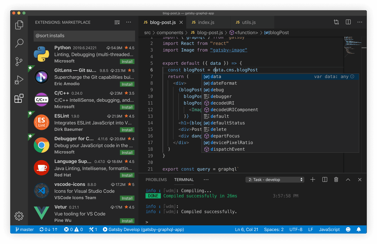
## VSCode extensions
Recommended extensions will be suggested to you when you visit the VSCode Marketplace.
- [ESLint](https://marketplace.visualstudio.com/items?itemName=dbaeumer.vscode-eslint): code syntax validator
ESLint is a JavaScript linting tool which is used for automatically detecting incorrect patterns found in ECMAScript/JavaScript code. It is used with the purpose of improving code quality, making code more consistent, and avoiding bugs. Rules can be configured to look for all kinds of discrepancies due to discouraged code patterns or formatting. Running a Linting tool over the source code helps to improve the quality and readability of the code.
- [Prettier](https://marketplace.visualstudio.com/items?itemName=esbenp.prettier-vscode): code formatter
Prettier is very popular because it improves code readability and makes the coding style consistent for teams. Developers are more likely to adopt a standard rather than writing their own code style from scratch, so tools like Prettier will make your code look good without you ever having to dabble in the formatting.
## Chrome browser
To install Google Chrome, use the "Self Service" application on your desktop.
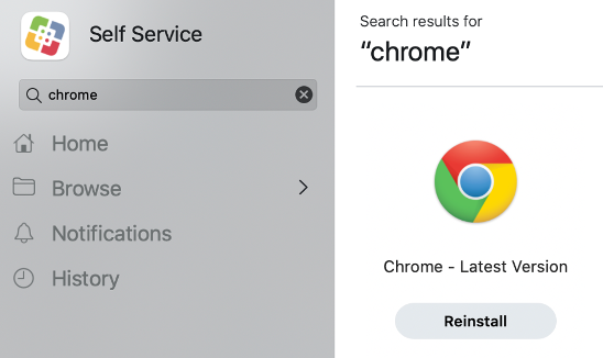
## Chrome browser extensions
In Chrome, you may install the following recommended extensions:
- [React Developer Tools](https://chrome.google.com/webstore/detail/react-developer-tools/fmkadmapgofadopljbjfkapdkoienihi)
- [Google Lighthouse](https://chrome.google.com/webstore/detail/lighthouse/blipmdconlkpinefehnmjammfjpmpbjk)
- [axe DevTools](https://chrome.google.com/webstore/detail/axe-devtools-web-accessib/lhdoppojpmngadmnindnejefpokejbdd)
## System essentials
To run all JS-based applications, it is **highly recommended** to have these tools installed:
- [Xcode Command Line Tools](https://mac.install.guide/commandlinetools/4.html) (Mac Only)
`xcode-select` contains necessary utilities for software development on macOS.
```bash
xcode-select --install
```
**_After install, exit, and restart Terminal (CMD + Q)_**
```bash
xcode-select --version
```
---
- [oh-my-zsh](https://ohmyz.sh/) >= 5.3.0 (optional)
`zsh` is an optional upgrade to the native shell which provides a delightful terminal experience.
```bash
sh -c "$(curl -fsSL https://raw.githubusercontent.com/robbyrussell/oh-my-zsh/master/tools/install.sh)"
```
**_After install, exit, and restart Terminal (CMD + Q)_**
```bash
omz version
```
---
- [node](https://github.com/nvm-sh/nvm) >= 16.0.0
`nvm` is a great tool for installing and upgrading versions of Node on your system.
```bash
curl -o- https://raw.githubusercontent.com/nvm-sh/nvm/v0.35.1/install.sh | bash
```
**_After install, exit, and restart Terminal (CMD + Q)_**
```bash
nvm --version
nvm install 16 && nvm use 16 && nvm alias default 16
```
**_After install, exit, and restart Terminal (CMD + Q)_**
```bash
npm --version
npm config set registry https://repo1.uhc.com/artifactory/api/npm/npm-virtual
```
---
- [git](https://git-scm.com/book/en/v2/Getting-Started-Installing-Git) >= 2.0.0
`git` is a universal version control system for working collaboratively and efficiently.
```bash
git config --global user.id "YOUR_MS_ID"
git config --global user.email "YOUR_EMAIL@optum.com"
```
---
comment: |
This is an auto-generated file. DO NOT EDIT THIS FILE DIRECTLY.
To edit this file, modify the source file in the 'web/overview/' directory, then run the 'copy-abyss-info' script to regenerate this file.
id: abyss-overview
title: Abyss Overview
hide_table_of_contents: true
---
---
comment: |
This is an auto-generated file. DO NOT EDIT THIS FILE DIRECTLY.
To edit this file, modify the source file in the 'web/overview/' directory, then run the 'copy-abyss-info' script to regenerate this file.
id: about
title: About Abyss
---
## What is Abyss?
## How Abyss works
## We support adoption
## Guiding principles
## We maintain assets
## The Abyss team
---
comment: |
This is an auto-generated file. DO NOT EDIT THIS FILE DIRECTLY.
To edit this file, modify the source file in the 'web/overview/' directory, then run the 'copy-abyss-info' script to regenerate this file.
id: abyss-version-2
title: Abyss Version 2
hide_table_of_contents: true
---
## Abyss Design System version 2
## V2 prep for designers
## V2 prep for developers
## Stay connected
---
comment: |
This is an auto-generated file. DO NOT EDIT THIS FILE DIRECTLY.
To edit this file, modify the source file in the 'web/overview/' directory, then run the 'copy-abyss-info' script to regenerate this file.
id: releases
title: Releases
hide_table_of_contents: true
---
---
comment: |
This is an auto-generated file. DO NOT EDIT THIS FILE DIRECTLY.
To edit this file, modify the source file in the 'web/overview/' directory, then run the 'copy-abyss-info' script to regenerate this file.
id: contact-us
title: Contact Us
hide_table_of_contents: true
---
## Support
## Requests
---
id: use-collapse
category: UI & DOM
title: useCollapse
description: Show or hide associated section of content.
pagination_prev: web/hooks/use-router
pagination_next: web/hooks/use-fuse
---
```jsx
import { useCollapse } from '@uhg-abyss/web/hooks/useCollapse';
```
## Usage
Use the `defaultIsOpen` prop to set the initial state for collapse container. The `duration` prop is defaulted to `300ms`, we can pass custom values to vary the transition time.
```tsx example
() => {
const StyledList = useMemo(
() =>
styled('ul', {
listStyle: 'inside',
lineHeight: '1.5',
margin: 0,
padding: 0,
}),
[]
);
const { collapseProps, buttonProps, isOpen } = useCollapse();
return (
Collapse example:
{isOpen ? 'Collapse' : 'Expand'}
Aliquam non felis convallis, tempus eros vel, sagittis augue.
Praesent hendrerit ipsum viverra, facilisis risus et, sollicitudin
massa.
Morbi tincidunt metus vitae quam semper hendrerit.
Fusce accumsan mi ut risus molestie, pretium fringilla risus
consectetur.
Nullam vel mi gravida, eleifend est vitae, semper mauris.
);
};
```
## Maximum duration
Use the `duration` prop to set the transition timing (in milliseconds) for showing and hiding content. This prop accepts a number between `0` and `1500`. Any value greater than `1500` will be set to `1500` internally. The default value is `250`.
:::note
For users who have `prefers-reduced-motion` set to `reduced` for accessibility reasons, the duration is overridden to `0` to prevent the animation transition.
:::
```tsx example
() => {
const StyledList = useMemo(
() =>
styled('ul', {
listStyle: 'inside',
lineHeight: '1.5',
margin: 0,
padding: 0,
}),
[]
);
const { collapseProps, buttonProps, isOpen } = useCollapse({
duration: 1500,
});
return (
1500ms duration example:
{isOpen ? 'Collapse' : 'Expand'}
Showing Content Based on Duration
Aliquam non felis convallis, tempus eros vel, sagittis augue.
Praesent hendrerit ipsum viverra, facilisis risus et, sollicitudin
massa.
Morbi tincidunt metus vitae quam semper hendrerit.
Fusce accumsan mi ut risus molestie, pretium fringilla risus
consectetur.
Nullam vel mi gravida, eleifend est vitae, semper mauris.
);
};
```
## Collapsing multiple
To control the expand/collapse functionality of multiple collapsible containers utilize the `CollapseProvider`. See the [CollapseProvider page](/web/ui/collapse-provider) for more details and examples on implementation.
```tsx example
() => {
const StyledList = useMemo(
() =>
styled('ul', {
listStyle: 'inside',
lineHeight: '1.5',
margin: 0,
padding: 0,
}),
[]
);
const CollapseList = ({ defaultIsOpen }) => {
const { collapseProps, buttonProps, isOpen } = useCollapse({
defaultIsOpen,
});
return (
{`Default ${
defaultIsOpen ? 'open' : 'closed'
} example:`}
{isOpen ? 'Collapse' : 'Expand'}
Aliquam non felis convallis, tempus eros vel, sagittis augue.
Praesent hendrerit ipsum viverra, facilisis risus et, sollicitudin
massa.
Morbi tincidunt metus vitae quam semper hendrerit.
Fusce accumsan mi ut risus molestie, pretium fringilla risus
consectetur.
Nullam vel mi gravida, eleifend est vitae, semper mauris.
);
};
return (
);
};
```
## Properties
```typescript
useCollapse(
defaultIsOpen?: boolean,
ref?: object,
duration?: number,
): object;
```
---
id: use-countdown
category: Utilities
title: useCountdown
description: The useCountdown is a custom hook for countdown capability.
---
```jsx
import { useCountdown } from '@uhg-abyss/web/hooks/useCountdown';
```
```tsx example
() => {
const { formattedTime } = useCountdown({ time: 10 * 60 * 1000 });
return {formattedTime};
};
```
## Callback function
You can specify a callback function that will be executed every time the countdown reaches zero.
```tsx example
() => {
const [isComplete, setComplete] = useState(false);
const onCompleted = () => {
setComplete(true);
};
const { formattedTime } = useCountdown({ time: 15 * 1000, onCompleted });
if (isComplete) {
return (
Time's Up!
);
}
return {formattedTime};
};
```
## Reset countdown time
Use the `resetCountdown` function returned by the hook to reset the countdown back to its starting value.
```tsx example
() => {
const [isComplete, setComplete] = useState(false);
const onCompleted = () => {
setComplete(true);
};
const { formattedTime, resetCountdown } = useCountdown({
time: 5 * 1000,
onCompleted,
});
if (isComplete) {
return (
Time's Up!
);
}
return (
{formattedTime}
);
};
```
## Set countdown time
Use the `setCountdownTime` function returned by the hook to set the countdown to a new time.
```tsx example
() => {
const [isComplete, setComplete] = useState(true);
const onCompleted = () => {
setComplete(true);
};
const { formattedTime, setCountdownTime } = useCountdown({
time: 0,
onCompleted,
});
if (isComplete) {
return (
Time's Up!
);
}
return {formattedTime};
};
```
## Output
```tsx example
() => {
const countdown = useCountdown({ time: 31556952000 });
return
{JSON.stringify(countdown, null, 2)}
;
};
```
---
id: use-form
category: State Management
title: useForm
description: useForm is a hook for defining, validating and submitting forms.
sourceIsTS: true
---
```tsx
import { useForm } from '@uhg-abyss/web/hooks/useForm';
```
## Usage
Use the `useForm` hook along with the [FormProvider](/web/ui/form-provider) in order to better manage your forms and fully utilize the capabilities of form management within Abyss.
Below is a simple example of a form built with `useForm`. Try filling out the inputs (or not) and submitting the form to see how it works!
```tsx live
() => {
const FormSpacing = useMemo(
() =>
styled('div', {
display: 'flex',
flexDirection: 'column',
gap: '$web.semantic.spacing.scale.sm',
}),
[]
);
const form = useForm();
const onSubmit = (data) => {
// Do something on submit
alert(`FormData: ${JSON.stringify(data)}`);
};
return (
);
};
```
## Handle submit
The `onSubmit` and `onError` props of `FormProvider` allow you to handle form submission and errors. The `onSubmit` callback will be called when the form is submitted and passes validation, while the `onError` callback will be called when the form is submitted but fails validation. Both callbacks receive the form data and the submit event as arguments.
```tsx live
() => {
const FormSpacing = useMemo(
() =>
styled('div', {
display: 'flex',
flexDirection: 'column',
gap: '$web.semantic.spacing.scale.sm',
}),
[]
);
const form = useForm({
defaultValues: {
firstName: 'John',
lastName: 'Doe',
},
});
const onSubmit = (data, e) => {
console.log('onSubmit', e);
};
const onError = (errors, e) => {
console.log('onError', e);
};
return (
);
};
```
## Parameters
### Default values
The `defaultValues` parameter populates the entire form with default values. It supports both synchronous and asynchronous assignments of default values.
```tsx live
() => {
const FormSpacing = useMemo(
() =>
styled('div', {
display: 'flex',
flexDirection: 'column',
gap: '$web.semantic.spacing.scale.sm',
}),
[]
);
const form = useForm({
defaultValues: {
firstName: 'John',
lastName: 'Doe',
},
});
const onSubmit = (data) => {
alert(`FormData: ${JSON.stringify(data)}`);
};
return (
);
};
```
### Values
The `values` parameter reacts to changes and updates the form values, which is useful when a form needs to be updated with external data.
This can be done synchronously:
```tsx
const MyForm = ({ values }) => {
const form = useForm({
values, // will get updated when values props updates
});
// ...
};
```
Or asynchronously:
```tsx
const MyForm = () => {
const values = await useFetch('/api');
const form = useForm({
defaultValues: {
firstName: '',
lastName: '',
},
values, // will get updated once `values` returns
});
// ...
};
```
### Disabled
The `disabled` parameter, if `true`, will disable all inputs within the form. The default value is `false`.
:::warning User experience note
When `disabled` is `true`, the "Submit" button is not disabled, but the form will not submit or validate and thus, the `onSubmit` callback will not be called. Because of this, it is recommended to also disable the "Submit" button (using the `isDisabled` prop) when the form is disabled to avoid confusion for users.
:::
```tsx live
() => {
const ButtonWrapper = useMemo(() => {
return styled('div', {
display: 'flex',
flexDirection: 'row',
marginTop: '$web.semantic.spacing.scale.md',
gap: '$web.semantic.spacing.scale.sm',
});
}, []);
const [formDisabled, setFormDisabled] = useState(false);
const form = useForm({
disabled: formDisabled,
});
const onSubmit = (data) => {
console.log('submitted', data);
};
return (
);
};
```
## Returned object
The `useForm` hook returns an object with the following properties and methods.
### Form state
This `formState` object contains information about the current state of the form. It contains the following properties along with a number of methods (described in the following sections):
- `errors`: An object with field errors.
- `isDirty`: Set to true after the user modifies any of the inputs.
- `isValid`: Set to true if the form doesn't have any errors.
- `isValidating`: Set to true during validation.
- `isSubmitting`: true if the form is currently being submitted; false if otherwise.
- `isSubmitted`: Set to true after the form is submitted.
- `isSubmitSuccessful`: Indicate the form was successfully submitted without any Promise rejection or Error being thrown within the handleSubmit callback.
- `submitCount`: Number of times the form was submitted.
- `touchedFields`: An object containing all the inputs the user has interacted with.
- `dirtyFields`: An object with the user-modified fields.
:::warning Important
When subscribing to `formState` in a `useEffect` callback, make sure to place the entire `formState` object in the dependencies array.
:::
```tsx
() => {
const form = useForm();
useEffect(() => {
// Do something with `formState`
}, [form.formState]);
// ...
};
```
### Watch
The `watch` method will watch specified inputs and return their values. You can watch a single input, multiple inputs, or the entire form. When the value(s) of the watched input(s) change, the component will re-render.
```tsx live
() => {
const FormSpacing = useMemo(
() =>
styled('div', {
display: 'flex',
flexDirection: 'column',
gap: '$web.semantic.spacing.scale.sm',
}),
[]
);
const form = useForm();
const onSubmit = (data) => {
alert(`FormData: ${JSON.stringify(data)}`);
};
// Watch one field by model
const watchField = form.watch('firstName');
// Target specific fields by their models
const watchFields = form.watch(['firstName', 'lastName']);
// Watch everything by passing no arguments
const watchAllFields = form.watch();
return (
Watch all fields: {JSON.stringify(watchAllFields)}
);
};
```
### Validate
The `validate` method allows you to manually trigger validation for specific fields. It takes the field model as the first argument, a success callback as the second argument, and an error callback as the third argument.
```tsx live
() => {
const FormSpacing = useMemo(
() =>
styled('div', {
display: 'flex',
flexDirection: 'column',
gap: '$web.semantic.spacing.scale.sm',
}),
[]
);
const ButtonWrapper = styled('div', {
display: 'flex',
flexDirection: 'row',
gap: '$web.semantic.spacing.scale.sm',
flexWrap: 'wrap',
});
const form = useForm({
defaultValues: {
firstName: 'John',
},
});
const handleValidateFirst = () => {
form.validate(
'firstName',
(data) => {
alert(`FormData: ${JSON.stringify(data)}`);
},
(error) => {
delete error.ref;
alert(`Error: ${JSON.stringify(error)}`);
}
);
};
const handleValidateLast = () => {
form.validate(
'lastName',
(data) => {
alert(`FormData: ${JSON.stringify(data)}`);
},
(error) => {
delete error.ref;
alert(`Error: ${JSON.stringify(error)}`);
}
);
};
return (
);
};
```
### Reset
The `reset` method allows you to reset some or all of the form state.
:::note
When invoking `reset({ value })` without supplying `defaultValues` via `useForm`, the library will replace `defaultValues` with a shallow clone value object that you provide (not a deep clone).
:::
Avoid doing the following, as it can lead to unexpected behavior due to shared references:
```tsx
const defaultValues = {
object: {
deepNest: {
file: new File(),
},
},
};
useForm({ defaultValues });
reset(defaultValues); // ❌
```
It's safer to create a new object, even if the values are the same, to ensure that there are no shared references:
```tsx
useForm({
deepNest: {
file: new File(),
},
});
reset({
deepNest: {
file: new File(), // ✅
},
});
```
```tsx live
() => {
const FormSpacing = useMemo(
() =>
styled('div', {
display: 'flex',
flexDirection: 'column',
gap: '$web.semantic.spacing.scale.sm',
}),
[]
);
const ButtonWrapper = styled('div', {
display: 'flex',
flexDirection: 'row',
gap: '$web.semantic.spacing.scale.sm',
flexWrap: 'wrap',
});
const form = useForm({
defaultValues: {
firstName: 'John',
lastName: 'Doe',
},
});
const reset = () => {
form.reset();
};
const resetWithValue = () => {
form.reset({ firstName: 'John' });
};
const resetWithOptions = () => {
form.reset(
{
lastName: 'Doe',
},
{
keepErrors: true,
keepDirty: true,
keepIsSubmitted: false,
keepTouched: false,
keepIsValid: false,
keepSubmitCount: false,
}
);
};
return (
);
};
```
### Set error
The `setError` method allows you to manually set one or more field errors.
```tsx live
() => {
const FormSpacing = useMemo(
() =>
styled('div', {
display: 'flex',
flexDirection: 'column',
gap: '$web.semantic.spacing.scale.sm',
}),
[]
);
const ButtonWrapper = styled('div', {
display: 'flex',
flexDirection: 'row',
gap: '$web.semantic.spacing.scale.sm',
flexWrap: 'wrap',
});
const form = useForm({
defaultValues: {
firstName: 'John',
lastName: 'Doe',
},
});
// Set single error
const setSingleError = () => {
form.setError('firstName', {
type: 'manual',
message: 'There is an error with your name!',
});
};
// Set multiple errors
const setMultipleErrors = () => {
[
{
type: 'manual',
name: 'firstName',
message: 'Check first name',
},
{
type: 'manual',
name: 'lastName',
message: 'Check last name',
},
].forEach(({ name, type, message }) => {
form.setError(name, { type, message });
});
};
// Set error for single field errors
React.useEffect(() => {
form.setError('firstName', {
types: {
required: 'This is required',
minLength: 'This is minLength',
},
});
}, []);
return (
);
};
```
### Clear errors
The `clearErrors` method allows you to clear one or more field errors. If no arguments are provided, it will clear all errors.
```tsx live
() => {
const FormSpacing = useMemo(
() =>
styled('div', {
display: 'flex',
flexDirection: 'column',
gap: '$web.semantic.spacing.scale.sm',
}),
[]
);
const ButtonWrapper = styled('div', {
display: 'flex',
flexDirection: 'row',
gap: '$web.semantic.spacing.scale.sm',
flexWrap: 'wrap',
});
const form = useForm({
defaultValues: {
firstName: 'John',
lastName: 'Doe',
phone: '555-555-5555',
},
});
const resetErrors = () => {
[
{
type: 'manual',
name: 'firstName',
message: 'Required',
},
{
type: 'manual',
name: 'lastName',
message: 'Required',
},
{
type: 'manual',
name: 'phone',
message: 'Required',
},
].forEach(({ name, type, message }) => {
form.setError(name, { type, message });
});
};
// Clear single error
const clearSingleErrors = () => {
form.clearErrors('firstName');
};
// Clear multiple errors
const clearMultipleErrors = () => {
form.clearErrors(['firstName', 'lastName']);
};
// Clear all errors
const clearAllErrors = () => {
form.clearErrors();
};
return (
);
};
```
### Set value
The `setValue` method allows you to dynamically set the value of a registered field and attempts to avoid unnecessary re-renders by only updating the specific field that changed.
```tsx live
() => {
const FormSpacing = useMemo(
() =>
styled('div', {
display: 'flex',
flexDirection: 'column',
gap: '$web.semantic.spacing.scale.sm',
}),
[]
);
const ButtonWrapper = styled('div', {
display: 'flex',
flexDirection: 'row',
gap: '$web.semantic.spacing.scale.sm',
flexWrap: 'wrap',
});
const form = useForm();
const setSingleValue = () => {
form.setValue('firstName', 'Bob');
};
const setMultipleValues = () => {
form.setValue('address', {
street: '123 Main St',
city: 'Anytown',
state: 'CA',
zip: '12345',
});
};
const setValueWithOptions = () => {
form.setValue('lastName', 'Luo', {
shouldValidate: true,
shouldDirty: true,
});
};
return (
);
};
```
### Set focus
The `setFocus` method allows you to programmatically focus on an input by model.
```tsx live
() => {
const FormSpacing = useMemo(
() =>
styled('div', {
display: 'flex',
flexDirection: 'column',
gap: '$web.semantic.spacing.scale.sm',
}),
[]
);
const form = useForm();
const setFocus = () => {
form.setFocus('firstName');
};
return (
);
};
```
### Get values
The `getValues` method is an optimized helper for reading form values. The difference between [`watch`](#watch) and `getValues` is that `getValues` will not trigger re-renders or subscribe to input changes.
```tsx live
() => {
const FormSpacing = useMemo(
() =>
styled('div', {
display: 'flex',
flexDirection: 'column',
gap: '$web.semantic.spacing.scale.sm',
}),
[]
);
const form = useForm({
defaultValues: {
firstName: 'John',
lastName: 'Doe',
phone: '555-555-5555',
},
});
// Read an individual field value by name
const singleValue = form.getValues('firstName');
// Read multiple fields by name
const multipleValues = form.getValues(['firstName', 'lastName']);
// Reads all form values
const allValues = form.getValues();
return (
Single value: {JSON.stringify(singleValue)}
Multiple values: {JSON.stringify(multipleValues)}
All values: {JSON.stringify(allValues)}
);
};
```
### Trigger
The `trigger` method allows you to manually trigger validation on the form or specific fields. This method is also useful when you have dependent validation (i.e., when one input's validation depends on the value of another input). For an example of this, see the [Cross-field validation example](#cross-field-validation-example) below.
```tsx live
() => {
const FormSpacing = useMemo(
() =>
styled('div', {
display: 'flex',
flexDirection: 'column',
gap: '$web.semantic.spacing.scale.sm',
}),
[]
);
const ButtonWrapper = styled('div', {
display: 'flex',
flexDirection: 'row',
gap: '$web.semantic.spacing.scale.sm',
flexWrap: 'wrap',
});
const form = useForm();
// Trigger one input to validate
const triggerSingle = () => {
form.trigger('firstName');
};
// Trigger multiple inputs to validate
const triggerMultiple = () => {
form.trigger(['firstName', 'lastName']);
};
// Trigger entire form to validate
const triggerAll = () => {
form.trigger();
};
const clearErrors = () => {
form.clearErrors();
};
return (
);
};
```
## Validation strategy
There are two different validation strategies:
- `mode`: Validation strategy to use before submitting the form (default: `'onSubmit'`).
- `reValidateMode`: Validation strategy to use after submitting the form (default: `'onChange'`).
Teams should only use the following options:
- `mode`: `'onChange'` | `'onSubmit'`
- `reValidateMode`: `'onChange'` | `'onSubmit'`
:::warning Disclaimer
Using other validation strategies can lead to inconsistent behavior.
:::
```tsx live
() => {
const FormSpacing = useMemo(
() =>
styled('div', {
display: 'flex',
flexDirection: 'column',
gap: '$web.semantic.spacing.scale.sm',
}),
[]
);
const form1 = useForm();
const form2 = useForm({
mode: 'onChange',
reValidateMode: 'onSubmit',
});
const onSubmit = (data) => {
console.log('data', data);
};
return (
);
};
```
## Cross-field validation example
This example shows how to use the [`trigger`](#trigger) method to create cross-field/dependent validation. In this example, the "Middle Name" field is only required if the "No Middle Name" option is not selected. When that option is toggled, it triggers validation on the "Middle Name" field to ensure that the error message is displayed or removed accordingly.
```tsx live
() => {
const FormSpacing = useMemo(
() =>
styled('div', {
display: 'flex',
flexDirection: 'column',
gap: '$web.semantic.spacing.scale.sm',
}),
[]
);
const form = useForm();
const onSubmit = (data) => {
console.log('data', data);
};
return (
{
const checkValue = form.getValues('lastName-check');
if (!checkValue && !v) {
return 'Required';
}
},
}}
/>
{
form.trigger('middleName');
}}
/>
);
};
```
## Form input autocomplete
To enable browser autocompletion, the `autoComplete` prop must be enabled on the `FormProvider` component (with the value `"on"`) as well as the individual input components. The value of the `autoComplete` prop on the input components should be set to the appropriate autocomplete attribute value that corresponds to the type of data being collected (e.g., `given-name` for first name, `family-name` for last name, `email` for email address, etc.). This allows browsers to recognize the type of information being requested and provide relevant autocomplete suggestions to users.
See the [Mozilla Developer Network docs](https://developer.mozilla.org/en-US/docs/Web/HTML/Attributes/autocomplete) for more information.
```tsx live
() => {
const form = useForm();
const inputs = [
{
label: 'Title',
autoComplete: 'honorific-prefix',
},
{
label: 'First Name',
autoComplete: 'given-name',
},
{
label: 'Middle Name',
autoComplete: 'additional-name',
},
{
label: 'Last Name',
autoComplete: 'family-name',
},
{
label: 'Nickname',
autoComplete: 'nickname',
},
{
label: 'Email',
autoComplete: 'email',
type: 'email',
},
{
label: 'Username',
autoComplete: 'username',
},
{
label: 'Current Password',
autoComplete: 'current-password',
type: 'password',
},
{
label: 'New Password',
autoComplete: 'new-password',
type: 'password',
},
{
label: 'One Time Code',
autoComplete: 'one-time-code',
},
{
label: 'Organization Title',
autoComplete: 'organization-title',
},
{
label: 'Organization',
autoComplete: 'organization',
},
{
label: 'Address',
autoComplete: 'street-address',
},
{
label: 'Address Line 1',
autoComplete: 'address-line1',
},
{
label: 'Address Line 2',
autoComplete: 'address-line2',
},
{
label: 'Country',
autoComplete: 'country',
},
{
label: 'Country Name',
autoComplete: 'country-name',
},
{
label: 'Postal Code',
autoComplete: 'postal-code',
mask: 'zip',
placeholder: '_____',
},
{
label: 'Name on Credit Card',
autoComplete: 'cc-name',
},
{
label: 'First Name on Credit Card',
autoComplete: 'cc-given-name',
},
{
label: 'Middle Name on Credit Card',
autoComplete: 'cc-additional-name',
},
{
label: 'Last Name on Credit Card',
autoComplete: 'cc-family-name',
},
{
label: 'Credit Card Number',
autoComplete: 'cc-number',
mask: '#### #### #### ####',
placeholder: '____ ____ ____ ____',
},
{
label: 'Credit Card Expiration Date',
autoComplete: 'cc-exp',
mask: 'date',
placeholder: 'mm/yy',
},
{
label: 'Credit Card Expiration Month',
autoComplete: 'cc-exp-month',
mask: '##',
placeholder: 'mm',
},
{
label: 'Credit Card Expiration Year',
autoComplete: 'cc-exp-year',
mask: '##',
placeholder: 'yy',
},
{
label: 'Credit Card CSC Code',
autoComplete: 'cc-csc',
mask: '###',
placeholder: '___',
},
{
label: 'Credit Card Type',
autoComplete: 'cc-type',
},
{
label: 'Transaction Currency',
autoComplete: 'transaction-currency',
},
{
label: 'Transaction Amount',
autoComplete: 'transaction-amount',
mask: 'numeric',
maskConfig: {
thousandSeparator: ',',
fixedDecimalScale: true,
decimalScale: 2,
prefix: '$',
},
},
{
label: 'Birth Date',
autoComplete: 'bday',
mask: 'date',
placeholder: 'mm/dd/yyyy',
},
{
label: 'Birth Day',
autoComplete: 'bday-day',
mask: '##',
placeholder: 'dd',
},
{
label: 'Birth Month',
autoComplete: 'bday-month',
mask: '##',
placeholder: 'mm',
},
{
label: 'Birth Year',
autoComplete: 'bday-year',
mask: '####',
placeholder: 'yyyy',
},
{
label: 'Gender',
autoComplete: 'sex',
},
{
label: 'Phone Number',
autoComplete: 'tel-local',
type: 'tel',
mask: 'phone',
placeholder: '(___) ___-____',
},
];
const handleSubmit = (data) => {
console.log('data', data);
};
return (
{inputs.map((item) => {
return (
);
})}
);
};
```
### Autofill off
```tsx live
() => {
const form = useForm();
const handleSubmit = (data) => {
console.log('data', data);
};
return (
);
};
```
## Additional documentation
`@uhg-abyss/web/hooks/useForm` is a built on top of the `useForm` hook from [React Hook Form](https://react-hook-form.com/). Teams that already leverage or want to use React Hook Form in other spots in their applications can use the `@uhg-abyss/web/tools/reactHookFormTools` package.
This package ensures you are using the same version of React Hook Form across the application and can also be used to grab type information directly.
:::warning Important
You should be using Abyss's `useForm` hook when using Abyss components and _not_ React Hook Form's.
:::
```tsx
import type { SubmitHandler } from '@uhg-abyss/web/tools/reactHookFormTools';
interface FormData {
firstName: string;
}
// ...
const handleSubmit: SubmitHandler = (data) => {
console.log('data', data);
};
// ...
```
Using TypeScript with `useForm` gives you strong type checking for your form data structure.
```tsx
interface FormData {
firstName: string;
lastName: string;
}
const form = useForm({
defaultValues: {
firstName: '',
lastName: '',
pizza: 'cheese', // Throws TS error since pizza is not a field in FormData
},
});
// Throws TS error since pizza is not a field in FormData
const watchField = form.watch('pizza');
// Doesn't throw TS error since firstName and lastName are fields in FormData
const watchFields = form.watch(['firstName', 'lastName']);
```
---
id: use-form-field-Array
category: State Management
title: useFormFieldArray
description: The useFormFieldArray is custom hook for working with uncontrolled Field Arrays (dynamic inputs). This hook supplies you with functions for manipulating the array/list of fields.
---
```jsx
import { useFormFieldArray } from '@uhg-abyss/web/hooks/useFormFieldArray';
```
## Usage
```tsx example
() => {
const defaultFormValues = {
data: [{ firstName: 'Bill', lastName: 'Lou' }],
};
const form = useForm({
defaultValues: defaultFormValues,
});
const { fields, append, prepend, insert, swap, move, remove } =
useFormFieldArray({
control: form.control,
name: 'data',
});
const handleSubmit = (data) => {
console.log('Submitted', data);
};
return (
{fields.map((field, index) => {
return (
Row #{index + 1}
);
})}
);
};
```
## Fields
This object contains the defaultValue and key for all your inputs. It's important to assign defaultValue to the inputs.
- The field.id (and not index) must be added as the component key to prevent re-renders breaking the fields.
```jsx
// ✅ correct:
{fields.map((field, index) => (
))}
// ✅ correct:
{fields.map((field, index) => )}
// ❌ incorrect:
{fields.map((field, index) => )}
```
- useFieldArray automatically generates a unique identifier named id which is used for key prop. For more information why this is required: [React lists and keys](https://reactjs.org/docs/lists-and-keys.html#keys).
When your array field contains objects with the key name id, useFieldArray
will overwrite and remove it. If you want to keep the id field in your array
of objects, you must use keyName prop to change to other name. Refer to the
following example:
```jsx
const { fields } = useFieldArray({
keyName: 'key', // by default key name is id, and input value with name id will be omitted
});
{
fields.map((field, index) => (
// key name changed
// input value id will be retained
));
}
```
- When you append, prepend, insert and update the field array, the obj can't be empty object rather need to supply all your input's defaultValues.
```jsx
append(); ❌
append({}); ❌
append({ firstName: 'bill', lastName: 'luo' }); ✅
```
## Append
Use the `append()` function to append input/inputs to the end of your fields and focus.
```tsx example
() => {
const defaultFormValues = {
append: [{ firstName: 'Bill', lastName: 'Lou' }],
};
const form = useForm({
defaultValues: defaultFormValues,
});
const { fields, append } = useFormFieldArray({
control: form.control,
name: 'append',
});
const handleSubmit = (data) => {
console.log('Submitted', data);
};
return (
{fields.map((field, index) => {
return (
Row #{index + 1}
);
})}
);
};
```
## Prepend
Use the `prepend()` function to prepend input/inputs to the start of your fields and focus.
```tsx example
() => {
const defaultFormValues = {
prepend: [{ firstName: 'Bill', lastName: 'Lou' }],
};
const form = useForm({
defaultValues: defaultFormValues,
});
const { fields, prepend } = useFormFieldArray({
control: form.control,
name: 'prepend',
});
const handleSubmit = (data) => {
console.log('Submitted', data);
};
return (
{fields.map((field, index) => {
return (
Row #{index + 1}
);
})}
);
};
```
## Insert
Use the `insert()` function to insert input/inputs at particular position and focus.
```tsx example
() => {
const defaultFormValues = {
insert: [
{ firstName: 'Bill', lastName: 'Lou' },
{ firstName: 'Bill-2', lastName: 'Lou-2' },
],
};
const form = useForm({
defaultValues: defaultFormValues,
});
const { fields, insert, remove } = useFormFieldArray({
control: form.control,
name: 'insert',
});
const handleSubmit = (data) => {
console.log('Submitted', data);
};
return (
{fields.map((field, index) => {
return (
);
})}
);
};
```
## Move
Use the `move()` function to move input/inputs to another position.
```tsx example
() => {
const defaultFormValues = {
move: [
{ firstName: 'Bill', lastName: 'Lou' },
{ firstName: 'moveBill', lastName: 'moveLou' },
],
};
const form = useForm({
defaultValues: defaultFormValues,
});
const { fields, move } = useFormFieldArray({
control: form.control,
name: 'move',
});
const handleSubmit = (data) => {
console.log('Submitted', data);
};
return (
{fields.map((field, index) => {
return (
Row #{index + 1}
);
})}
);
};
```
## Replace
Use the `replace()` function to replace the entire field array values with a custom list of objects.
```tsx example
() => {
const replaceFormValues = [
{ firstName: 'replaceBill', lastName: 'replaceLou' },
{ firstName: 'replaceBill-2', lastName: 'replaceLou-2' },
];
const defaultFormValues = {
data: [
{ firstName: 'Bill', lastName: 'Lou' },
{ firstName: 'Bill-2', lastName: 'Lou-2' },
],
};
const form = useForm({
defaultValues: defaultFormValues,
});
const { fields, replace } = useFormFieldArray({
control: form.control,
name: 'data',
});
const handleSubmit = (data) => {
console.log('Submitted', data);
};
return (
{fields.map((field, index) => {
return (
Row #{index + 1}
);
})}
);
};
```
## Remove
Use the `remove()` function to remove elements at a particular position (or positions) in the list, or remove all of them when no index is provided.
```tsx example
() => {
const defaultFormValues = {
remove: [
{ firstName: 'removeBill', lastName: 'removeLou' },
{ firstName: 'removeBill-2', lastName: 'removeLou-2' },
{ firstName: 'removeBill-3', lastName: 'removeLou-3' },
],
};
const form = useForm({
defaultValues: defaultFormValues,
});
const { fields, remove } = useFormFieldArray({
control: form.control,
name: 'remove',
});
const handleSubmit = (data) => {
console.log('Submitted', data);
};
return (
{fields.map((field, index) => {
return (
Row #{index + 1}
);
})}
);
};
```
## Additional documentation
Abyss's `useFormFieldArray` hook is simply an alias of React Hook Form's [`useFieldArray` hook](https://react-hook-form.com/docs/usefieldarray). You can view the official documentation to learn more.
---
id: use-fuse
category: UI & DOM
title: useFuse
description: The useFuse hook is used to help with fuzzy search, also known as approximate string matching.
---
```jsx
import { useFuse } from '@uhg-abyss/web/hooks/useFuse';
```
## Usage
The `useFuse` hook uses the [Fuse.js](https://fusejs.io) library to help with fuzzy searching (more formally known as approximate string matching), which is the technique of finding strings that are approximately equal to a given pattern (rather than exactly).
## Example with TextInput component
```tsx example
() => {
const [value, setValue] = useState('');
const keys = ['title', 'author'];
const totalList = [
{
title: "Old Man's War",
author: 'John Scalzi',
},
{
title: 'The Lock Artist',
author: ' Steve Hamilton',
},
{
title: 'HTML5',
author: 'Remy Sharp',
},
{
title: 'Right Ho Jeeves',
author: 'P.D Woodhouse',
},
{
title: 'The Code of the Wooster',
author: 'P.D Woodhouse',
},
{
title: 'Thank You Jeeves',
author: 'P.D Woodhouse',
},
{
title: 'The DaVinci Code',
author: 'Dan Brown',
},
{
title: 'Angels & Demons',
author: 'Dan Brown',
},
{
title: 'The Silmarillion',
author: 'J.R. Tolkien',
},
{
title: 'Syrup',
author: 'Max Barry',
},
{
title: 'The Lost Symbol',
author: 'Dan Brown',
},
{
title: 'The Book of Lies',
author: 'Brad Meltzer',
},
{
title: 'Lamb',
author: 'Christopher Moore',
},
];
const fuse = useFuse({
list: totalList,
config: {
threshold: 0.4,
},
keys,
});
return (
{
setValue(e.target.value);
}}
onClear={() => {
setValue('');
}}
placeholder="Enter search value"
/>
Search Results:
{JSON.stringify(fuse.search(value), null, 2)}
);
};
```
## Fuse keys
Fuse Keys are a list of keys that will be searched. Keys can be used to search in an object array, a nested search, as well as a weighted search. When a weight isn't provided, it will default to 1.
## Fuse config options
Listed below are options that can be added to the config provided by the Fuse.js library
### Basic options
| Property | Type | Default |
| :------------------- | :------ | :------ |
| `isCaseSensitive` | boolean | `false` |
| `includeScore` | boolean | `false` |
| `includeMatches` | boolean | `false` |
| `minMatchCharLength` | number | `1` |
| `shouldSort` | boolean | `true` |
| `findAllMatches` | boolean | `false` |
| `keys` | Array | `[]` |
### Fuzzy matching options
| Property | Type | Default |
| :--------------- | :------ | :------ |
| `location` | number | `0` |
| `threshold` | number | `0.6` |
| `distance` | number | `100` |
| `ignoreLocation` | boolean | `false` |
### Advanced options
| Property | Type | Default |
| :------- | :------- | :--------------------------------------------------------- |
| `getFn` | Function | `(obj: T, path: string \| string[]) => string \| string[]` |
## Search object array example
```jsx
const list = [
{
title: "Old Man's War",
author: 'John Scalzi',
tags: ['fiction'],
},
{
title: 'The Lock Artist',
author: 'Steve',
tags: ['thriller'],
},
];
const config = {
includeScore: true,
};
const keys= ['author', 'tags'],
const fuse = useFuse({list, config, keys});
const result = fuse.search('tion');
```
Expected output:
```jsx
[
{
item: {
title: "Old Man's War",
author: 'John Scalzi',
tags: ['fiction'],
},
refIndex: 0,
score: 0.03,
},
];
```
## Nested search example
You can search through nested values using dot notation, array notation, or by defining a per-key `getFn` function.
:::warning Important
The path **must** point to a string, otherwise you will not get any results.
:::
Example with dot notation:
```jsx
const list = [
{
title: "Old Man's War",
author: {
name: 'John Scalzi',
tags: [
{
value: 'American',
},
],
},
},
{
title: 'The Lock Artist',
author: {
name: 'Steve Hamilton',
tags: [
{
value: 'English',
},
],
},
},
];
const config = {
includeScore: true,
};
const keys = ['author.tags.value'];
const fuse = useFuse({ list, config, keys });
const result = fuse.search('engsh');
```
Using `getFn`:
```jsx
const config = {
includeScore: true,
};
const keys = [
{ name: 'title', getFn: (book) => book.title },
{ name: 'authorName', getFn: (book) => book.author.name },
];
const fuse = useFuse({ list, config, keys });
const result = fuse.search({ authorName: 'Steve' });
```
Expected output for both:
```jsx
[
{
item: {
title: 'The Lock Artist',
author: {
name: 'Steve Hamilton',
tags: [
{
value: 'English',
},
],
},
},
refIndex: 1,
score: 0.4,
},
];
```
## Properties
```typescript
useFuse({ list, config, keys });
```
---
id: use-media-query
category: UI & DOM
title: useMediaQuery
description: Subscribe to media queries with window.matchMedia.
sourceIsTS: true
---
```jsx
import { useMediaQuery } from '@uhg-abyss/web/hooks/useMediaQuery';
```
## Disclaimer
The `useMediaQuery` hook uses JavaScript to determine if the media query matches. This can cause issues with server-side rendering, as the `window.matchMedia` API is not available on the server. With the default options, the hook initializes to `false` and then updates after mount. If you need a specific SSR fallback value on first render, provide an [initial value](#server-side-rendering) and set `getInitialValueInEffect` to `false`. We recommend using CSS media queries (through either the [`styled` tool](/web/theme-customization/styling/styled-components) or the [`css` prop](/web/theme-customization/styling/style-customization)) or the [MediaQuery component](/web/ui/media-query) for responsive design. If you only need to adjust functional behavior based on media queries, the `useMediaQuery` hook can be a good option.
## Usage
The `useMediaQuery` hook leverages the `window.matchMedia` API and will return `false` if API is not available unless initial value is provided in the second argument.
Resize browser window to trigger `window.matchMedia` event:
```tsx example
() => {
const matches = useMediaQuery('(min-width: 900px)');
return (
Breakpoint {matches ? 'matches' : 'does not match'}
);
};
```
## Server-side rendering
For server-side rendering, choose behavior based on your first-render requirement. With the default (where `getInitialValueInEffect` is `true`), the hook always returns `false` initially and updates after mounting when `window.matchMedia` is available. If you provide an `initialValue` and want it applied on the initial render (including SSR), set `getInitialValueInEffect` to `false`.
```js
const matches = useMediaQuery('(max-width: 700px)', true, {
getInitialValueInEffect: false,
});
```
## Properties
```typescript
useMediaQuery(
query: string,
initialValue?: boolean,
options?: {
getInitialValueInEffect: boolean;
}
): boolean;
```
---
id: use-overlay
category: State Management
title: useOverlay
description: A custom hook for managing overlays like Modal and Drawer with ease.
sourceIsTS: true
---
```jsx
import { useOverlay } from '@uhg-abyss/web/hooks/useOverlay';
```
## Usage
Use the `useOverlay` hook to handle the state of any overlay like [ModalDialog](/web/ui/modal-dialog) and [Drawer](/web/ui/drawer). Each overlay must have a unique `model` value to identify it, which must also be passed to the `useOverlay` hook.
`useOverlay` returns an object with the following methods:
- `open(data?: any)`: Opens the overlay. You can pass data to be injected into the overlay state.
- `close(data?: any)`: Closes the overlay. You can pass data to be injected into the overlay state.
- `toggle(data?: any)`: Toggles the overlay. You can pass data to be injected into the overlay state.
- `getState()`: Returns the current state of the overlay.
TypeScript users can provide a type for the state `data` to the `useOverlay` hook like so:
```ts
interface ModalData {
firstName: string;
lastName: string;
}
const modal = useOverlay('data-modal');
modal.open({ firstName: 'John', lastName: 'Doe' }); // data parameter is now typed as ModalData
```
```tsx example
() => {
const StateOutput = styled('pre', {
marginTop: '8px',
});
const model = 'data-modal';
const modal = useOverlay(model);
const { isOpen, data } = modal.getState();
return (
{JSON.stringify({ isOpen, data }, null, 2)}
First Name: {data && data.firstName}
Last Name: {data && data.lastName}
);
};
```
## OverlayProvider
:::danger Important
Applications must be wrapped in an [OverlayProvider](/web/ui/overlay-provider) in order to use `useOverlay`.
:::
```jsx
{children}
```
---
id: use-pagination
category: State Management
title: usePagination
description: The usePagination is a custom hook for Pagination capability.
sourceIsTS: true
---
```jsx
import { usePagination } from '@uhg-abyss/web/hooks/usePagination';
```
```tsx example
() => {
const paginationProps = usePagination({ pages: 6 });
return (
Page: {paginationProps.state.currentPage}
{JSON.stringify(paginationProps, null, 2)}
);
};
```
## usePagination props
```jsx
const pagination = usePagination({ pages: 10 });
const {
canNextPage, // Boolean to check if next page can be accessed
canPreviousPage, // Boolean to check if previous page can be accessed
goToPage, // Method to go to a certain page
nextPage, // Method to go to next page
lastPage, // Method to go to last page
firstPage, // Method to go to first page
pageCount, // Method to go to a certain page
pageIndex, // Index of current page
previousPage, // Method to go to a previous page
setData, // Function to set active data
state, // Includes currentPage, pageIndex, pageCount, rows, rowCount
} = pagination;
```
## Methods
`previousPage`, `goToPage`, and `nextPage` are methods to let Pagination know how to navigate to certain pages.
```tsx example
() => {
const { goToPage, previousPage, nextPage, state, ...paginationProps } =
usePagination({
pages: 10,
});
const { currentPage } = state;
return (
Page {currentPage}
);
};
```
## Boolean checks
`canPreviousPage` and `canNextPage` are used to check if the previous or next page is accessible given the current page index.
```tsx example
() => {
const { canPreviousPage, canNextPage, state, ...paginationProps } =
usePagination({ pages: 10 });
const { currentPage } = state;
return (
Page {currentPage}
);
};
```
## Step tracker use case
Use the `usePagination` hook to handle the state and props of Pagination. Methods returned include `setData`, `goToPage`, `previousPage`, and `nextPage`.
:::info
Find additional resources on how `usePagination` can be used to support StepTracker on the [StepTracker](/web/ui/step-tracker) page.
:::
```tsx example
() => {
const paginationProps = usePagination({ pages: 7, start: 2 });
return (
{JSON.stringify(paginationProps, null, 2)}
);
};
```
---
id: use-query
category: State Management
title: useQuery
description: Hook for making GraphQL queries.
---
## Usage
The `useQuery` hook allows you to turn your GraphQL queries into custom hooks. This functions similarly to the popular GraphQL library Apollo. `useQuery` helps keep your API logic in line with React methodology and best practices.
## Getting started
First, create your GQL query file. The example below queries for a person and is named **GetPerson.gql**
```jsx
query Person($personid: ID!) {
person(msid: $personId) {
name
email
company
location
}
}
```
Next, insert the following code in the **index.js**
```js
export { usePersonSearch } from './usePersonSearch';
```
Then create a custom hook for your query. This example is named **usePersonSearch.js**
```js
import { useQuery } from '@uhg-abyss/web/hooks/useQuery';
import GetPerson from './GetPerson.gql';
export const usePersonSearch = (options) => {
return useQuery(GetPerson, {
...options,
url: '/api/graphql',
accessor: 'person',
initialState: {
name: '',
email: '',
company: '',
location: '',
},
});
};
```
Now, you can call the query from within your application. This example uses a submit button and search box to run the query search. This example component is named **QueryPage.jsx**
```jsx
import React, { useState } from 'react';
import { Button } from '@uhg-abyss/web/ui/Button';
import { TextInput } from '@uhg-abyss/web/ui/TextInput';
import { usePersonSearch } from '@src/hooks/usePersonSearch';
export const QueryPage = () => {
const [searchValue, setSearchValue] = useState();
const [personSearchResult, getPersonSearch] = usePersonSearch();
const { person } = personSearchResult.data;
const handleSearch = () => {
getPersonSearch({
variables: {
personid: searchValue,
},
});
};
const handleChange = (e) => {
setSearchValue(e.target.value);
};
return (
Name: {person?.name}
Email: {person?.email}
Company: {person?.company}
Location: {person?.location}
);
};
```
## Query provider
Wrap your code in the `QueryProvider` to access all calls made from components within the provider
```jsx
import { QueryProvider } from '@uhg-abyss/web/ui/QueryProvider';
export const ReactComponentWithQueryProvider = ({ ...props }) => {
return {/* all components you wish to wrap */};
};
```
Access query data through `QueryContext`. The `queryState` property will contain your data categorized by GQL query name.
```jsx
import React, { useContext } from 'react';
import { QueryContext } from '@uhg-abyss/web/hooks/useQuery';
export const ComponentToReadQueryProvider = ({ ...props }) => {
const queryContext = useContext(QueryContext);
return (
{
queryContext?.queryState?.['nameOfYourQuery']?.data?.[
'propertyYouWishToAccess'
]
}
);
};
```
## Option arguments
Below is a list of available option arguments and their uses.
```jsx
const options = {
url: 'example/api/graphql', // URL endpoint
requestPolicy: 'no-cache' // set to 'no-cache' to disable data cache
headers:{
"Content-Type": 'application/json',
"Authorization": "bearer_token_here"
}, // header object
initialState: {} // object that holds the initial state of data being queried
onCalled: console.log('onCalled'), // function that runs when request is called
onCompleted: console.log('onCompleted'), // function that runs when request is completed
onError: console.log('onError'), // function that runs when request fails
onCache: console.log('onCache'), // function that runs when data is cached
clearCache: [''], // array of keys to clear from cache
}
```
---
id: use-router
category: State Management
title: useRouter
description: Hook for using browser information and navigation.
---
## Usage
The `useRouter` hook is based on the [React Router Dom Library](https://reactrouter.com/en/main). This hook provides several methods that allow users to manage and interact with routing and navigation.
:::danger Important
`useRouter` must be used within the context of a [RouterProvider](/web/ui/router-provider).
:::
```jsx
import { useRouter } from '@uhg-abyss/web/hooks/useRouter';
```
## matchPath
`matchPath` matches a path with a set of given parameters. The first argument is a path string. The second is a JSON object with a path variable and optional arguments. `matchPath` will return a JSON object if paths match or `null` if they do not.
```jsx
const { matchPath } = useRouter();
const match = matchPath('/users/123', {
path: '/users/:id', // either a single string or an array of strings
exact: true, // optional, defaults to false
strict: false, // optional, defaults to false
});
// returns object if true and null if false
// {
// isExact: true
// params: {
// id: "2"
// }
// path: "/users/:id"
// url: "/users/2"
// }
```
## navigate
The `navigate` hook returns a function that lets you navigate programmatically. Below is an example of a button component that will navigate to the getting started page when clicked.
```jsx
const NavigationButton = () => {
const { navigate } = useRouter();
return (
);
};
```
## getLocation
`getLocation` returns a JSON object with information about current router location. It is commonly used to trigger useEffect logic when location changes.
It can return one of three values:
- **React Router location object** — when inside a RouterProvider context.
- **Native browser location object** — when outside Router context in a browser.
- **null** — when no location is available (for example, in server-side rendering, certain test environments, or before the router has initialized).
```jsx
const { getLocation } = useRouter();
let location = getLocation();
React.useEffect(() => {
console.log(location);
}, [location]);
// location variable Value example
// {
// pathname: '/',
// search: '',
// hash: '',
// state: null,
// key: 'zflihx26'
// }
```
:::tip
Due to TypeScript limitations in distinguishing between `RRLocation` and `Location`, the return type of `getLocation()` is `any`. You can manually cast the type before accessing type-specific properties like `state` or `href`.
:::
```jsx
import { useRouter } from '@uhg-abyss/web/hooks/useRouter';
import { Location as RRLocation, useInRouterContext }
from '@uhg-abyss/web/tools/reactRouterTools';
//...
const { getLocation } = useRouter();
let location = getLocation();
let inRouterContext = false;
if (useInRouterContext) {
inRouterContext = useInRouterContext();
}
if (inRouterContext && location) {
const rrLoc = location as RRLocation;
console.log('React Router location state:', rrLoc.state);
} else if (location) {
const browserLoc = location as Location;
console.log('Browser location href:', browserLoc.href);
} else {
console.log('No location available (Null)');
}
```
## getRouteParams
`getRouteParams` returns an object of key/value pairs of the dynamic params from the current URL. Pass a path variable to return params specific to that path.
```jsx
const { getRouteParams } = useRouter();
const params = getRouteParams();
const paramsOnPath = getRouteParams('/pathExample');
```
## getSearchParams
`getSearchParams` is used to read the query string in the URL for the current location and returns all search parameters.
```jsx
const { getSearchParams } = useRouter();
const [searchParams] = getSearchParams();
```
## usePathComparison
`usePathComparison` is not part of `useRouter`, but functions on similar logic. It can be used to compare a given URL with the current url. Returns `true` if both paths match or `false` if they do not
```jsx
import { usePathComparison } from '../usePathComparison';
```
```jsx
const urlIsSameAsCurrent = usePathComparison('url');
```
## Additional documentation
Teams wanting to use React Router (v7) directly can import from this path to ensure consistent versions across your application:
```tsx
import { useLocation, useParams } from '@uhg-abyss/web/tools/reactRouterTools';
```
---
id: use-scroll-trigger
category: UI & DOM
title: useScrollTrigger
description: The useScrollTrigger is a custom hook for handling scroll behavior for any scrollable element.
---
```jsx
import { useScrollTrigger } from '@uhg-abyss/web/hooks/useScrollTrigger';
```
## Usage
`useScrollTrigger` handles scroll behavior for any scrollable element. Basic usage works the same way as `element.scrollIntoView()`. The hook adjusts the scrolling animation with respect to the `prefers-reduced-motion` user preference.
```tsx example
() => {
const { scrollIntoView, targetRef } = useScrollTrigger({
offset: 60,
});
return (
Hello there
);
};
```
## API
The hook is configured with a settings object:
- `onScrollFinish` - callback function executed after the scroll animation
- `easing` - a custom math easing function
- `duration` - duration of the scroll animation in milliseconds, default is `1250`
- `axis` - the axis of scroll, default is `y`
- `cancelable` - indicates whether the animation may be interrupted by user scrolling. Default is `true`
- `offset` - additional distance between the nearest edge and element. Default is `0`
- `isList` - a flag that prevents content jumping in scrolling lists with multiple targets, e.g. Select, Carousel. Default is `false`
The hook returns an object with:
- `scrollIntoView` - function that starts the scroll animation
- `scrollStop` - function that stops the scroll animation
- `targetRef` - ref of the target HTML node
- `scrollableRef` - ref of the scrollable parent HTML element. If not used, the `document` element will be used
The returned `scrollIntoView` function accepts a single optional argument `alignment`, which is the alignment of the target element relative to the parent based on the current axis. The default value of `alignment` is `'start'`.
```jsx
scrollIntoView({ alignment: 'center' });
```
## Easing
Use the `easing` parameter to control the timing of the animation. It accepts a function that takes a single argument `t` which is a number between `0` and `1` representing the progress of the animation.
:::info
The default easing function is [`easeInOutQuad`](https://easings.net/#easeInOutQuad). Learn more about different easing functions on [easings.net](https://easings.net/).
:::
```jsx
// Default value of easeInOutQuad
useScrollTrigger({
easing: (t) => (t < 0.5 ? 2 * t * t : -1 + (4 - 2 * t) * t),
});
```
## Parent node
```tsx example
() => {
const { scrollIntoView, targetRef, scrollableRef } = useScrollTrigger();
return (
);
};
```
## Properties
```typescript
useScrollTrigger({
onScrollFinish?: () => {},
duration?: number,
axis?: 'x' | 'y',
easing?: (t: number) => number,
offset?: number,
cancelable?: boolean,
isList?: boolean,
sRef?: MutableRefObject,
tRef?: MutableRefObject,
}): {
targetRef: MutableRefObject,
scrollableRef: MutableRefObject,
scrollIntoView: ({
alignment?: 'start' | 'end' | 'center',
}) => void,
scrollStop: () => void,
};
```
---
id: use-translate
category: Utilities
title: useTranslate
description: Used to retrieve translated strings from the Abyss i18n object and supply values to the placeholders.
sourceIsTS: true
---
```jsx
import { useTranslate } from '@uhg-abyss/web/hooks/useTranslate';
```
## Usage
```ts
interface I18nTranslate {
t: (key: string, replacements?: object) => string;
i18n: object;
}
useTranslate(key: string, replacements?: object): I18nTranslate
```
The `key` argument corresponds to the key in the `i18n` object. The `replacements` argument is an object that contains the value(s) to replace in the translated string.
## Example
Let's use an example to illustrate how the `useTranslate` hook works. The [Results](/web/ui/pagination#results) component displays the currently visible results and the total number of results. We can get the value of this text with the key `'Results.multipleResults'`.
```tsx example
() => {
const { t } = useTranslate();
return {t('Results.multipleResults')};
};
```
Notice the values in double curly braces (`{{ }}`). These are placeholder values. If we want to manually replace these, we can pass in the `replacements` object with the keys `resultFrom`, `resultTo`, and `resultsTotalCount`.
```tsx example
() => {
const { t } = useTranslate();
return (
{t('Results.multipleResults', {
resultFrom: 1,
resultTo: 5,
resultsTotalCount: 10,
})}
);
};
```
:::note
In regular usage of Abyss components, passing these replacements in manually is unnecessary. All components automatically replace these placeholders with the correct values.
:::
We can also use the `useTranslate` hook to get the translated string from the `i18n` object. Note that this method does not provide a built-in way to supply values to the placeholders.
```tsx example
() => {
const { i18n } = useTranslate();
return {i18n.Results.multipleResults};
};
```
## Related links
- [I18nProvider](/web/ui/i18n-provider)
- [Translate](/web/ui/translate)
---
id: use-visually-hidden
category: Accessibility
title: useVisuallyHidden
description: The useVisuallyHidden is a custom hook for visually hiding content.
---
```jsx
import { useVisuallyHidden } from '@uhg-abyss/web/hooks/useVisuallyHidden';
```
## Usage
```jsx
export const useVisuallyHidden = () => {
const visuallyHiddenProps = {
style: {
border: 0,
clip: 'rect(0 0 0 0)',
clipPath: 'inset(50%)',
height: 1,
margin: '0 -1px -1px 0',
overflow: 'hidden',
padding: 0,
position: 'absolute',
width: 1,
whiteSpace: 'nowrap',
},
};
return { visuallyHiddenProps };
};
```
---
id: abyss-overview
slug: /web/abyss-overview
title: Abyss Overview
hide_table_of_contents: true
---
---
id: about
slug: /web/about
title: About Abyss
---
## What is Abyss?
## How Abyss works
## We support adoption
## Guiding principles
## We maintain assets
## The Abyss team
---
id: abyss-version-2
slug: /web/abyss-version-2
title: Abyss Version 2
hide_table_of_contents: true
---
## Abyss Design System version 2
## V2 prep for designers
## V2 prep for developers
## Stay connected
---
id: releases
slug: /web/releases
title: Releases
hide_table_of_contents: true
---
---
id: contact-us
slug: /web/contact-us
title: Contact Us
hide_table_of_contents: true
---
## Support
## Requests
---
id: product-resources
title: Product Resources
---
## Overview
## How does Abyss work?
## Versioning
## Branding
## Accessibility
## Support
---
id: product-inclusion
title: Product Inclusion
---
## Mission statement
## Product inclusion principles
## Product inclusion checklist
## Product inclusion audit tool
## Contact us
---
id: accessibility
title: Accessibility
---
## Overview
## Interactive components
```tsx example
() => {
return ;
};
```
### Keyboard Interactions
## Color contrast
```tsx example
() => {
return (
);
};
```
## Visually hidden content
Visually hidden content refers to content that is visually hidden, but remains accessible to assistive technology. This content can be styled using the [useVisuallyHidden hook](/web/hooks/use-visually-hidden/) from the Abyss library.
This can be useful in situations where additional visual information or cues need to be conveyed to non-visual users, or in interactive control situations where the component is focusable.
## Icons
### Meaningful or control icons
If the icon is being used in a setting where it is the only element providing meaning, then that same meaning should be conveyed to screen reader users. The below implementation provides examples of situations in which the `title` property is required and should describe the purpose of the image.
Example 1: an alert icon is used to convey a sense of urgency; there is adjacent text ("There is a data outage") but the text doesn't include any words that convey urgency. In this case, the icon should have a text alternative such as "Alert" or "Warning".
```tsx example
() => {
return (
There is a data outage
);
};
```
Example 2: an "X" material icon is used as a close button on a modal dialog. There
is no adjacent text, so the icon should have a text alternative of "close" or "close
window".
```tsx example
() => {
return (
);
};
```
### Decorative icons
If the icon is being used in a setting in which it is just a decorative element (which is the default case for icons), then the icon should be ignored by screen readers. The below implementation provides example of which situations would be classified as decorative.
Example 1: an alert icon is used next to an urgent message and the word "Alert" is included in the adjacent text. In this case, the icon becomes decorative in nature and should be ignored by screen readers.
```tsx example
() => {
return (
Alert: There is a data outage
);
};
```
Example 2: an "X" material icon is used as a close button on a modal dialog; the
word "Close" appears to the right of the button. In this case, the icon should be
considered decorative and ignored by screen readers.
```tsx example
() => {
return (
Close
);
};
```
## Additional resources
---
comment: |
This is an auto-generated file. DO NOT EDIT THIS FILE DIRECTLY.
To edit this file, modify the source file in the 'web/overview/' directory, then run the 'copy-abyss-info' script to regenerate this file.
id: abyss-overview
title: Abyss Overview
hide_table_of_contents: true
---
---
comment: |
This is an auto-generated file. DO NOT EDIT THIS FILE DIRECTLY.
To edit this file, modify the source file in the 'web/overview/' directory, then run the 'copy-abyss-info' script to regenerate this file.
id: about
title: About Abyss
---
## What is Abyss?
## How Abyss works
## We support adoption
## Guiding principles
## We maintain assets
## The Abyss team
---
comment: |
This is an auto-generated file. DO NOT EDIT THIS FILE DIRECTLY.
To edit this file, modify the source file in the 'web/overview/' directory, then run the 'copy-abyss-info' script to regenerate this file.
id: abyss-version-2
title: Abyss Version 2
hide_table_of_contents: true
---
## Abyss Design System version 2
## V2 prep for designers
## V2 prep for developers
## Stay connected
---
comment: |
This is an auto-generated file. DO NOT EDIT THIS FILE DIRECTLY.
To edit this file, modify the source file in the 'web/overview/' directory, then run the 'copy-abyss-info' script to regenerate this file.
id: releases
title: Releases
hide_table_of_contents: true
---
---
comment: |
This is an auto-generated file. DO NOT EDIT THIS FILE DIRECTLY.
To edit this file, modify the source file in the 'web/overview/' directory, then run the 'copy-abyss-info' script to regenerate this file.
id: contact-us
title: Contact Us
hide_table_of_contents: true
---
## Support
## Requests
---
comment: |
This is an auto-generated file. DO NOT EDIT THIS FILE DIRECTLY.
To edit this file, modify the source file in the 'web/overview/' directory, then run the 'copy-abyss-info' script to regenerate this file.
id: abyss-overview
title: Abyss Overview
hide_table_of_contents: true
---
---
comment: |
This is an auto-generated file. DO NOT EDIT THIS FILE DIRECTLY.
To edit this file, modify the source file in the 'web/overview/' directory, then run the 'copy-abyss-info' script to regenerate this file.
id: about
title: About Abyss
---
## What is Abyss?
## How Abyss works
## We support adoption
## Guiding principles
## We maintain assets
## The Abyss team
---
comment: |
This is an auto-generated file. DO NOT EDIT THIS FILE DIRECTLY.
To edit this file, modify the source file in the 'web/overview/' directory, then run the 'copy-abyss-info' script to regenerate this file.
id: abyss-version-2
title: Abyss Version 2
hide_table_of_contents: true
---
## Abyss Design System version 2
## V2 prep for designers
## V2 prep for developers
## Stay connected
---
comment: |
This is an auto-generated file. DO NOT EDIT THIS FILE DIRECTLY.
To edit this file, modify the source file in the 'web/overview/' directory, then run the 'copy-abyss-info' script to regenerate this file.
id: releases
title: Releases
hide_table_of_contents: true
---
---
comment: |
This is an auto-generated file. DO NOT EDIT THIS FILE DIRECTLY.
To edit this file, modify the source file in the 'web/overview/' directory, then run the 'copy-abyss-info' script to regenerate this file.
id: contact-us
title: Contact Us
hide_table_of_contents: true
---
## Support
## Requests
---
id: style-customization
title: Style Customization
category: Styling
description: Guide to styling and customizing Abyss components.
hideHeaderActions: true
---
## Overview
This document provides a high-level overview on how to apply theming and style customization to Abyss components. Each component/tool mentioned below has its own dedicated documentation page, which we encourage you to visit and explore to better understand the full capabilities.
We do our best to support flexibility when applying style customizations to Abyss components but we do recommend utilizing the [Designer toolkit](/web/designers/design-kit/#designer-toolkit) and keeping customizations to a minimum, as the Abyss components are designed to create a standard appearance across all UHG-affiliated products.
## Theming Setup
To ensure a consistent look and feel across your application and for proper styling customization to take effect, you must first set up theming in your application by using the `ThemeProvider` component and `createTheme` tool.
### Apply ThemeProvider
Begin by wrapping your application root with the `ThemeProvider`. This will enable all Abyss child components to receive the theme context. For details on available props and configuration, please visit the [ThemeProvider documentation](/web/theme-customization/tokens/theme-provider).
```jsx
import { ThemeProvider } from '@uhg-abyss/web/ui/ThemeProvider';
import { createTheme } from '@uhg-abyss/web/tools/theme';
// Brand themes available are 'uhc', 'optum'.
const theme = createTheme('uhc', {
// optional theme override and configuration object
});
const App = () => {
return ...;
};
```
### Create a theme
Use the `createTheme` function to generate the base theme configuration and token values for your desired brand theme. As the first argument, this function accepts one of two brand themes, `'uhc'` or `'optum'`, and an optional theme override object as the second argument.
Once created, provide the theme object into the `theme` prop on `ThemeProvider` as shown above.
For more details, see the [createTheme documentation](/web/theme-customization/tokens/create-theme).
## Style customization options
Now that you've laid the foundation for the theme, you can apply style customizations to Abyss components using the following methods.
### Theme token customizations
As mentioned above, the `createTheme` function accepts an override object as a second argument. This enables you to white label on top of the base theme by applying overrides to the theme tokens.
For details on how to implement these token customizations please visit the [white labeling guides](/web/theme-customization/tokens/white-labeling-guide).
### Styled tool
The `styled` function allows you to create styled components using a CSS-in-JS approach. This provides performance benefits and better developer experience with type checks and autocomplete suggestions. It is also compatible with all [theme tokens](/web/theme-customization/tokens/tokens-reference).
```jsx
import { styled } from '@uhg-abyss/web/tools/styled';
const Button = styled('button', {
color: 'red',
fontSize: '14px',
'&:hover': {
color: 'black',
},
});
```
For more details, see the [styled documentation](/web/theme-customization/styling/styled-components).
### CSS prop
You can use the `css` prop to apply styles directly to components. This is useful for quick, minor customizations without creating a separate styled component. It is also compatible with all [theme tokens](/web/theme-customization/tokens/tokens-reference).
#### Button example
Below, we have two `Button` components, one filled and one outlined, with the default styling from the theme applied.
To customize the `Button` component, you can target specific Abyss static class names to change the styles.
To find the list of available styles, go to the [Integration tab](/web/ui/button?tab=integration) located on each component's documentation page and find the "Classes" table. Or you can simply inspect the component in the browser to find the Abyss class name for the element you'd like to target. Below is the table for `Button`:
### Button Classes
## Button Classes
| Class Name | Description |
|------------|-------------|
| `.abyss-button-root` | Button root element |
| `.abyss-button-content-container` | Content container element |
| `.abyss-button-leading-icon` | IconSymbol placed before the button content |
| `.abyss-button-new-window-icon` | Icon for new window anchor buttons |
| `.abyss-button-trailing-icon` | IconSymbol placed after the button content |
| `.abyss-button-icon-only-icon` | IconSymbol placed as the button content (icon-only position) |
| `.abyss-button-loading-spinner` | LoadingSpinner placed inside the button when `isLoading` is true |
| `.abyss-button-active` | Button root element when active |
Now, we can apply our custom styles and see the results!
:::info
Please visit the [Accessibility tab](/web/ui/button?tab=accessibility) on each the component's documentation page to read more on designing an accessible component.
:::
## Other styling options
### Static class names
Apart from the customization methods listed above, you can use each components Abyss static classes to apply overrides using regular CSS style sheets.
```css
.abyss-box-root {
color: lightblue;
background-color: verdana;
border: 3px solid red;
box-shadow: 2px 2px 7px 1px grey;
}
.abyss-text-input-label {
color: white;
text-align: center;
}
```
---
id: styled-components
category: Styling
title: styled
description: Tool to create styled components.
sourcePath: tools/styled
---
```jsx
import { styled } from '@uhg-abyss/web/tools/styled';
```
## Object syntax only
Write CSS using the object style syntax. The reasons for this are: performance, bundle size and developer experience (type checks and autocomplete suggestions for both properties and values).
```jsx
const Button = styled('button', {
color: 'red',
fontSize: '14px',
'&:hover': {
color: 'black',
fontSize: '14px',
},
});
```
## Chaining selectors
All chained selectors require the `&` sign.
```jsx
const Button = styled('button', {
// all chained
'&:hover': {},
'&::before': {},
'&.class': {},
});
```
## Prop interpolation vs. variants
You can conditionally apply variants at the consumption level, including at different breakpoints.
```jsx
const Button = styled('button', {
variants: {
color: {
violet: { backgroundColor: 'blueviolet' },
gray: { backgroundColor: 'gainsboro' },
},
},
});
() => ;
```
## Tokens and themes
You can define tokens in the [createTheme](/web/theme-customization/tokens/create-theme) config file and seamlessly consume and access them directly in the Style Object.
See the [Tokens](/web/theme-customization/tokens/tokens-reference) documentation page for more information.
```jsx
const Example = styled('div', {
backgroundColor: '$core.color.brand.100',
height: 100,
width: 100,
});
```
## Focus rings
You can use the `focusRing` property to add focus rings to your styled components.
```jsx
const Example = styled('div', {
'&:focus-visible': {
focusRing: 'default',
},
});
```
Available focus ring styles:
| Option | Description |
| :------------------ | :--------------------------------------------------------------------------------- |
| `default` | Standard focus for most interactive elements. Includes outline with border radius. |
| `boundingBorder` | Use when focus outline should align exactly with element borders. |
| `activeImmediately` | Use for buttons and clickable elements to show focus on mouse click. |
| `inset` | Use when focus should appear inside element boundaries (e.g., in tight layouts). |
| `insetHighlight` | Use for form inputs and controls requiring prominent inset focus indication. |
| `none` | Remove all focus styles |
**Modifiers:**
- Add `!alt` to any style (e.g., `focusRing: 'default !alt'`) to use the alternate focus color.
- You can override the focus color by passing a token (e.g., `focusRing: 'default $core.color.brand.100'`).
## Global styles
You can add global styles with the `globalCss` API.
```jsx
import { globalCss } from '@uhg-abyss/web/tools/styled';
const globalStyles = globalCss({
body: {
margin: '0',
},
});
export function App() => {
globalStyles();
return
Your app
}
```
## Animations
You can use the keyframes function to add animations
```jsx
import { keyframes } from '@uhg-abyss/web/tools/styled';
const fadeIn = keyframes({
'0%': { opacity: '0' },
'100%': { opacity: '1' },
});
const Box = styled('div', {
animationName: fadeIn,
});
```
## Dynamic/static
When Emotion variants won't work and the CSS styling you need is variable, you can use the `static` and `dynamic` config in the `styled` tool. Place all of your static CSS along with `variants`, `compoundVariants`, and `defaultVariants` in the `static` config. The `dynamic` config accepts a function that returns any properties that are passed to the component. You can then use those props to handle dynamic styles like sizing and colors.
:::tip
For the best results and performance, prefer using static `variants` over the `dynamic` function whenever possible.
:::
```tsx example
() => {
const StyledDiv = styled('div', {
static: {
display: 'flex',
alignItems: 'center',
justifyContent: 'center',
borderWidth: '$web.semantic.border-width.container',
borderStyle: 'solid',
borderRadius: '$web.semantic.border-radius.container.large',
variants: {
variant: {
solid: {
color: '$web.semantic.color.text.content.primary-alt',
backgroundColor: '$web.semantic.color.surface.container.primary',
borderColor: '$web.semantic.color.border.content.primary',
},
outline: {
color: '$web.semantic.color.text.content.primary',
backgroundColor: '$web.semantic.color.surface.container.secondary',
borderColor: '$web.semantic.color.border.content.primary',
},
},
isDisabled: {
true: {
backgroundColor:
'$web.semantic.color.surface.interactive.standards.disabled.default.primary',
color: '$web.semantic.color.text.interactive.disabled.primary',
borderColor:
'$web.semantic.color.border.interactive.controls.disabled.default',
cursor: 'not-allowed',
},
},
},
compoundVariants: [
{
variant: 'solid',
isDisabled: true,
css: {
borderColor: 'transparent',
},
},
],
},
dynamic: ({ cssProps }) => {
const { padding: basePadding, fontSize } = cssProps;
const parsedPadding = parseInt(basePadding, 10);
return {
padding: parsedPadding,
fontSize,
};
},
});
const [variant, setVariant] = useState('solid');
const [isDisabled, setIsDisabled] = useState(false);
const [padding, setPadding] = useState('12');
return (
{
setVariant(e.target.value);
}}
>
{
setIsDisabled(e.target.checked);
}}
/>
{
return setPadding(e);
}}
/>
{'Styled
element'}
);
};
```
## Media queries
The `styled` tool also supports media queries with Abyss's predefined breakpoints. You can use the `ScreenQueries` enum from the `styled` tool for convenience or provide your own custom strings.
```jsx
import { ScreenQueries } from '@uhg-abyss/web/tools/styled';
```
This example uses the `ScreenQueries` enum:
```tsx example
() => {
const Container = styled('div', {
width: '100%',
boxSizing: 'border-box',
padding: '$web.semantic.spacing.scale.md',
borderWidth: '$web.semantic.border-width.container',
borderStyle: 'solid',
borderColor: '$web.semantic.color.border.content.neutral',
borderRadius: '$web.semantic.border-radius.container.small',
backgroundColor: 'white',
[ScreenQueries.SmallerThanLarge]: {
backgroundColor: 'blue',
},
[ScreenQueries.SmallerThanMedium]: {
backgroundColor: 'green',
},
[ScreenQueries.SmallerThanSmall]: {
backgroundColor: 'red',
},
});
return (
Resize the window to see the background color change when the window
size hits the different breakpoints.
);
};
```
This example uses the Abyss `@screen` string syntax:
```tsx example
() => {
const Container = styled('div', {
width: '100%',
boxSizing: 'border-box',
padding: '$web.semantic.spacing.scale.md',
borderWidth: '$web.semantic.border-width.container',
borderStyle: 'solid',
borderColor: '$web.semantic.color.border.content.neutral',
borderRadius: '$web.semantic.border-radius.container.small',
backgroundColor: 'white',
'@screen < $lg': {
backgroundColor: 'blue',
},
'@screen < $md': {
backgroundColor: 'green',
},
'@screen < $sm': {
backgroundColor: 'red',
},
});
return (
Resize the window to see the background color change when the window
size hits the different breakpoints.
);
};
```
This example uses custom media query strings:
```tsx example
() => {
const Container = styled('div', {
width: '100%',
boxSizing: 'border-box',
padding: '$web.semantic.spacing.scale.md',
borderWidth: '$web.semantic.border-width.container',
borderStyle: 'solid',
borderColor: '$web.semantic.color.border.content.neutral',
borderRadius: '$web.semantic.border-radius.container.small',
backgroundColor: 'white',
'@media (max-width: 1248px)': {
backgroundColor: 'blue',
},
'@media (max-width: 744px)': {
backgroundColor: 'green',
},
'@media (max-width: 360px)': {
backgroundColor: 'red',
},
});
return (
Resize the window to see the background color change when the window
size hits the different breakpoints.
);
};
```
---
id: tokens-intro
title: Tokens Overview
category: Theme & Tokens
description: An introduction to design tokens in the Abyss Design System.
hide_table_of_contents: false
hideHeaderActions: true
---
## Introduction & overview
### What are design tokens?
Design tokens are the variables of a design system. They contain UI data such as colors, border width, elevation, and even motion. They are used in place of hard-coded values such as hex codes or pixels to maintain scalability and consistency.
### Further reading
[Nathan Curtis on Tokens in design systems](https://medium.com/eightshapes-llc/tokens-in-design-systems-25dd82d58421)
To go directly to setup guides, check out the [Theme Guides](/web/theme-customization/tokens/theme-guides).
---
## Token system architecture
### 3-tier token system
Abyss uses a 3-tier token system:
#### Core Tier
Contains primitive values, with no specific meaning - the name of the token and its raw value (HEX code for colors, and numbers for borders, corner radius, opacity, etc.)
These are restricted by brand. For example, UHC and Optum have different sets of available core colors, which align with the brand's identity.
**Example**: `$core.color.brand.100` → `#0071e3`
#### Semantic tier
Communicates design decisions on the exact usage of a Core token system-wide.
**Example**: `$web.semantic.color.surface.container.primary` → `$core.color.brand.100`
#### Component tokens
This is the lowest level token -- passed directly into the component and references a semantic.
**Example**: `$rating.color.surface.icon.filled` → `$web.semantic.color.surface.accent.decorative.3`
Inside implementation of Rating:
```jsx
```
### Token categories
Abyss supports tokens for:
- **Colors**: Brand, neutral, semantic colors
- **Spacing**: Padding, margins, gaps
- **Sizing**: Width, height, component dimensions
- **Border Width**: Border thickness values
- **Border Radius**: Corner rounding values
- **Opacity**: Transparency levels
- **Typography**: Font sizes, weights, line heights, families
- **Shadows**: Box shadow definitions
#### Composite tokens format
`typography` tokens are formatted differently, as they are objects that contain multiple properties which map to core tokens.
**Example:**
```
'web.semantic.typography.display.lg': {
fontFamily: '$web.semantic.font-family.h-serif',
fontWeight: '$web.core.font-weight.uhc-serif-headline.semibold',
fontSize: '$web.core.font-size.display.100',
lineHeight: '$web.core.line-height.120',
letterSpacing: '$web.core.letter-spacing.none',
textDecoration: '$web.core.text-decoration.none',
textCase: '$web.core.text-case.none',
},
```
### Token format support
The Abyss token system uses DTCG (Design Tokens Community Group) token format, but `flattenTokens` supports both DTCG and legacy token formats.
#### DTCG format (current standard)
```json
{
"brand": {
"$value": "#0071e3",
"$type": "color"
}
}
```
#### Legacy format (deprecated)
```json
{
"brand": {
"value": "#0071e3",
"type": "color"
}
}
```
The system automatically detects which format is being used and handles both identically.
---
id: tokens-reference
title: Tokens Reference
category: Theme & Tokens
description: A full reference of all core and semantic design tokens available in the Abyss Design System.
hide_table_of_contents: false
hideHeaderActions: true
---
# Token tables
## Core tokens
Below is a list of core tokens used throughout Abyss. These are split into the categories `color`, `border-width`, `border-radius`, `opacity`, `spacing`, and `sizing`.
:::tip
In the tables below, you can click on a token row to copy the token to your clipboard.
:::
#### Border width tokens
`border-width` tokens are used to define the `borderWidth` on components.
```jsx
const Example = styled('div', {
borderWidth: '$core.border-width.md',
});
```
---
#### Border radius tokens
`border-radius` tokens are used to define the `borderRadius` on components.
```jsx
const Example = styled('div', {
borderRadius: '$core.border-radius.md',
});
```
---
#### Opacity tokens
`opacity` tokens are used to define the opacity of a component.
```jsx
const Example = styled('div', {
opacity: '$core.opacity.md',
});
```
---
#### Spacing tokens
`spacing` tokens define the space between components. Generally, these are used for the `padding`, `margin`, or `gap` of components.
```jsx
const Example = styled('div', {
padding: '$core.spacing.200',
});
```
---
#### Sizing tokens
`sizing` tokens define the size of components. Generally, these will be used to define the `width` or `height`.
```jsx
const Example = styled('div', {
width: '$core.sizing.600',
height: '$core.sizing.600',
});
```
---
#### Color tokens
`color` tokens are used to define the color of components.
```jsx
const Example = styled('div', {
backgroundColor: '$core.color.brand.100',
});
```
## Semantic tokens
:::tip
Click on the desired token to copy it to your clipboard.
:::
---
id: white-labeling-guide
title: White Labeling Guide
category: Theme & Tokens
description: Guide to white labeling and customizing themes in the Abyss Design System.
hide_table_of_contents: false
hideHeaderActions: true
---
## White labeling with Abyss
Abyss is comprised of a group of designers, accessibility experts, engineers, and QE who work together to build design kits, component libraries, and documentation sites that are packed with prebuilt, reusable or global assets that align with our enterprise branding and accessibility standards to ensure quality, drive consistency, and help teams reduce redundancies in design and code, forging seamless collaboration across product portfolios.
Abyss helps teams create exceptional digital solutions and user journeys, enhancing user experience while driving familiarity for our end users across different platforms. Teams can feel confident using Abyss, leveraging our components and assets, knowing they don't have to do design or accessibility checks to ensure compliance.
In addition to reusability, we also offer flexibility for customization, ensuring products remain streamlined and effortlessly maintainable through the combination of leveraging what's available in Abyss and allowing teams to focus more of their time on specific user cases or product needs. This includes white labeling, which allows for design and engineering teams to take any of the reusable components, or building blocks, and apply their own styling and themes, rather than leveraging enterprise brand themes for UHC or Optum.
### The goal
The Abyss brand aims to empower white label consuming teams to apply their own themes to the design system, ensuring flexibility for both development and design teams to fully own and manage their tokens. This approach reduces dependency on the core design team for updates while preserving a unified system structure, allowing teams to maintain consistency and efficiency in their digital solutions.
## Glossary
**White Labeling** - The process of adapting a framework to support a specific brand or multiple brands not supported by Abyss, while allowing for customization.
**Tokens Studio for Figma** - Tokens Studio is the backbone of the Abyss tokening strategy. It's a centralized place to create, manage, and export tokens to both Figma variables and as a dev-consumable JSON file. Read more on [Tokens Studio here](https://tokens.studio/).
**Tokens** - Tokens are key-value pairs consisting of the token's name and value. These represent fundamental design decisions as abstract, reusable data. They allow for easy adaptation and customization of the Abyss Design System while maintaining consistency for any brand or style.
**Theme** - A set of tokens that define a brand.
**Base Theme** - A theme whose tokens are managed, published and versioned by Abyss, such as `Optum` and `UHC`.
**White-Labeled Theme** - A customized theme whose tokens are managed, published, and versioned by an Abyss consumer for the brands they maintain.
## Setting up a white-labeled theme
To create a white-labeled theme, use the [createTheme](/web/theme-customization/tokens/create-theme) tool with token overrides.
### 1. Combine brand tokens
#### a) Using the flattenTokens function
Use the [flattenTokens](/web/theme-customization/tokens/flatten-tokens) function to combine the tokens from the JSON files into a single object for each different brand. This function supports a layered system where tokens from different themes can override core, semantic, and component level tokens.
```typescript
import { flattenTokens } from '@uhg-abyss/web/tools/theme';
import core from '..tokens/core.json';
import brand_A from '..tokens/brand_A.json';
const brandThemeObjectA = flattenTokens(core, brand_A);
```
#### b) Using the Live Token Editor
Alternatively, we have a **Live Token Editor** available in the nav bar of this documentation site. This tool allows you edit tokens in real time and export them as a JSON file. This JSON can then be imported and used with the `createTheme` function.

### 2. Create theme objects
Use the [createTheme](/web/theme-customization/tokens/create-theme) function to create a theme object from the flattened tokens or imported JSON. This theme object will be used to apply the white label theme to your application. The `createTheme` function takes two arguments: the name of the base theme (`"uhc"`, or `"optum"`) and an optional object for any overrides you wish to apply, such as your white-labeled theme.
```typescript
import { createTheme } from '@uhg-abyss/web/tools/theme';
const brandThemeA = createTheme('optum', brandThemeObjectA);
```
### 3. Implement new themes
Wrap your application with the [ThemeProvider](/web/theme-customization/tokens/theme-provider). Depending on the brand selected, pass in the needed brand theme to the theme object. This ensures that the brand theme is applied globally to all components within your application.
```typescript
import { createTheme, flattenTokens } from '@uhg-abyss/web/tools/theme';
import { ThemeProvider } from '@uhg-abyss/web/ui/ThemeProvider';
import core from '../tokens/core.json';
import brand_A from '../tokens/brand_A.json';
const brandThemeObjectA = flattenTokens(core, brand_A);
const brandThemeA = createTheme('optum', brandThemeObjectA);
const App = () => (
{/* Your application */}
);
```
## Example
```tsx example
() => {
const coreTheme = {
core: {
color: {
brand: {
100: {
$value: '#0071e3',
$type: 'color',
$description:
'Overrides core token used to define, primary Button background color, secondary Button text and outline color and Accordion trigger text',
},
},
},
spacing: {
200: {
$value: '24px',
$type: 'spacing',
$description:
'Overrides core token used to define $sm Button padding and Accordion trigger padding',
},
300: {
$value: '32px',
$type: 'spacing',
$description:
'Overrides core token used to define $md/$lg Button padding',
},
},
},
};
const semanticTheme = {
web: {
semantic: {
color: {
surface: {
interactive: {
standards: {
hover: {
default: {
primary: {
$value: '#0053A6',
$type: 'color',
$description:
'Overrides semantic token used to define primary Button hover color',
},
},
},
},
buttons: {
hover: {
cta: {
$value: '{core.color.brand.10}',
$type: 'color',
$description:
'Overrides semantic token used to define secondary Button hover color',
},
},
},
},
},
},
sizing: {
icon: {
utility: {
md: {
$value: '32px',
$type: 'sizing',
$description:
'Overrides semantic token used to define Accordion collapse chevron icon size and the Button icon size',
},
},
},
width: {
sm: {
$value: '36px',
$type: 'sizing',
$description:
'Overrides semantic token used to define $sm Button height',
},
md: {
$value: '42px',
$type: 'sizing',
$description:
'Overrides semantic token used to define $md Button height',
},
},
},
},
},
};
const Buttons = () => {
return (
);
};
const Accordions = () => {
return (
Sandbox Accordion 1Sandbox Accordion 1 ContentSandbox Accordion 2Sandbox Accordion 2 ContentSandbox Accordion 3Sandbox Accordion 3 Content
);
};
const flattenedTokens = flattenTokens(coreTheme, semanticTheme);
const currentTheme = useAbyssTheme();
const theme = createTheme(currentTheme.themeName as 'optum' | 'uhc', { theme: flattenedTokens });
return (
Original Theme
Custom Theme
);
};
```
---
id: theme-guides
title: Theme Guides
category: Theme & Tokens
description: A comprehensive guide to understanding and using themes in the Abyss Design System.
hide_table_of_contents: false
hideHeaderActions: true
---
# Theme Guides
## If I want to set up tokens and themes in my project...
To use Abyss themes and tokens, your project must be wrapped with a `ThemeProvider` and a theme object made with `createTheme` must be passed in.
The `createTheme` function allows for passing in a base brand theme and customizing it with overrides. Pass in `uhc` or `optum` to use the respective approved brand themes.
```jsx
import { ThemeProvider } from '@uhg-abyss/web/ui/ThemeProvider';
import { createTheme } from '@uhg-abyss/web/tools/theme';
const theme = createTheme('uhc');
const App = () => {
return ...;
};
```
### If I want to override tokens in a base theme (white-label)...
Use `createTheme` to customize specific tokens while keeping the rest of the base theme intact. The second argument accepts a `themeConfig` object with token overrides.
See [createTheme](/web/theme-customization/tokens/create-theme) for more details.
```jsx
const themeConfig = {
theme: {
colors: {...},
space: {...},
fontSizes: {...},
fonts: {...},
fontWeights: {...},
lineHeights: {...},
letterSpacings: {...},
sizes: {...},
borderWidths: {...},
borderStyles: {...},
radii: {...},
shadows: {...},
opacities: {...},
},
};
```
```jsx
import { ThemeProvider } from '@uhg-abyss/web/ui/ThemeProvider';
import { createTheme } from '@uhg-abyss/web/tools/theme';
const theme = createTheme('uhc', {
theme: {
colors: {
'core.color.brand.100': '#6950C3',
customColor: '#ff612b',
},
},
});
const App = () => (
);
```
### If I want to extend an existing theme with variations...
Use `extendTheme` to create theme variations or apply overrides in nested component contexts. This is especially useful when you need to inherit parent customizations while adding your own overrides.
See [extendTheme](/web/theme-customization/tokens/extend-theme) for more details.
```jsx
import { ThemeProvider } from '@uhg-abyss/web/ui/ThemeProvider';
import { createTheme, extendTheme } from '@uhg-abyss/web/tools/theme';
const baseTheme = createTheme('uhc', {
theme: {
colors: {
'core.color.brand.100': '#003DA5',
'core.color.brand.110': '#002D7A',
},
},
});
const App = () => (
{/* Nested theme inherits base + adds overrides */}
extendTheme(parent, {
theme: {
colors: {
'web.semantic.color.surface.container.primary': '#F5F5F5',
},
},
})
}
>
);
```
### If I want to import tokens from Figma Tokens Studio...
Export tokens from Figma Tokens Studio as JSON files, then use `flattenTokens` to combine and resolve token references. Pass the flattened tokens to `createTheme`.
:::info
`flattenTokens` supports both [DTCG and legacy token formats](/web/theme-customization/tokens/flatten-tokens#token-format-support) and automatically resolves token references.
:::
```jsx
import { ThemeProvider } from '@uhg-abyss/web/ui/ThemeProvider';
import { createTheme, flattenTokens } from '@uhg-abyss/web/tools/theme';
import coreTokens from './tokens/core.json';
import semanticTokens from './tokens/semantic.json';
import brandTokens from './tokens/brand.json';
const flattenedTokens = flattenTokens(coreTokens, semanticTokens, brandTokens);
const theme = createTheme('optum', { theme: flattenedTokens });
const App = () => (
);
```
## If I want to use tokens in styled components...
Use the `styled` function with token references prefixed by `$`. Tokens automatically resolve to their values from the current theme.
See [Styled Components](/web/theme-customization/styling/styled-components) for more details on using styled components in Abyss.
```jsx
import { styled } from '@uhg-abyss/web/tools/styled';
const Card = styled('div', {
backgroundColor: '$web.semantic.color.surface.container.secondary',
padding: '$web.semantic.spacing.scale.lg',
borderRadius: '$core.border-radius.md',
borderWidth: '$core.border-width.sm',
borderColor: '$web.semantic.color.border.interactive.buttons.default',
});
```
---
## If I want to customize an Abyss component...
Most Abyss components have token-based props for colors, spacing, typography, etc. There are a number of options:
- Override component tokens with custom values to change specific components to change how a component looks everywhere in the app. See [the guide above](#if-i-want-to-override-tokens-in-a-base-theme-white-label) for more details.
- Create [styled components](/web/theme-customization/styling/styled-components) that wrap Abyss components and apply custom styles on top of the base component styles.
- Use the [css prop](/web/theme-customization/styling/style-customization#css-prop) to override styles on a component instance.
- Use [static class names](/web/theme-customization/styling/style-customization#static-class-names) to apply overrides using regular CSS style sheets.
## If I want to access token values directly...
To access the raw values, use the `useToken` hook. Specify the token category and pass the token key.
```jsx
import { useToken } from '@uhg-abyss/web/hooks/useToken';
const MyComponent = () => {
const getColorToken = useToken('colors');
const color = getColorToken('$core.color.brand.80');
return (
Abyss Design System
);
};
```
## If I want to use tokens with third-party components...
Use the `useToken` hook to get token values and pass them as props to third-party components.
```jsx
import { useToken } from '@uhg-abyss/web/hooks/useToken';
import { Button } from 'external-library';
const MyButton = () => {
const getColorToken = useToken('colors');
const buttonColor = getColorToken('$core.color.brand.80');
return ;
};
```
## If I want to use Enterprise Sans font (UHC theme only)...
The default font for the UHC theme is **UHC Sans**. Teams looking to utilize **Enterprise Sans** can do so by setting the `enterpriseFont` property to `true` in the themeConfig object.
```jsx
const theme = createTheme('uhc', {
enterpriseFont: true,
});
```
:::danger UHC only
This flag only applies to the UHC theme.
:::
---
id: create-theme
title: createTheme
category: Theme & Tokens
description: Tool to create and modify themes.
sourcePath: tools/theme/createTheme/createTheme.ts
---
```jsx
import { createTheme } from '@uhg-abyss/web/tools/theme';
```
The `createTheme` tool uses Abyss's preset themes and allows you to override those themes to fit your design needs. `createTheme` is used in conjunction with [ThemeProvider](/web/theme-customization/tokens/theme-provider) and leverages Emotion for styling.
## Usage
`createTheme` accepts two arguments. The first is the name of a default theme and is **required**. There are currently two themes available: `'uhc'` and `'optum'`. The second argument is an optional themeConfig object that can include theme overrides and other configuration options.
```typescript
createTheme(
themeName: 'uhc' | 'optum',
themeConfig?: {
/** Theme token overrides */
theme?: DeepPartial;
/** Global CSS style overrides */
css?: Record;
/** Whether to include base CSS styles (reset, normalize, foundational styles). @deprecated Use `selfContainedBaseCss` instead. @default true */
includeBaseCss?: boolean;
/** Whether to scope base CSS under the theme class instead of globally. @deprecated Use `selfContainedBaseCss` instead. @default false */
scopeBaseCss?: boolean;
/** Suppress global base CSS and have each component carry its own base resets, so Abyss styles don't bleed into a host app. @default false */
selfContainedBaseCss?: boolean;
/** Whether to include theme-specific font face definitions. @default true */
includeFonts?: boolean;
/** Whether to include default heading styles (h1-h6). @default true */
includeHeadings?: boolean;
/** Custom CDN URL for brand assets (logos, icons, brandmarks) */
brandAssetsCdn?: string;
/** Use Enterprise Sans font family (UHC theme only). @default false */
enterpriseFont?: boolean;
/** Override the theme name */
themeName?: string;
/** Enable CSS variable caching. @default true */
enableCSSVariableCache?: boolean;
/** Enable theme object caching. @default false */
enableThemeCache?: boolean;
}
): BaseTheme;
```
## Theme overrides
The themeConfig object accepts `theme` and `css` properties to override the default [theme tokens](/web/theme-customization/tokens/tokens-reference) and/or create custom tokens that can be used in the [styled tool](/web/theme-customization/styling/styled-components) or the available [css prop](/web/theme-customization/styling/style-customization#css-prop) on each component. This allows teams to customize the theme for specific projects or brands in a single location.
### UHC theme example
```jsx
import { ThemeProvider } from '@uhg-abyss/web/ui/ThemeProvider';
import { createTheme } from '@uhg-abyss/web/tools/theme';
const themeConfig = {
theme: {
breakpoints: {
xs: 0,
sm: 360,
md: 744,
lg: 1248,
},
colors: {
'core.color.brand.5': '#EDF3FB',
'core.color.brand.10': '#E3EEFA',
'core.color.brand.20': '#D9E9FA',
},
sizes: {...},
space: {...},
fontSizes: {...},
fonts: {...},
fontWeights: {...},
lineHeights: {...},
letterSpacings: {...},
borderWidths: {...},
borderStyles: {...},
radii: {...},
shadows: {...},
opacities: {...},
},
css: { // provide custom global css overrides
p: {
marginBottom: '10px',
},
},
};
const theme = createTheme('uhc', themeConfig);
const App = () => {
return ...;
};
ReactDOM.render(, document.getElementById('root'));
```
### Optum theme example
```jsx
import { ThemeProvider } from '@uhg-abyss/web/ui/ThemeProvider';
import { createTheme } from '@uhg-abyss/web/tools/theme';
const themeConfig = {
theme: {
colors: {
'core.color.brand.70': '#0C55B8',
'core.color.brand.80': '#004BA0',
'core.color.brand.100': '#002677',
},
},
};
const theme = createTheme('optum', themeConfig);
const App = () => {
return ...;
};
```
## Abyss theme tokens
You can create your own themes by white labeling and applying overrides to our [theme tokens](/web/theme-customization/tokens/tokens-reference). Please see the [white labeling guides](/web/theme-customization/tokens/white-labeling-guide) for more information.
For a quick start, you can also use our **Live Token Editor**, found in the header of this documentation site, to create and export your own themes. These can then be imported into your project and passed into `createTheme` as the theme override.

## Extending themes
If you need to create variations of an existing theme or apply overrides in nested component contexts, use [extendTheme](/web/theme-customization/tokens/extend-theme) instead. `extendTheme` is optimized for creating theme variations and nested theme contexts with minimal CSS overhead.
## Font configuration
The default font for the UHC theme is **UHC Sans**. Teams looking to utilize **Enterprise Sans** can do so by setting the `enterpriseFont` property to `true` in the themeConfig object as shown below. This flag only applies to the UHC theme.
```jsx
const themeConfig = {
enterpriseFont: true,
};
const theme = createTheme('uhc', themeConfig);
```
For more information on fonts and other brand related information, please see the following [Brand documentation](/web/brand/{brand}/get-started).
## Self-contained component styles
:::info Opt-in preview
`selfContainedBaseCss` is fully opt-in and defaults to `false`. Existing consumers are completely unaffected until they add the flag. When enabled, Abyss components render **visually identically** to the default configuration. The only difference is _where_ the base resets come from (each component instead of a shared global sheet).
:::
Abyss is moving away from injecting global base CSS (reset, normalize, foundational styles) altogether. Global styles have a few downsides:
- **Host app bleed**: a global stylesheet affects the host app's own elements too, not just Abyss's.
- **Load-order/specificity fragility**: whether a rule applies depends on where it lands relative to everything else on the page.
- **Harder to reason about locally**: explaining a component's look requires knowing about a separate, page-wide stylesheet.
In V3, every Abyss component will always carry its own base resets internally, with no global stylesheet at all. `selfContainedBaseCss: true` lets you opt into that model today:
```jsx
import { ThemeProvider } from '@uhg-abyss/web/ui/ThemeProvider';
import { createTheme } from '@uhg-abyss/web/tools/theme';
const theme = createTheme('optum', {
selfContainedBaseCss: true,
});
const MicroFrontend = () => {
return ...;
};
```
### What the base styles cover
Rather than injecting a single global stylesheet, each Abyss component internally carries only the base resets it actually needs. A `Button` carries the native button reset, a `Link` carries the anchor reset, a layout component carries `box-sizing: border-box`, and so on. With the flag enabled, the combined visual output of Abyss components is **identical** to the current default configuration.
The full set of rules that move from the global sheet into per-component styles is defined across three source files: [`cssReset.js`](https://github.com/uhc-tech/abyss/blob/main/packages/abyss-web/src/tools/styled/helpers/cssReset.js), [`cssNormalize.js`](https://github.com/uhc-tech/abyss/blob/main/packages/abyss-web/src/tools/styled/helpers/cssNormalize.js), and [`cssElements.js`](https://github.com/uhc-tech/abyss/blob/main/packages/abyss-web/src/tools/styled/helpers/cssElements.js). Scanning those is the fastest way to know exactly what your raw HTML elements previously inherited for free.
:::caution Disclaimer
Currently, Abyss's base CSS is injected at runtime, so it lands after most stylesheets and wins ties by load order. With `selfContainedBaseCss: true`, that global sheet is no longer injected. Rules from a custom stylesheet or one from a different framework that Abyss's stylesheet had been suppressing will start applying.
If you see unexpected styling on non-Abyss elements after enabling the flag, scope or raise the specificity of your own CSS to address it. Restoring Abyss's global reset would reintroduce the bleed you opted out of.
:::
### Migrating raw HTML and custom components
Because the global sheet is no longer injected, raw HTML elements (``, `
`, `
`, `
`, etc.) and your own styled components sitting alongside Abyss components **won't automatically receive the base resets**. You may have some migration work if your app relies on those rules being present globally.
The fastest path is to restore them all at once with the `Global` component, which follows the same rules, it's just your call instead of Abyss's:
```jsx
import { Global } from '@uhg-abyss/web/ui/ThemeProvider';
// Add this once near the root of your micro-frontend
;
```
If you prefer more granular control or want to avoid any global surface area, here are the rules with the most visible impact to handle element-by-element:
**`` — loses `max-width: 100%`, can overflow its container**
```jsx
// Before
// After
```
**`
` — loses `margin-bottom: 10px`**
```jsx
// Before
Some text
// After — inline
Some text
// After — use Abyss (carries the reset itself)
Some text
```
**`
`-`
` — browser-default margin reappears (~0.67-0.83em top + bottom)**
```jsx
// Before
Title
// After — inline
Title
// After — use Abyss (carries the reset itself)
Title
```
**`
` / `` — list bullets and 40px indent return**
```jsx
// Before
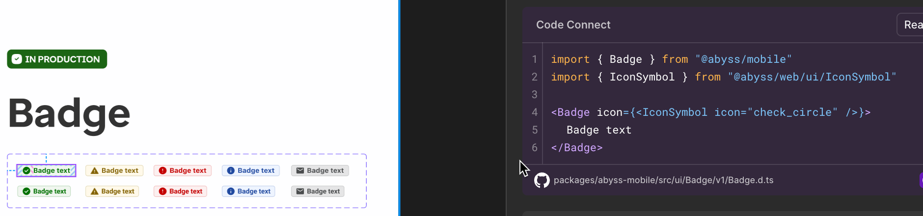 );
};
```
#### Slot limitations
At this time, code connect does not support slots. If you need to use a slot, you will need to manually add it to the code after copying it from Code Connect. The recommended code section does not show the actual slot element's code.
```tsx example
() => {
return (
);
};
```
#### Slot limitations
At this time, code connect does not support slots. If you need to use a slot, you will need to manually add it to the code after copying it from Code Connect. The recommended code section does not show the actual slot element's code.
```tsx example
() => {
return (
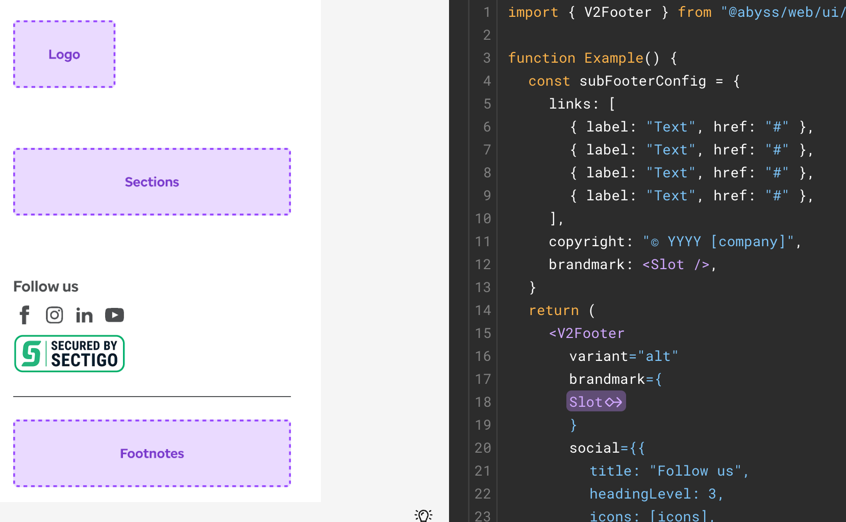 );
};
```
### Supported components
);
};
```
### Supported components

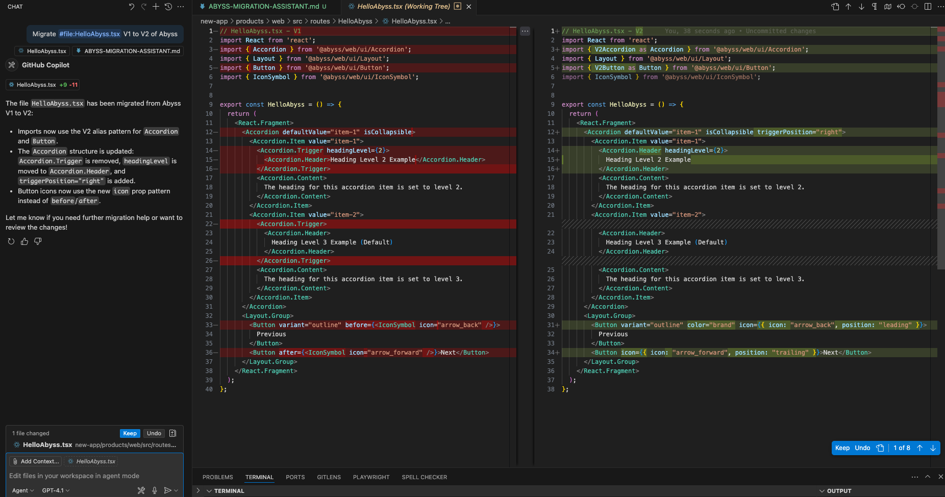 );
};
```
### Detect deprecated imports
To help with identifying deprecated components, we provide a script that scans your codebase for deprecated Abyss imports. This script will help you identify which components need to be replaced before migrating to v2.
:::note
Abyss imports show deprecation warnings. This tool is used scan your codebase for all deprecated imports at once.
:::
```tsx example
() => {
return (
);
};
```
### Detect deprecated imports
To help with identifying deprecated components, we provide a script that scans your codebase for deprecated Abyss imports. This script will help you identify which components need to be replaced before migrating to v2.
:::note
Abyss imports show deprecation warnings. This tool is used scan your codebase for all deprecated imports at once.
:::
```tsx example
() => {
return (
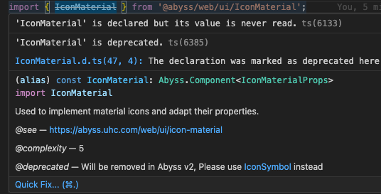 );
};
```
#### How to use the script
Start by downloading the [script's ZIP folder](/migration/detect-deprecated-imports.zip), then extract it to your project root directory. The structure should look like this:
```
your-project-root/
├── abyss-migration-tools/
│ ├── scan-imports.sh
│ ├── detect-deprecated-imports.js
| └── deprecated-imports.json
├── package.json
└── src/
└── ... (your project files)
```
Then, run the following commands to make the script executable and scan your codebase:
```bash
# Make the script executable
chmod +x abyss-migration-tools/scan-imports.sh
# Run the script to scan your entire codebase
./abyss-migration-tools/scan-imports.sh
# Or specify a specific directory to scan
./abyss-migration-tools/scan-imports.sh src/components
```
The script will scan your codebase for deprecated Abyss imports and report any findings. For example, running the script might show output like this:
```tsx example
() => {
return (
);
};
```
#### How to use the script
Start by downloading the [script's ZIP folder](/migration/detect-deprecated-imports.zip), then extract it to your project root directory. The structure should look like this:
```
your-project-root/
├── abyss-migration-tools/
│ ├── scan-imports.sh
│ ├── detect-deprecated-imports.js
| └── deprecated-imports.json
├── package.json
└── src/
└── ... (your project files)
```
Then, run the following commands to make the script executable and scan your codebase:
```bash
# Make the script executable
chmod +x abyss-migration-tools/scan-imports.sh
# Run the script to scan your entire codebase
./abyss-migration-tools/scan-imports.sh
# Or specify a specific directory to scan
./abyss-migration-tools/scan-imports.sh src/components
```
The script will scan your codebase for deprecated Abyss imports and report any findings. For example, running the script might show output like this:
```tsx example
() => {
return (
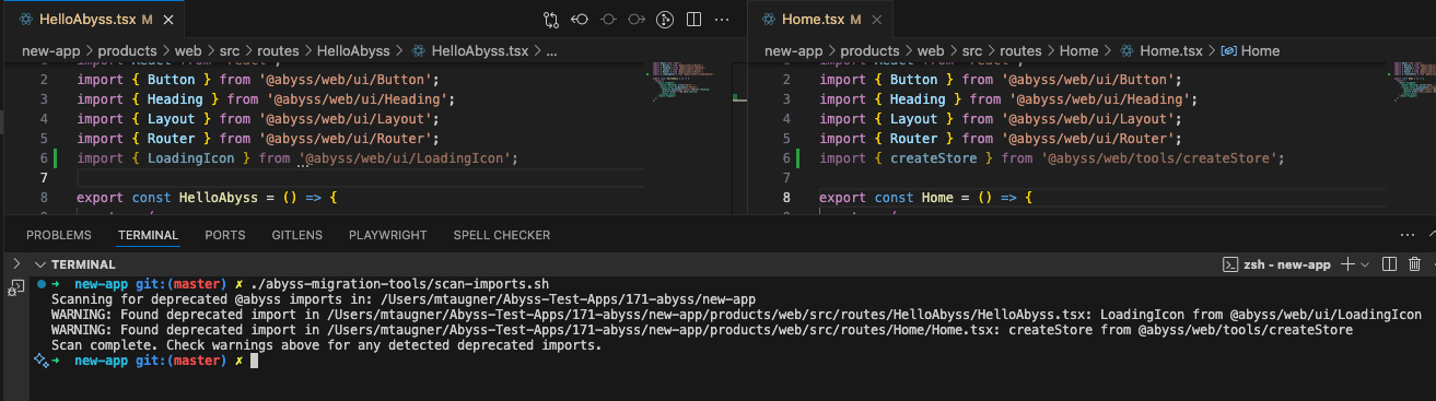 );
};
```
After identifying deprecated imports, refer to the [deprecation table](#deprecations) above for specific migration advice for each component or utility. For example, the table shows that `createStore` should be replaced with [Zustand](https://zustand.docs.pmnd.rs/getting-started/introduction) directly.
---
id: components
title: Component Changes
---
## Overview
This guide focuses on breaking prop changes to be aware of when migrating from Abyss V1 to V2. These include:
- Props that have been removed
- Props whose behavior or typings have been updated
- Props whose names have been changed but whose functionality remains the same.
This guide does **not** cover:
- New props added in V2, or
- Additional features and enhancements.
For complete documentation of all available props, including new features added, refer to each component's dedicated documentation page.
:::tip AI-Powered Component Migration
Need help with component migration? Use our [AI-powered migration tool](/web/developers/migration-v2/v1-to-v2-guide/#ai-powered-migration) to help convert V1 components to their V2 equivalents with proper prop mapping.
:::
## Accordion
);
};
```
After identifying deprecated imports, refer to the [deprecation table](#deprecations) above for specific migration advice for each component or utility. For example, the table shows that `createStore` should be replaced with [Zustand](https://zustand.docs.pmnd.rs/getting-started/introduction) directly.
---
id: components
title: Component Changes
---
## Overview
This guide focuses on breaking prop changes to be aware of when migrating from Abyss V1 to V2. These include:
- Props that have been removed
- Props whose behavior or typings have been updated
- Props whose names have been changed but whose functionality remains the same.
This guide does **not** cover:
- New props added in V2, or
- Additional features and enhancements.
For complete documentation of all available props, including new features added, refer to each component's dedicated documentation page.
:::tip AI-Powered Component Migration
Need help with component migration? Use our [AI-powered migration tool](/web/developers/migration-v2/v1-to-v2-guide/#ai-powered-migration) to help convert V1 components to their V2 equivalents with proper prop mapping.
:::
## Accordion
 {' '}
{' '}
 {' '}
{' '}
 {' '}
{' '}
 {' '}
{' '}
 {' '}
{' '}