---
comment: |
This is an auto-generated file. DO NOT EDIT THIS FILE DIRECTLY.
To edit this file, modify the source file in the 'mobile/overview/' directory, then run the 'copy-abyss-info' script to regenerate this file.
id: abyss-overview
title: Abyss Overview
hide_table_of_contents: true
---
---
comment: |
This is an auto-generated file. DO NOT EDIT THIS FILE DIRECTLY.
To edit this file, modify the source file in the 'mobile/overview/' directory, then run the 'copy-abyss-info' script to regenerate this file.
id: about
title: About Abyss
---
## What is Abyss?
## How Abyss works
## We Support Adoption
## Guiding Principles
## We Maintain Assets
## The Abyss Team
---
comment: |
This is an auto-generated file. DO NOT EDIT THIS FILE DIRECTLY.
To edit this file, modify the source file in the 'mobile/overview/' directory, then run the 'copy-abyss-info' script to regenerate this file.
id: abyss-version-2
title: Abyss Version 2
hide_table_of_contents: true
---
## Abyss Design System version 2
## V2 prep for designers
## V2 prep for developers
## Stay Connected
---
comment: |
This is an auto-generated file. DO NOT EDIT THIS FILE DIRECTLY.
To edit this file, modify the source file in the 'mobile/overview/' directory, then run the 'copy-abyss-info' script to regenerate this file.
id: releases
title: Releases
hide_table_of_contents: true
---
---
comment: |
This is an auto-generated file. DO NOT EDIT THIS FILE DIRECTLY.
To edit this file, modify the source file in the 'mobile/overview/' directory, then run the 'copy-abyss-info' script to regenerate this file.
id: contact-us
title: Contact Us
hide_table_of_contents: true
---
## Support
## Requests
---
comment: |
This is an auto-generated file. DO NOT EDIT THIS FILE DIRECTLY.
To edit this file, modify the source file in the 'mobile/overview/' directory, then run the 'copy-abyss-info' script to regenerate this file.
id: disclaimer
title: Mobile Components Disclaimer
---
As a note, these components were developed for use in a mobile application environment. For your convenience, we created documentation and interactive examples on our Abyss site. We have tried our best to accurately show the functionality and style of each component on these pages, but you may notice some differences and limitations as the optimal platform for viewing and interacting with these components is a mobile device.
A few examples are described below:
- [Date Input](/mobile/ui/date-input) requires native code, so this component is only supported on iOS and Android. There are no interactive examples in the documentation; only recordings of each feature are available. To fully interact with the date and time pickers you will need to import the component within a mobile development environment.
- [Modal](/mobile/ui/modal), and any component that uses Modal, takes up the entire browser window when opened. While it is intended to take up the entire phone screen as well, the content on the modal will fill much more space when used on a mobile device than it does in the browser window.
---
id: brandmark
category: Brand
title: Brandmark
description: Logos/Brandmarks for Optum brands.
design: https://www.figma.com/design/AxPl4wZUpCl5Wl5yjrPUG8?node-id=75764-3185
---
```jsx
import { Brandmark } from '@uhg-abyss/mobile';
```
```tsx example
() => {
return (
);
};
```
## Brand
Use the `brand` property to adjust which brand is being selected.
```tsx example
() => {
return (
);
};
```
## Size
Use the `size` property to adjust the size of the brandmark.
```tsx example
() => {
return (
);
};
```
## Affiliate
Use the `affiliate` property to select the required brandmark affiliates.
```tsx example
() => {
return (
);
};
```
## Variant
Use the `variant` property to select the required brandmark variants.
```tsx example
() => {
return (
);
};
```
## Color
Use the `color` property to select available brandmark colors.
```tsx example
() => {
return (
);
};
```
### Brandmark Props
## Brandmark Props
| Prop | Type | Description | Default | Required |
|------|------|-------------|---------|----------|
| `affiliate` | `'aarp_extra_assurance_benefits' \| 'aarp_medicare_plans' \| 'aarp_medicare_prescription' \| 'aarp_medicare_advantage' \| 'aarp_medicare_supplement' \| 'aarp_supplemental_personal_health' \| 'community_plan' \| 'dental' \| 'dual_complete' \| 'global' \| 'hearing' \| 'medicare_advantage' \| 'medicare_plans' \| 'medicare_solutions' \| 'oxford' \| 'uhc' \| 'vision' \| 'optum' \| 'optum_financial' \| 'optum_frontier_therapies' \| 'optum_perks' \| 'optum_prescription' \| 'optum_serve' \| 'optum_store' \| 'uhg' \| 'surest'` | Indicates the brandmark affiliate | `-` | Yes |
| `brand` | `'uhc' \| 'optum' \| 'uhg' \| 'surest' \| undefined` | Indicates which brand you want your brandmark from | `-` | No |
| `color` | `string \| undefined` | Set color option of the brandmark | `-` | No |
| `onError` | `() => void \| undefined` | Callback function when the brandmark has an error loading | `-` | No |
| `onLoad` | `() => void \| undefined` | Callback function when the brandmark is loaded | `-` | No |
| `size` | `'$sm' \| '$md' \| '$lg' \| number \| undefined` | Set size of brandmark | `200` | No |
| `sizes` | `Record \| undefined` | Pre programmed sizes for the brandmark | `'{ sm: 100, md: 150, lg: 200 }'` | No |
| `title` | `string \| undefined` | Set title for the brandmark | `-` | No |
| `variant` | `'lockup' \| 'lockup_horizontal' \| 'u_mark' \| 'u_mark_horizontal' \| 'monogram' \| 'stacked_wordmark' \| 'wordmark' \| 'lockup' \| 'lockup' \| 's_mark'` | Indicates the brandmark variant | `-` | Yes |
### Brandmark Classes
```tsx example
() => {
return
Brandmarks
;
};
```
The source for these brandmarks can be found in the [Brandmark Library](https://brand.optum.com/content/wordmark-library-resources).
You can use the search functionality to find the required brandmark. Brandmarks can be searched using their affiliates, variants or colors.
### Brandmark Tokens
---
id: icon-brand
category: Brand
title: IconBrand
description: Used to implement Brand icons and adapt their properties.
design: https://www.figma.com/design/anZoHg026SyKJHWGJ7Vf4Q?node-id=1-431
---
```jsx
import { IconBrand } from '@uhg-abyss/mobile';
```
```tsx example
() => {
return ;
};
```
## Icons
Use the `icon` property to adjust which icon is being selected.
```tsx example
() => {
return (
);
};
```
## Size
Use the `size` property to adjust the size of an icon by setting it to a specific number, or using a token. The default is `$md`.
Token sizes: `$icon-brand.sizing.xs`: 40 `$icon-brand.sizing.sm`: 64 `$icon-brand.sizing.md`: 96 `$icon-brand.sizing.lg`: 112 `$icon-brand.sizing.xl`: 136
```tsx example
() => {
return (
);
};
```
## Brand Icon Variants
Use the `variant` property to change the style of Brand icons. Available variants are `twotonedarkcircle`, `twotonelightcircle`, `twotone`, `onetonedarkcircle`, and `onetone`. The default variant is `twotonedarkcircle`.
```tsx example
() => {
return (
onetonedarkcircletwotonedarkcircletwotonelightcircleonetonetwotone
);
};
```
### IconBrand Props
## IconBrand Props
| Prop | Type | Description | Default | Required |
|------|------|-------------|---------|----------|
| `brand` | `'uhc' \| 'optum' \| 'uhg' \| 'surest' \| undefined` | Indicates which brand you want your icon from. This changes the colors of the icon to match the brand you select | `-` | No |
| `delayLongPress` | `number \| undefined` | Delay in milliseconds before the `onLongPress` callback is triggered. | `-` | No |
| `delayPressIn` | `number \| undefined` | Delay in milliseconds before the `onPressIn` callback is triggered. | `-` | No |
| `delayPressOut` | `number \| undefined` | Delay in milliseconds before the `onPressOut` callback is triggered. | `-` | No |
| `disabled` | `boolean \| undefined` | Disables press interactions for the icon. | `-` | No |
| `disableScaling` | `boolean \| undefined` | Specifies whether the icon should scale to respect Text Size accessibility settings | `false` | No |
| `fallback` | `React.JSX.Element \| undefined` | Element to render if the icon fails to load | `-` | No |
| `icon` | `ValidIconBrandName` | Name of the brand icon | `-` | Yes |
| `isScreenReadable` | `boolean \| undefined` | Indicate whether the icon is screen readable or not. If the icon is screen readable, then provide a title | `-` | No |
| `maxFontSizeMultiplier` | `number \| undefined` | Specifies the largest possible scale the icon can reach when `disableScaling` is false | `-` | No |
| `onError` | `() => void \| undefined` | Callback function to be called when the icon fails to load | `-` | No |
| `onLoad` | `() => void \| undefined` | Callback function to be called when the icon is loaded | `-` | No |
| `onLongPress` | `(event: GestureResponderEvent) => void \| undefined` | Callback fired after a long press gesture is detected. | `-` | No |
| `onPress` | `(event: GestureResponderEvent) => void \| undefined` | Callback fired when the icon is pressed. | `-` | No |
| `onPressIn` | `(event: GestureResponderEvent) => void \| undefined` | Callback fired when a press-in gesture starts. | `-` | No |
| `onPressOut` | `(event: GestureResponderEvent) => void \| undefined` | Callback fired when a press-in gesture ends. | `-` | No |
| `size` | `Abyss.Size \| undefined` | Set the size of the icon | `'$icon-brand.sizing.md'` | No |
| `sizes` | `Record \| undefined` | Pre programmed sizes for the icons | `-` | No |
| `title` | `string \| undefined` | Set the title of the icon | `-` | No |
| `variant` | `'onetone' \| 'onetonedarkcircle' \| 'twotone' \| 'twotonelightcircle' \| 'twotonedarkcircle' \| undefined` | The style/color variation of the brand icon | `'twotonedarkcircle'` | No |
### IconBrand Classes
```tsx example
() => {
return
Brand Icons
;
};
```
Abyss uses branded iconography iconography that is designed to aid wayfinding, draw
attention, and support messaging.
The source for these design icons can be found in the [Brand Icons Library](https://brand.uhc.com/content/iconography).
### IconBrand Tokens
---
id: icon-custom
category: Brand
title: IconCustom
description: Used to implement custom icons and adapt their properties.
design: https://www.figma.com/design/anZoHg026SyKJHWGJ7Vf4Q?node-id=5-159
---
```jsx
import { IconCustom } from '@uhg-abyss/mobile';
```
```tsx example
() => {
return ;
};
```
## Size
Use the `size` property to adjust the size of an icon by setting it to a specific number or token. The default size is set to 24.
Token sizes: `$xs`: 16 `$sm`: 20 `$md`: 24 `$lg`: 40 `$xl`: 48
```tsx example
() => {
return (
);
};
```
## Variants
Use the `variant` prop to change the style of the custom icons. The prop takes in either a `light` or `lightactive` value. The default is `light`.
```tsx example
() => {
return (
lightlightactive
);
};
```
## Brand
Use the `brand` property to adjust which brands icons are being selected. Note that some of the icons are unique to certain brands.
The default is the theme brand, then falls back to `uhc`.
```tsx example
() => {
return (
);
};
```
## Active
When placing an icon inside of a clickable element, the icon should be toggled between its normal and active state.
```tsx example
() => {
return (
{({ pressed }) => {
return (
Home
);
}}
);
};
```
## Indicator
The [indicator component](/mobile/ui/indicator) can be used as a wrapper to add a notification badge.
```tsx example
() => {
return (
);
};
```
### IconCustom Props
## IconCustom Props
| Prop | Type | Description | Default | Required |
|------|------|-------------|---------|----------|
| `brand` | `'uhc' \| 'optum' \| undefined` | Specifies the brand of the custom icon. Defaults to the theme's brand, then falls back to 'uhc'. | `-` | No |
| `icon` | `keyof typeof dark \| keyof typeof light` | Name of the custom icon | `-` | Yes |
| `variant` | `'light' \| 'dark' \| 'darkactive' \| 'lightactive' \| 'light' \| 'lightactive' \| undefined` | The style variation of the custom icon | `'light'` | No |
### IconCustom Classes
```tsx example
() => {
return
Custom Icons
;
};
```
### IconCustom Tokens
---
id: illustration-brand
category: Media
title: IllustrationBrand
description: Used to implement Brand illustrations and adapt their properties.
design: https://www.figma.com/design/34gRQMq2NxFgeRynjqd24C?node-id=1218-19509
---
```jsx
import { IllustrationBrand } from '@uhg-abyss/mobile';
```
```tsx example
() => {
return (
);
};
```
## Brand
Use the `brand` property to adjust which brand is being selected.
```tsx example
() => {
return ;
};
```
## Size
Use the `size` property to adjust the size of the illustration.
`IllustrationBrand` scales proportionally based on the image ratio and renders with a contain resize mode so the full illustration stays visible. If you wrap it, prefer a layout that lets the illustration grow from its width instead of a fixed-height container with clipping styles.
```tsx example
() => {
return (
);
};
```
### IllustrationBrand Props
## IllustrationBrand Props
| Prop | Type | Description | Default | Required |
|------|------|-------------|---------|----------|
| `brand` | `'uhc' \| 'optum' \| 'surest' \| undefined` | Indicates which brand you want your illustration from | `-` | No |
| `color` | `IllustrationColor \| undefined` | Sets color option of the illustration | `-` | No |
| `illustration` | `UhcIllustrationBrandName \| undefined \| OptumIllustrationBrandName \| SurestIllustrationBrandName` | The name of the illustration | `-` | No |
| `size` | `Abyss.Size \| undefined` | Sets the size of the illustration | `200` | No |
| `title` | `string \| undefined` | Set accessibilityLabel of the image | `-` | No |
| `variant` | `IllustrationVariant \| undefined` | The color variant for illustrations with multiple variants on the same background color. Applicable only to certain UHC illustrations | `1` | No |
### IllustrationBrand Classes
```tsx example
() => {
return
Illustration Source
;
};
```
The source for these illustrations can be found in the brand libraries.
You can use the search functionality to find the required illustration.
Illustrations can be searched using their title, variants, or colors.
---
id: brandmark
category: Brand
title: Brandmark
description: Logos/Brandmarks for UHC brands.
design: https://www.figma.com/design/wCMblLsq9TxAQvKzY3EfCt?node-id=82983-2524
---
```jsx
import { Brandmark } from '@uhg-abyss/mobile';
```
```tsx example
() => {
return (
);
};
```
## Brand
Use the `brand` property to adjust which brand is being selected.
```tsx example
() => {
return (
);
};
```
## Size
Use the `size` property to adjust the size of the brandmark.
```tsx example
() => {
return (
);
};
```
## Affiliate
Use the `affiliate` property to select the required brandmark affiliates.
```tsx example
() => {
return (
);
};
```
## Variant
Use the `variant` property to select the required brandmark variants.
```tsx example
() => {
return (
);
};
```
## Color
Use the `color` property to select available brandmark colors.
```tsx example
() => {
return (
);
};
```
### Brandmark Props
## Brandmark Props
| Prop | Type | Description | Default | Required |
|------|------|-------------|---------|----------|
| `affiliate` | `'aarp_extra_assurance_benefits' \| 'aarp_medicare_plans' \| 'aarp_medicare_prescription' \| 'aarp_medicare_advantage' \| 'aarp_medicare_supplement' \| 'aarp_supplemental_personal_health' \| 'community_plan' \| 'dental' \| 'dual_complete' \| 'global' \| 'hearing' \| 'medicare_advantage' \| 'medicare_plans' \| 'medicare_solutions' \| 'oxford' \| 'uhc' \| 'vision' \| 'optum' \| 'optum_financial' \| 'optum_frontier_therapies' \| 'optum_perks' \| 'optum_prescription' \| 'optum_serve' \| 'optum_store' \| 'uhg' \| 'surest'` | Indicates the brandmark affiliate | `-` | Yes |
| `brand` | `'uhc' \| 'optum' \| 'uhg' \| 'surest' \| undefined` | Indicates which brand you want your brandmark from | `-` | No |
| `color` | `string \| undefined` | Set color option of the brandmark | `-` | No |
| `onError` | `() => void \| undefined` | Callback function when the brandmark has an error loading | `-` | No |
| `onLoad` | `() => void \| undefined` | Callback function when the brandmark is loaded | `-` | No |
| `size` | `'$sm' \| '$md' \| '$lg' \| number \| undefined` | Set size of brandmark | `200` | No |
| `sizes` | `Record \| undefined` | Pre programmed sizes for the brandmark | `'{ sm: 100, md: 150, lg: 200 }'` | No |
| `title` | `string \| undefined` | Set title for the brandmark | `-` | No |
| `variant` | `'lockup' \| 'lockup_horizontal' \| 'u_mark' \| 'u_mark_horizontal' \| 'monogram' \| 'stacked_wordmark' \| 'wordmark' \| 'lockup' \| 'lockup' \| 's_mark'` | Indicates the brandmark variant | `-` | Yes |
### Brandmark Classes
```tsx example
() => {
return
Brandmarks
;
};
```
The source for these brandmarks can be found in the [Brandmark Library](https://brand.uhc.com/content/logo-brandmark-library).
You can use the search functionality to find the required brandmark. Brandmarks can be searched using their affiliates, variants or colors.
### Brandmark Tokens
---
id: icon-brand
category: Brand
title: IconBrand
description: Used to implement Brand icons and adapt their properties.
design: https://www.figma.com/design/anZoHg026SyKJHWGJ7Vf4Q?node-id=1-431
---
```jsx
import { IconBrand } from '@uhg-abyss/mobile';
```
```tsx example
() => {
return ;
};
```
## Icons
Use the `icon` property to adjust which icon is being selected.
```tsx example
() => {
return (
);
};
```
## Size
Use the `size` property to adjust the size of an icon by setting it to a specific number, or using a token. The default is `$md`.
Token sizes: `$icon-brand.sizing.xs`: 40 `$icon-brand.sizing.sm`: 64 `$icon-brand.sizing.md`: 96 `$icon-brand.sizing.lg`: 112 `$icon-brand.sizing.xl`: 136
```tsx example
() => {
return (
);
};
```
## Brand Icon Variants
Use the `variant` property to change the style of Brand icons. Available variants are `twotonedarkcircle`, `twotonelightcircle`, `twotone`, `onetonedarkcircle`, and `onetone`. The default variant is `twotonedarkcircle`.
```tsx example
() => {
return (
onetonedarkcircletwotonedarkcircletwotonelightcircleonetonetwotone
);
};
```
### IconBrand Props
## IconBrand Props
| Prop | Type | Description | Default | Required |
|------|------|-------------|---------|----------|
| `brand` | `'uhc' \| 'optum' \| 'uhg' \| 'surest' \| undefined` | Indicates which brand you want your icon from. This changes the colors of the icon to match the brand you select | `-` | No |
| `delayLongPress` | `number \| undefined` | Delay in milliseconds before the `onLongPress` callback is triggered. | `-` | No |
| `delayPressIn` | `number \| undefined` | Delay in milliseconds before the `onPressIn` callback is triggered. | `-` | No |
| `delayPressOut` | `number \| undefined` | Delay in milliseconds before the `onPressOut` callback is triggered. | `-` | No |
| `disabled` | `boolean \| undefined` | Disables press interactions for the icon. | `-` | No |
| `disableScaling` | `boolean \| undefined` | Specifies whether the icon should scale to respect Text Size accessibility settings | `false` | No |
| `fallback` | `React.JSX.Element \| undefined` | Element to render if the icon fails to load | `-` | No |
| `icon` | `ValidIconBrandName` | Name of the brand icon | `-` | Yes |
| `isScreenReadable` | `boolean \| undefined` | Indicate whether the icon is screen readable or not. If the icon is screen readable, then provide a title | `-` | No |
| `maxFontSizeMultiplier` | `number \| undefined` | Specifies the largest possible scale the icon can reach when `disableScaling` is false | `-` | No |
| `onError` | `() => void \| undefined` | Callback function to be called when the icon fails to load | `-` | No |
| `onLoad` | `() => void \| undefined` | Callback function to be called when the icon is loaded | `-` | No |
| `onLongPress` | `(event: GestureResponderEvent) => void \| undefined` | Callback fired after a long press gesture is detected. | `-` | No |
| `onPress` | `(event: GestureResponderEvent) => void \| undefined` | Callback fired when the icon is pressed. | `-` | No |
| `onPressIn` | `(event: GestureResponderEvent) => void \| undefined` | Callback fired when a press-in gesture starts. | `-` | No |
| `onPressOut` | `(event: GestureResponderEvent) => void \| undefined` | Callback fired when a press-in gesture ends. | `-` | No |
| `size` | `Abyss.Size \| undefined` | Set the size of the icon | `'$icon-brand.sizing.md'` | No |
| `sizes` | `Record \| undefined` | Pre programmed sizes for the icons | `-` | No |
| `title` | `string \| undefined` | Set the title of the icon | `-` | No |
| `variant` | `'onetone' \| 'onetonedarkcircle' \| 'twotone' \| 'twotonelightcircle' \| 'twotonedarkcircle' \| undefined` | The style/color variation of the brand icon | `'twotonedarkcircle'` | No |
### IconBrand Classes
```tsx example
() => {
return
Brand Icons
;
};
```
Abyss uses branded iconography that is designed to aid way-finding, draw attention,
and support messaging.
The source for these design icons can be found in the [Brand Icons Library](https://brand.uhc.com/content/iconography).
## Dynamic Type
Brand icons do not scale. When using IconBrand, the `disabledScaling` prop should be set to `true`.
### IconBrand Tokens
---
id: icon-custom
category: Brand
title: IconCustom
description: Used to implement custom icons and adapt their properties.
design: https://www.figma.com/design/anZoHg026SyKJHWGJ7Vf4Q?node-id=5-159
---
```jsx
import { IconCustom } from '@uhg-abyss/mobile';
```
```tsx example
() => {
return ;
};
```
## Size
Use the `size` property to adjust the size of an icon by setting it to a specific number or token. The default size is set to 24.
Token sizes: `$xs`: 16 `$sm`: 20 `$md`: 24 `$lg`: 40 `$xl`: 48
```tsx example
() => {
return (
);
};
```
## Variants
Use the `variant` prop to change the style of the custom icons. The prop takes in a `light` and `dark` value, as well as
`lightactive` and `darkactive` counterparts. The default is `light`.
```tsx example
() => {
return (
lightlightactivedarkdarkactive
);
};
```
## Brand
Use the `brand` property to adjust which brands icons are being selected. Note that some of the icons are unique to certain brands.
The default is the theme brand, then falls back to `uhc`.
```tsx example
() => {
return ;
};
```
## Active
When placing an icon inside of a clickable element, the icon should be toggled between its normal and active state.
```tsx example
() => {
return (
{({ pressed }) => {
return (
Home
);
}}
);
};
```
## Indicator
The [indicator component](/mobile/ui/indicator) can be used as a wrapper to add a notification badge.
```tsx example
() => {
return (
);
};
```
### IconCustom Props
## IconCustom Props
| Prop | Type | Description | Default | Required |
|------|------|-------------|---------|----------|
| `brand` | `'uhc' \| 'optum' \| undefined` | Specifies the brand of the custom icon. Defaults to the theme's brand, then falls back to 'uhc'. | `-` | No |
| `icon` | `keyof typeof dark \| keyof typeof light` | Name of the custom icon | `-` | Yes |
| `variant` | `'light' \| 'dark' \| 'darkactive' \| 'lightactive' \| 'light' \| 'lightactive' \| undefined` | The style variation of the custom icon | `'light'` | No |
### IconCustom Classes
```tsx example
() => {
return
Custom Icons
;
};
```
### IconCustom Tokens
---
id: illustrated-icon-brand
slug: /mobile/brand/uhc/illustrated-icon-brand
category: Brand
title: IllustratedIconBrand
description: Used to implement UHC brand illustrated icons and adapt their properties.
sourceIsTS: true
---
```jsx
import { IllustratedIconBrand } from '@uhg-abyss/mobile';
```
```tsx sandbox
{
component: 'IllustratedIconBrand',
inputs: [
{
prop: 'icon',
type: 'string',
},
{
prop: 'size',
type: 'string',
},
{
prop: 'color',
type: 'select',
options: [
{ label: 'none', value: undefined },
{ label: 'gold', value: 'gold' },
{ label: 'orange', value: 'orange' },
{ label: 'multicolor', value: 'multicolor' },
]
},
],
}
// Disclaimer: Not all icon/color combinations are applicable; inapplicable combinations will display as empty
```
## Size
Use the `size` property to adjust the width of the illustrated icon. The default value is `100`. The height of the illustration will scale proportionally to the width.
```tsx live
```
## Color
Use the `color` property to select available illustrated icon colors. The available colors are `"gold"`, `"orange"`, and `"multicolor"`.
:::warning
Not all illustrated icons have any color variants. In such cases, omit the `color` prop; otherwise, the icon will not display.
:::
```tsx live
```
### IllustratedIconBrand Props
## IllustratedIconBrand Props
| Prop | Type | Description | Default | Required |
|------|------|-------------|---------|----------|
| `color` | `'gold' \| 'multicolor' \| 'orange' \| undefined` | The color of the illustrated icon. Applicable only to certain assets. | `-` | No |
| `icon` | `keyof typeof uhc.gold \| keyof typeof uhc.multicolor \| keyof typeof uhc.orange \| keyof typeof uhc.none` | Name of the illustrated icon asset. | `-` | Yes |
| `size` | `number \| undefined` | The width of the icon. | `100` | No |
### IllustratedIconBrand Classes
## Screen Reader Support
Illustrated icons are intended to be used as [decorative images](https://www.w3.org/WAI/tutorials/images/decorative/) and as such, are ignored by screen readers by default. However, should a case arise in which an illustrated icon needs to be accessible, use the `accessibilityLabel` prop to provide accessible text to the image. This text should be descriptive enough to convey the meaning of the illustrated icon.
```tsx live
```
```tsx example
() => {
return
Illustrated Icon Source
;
};
```
The source for these illustrated icons can be found in the brand libraries.
You can use the search functionality to find the required illustrated icons. Icons can be searched using their title or colors.
---
id: illustration-brand
category: Brand
title: IllustrationBrand
description: Used to implement Brand illustrations and adapt their properties.
design: https://www.figma.com/design/34gRQMq2NxFgeRynjqd24C?node-id=1218-19509
---
```jsx
import { IllustrationBrand } from '@uhg-abyss/mobile';
```
```tsx example
() => {
return (
);
};
```
## Brand
Use the `brand` property to adjust which brand is being selected.
```tsx example
() => {
return (
);
};
```
## Size
Use the `size` property to adjust the size of the illustration.
`IllustrationBrand` scales proportionally based on the image ratio and renders with a contain resize mode so the full illustration stays visible. If you wrap it, prefer a layout that lets the illustration grow from its width instead of a fixed-height container with clipping styles.
```tsx example
() => {
return ;
};
```
## Color
Use the `color` property to select available illustration colors.
```tsx example
() => {
return (
);
};
```
## Variant
Some UHC illustrations have multiple variants of accent colors on the same background color. Use the `variant` prop to select the color combination.
```tsx example
() => {
return (
);
};
```
### IllustrationBrand Props
## IllustrationBrand Props
| Prop | Type | Description | Default | Required |
|------|------|-------------|---------|----------|
| `brand` | `'uhc' \| 'optum' \| 'surest' \| undefined` | Indicates which brand you want your illustration from | `-` | No |
| `color` | `IllustrationColor \| undefined` | Sets color option of the illustration | `-` | No |
| `illustration` | `UhcIllustrationBrandName \| undefined \| OptumIllustrationBrandName \| SurestIllustrationBrandName` | The name of the illustration | `-` | No |
| `size` | `Abyss.Size \| undefined` | Sets the size of the illustration | `200` | No |
| `title` | `string \| undefined` | Set accessibilityLabel of the image | `-` | No |
| `variant` | `IllustrationVariant \| undefined` | The color variant for illustrations with multiple variants on the same background color. Applicable only to certain UHC illustrations | `1` | No |
### IllustrationBrand Classes
```tsx example
() => {
return
Illustration Source
;
};
```
The source for these illustrations can be found in the brand libraries.
You can use the search functionality to find the required illustration.
Illustrations can be searched using their title, variants, or colors.
---
id: brandmark
category: Brand
title: Brandmark
description: Logos/Brandmarks for UHG brands.
design: https://www.figma.com/design/tk08Md4NBBVUPNHQYthmqp?node-id=0-21
---
```jsx
import { Brandmark } from '@uhg-abyss/mobile';
```
```tsx example
() => {
return (
);
};
```
## Brand
Use the `brand` property to adjust which brand is being selected.
```tsx example
() => {
return (
);
};
```
## Size
Use the `size` property to adjust the size of the brandmark.
```tsx example
() => {
return (
);
};
```
## Variant
Use the `variant` property to select the required brandmark variants.
```tsx example
() => {
return (
);
};
```
## Color
Use the `color` property to select available brandmark colors.
```tsx example
() => {
return (
);
};
```
### Brandmark Props
## Brandmark Props
| Prop | Type | Description | Default | Required |
|------|------|-------------|---------|----------|
| `affiliate` | `'aarp_extra_assurance_benefits' \| 'aarp_medicare_plans' \| 'aarp_medicare_prescription' \| 'aarp_medicare_advantage' \| 'aarp_medicare_supplement' \| 'aarp_supplemental_personal_health' \| 'community_plan' \| 'dental' \| 'dual_complete' \| 'global' \| 'hearing' \| 'medicare_advantage' \| 'medicare_plans' \| 'medicare_solutions' \| 'oxford' \| 'uhc' \| 'vision' \| 'optum' \| 'optum_financial' \| 'optum_frontier_therapies' \| 'optum_perks' \| 'optum_prescription' \| 'optum_serve' \| 'optum_store' \| 'uhg' \| 'surest'` | Indicates the brandmark affiliate | `-` | Yes |
| `brand` | `'uhc' \| 'optum' \| 'uhg' \| 'surest' \| undefined` | Indicates which brand you want your brandmark from | `-` | No |
| `color` | `string \| undefined` | Set color option of the brandmark | `-` | No |
| `onError` | `() => void \| undefined` | Callback function when the brandmark has an error loading | `-` | No |
| `onLoad` | `() => void \| undefined` | Callback function when the brandmark is loaded | `-` | No |
| `size` | `'$sm' \| '$md' \| '$lg' \| number \| undefined` | Set size of brandmark | `200` | No |
| `sizes` | `Record \| undefined` | Pre programmed sizes for the brandmark | `'{ sm: 100, md: 150, lg: 200 }'` | No |
| `title` | `string \| undefined` | Set title for the brandmark | `-` | No |
| `variant` | `'lockup' \| 'lockup_horizontal' \| 'u_mark' \| 'u_mark_horizontal' \| 'monogram' \| 'stacked_wordmark' \| 'wordmark' \| 'lockup' \| 'lockup' \| 's_mark'` | Indicates the brandmark variant | `-` | Yes |
### Brandmark Classes
```tsx example
() => {
return
Brandmarks
;
};
```
You can use the search functionality to find the required brandmark. Brandmarks can be searched using their affiliates, variants or colors.
### Brandmark Tokens
---
id: components
title: Components
---
Browse Abyss mobile components.
:::tip
Scroll down within the Viewport Width to see more components.
:::
---
id: flat-list
category: Core
title: FlatList
description: A performant interface for rendering basic flat lists.
sourceIsTS: true
---
## Usage
The `FlatList` component is a high-performance list component that efficiently renders only the items currently
visible on the screen, regardless of the size of the data set. It is ideal for rendering basic, flat lists and
supports the most handy features like:
- Full tokenization support.
- Fully cross-platform.
- Optional horizontal mode.
- Configurable viewability callbacks.
- Header support.
- Footer support.
- Separator support.
- Pull to Refresh.
- Scroll loading.
- ScrollToIndex support.
- Multiple column support.
:::tip
If you need section support, consider using the [SectionList](/mobile/core/section-list) component.
:::
```tsx example
() => {
const data = [
{
id: 'bd7acbea-c1b1-46c2-aed5-3ad53abb28ba',
title: 'One',
},
{
id: '3ac68afc-c605-48d3-a4f8-fbd91aa97f63',
title: 'Two',
},
{
id: '58694a0f-3da1-471f-bd96-145571e29d72',
title: 'Three',
},
{
id: '9b7acbea-c1b1-46c2-aed5-3ad53abb28ba',
title: 'Four',
},
{
id: '8ac68afc-c605-48d3-a4f8-fbd91aa97f63',
title: 'Five',
},
{
id: '78694a0f-3da1-471f-bd96-145571e29d72',
title: 'Six',
},
{
id: '6b7acbea-c1b1-46c2-aed5-3ad53abb28ba',
title: 'Seven',
},
{
id: '5ac68afc-c605-48d3-a4f8-fbd91aa97f63',
title: 'Eight',
},
];
const ItemWrapper = styled('View', {
width: '50%',
padding: '$semantic.spacing.lg',
});
const ItemContainer = styled('View', {
backgroundColor: '$semantic.color.surface.container.emphasis.3',
padding: '$semantic.spacing.lg',
borderWidth: 4,
borderColor: '$semantic.color.border.status.saturated.info',
alignItems: 'center',
borderRadius: '$semantic.border-radius.container.main',
});
const Category = styled('View', {
height: 50,
alignItems: 'center',
justifyContent: 'center',
});
const Item = ({ title }) => {
return (
{title}
);
};
return (
{
return ;
}}
keyExtractor={(item) => {
return item.id;
}}
numColumns={2}
ListHeaderComponent={
FlatList Header
}
ListHeaderComponentStyle={{
backgroundColor: '$semantic.color.surface.container.primary',
borderColor: '$semantic.color.border.status.saturated.info',
borderWidth: 6,
marginHorizontal: '$semantic.spacing.lg',
borderRadius: '$semantic.border-radius.container.main',
}}
columnWrapperStyle={{
borderWidth: 6,
borderColor: '$semantic.color.border.status.saturated.info',
marginVertical: '$semantic.spacing.xs',
backgroundColor: '$semantic.color.surface.container.primary',
borderRadius: '$semantic.border-radius.container.main',
}}
contentContainerStyle={{
backgroundColor: '$semantic.color.surface.container.tertiary',
padding: '$semantic.spacing.lg',
}}
ListFooterComponentStyle={{
backgroundColor: '$semantic.color.surface.container.primary',
borderColor: '$semantic.color.border.status.saturated.info',
borderWidth: 6,
marginHorizontal: '$semantic.spacing.lg',
borderRadius: '$semantic.border-radius.container.main',
}}
ListFooterComponent={
FlatList Footer
}
/>
);
};
```
### Best Practices
- **Use Memoization:** Use [React.memo()](https://react.dev/reference/react/memo) to avoid unnecessary re-renders of list items.
- **Pagination:** For large datasets, implement pagination with `onEndReached` to load additional data dynamically.
- **Key Extraction:** Ensure `keyExtractor` returns a unique and stable key to avoid performance degradation caused by reordering or re-rendering items unnecessarily.
## Considerations
_`FlatList` is a convenience wrapper around [VirtualizedList](/mobile/core/virtualized-list), and thus inherits its props (as well as those of [ScrollView](/mobile/core/scroll-view)) that aren't explicitly listed here, along with the following caveats:_
- **Internal State:** Internal state is not preserved when content scrolls out of the render window. Ensure all your data is captured in the item data or external stores like Flux, Redux, or Relay.
- **Prop Updates:** This is a `PureComponent` meaning it will not re-render if props remain shallow-equal. Make sure that everything your `renderItem` function depends on is passed as a prop (e.g. `extraData`) that is not `===` after updates, otherwise your UI may not update on changes. This includes the `data` prop and parent component state.
- **Item Rendering:** In order to constrain memory and enable smooth scrolling, content is rendered asynchronously offscreen. This means it's possible to scroll faster than the fill rate and momentarily see blank content. This is a tradeoff that can be adjusted to suit the needs of each application.
- **Key Management:** By default, the list looks for a `key` prop on each item and uses that for the React key. Alternatively, you can provide a custom `keyExtractor` prop.
### Accessibility Considerations
- **Screen Reader Support:** Ensure that list items have accessible labels and descriptions, especially if they contain interactive elements.
- **Focus Management:** When dynamically loading data, manage focus properly so users can navigate the list without losing track of their position.
### Performance Considerations
- **Windowing:** Use `initialNumToRender` and `maxToRenderPerBatch` props to control how many items are rendered initially and in each batch to avoid overloading the UI with too many items at once.
- **Recycling Cells:** Consider using `CellRenderComponent` to recycle rendered items and improve rendering performance for large lists.
- **Avoid Excessive Renders:** Leverage `shouldComponentUpdate` to prevent unnecessary renders of list items.
### FlatList Classes
### FlatList Props
## FlatList Props
| Prop | Type | Description | Default | Required |
|------|------|-------------|---------|----------|
| `columnWrapperStyle` | `Abyss.Style<'View'> \| undefined` | Optional custom style for multi-item rows generated when `numColumns > 1` | `-` | No |
| `contentContainerStyle` | `Abyss.Style<'View'> \| undefined` | These styles will be applied to the scroll view content container which wraps all of the child views. | `-` | No |
| `contentInset` | `Insets \| undefined` | The amount by which the scroll view content is inset from the edges of the scroll view. Defaults to `{top: 0, left: 0, bottom: 0, right: 0}`. | `-` | No |
| `contentOffset` | `PointProp \| undefined` | Used to manually set the starting scroll offset. The default value is `{ x: 0, y: 0 }` | `-` | No |
| `endFillColor` | `Abyss.Color \| undefined` | Sometimes a ScrollView takes up more space than its content fills. When this is the case, this prop will fill the rest of the ScrollView with a color to avoid setting a background and creating unnecessary overdraw. This is an advanced optimization that is not needed in the general case. | `-` | No |
| `fadingEdgeLength` | `Abyss.Space \| undefined` | Fades out the edges of the scroll content. If the value is greater than 0, the fading edges will be set accordingly to the current scroll direction and position, indicating if there is more content to show. The default value is 0. | `-` | No |
| `hitSlop` | `number \| Insets \| null \| undefined` | This defines how far a touch event can start away from the view. Typical interface guidelines recommend touch targets that are at least 30 - 40 points/density-independent pixels. If a Touchable view has a height of 20 the touchable height can be extended to 40 with `hitSlop={{ top: 10, bottom: 10, left: 0, right: 0 }}` NOTE The touch area never extends past the parent view bounds and the Z-index of sibling views always takes precedence if a touch hits two overlapping views. | `-` | No |
| `ListFooterComponentStyle` | `Abyss.Style<'View'> \| undefined` | Styling for internal View for ListFooterComponent | `-` | No |
| `ListHeaderComponentStyle` | `Abyss.Style<'View'> \| undefined` | Styling for internal View for ListHeaderComponent | `-` | No |
| `style` | `Abyss.Style<'FlatList'> \| undefined` | FlatList style properties with Abyss token mapping | `-` | No |
---
id: image
category: Core
title: Image
description: Displays different types of images, including network images, static resources, temporary local images, and images from local disk, such as the camera roll.
sourceIsTS: true
---
```jsx
import { Image } from '@uhg-abyss/mobile';
```
## Usage
The Image component is a fundamental UI element that displays images in your application.
This component is a customized extension of React Native's `Image` component, which is enhanced to
fit seamlessly within our design system. It supports various image formats, allows for custom
styling, and includes optimizations for loading performance.
:::warning Important
For network and data images, you will need to manually specify the dimensions of your image!
:::
```tsx example
() => {
return (
);
};
```
You can also use the `style` prop with custom design tokens to style the image.
```tsx example
() => {
return (
);
};
```
## GIF and WebP support on Android
When building your own native code, GIF and WebP are not supported by default on Android.
You will need to add some optional modules in `android/app/build.gradle`, depending on the needs of your app.
```
dependencies {
// If your app supports Android versions before Ice Cream Sandwich (API level 14)
implementation 'com.facebook.fresco:animated-base-support:1.3.0'
// For animated GIF support
implementation 'com.facebook.fresco:animated-gif:3.1.3'
// For WebP support, including animated WebP
implementation 'com.facebook.fresco:animated-webp:3.1.3'
implementation 'com.facebook.fresco:webpsupport:3.1.3'
// For WebP support, without animations
implementation 'com.facebook.fresco:webpsupport:3.1.3'
}
```
## Best Practices
- **Use Accessibility Label:** Provide meaningful accessibility labels for accessibility. This is especially important for images that convey important information.
- **Optimize Images:** Use appropriately sized images to reduce load times and improve performance. Compress images and use formats that balance quality and file size.
- **Minimize Re-Renders:** Avoid unnecessary re-renders of the Image component, especially for large or high-resolution images.
### Image Classes
### Image Props
## Image Props
| Prop | Type | Description | Default | Required |
|------|------|-------------|---------|----------|
| `capInsets` | `Insets \| undefined` | When the image is resized, the corners of the size specified by `capInsets` will stay a fixed size, but the center content and borders of the image will be stretched. This is useful for creating resizable rounded buttons, shadows, and other resizable assets. More info in the [official Apple documentation](https://developer.apple.com/library/ios/documentation/UIKit/Reference/UIImage_Class/index.html#//apple_ref/occ/instm/UIImage/resizableImageWithCapInsets). | `-` | No |
| `height` | `Abyss.Size \| undefined` | Height of the image component. | `-` | No |
| `style` | `Abyss.Style<"Image">` | Image style properties with Abyss token mapping | `-` | No |
| `tintColor` | `Abyss.Color \| undefined` | Changes the color of all non-transparent pixels to the `tintColor`. | `-` | No |
| `width` | `Abyss.Size \| undefined` | Width of the image component. | `-` | No |
---
id: image-background
category: Core
title: ImageBackground
description: Display an image as the background of another component.
sourceIsTS: true
---
```jsx
import { ImageBackground } from '@uhg-abyss/mobile';
```
## Usage
A common feature request from developers familiar with the web is a `background-image`. To handle this use case, you can use the
`ImageBackground` component, which has the same props as `Image`, and add whatever children to it you would like to layer on top of it.
The `ImageBackground` component is a specialized container that displays an image as the background of a view.
This component is an enhancement of React Native's core `ImageBackground`, tailored to integrate seamlessly with our design system.
## Example
```tsx example
() => {
return (
Inside
);
};
```
## Resize Mode
The `resizeMode` prop controls how the image is resized within the bounds set by the `style` prop. It can be one of the following values:
```tsx example
() => {
const [mode, setMode] = useState('cover');
const changeMode = (newMode) => {
return () => {
setMode(newMode);
};
};
const modes = ['cover', 'contain', 'stretch', 'repeat', 'center'];
return (
Abyss
{modes.map((m) => {
return (
);
})}
);
};
```
### ImageBackground Classes
### ImageBackground Props
## ImageBackground Props
| Prop | Type | Description | Default | Required |
|------|------|-------------|---------|----------|
| `capInsets` | `Insets \| undefined` | When the image is resized, the corners of the size specified by `capInsets` will stay a fixed size, but the center content and borders of the image will be stretched. This is useful for creating resizable rounded buttons, shadows, and other resizable assets. More info in the [official Apple documentation](https://developer.apple.com/library/ios/documentation/UIKit/Reference/UIImage_Class/index.html#//apple_ref/occ/instm/UIImage/resizableImageWithCapInsets). | `-` | No |
| `height` | `Abyss.Size \| undefined` | Height of the image component. | `-` | No |
| `imageStyle` | `Abyss.Style<"Image">` | These styles will be applied to the Image component which is nested inside ImageBackground | `-` | No |
| `style` | `Abyss.Style<"ImageBackground">` | ImageBackground style properties with Abyss token mapping | `-` | No |
| `tintColor` | `Abyss.Color \| undefined` | Changes the color of all non-transparent pixels to the `tintColor`. | `-` | No |
| `width` | `Abyss.Size \| undefined` | Width of the image component. | `-` | No |
---
id: keyboard-avoiding-view
category: Core
title: KeyboardAvoidingView
description: Automatically adjust its height, position, or bottom padding based on the keyboard height to remain visible while the virtual keyboard is displayed.
sourceIsTS: true
---
```jsx
import { KeyboardAvoidingView } from '@uhg-abyss/mobile';
```
## Usage
The `KeyboardAvoidingView` component is designed to automatically adjust the layout of your application
when the on-screen keyboard appears, ensuring that the content remains visible and accessible to the user.
This component extends the `KeyboardAvoidingView` core component present in React Native, while also supporting tokens
in the `style`, `contentContainerStyle`, and `keyboardVerticalOffset` props.
```jsx
() => {
const [value, setValue] = useState('');
return (
Press the Input
);
};
const styles = StyleSheet.create({
heading: {
marginBottom: '$semantic.spacing.sm',
},
innerView: {
padding: 24,
flex: 1,
justifyContent: 'space-between',
},
});
```
### KeyboardAvoidingView Classes
### KeyboardAvoidingView Props
## KeyboardAvoidingView Props
| Prop | Type | Description | Default | Required |
|------|------|-------------|---------|----------|
| `contentContainerStyle` | `Abyss.Style<"View">` | The style of the content container(View) when behavior is 'position'. | `-` | No |
| `hitSlop` | `number \| Insets \| null \| undefined` | This defines how far a touch event can start away from the view. Typical interface guidelines recommend touch targets that are at least 30 - 40 points/density-independent pixels. If a Touchable view has a height of 20 the touchable height can be extended to 40 with `hitSlop={{ top: 10, bottom: 10, left: 0, right: 0 }}` NOTE The touch area never extends past the parent view bounds and the Z-index of sibling views always takes precedence if a touch hits two overlapping views. | `-` | No |
| `keyboardVerticalOffset` | `Abyss.Space \| undefined` | This is the distance between the top of the user screen and the react native view, may be non-zero in some use cases. | `-` | No |
| `style` | `Abyss.Style<"KeyboardAvoidingView">` | KeyboardAvoidingView style properties with Abyss token mapping | `-` | No |
---
id: keyboard-aware-scroll-view
category: Core
title: KeyboardAwareScrollView
description: A ScrollView component that automatically handles keyboard appearance and scrolls to focused TextInput.
sourceIsTS: true
---
```jsx
import { KeyboardAwareScrollView } from '@uhg-abyss/mobile';
```
## Usage
The `KeyboardAwareScrollView` component is a wrapper around [react-native-keyboard-aware-scroll-view's](https://github.com/APSL/react-native-keyboard-aware-scroll-view) `KeyboardAwareScrollView` component that automatically adjusts its content when the keyboard appears. It's particularly useful for forms and other input-heavy screens where you want to ensure that the focused input remains visible when the keyboard is shown.
```jsx
() => {
const [value1, setValue1] = useState('');
const [value2, setValue2] = useState('');
return (
Form Example
);
};
```
## Platform Differences
- On iOS, the component uses `react-native-keyboard-aware-scroll-view` which provides smooth keyboard handling.
- On Android, it falls back to the native `ScrollView` with basic keyboard handling.
### KeyboardAwareScrollView Classes
### KeyboardAwareScrollView Props
## KeyboardAwareScrollView Props
| Prop | Type | Description | Default | Required |
|------|------|-------------|---------|----------|
| `children` | `React.ReactNode` | - | `-` | Yes |
| `dismissKeyboardOnScroll` | `boolean \| undefined` | - | `-` | No |
| `keyboardAware` | `boolean \| undefined` | - | `-` | No |
---
id: pressable
category: Core
title: Pressable
description: A Pressable component wrapper that can be used to provide touch feedback.
sourceIsTS: true
---
## Usage
Pressable is a Core Component that can detect various stages of press interactions on any of its defined children.
```jsx
I'm pressable!
```
### How It Works
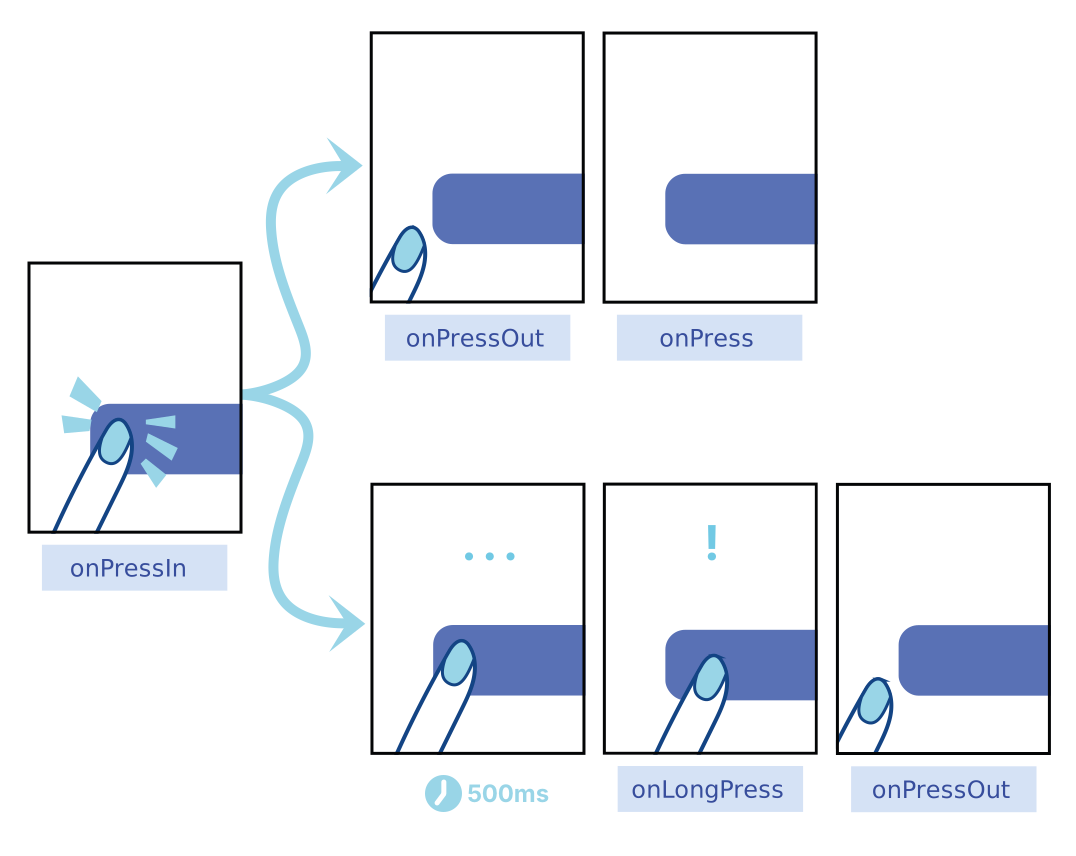
**On an element wrapped by Pressable:**
- [onPressIn](https://reactnative.dev/docs/pressable#onpressin) is called when a press is activated.
- [onPressOut](https://reactnative.dev/docs/pressable#onpressout) is called when the press gesture is deactivated.
**After onPressIn, the user will either:**
- Remove their finger, triggering [onPressOut](https://reactnative.dev/docs/pressable#onpressout) followed
by [onPress](https://reactnative.dev/docs/pressable#onpress).
- Hold their finger longer than 500 milliseconds before removing it, [onLongPress](https://reactnative.dev/docs/pressable#onlongpress)
is triggered. _([onPressOut](https://reactnative.dev/docs/pressable#onpressout) will still fire when they remove their finger)_.
Diagram from React Native Documentation
:::note
The touch area never extends past the parent view bounds and the Z-index of sibling views always takes precedence if a touch hits two overlapping views.
:::
### HitRect & HitSlop
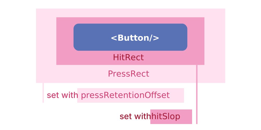
Fingers are not the most precise instruments, and it is common for users to accidentally activate the wrong element or miss
the activation area. To help, `Pressable` has an optional `HitRect` you can use to define how far a touch can register away from
the wrapped element. Presses can start anywhere within a `HitRect`.
`PressRect` allows presses to move beyond the element and its `HitRect` while maintaining activation and being eligible for a
"press"—think of sliding your finger slowly away from a button you're pressing down on.
Diagram from React Native Documentation
_You can set `HitRect` with `hitSlop` and set `PressRect` with `pressRetentionOffset`_.
:::info More documentation
`Pressable` uses React Native's `Pressability` API. For more information around the state machine flow of `Pressability` and how it works, check out the [`Pressability` implementation](https://github.com/facebook/react-native/blob/main/packages/react-native/Libraries/Pressability/Pressability.js#L350).
:::
### Styling
The `style` prop can be a function, an array of objects, or an object that defines the style of the `Pressable` component with design tokens.
When using a function, the function will receive the `pressed` state as an argument.
Additionally, the `children` prop can be a function that receives the `pressed` state as an argument or a React element.
```tsx example
() => {
return (
{
return {
width: 125,
height: 125,
borderWidth: pressed ? 10 : 4,
borderRadius: '$core.border-radius.xl',
borderColor: pressed
? '$semantic.color.border.status.subtle.success'
: '$semantic.color.border.status.subtle.error',
backgroundColor: pressed
? '$semantic.color.surface.container.status.success.tint'
: '$semantic.color.surface.container.status.error.tint',
margin: '$semantic.spacing.lg',
padding: '$semantic.spacing.sm',
alignItems: 'center',
justifyContent: 'center',
};
}}
onPress={() => {
console.log('onPress Called!');
}}
onPressIn={() => {
console.log('onPressIn Called!');
}}
onPressOut={() => {
console.log('onPressOut Called!');
}}
onLongPress={() => {
console.log('onLongPress Called!');
}}
>
{({ pressed }) => {
return (
{pressed ? 'Release Me' : 'Press Me'}
);
}}
);
};
```
### Best Practices
- **Press Feedback:** Always provide clear visual feedback (like color changes or animations) to indicate the element has been pressed.
- **Hit Slop:** Use the `hitSlop` prop to extend the touchable area if needed, especially for smaller elements.
- **Optimize Press Timing**: Use `onPressIn` and `onPressOut` wisely to handle animations or delays without affecting user experience.
## Accessibility Considerations
- **Pressable Texts:** Ensure that the label of the pressable is descriptive for screen readers.
- **Feedback for Press**: Make sure the visual feedback is discernible for all users, including those with visual impairments.
- **Keyboard Navigation:** Ensure that pressable components are focusable and navigable with a keyboard.
### Pressable Classes
### Pressable Props
## Pressable Props
| Prop | Type | Description | Default | Required |
|------|------|-------------|---------|----------|
| `android_ripple` | `PressableAndroidRippleConfig \| null \| undefined` | Enables the Android ripple effect and configures its color. | `-` | No |
| `hitSlop` | `Insets \| Inset \| null \| undefined` | This defines how far a touch event can start away from the view. Typical interface guidelines recommend touch targets that are at least 30 - 40 points/density-independent pixels. If a Touchable view has a height of 20 the touchable height can be extended to 40 with `hitSlop={{ top: 10, bottom: 10, left: 0, right: 0 }}` NOTE The touch area never extends past the parent view bounds and the Z-index of sibling views always takes precedence if a touch hits two overlapping views. | `-` | No |
| `pressRetentionOffset` | `Insets \| Inset \| null \| undefined` | Additional distance outside of this view in which a touch is considered a press before `onPressOut` is triggered. | `-` | No |
| `style` | `((state: PressableStateCallbackType) => Abyss.Style<"Pressable">) \| Abyss.Style<"Pressable">` | Pressable style properties with Abyss token mapping | `-` | No |
---
id: refresh-control
category: Core
title: RefreshControl
description: A standard control that can initiate the refreshing of a scroll view's contents.
sourceIsTS: true
---
```jsx
import { RefreshControl } from '@uhg-abyss/mobile';
```
## Usage
The `RefreshControl` component is used to implement pull-to-refresh functionality in scrollable views,
such as `ScrollView`, `FlatList`, or `SectionList`. This component is a customized version of React
Native's core RefreshControl, offering enhanced styling, animations, and better integration with our
design system.
:::note
`refreshing` is a controlled prop, which is why it needs to be set to `true` in the `onRefresh` function. Otherwise, the refresh indicator will stop immediately.
:::
```jsx
() => {
const [refreshing, setRefreshing] = useState(false);
const onRefresh = useCallback(() => {
setRefreshing(true);
setTimeout(() => {
setRefreshing(false);
}, 4500);
}, []);
return (
}
>
Pull down to see RefreshControl indicator
);
};
```
### RefreshControl Classes
### RefreshControl Props
## RefreshControl Props
| Prop | Type | Description | Default | Required |
|------|------|-------------|---------|----------|
| `colors` | `Abyss.Color[] \| undefined` | The colors (at least one) that will be used to draw the refresh indicator | `-` | No |
| `hitSlop` | `number \| Insets \| null \| undefined` | This defines how far a touch event can start away from the view. Typical interface guidelines recommend touch targets that are at least 30 - 40 points/density-independent pixels. If a Touchable view has a height of 20 the touchable height can be extended to 40 with `hitSlop={{ top: 10, bottom: 10, left: 0, right: 0 }}` NOTE The touch area never extends past the parent view bounds and the Z-index of sibling views always takes precedence if a touch hits two overlapping views. | `-` | No |
| `progressBackgroundColor` | `Abyss.Color \| undefined` | The background color of the refresh indicator | `-` | No |
| `progressViewOffset` | `Abyss.Space \| undefined` | The distance between the refresh indicator and the top of the view | `-` | No |
| `style` | `Abyss.Style<"RefreshControl">` | RefreshControl style properties with Abyss token mapping | `-` | No |
| `tintColor` | `Abyss.Color \| undefined` | The color of the refresh indicator | `-` | No |
| `titleColor` | `Abyss.Color \| undefined` | The color of the refresh indicator title | `-` | No |
---
id: safe-area-view
category: Core
title: SafeAreaView
description: Render content within the safe area boundaries of a device.
sourceIsTS: true
---
```jsx
import { SafeAreaView } from '@uhg-abyss/mobile';
```
## Usage
The purpose of `SafeAreaView` is to render content within the safe area boundaries of a device.
The Abyss SafeAreaView is built on top of the SafeAreaView component provided by the [react-native-safe-area-context](https://github.com/AppAndFlow/react-native-safe-area-context) library.
Please install the library in your project to use the Abyss SafeAreaView component. If the library is not installed, the Abyss SafeAreaView will fallback to the React Native SafeAreaView component.
`SafeAreaView` renders nested content and automatically applies padding to reflect the portion
of the view that is not covered by navigation bars, tab bars, toolbars, and other ancestor
views. Moreover, and most importantly, Safe Area's paddings reflect the physical limitation
of the screen, such as rounded corners or camera notches (i.e. the sensor housing area on iPhone 13).
## Edges
You can set the edges to apply the safe area insets to by using the `edges` prop.
For example if you don't want insets to apply to the top edge because the view does not touch the top of the screen you can use:
```jsx
...
```
Optionally it can be set to an object `{ top?: EdgeMode, right?: EdgeMode, bottom?: EdgeMode, left?: EdgeMode }` where `EdgeMode = 'off' | 'additive' | 'maximum'`.
Additive is a default mode and is the same as passing and edge in the array: `finalPadding = safeArea + padding`.
Maximum mode will use safe area inset or padding/margin (depends on mode) if safe area is less: `finalPadding = max(safeArea, padding)`.
For example if you want a floating UI element that should be at the bottom safe area edge on devices with safe area or 24px from the
bottom of the screen on devices without safe area or if safe area is less than 24px:
```jsx
...
```
## Example
```jsx
This is a SafeAreaView that avoids the Status Bar
This is a SafeAreaView that avoids the Home Bar
```
```tsx example
() => {
const PhoneContainer = styled('View', {
justifyContent: 'space-between',
width: '100%',
});
const PaddedView = styled('View', {
paddingHorizontal: '$semantic.spacing.lg',
backgroundColor: '$core.color.brand.100',
width: '100%',
variants: {
placement: {
top: {
paddingTop: 40,
paddingBottom: '$semantic.spacing.lg',
},
bottom: {
paddingBottom: 28,
paddingTop: '$semantic.spacing.lg',
},
},
},
});
const Label = styled('Text', {
color: '$semantic.color.text.body.alt',
fontSize: '$semantic.font-size.body.60',
textAlign: 'center',
});
return (
);
};
```
### SafeAreaView Classes
### SafeAreaView Props
## SafeAreaView Props
| Prop | Type | Description | Default | Required |
|------|------|-------------|---------|----------|
| `edges` | `Edges \| undefined` | Sets the edges to apply the safe area insets to. For example if you don't want insets to apply to the top edge because the view does not touch the top of the screen you can use: ```tsx ``` You can also specify edge modes: ```tsx ``` - `'off'` - don't apply insets for the specified edge - `'additive'` - (default) add the safe area inset to the existing padding or margin - `'maximum'` - use the larger of the existing padding/margin or the safe area inset | `-` | No |
| `hitSlop` | `number \| Insets \| null \| undefined` | This defines how far a touch event can start away from the view. Typical interface guidelines recommend touch targets that are at least 30 - 40 points/density-independent pixels. If a Touchable view has a height of 20 the touchable height can be extended to 40 with `hitSlop={{ top: 10, bottom: 10, left: 0, right: 0 }}` NOTE The touch area never extends past the parent view bounds and the Z-index of sibling views always takes precedence if a touch hits two overlapping views. | `-` | No |
| `mode` | `"padding" \| "margin" \| undefined` | The mode to use to apply safe area insets. 'padding' will add the insets to the existing padding of the view, while 'margin' will add the insets to the existing margin of the view. Defaults to 'padding'. | `'padding'` | No |
| `onBlur` | `Abyss.NativeSyntheticEventHandler` | Called when the view loses focus | `-` | No |
| `onFocus` | `Abyss.NativeSyntheticEventHandler` | Called when the view gains focus | `-` | No |
| `style` | `Abyss.Style<"SafeAreaView">` | SafeAreaView style properties with Abyss token mapping | `-` | No |
---
id: scroll-view
category: Core
title: ScrollView
description: A generic scrolling container that can host multiple components and views.
sourceIsTS: true
---
## Usage
The `ScrollView` component is a scrollable container that can hold a variety of elements,
enabling vertical or horizontal scrolling. This customized version of React Native's [ScrollView](https://reactnative.dev/docs/scrollview)
component integrates Abyss design tokens and performance optimizations for a smooth and responsive experience.
```tsx example
() => {
return (
Scroll Me
Lorem ipsum odor amet, consectetuer adipiscing elit. Elit lacinia
torquent et mauris habitasse netus efficitur aenean aptent. Finibus
posuere maximus tortor, nisi bibendum ultricies. Tellus integer eu
commodo sed pharetra mauris quam potenti mauris. Convallis nisl auctor
risus mattis id. Himenaeos turpis egestas consequat tortor aliquam,
dictumst integer volutpat eu. Quis leo ex parturient arcu sagittis. Et
nostra platea vestibulum bibendum pharetra accumsan semper cursus.
{'\n'}
{'\n'}
Dictum porttitor penatibus auctor nisl; sem porttitor curae quisque.
Ipsum accumsan eu vestibulum ligula, vehicula integer. Nunc varius massa
placerat conubia mus magna. Aliquet eleifend porttitor porta mattis
consectetur habitasse at fringilla. Odio aptent aliquam sociosqu justo
egestas adipiscing ac conubia. Bibendum ultrices commodo ante mus mollis
netus.
{'\n'}
{'\n'}
Bibendum taciti habitant ridiculus scelerisque aliquam varius lacus
maximus. Efficitur facilisis parturient auctor accumsan nascetur ad
phasellus lectus. Lacinia natoque conubia convallis habitant mauris
eleifend. Turpis consectetur tempor egestas taciti; venenatis cursus?
Cursus congue adipiscing purus neque vitae nibh? Risus accumsan
ullamcorper velit eros tellus curae. Interdum nascetur morbi; pharetra
id venenatis volutpat potenti. Convallis senectus praesent lectus nisi
eget justo vitae. Venenatis ornare sociosqu euismod feugiat integer.
Curae odio massa purus eu facilisis laoreet.
{'\n'}
{'\n'}
Lectus curabitur scelerisque mus auctor nascetur iaculis ante risus.
Tristique conubia nisl inceptos bibendum pellentesque. Eleifend
imperdiet gravida pellentesque hendrerit eget dignissim magnis varius
augue. Curabitur proin porttitor molestie gravida amet praesent et
fringilla. Ante etiam at gravida efficitur cubilia rutrum torquent
adipiscing. Parturient bibendum id convallis torquent venenatis. Lacinia
primis leo nullam tincidunt consectetur quisque. Elementum tristique
quis magnis ornare molestie venenatis. Sollicitudin netus class rutrum
proin; curabitur facilisis convallis pretium sollicitudin. Feugiat
volutpat eget arcu convallis ultricies id.
);
};
```
### ScrollView vs FlatList
`ScrollView` renders all its child components all at once, even if the component is not in view.
This can negatively affect the performance of the app by requiring more processing power and memory usage when rendering a large number of items.
This is where [FlatList](/mobile/core/flat-list) comes into play. `FlatList` renders items lazily, before they
appear on screen. It also removes items that scroll off-screen to save memory and processing time.
`FlatList` is also handy if you want to render separators between your items, multiple columns,
infinite scrolling, or any number of other features it supports out of the box.
### Best Practices
- **Minimize Overdraw:** Use a background color to avoid unnecessary redrawing of background elements.
- **Limit Scrollable Content:** Avoid putting too many elements inside a `ScrollView`. If the content grows large, consider using a `FlatList` or `SectionList` for better performance.
- **Optimize Images:** When scrolling with images, ensure they are properly sized and optimized to prevent memory issues.
## Considerations
- **Bounded Height:** The `ScrollView` must have a bounded height, since they contain children with unbound-heights.
- To set the height of a `ScrollView`, either define a height directly (discouraged) or make sure the parent Components have bounded height.
- **Nested Responders:** `ScrollView` does not yet support preventing touch gestures on its children from becoming scroll gestures.
- This doesn't mean that responders won't work inside of a `ScrollView`. It simply means `ScrollView` will prioritize its own responder if it detects a gesture that could be interpreted as a scroll.
- _*For more information, check out React Native's [Gesture Responder System](https://reactnative.dev/docs/gesture-responder-system).*_
### Accessibility Considerations
- **Keyboard Focus:** Ensure that the content inside the `ScrollView` is reachable and visible when users navigate with a keyboard.
- **Readable Labels:** Label any scrollable area for screen readers, so users know they can scroll through the content.
- **Scroll Indicators:** Allow scroll indicators to be visible for accessibility users, so they are aware of the scrollable content.
### Performance Considerations
- **Rendering Limits:** Avoid placing too many child components inside a `ScrollView` as it can cause performance bottlenecks. Instead, use lists (`FlatList`,`SectionList`) for large datasets.
- **Lazy Loading:** Consider lazy loading for content-heavy views to avoid loading everything upfront.
- **Batch Updates:** Ensure updates to the scroll view content are batched to reduce rendering overhead.
### ScrollView Classes
### ScrollView Props
## ScrollView Props
| Prop | Type | Description | Default | Required |
|------|------|-------------|---------|----------|
| `contentContainerStyle` | `Abyss.Style<"View">` | These styles will be applied to the scroll view content container which wraps all of the child views. | `-` | No |
| `contentInset` | `Insets \| undefined` | The amount by which the scroll view content is inset from the edges of the scroll view. Defaults to `{top: 0, left: 0, bottom: 0, right: 0}`. | `-` | No |
| `contentOffset` | `PointProp \| undefined` | Used to manually set the starting scroll offset. The default value is `{ x: 0, y: 0 }` | `-` | No |
| `endFillColor` | `Abyss.Color \| undefined` | Sometimes a ScrollView takes up more space than its content fills. When this is the case, this prop will fill the rest of the ScrollView with a color to avoid setting a background and creating unnecessary overdraw. This is an advanced optimization that is not needed in the general case. | `-` | No |
| `fadingEdgeLength` | `Abyss.Space \| undefined` | Fades out the edges of the scroll content. If the value is greater than 0, the fading edges will be set accordingly to the current scroll direction and position, indicating if there is more content to show. The default value is 0. | `-` | No |
| `hitSlop` | `number \| Insets \| null \| undefined` | This defines how far a touch event can start away from the view. Typical interface guidelines recommend touch targets that are at least 30 - 40 points/density-independent pixels. If a Touchable view has a height of 20 the touchable height can be extended to 40 with `hitSlop={{ top: 10, bottom: 10, left: 0, right: 0 }}` NOTE The touch area never extends past the parent view bounds and the Z-index of sibling views always takes precedence if a touch hits two overlapping views. | `-` | No |
| `style` | `Abyss.Style<"ScrollView">` | ScrollView style properties with Abyss token mapping | `-` | No |
---
id: section-list
category: Core
title: SectionList
description: A performant interface for rendering sectioned lists.
sourceIsTS: true
---
## Usage
The `SectionList` component is a high-performance list component that efficiently renders sectioned lists. It is ideal for rendering lists with sections and supports the most handy features like:
- Full tokenization support.
- Fully cross-platform.
- Configurable viewability callbacks.
- List header support.
- List footer support.
- Item separator support.
- Section header support.
- Section separator support.
- Heterogeneous data and item rendering support.
- Pull to Refresh.
- Scroll loading.
:::tip
If you don't need section support and want a simpler interface, use a [FlatList](/mobile/core/flat-list).
:::
```tsx example
() => {
const data = [
{
title: 'Main Dishes',
data: ['Pizza', 'Burger', 'Risotto'],
},
{
title: 'Sides',
data: ['French Fries', 'Onion Rings', 'Fried Shrimps'],
},
{
title: 'Drinks',
data: ['Water', 'Coke', 'Beer'],
},
{
title: 'Desserts',
data: ['Cheese Cake', 'Ice Cream', 'Brownies'],
},
];
const Item = styled('Text', {
backgroundColor: '$semantic.color.surface.container.emphasis.4',
padding: '$semantic.spacing.lg',
marginVertical: '$semantic.spacing.xs',
fontSize: '$core.font-size.h.40',
color: '$core.color.brand.100',
borderWidth: 2.5,
borderColor: '$core.color.brand.100',
});
return (
{
return item + index;
}}
renderItem={({ item }) => {
return {item};
}}
renderSectionHeader={({ section: { title } }) => {
return (
{title}
);
}}
contentContainerStyle={{ padding: '$semantic.spacing.lg' }}
/>
);
};
```
### Best Practices
- **Use Memoization:** Use [React.memo()](https://react.dev/reference/react/memo) to avoid unnecessary re-renders of list items.
- **Section Headers:** Keep section headers concise to avoid taking up too much space.
- **Key Management:** Ensure that the `keyExtractor` for individual items and sections is unique to avoid rerender issues.
## Considerations
_`SectionList` is a convenience wrapper around [VirtualizedList](/mobile/core/virtualized-list), and thus inherits its props (as well as those of [ScrollView](/mobile/core/scroll-view)) that aren't explicitly listed here, along with the following caveats:_
- **Internal State:** Internal state is not preserved when content scrolls out of the render window. Ensure all your data is captured in the item data or external stores like Flux, Redux, or Relay.
- **Prop Updates:** This is a `PureComponent` meaning it will not re-render if props remain shallow-equal. Make sure that everything your `renderItem` function depends on is passed as a prop (e.g. `extraData`) that is not `===` after updates, otherwise your UI may not update on changes. This includes the `data` prop and parent component state.
- **Item Rendering:** In order to constrain memory and enable smooth scrolling, content is rendered asynchronously offscreen. This means it's possible to scroll faster than the fill rate and momentarily see blank content. This is a tradeoff that can be adjusted to suit the needs of each application.
- **Key Management:** By default, the list looks for a `key` prop on each item and uses that for the React key. Alternatively, you can provide a custom `keyExtractor` prop.
### Accessibility Considerations
- **Navigable Sections:** Ensure section headers and items are properly labeled for screen readers.
- **Focus Management:** When rendering additional sections, ensure the user focus remains consistent without jumping or losing context.
### Performance Considerations
- **Batch Updates:** Use batch updates to avoid triggering multiple re-renders when updating section data.
- **SectionHeader Optimization:** Memoize section headers to prevent unnecessary re-renders during list scrolls.
- **Windowing:** Use `initialNumToRender` and `maxToRenderPerBatch` props to control how many items are rendered initially and in each batch to avoid overloading the UI with too many items at once.
- **Recycling Cells:** Consider using `CellRenderComponent` to recycle rendered items and improve rendering performance for large lists.
### SectionList Classes
### SectionList Props
## SectionList Props
| Prop | Type | Description | Default | Required |
|------|------|-------------|---------|----------|
| `contentContainerStyle` | `Abyss.Style<'View'> \| undefined` | These styles will be applied to the scroll view content container which wraps all of the child views. | `-` | No |
| `contentInset` | `Insets \| undefined` | The amount by which the scroll view content is inset from the edges of the scroll view. Defaults to `{top: 0, left: 0, bottom: 0, right: 0}`. | `-` | No |
| `contentOffset` | `PointProp \| undefined` | Used to manually set the starting scroll offset. The default value is `{ x: 0, y: 0 }` | `-` | No |
| `endFillColor` | `Abyss.Color \| undefined` | Sometimes a ScrollView takes up more space than its content fills. When this is the case, this prop will fill the rest of the ScrollView with a color to avoid setting a background and creating unnecessary overdraw. This is an advanced optimization that is not needed in the general case. | `-` | No |
| `fadingEdgeLength` | `Abyss.Space \| undefined` | Fades out the edges of the scroll content. If the value is greater than 0, the fading edges will be set accordingly to the current scroll direction and position, indicating if there is more content to show. The default value is 0. | `-` | No |
| `hitSlop` | `number \| Insets \| null \| undefined` | This defines how far a touch event can start away from the view. Typical interface guidelines recommend touch targets that are at least 30 - 40 points/density-independent pixels. If a Touchable view has a height of 20 the touchable height can be extended to 40 with `hitSlop={{ top: 10, bottom: 10, left: 0, right: 0 }}` NOTE The touch area never extends past the parent view bounds and the Z-index of sibling views always takes precedence if a touch hits two overlapping views. | `-` | No |
| `ListFooterComponentStyle` | `Abyss.Style<'View'> \| undefined` | Styling for internal View for ListFooterComponent | `-` | No |
| `ListHeaderComponentStyle` | `Abyss.Style<'View'> \| undefined` | Styling for internal View for ListHeaderComponent | `-` | No |
| `style` | `Abyss.Style<'SectionList'> \| undefined` | SectionList style properties with Abyss token mapping | `-` | No |
---
id: status-bar
category: Core
title: StatusBar
description: Component to control the app's status bar.
sourceIsTS: true
---
```jsx
import { StatusBar } from '@uhg-abyss/mobile';
```
## Usage
The `StatusBar` component controls the app's status bar. The status bar is the zone, typically at the top of
the screen, that displays the current time, Wi-Fi and cellular network information, battery level
and/or other status icons.
This component is a customized version of React Native's `StatusBar` core component, offering additional configuration
options and integration with our design system. It allows you to manage the status bar's `style`, `visibility`, and `backgroundColor`
to match the application's theme with our design tokens.
## Usage with Navigator
It is possible to have multiple StatusBar components mounted at the same time. The props will
be merged in the order the StatusBar components were mounted.
## Imperative API
For cases where using a component is not ideal, there is also an imperative API exposed as
static functions on the component. However, it is not recommended to use the static API and the
component for the same prop because any value set by the static API will get overridden by the one
set by the component in the next render.
## Performance Considerations
The StatusBar is a lightweight component, but to ensure optimal performance:
- **Minimize Dynamic Changes:** Limit frequent updates to the status bar's properties, as unnecessary changes
can impact performance, especially on lower-end devices.
- **Use Animations Judiciously:** While animations can enhance the user experience, use them sparingly to
avoid performance degradation.
## Accessibility Considerations
When configuring the StatusBar, ensure that the chosen colors and styles provide sufficient contrast
and readability. The status bar should be easily readable in various lighting conditions and should not
obscure critical content or UI elements.
### StatusBar Classes
### StatusBar Props
## StatusBar Props
| Prop | Type | Description | Default | Required |
|------|------|-------------|---------|----------|
| `backgroundColor` | `Abyss.Color \| undefined` | Background color of the status bar. | `-` | No |
---
id: touchable-highlight
category: Core
title: TouchableHighlight
description: A wrapper for making views respond properly to touches.
sourceIsTS: true
---
:::tip
If you're looking for a more extensive and future-proof way to handle touch-based input, check out the [`Pressable` API](/mobile/core/pressable).
:::
## Usage
`TouchableHighlight` is a wrapper for handling pressEvents of a `View`. While pressing down, the opacity of the wrapped view
is decreased, allowing the underlay color to show through.
```jsx
function MyComponent(props: MyComponentProps) {
return (
My Component
);
}
alert('Pressed!')}
>
;
```
```tsx example
() => {
return (
{}}
>
Gray Touchable Highlight
);
};
```
## Considerations
- **Visual Artifacts:** The underlay comes from wrapping the child in a `View` component. This can sometimes cause unwanted visual artifacts and affect layout if not used correctly.
For example, if the `backgroundColor` of the wrapped `View` is not explicitly set to an opaque color.
- **Children:** `TouchableHighlight` can only have a single child. If you wish to have several children, wrap them in a `View`.
### Accessibility Considerations
- **Feedback for Users:** Ensure that the visual feedback (`underlayColor` color) is noticeable for users with visual impairments.
- **Screen Reader Support:** Label the component appropriately for screen readers so users understand the interaction.
- **Keyboard Focus:** Ensure the component can be focused and activated using a keyboard for accessibility.
### TouchableHighlight Classes
### TouchableHighlight Props
## TouchableHighlight Props
| Prop | Type | Description | Default | Required |
|------|------|-------------|---------|----------|
| `activeOpacity` | `Abyss.Opacity \| undefined` | Determines what the opacity of the wrapped view should be when touch is active | `-` | No |
| `hitSlop` | `Insets \| Inset \| null \| undefined` | This defines how far your touch can start away from the button. This is added to pressRetentionOffset when moving off of the button. NOTE The touch area never extends past the parent view bounds and the Z-index of sibling views always takes precedence if a touch hits two overlapping views. | `-` | No |
| `pressRetentionOffset` | `Insets \| Inset \| null \| undefined` | When the scroll view is disabled, this defines how far your touch may move off of the button, before deactivating the button. Once deactivated, try moving it back and you'll see that the button is once again reactivated! Move it back and forth several times while the scroll view is disabled. Ensure you pass in a constant to reduce memory allocations. | `-` | No |
| `style` | `Abyss.Style<"TouchableHighlight">` | TouchableHighlight style properties with Abyss token mapping | `-` | No |
| `underlayColor` | `Abyss.Color \| undefined` | The color of the underlay that will show through when the touch is active | `-` | No |
---
id: touchable-opacity
category: Core
title: TouchableOpacity
description: A wrapper for making views respond properly to touches.
sourceIsTS: true
---
:::tip
If you're looking for a more extensive and future-proof way to handle touch-based input, check out the [`Pressable` API](/mobile/core/pressable).
:::
## Usage
The `TouchableOpacity` component is used to create pressable elements that fade out on press,
providing smooth and subtle visual feedback. This component is lightweight and often used for
buttons or other pressable elements that require an opacity change on interaction. This customized
version of the React Native `TouchableOpacity` component is enhanced to supports Abyss design tokens and fit seamlessly into our design system.
Opacity is controlled by wrapping the children in an `Animated.View`, which is added to the view
hierarchy. Be aware that this can affect layout.
```tsx example
() => {
const styles = StyleSheet.create({
button: {
borderWidth: 2,
padding: '$semantic.spacing.lg',
alignItems: 'center',
borderRadius: 100,
borderColor: '$semantic.color.border.status.saturated.info',
backgroundColor: '$semantic.color.surface.container.emphasis.4',
},
});
return (
Opacity Button
);
};
```
### Best Practices
- **Consistent Opacity:** Use consistent values for activeOpacity across your app to maintain uniformity in user interactions.
- **Clear Press Feedback:** Ensure that the change in opacity is noticeable enough to signal to users that the element is pressed.
- **Layering Components:** Be mindful when layering TouchableOpacity over complex backgrounds, as the fade effect might not be as visible.
## Accessibility Considerations
- **Visual Feedback:** Ensure the fade effect is sufficiently noticeable for all users, especially those with visual impairments.
- **Keyboard Navigation:** Ensure the component can be navigated and activated via a keyboard.
- **Accessible Labels:** Add descriptive labels to the TouchableOpacity component so screen readers can convey its functionality.
### TouchableOpacity Classes
### TouchableOpacity Props
## TouchableOpacity Props
| Prop | Type | Description | Default | Required |
|------|------|-------------|---------|----------|
| `activeOpacity` | `Abyss.Opacity \| undefined` | Determines what the opacity of the wrapped view should be when touch is active | `-` | No |
| `hitSlop` | `Insets \| Inset \| null \| undefined` | This defines how far your touch can start away from the button. This is added to pressRetentionOffset when moving off of the button. NOTE The touch area never extends past the parent view bounds and the Z-index of sibling views always takes precedence if a touch hits two overlapping views. | `-` | No |
| `pressRetentionOffset` | `Insets \| Inset \| null \| undefined` | When the scroll view is disabled, this defines how far your touch may move off of the button, before deactivating the button. Once deactivated, try moving it back and you'll see that the button is once again reactivated! Move it back and forth several times while the scroll view is disabled. Ensure you pass in a constant to reduce memory allocations. | `-` | No |
| `style` | `Abyss.Style<"TouchableOpacity">` | TouchableOpacity style properties with Abyss token mapping | `-` | No |
---
id: touchable-without-feedback
category: Core
title: TouchableWithoutFeedback
description: Captures touch events without providing any visual feedback.
sourceIsTS: true
---
:::tip
If you're looking for a more extensive and future-proof way to handle touch-based input, check out the [`Pressable` API](/mobile/core/pressable).
:::
## Usage
The `TouchableWithoutFeedback` component is a wrapper that captures touch events without providing any visual feedback.
It is ideal for handling touch events on components that don't need to display any visual feedback.
:::warning
Do not use unless you have a very good reason. All elements that respond to press should have a visual feedback when touched.
:::
```tsx
function MyComponent(props: MyComponentProps) {
return (
My Component
);
}
alert('Pressed!')}>
;
```
### Example
```tsx example
() => {
const Container = styled('View', {
flex: 1,
justifyContent: 'center',
paddingHorizontal: '$semantic.spacing.lg',
});
const CountContainer = styled('View', {
alignItems: 'center',
padding: '$semantic.spacing.lg',
});
const Count = styled('Text', {
color: '$semantic.color.text.label.status.info',
});
const ButtonView = styled('View', {
alignItems: 'center',
backgroundColor:
'$semantic.color.surface.interactive.standards.active.secondary',
padding: '$semantic.spacing.sm',
});
const [count, setCount] = useState(0);
const handlePress = () => {
setCount(count + 1);
};
return (
Count: {count}Increment
);
};
```
### Best Practices
- **Use Sparingly:** Only use `TouchableWithoutFeedback` when no visual feedback is required or desired.
If feedback is expected, use `Pressable` or `TouchableOpacity` instead.
- **Visual Feedback:** Ensure the child components provide sufficient visual feedback, even if `TouchableWithoutFeedback` does not.
- **Invisible Buttons:** Consider accessibility implications if `TouchableWithoutFeedback` is used to
create invisible or hidden touch areas.
## Considerations
- **Number of Children:** `TouchableWithoutFeedback` only supports one child. If you wish to have several child components, wrap them in a View.
- **Prop Spread:** `TouchableWithoutFeedback` Does not handle touch events directly, it clones its child and applies responder props to the clone.
Therefore it is important that any intermediary components pass props through to the underlying React Native component.
### Accessibility Considerations
- **Keyboard Navigation:** Ensure the component is accessible via keyboard and focusable if needed.
- **Screen Reader Labels:** If touchable areas are hidden or provide no feedback, ensure the interactive
area is described accurately for screen readers.
### TouchableWithoutFeedback Classes
### TouchableWithoutFeedback Props
## TouchableWithoutFeedback Props
| Prop | Type | Description | Default | Required |
|------|------|-------------|---------|----------|
| `hitSlop` | `Insets \| Inset \| null \| undefined` | This defines how far your touch can start away from the button. This is added to pressRetentionOffset when moving off of the button. NOTE The touch area never extends past the parent view bounds and the Z-index of sibling views always takes precedence if a touch hits two overlapping views. | `-` | No |
| `pressRetentionOffset` | `Insets \| Inset \| null \| undefined` | When the scroll view is disabled, this defines how far your touch may move off of the button, before deactivating the button. Once deactivated, try moving it back and you'll see that the button is once again reactivated! Move it back and forth several times while the scroll view is disabled. Ensure you pass in a constant to reduce memory allocations. | `-` | No |
| `style` | `Abyss.Style<"TouchableWithoutFeedback">` | TouchableWithoutFeedback style properties with Abyss token mapping | `-` | No |
---
id: view
category: Core
title: View
description: The most fundamental core component for building a UI, a container that supports layout.
sourceIsTS: true
---
```jsx
import { View } from '@uhg-abyss/mobile';
```
## Usage
The `View` component is one of the fundamental building blocks of a user interface. It functions as a
container that supports layout, styling, and interaction handling. The component serves as a versatile
wrapper for organizing and displaying other components within a user interface.
While it extends the core View component present in React Native, the `View` component in Abyss Mobile
allows using tokens directly in the style prop. This feature enables developers to use the design tokens
defined in the theme to style a component.
This example creates a View that wraps two boxes with color and a text component in a row with padding.
Notice the use of design tokens in the style prop.
```tsx example
() => {
return (
Hello World!
);
};
```
:::info Styling
Views are designed to be used with [`StyleSheet`](/mobile/ui/style-sheet) for clarity and performance, although inline styles are also supported.
:::
## Best Practices
- **Use for Layout**: Utilize the `View` component to create layouts and organize components within a user interface. For
text context, consider using the [Text component](/mobile/ui/text).
- **Avoid Excessive Nesting**: Limit the number of nested `View` components to maintain a clean and efficient layout.
- **Use Tokens**: Leverage design tokens in the style prop to ensure consistency and maintainability in styling.
- **Accessibility**: Ensure that the content within the `View` component is accessible to all users by providing
appropriate labels and descriptions where necessary.
## Performance Considerations
To maximize performance, be mindful of:
- **Shallow component trees**: Minimize nesting `View` components to reduce the complexity of the component tree.
- **Avoid unnecessary re-renders**: Use `React.memo` or similar optimization when rendering complex or frequently changing layouts.
### View Classes
### View Props
## View Props
| Prop | Type | Description | Default | Required |
|------|------|-------------|---------|----------|
| `hitSlop` | `number \| Insets \| null \| undefined` | This defines how far a touch event can start away from the view. Typical interface guidelines recommend touch targets that are at least 30 - 40 points/density-independent pixels. If a Touchable view has a height of 20 the touchable height can be extended to 40 with `hitSlop={{ top: 10, bottom: 10, left: 0, right: 0 }}` NOTE The touch area never extends past the parent view bounds and the Z-index of sibling views always takes precedence if a touch hits two overlapping views. | `-` | No |
| `onBlur` | `Abyss.NativeSyntheticEventHandler` | Called when the view loses focus | `-` | No |
| `onFocus` | `Abyss.NativeSyntheticEventHandler` | Called when the view gains focus | `-` | No |
| `style` | `Abyss.Style<"View">` | View style properties with Abyss token mapping | `-` | No |
---
id: virtualized-list
category: Core
title: VirtualizedList
description: A high-performance list component that efficiently renders only the items currently visible on the screen, regardless of the size of the data set.
sourceIsTS: true
---
## Usage
The `VirtualizedList` component is a high-performance list component that efficiently renders only the items currently
visible on the screen, regardless of the size of the data set.
This is the base implementation of the [FlatList](/mobile/core/flat-list) and [SectionList](/mobile/core/section-list) components. In general,
this should only be used if you need more flexibility than FlatList or SectionList can provides, e.g. for use with immutable data instead of plain arrays.
Virtualization massively improves the performance and memory consumption of large lists by maintaining a finite render window showing only active
items and replacing all items outside of the render window with appropriately sized blank space. The render window adapts with scrolling behavior,
items are rendered incrementally with _low-pri_ (after any running interactions) if they are far from the visible area, or with _hi-pri_ if they are near the visible area.
```tsx example
() => {
const ItemContainer = styled('View', {
backgroundColor: '$semantic.color.surface.accent.secondary',
height: 150,
justifyContent: 'center',
marginVertical: '$semantic.spacing.sm',
marginHorizontal: '$semantic.spacing.lg',
padding: 20,
});
const ItemText = styled('Text', {
fontSize: 32,
});
const Item = ({ title }) => {
return (
{title}
);
};
const getItem = (_data, index) => {
return {
id: Math.random().toString(12).substring(0),
title: `Item ${index + 1}`,
};
};
return (
{
return ;
}}
keyExtractor={(item) => {
return item.id;
}}
getItemCount={() => {
return 50;
}}
getItem={getItem}
ListFooterComponent={}
ListHeaderComponent={}
ListHeaderComponentStyle={{
borderColor: '$semantic.color.border.interactive.buttons.active.alt',
borderWidth: 4,
marginHorizontal: '$semantic.spacing.lg',
}}
ListFooterComponentStyle={{
borderColor: '$semantic.color.border.interactive.buttons.active.alt',
borderWidth: 4,
marginHorizontal: '$semantic.spacing.lg',
}}
/>
);
};
```
### Best Practices
- **Pagination:** Implement infinite scrolling by utilizing the `onEndReached` prop for large datasets.
- **Use Memoization:** Use [React.memo()](https://react.dev/reference/react/memo) to avoid unnecessary re-renders of list items.
- **Lazy Load Images:** If the list contains images, ensure they are lazy-loaded to avoid consuming memory unnecessarily.
- **Key Management:** Ensure `keyExtractor` returns a unique and stable key to avoid performance degradation caused by reordering or re-rendering items unnecessarily.
## Considerations
- **Internal State:** Internal state is not preserved when content scrolls out of the render window. Ensure all your data is captured in the item data or external stores like _Flux_, _Redux_, or _Relay_.
- **Prop Updates:** This is a `PureComponent` meaning it will not re-render if props remain shallow-equal. Make sure that everything your `renderItem` function depends on is in
passed as a prop (e.g. `extraData`) that is not `===` after updates, otherwise your UI may not update on changes. This includes the `data` prop and parent component state.
- **Item Rendering:** To constrain memory and enable smooth scrolling, content is rendered asynchronously offscreen. This means it's possible to scroll faster than the fill
rate and momentarily see blank content. This is a tradeoff that can be adjusted to suit the needs of each application.
- **Key Management:** By default, the list looks for a `key` prop on each item and uses that for the React key. Alternatively, you can provide a custom `keyExtractor` prop.
### Accessibility Considerations
- **Focus Retention:** Retain focus and scroll position when adding or removing items from the list.
- **Content Labeling:** Ensure each list item has accessible labels or descriptions for screen readers.
### Performance Considerations
- **Windowing:** Adjust the `initialNumToRender` and `windowSize` props to strike a balance between performance and UX.
- **Cell Recycling:** Use `CellRendererComponent` to efficiently recycle rendered items, especially for very large datasets.
- **Avoid Expensive Re-renders:** Avoid triggering unnecessary re-renders by memoizing components or using `React.PureComponent`.
### VirtualizedList Classes
### VirtualizedList Props
## VirtualizedList Props
| Prop | Type | Description | Default | Required |
|------|------|-------------|---------|----------|
| `contentContainerStyle` | `Abyss.Style<'View'> \| undefined` | These styles will be applied to the scroll view content container which wraps all of the child views. | `-` | No |
| `contentInset` | `Insets \| undefined` | The amount by which the scroll view content is inset from the edges of the scroll view. Defaults to `{top: 0, left: 0, bottom: 0, right: 0}`. | `-` | No |
| `contentOffset` | `PointProp \| undefined` | Used to manually set the starting scroll offset. The default value is `{ x: 0, y: 0 }` | `-` | No |
| `endFillColor` | `Abyss.Color \| undefined` | Sometimes a ScrollView takes up more space than its content fills. When this is the case, this prop will fill the rest of the ScrollView with a color to avoid setting a background and creating unnecessary overdraw. This is an advanced optimization that is not needed in the general case. | `-` | No |
| `fadingEdgeLength` | `Abyss.Space \| undefined` | Fades out the edges of the scroll content. If the value is greater than 0, the fading edges will be set accordingly to the current scroll direction and position, indicating if there is more content to show. The default value is 0. | `-` | No |
| `hitSlop` | `number \| Insets \| null \| undefined` | This defines how far a touch event can start away from the view. Typical interface guidelines recommend touch targets that are at least 30 - 40 points/density-independent pixels. If a Touchable view has a height of 20 the touchable height can be extended to 40 with `hitSlop={{ top: 10, bottom: 10, left: 0, right: 0 }}` NOTE The touch area never extends past the parent view bounds and the Z-index of sibling views always takes precedence if a touch hits two overlapping views. | `-` | No |
| `ListFooterComponentStyle` | `Abyss.Style<'View'> \| undefined` | Styling for internal View for ListFooterComponent | `-` | No |
| `ListHeaderComponentStyle` | `Abyss.Style<'View'> \| undefined` | Styling for internal View for ListHeaderComponent | `-` | No |
| `style` | `Abyss.Style<'VirtualizedList'> \| undefined` | VirtualizedList style properties with Abyss token mapping | `-` | No |
---
comment: |
This is an auto-generated file. DO NOT EDIT THIS FILE DIRECTLY.
To edit this file, modify the source file in the 'mobile/overview/' directory, then run the 'copy-abyss-info' script to regenerate this file.
slug: /mobile/ui/abyss-info/abyss-overview
id: abyss-overview
title: Abyss Overview
hide_table_of_contents: true
---
---
comment: |
This is an auto-generated file. DO NOT EDIT THIS FILE DIRECTLY.
To edit this file, modify the source file in the 'mobile/overview/' directory, then run the 'copy-abyss-info' script to regenerate this file.
slug: /mobile/ui/abyss-info/about
id: about
title: About Abyss
---
## What is Abyss?
## How Abyss works
## We Support Adoption
## Guiding Principles
## We Maintain Assets
## The Abyss Team
---
comment: |
This is an auto-generated file. DO NOT EDIT THIS FILE DIRECTLY.
To edit this file, modify the source file in the 'mobile/overview/' directory, then run the 'copy-abyss-info' script to regenerate this file.
slug: /mobile/ui/abyss-info/abyss-version-2
id: abyss-version-2
title: Abyss Version 2
hide_table_of_contents: true
---
## Abyss Design System version 2
## V2 prep for designers
## V2 prep for developers
## Stay Connected
---
comment: |
This is an auto-generated file. DO NOT EDIT THIS FILE DIRECTLY.
To edit this file, modify the source file in the 'mobile/overview/' directory, then run the 'copy-abyss-info' script to regenerate this file.
slug: /mobile/ui/abyss-info/releases
id: releases
title: Releases
hide_table_of_contents: true
---
---
comment: |
This is an auto-generated file. DO NOT EDIT THIS FILE DIRECTLY.
To edit this file, modify the source file in the 'mobile/overview/' directory, then run the 'copy-abyss-info' script to regenerate this file.
slug: /mobile/ui/abyss-info/contact-us
id: contact-us
title: Contact Us
hide_table_of_contents: true
---
## Support
## Requests
---
comment: |
This is an auto-generated file. DO NOT EDIT THIS FILE DIRECTLY.
To edit this file, modify the source file in the 'mobile/overview/' directory, then run the 'copy-abyss-info' script to regenerate this file.
slug: /mobile/ui/abyss-info/disclaimer
id: disclaimer
title: Mobile Components Disclaimer
---
As a note, these components were developed for use in a mobile application environment. For your convenience, we created documentation and interactive examples on our Abyss site. We have tried our best to accurately show the functionality and style of each component on these pages, but you may notice some differences and limitations as the optimal platform for viewing and interacting with these components is a mobile device.
A few examples are described below:
- [Date Input](/mobile/ui/date-input) requires native code, so this component is only supported on iOS and Android. There are no interactive examples in the documentation; only recordings of each feature are available. To fully interact with the date and time pickers you will need to import the component within a mobile development environment.
- [Modal](/mobile/ui/modal), and any component that uses Modal, takes up the entire browser window when opened. While it is intended to take up the entire phone screen as well, the content on the modal will fill much more space when used on a mobile device than it does in the browser window.
---
comment: |
This is an auto-generated file. DO NOT EDIT THIS FILE DIRECTLY.
To edit this file, modify the source file in the 'mobile/overview/' directory, then run the 'copy-abyss-info' script to regenerate this file.
id: abyss-overview
title: Abyss Overview
hide_table_of_contents: true
---
---
comment: |
This is an auto-generated file. DO NOT EDIT THIS FILE DIRECTLY.
To edit this file, modify the source file in the 'mobile/overview/' directory, then run the 'copy-abyss-info' script to regenerate this file.
id: about
title: About Abyss
---
## What is Abyss?
## How Abyss works
## We Support Adoption
## Guiding Principles
## We Maintain Assets
## The Abyss Team
---
comment: |
This is an auto-generated file. DO NOT EDIT THIS FILE DIRECTLY.
To edit this file, modify the source file in the 'mobile/overview/' directory, then run the 'copy-abyss-info' script to regenerate this file.
id: abyss-version-2
title: Abyss Version 2
hide_table_of_contents: true
---
## Abyss Design System version 2
## V2 prep for designers
## V2 prep for developers
## Stay Connected
---
comment: |
This is an auto-generated file. DO NOT EDIT THIS FILE DIRECTLY.
To edit this file, modify the source file in the 'mobile/overview/' directory, then run the 'copy-abyss-info' script to regenerate this file.
id: releases
title: Releases
hide_table_of_contents: true
---
---
comment: |
This is an auto-generated file. DO NOT EDIT THIS FILE DIRECTLY.
To edit this file, modify the source file in the 'mobile/overview/' directory, then run the 'copy-abyss-info' script to regenerate this file.
id: contact-us
title: Contact Us
hide_table_of_contents: true
---
## Support
## Requests
---
comment: |
This is an auto-generated file. DO NOT EDIT THIS FILE DIRECTLY.
To edit this file, modify the source file in the 'mobile/overview/' directory, then run the 'copy-abyss-info' script to regenerate this file.
id: disclaimer
title: Mobile Components Disclaimer
---
As a note, these components were developed for use in a mobile application environment. For your convenience, we created documentation and interactive examples on our Abyss site. We have tried our best to accurately show the functionality and style of each component on these pages, but you may notice some differences and limitations as the optimal platform for viewing and interacting with these components is a mobile device.
A few examples are described below:
- [Date Input](/mobile/ui/date-input) requires native code, so this component is only supported on iOS and Android. There are no interactive examples in the documentation; only recordings of each feature are available. To fully interact with the date and time pickers you will need to import the component within a mobile development environment.
- [Modal](/mobile/ui/modal), and any component that uses Modal, takes up the entire browser window when opened. While it is intended to take up the entire phone screen as well, the content on the modal will fill much more space when used on a mobile device than it does in the browser window.
---
id: design-checklist
title: Design Checklist
---
## Overview
Welcome to Abyss! If you're just starting out designing with Abyss, you're in the right place. Here's a checklist of everything you need to get up and running. Abyss design kit is available in Figma through our enterprise account (Optum/UHG).
## Create Figma Account
## Using the Designer Toolkit
## Review Updates
---
id: design-kit
title: Design Kit
---
## Overview
## Designer Toolkit
## Guidance
## Accessibility
## Contact Us
---
id: overview
title: Overview
---
## Design resources
## Support
---
comment: |
This is an auto-generated file. DO NOT EDIT THIS FILE DIRECTLY.
To edit this file, modify the source file in the 'mobile/overview/' directory, then run the 'copy-abyss-info' script to regenerate this file.
id: abyss-overview
title: Abyss Overview
hide_table_of_contents: true
---
---
comment: |
This is an auto-generated file. DO NOT EDIT THIS FILE DIRECTLY.
To edit this file, modify the source file in the 'mobile/overview/' directory, then run the 'copy-abyss-info' script to regenerate this file.
id: about
title: About Abyss
---
## What is Abyss?
## How Abyss works
## We Support Adoption
## Guiding Principles
## We Maintain Assets
## The Abyss Team
---
comment: |
This is an auto-generated file. DO NOT EDIT THIS FILE DIRECTLY.
To edit this file, modify the source file in the 'mobile/overview/' directory, then run the 'copy-abyss-info' script to regenerate this file.
id: abyss-version-2
title: Abyss Version 2
hide_table_of_contents: true
---
## Abyss Design System version 2
## V2 prep for designers
## V2 prep for developers
## Stay Connected
---
comment: |
This is an auto-generated file. DO NOT EDIT THIS FILE DIRECTLY.
To edit this file, modify the source file in the 'mobile/overview/' directory, then run the 'copy-abyss-info' script to regenerate this file.
id: releases
title: Releases
hide_table_of_contents: true
---
---
comment: |
This is an auto-generated file. DO NOT EDIT THIS FILE DIRECTLY.
To edit this file, modify the source file in the 'mobile/overview/' directory, then run the 'copy-abyss-info' script to regenerate this file.
id: contact-us
title: Contact Us
hide_table_of_contents: true
---
## Support
## Requests
---
comment: |
This is an auto-generated file. DO NOT EDIT THIS FILE DIRECTLY.
To edit this file, modify the source file in the 'mobile/overview/' directory, then run the 'copy-abyss-info' script to regenerate this file.
id: disclaimer
title: Mobile Components Disclaimer
---
As a note, these components were developed for use in a mobile application environment. For your convenience, we created documentation and interactive examples on our Abyss site. We have tried our best to accurately show the functionality and style of each component on these pages, but you may notice some differences and limitations as the optimal platform for viewing and interacting with these components is a mobile device.
A few examples are described below:
- [Date Input](/mobile/ui/date-input) requires native code, so this component is only supported on iOS and Android. There are no interactive examples in the documentation; only recordings of each feature are available. To fully interact with the date and time pickers you will need to import the component within a mobile development environment.
- [Modal](/mobile/ui/modal), and any component that uses Modal, takes up the entire browser window when opened. While it is intended to take up the entire phone screen as well, the content on the modal will fill much more space when used on a mobile device than it does in the browser window.
---
id: code-connect
title: Code Connect
---
## Figma Code Connect for Mobile
:::info
Components on the UHC or Global Figma with Code Connect enabled may only be for the V2 version of the component. See the [list below](#supported-components) for supported components.
:::
Figma [Code Connect](https://www.figma.com/code-connect-docs/) is a Design-to-Code tool that aims to scaffold out the code required to implement a Figma Design.
:::note
Code Connect is currently in alpha and availability for components is changing. We invite you to discuss any enhancements or limitations in our [Github Discussion Topic](https://github.com/uhc-tech/abyss/discussions/3775).
:::
## Instructions
This [demo video](https://uhgazure.sharepoint.com/teams/AbyssProductUHCProvider/_layouts/15/stream.aspx?id=%2Fteams%2FAbyssProductUHCProvider%2FShared%20Documents%2FHow%20To%20Videos%2Fabyss%2Dcode%2Dconnect%2Dmobile%2Emp4&ga=1&referrer=StreamWebApp%2EWeb&referrerScenario=AddressBarCopied%2Eview%2Ea2480ad0%2D24c0%2D4f27%2Dbecb%2D49e924c87c97) contains an overview of how to use Abyss with Code Connect.
- Open the Figma file with the component you want to use and select the component. In dev mode, the Code Connect panel will be viewable in the side bar under "Recommended Code."
- The button "Explore component behavior" will allow you to see the component in a preview mode. You can change available props and variants from this panel.
:::warning Important
Due to Figma limitations, not all possible combinations will be available through Code Connect. Check the Abyss documentation for the full list of available props and variants.
:::
```tsx example
() => {
return (
);
};
```
#### Slot limitations
At this time, code connect does not support slots. If you need to use a slot, you will need to manually add it to the code after copying it from Code Connect.
The recommended code section does not show the actual slot element's code.
```tsx example
() => {
return (
);
};
```
### Supported Components
---
id: abyss-admirals
title: Abyss Admirals
isHidden: true
---
## Who are Abyss Admirals?
An Abyss Admiral is a highly specialized role for a
software engineer who is a dedicated member of a product delivery team.
The most basic and essential function of an Admiral is to act as a bridge
between the core Abyss ecosystem and the product team leveraging the
framework.
Acting as representatives or ambassadors for their products, Admirals
enable the adoption of a{' '}
scalable, federated software development model by sharing
the Abyss community's best practices with their teams. As subject matter
experts for Abyss, Admirals are encouraged to guide and mentor their
engineering teams, empowering them to take advantage of the benefits of
working in a collaborative enterprise environment.
## Benefits for Product Stakeholders
It's very important for product stakeholders to understand that an Admiral's involvement in their new responsibilities will reduce their capacity for delivering sprint work as a standard individual contributor. However, by allocating enough time for the role, Admirals will enable engineering scrum teams to measurably improve both quality and delivery metrics. It's recommended to dedicate between **30% - 50%** of an Admiral's capacity for this role, but could be up to 100% depending on the size and scope of the project.
Product stakeholders will be able to capitalize on the efficiencies gained by leveraging the collective knowledge and shared solutions that are accessible through the broader Abyss community. The benefits of staffing a dedicated Admiral on your product include:
- **Accelerated Solution Development:**
When delivery teams are asked to identify and create solutions to common problems, they'll need to do so in between developing new features which can result in delays. An Admiral assists their product teams at critical moments by eliminating these bottlenecks and offering proven solutions, which in turn increases the speed of delivery.
- **Minimized Duplication of Work:**
The Abyss team facilitates the creation of reusable digital assets such that, when the business makes a new request, an Admiral can utilize a similar solution that was built previously for another team rather than building a new one from scratch, greatly minimizing cost and time to value.
- **Consistent Product Quality:**
It's reasonable to assume that most teams will not be evenly balanced when it comes to experience and skill levels, resulting in products being built with different techniques and standards. Admirals can ensure that the quality of development is both consistent and in accordance with the established standards of other products built with Abyss.
- **Expansive Specialist Network:**
When working with an Abyss Admiral, product stakeholders obtain access to a network of highly experienced and qualified specialists including software architects, lead engineers, UX designers, accessibility experts who are motivated to craft the best product experiences possible.
## Benefits for Engineering Managers
It's very important for engineering managers to understand that an Admiral's involvement in their new responsibilities will reduce their capacity for delivering sprint work as a standard individual contributor. However, by allocating enough time for the role, Admirals will enable engineering scrum teams to measurably improve both quality and delivery metrics. It's recommended to dedicate between **30% - 50%** of an Admiral's capacity for this role, but could be up to 100% depending on the size and scope of the project.
Engineering managers will be able to capitalize on the efficiencies gained by leveraging the collective knowledge and shared solutions that are accessible through the broader Abyss community. The benefits of staffing a dedicated Admiral on your delivery team include:
- **Reduced Software Fragmentation:**
When individual teams are developing within disconnected, siloed environments, they'll often discover multiple different approaches to solve the same problem. Admirals can act as advisors to prevent this additional overhead from occurring by raising awareness of pre-existing solutions.
- **Promote Engineering Growth:**
For an engineer who is eager to progress further along their career path, the Admirals program offers an elevated set of responsibilities for overseeing software projects. Since this role is both highly technical and relationship-oriented, coupled with a sense of personal accountability, Admirals can leverage this experience to explore their interest in management or technology leadership roles.
- **Accountability for Essential Tasks:**
Engineering teams are often overburdened with upkeep and maintenance related chores because they are given a lower priority than feature work. By assigning an Admiral to each project, engineering managers can verify that code quality, versioning, and peer review processes are being observed.
- **Optimized Outcomes:**
Admirals reduce the time and cost of development through specialization and economies of scale. By tapping into a centralized community of knowledge, skills, and experience, the Admirals program is able to streamline access to those scarce capabilities while also facilitating balanced, cohesive engineering teams.
## Admiral Assignments
- **Upgrade Abyss Versions:**
It's highly beneficial to keep your product up-to-date with the newest versions of Abyss. Inform your engineering team and product stakeholders of any new components, tools, or patterns your application can leverage.
- **Review the [release notes](/mobile/releases/) after a release** to determine the level of effort for upgrading to the latest version.
- **Run the command `npm run abyss`** to automatically upgrade all Abyss packages in your project.
- **Support for new features and defects** will only be included in new versions.
- **Monitor Code Quality:**
As an Admiral, the accountability of maintaining high standards for code quality starts with you. Become well-versed in JavaScript, React, ESLint, and SonarQube anti-patterns and shepherd your team away from these pitfalls, reducing the burden of unrestrained technical debt and extending the lifespan of your codebase.
- **Remediate runtime errors & warnings** observed in the browser's developer console for your product.
- **Inspect problems reported by [ESLint](https://eslint.org/docs/latest/rules)** and discuss rule modifications with other Admirals.
- **Triage issues identified by [Sonar](https://sonar.optum.com)** to ensure your product meets code quality benchmarks.
- **Manage Pull Requests:**
Within the GitHub repository for your product, you should encourage your team to open pull requests regularly. By consulting with other Admirals, you are in the most well-suited position to act as a code reviewer for your team.
- **Open draft PR's early** in the sprint to give you and your team enough time to review and offer feedback on the approach.
- **Offer comments and conduct reviews** for each PR before approving.
- **Merge PR's in a timely manner** to improve time-to-build metrics for your product.
- **Leverage Assets:**
Admirals should strive to identify all of the usable assets that exist within Abyss, as well as the network of individuals involved. Becoming familiar with the abstract concepts of a framework will elevate the engineering maturity of your team.
- **Research code developed for Abyss** to understand the patterns for consistent, repeatable software practices.
- **Review and update documentation** which demonstrates guidance for best practices, guidelines, and considerations.
- **Foster relationships with key experts** who possess very specific and unique skill sets who can influence the growth of your product.
- **Continuous Learning:**
To be successful, Admirals should provide thought leadership, direction, and appropriate recommendations for their teams and the Admiral community. The ability to both absorb and transfer knowledge is essential.
- **Have a self-starter attitude** and a passion for growing your career by being surrounded by like-minded engineers.
- **Seek opportunities for learning** by reading developer blogs, attending tech conferences, and networking with other Admirals.
- **Familiarize yourself with industry trends** by researching and recommending techniques for application development.
- **Sustainable Software:**
When left unchecked, the sustainability of an application can continuously deteriorate. Admirals are able to counteract this by taking appropriate measures to establish a healthy development environment and extend the lifespan of a product.
- **Maintain a log of tech debt** and track the ongoing scope of maintenance tasks incurred from past sprints.
- **Conduct frequent pair programming** sessions with your team to guide current feature development.
- **Discuss upcoming requirements** with architects to establish a clear path for future stories in your product pipeline.
- **Abyss Contributions:**
With the Admiral contribution process, the development process for new assets can be accelerated by building the solution yourself as the need arises; rather than waiting for your idea to reach the top of the Abyss core backlog.
- **Determine the priority** for framework enhancements based on your product delivery schedule.
- **Discuss new ideas in [Office Hours](#abyss-office-hours)** with the core team and other Admirals.
- **Follow the [Contribution Workflow](#contribution-workflow)** shown below to share your proposals with the framework.
## Admiral Developers Guide
If an existing Abyss component doesn't meet your product's requirements, you can follow this guide for building and testing changes within your application's codebase. Start by cloning the package structure of Abyss within your product, such as `src/abyss/mobile/ui/Badge` demonstrated below. If you are creating a new component, you can start with a similar one as a template, otherwise cloning the existing component is the recommended approach.
```txt
└── packages
└── mobile
├── node_modules
├── src
| └── ui
| └── Badge
| ├── index.js
| └── Badge.jsx
└── package.json
```
Next, replace the relative imports with absolute paths to `@uhg-abyss/mobile`. You can use any combination of Abyss package imports, open source libraries, and custom JavaScript dependencies to build your component.
```jsx
import React from 'react';
import PropTypes from 'prop-types';
import { styled } from '../../tools/styled';
import { useAbyssProps } from '../../hooks/useAbyssProps';
```
Replace with:
```jsx
import React from 'react';
import PropTypes from 'prop-types';
import { styled } from '@uhg-abyss/mobile/tools/styled';
import { useAbyssProps } from '@uhg-abyss/mobile/hooks/useAbyssProps';
```
Finally, to test your component changes, modify your import path by changing `@uhg-abyss/mobile/ui/Badge` to `@src/abyss/mobile/ui/Badge` which will use your local Abyss component. Once you have fully verified your changes, you can submit a new Pull Request back to [Abyss](https://github.com/uhc-tech/abyss/pulls) and showcase your updates in the Abyss office hours. Once merged, your contributions will be available in the next release!
## Contribution Workflow
As an Abyss Admiral the workflow for a contribution goes as follows:
1. Office Hours: Discuss proposal for new components, designs, architecture, and tools with other Admirals.
2. Abyss Contact us: If idea can be re-used, submit a new request with Abyss "Contact Us" form.
3. Develop Locally: Follow the steps in Admiral developers guide to create re-usable asset locally in your product.
4. Abyss GitHub: Before opening a new Pull Request, ensure that all requirements are met for UX, branding, and accessibility guidelines.
5. Abyss Office Hours: Demo proposed feature with Abyss core team and other Admirals.
6. Abyss GitHub: Pull Request undergoes modifications from feedback, acceptance, quality checks and merge.
The contribution will end with the finalized Abyss packages

## Abyss Office Hours
| Day | Time | Meeting |
| --------- | ----------------------- | ------------------------------------------------------------------------------------------------------------------------------------------------------------------------------------------------------------------------------------------------------------------------- |
| Tuesdays | 3:00 - 4:00 PM **CST** | [Join Teams Meeting](https://teams.microsoft.com/l/meetup-join/19%3ameeting_YjVlMDM3OTgtY2ExYi00OTU0LWIyYTYtODk0NGUwN2E2MmUz%40thread.v2/0?context=%7b%22Tid%22%3a%22db05faca-c82a-4b9d-b9c5-0f64b6755421%22%2c%22Oid%22%3a%226e73a16f-0cf1-4fd2-9501-31c2c9038e9b%22%7d) |
| Thursdays | 9:00 - 10:00 AM **CST** | [Join Teams Meeting](https://teams.microsoft.com/l/meetup-join/19%3ameeting_YjVlMDM3OTgtY2ExYi00OTU0LWIyYTYtODk0NGUwN2E2MmUz%40thread.v2/0?context=%7b%22Tid%22%3a%22db05faca-c82a-4b9d-b9c5-0f64b6755421%22%2c%22Oid%22%3a%226e73a16f-0cf1-4fd2-9501-31c2c9038e9b%22%7d) |
---
id: abyss-contributors
title: Abyss Contributors
---
## Overview
First of all, thank you for your interest in contributing to Abyss. All of your contributions are valuable to the project! There are several ways you can get involved in the Abyss community and become a contributor:
- **Share Abyss:** Share the link to [Abyss](https://abyss.uhc.com) with members of your product team, and we'd be happy to discuss how we can help support your application.
- **Improve documentation:** Help us improve the [Abyss Docs](https://github.com/uhc-tech/abyss/tree/main/products/abyss-docs-web) by fixing incomplete or missing sections, examples, and explanations.
- **Provide feedback:** The team at Abyss are constantly working to make the project better, please let us know what features you would like to see with the [Contact Us](/mobile/contact-us/) form.
## Abyss code repo
```tsx example
() => {
const packages = [
'api',
'core',
'desktop',
'ext',
'infra',
'mobile',
'parcels',
'utility',
'web',
];
const products = ['assets', 'docs', 'ext', 'scaffold', 'storybook'];
return (
The Abyss source code monorepo contains both core packages and products
Packages:
{packages.map((item) => {
return (
{item}
);
})}
Products:
{products.map((item) => {
return (
{item}
);
})}
{``}
}
>
Visit
);
};
```
### Setting up project locally
For the essential system tools to get Abyss running on your local development environment, visit our [workplace setup guide](/mobile/developers/workspace-setup).
To set up, clone the [Abyss repository](https://github.com/uhc-tech/abyss) to a directory of your choice:
```bash
git clone https://github.com/uhc-tech/abyss.git
```
Afterwards, install the dependencies for `abyss` on your machine:
```bash
# Go into the abyss directory
cd abyss
# Install abyss dependencies
pnpm i
```
Then you are ready to start `abyss-docs` on your machine:
```bash
pnpm run docs
```
### Commit conventions
With several contributors working on Abyss, it's important to write your commit messages to be as descriptive as possible. Abyss follows the conventional commit format to keep commits organized and searchable.
```txt
(): []
```
Examples:
```txt
docs(web): Edit Button accessibility section [US123456789]
refactor(web): Extract loading overlay logic
feat(mobile): Add new Carousel feature [US987654321]
fix(docs): Fix docs deployment script [DE1234567]
```
### Git branch names
Naming the branch you're working on helps repository maintainers understand the changes being made when the PR is opened. Using consistent branch name prefixes also allows build tools to automatically categorize the branches using labels. Branch names should be all lowercase (with the exception of `US` and `DE`) and include hyphens between words. All branches are divided into four groups:
- **story/** - Changes associated with a User Story, use the unique 7-digit number from Rally followed by a task description.
- **defect/** - Changes associated with a Defect, use the unique 7-digit number from Rally followed by a task description.
- **refactor/** - Changes to the repo that aren't documented in Rally are considered refactors, so use the task portion to add detail to your branch name.
- **release/** - Used specifically by build tools, this branch name is exclusive to release notes and documentation leading up to a new release.
Examples:
```bash
$ git checkout -b story/US2434515-developer-toolkit
$ git checkout -b defect/DE308703-button-accessibility
$ git checkout -b refactor/select-input-multi-docs
$ git checkout -b story/US1533842-use-loading-overlay
```
Branch Name Rules:
- Branch prefix must start with `story/`, `defect/`, `refactor/`, or `release/`
- Branch name may consist only of **lowercase letters**, **numbers**, and **hyphens**
- The user story or defect ID (`US###` or `DE###`) must be included in the branch name and is an exception to this rule
## Secure groups
Visit [Secure](https://secure.uhc.com) to request permissions for the following group:
- `abyss_contributors`: For write access to Abyss [GitHub repositories](https://github.com/uhc-tech/abyss)
## Developer tools
Abyss is built using a list of trusted resources. Below are links to what makes up the framework of Abyss.
```tsx example
() => {
const devLinks = [
{
name: 'React Native',
href: 'https://reactnative.dev/',
},
{
name: 'Emotion',
href: 'https://emotion.sh/docs/introduction',
},
{
name: 'React Navigation',
href: 'https://reactnavigation.org/docs/getting-started',
},
{
name: 'pnpm',
href: 'https://pnpm.io/',
},
];
return (
{devLinks.map((link) => {
return (
{link.name}
);
})}
);
};
```
If you're ready to get started with Abyss on your own, check out the Abyss StarterKit (coming soon) to get started.
## Design tools
Abyss has a dedicated team of designers creating a Design Kit on Figma. Below are some resources to help developers navigate these tools:
```tsx example
() => {
const designLinks = [
{
name: 'Abyss Design Kit',
href: 'https://www.figma.com/design/wCMblLsq9TxAQvKzY3EfCt/App--Component-Library-%7C-UHC?node-id=1180-3541',
},
{
name: 'Figma for developers',
href: 'https://www.figma.com/best-practices/tips-on-developer-handoff/an-overview-of-figma-for-developers/',
},
{
name: 'UHC branding',
href: 'https://brand.uhc.com',
},
{
name: 'Optum branding',
href: 'https://brand.optum.com',
},
];
return (
{designLinks.map((link) => {
return (
{link.name}
);
})}
);
};
```
If you're a designer and want to dive deeper into the Abyss Design Kit, visit our Designer Getting Started (coming soon) page to learn more.
---
id: documentation-guide
title: Documentation Guide
---
## Overview
The documentation pages are organized under the **docs** directory shown below. When adding a new component, tool, or guide to Abyss Docs, create a new markdown.md file under the associated folder.
```txt
abyss-docs-web
└── docs
└── mobile
├── brand
├── developers
├── hooks
├── tools
└── ui
```
## Markdown Structure
Each markdown file should begin with the following metadata, as an example:
```md
---
id: card
category: Layout
title: Card
description: A single or multi-section container used to display content related to a single subject.
design: https://www.figma.com/file/wCMblLsq9TxAQvKzY3EfCt/branch/Sk3MrHYxjT39TKDzDU5LBc/Abyss-Mobile?node-id=12334%3A61355
---
```
Every doc page is divided into three tabs: Overview, Integration, and Accessibility. Within the body of the markdown file, use these tabs to group sections of information.
```jsx
**Overview Content**
**Integration Content**
**Accessibility Content**
```
## Overview Tab
###### Import statement
Add the import statement for the feature like such:
```jsx
import { Alert } from '@uhg-abyss/mobile';
```
###### Component Sandbox
Add Sandbox after the import statement for any components that make sense
to have a sandbox. Inputs are controlled props that can be adjusted by the user using the Sandbox features. Each input contains `prop`, `type` and optionally: `options` and, `defaultValue`.
To create a Sandbox, use the convention below:
```tsx example
(
Go To Results
);
```
###### Property examples
Following the Sandbox, it's important to show the ability of each property separate of the others. We break each one down, giving it a title, description, and jsx example showing variants of that specific property. For example, if you wanted to show the sizes for Button, you'd write:
```jsx
```
Since there are multiple visual variants of Button, which use the same sizing convention (`small` & `large`) we can combine the visuals under the one size example by organizing them utilizing the built-in Layout component from the Abyss library. Here's what the combined example looks like:
```jsx
```
To follow the complexity of each prop example, use the following rules to properly document the feature:
- **When organizing the list of examples,** they should be ordered from simple to complex starting with size or width
- **Start each example case** with "Use the `prop-name` property to..." followed by an explanation
- **For props with a pre-set list of variants,** add a sentence listing out the variant options "Variants include `variant-1`, `variant-2`," and so on
- **For props with a default value,** add "The default value is set to `value`"
- **For the customization example section,** include the sentence "If further customization is needed, most styles of `component-name` can be overridden by passing style props to `abyss-component-name`. See the class table on each component for more details"
- **Size and width examples** should include the list of Abyss style sizes
- **Examples may include:** size, width, isDisabled, controlled, uncontrolled, loading, and customization. Take a look at other doc pages for examples of how to best format the component you're documenting
## Integration Tab
Implementing a props table and classes table for the component, and any sub-components gives users an in-depth view of the component without having to visit the code. (The below example is modified for this template. Please refer to the Button component for a full list of props and classes).
Follow these rules when creating a Props Table:
- **Prop name** is lowercase
- **Type** is one of the following: boolean, function, array, shape, number, string, number | string
- **Description** first word is uppercase, followed by a brief description of the props use
Follow these rules when creating a Classes Table:
- **Class name** is lowercase and uses dashes to separate words
- **Description** first word is uppercase, followed by a brief description of the class
#### Example of Integration Tab
### Button Props
## Button Props
| Prop | Type | Description | Default | Required |
|------|------|-------------|---------|----------|
| `children` | `React.ReactNode \| ((state: PressableStateCallbackType) => React.ReactNode) \| undefined` | The contents of the button component | `-` | No |
| `icon` | `IconObj \| IconSymbolName \| IconInsertFunction \| React.ReactNode \| undefined` | Defines the icon name, variant and position | `-` | No |
| `iconPosition` | `'leading' \| 'trailing' \| 'iconOnly' \| undefined` | Defines the position of the icon relative to the button text | `'trailing'` | No |
| `isDisabled` | `boolean \| undefined` | Disables the button | `false` | No |
| `isLoading` | `boolean \| undefined` | Shows a loading spinner | `false` | No |
| `onPress` | `Abyss.GestureResponderEventHandler` | Callback fired when the Button is pressed | `-` | No |
| `size` | `'large' \| 'small' \| undefined` | Defines the button size | `'large'` | No |
| `submit` | `boolean \| undefined` | Flag to indicate the button is a form submit button | `false` | No |
| `type` | `'filled' \| 'outline' \| 'text' \| undefined` | Defines the button type (style) | `'filled'` | No |
| `variant` | `'brand' \| 'neutral' \| 'destructive' \| 'inverse' \| undefined` | Defines the button variant | `'brand'` | No |
### Button Classes
## Accessibility Tab
This tab is important to be as thorough and in-detail as possible, adhering to the WAI-ARIA design guidelines. Check out the accessibility documentation on [React Native](https://reactnative.dev/docs/accessibility) for guidance during development.
Follow this pattern when creating the Accessibility tab:
- **Brief description** write a description about the component, and link to the WAI-ARIA website page referring to the component
- **Sandbox** allows our A11Y partners to practice assistive technology on the component in a dedicated field
- **Keyboard interactions table** referring to the WAI-ARIA keyboard interactions, create a table with all interactions usable for the specific component
- **Additional guidance** note any additional guidance features of the component, including (but not limited to) Decorative Icons, Loading State, etc.
#### Example of Accessibility Tab
An alert is an element that displays a brief, important message in a way that attracts the user's attention without interrupting the user's task. Dynamically rendered alerts are automatically announced by most screen readers, and in some operating systems, they may trigger an alert sound. It is important to note that, at this time, screen readers do not inform users of alerts that are present on the page before page load completes.
Adheres to the [Alert WAI-ARIA design pattern](https://www.w3.org/TR/wai-aria-practices-1.2/#alert).
```tsx example
() => {
return (
{}}
/>
{}}
/>
{}}
/>
{}}
/>
);
};
```
### Keyboard Interactions
###### Decorative Icons
In the alert below, since the word "Warning" appears next to the icon, the icon is considered decorative and must be ignored by assistive technology. The icon does not need to meet the 3:1 minimum contrast requirement against its adjacent color.
```tsx example
() => {
return (
);
};
```
###### Close Button Guidance
Keyboard operation: if the "close" button is used on the alert, it must be keyboard accessible. A keyboard only user must be able to tab to the button, and activate it with the space bar and the enter key.
```tsx example
() => {
return (
{}}
/>
);
};
```
Note: per the WAI ARIA specification, when the "alert" role is used, the user should not be required to close the alert. In this case, it is assumed that the close button is provided as a convenience and the user is not explicitly required to close the alert.
---
id: mobile-contribution-standards
title: Mobile Contribution Standards
---
## Overview
Thanks for getting involved with Abyss! If you've made it here we'll assume you've reviewed the [Abyss Contributors](/mobile/developers/contributors/abyss-contributors) page. To make the contribution process go as smooth as possible, we've laid out our code standards and development steps for you below.
As a reminder the component you are developing should _already_ be approved by product, design, and accessibility.
## Code Standards
While components may differ, most Abyss Mobile UI components have the following...
The outermost styled element will be named `ComponentNameRoot`. The rest of the names should describe what they contain. Below is a simplified example from [Modal](/mobile/ui/modal/)
```
// code
```
The `useAbyssProps` hook must be imported in each component. This allows consuming teams to customize the style of the component and gives the ability to assign unique test-ids.
```
const abyssProps = useAbyssProps(props);
```
`abyssProps` are spread into each element that will allow for customization and testing. The class names start with the component name followed by a dash and then the element name. These names should be simple and self-explanatory. For example, `button-root` describes the root element and `button-label` describes the label element.
```
```
Add accessibility props when applicable.
```
```
Don't forget the display name.
```
Button.displayName = '@uhg-abyss/mobile/ui/Button';
```
### Types, Props, and Classes
All the types, props, and classes used in the component must be defined in a `ComponentName.types.ts` file. This file should export a TypeScript interface for the component's props, classes, and any reused types.
Below is a simplified example of Button:
```
export type ButtonClasses = {
'button-root': Abyss.Class<'Animated.Pressable'>;
'button-label': Abyss.Class<'Animated.Text'>;
};
```
Unless a prop is marked as required in the TypeScript interface, be sure to add a default value where applicable (and within the component itself).
```
export interface ButtonProps
extends Abyss.BaseProps {
/**
* The contents of the button component
*/
children?:
| React.ReactNode
| ((state: PressableStateCallbackType) => React.ReactNode);
/**
* Defines the button type (style)
* @default 'filled'
*/
type?: 'filled' | 'outline' | 'text';
/**
* Defines the button size
* @default 'large'
*/
size?: 'large' | 'small';
/**
* Disables the button
* @default false
*/
isDisabled?: boolean;
/**
* Callback fired when the Button is pressed
*/
onPress?: Abyss.GestureResponderEventHandler;
}
```
```
export interface ButtonRef extends Abyss.PressableRef {}
```
Once the `ComponentName.types.ts` file is complete import the necessary elements into the `ComponentName.tsx` file.
```
import type { ButtonProps, ButtonRef } from './Button.types';
```
The full props spread may look something like the example below.
`ButtonRoot` is the outermost `Pressable` component, so `size` and `type` are passed in for styling, as well as all the props pertaining to press interactions: `onPress`, `onPressIn`, `onPressOut`, and `disabled`. `{...abyssProps('button-root')}` is added, and for the Button component specifically, accessibility props are only within the `ButtonRoot` element.
```
```
## Development Workflow
###### 1. Developer Refinement
Before starting development, you are **required** to attend our Mobile Developer refinement session. Here we will discuss the development plan for the component you are contributing. This includes outlining code already available to be used within your component, as well as what we expect to be reusable from your component.
###### 2. Development
Please review our [Code Standards](/mobile/developers/contributors/mobile-contribution-standards/#code-standards) before you get started, and remember we're here to help! Feel free to reach out an Abyss Mobile developer and attend [office hours](/mobile/contact-us/?card=meetings) for anything that comes up during development.
###### 3. Documentation
A component is not complete without proper documentation. Please see our [Documentation Guide](/mobile/developers/contributors/documentation-guide/) for more details and examples. Be sure to continue to update documentation with any changes from the Peer, QE, and A11y reviews.
###### 4. Peer Review
After you've completed development, make a pull request and reach out to the Abyss Mobile developer that has been assigned to review your component. They will do an initial review, as well as check any code changes after QE and Accessibility testing. Any changes requested bring you back to [development](/mobile/developers/contributors/mobile-contribution-standards/#2-development).
###### 5. Quality Engineering Review
Once the PR is complete, your component will be sent to our quality engineer for testing. Any changes requested bring you back to [development](/mobile/developers/contributors/mobile-contribution-standards/#2-development).
###### 6. Accessibility Review
After your component has been approved by QE, it will be passed on to our accessibility engineer for testing. You are responsible for adding accessibility elements within your component. Check out our [Accessibility Testing](/mobile/developers/testing/accessibility-testing/) page and the [React Native documentation](https://reactnative.dev/docs/accessibility) for further guidance. Any changes requested bring you back to [development](/mobile/developers/contributors/mobile-contribution-standards/#2-development). If the changes made only pertain to accessibility, the component does not need to be reviewed again by QE.
## Definition of Done
By contributing to Abyss, you are committing to the full development cycle. A component is complete when all changes have been made and accepted by the Peer, QE, and Accessibility reviews, and is thoroughly documented.
---
id: getting-started
title: Getting Started
---
## New Application
Use [React Native's setup documentation](https://reactnative.dev/docs/environment-setup) to create a boilerplate application, then proceed to the next section
to install Abyss.
## Existing Application
For teams that want to use Abyss Mobile within an existing React Native installation you can still use Abyss within your application.
### Peer dependencies
Please note that React and React Native are peer dependencies, meaning you should ensure they are installed before installing Abyss.
:::note
Minimum supported versions may change over time, including the React Native version. See the [Versioning Guide](/mobile/developers/versioning-guide#peer-dependency-compatibility) to learn more.
:::
```json
"peerDependencies": {
"react": "^18.0.0 || ^19.0.0",
"react-native": ">=0.81.0 <1",
"react-native-safe-area-context": ">=3.0.0",
"react-native-screens": ">=2.0.0",
"react-native-svg": ">=13.0.0",
"@react-navigation/bottom-tabs": ">=6.0.0",
"@react-navigation/native": ">=6.0.0",
"@react-navigation/native-stack": ">=6.0.0"
},
```
### Install Abyss Mobile
To add Abyss mobile to an existing application, first install the Abyss dependencies:
```jsx
npm install @uhg-abyss/mobile
```
Then, wrap your application root component with [`ThemeProvider`](/mobile/theme-customization/tokens/theme-provider).
The `ThemeProvider` enables global theming for your application, with the option to customize or rely on the default styles of Abyss components. Utilizing React's context, it distributes your theme to all nested components.
```jsx
import { ThemeProvider } from '@uhg-abyss/mobile/ui/ThemeProvider';
const theme = createTheme('uhc');
function Demo() {
return (
);
}
```
## Upgrading Abyss
Abyss releases [New Versions](/mobile/releases/) on a biweekly basis. For further details, refer to our [Versioning Guide](/mobile/developers/versioning-guide).
You can upgrade Abyss by running the following command in the root of your application:
```bash
npm install @uhg-abyss/web@latest
```
```bash
yarn add @uhg-abyss/web@latest
```
Benefits to staying current with the latest version of Abyss include:
- **Adhering to Brand Guidelines**
- Align with the latest branding guidelines, ensuring your application maintains a consistent look and feel with the overall brand identity.
- **Enhanced Security**
- Address vulnerabilities and security enhancements to protect your application against emerging threats.
- **Improved Accessibility**
- As accessibility standards evolve, Abyss updates provide enhancements and fixes that help ensure your application is accessible to all users, including those with disabilities.
- **Access to New Components Features**
- Gain access to new components and features that can enrich the user experience and offer new functionality for your application.
- **Bug Fixes**
- Addresses defects that improve the stability and performance of your application.
- **Efficient Upgrades and Minimal Regression Testing**
- Staying updated with the latest version simplifies the upgrade process and minimizes related regression testing efforts.
---
id: v1-to-v2-guide
title: V1 to V2 Guide
---
Abyss V2 is finally here! We've worked hard to make the transition from V1 as smooth as possible.
## Troubleshooting
If you encounter any issues during the migration process, please post your questions, problems, or findings on GitHub Discussions. This will allow all teams to see, respond to, and benefit from shared solutions. If someone has already asked a similar question, consider adding your insights or upvoting the existing discussion rather than creating a duplicate. This helps keep the conversation organized and makes it easier for everyone to find relevant information.
[Go to the V1 → V2 Migration Discussion](https://github.com/uhc-tech/abyss/discussions/5083)
## Getting started
The steps listed below will guide you through the migration process.
### 1. Update to the latest V1 version
Make sure your project is running on the [most recent V1 release](/mobile/releases) before starting any migration steps. This will help minimize potential issues during the migration process.
### 2. Update React
In Abyss V2, we have updated our peer dependencies for React and React DOM. Notably, **React 16 and 17 are no longer supported** in Abyss V2. You should ensure your application is running on React 18 or 19 before migrating to Abyss V2.
```json
// V1
- "react": "^16.0.0 || ^17.0.0 || ^18.0.0 || ^19.0.0"
// V2
+ "react": "^18.0.0 || ^19.0.0"
```
### 3. Update React Native
In Abyss V2, we have updated our peer dependencies for React Native. Notably, **React Native versions below 0.70 are no longer supported** in Abyss V2. You should ensure your application is running on React Native 0.70 or higher before migrating to Abyss V2.
```json
// V1
- "react-native": ">=0.64.0 <1"
// V2
+ "react-native": ">=0.70.0 <1"
```
### 4. Update component usage
**It is strongly recommended** to replace your V1 components with their V2 counterparts before updating to Abyss V2. This way, when you move to V2, most of your components will only need to update the import names (e.g., `V2Button` → `Button`) instead of making all the prop changes at the same time.
Navigate to the [Component Changes](/mobile/developers/migration/v2/components/) guide to see a list of components with breaking changes between V1 and V2, along with details on what has changed for each component.
:::info
Some components have breaking changes between V1 and V2 without a V2 counterpart. Please refer to the [Component Migration Notes](/mobile/developers/migration/v2/components#component-migration-notes) section for more details.
:::
#### Deprecations
Below is a list of tools, hooks, and components that are no longer available in Abyss V2.
### 5. Update to the latest V2 version
Now that you've completed all preparation steps, you can update your project to use Abyss V2! Assuming that you have already replaced the deprecated V1 components with their recommended alternatives and switched all other components to their V2 counterparts, the migration to Abyss V2 should be straightforward.
Most of the remaining work should be **import renaming** rather than large-scale refactoring.
#### Remove the V2 prefix
We had released a number of V2 components in V1 with a `V2` prefix to allow teams to start using them early and ease the migration process. Now that you are migrating to Abyss V2, you will need to **remove the `V2` prefix** from these components in your imports. If you used an alias when importing, make sure to update that as well.
```jsx
// Before
import { V2Button } from '@uhg-abyss/mobile/ui/Button';
import { V2Coachmark as Coachmark } from '@uhg-abyss/mobile/ui/Coachmark';
// After
import { Button } from '@uhg-abyss/mobile/ui/Button';
import { Coachmark } from '@uhg-abyss/mobile/ui/TextInput';
```
#### Updating components with breaking changes
As mentioned above some components have breaking changes between V1 and V2 without a V2 counterpart. Please update these components as needed based on the documentation found in the [Component Changes](/mobile/developers/migration/v2/components/) section.
Example of a breaking change:
```jsx
// V1 (1.X)
This is the toast message content
// V2 (2.X)
```
## UHG theme
The UHG theme has been **removed in Abyss V2**. To learn more about this change and how to migrate, please navigate to the [UHG Theme](/mobile/developers/migration/v2/v2-uhg-theme) documentation.
## Theming
Some values in the overrides provided to the [createTheme function](/mobile/theme-customization/tokens/create-theme) have been removed to better align with brand design guidelines. If your project is using any of the following overrides, you will need to remove them.
### deprecatedOptumIcons
The `deprecatedOptumIcons` override has been removed as the old Optum brand icons were not aligned with the Optum brand guidelines. Removing this override will ensure that your application uses the correct icons. No changes to your codebase are necessary beyond removing this override from your theme configuration.
:::danger Remove `useDeprecated` prop
It was previously possible to override a single `BrandIcon` with the `useDeprecated` prop. This prop is no longer supported in V2 and should be removed from all `BrandIcon` instances.
:::
## AI-Powered Migration Copilot
To help with component migration, we provide an AI context package that works with tools like GitHub Copilot, ChatGPT, or other AI code assistants. This context enables the AI to understand V1 to V2 changes and provide accurate migration assistance.
#### Using the Migration Copilot
- [Download the this zip folder](/migration/mobile/ai-migration-context.zip)
- Extract the zip to your project root directory:
```
your-project-root/
├── abyss-migration-ai-context/
│ ├── ABYSS-MIGRATION-ASSISTANT.md
| └── MigrationData.json
├── package.json
└── src/
└── ... (your project files)
```
Add the context to your AI tool of choice (e.g., Copilot, ChatGPT, etc.) referencing the folder location.
Next you can prompt the AI tool with questions like:
```bash
Migrate this file from V1 to V2 of Abyss
Migrate the `Button` component from V1 to V2 of Abyss
```
Here is an example showcasing migrating a file from V1 to V2 of Abyss using the AI tool:
```bash
Migrate #file:Mobile.tsx from V1 to V2 of Abyss
```
:::note
This is the result after using the one prompt above. No additional prompts were needed to get the correct result.
:::
```tsx example
() => {
return (
);
};
```
---
id: components
title: Component Changes
---
## Overview
This guide focuses on breaking prop changes to be aware of when migrating from Abyss V1 to V2. These include:
- Props that have been removed
- Props whose behavior or typings have been updated
- Props whose names have been changed but whose functionality remains the same.
This guide does **not** cover:
- New props added in V2
- Class changes
- Token changes
- Additional features and enhancements
For complete documentation of all available props, including new features added, refer to each component's dedicated documentation page.
:::tip AI-Powered Component Migration
Need help with component migration? Use our [AI-powered migration tool](/mobile/developers/migration/v2/v1-to-v2-guide#ai-powered-migration-copilot) to help convert V1 components to their V2 equivalents with proper prop mapping.
:::
## Component migration notes
While many components in V1 had a dedicated `V2`-prefixed counterpart to allow teams to adopt enhancements gradually, **not all components followed this pattern**.
In some cases, breaking changes were introduced directly in the V2 release without creating a separate `V2` component name.
To help identify this:
- **Migration possible while staying on 1.X — via V2 Component or usage adjustments:** The updated (V2) form of this component is already included in the latest 1.X release. You can migrate without upgrading to 2.X by switching to the V2 Component or updating your usage to avoid deprecated features (such as removing or replacing certain props).
- **Requires 2.X upgrade — migration available only in major V2:** The updated component or breaking change is only available starting in major version 2.X, where it becomes the default without any "V2" prefix.
## Badge
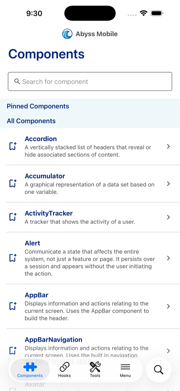
## Banner
## Button
## Carousel
## CellGroup
### CellGroup.Cell
## Chip
## Coachmark
## DonutChart
## IconBrand
## LoadingSpinner
## NeedHelp
## Popover
## Rating
## SelectInput
## SelectInputMulti
## Skeleton
## Tabs
## TextField
## TextInput
## Timeline
## Toast
---
id: v2-uhg-theme
title: UHG Theme
---
## Overview
The `uhg` theme will be removed in Abyss V2.
**Why is the UHG theme being removed?**
The `uhg` theme does not have an official set of design tokens, which means it cannot be aligned to design standards.
## Migration
All teams currently using the `uhg` theme should migrate to the `uhc` theme as soon as possible.
:::note
All actions in this guide can/should be implemented **now** in Abyss V1.
:::
The `uhg` and `uhc` themes are very close in appearance. If UHG-specific styling is required, you can override using tokens.
**Step-by-step migration instructions are provided below.**
**Step 1:** Update the theme used in your application from `uhg` to `uhc`.
```jsx
// Old usage
const theme = createTheme('uhg');
// New usage
const theme = createTheme('uhc');
```
**Step 2:** If you are using `Brandmark` or `IconBrand` components, update them to use the `brand` prop.
```jsx
```
:::note
Teams are welcome to use the `uhc` theme assets (logos, icons) if they prefer the updated branding.
:::
**Step 3:** Override tokens (if needed)
If you need to preserve specific UHG token styling from V1, you can override tokens when creating your theme.
To learn more about overriding tokens, see the [Flatten Tokens](/mobile/theme-customization/tokens/flatten-tokens) and [Create Theme](/mobile/theme-customization/tokens/create-theme) documentation.
**Step 4:** Test your application to ensure all components have the desired appearance.
As stated above the `uhg` and `uhc` themes are very similar, so minimal changes should be needed. However, it's important to verify that everything looks correct after the migration.
:::note
Many teams may find the `uhc` theme meets their visual and functional needs without additional customization. Unless your team has specific styling requirements or a business request for a different look, you should expect **little to no changes** beyond the theme switch.
:::
## Smooth Upgrade to V2
By completing the steps outlined above **now** in Abyss V1, you will have already addressed all `uhg` changes.
When Abyss V2 is officially released, your application should have **no `uhg`-specific breaking issues**, allowing for a smooth upgrade process.
## Future of the UHG theme
There is a possibility that a fully defined UHG theme - with its own complete set of design tokens - may be created in the future.
However, this is **not currently planned** and should not be expected in the near term.
Teams should use the `uhc` theme moving forward.
---
id: legacy-tokens-migration
title: Legacy Tokens Migration
---
For a long time, Abyss provided a set of "tokens" to allow teams to access standardized values for colors, typography, spacing, and more. These legacy tokens have been **removed** in Abyss V2 in favor of our new [design token system](/mobile/theme-customization/tokens/tokens-reference).
Teams that were not using these legacy tokens previously will not need to make any changes to their codebase beyond the normal [component migrations](/mobile/developers/migration/v2/components), but teams that were using them will need to perform some migration steps. The largest challenge is that there is not a one-to-one mapping between the legacy tokens and the new design tokens. To better align with the Abyss V2 Design System, we highly recommend that teams migrate to the new design tokens. However, for teams wanting to minimize up-front work, there is an alternative. Both methods are described below.
## Method 1: Mapping to new design tokens (Preferred)
The preferred method for migrating away from legacy tokens is to update your usages of them to the new design tokens. This will ensure your application is fully aligned with the Abyss V2 Design System and will benefit from any future updates to the design tokens. Additionally, as the legacy tokens have been removed, this method will make it easier for the Abyss team to provide support.
When migrating to the new design tokens, you will need to identify the appropriate design token that matches the legacy token you were using. Generally speaking, this will mean finding the closest matching [semantic token](/mobile/theme-customization/tokens/tokens-reference?tab=semantic+tokens) and replacing the legacy token with that semantic token.
```jsx
Legacy token usage
New design token usage
```
:::tip Use semantic tokens
While it is possible to use [core tokens](/mobile/theme-customization/tokens/tokens-reference?tab=core+tokens) directly, we strongly recommend using semantic tokens whenever possible. Semantic tokens provide context for how a token should be used, which helps ensure consistency across your application.
:::
Additionally, there will likely be some cases where a direct mapping is not possible. In these cases, you will either need to:
- Use a hard-coded value that matches the legacy token (not recommended),
- Find a semantic token that is close enough, or
- Create a custom token in your theme override to match the legacy token (see [Method 2](#method-2-adding-custom-tokens) below).
See our [migration table](#legacy-tokens-migration-table) below for help finding the appropriate tokens.
## Method 2: Adding custom tokens
The quickest way to migrate to V2 with minimal token changes is to reintroduce any legacy tokens used in your application as custom tokens in your [theme overrides](/mobile/theme-customization/tokens/create-theme#example) in the `createTheme` tool. These tokens will be added into the theme and can be used in the same way as before.
The reason we discourage this method is that it adds extra maintenance overhead for your team and is inconsistent with the Abyss V2 Design System. However, it is valid as a temporary solution to minimize up-front work and allow your team to migrate to the new design tokens over time.
## Legacy tokens reference
Below are all the legacy tokens we supported in Abyss V1. You can use this as a reference when migrating your application to use the new design tokens.
## Legacy tokens migration table
To help with your migration, we've additionally created an interactive table that shows each legacy token, its resolved value, and all matching semantic tokens in the new system. You can click on any token to copy it to your clipboard.
:::note
Some legacy tokens may not have direct semantic token matches. In these cases, you'll need to either find a semantically similar token, use a core token directly, or add a custom token to your theme.
:::
---
id: overview
title: Overview
---
Abyss is a full-stack mobile application framework that enables you to build products faster and easier than ever. It features a comprehensive set of tools that weaves together the best parts of [React Native](https://reactnative.dev/) and [GraphQL](https://graphql.org). By taking common patterns and modularizing them into accessible and reusable packages, Abyss is designed to accelerate the development of production-ready React Native applications.
The framework handles all heavy lifting behind the scenes, allowing you to focus on core business logic specific to your product. Automated code quality tools analyze, identify, and correct errors in the code, giving developers real-time feedback and training to standardize programming styles. With improvements in project maintainability, scalability, and source code quality, Abyss aims to deliver the best overall development experience.
Developers looking to use Abyss must have or obtain access to [Artifactory](https://centraluhg.jfrog.io) via [Secure](https://secure.uhc.com/).
## Learning React Native
Just starting your journey with React Native? Abyss is a framework built on top of the popular React Native library. To get started, visit the [React Native documentation](https://reactnative.dev/docs/environment-setup). If you are interested in learning high-level concepts, check out the [getting started guide for React Native](https://reactnative.dev/docs/getting-started).
## Developer Tools
Abyss is built using a list of trusted resources. Below are links to what makes up the framework of Abyss Mobile.
:::info VPN issue
Links to the npm site have been blocked on the UHG VPN. To access the npm link below, you will need to disconnect from the VPN.
:::
```tsx example
() => {
const devLinks = [
{
id: 1,
name: 'React Native',
href: 'https://reactnative.dev/',
},
{
id: 2,
name: 'Emotion',
href: 'https://emotion.sh/docs/introduction',
},
{
id: 3,
name: 'React Navigation',
href: 'https://reactnavigation.org/docs/getting-started',
},
{
id: 4,
name: 'npm ',
href: 'https://docs.npmjs.com/about-npm',
},
];
return (
{devLinks.map((link) => {
return (
{link.name}
);
})}
);
};
```
## Support
If you're ready to get started with Abyss for your next project, check out our [Contact Us](/mobile/contact-us) page. Submit a new support request and let us know how we can help your team. If you found Abyss to be helpful, please [give us a star on github](https://github.com/uhc-tech/abyss)!
---
id: quality-engineering
title: Quality Engineering
description: QE Testing Overview.
---
## Dedication To Quality
## Test Plan
## Automation Testing
Automation testing of Abyss components is a top priority. Currently, our automation tests consist of the following:
### Web
### Mobile
### Unit Testing
## Manual Testing
## FAQ
---
id: end-user-spec
title: End User Specifications
description: Abyss Spec.
---
## Version Requirements
## Testing and Review
## How are these numbers calculated?
## Abyss Web
## Abyss Mobile
\* Last updated March 2025. To ensure this document is kept up to date and relevant, it should be revisited and revised with the latest metrics information on a set schedule, such as quarterly or bi-annually.
---
id: component-testing
title: Component Testing
description: Guide on how to facilitate testing of Abyss Mobile components.
---
## testID
To facilitate the usage of component testing libraries such as **[React Native Testing Library](https://callstack.github.io/react-native-testing-library/docs/getting-started)** you have the option of adding a `testID` attribute to a component's corresponding elements. By passing `testID` in as a prop with a value of the desired string id this attribute will be appended to all component elements that include a unique Abyss class name. Please see the Integration tab and the Classes sub-heading for each component to determine which elements will receive this test id. The resulting `testID` value will be a concatenated string that combines the value passed in with the prop and the element's unique class name.
For example, the following code:
```tsx example
() => {
return (
Add your dependents to your account to view their claims and coverage.
);
};
```
will render the following structure:
```jsx
Add your dependents to your account to view their claims and coverage.
May 13, 2025
```
## Change testing strategy
By default, the `testID` will have an Abyss class name appended to it. If you do not want this, you can use the [`TestProvider`](/mobile/ui/test-provider) component to change the testing strategy.
The `TestProvider` component has two strategies: `"class"` and `"root"`.
### Root strategy
The `"root"` strategy applies the `testID` only to the root element of the component. This means you won't be able to target nested elements within the Abyss component for testing.
For example, let's say the `testID` of [ProgressBar](/mobile/ui/progress-bar) is set to `"your-test-ID"`.
```jsx
```
You can use the following code to find and test the element:
```jsx
import { render } from '@testing-library/react-native';
const screen = render(
);
const element = screen.getByTestId('your-test-ID');
```
### Class strategy
The `"class"` strategy (similar to default) allows testing of nested components by appending the Abyss class name to your `testID`. This creates unique identifiers for each element within the component.
For example, let's say the `testID` of [ProgressBar](/mobile/ui/progress-bar) is set to `"your-test-ID"`.
```jsx
```
You will have to look at the classes for the ProgressBar component to determine which elements will receive this test ID
and have its class name appended to it.
### ProgressBar Classes
The resulting test IDs will be _**`"your-test-ID-abyss-progress-bar-root"`**_ & _**`"your-test-ID-abyss-progress-bar-slide"`**_.
You can then use the following code to find and test an element's subcomponents:
```jsx
import { render } from '@testing-library/react-native';
const screen = render(
);
const element = screen.getByTestId('your-test-ID-abyss-progress-bar-slide');
```
---
id: accessibility-testing
title: Accessibility Testing
---
## Overview
Mobile accessibility, also known as A11Y, is the design and creation of mobile applications that can be used by everyone regardless of age, device, or disability. Accessibility support is necessary to allow assistive technology to interpret mobile pages. Abyss fully supports building accessible mobile applications and follows the Web Content Accessibility Guidelines [(WCAG 2.1)](https://www.w3.org/WAI/standards-guidelines/mobile/) and the [UHG Accessibility Engineering Standards](https://uhgazure.sharepoint.com/sites/a11y-engineering-standards) by the Accessibility Center of Excellence (ACOE).
The list below are steps to take as a developer to ensure accessibility compliance. Please take a minute to read through the following testing resources and familiarize yourself with how to utilize them for best practices.
## Keyboard Navigation
Use an external Bluetooth keyboard only to navigate the page without using your finger to tap or swipe. A visual focus cue, known as the keyboard focus, should appear when navigating content. Look for difficulty reaching or activating interactive components, or if the focus becomes trapped on portions of the screen.
Expected keyboard behavior for custom components is typically the following, but there are exceptions
- Content navigation
- **Tab** to enter a component
- Use **arrow keys** to navigate within the component
- **Tab** to exit the component
- Interacting with CTA or form components
- **Enter** or **Space** to mimic a tap or press
- **Arrow keys** to navigate to an item within a list OR mimic a swipe
- **Tab** to move onto the next item
## Desktop Development Tools
XCode's Accessibility Inspector tool is available for inspecting the code of the application for accessibility features and labels via a mobile emulator.
## Screen Reader Mobile Controls
A Screen Reader is an accessibility tool used primarily by sight-deficient users to navigate computer/mobile content. They interact with applications by reading aloud the content presented in the code. On mobile devices, users utilize either custom tap/swipe controls, Bluetooth keyboards, or both, to interact with the application. These users are impacted the most from lacking A11Y implementation.
Testing with a screen reader on physical mobile devices is important to understand if the code is working effectively for these tools.
Mobile devices provide the following screen readers, each with similar, yet unique functionality
- iOS VoiceOver: [Learn about VoiceOver gestures](https://support.apple.com/guide/iphone/learn-voiceover-gestures-iph3e2e2281/ios)
- Android TalkBack: [Learn about TalkBack gestures](https://support.apple.com/guide/iphone/learn-voiceover-gestures-iph3e2e2281/ios)
## npm Packages
Most npm packages rely on axe-core. Set an impact level and start with critical issues then work down. Remember to allow time to fix critical issues in the User Story. Otherwise, the product developers will get frustrated and learn to ignore the errors, which defeats the purpose and doesn't help anyone.
## Linting
For linting rules, work with an Accessibility Engineer to determine what to include there.
## Summary
Remember, the tools/processes mentioned above don't catch all A11Y issues, but they serve as a great start to empowering the team to do some of your own testing.
You can learn more from the Mobile Accessibility page in the [Accessibility Knowledge Center](https://uhgazure.sharepoint.com/sites/accessibility-knowledge-center/SitePages/Mobile-accessibility.aspx).
For further information, reach out to an Accessibility Engineer!
## Accessibility Tools
If you're looking for an in-depth overview of what accessibility standards Abyss is working towards, visit our Abyss [Accessibility page](/web/resources/accessibility).
```tsx example
() => {
const accessibilityLinks = [
{
id: 1,
name: 'WCAG 2.1',
href: 'https://www.w3.org/WAI/WCAG21/Understanding/',
},
{
id: 2,
name: 'Color Contrast Analyser (CCA)',
href: 'https://webaim.org/resources/contrastchecker/',
},
{
id: 3,
name: 'W3 Validator',
href: 'https://validator.w3.org/favelets.html',
},
{
id: 4,
name: 'Digital A11y',
href: 'https://www.digitala11y.com/accessibility-bookmarklets-testing/',
},
{
id: 5,
name: 'React Native Accessibility',
href: 'https://reactnative.dev/docs/accessibility',
},
];
return (
{accessibilityLinks.map((link) => {
return (
}
>
{link.name}
);
})}
);
};
```
---
id: native-liquid-glass-tabs
title: Liquid Glass/Native Tabs
---
:::tip
This is an advanced integration that touches navigation, native modules, and your build config. The file names and paths below are suggestions — adapt them to wherever the equivalent lives in your app. If you get stuck, reach out on our [GitHub Discussions board](https://github.com/uhc-tech/abyss/discussions).
:::
## What you'll build
A bottom tab bar that renders the **native iOS 26 Liquid Glass tab bar** on iOS while keeping Abyss' design‑system (JS‑drawn) tab bar on Android — both driven by a **single React Navigation v7** install.
- **iOS** → `createNativeBottomTabNavigator` (React Navigation's `/unstable` native tabs, backed by `react-native-screens`). On the iOS 26 SDK this is automatically a Liquid Glass bar, including the isolated search button.
- **Android** → Abyss' `createBottomTabNavigator` (the JS‑drawn DS tab bar), which is unchanged.
Why split? The native bar gives you the real platform look (Liquid Glass, SF Symbols, the search pill) that can't be reproduced in JS, while Android keeps the Abyss‑branded bar your users already know.
:::note Accessibility comes for free
Because the bar is the platform's own, it inherits native VoiceOver / TalkBack semantics, Dynamic Type, and reduce‑transparency / contrast handling automatically — no extra work on your side.
:::
:::note Requirements
This is an advanced integration. Before you start you must be on **React Navigation v7** (see Step 1), **`react-native-screens` 4.25+**, and — for the Liquid Glass appearance specifically — building against the **iOS 26 SDK (Xcode 17+)**. On older SDKs the native bar still works, it just renders as the standard (non‑glass) `UITabBar`.
:::
## Step 1: Move to React Navigation v7
The native tabs API only exists on v7, so the whole app must be on a single v7 install (mixing v6 and v7 is not supported). Below are the changes that affect **Abyss** usage specifically — see the [React Navigation upgrade guide](https://reactnavigation.org/docs/upgrading-from-6.x) for the full list.
#### Use the v7‑compatible navigator factories
Abyss' `createBottomTabNavigator` and `createStackNavigator` were typed for v6. v7 changed `TypedNavigator` to take a single type‑bag argument, so the v6 types no longer satisfy it. Abyss ships drop‑in v7 casts — switch your imports:
```diff
- import { createBottomTabNavigator } from '@uhg-abyss/mobile';
- import { createStackNavigator } from '@uhg-abyss/mobile';
+ import { createBottomTabNavigatorV7 } from '@uhg-abyss/mobile';
+ import { createStackNavigatorV7 } from '@uhg-abyss/mobile';
```
```diff
- const Tab = createBottomTabNavigator();
- const Stack = createStackNavigator();
+ const Tab = createBottomTabNavigatorV7();
+ const Stack = createStackNavigatorV7();
```
These are runtime‑identical to the v6 factories (same component, same options) — only the types change, so the navigator's screen options and `tabBarIcon`/header callbacks type‑check correctly under v7.
## Step 2: Install dependencies
The native tabs live in `@react-navigation/bottom-tabs/unstable` and are backed by `react-native-screens`' native `Tabs` host, which requires **4.25+**.
```bash
npm install @react-navigation/native@7.3.3 \
@react-navigation/native-stack@7.17.5 \
@react-navigation/bottom-tabs@7.18.2 \
react-native-screens@4.25.2 \
react-native-safe-area-context@5.8.0
cd ios && pod install
```
Because the native tabs are an **unstable** API, pin to **exact** versions rather than ranges — a minor or patch bump can change the native contract (e.g. renaming a Fabric view manager, which surfaces as a `Can't find ViewManager` crash after a JS-only update). These are the tested versions:
| Package | Version |
| -------------------------------- | ------- |
| `react-native` | 0.86.0 |
| `@react-navigation/native` | 7.3.3 |
| `@react-navigation/native-stack` | 7.17.5 |
| `@react-navigation/bottom-tabs` | 7.18.2 |
| `react-native-screens` | 4.25.2 |
| `react-native-safe-area-context` | 5.8.0 |
:::note TypeScript can't resolve the `/unstable` subpath
`@react-navigation/bottom-tabs/unstable` ships its types through the package `exports` map, which many React Native TS setups don't read. If you get a "Cannot find module" error on the import, add an ambient declaration (e.g. in `global.d.ts`) that re‑exports the real types:
```ts
declare module '@react-navigation/bottom-tabs/unstable' {
export * from '@react-navigation/bottom-tabs/lib/typescript/src/unstable';
}
```
:::
## Step 3: Split the navigator by platform
Create **two** tab navigators from one param list — the native one for iOS and the Abyss one for Android — and pick between them at render time.
```jsx
import { Platform } from 'react-native';
import { createBottomTabNavigatorV7 } from '@uhg-abyss/mobile';
import { createNativeBottomTabNavigator } from '@react-navigation/bottom-tabs/unstable';
const isIOS = Platform.OS === 'ios';
type TabParamList = {
Home: undefined;
Activity: undefined;
Profile: undefined;
Settings: undefined;
};
// iOS -> native UITabBar (React Navigation v7 /unstable), Liquid Glass on iOS 26.
// Android -> Abyss' JS-drawn createBottomTabNavigator (design-system tab bar).
const NativeTab = createNativeBottomTabNavigator();
const AbyssTab = createBottomTabNavigatorV7();
```
Render the right one. Because both navigators read the same param list and the same screen components, the only difference is the bar itself:
```jsx
function Tabs() {
return isIOS ? : ;
}
```
The native navigator is plain React Navigation — declare your screens as usual (icons come in [Step 4](#step-4-icons-styling-and-badges)):
```jsx
function NativeGlassTabs() {
return (
);
}
```
The Android navigator is your existing Abyss tab bar, unchanged apart from the `V7` factory:
```jsx
function AbyssJsTabs() {
return (
{/* ...the rest of your Abyss tabs */}
);
}
```
## Step 4: Icons, styling, and badges
The native navigator doesn't take a React element for `tabBarIcon` — it takes an **icon descriptor**: an **SF Symbol** (iOS) or an **image** (both platforms). A common setup gives iOS an SF Symbol and Android an image via `Platform.select`:
```jsx
```
- **`sfSymbol`** (iOS only) — `{ type: 'sfSymbol', name }`, any name from Apple's [SF Symbols](https://developer.apple.com/sf-symbols/) catalog.
- **`image`** (iOS + Android) — `{ type: 'image', source }`. Provide the icon at multiple densities (`icon.png`, `icon@2x.png`, `icon@3x.png`) since native icons aren't auto‑scaled on iOS. You can also point at a platform asset with `source: { uri: 'icon_name' }` (an Android drawable / iOS image set).
#### Tinting
By default the image is **tinted** with the active/inactive color. On **Android the image is always tinted** (the `tinted` flag is ignored), so a transparent single‑color glyph works best — a flat icon with its own background will tint to a solid block. On **iOS**, pass `tinted: false` to preserve a multi‑color icon's own colors:
```jsx
tabBarIcon: {
type: 'image',
source: require('./assets/tab-icons/home.png'),
tinted: false, // iOS: keep the icon's own colors
}
```
#### Different icons per state
`tabBarIcon` also accepts a function of `{ focused, color, size }` that returns a descriptor — handy for filled/outline variants:
```jsx
tabBarIcon: ({ focused }) => ({
type: 'sfSymbol',
name: focused ? 'heart.fill' : 'heart',
}),
```
This is iOS‑only; on Android the inactive icon is used for both states.
#### Styling the bar
Native tab bars are intentionally far less able to be styled than the Abyss JS bar — you're getting the platform's own bar, so the OS owns most of the appearance. What you _can_ set per screen:
- `tabBarActiveTintColor` / `tabBarInactiveTintColor` — icon and label colors.
- `tabBarStyle.display: 'none'` — hide the bar.
- `tabBarStyle.backgroundColor` / `shadowColor` — **Android and iOS ≤ 18 only.** The iOS 26 Liquid Glass bar manages its own background and ignores these.
There's no equivalent to the JS bar's full style surface (custom item styles, label weights, and so on). If a design needs that level of control, that's a signal to keep the JS bar on that platform.
#### Badges
Set `tabBarBadge` (a number or string) in a screen's options; `tabBarBadgeStyle` tweaks its appearance:
```jsx
```
## Step 5: The iOS 26 search tab
iOS 26 offers two search affordances. Both are iOS‑only, so gate them with `Platform.select`.
#### Isolated search button
`tabBarSystemItem: 'search'` renders the search tab as a separate pill on the right of the bar. Android has no equivalent, so fall back to a normal icon + label:
```jsx
```
#### Search‑field transform
When the search tab is selected, the bar can morph into a search field. This happens **only** when:
1. the search tab renders a **nested native stack**, and
2. the **focused screen of that stack** sets `headerSearchBarOptions`.
It does **not** work if `headerSearchBarOptions` is set on the tab screen itself. Nest a stack instead:
```jsx
import { createNativeStackNavigator } from '@react-navigation/native-stack';
const SearchStack = createNativeStackNavigator<{ SearchHome: undefined }>();
function SearchScreen() {
return (
);
}
```
…and set the search options from the focused screen:
```jsx
function SearchHomeScreen() {
const navigation = useNavigation();
const [query, setQuery] = useState('');
useLayoutEffect(() => {
navigation.setOptions({
headerSearchBarOptions: {
placeholder: 'Search',
hideWhenScrolling: false,
onChangeText: (e) => setQuery(e.nativeEvent.text),
},
});
}, [navigation]);
// ...render filtered results, navigate on selection
}
```
#### Older iOS (≤ 18) and pre‑iOS‑26 SDK builds
Liquid Glass is an iOS 26 feature, opt‑in via the iOS 26 SDK (Xcode 17+). On older OS versions — or when building against an earlier SDK — **the same code renders the standard opaque `UITabBar`**: fully functional, just not glass. No code changes are needed; the fallback is automatic. A few specifics:
- The bar is **opaque and part of the layout**, so content sits above it normally — the bottom‑inset handling in [Step 6](#step-6-keep-content-clear-of-the-tab-bar) becomes a no‑op.
- `tabBarSystemItem: 'search'` renders an **inline system search tab** (magnifying glass + label) instead of the iOS‑26 isolated pill.
- SF Symbol icons still render.
## Step 6: Keep content clear of the tab bar
This is the part teams most often miss. The native bar **overlays** the screen — it isn't part of the JS layout, and the JS side can't read its height ([react-native-screens#3627](https://github.com/software-mansion/react-native-screens/issues/3627)). On iOS that's intentional (content scrolls under the translucent glass); the problem is when content gets _clipped_ at the bottom.
#### Scrollable content
- **iOS** — the native tabs automatically set the content inset on the **first `ScrollView`** found in a screen (the `overrideScrollViewContentInsetAdjustmentBehavior` option, on by default). Usually you do nothing. If your scrollable isn't the first one found, set `contentInsetAdjustmentBehavior="automatic"` on it.
- **Android** — there's **no** auto‑inset, and `contentInsetAdjustmentBehavior` is iOS‑only. Inset each tab's whole content area above the bar **once**, using `react-native-screens` experimental `SafeAreaView` with `insetType="interface"`, wired through the navigator's `screenLayout`.
Create a small wrapper (e.g. `src/components/NativeTabContent.tsx`):
```jsx
import React from 'react';
import { Platform } from 'react-native';
import { SafeAreaView } from 'react-native-screens/experimental';
const isIOS = Platform.OS === 'ios';
export const NativeTabContent = ({
children,
}: {
children: React.ReactNode,
}) => {
// iOS scrolls under the glass bar (handled above); Android needs the content inset by the
// bar's measured "interface" inset so nothing is clipped.
if (isIOS) return <>{children}>;
return (
{children}
);
};
```
Apply it once on the native navigator — `screenLayout` wraps every screen, so every tab is covered:
```jsx
(
{children}
)}
>
{/* ...screens */}
```
:::caution Experimental dependency
`react-native-screens/experimental` is explicitly unstable and may change without a major version bump. It's the only way to read the native bar's inset today; pin your `react-native-screens` version, track [react-native-screens#3627](https://github.com/software-mansion/react-native-screens/issues/3627), and swap to a stable `useBottomTabBarHeight()` for native tabs when it lands.
:::
#### Absolute / bottom‑anchored content
Content that isn't scrollable — a floating button, a `flex-end` button stack — doesn't get the iOS auto‑inset either, so it sits under the glass bar. Wrap it in a small helper:
```jsx
import React from 'react';
import { Platform, StyleProp, ViewStyle } from 'react-native';
import { SafeAreaView } from 'react-native-screens/experimental';
const isIOS = Platform.OS === 'ios';
export const TabBarInset = ({
children,
style,
}: {
children: React.ReactNode,
style?: StyleProp,
}) => {
// On iOS, lift content above the native bar. On Android the screen is already inset by
// `screenLayout` (above), so this is a no-op there.
return (
{children}
);
};
```
Two usage shapes:
```jsx
// 1. Wrap an already-positioned overlay (e.g. an absolute floating-button container):
// 2. Let it BE the bottom-anchoring container
// (replaces a height:'100%' + justifyContent:'flex-end' view):
```
## Step 7: Fix your test & build config for v7 ESM
React Navigation v7 ships as **ESM** with extension-less imports. Anything not told to transpile/relax it will fail on `@react-navigation/*`. Metro handles it out of the box, but **TypeScript**, **Jest**, and **webpack** each need a nudge.
**TypeScript** — if your `tsconfig.json` uses a Node‑style `moduleResolution` (`node`, `node16`, or `nodenext`), importing the v7 ESM packages throws `TS1479` (the referenced file "is an ECMAScript module … cannot be imported with `require`"). Switch to bundler resolution — the correct setting for a Metro project anyway:
```json
{
"compilerOptions": {
"module": "esnext",
"moduleResolution": "bundler"
}
}
```
**Jest** — add the navigation packages to the `transformIgnorePatterns` allow‑list (the `(?!…)` negative lookahead) in your Jest config (`jest.config.js`, or the `jest` key in `package.json`):
```js
transformIgnorePatterns: [
'node_modules/(?!((jest-)?react-native|@react-native(-community)?|@react-navigation|react-native-screens|react-native-safe-area-context)/)',
],
```
Without it you'll see `SyntaxError: Cannot use import statement outside a module` (or "unexpected token") pointing at `@react-navigation/native/lib/module/index.js`.
**webpack** (Storybook, a docs site, etc.) — relax fully‑specified resolution:
```js
module: {
rules: [{ test: /\.m?js$/, resolve: { fullySpecified: false } }],
},
```
## Gotchas & known limitations
- **Experimental inset dependency.** `TabBarInset` / `NativeTabContent` rely on `react-native-screens/experimental` — acceptable, but pin `react-native-screens` and track [#3627](https://github.com/software-mansion/react-native-screens/issues/3627).
- **The native tabs API is `/unstable`.** It's still maturing; review the open [native bottom-tab issues](https://github.com/react-navigation/react-navigation/issues/12963) (Android especially) before shipping.
- **Liquid Glass needs the iOS 26 SDK** (Xcode 17+). On older SDKs the bar renders as a standard `UITabBar` — functional, just not glass.
- **You must be fully on v7.** Mixing React Navigation v6 and v7 in one app is unsupported.
---
id: versioning-guide
title: Versioning Guide
---
## Overview
Stability ensures that reusable components and libraries, tutorials, tools, and learned practices don't become obsolete unexpectedly. Stability is essential for the ecosystem around Abyss to thrive.
This document contains the practices that are followed to provide you with a leading-edge UI library, balanced with stability, ensuring that future changes are always introduced in a predictable way.
## Semantic versioning
Abyss follows [Semantic Versioning 2.0.0](https://semver.org). Abyss version numbers have three parts: major.minor.patch. The version number is incremented based on the level of change included in the release.
- **Major releases** contain significant new features, some but minimal developer assistance is expected during the update. When updating to a new major release, you may need to run update scripts, refactor code, run additional tests, and learn new APIs.
- **Minor releases** contain important new features. Minor releases should be fully backward-compatible; no developer assistance is expected during update, but you can optionally modify your apps and libraries to begin using new APIs, features, and capabilities that were added in the release.
- **Patch releases** are low risk, contain bug fixes and small new features. No developer assistance is expected during update.
:::note
Abyss component APIs follow semver strictly. React Native is a peer dependency — upgrading it may require separate changes to your app outside of Abyss. [Learn more about supported React Native versions.](#supported-react-native-versions)
:::
## Release frequency
A regular schedule of releases helps you plan and coordinate your updates with the continuing evolution of Abyss. In general, you can expect the following release cycle:
- A **major** release typically every year for major changes.
- A **minor** release every two weeks after each sprint.
- A **patch** release at any time for urgent bugfixes.
## Deprecation Practices
Sometimes **"breaking changes,"** such as the removal of support for select APIs and features, are necessary.
To make these transitions as easy as possible:
- The number of breaking changes is minimized, and migration tools provided when possible.
- The deprecation policy described below is followed, so that you have time to update your apps to the latest APIs and best practices.
## Deprecation Policy
- Deprecated features are announced in the changelog, and when possible, with warnings at runtime.
- When a deprecation is announced, recommended update path is provided.
- Existing use of a stable API during the deprecation period is supported, so your code will keep working during that period.
- Peer dependency updates (React) that require changes to your apps are only made in a major release.
## Supported React Native versions
`@uhg-abyss/mobile` follows a **rolling support window**, officially supporting the **latest 5 React Native minor versions** at any given time.
See ADR-025 for the full versioning strategy and rationale.
### Why are older versions of React Native dropped?
Supporting every React Native version indefinitely grows the testing surface, increases maintenance overhead, and prevents the team from adopting newer APIs and architecture improvements. Dropping older versions on a predictable schedule keeps the library sustainable while giving teams a reasonable window to upgrade.
### Initial adoption
To give teams ample time to upgrade, the new minimum of `0.82.0` will be enforced starting approximately **September 1, 2026**.
### Support window
Abyss tests against the newest supported React Native version.
| React Native | Status | Architecture |
| ------------ | -------------- | ------------ |
| 0.85.x | ✅ Supported | New |
| 0.84.x | ✅ Supported | New |
| 0.83.x | ✅ Supported | New |
| 0.82.x | ✅ Supported | New |
| 0.81.x | ✅ Supported | New / Old |
| < 0.81.0 | ❌ Unsupported | — |
:::note
Old architecture was removed by default in React Native 0.82. Abyss tests exclusively on the new architecture.
:::
### Peer dependency compatibility
| Dependency | Minimum version |
| -------------------------------- | --------------- |
| `react-native` | `>=0.81.0 <1` |
| `react-native-svg` | `>=13.0.0` |
| `react-native-video` | `>=6.0.0` |
| `react-native-safe-area-context` | `>=3.0.0` |
| `react-native-screens` | `>=2.0.0` |
| `@react-navigation/native` | `>=6.0.0` |
| `@react-navigation/native-stack` | `>=6.0.0` |
| `@react-navigation/bottom-tabs` | `>=6.0.0` |
---
id: workspace-setup
title: Workspace Setup
pagination_prev: null
---
## Overview
Developing modern JavaScript applications requires efficient, powerful, and extensible tooling. Consistency across developer machines is a priority when collaborating across highly distributed teams. The following is a guide for installing the preferred environment for JS development.

## Secure Groups
Visit [secure.uhc.com](https://secure.uhc.com) to request permissions groups:
- **github_users**: To access [github.com](https://github.com)
- **Mac_Admin**: To install software for macOS users only
## VSCode Editor
To write code for UI projects, it is **highly recommended** that you download and install [Visual Studio Code](https://code.visualstudio.com).

## VSCode Extensions
Recommended extensions will be suggested to you when you visit the VSCode Marketplace.
- [ESLint](https://marketplace.visualstudio.com/items?itemName=dbaeumer.vscode-eslint) - code syntax validator
ESLint is a JavaScript linting tool which is used for automatically detecting incorrect patterns found in ECMAScript/JavaScript code. It is used with the purpose of improving code quality, making code more consistent, and avoiding bugs. Rules can be configured to look for all kinds of discrepancies due to discouraged code patterns or formatting. Running a Linting tool over the source code helps to improve the quality and readability of the code.
- [Prettier](https://marketplace.visualstudio.com/items?itemName=esbenp.prettier-vscode) - code formatter
Prettier is very popular because it improves code readability and makes the coding style consistent for teams. Developers are more likely to adopt a standard rather than writing their own code style from scratch, so tools like Prettier will make your code look good without you ever having to dabble in the formatting.
## System Essentials
### Xcode
- [Xcode Command Line Tools](https://mac.install.guide/commandlinetools/4.html) (Mac Only)
`xcode-select` contains necessary utilities for software development on macOS. Xcode's simulator will be used for viewing your app in an iOS environment.
```bash
xcode-select --install
```
**_After install, exit, and restart Terminal (CMD + Q)_**
```
$ xcode-select --version
```
### Android Studio
Install [Android Studio.](https://developer.android.com/) The Virtual Device Manager will be used for viewing your app in an Android environment.
### Additional Tools
- [oh-my-zsh](https://ohmyz.sh/) >= 5.3.0 (optional)
`zsh` is an optional upgrade to the native shell which provides a delightful terminal experience.
```bash
sh -c "$(curl -fsSL https://raw.githubusercontent.com/robbyrussell/oh-my-zsh/master/tools/install.sh)"
```
**_After install, exit, and restart Terminal (CMD + Q)_**
```bash
omz version
```
---
- [node](https://github.com/nvm-sh/nvm) >= 16.0.0
`nvm` is a great tool for installing and upgrading versions of Node on your system.
```bash
curl -o- https://raw.githubusercontent.com/nvm-sh/nvm/v0.35.1/install.sh | bash
```
**_After install, exit, and restart Terminal (CMD + Q)_**
```bash
nvm --version
nvm install 16 && nvm use 16 && nvm alias default 16
```
**_After install, exit, and restart Terminal (CMD + Q)_**
```
$ npm --version
$ npm config set registry https://repo1.uhc.com/artifactory/api/npm/npm-virtual
```
---
- [git](https://git-scm.com/book/en/v2/Getting-Started-Installing-Git) >= 2.0.0
`git` is a universal version control system for working collaboratively and efficiently.
```bash
git config --global user.id "YOUR_MS_ID"
git config --global user.email "YOUR_EMAIL@optum.com"
```
## Git Branch Names
Naming the branch you're working on helps repository maintainers understand the changes being made when the PR is opened. Using consistent branch name prefixes also allows build tools to automatically categorize the branches using labels. Branch names should be all lowercase (with the exception of US and DE) and include hyphens between words. All branches are divided into four groups:
- **story/#######** - Changes associated with a User Story, use the unique 7-digit number from Rally followed by a task description.
- **defect/#######** - Changes associated with a Defect, use the unique 7-digit number from Rally followed by a task description.
- **refactor/** - Changes to the repo that aren't documented in Rally are considered refactors, so use the task portion to add detail to your branch name.
- **release/** - Used specifically by build tools, this branch name is exclusive to release notes and documentation leading up to a new release.
Examples:
```
git checkout -b story/US2434515-developer-toolkit
git checkout -b defect/DE308703-button-accessibility
git checkout -b refactor/select-list-multi-docs
git checkout -b story/US1533842-use-loading-overlay
```
Branch Name Rules:
- Branch prefix must start with **story**, **defect**, **refactor**, or **release**
- Branch name must be only **lowercase letters, numbers, and hyphens**
- **US###** and **DE###** are valid character exceptions
---
comment: |
This is an auto-generated file. DO NOT EDIT THIS FILE DIRECTLY.
To edit this file, modify the source file in the 'mobile/overview/' directory, then run the 'copy-abyss-info' script to regenerate this file.
id: abyss-overview
title: Abyss Overview
hide_table_of_contents: true
---
---
comment: |
This is an auto-generated file. DO NOT EDIT THIS FILE DIRECTLY.
To edit this file, modify the source file in the 'mobile/overview/' directory, then run the 'copy-abyss-info' script to regenerate this file.
id: about
title: About Abyss
---
## What is Abyss?
## How Abyss works
## We Support Adoption
## Guiding Principles
## We Maintain Assets
## The Abyss Team
---
comment: |
This is an auto-generated file. DO NOT EDIT THIS FILE DIRECTLY.
To edit this file, modify the source file in the 'mobile/overview/' directory, then run the 'copy-abyss-info' script to regenerate this file.
id: abyss-version-2
title: Abyss Version 2
hide_table_of_contents: true
---
## Abyss Design System version 2
## V2 prep for designers
## V2 prep for developers
## Stay Connected
---
comment: |
This is an auto-generated file. DO NOT EDIT THIS FILE DIRECTLY.
To edit this file, modify the source file in the 'mobile/overview/' directory, then run the 'copy-abyss-info' script to regenerate this file.
id: releases
title: Releases
hide_table_of_contents: true
---
---
comment: |
This is an auto-generated file. DO NOT EDIT THIS FILE DIRECTLY.
To edit this file, modify the source file in the 'mobile/overview/' directory, then run the 'copy-abyss-info' script to regenerate this file.
id: contact-us
title: Contact Us
hide_table_of_contents: true
---
## Support
## Requests
---
comment: |
This is an auto-generated file. DO NOT EDIT THIS FILE DIRECTLY.
To edit this file, modify the source file in the 'mobile/overview/' directory, then run the 'copy-abyss-info' script to regenerate this file.
id: disclaimer
title: Mobile Components Disclaimer
---
As a note, these components were developed for use in a mobile application environment. For your convenience, we created documentation and interactive examples on our Abyss site. We have tried our best to accurately show the functionality and style of each component on these pages, but you may notice some differences and limitations as the optimal platform for viewing and interacting with these components is a mobile device.
A few examples are described below:
- [Date Input](/mobile/ui/date-input) requires native code, so this component is only supported on iOS and Android. There are no interactive examples in the documentation; only recordings of each feature are available. To fully interact with the date and time pickers you will need to import the component within a mobile development environment.
- [Modal](/mobile/ui/modal), and any component that uses Modal, takes up the entire browser window when opened. While it is intended to take up the entire phone screen as well, the content on the modal will fill much more space when used on a mobile device than it does in the browser window.
---
id: use-animation
category: Utilities
title: useAnimation
description: Use to create standardized animation types for Abyss Mobile components.
design: https://www.figma.com/proto/wCMblLsq9TxAQvKzY3EfCt/branch/c6ve0gNrTGpdwBIuJehC3n/Abyss-Mobile?page-id=41951%3A175&type=design&node-id=41951-176&viewport=741%2C524%2C0.06&t=33q3lqs409fRYj6B-1&scaling=scale-down-width&starting-point-node-id=41951%3A176&show-proto-sidebar=1
---
```jsx
import { useAnimation } from '@uhg-abyss/mobile';
```
## Usage
`useAnimation` hook standardizes the animation types for Abyss components and simplifies additional customization. The hook returns `animate`, `value`, `interpolations`, as well as other [Animated](https://reactnative.dev/docs/animated#methods) functions used throughout Abyss.
```jsx
export const useAnimation = (value: number, config: AnimationConfig) => {
...
return {
animate,
value: animatedValue,
interpolations,
createAnimation,
add,
subtract,
multiply,
divide,
delay,
parallel,
loop,
sequence,
};
};
```
## Animate
The `animate` function requires a toValue be passed in, with the option for overrides and a callback function.
```jsx
const animate = (
toValue: number,
configOverride?: Partial,
callback?: Animated.EndCallback
) => {
return createAnimation(toValue, configOverride).start(callback);
};
```
```tsx example
() => {
const { animate, value, interpolations } = useAnimation(1, {
easing: 'gentle',
interpolations: {
background: {
inputRange: [0.95, 1],
outputRange: [
'$core.color.brand.100',
'$semantic.color.surface.container.status.info.saturated',
],
tokenType: 'colors',
},
},
});
const AnimatedButton = styled('Animated.Pressable', {
justifyContent: 'center',
alignItems: 'center',
padding: '$semantic.spacing.lg',
borderRadius: 100,
alignSelf: 'center',
});
return (
{
animate(0.95);
}}
onPressOut={() => {
animate(1);
}}
style={{
transform: [{ scale: value }],
backgroundColor: interpolations.background,
}}
>
Press Me
);
};
```
### Overrides
By default the animation type is set to `'timing'`. Additional types supported are `'spring'` and `'instant'` with the following animation config open to override:
```jsx
interface AnimationConfig extends BaseAnimationConfig {
type?: 'spring' | 'timing' | 'instant';
interpolations?: Record;
delay?: number | undefined;
// timing
easing?: Easing;
duration?: number | undefined;
// spring
overshootClamping?: boolean | undefined;
restDisplacementThreshold?: number | undefined;
restSpeedThreshold?: number | undefined;
velocity?: number | { x: number, y: number } | undefined;
bounciness?: number | undefined;
speed?: number | undefined;
tension?: number | undefined;
friction?: number | undefined;
stiffness?: number | undefined;
mass?: number | undefined;
damping?: number | undefined;
}
```
## Interpolations
The `interpolations` prop can take in multiple interpolation objects to be used on the same animated value.
```jsx
const { value, animate, interpolations } = useAnimation(1, {
easing: 'gentle',
interpolations: {
backgroundColor: {
inputRange: [0.95, 1],
outputRange: [
'$semantic.color.surface.container.status.info.saturated',
'$core.color.brand.100',
],
tokenType: 'colors',
},
opacity: {
inputRange: [0.95, 1],
outputRange: [0, 1],
},
},
});
```
```tsx example
() => {
const { animate, value, interpolations } = useAnimation(1, {
easing: 'gentle',
interpolations: {
background: {
inputRange: [0.95, 1],
outputRange: ['#00BED5', '$core.color.brand.100'],
tokenType: 'colors',
},
opacity: {
inputRange: [0.95, 1],
outputRange: [0.8, 1],
},
},
});
const Label = styled('Animated.Text', {
color: '$semantic.color.text.body.alt',
typography: '$semantic.typography.p.xs-bold',
marginTop: '$semantic.spacing.xs',
});
const AnimatedTabButton = styled('Animated.Pressable', {
justifyContent: 'center',
alignItems: 'center',
padding: '$semantic.spacing.lg',
borderRadius: 10,
alignSelf: 'center',
});
return (
{
animate(0.95);
}}
onPressOut={() => {
animate(1);
}}
style={{
transform: [{ scale: value }],
backgroundColor: interpolations.background,
}}
>
);
};
```
## Additional Functionality
Other Animated methods currently used throughout Abyss components can also be returned.
```jsx
const parallel = (
animations: Animated.CompositeAnimation[],
parallelConfig?: Animated.ParallelConfig
) => {
return Animated.parallel(animations, parallelConfig);
};
const loop = (
animation: Animated.CompositeAnimation,
loopConfig?: Animated.LoopAnimationConfig
) => {
return Animated.loop(animation, loopConfig);
};
const sequence = (animations: Animated.CompositeAnimation[]) => {
return Animated.sequence(animations);
};
const delay = (time: number) => {
return Animated.delay(time);
};
const add = (num: number) => {
return Animated.add(animatedValue, num);
};
const subtract = (num: number) => {
return Animated.subtract(animatedValue, num);
};
const divide = (num: number) => {
return Animated.divide(animatedValue, num);
};
const multiply = (num: number) => {
return Animated.multiply(animatedValue, num);
};
```
## Accessibility Integration
The `useAnimation` hook has built-in integration with the [`useReduceMotion`](/mobile/hooks/use-reduce-motion) hook. This ensures that animated components automatically respect the user's "Reduce Motion" accessibility setting without requiring additional handling.
When "Reduce Motion" is enabled, the `useAnimation` hook adjusts the animation type to `'instant'`, minimizing motion effects. This makes it easier to create accessible components that align with user preferences.
---
id: use-device-orientation
category: Utilities
title: useDeviceOrientation
description: Used to retrieve the orientation of the mobile device.
---
```jsx
import { useDeviceOrientation } from '@uhg-abyss/mobile';
```
## Usage
`useDeviceOrientation` measures the width and height of the screen and returns `'landscape'` or `'portrait'`.
```jsx
const orientation = useDeviceOrientation();
const iconSize = orientation === 'landscape' ? 20 : 24;
return ;
```
---
id: use-form
category: State Management
title: useForm
description: useForm is a hook for defining, validating and submitting forms.
sourceIsTS: true
---
```jsx
import { useForm } from '@uhg-abyss/mobile';
```
## Usage
The `useForm` hook is used to define, validate, and submit forms in Abyss. Use `useForm` along with the [FormProvider](/mobile/ui/form-provider)
component in order to better manage your forms and fully utilize the capabilities of form management within Abyss.
Abyss components that can be used with useForm have a `model` prop that is used to bind the component to the form state.
Validations can be defined on each component using the `validations` prop, which accepts an object with validation rules.
If a component fails validation, it will display an error message based on the validation rules defined.
When a form is successfully submitted, the function passed to the `onSubmit` prop will be called with the form data.
```tsx example
() => {
const form = useForm();
const onSubmit = (data) => {
// Do something on submit
alert(`FormData: ${JSON.stringify(data)}`);
};
return (
);
};
```
## Default Values
The defaultValues prop populates the entire form with default values. It supports both synchronous and asynchronous assignments of default values.
```tsx example
() => {
// Default Values Passed into useForm
const form = useForm({
defaultValues: {
firstName: 'John',
lastName: 'Doe',
},
});
const onSubmit = (data) => {
alert(`FormData: ${JSON.stringify(data)}`);
};
return (
);
};
```
## Form State
This object contains information about the form state. If you want to subscribe to formState via useEffect, make sure that you place the entire formState in the optional array.
```jsx
const form = useForm();
const {
errors, // An object with field errors
isDirty, // Set to true after the user modifies any of the inputs.
isValid, // Set to true if the form doesn't have any errors.
isValidating, // Set to true during validation.
isSubmitting, // true if the form is currently being submitted; false if otherwise.
isSubmitted, // Set to true after the form is submitted.
isSubmitSuccessful, // Indicate the form was successfully submitted without any Promise rejection or Error being thrown within the handleSubmit callback.
submitCount, // Number of times the form was submitted.
touchedFields, // An object containing all the inputs the user has interacted with.
dirtyFields, // An object with the user-modified fields.
} = form.formState;
```
## Watch
This will watch specified inputs and return their values. It is useful for determining what to render.
```tsx example
() => {
const form = useForm();
const onSubmit = (data) => {
alert(`FormData: ${JSON.stringify(data)}`);
};
// Watch one field
const WatchField = form.watch('firstName');
// Target specific fields by their names
const WatchFields = form.watch(['firstName', 'lastName']);
// Watch everything by passing no arguments
const WatchAllFields = form.watch();
return (
Watch One Field: {JSON.stringify(WatchField)}Watch Multiple Fields: {JSON.stringify(WatchFields)}Watch All Fields: {JSON.stringify(WatchAllFields)}
);
};
```
## Handle Submit
This function will receive the form data if form validation is successful.
```tsx example
() => {
const form = useForm({
defaultValues: {
firstName: 'John',
lastName: 'Doe',
},
});
const onSubmit = (data) => {
alert('onSubmit');
};
const onError = (errors) => {
alert('onError');
};
return (
);
};
```
## Validate Model
This function will receive the model data if form validation is successful.
```tsx example
() => {
const form = useForm<{ firstName: string; lastName: string }>({
defaultValues: {
firstName: 'John',
},
});
const handleValidateFirst = () => {
form.validate(
'firstName',
(data) => {
alert(`FormData: ${JSON.stringify(data)}`);
},
(error) => {
delete error.ref;
alert(`Error: ${JSON.stringify(error)}`);
}
);
};
const handleValidateLast = () => {
form.validate(
'lastName',
(data) => {
alert(`FormData: ${JSON.stringify(data)}`);
},
(error) => {
delete error.ref;
alert(`Error: ${JSON.stringify(error)}`);
}
);
};
return (
);
};
```
## Set Error
The function allows you to manually set one or more errors.
```tsx example
() => {
const form = useForm({
defaultValues: {
firstName: 'John',
lastName: 'Doe',
},
});
// Set single error
const setSingleError = () => {
form.setError('firstName', {
type: 'manual',
message: 'There is an error with your name!',
});
};
// Set multiple errors
const setMultipleErrors = () => {
[
{
type: 'manual',
name: 'firstName',
message: 'Check first name',
},
{
type: 'manual',
name: 'lastName',
message: 'Check last name',
},
].forEach(({ name, type, message }) => {
form.setError(name as 'firstName' | 'lastName', { type, message });
});
};
// Set error for single field errors
React.useEffect(() => {
form.setError('firstName', {
types: {
required: 'This is required',
minLength: 'This is minLength',
},
});
}, []);
return (
);
};
```
## Clear Errors
This function can manually clear errors in the form.
```tsx example
() => {
const form = useForm({
defaultValues: {
firstName: 'John',
lastName: 'Doe',
phone: '555-555-5555',
},
});
const resetErrors = () => {
[
{
type: 'manual',
name: 'firstName',
message: 'Required',
},
{
type: 'manual',
name: 'lastName',
message: 'Required',
},
{
type: 'manual',
name: 'phone',
message: 'Required',
},
].forEach(({ name, type, message }) => {
form.setError(name as 'firstName' | 'lastName' | 'phone', {
type,
message,
});
});
};
// Clear single error
const clearSingleErrors = () => {
form.clearErrors('firstName');
};
// Clear multiple errors
const clearMultipleErrors = () => {
form.clearErrors(['firstName', 'lastName']);
};
// Clear all errors
const clearAllErrors = () => {
form.clearErrors();
};
return (
);
};
```
## Get Values
An optimized helper for reading form values. The difference between watch and getValues is that getValues will not trigger re-renders or subscribe to input changes.
```tsx example
() => {
const form = useForm({
defaultValues: {
firstName: 'John',
lastName: 'Doe',
phone: '555-555-5555',
},
});
// Read an individual field value by name
const singleValue = form.getValues('firstName');
// Read multiple fields by name
const multipleValues = form.getValues(['firstName', 'lastName']);
// Reads all form values
const allValues = form.getValues();
return (
Single Value: {JSON.stringify(singleValue)}
Multiple Values: {JSON.stringify(multipleValues)}
All Values: {JSON.stringify(allValues)}
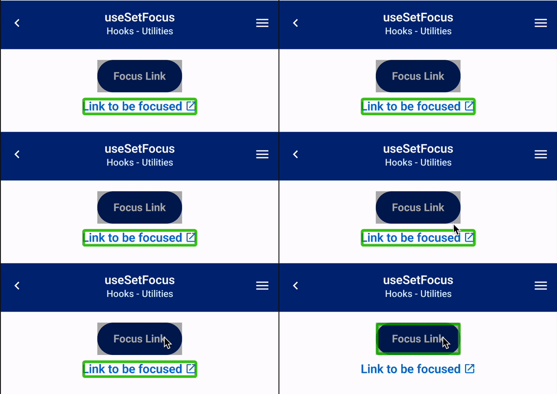
);
};
```
## Trigger
Manually triggers form or input validation. This method is also useful when you have dependent validation (input validation depends on another input's value).
```tsx example
() => {
const form = useForm();
// Trigger one input to validate
const triggerSingle = () => {
form.trigger('firstName');
};
// Trigger multiple inputs to validate
const triggerMultiple = () => {
form.trigger(['firstName', 'lastName']);
};
// Trigger entire form to validate
const triggerAll = () => {
form.trigger();
};
const clearErrors = () => {
form.clearErrors();
};
return (
);
};
```
## Cross-Field Validation Example
```tsx example
() => {
const form = useForm();
const onSubmit = (data) => {
console.log('data', data);
};
return (
{
const checkValue = form.getValues('middleName-check');
if (!checkValue && !v) {
return 'Required';
}
},
}}
showValidations={false}
/>
{
form.trigger('middleName');
}}
/>
);
};
```
## Additional Documentation
`@uhg-abyss/mobile/hooks/useForm` is built on top of the `useForm` hook from [React Hook Form](https://react-hook-form.com/get-started).
:::warning Important
You should be using Abyss's `useForm` hook when using Abyss components and _not_ React Hook Form's.
:::
---
id: use-reduce-motion
category: Utilities
title: useReduceMotion
description: Used within animated components to respect a user's accessibility preferences.
---
```jsx
import { useReduceMotion } from '@uhg-abyss/mobile';
```
## Usage
The `useReduceMotion` hook is a custom hook designed to determine whether the user has enabled the "Reduce Motion" accessibility setting on their device. This setting is often used by individuals who prefer to minimize animations and motion effects for accessibility or comfort reasons.
The hook returns an object `{reducedMotionEnabled}` with the boolean value:
- `true`: "Reduce Motion" is enabled.
- `false`: "Reduce Motion" is disabled.
When reduce motion is enabled, this hook can be used to adjust animation behavior.
```tsx example
() => {
const AnimatedContainer = styled('Animated.View', {
padding: '$semantic.spacing.xl',
backgroundColor: '$semantic.color.surface.container.primary',
width: 100,
height: 100,
margin: '$semantic.spacing.xl',
});
const SequentialAnimation = () => {
const { reducedMotionEnabled } = useReduceMotion();
const animatedValues = useRef([
new Animated.Value(1),
]).current;
useEffect(() => {
const createAnimation = (index) => {
return Animated.sequence([
Animated.timing(animatedValues[index], {
toValue: 1.4,
duration: 500,
useNativeDriver: false,
}),
Animated.timing(animatedValues[index], {
toValue: 1,
duration: 500,
useNativeDriver: false,
}),
]);
};
const loopAnimation = Animated.loop(
Animated.stagger(250, [
createAnimation(0),
createAnimation(1),
createAnimation(2),
])
);
loopAnimation.start();
return () => {
return loopAnimation.stop();
};
}, []);
return (
{animatedValues.map((animatedValue, index) => {
return (
);
})}
);
};
return ;
};
```
## Enabling Reduce Motion by Device
### iOS
- Open the Settings app
- Select Accessibility
- Choose Motion
- Toggle the switch next to Reduce Motion to on
### Android
- Open the Settings app
- Select Accessibility
- Depending on your Android version, look for Remove Animations (or similar)
### Windows
- Open Settings
- Select Accessibility
- Go to Visual Effects
- Toggle Animation Effects to off
### Mac OS
- Open System Settings
- Select Accessibility
- Choose Display
- Toggle Reduce Motion to on
## Additional Notes
- The hook listens for changes to the "Reduce Motion" setting and updates its value dynamically.
- The [`useAnimation`](/mobile/hooks/use-animation) hook integrates `useReduceMotion` directly, ensuring that animated components automatically respect the user's motion preferences without requiring additional handling.
- Use this hook to create a more inclusive and accessible experience for users who prefer minimal motion effects. Please refer to accessibility guidelines for animations when creating new components.
- WCAG standards:
- [iOS](https://uhgazure.sharepoint.com/sites/a11y-engineering-standards/SitePages/CP-2.33-Animations-from-Interactions-Native-iOS.aspx?web=1)
- [Android](https://uhgazure.sharepoint.com/sites/a11y-engineering-standards/SitePages/CP-2.33-Animations-from-Interactions-Native-Android.aspx?web=1)
---
id: use-set-focus
category: Utilities
title: useSetFocus
description: Used to set accessibility focus on a specified element.
---
```jsx
import { useSetFocus } from '@uhg-abyss/mobile';
```
## Usage
The hook returns a function that consumes a ref object. Call the function to move screen reader focus to the target element.
:::warning
For accessibility focus to work correctly, you must provide `accessible={true}` on the element that needs to be focused. This ensures the element is recognized by screen readers.
:::
```jsx
const setFocus = useSetFocus();
const myRef = useRef(null);
return (
<>
Link to be focused
>
);
```
## Example
In the example below, Android's Talkback can be seen focusing the bottom text when the `Focus Text` button is pressed.
---
id: use-translate
category: Utilities
title: useTranslate
description: Used to get the translated string from the i18n object.
---
```jsx
import { useTranslate } from '@uhg-abyss/mobile/hooks/useTranslate';
```
The `useTranslate` hook is used to get the translated string from the Abyss [i18n](https://github.com/uhc-tech/abyss/blob/main/packages/abyss-mobile/src/tools/i18n/translations/en.ts) object.
## Usage
```typescript
interface I18nTranslate {
t: (key: string, replacements?: object) => string;
i18n: object;
}
useTranslate(key: string, replacements?: object): I18nTranslate
```
The `key` argument corresponds to the key in the i18n object. The `replacements` argument is an object that contains the values to replace in the translated string.
Let's use an example to illustrate how to use the `useTranslate` hook. In the [TextArea](/mobile/ui/text-area) component, we have a text block that displays the remaining characters available
to be typed in the text area. We can get that value with the key `TextArea.charactersRemaining`.
```tsx example
() => {
const { t } = useTranslate();
return {t('TextArea.charactersRemaining')};
};
```
If we want to replace the value of the remaining characters, we can pass in the `replacements` object with the key `count`.
Replacement values should always appear in double curly braces, (e.g. `{{count}}`).
```tsx example
() => {
const { t } = useTranslate();
return {t('TextArea.charactersRemaining', { count: 10 })};
};
```
We can also use the `useTranslate` hook to get the translated string from the i18n object.
```tsx example
() => {
const { i18n } = useTranslate();
return {i18n.TextArea.charactersRemaining};
};
```
---
id: abyss-overview
slug: /mobile/abyss-overview
title: Abyss Overview
hide_table_of_contents: true
---
---
id: about
slug: /mobile/about
title: About Abyss
---
## What is Abyss?
## How Abyss works
## We Support Adoption
## Guiding Principles
## We Maintain Assets
## The Abyss Team
---
id: abyss-version-2
slug: /mobile/abyss-version-2
title: Abyss Version 2
hide_table_of_contents: true
---
## Abyss Design System version 2
## V2 prep for designers
## V2 prep for developers
## Stay Connected
---
id: releases
slug: /mobile/releases
title: Releases
hide_table_of_contents: true
---
---
id: contact-us
slug: /mobile/contact-us
title: Contact Us
hide_table_of_contents: true
---
## Support
## Requests
---
id: disclaimer
slug: /mobile/disclaimer
title: Mobile Components Disclaimer
---
As a note, these components were developed for use in a mobile application environment. For your convenience, we created documentation and interactive examples on our Abyss site. We have tried our best to accurately show the functionality and style of each component on these pages, but you may notice some differences and limitations as the optimal platform for viewing and interacting with these components is a mobile device.
A few examples are described below:
- [Date Input](/mobile/ui/date-input) requires native code, so this component is only supported on iOS and Android. There are no interactive examples in the documentation; only recordings of each feature are available. To fully interact with the date and time pickers you will need to import the component within a mobile development environment.
- [Modal](/mobile/ui/modal), and any component that uses Modal, takes up the entire browser window when opened. While it is intended to take up the entire phone screen as well, the content on the modal will fill much more space when used on a mobile device than it does in the browser window.
---
id: product-resources
title: Product Resources
---
## Overview
## How does Abyss work?
## Versioning
## Branding
## Accessibility
## Support
---
id: product-inclusion
title: Product Inclusion
---
## Mission statement
## Product inclusion principles
## Product inclusion checklist
## Product inclusion audit tool
## Contact us
---
id: accessibility
title: Accessibility
---
## Overview
## Interactive components
```tsx example
() => {
return ;
};
```
## Color Contrast
```tsx example
() => {
return (
);
};
```
## Icons
### Meaningful or Control Icons
If the icon is being used in a setting where it is the only element providing meaning, then that same meaning should be conveyed to screen reader users. The below implementation provides examples of situations in which the property `isScreenReadable` should be set to true and the `title` property is required and should describe the purpose of the image.
Example 1: an alert icon is used to convey a sense of urgency; there is adjacent text ("There is a data outage") but the text doesn't include any words that convey urgency. In this case, the icon should have a text alternative such as "Alert" or "Warning".
```tsx example
() => {
return (
There is a data outage
);
};
```
Example 2: an "X" material icon is used as a close button on a modal dialog. There
is no adjacent text, so the icon should have a text alternative of "close" or "close
window".
```tsx example
() => {
return (
);
};
```
### Decorative Icons
If the icon is being used in a setting in which it is just a decorative element (which is the default case for icons), then the icon should be ignored by screen readers. The below implementation provides example of which situations would be classified as decorative. Since the default of `isScreenReadable` is set to false no specific changes need to be made for decorative icons.
Example 1: an alert icon is used next to an urgent message and the word "Alert" is included in the adjacent text. In this case, the icon becomes decorative in nature and should be ignored by screen readers.
```tsx example
() => {
return (
Alert: There is a data outage
);
};
```
Example 2: an "X" material icon is used as a close button on a modal dialog; the
word "Close" appears to the right of the button. In this case, the icon should be
considered decorative and ignored by screen readers.
```tsx example
() => {
return (
Close
);
};
```
## Dynamic Type
Abyss Mobile standards for dynamic types are as follows:
- We scale typography and icons in increments of 11.8%.
- [Figma](https://www.figma.com/design/34gRQMq2NxFgeRynjqd24C/Documentation-%7C-Abyss-Mobile?node-id=7-144&t=Os647hSjOcX5N1UO-0)
shows scaling examples at xxxLarge and AX5.
- We do not scale images, brand icons, or illustrations.
- See [IconBrand](/mobile/brand/uhc/icon-brand/) and [IllustrationBrand](/mobile/brand/uhc/illustration-brand/) for more details.
- We also do not scale border-weight or border-radius.
- Some components, such as framing components and certain graphic elements, freeze at xxxLarge (3XL).
### Scale
```tsx example
() => {
return (
Scale
Percent
XL
110%
XXL
120%
XXXL
130%
AX1
179%
AX2
214%
AX3
264%
AX4
314%
AX5
357%
);
};
```
## Additional Resources
---
comment: |
This is an auto-generated file. DO NOT EDIT THIS FILE DIRECTLY.
To edit this file, modify the source file in the 'mobile/overview/' directory, then run the 'copy-abyss-info' script to regenerate this file.
id: abyss-overview
title: Abyss Overview
hide_table_of_contents: true
---
---
comment: |
This is an auto-generated file. DO NOT EDIT THIS FILE DIRECTLY.
To edit this file, modify the source file in the 'mobile/overview/' directory, then run the 'copy-abyss-info' script to regenerate this file.
id: about
title: About Abyss
---
## What is Abyss?
## How Abyss works
## We Support Adoption
## Guiding Principles
## We Maintain Assets
## The Abyss Team
---
comment: |
This is an auto-generated file. DO NOT EDIT THIS FILE DIRECTLY.
To edit this file, modify the source file in the 'mobile/overview/' directory, then run the 'copy-abyss-info' script to regenerate this file.
id: abyss-version-2
title: Abyss Version 2
hide_table_of_contents: true
---
## Abyss Design System version 2
## V2 prep for designers
## V2 prep for developers
## Stay Connected
---
comment: |
This is an auto-generated file. DO NOT EDIT THIS FILE DIRECTLY.
To edit this file, modify the source file in the 'mobile/overview/' directory, then run the 'copy-abyss-info' script to regenerate this file.
id: releases
title: Releases
hide_table_of_contents: true
---
---
comment: |
This is an auto-generated file. DO NOT EDIT THIS FILE DIRECTLY.
To edit this file, modify the source file in the 'mobile/overview/' directory, then run the 'copy-abyss-info' script to regenerate this file.
id: contact-us
title: Contact Us
hide_table_of_contents: true
---
## Support
## Requests
---
comment: |
This is an auto-generated file. DO NOT EDIT THIS FILE DIRECTLY.
To edit this file, modify the source file in the 'mobile/overview/' directory, then run the 'copy-abyss-info' script to regenerate this file.
id: disclaimer
title: Mobile Components Disclaimer
---
As a note, these components were developed for use in a mobile application environment. For your convenience, we created documentation and interactive examples on our Abyss site. We have tried our best to accurately show the functionality and style of each component on these pages, but you may notice some differences and limitations as the optimal platform for viewing and interacting with these components is a mobile device.
A few examples are described below:
- [Date Input](/mobile/ui/date-input) requires native code, so this component is only supported on iOS and Android. There are no interactive examples in the documentation; only recordings of each feature are available. To fully interact with the date and time pickers you will need to import the component within a mobile development environment.
- [Modal](/mobile/ui/modal), and any component that uses Modal, takes up the entire browser window when opened. While it is intended to take up the entire phone screen as well, the content on the modal will fill much more space when used on a mobile device than it does in the browser window.
---
comment: |
This is an auto-generated file. DO NOT EDIT THIS FILE DIRECTLY.
To edit this file, modify the source file in the 'mobile/overview/' directory, then run the 'copy-abyss-info' script to regenerate this file.
id: abyss-overview
title: Abyss Overview
hide_table_of_contents: true
---
---
comment: |
This is an auto-generated file. DO NOT EDIT THIS FILE DIRECTLY.
To edit this file, modify the source file in the 'mobile/overview/' directory, then run the 'copy-abyss-info' script to regenerate this file.
id: about
title: About Abyss
---
## What is Abyss?
## How Abyss works
## We Support Adoption
## Guiding Principles
## We Maintain Assets
## The Abyss Team
---
comment: |
This is an auto-generated file. DO NOT EDIT THIS FILE DIRECTLY.
To edit this file, modify the source file in the 'mobile/overview/' directory, then run the 'copy-abyss-info' script to regenerate this file.
id: abyss-version-2
title: Abyss Version 2
hide_table_of_contents: true
---
## Abyss Design System version 2
## V2 prep for designers
## V2 prep for developers
## Stay Connected
---
comment: |
This is an auto-generated file. DO NOT EDIT THIS FILE DIRECTLY.
To edit this file, modify the source file in the 'mobile/overview/' directory, then run the 'copy-abyss-info' script to regenerate this file.
id: releases
title: Releases
hide_table_of_contents: true
---
---
comment: |
This is an auto-generated file. DO NOT EDIT THIS FILE DIRECTLY.
To edit this file, modify the source file in the 'mobile/overview/' directory, then run the 'copy-abyss-info' script to regenerate this file.
id: contact-us
title: Contact Us
hide_table_of_contents: true
---
## Support
## Requests
---
comment: |
This is an auto-generated file. DO NOT EDIT THIS FILE DIRECTLY.
To edit this file, modify the source file in the 'mobile/overview/' directory, then run the 'copy-abyss-info' script to regenerate this file.
id: disclaimer
title: Mobile Components Disclaimer
---
As a note, these components were developed for use in a mobile application environment. For your convenience, we created documentation and interactive examples on our Abyss site. We have tried our best to accurately show the functionality and style of each component on these pages, but you may notice some differences and limitations as the optimal platform for viewing and interacting with these components is a mobile device.
A few examples are described below:
- [Date Input](/mobile/ui/date-input) requires native code, so this component is only supported on iOS and Android. There are no interactive examples in the documentation; only recordings of each feature are available. To fully interact with the date and time pickers you will need to import the component within a mobile development environment.
- [Modal](/mobile/ui/modal), and any component that uses Modal, takes up the entire browser window when opened. While it is intended to take up the entire phone screen as well, the content on the modal will fill much more space when used on a mobile device than it does in the browser window.
1. Follow format of mobile's theme-customization documentation, changes described in the branch summary section below.
2. Move all relevant files from web's current directories.
1. createTheme
2. ThemeProvider
3. styled
4. useToken
5. etc.
3. Create a new tokens guide file, like `04-theme-guides.mdx`, for web's tokens. Most things should be the same, but ensure the examples follow web's tokens structure. Reference existing tokens documentation on the web side.
## Branch Summary: `testing/neil-token-docs`
### High-Level Structural Changes
#### New `theme-customization/` section
A new top-level mobile docs section (`docs/mobile/theme-customization/`) was created to consolidate all theming and styling content that was previously scattered across multiple areas.
#### Files moved into `theme-customization/tokens/`
The following files were relocated from various directories:
| Old path | New path |
| -------------------------------------- | --------------------------------------------------------- |
| `mobile/tools/create-theme.mdx` | `theme-customization/tokens/06-create-theme.mdx` |
| `mobile/ui/ThemeProvider.mdx` | `theme-customization/tokens/07-ThemeProvider.mdx` |
| `mobile/tools/extend-theme.mdx` | `theme-customization/tokens/08-extend-theme.mdx` |
| `mobile/tools/flattenTokens.mdx` | `theme-customization/tokens/09-flatten-tokens.mdx` |
| `mobile/hooks/useToken.mdx` | `theme-customization/tokens/10-use-token.mdx` |
| `mobile/white-labeling/1-overview.mdx` | `theme-customization/tokens/03-white-labeling-guides.mdx` |
New token docs were also added:
- `01-tokens-intro.mdx` — Tokens overview
- `02-token-reference.mdx` — Token reference
- `04-theme-guides.mdx` — Theme guides
- `05-typography.mdx` — Typography tokens
#### Files moved into `theme-customization/styling/`
| Old path | New path |
| --------------------------------------------------- | ----------------------------------------------------- |
| `mobile/developers/tutorials/styled-components.mdx` | `theme-customization/styling/styled-components.mdx` |
| `mobile/developers/style-customization.mdx` | `theme-customization/styling/style-customization.mdx` |
#### Deleted files
- `mobile/developers/tutorials/custom-themes.mdx` — removed
- `mobile/white-labeling/developer-guide/` — both sub-pages removed
#### `overview/` files renumbered
All files in `mobile/overview/` were renamed with numeric prefixes (`01-` through `06-`) for consistent ordering.
#### Internal links updated
All internal doc links pointing to old paths (e.g. `/mobile/developers/theming/`, `/mobile/hooks/use-token`, `/web/ui/text`) were updated to reflect the new routes under `/mobile/theme-customization/`.
---
id: style-customization
title: Style Customization
category: Styling
description: Guide to override styles for Abyss components.
design: https://www.figma.com/file/tk08Md4NBBVUPNHQYthmqp/Abyss-Design-System?node-id=0%3A1
hideHeaderActions: true
---
## Overview
Every Abyss component supports style customization using class names. Customization should be kept at a minimum, as the Abyss components are set to create a standard across all UHG affiliated products.
## Prop overrides
To apply your styles to any component, go to the **Integration** tab under component documentation and find the classes table. The class name column will tell you how to target specific elements in any component.
### Button example
Here you have a default `Button` component.
Similarly, to customize `Button` component, you can target specific class names to change the styles. The `Button` component should maintain a 3:1 color contrast ratio. Please visit the [accessibility](/mobile/resources/accessibility) documentation page to read more on designing an accessible component.
### Button Classes
```jsx
// Add styles to Button
```
## States
Components that allow for additional customization depending on their state can be configured by passing the desired style to the Abyss class using the `&:state` selector. Available states will be displayed on the integration tab.
---
id: styled-components
title: Styled Components
category: Styling
hideHeaderActions: true
---
:::tip
We would appreciate any feedback on our tutorial guide. If you are stuck at any time, please reach out on our [GitHub Discussions board](https://github.com/uhc-tech/abyss/discussions).
:::
### Step 1: Create a styled screen
In Visual Studio Code, open the **my-new-app** project. From here, navigate to **products/mobile/src/screens** and create a new folder named `StyledScreen`. Within this new folder, create two new files named `index.ts` and `StyledScreen.tsx`.
```txt
products
└── mobile
└── src
└── screens
└── StyledScreen
├── index.ts
└── StyledScreen.tsx
```
### Step 2: Creating styled components
You can use the **styled** tool to style existing components or create new styled components. To learn more, check out our [styled](/mobile/theme-customization/styling/styled/) function.
In your **StyledScreen.tsx** file, add the following import statements:
```jsx
import React from 'react';
import { IconBrand, Card, Text, styled } from '@uhg-abyss/mobile';
```
We will create an information box to demonstrate how to work with styled-components.
After your import statements, insert the following code:
```jsx
const StyledCard = styled(Card, {
padding: '$semantic.spacing.sm',
flexDirection: 'row',
alignItems: 'center',
});
const StyledText = styled('Text', {
fontWeight: '$semantic.font-weight.semibold',
});
```
### Step 3: Rendering styled components
This component uses the **StyledCard**, and **StyledText** components we created previously. There are other features available in the [styled](/mobile/theme-customization/styling/styled/) function to customize and edit your components to best fit your product's custom designs.
In the **StyledScreen.tsx** file, add the following code to your **StyledScreen** component:
```jsx
export const StyledScreen = () => {
return (
Average cost in your area: $980
);
};
```
### Step 4: Viewing styled components
At the end of this tutorial, the code in your **StyledScreen.tsx** file should look like this:
```jsx
import React from 'react';
import { styled, IconBrand, Card, Text } from '@uhg-abyss/mobile';
const StyledCard = styled(Card, {
padding: '$semantic.spacing.sm',
flexDirection: 'row',
alignItems: 'center',
});
const StyledText = styled('Text', {
fontWeight: '$semantic.font-weight.semibold',
});
const StyledScreen = () => {
return (
Average cost in your area: $980
);
};
```
On your device, your StyledScreen should look like this:
```tsx example
() => {
// Create styled Card
const StyledCard = styled(Card, {
padding: '$semantic.spacing.sm',
flexDirection: 'row',
alignItems: 'center',
});
// Create styled Text
const StyledText = styled('Text', {
fontWeight: '$core.font-weight.semibold',
});
const StyledScreen = () => {
return (
Average cost in your area: $980
);
};
return ;
};
```
Great job, you have successfully styled components!
---
id: styled
category: Styling
title: styled
description: Tool to style elements.
sourcePath: tools/styled/styled.ts
---
```jsx
import { styled } from '@uhg-abyss/mobile';
```
## Properties
```typescript
styled(
nativeElement: string | React.FC,
config?: object
)
```
## Object Syntax Only
Write using the JavaScript object style syntax. The reasons for this are: performance, bundle size, and developer experience.
```jsx
const Button = styled('Pressable', {
backgroundColor: '$semantic.color.surface.container.emphasis.4',
borderColor: '$core.color.brand.100',
borderWidth: 2,
borderRadius: 24,
padding: 12,
});
```
```tsx example
() => {
const Button = styled('Pressable', {
backgroundColor: '$semantic.color.surface.container.emphasis.4',
borderColor: '$core.color.brand.100',
borderWidth: 2,
borderRadius: 24,
padding: 16,
});
return ;
};
```
## Prop Interpolation vs Variants
You can conditionally apply variants at the consumption level.
```jsx
const Button = styled('Pressable', {
...
variants: {
isDisabled: {
true: { backgroundColor: '$semantic.color.surface.interactive.standards.disabled.secondary' },
},
},
});
```
```tsx example
() => {
const Button = styled('Pressable', {
alignItems: 'center',
borderRadius: 24,
paddingVertical: 8,
paddingHorizontal: 16,
backgroundColor: '$semantic.color.surface.container.primary',
variants: {
isDisabled: {
true: {
backgroundColor:
'$semantic.color.surface.interactive.standards.disabled.secondary',
},
},
},
});
return (
);
};
```
## Tokens and Themes
You can define tokens in the config file and seamlessly consume and access directly in the Style Object.
```jsx
const Button = styled('Pressable', {
...
backgroundColor: '$semantic.color.surface.container.primary',
paddingVertical: '$semantic.spacing.sm',
paddingHorizontal: '$semantic.spacing.lg',
});
```
```tsx example
() => {
const Button = styled('Pressable', {
alignItems: 'center',
borderRadius: 24,
paddingVertical: '$semantic.spacing.sm',
paddingHorizontal: '$semantic.spacing.lg',
backgroundColor: '$semantic.color.surface.container.primary',
});
return (
);
};
```
### Responsive Media Queries
Use standard `@media` queries with `min-width`, `max-width`, and `orientation` to create responsive layouts. Any valid CSS media query is supported. The following are recommended baseline breakpoints for common phone and tablet form factors:
| Query | Matches |
| -------------------------------------------------------- | --------------------------------------------------- |
| `@media (max-width: 479px)` | Phone portrait |
| `@media (min-width: 480px)` | Phone landscape + tablet portrait |
| `@media (min-width: 480px) and (orientation: landscape)` | Phone landscape + tablet landscape |
| `@media (min-width: 768px) and (orientation: portrait)` | Tablet portrait |
| `@media (min-width: 768px) and (orientation: landscape)` | Tablet landscape - overrides above tablet landscape |
```jsx
const Card = styled('View', {
flexDirection: 'column',
// phone landscape + tablet portrait
'@media (min-width: 480px)': {
flexDirection: 'row',
padding: '$semantic.spacing.lg',
},
// tablet landscape
'@media (min-width: 768px) and (orientation: landscape)': {
padding: '$semantic.spacing.xxl',
},
});
```
## Animations
You can use Animated within a styled component to add animations. Animation values must be passed to the component's `style` prop, not placed within the styled configs.
```jsx
import { Animated } from 'react-native';
const AnimatedButton = styled(Animated.View, {
alignItems: 'center',
borderRadius: 24,
paddingVertical: '$semantic.spacing.sm',
paddingHorizontal: '$semantic.spacing.lg',
backgroundColor: '$semantic.color.surface.container.primary',
});
const animatedValue = useRef(new Animated.Value(1)).current;
const fade = (direction) => {
Animated.timing(animatedValue, {
toValue: direction === 'in' ? 0.95 : 1,
duration: direction === 'in' ? 100 : 300,
useNativeDriver: true,
easing: Easing.bezier(0.25, 0.1, 0.25, 0.1),
}).start();
};
const handlePressIn = (e) => {
fade('in');
};
const handlePressOut = (e) => {
fade('out');
};
```
```tsx example
() => {
const ButtonWrapper = styled('Pressable', {});
const AnimatedButton = styled(Animated.View, {
alignItems: 'center',
borderRadius: 24,
paddingVertical: '$semantic.spacing.sm',
paddingHorizontal: '$semantic.spacing.lg',
backgroundColor: '$semantic.color.surface.container.primary',
});
const animatedValue = useRef(new Animated.Value(1)).current;
const fade = (direction) => {
Animated.timing(animatedValue, {
toValue: direction === 'in' ? 0.95 : 1,
duration: direction === 'in' ? 100 : 300,
useNativeDriver: Platform.select({
native: true,
default: false,
}),
easing: Easing.bezier(0.25, 0.1, 0.25, 0.1),
}).start();
};
const handlePressIn = (e) => {
fade('in');
};
const handlePressOut = (e) => {
fade('out');
};
return (
Button
);
};
```
## Dynamic/Static
When static variants won't work and you need a variable style, you can use the `props` config in the `styled` tool. Place all of your styles along with variants in the static config. The `props` config takes in a function with the props passed into the component as the function's parameters. You can then use those props to handle dynamic styles like sizing and colors. The function should return the style properties to add to the component. The `props` function overrides static styles and styles defined in `variants`.
For the best results and performance, it is recommended to use variants when possible.
```tsx example
() => {
const Button = styled('Pressable', {
borderRadius: 24,
alignItems: 'center',
justifyContent: 'center',
variants: {
variant: {
solid: { backgroundColor: '#d9f6fa' },
outline: {
backgroundColor: '$semantic.color.surface.container.secondary',
borderWidth: 2,
borderColor: '$core.color.brand.100',
},
},
isDisabled: {
true: {
backgroundColor:
'$semantic.color.surface.interactive.standards.disabled.secondary',
borderWidth: 0,
},
},
},
props: ({ size }) => {
return { padding: size + 4 };
},
});
return (
);
};
```
---
id: use-style-sheet
category: Styling
title: useStyleSheet
description: Used to parse styles from a StyleSheet.
sourcePath: hooks/useStyleSheet/useStyleSheet.ts
---
```jsx
import { useStyleSheet } from '@uhg-abyss/mobile';
```
The `useStyleSheet` hook helps to parse the additional functionality from the Abyss [StyleSheet](/mobile/ui/style-sheet).
## Usage
```tsx
useStyleSheet(styles: object): object
```
Take a look at StyleSheet below:
```jsx
const styles = StyleSheet.create({
container: {
padding: '$semantic.spacing.xs * 4px',
margin: '$fontScale',
},
label: {
color: '$semantic.color.text.body.paragraph',
fontWeight: '$core.font-weight.bold',
fontSize: '$core.font-size.p.100',
marginVertical: '$semantic.spacing.lg * 2',
fontFamily: '$heading',
},
box: {
backgroundColor: '$semantic.color.surface.container.status.info.saturated',
borderColor: '$semantic.color.border.status.saturated.error',
borderRadius:
'$semantic.border-radius.container.sticky * $core.border-radius.xs',
borderWidth: 4,
width: '6rem',
height: '48px * 3',
marginBottom: '32px - 0.75rem',
'@media (min-width: 767px)': {
width: '12rem',
},
},
});
```
There's a lot of code that is unfamiliar to the normal StyleSheet. Above, there are _**media queries**_,
_**tokens**_, _**operations**_, _**rem values**_, and _**pixel values**_, which normally would not be able to be parsed by React
Native core components. This is where the `useStyleSheet` hook comes in. By using the hook, we can parse these
values into values that the core components can understand.
```tsx example
() => {
const themedStyles = StyleSheet.create({
container: {
padding: '$semantic.spacing.xs * 4px',
margin: '$fontScale',
},
label: {
color: '$semantic.color.text.body.paragraph',
fontWeight: '$core.font-weight.bold',
fontSize: '$core.font-size.p.100',
marginVertical: '$semantic.spacing.lg * 2',
fontFamily: '$heading',
},
box: {
backgroundColor: '$semantic.color.surface.container.status.info.saturated',
borderColor: '$semantic.color.border.status.saturated.error',
borderRadius:
'$semantic.border-radius.container.sticky * $core.border-radius.xs',
borderWidth: 4,
width: '6rem',
height: '48px * 3',
marginBottom: '32px - 0.75rem',
'@media (min-width: 767px)': {
width: '12rem',
},
},
});
const styles = useStyleSheet(themedStyles);
return (
Parsed Styles{JSON.stringify(styles, null, 4)}Original Styles{JSON.stringify(themedStyles, null, 4)}
);
};
```
---
id: tokens-intro
title: Tokens Overview
category: Theme & Tokens
description: An introduction to design tokens in the Abyss Design System.
hide_table_of_contents: false
hideHeaderActions: true
---
# Tokens overview
## Introduction & overview
### What are design tokens?
Design tokens are the variables of a design system. They contain UI data such as colors, border width, elevation, and even motion. They are used in place of hard-coded values such as hex codes or pixels to maintain scalability and consistency.
### Further reading
[Nathan Curtis on Tokens in design systems](https://medium.com/eightshapes-llc/tokens-in-design-systems-25dd82d58421)
To go directly to setup guides, check out the [Theme Guides](/mobile/theme-customization/tokens/theme-guides).
---
## Token system architecture
### 3-tier token system
Abyss uses a 3-tier token system:
#### Core tier
Contains primitive values, with no specific meaning - the name of the token and its raw value (HEX code for colors, and numbers for borders, corner radius, opacity, etc.)
These are restricted by brand. For example, UHC and Optum have different sets of available core colors, which align with the brand's identity.
**Example**: `$core.color.brand.100` → `#0071e3`
#### Semantic tier
Communicates design decisions on the exact usage of a Core token system-wide.
**Example**: `$semantic.color.surface.container.primary` → `$core.color.brand.100`
#### Component tokens
This is the lowest level token -- passed directly into the component and references a semantic.
**Example**: `$rating.color.surface.icon.filled` → `$semantic.color.surface.accent.decorative.3`
Inside implementation of Rating:
```
```
### Token categories
Abyss supports tokens for:
- **Colors**: Brand, neutral, semantic colors
- **Spacing**: Padding, margins, gaps
- **Sizing**: Width, height, component dimensions
- **Border Width**: Border thickness values
- **Border Radius**: Corner rounding values
- **Opacity**: Transparency levels
- **Typography**: Font sizes, weights, line heights, families
- **Shadows**: Box shadow definitions
#### Composite tokens format
`typography` and `shadow` tokens are formatted differently, as they are objects that contain multiple properties. Depending on the token, these properties can be a mix of core tokens and raw values.
Not all properties are found in every token. For example, some shadow tokens only have `shadowColor` and `shadowOffset`, while others also include `shadowOpacity` and `shadowRadius`.
**Example:**
```
'semantic.typography.p.sm-bold': {
fontWeight: '$core.font-weight.bold',
fontSize: '$core.font-size.p.60',
lineHeight: '$core.line-height.60',
},
'semantic.box-shadow.focus.error': {
shadowColor: '$core.color.red.100',
shadowOffset: {
width: 0,
height: 0,
},
shadowOpacity: 1,
shadowRadius: 4,
},
```
They are used with the `typography` and `shadow` props:
```
const SmallSectionTitle = styled('Text', {
typography: 'semantic.typography.p.sm-bold'
shadow: 'semantic.box-shadow.focus.error'
})
```
### Token format support
The Abyss token system uses DTCG (Design Tokens Community Group) token format, but `flattenTokens` supports both DTCG and legacy token formats.
#### DTCG format (current standard)
```json
{
"brand": {
"$value": "#0071e3",
"$type": "color"
}
}
```
#### Legacy format (deprecated)
```json
{
"brand": {
"value": "#0071e3",
"type": "color"
}
}
```
The system automatically detects which format is being used and handles both identically.
---
id: tokens-reference
title: Tokens Reference
category: Theme & Tokens
description: A full reference of all core and semantic design tokens available in the Abyss Design System.
hide_table_of_contents: false
hideHeaderActions: true
---
# Token tables
## Core tokens
Below is a list of core tokens used throughout Abyss. These are split into the categories `color`, `border-width`, `border-radius`, `opacity`, `spacing`, and `sizing`.
:::tip
Click on the token row to copy the token to your clipboard.
:::
#### Border width tokens
`border-width` tokens are used to define the `borderWidth` on components.
```jsx
const Example = styled('View', {
borderWidth: '$core.border-width.md',
});
```
---
#### Border radius tokens
`border-radius` tokens are used to define the `borderRadius` on components.
```jsx
const Example = styled('View', {
borderRadius: '$core.border-radius.md',
});
```
---
#### Opacity tokens
`opacity` tokens are used to define the opacity of a component.
```jsx
const Example = styled('View', {
opacity: '$core.opacity.md',
});
```
---
#### Spacing tokens
`spacing` tokens define the space between components. Generally, these are used for the `padding`, `margin`, or `gap` of components.
```jsx
const Example = styled('View', {
padding: '$core.spacing.200',
});
```
---
#### Sizing tokens
`sizing` tokens define the size of components. Generally, these will be used to define the `width` or `height`.
```jsx
const Example = styled('View', {
width: '$core.sizing.600',
height: '$core.sizing.600',
});
```
---
#### Color tokens
`color` tokens are used to define the color of components.
```jsx
const Example = styled('View', {
backgroundColor: '$core.color.brand.100',
});
```
## Semantic tokens
:::tip
Click on the token row to copy the token to your clipboard.
:::
---
id: white-labeling-guides
category: Theme & Tokens
title: White Labeling Guide
hideHeaderActions: true
---
## White labeling with Abyss
Abyss is comprised of a group of designers, accessibility experts, engineers, and QE who work together to build design kits, component libraries, and documentation sites that are packed with prebuilt, reusable or global assets that align with our enterprise branding and accessibility standards to ensure quality, drive consistency, and help teams reduce redundancies in design and code, forging seamless collaboration across product portfolios.
Abyss helps teams create exceptional digital solutions and user journeys, enhancing user experience while driving familiarity for our end users across different platforms. Teams can feel confident using Abyss, leveraging our components and assets, knowing they don't have to do design or accessibility checks to ensure compliance.
In addition to reusability, we also offer flexibility for customization, ensuring products remain streamlined and effortlessly maintainable through the combination of leveraging what's available in Abyss and allowing teams to focus more of their time on specific user cases or product needs. This includes white labeling, which allows for design and engineering teams to take any of the reusable components, or building blocks, and apply their own styling and themes, rather than leveraging enterprise brand themes for UHC or Optum.
### The goal
The Abyss brand aims to empower white label consuming teams to apply their own themes to the design system, ensuring flexibility for both development and design teams to fully own and manage their tokens. This approach reduces dependency on the core design team for updates while preserving a unified system structure, allowing teams to maintain consistency and efficiency in their digital solutions.
## Glossary
**White Labeling** - The process of adapting a framework to support a specific brand or multiple brands not supported by Abyss, while allowing for customization.
**Tokens Studio for Figma** - Tokens Studio is the backbone of the Abyss tokening strategy. It's a centralized place to create, manage, and export tokens to both Figma variables and as a dev-consumable JSON file. Read more on [Tokens Studio here](https://tokens.studio/).
**Tokens** - Tokens are key-value pairs consisting of the token's name and value. These represent fundamental design decisions as abstract, reusable data. They allow for easy adaptation and customization of the Abyss Design System while maintaining consistency for any brand or style.
**Theme** - A set of tokens that define a brand.
**Base Theme** - A theme whose tokens are managed, published and versioned by Abyss, such as `Optum` and `UHC`.
**White-Labeled Theme** - A customized theme whose tokens are managed, published, and versioned by an Abyss consumer for the brands they maintain.
## Setting up white-labeled themes
### 1. Combine brand tokens
#### a) Using the flattenTokens function
Use the `flattenTokens` function to combine the tokens from the JSON files into a single object for each different brand. This function supports a layered system where tokens from different themes can override core, semantic, and component level tokens.
```typescript
import { flattenTokens } from '@uhg-abyss/mobile';
import core from '..tokens/core.json';
import brand_A from '..tokens/brand_A.json';
const brandThemeObjectA = flattenTokens(core, brand_A);
```
#### b) Using the Live Token Editor
Alternatively, we have a **Live Token Editor** available in the header of this documentation site. This tool allows you to edit tokens in real time and export them as a JSON file. This JSON can then be imported and used with the `createTheme` function.

### 2. Create theme objects
Use the [createTheme](/mobile/theme-customization/tokens/create-theme) function to create a theme object from the flattened tokens. This theme object will be used to apply the white label theme to your application. The `createTheme` function takes two arguments: the name of the base theme (`"uhc"`, or `"optum"`) and an optional object for any overrides you wish to apply, such as your white-labeled theme.
```typescript
import { createTheme } from '@uhg-abyss/mobile';
const brandThemeA = createTheme('optum', brandThemeObjectA);
```
### 3. Implement new themes
Wrap your application with the [ThemeProvider](/mobile/theme-customization/tokens/theme-provider). Depending on the brand selected, pass in the needed brand theme to the theme object. This ensures that the brand theme is applied globally to all components within your application.
```typescript
import { ThemeProvider, createTheme, flattenTokens } from '@uhg-abyss/mobile';
import core from '..tokens/core.json';
import brand_A from '..tokens/brand_A.json';
const brandThemeObjectA = flattenTokens(core, brand_A);
const brandThemeA = createTheme('optum', brandThemeObjectA);
const App = () => (
{/* Your application */}
);
```
## Example
```jsx live
const coreTheme = {
core: {
color: {
brand: {
60: {
$value: '#60A0F0',
$type: 'color',
$description: 'Overrides info toast with core token',
},
},
red: {
60: {
$value: '#FF5757',
$type: 'color',
$description: 'Overrides error toast with core token',
},
},
},
},
};
const semanticTheme = {
semantic: {
color: {
surface: {
container: {
status: {
warning: {
saturated: {
$value: '#FFAC63',
$type: 'color',
$description: 'Overrides warning toast with semantic token',
},
},
},
},
},
},
},
};
const componentTheme = {
toast: {
color: {
background: {
success: {
$value: '#61D48F',
$type: 'color',
$description: 'Overrides success toast with component token',
},
error: {
$value: '{core.color.red.60}',
$type: 'color',
$description: 'Overrides error toast with component token',
},
},
icon: {
leading: {
$value: '{core.color.neutral.80}',
$type: 'color',
$description: 'Toast color icon leading',
},
close: {
$value: '{core.color.neutral.80}',
$type: 'color',
$description: 'Toast color icon close',
},
},
text: {
heading: {
$value: '{semantic.color.text.interactive.rest.tertiary}',
$type: 'color',
$description: 'Toast color heading',
},
link: {
$value: '{semantic.color.text.interactive.rest.tertiary}',
$type: 'color',
$description: 'Toast color link',
},
notification: {
$value: '{semantic.color.text.interactive.rest.tertiary}',
$type: 'color',
$description: 'Toast color notification',
},
},
},
'font-size': {
heading: {
$value: '{core.font-size.lg}',
$type: 'fontSizes',
$description: 'Overrides toast heading font size with component token',
},
},
'line-height': {
$value: '{core.line-height.lg}',
$type: 'lineHeights',
$description: 'Overrides toast line height with component token',
},
},
};
const Toasts = ({ overridden }) => {
return (
);
};
const flattenedTokens = flattenTokens(coreTheme, semanticTheme, componentTheme);
const theme = createTheme('uhc', { theme: flattenedTokens });
const styles = StyleSheet.create({
heading: {
marginLeft: '$semantic.spacing.lg',
marginBottom: '$semantic.spacing.sm',
marginTop: '$semantic.spacing.xl',
},
});
render(() => {
return (
Original ThemeCustom Theme
);
});
```
---
id: theme-guides
title: Theme Guides
category: Theme & Tokens
description: A comprehensive guide to understanding and using themes in the Abyss Design System.
hide_table_of_contents: false
hideHeaderActions: true
---
# Theme guides
## If I want to set up tokens and themes in my project...
To use Abyss themes and tokens, your project must be wrapped with a `ThemeProvider`, and a theme object made with `createTheme` must be passed in.
The `createTheme` function allows for passing in a base brand theme and customizing it with overrides. Pass in `uhc` or `optum` to use the respective approved brand themes.
```
import { ThemeProvider, createTheme } from '@uhg-abyss/mobile';
const theme = createTheme('uhc');
// All children components will have access to the theme and tokens
const App = () => {
return ...;
};
```
### If I want to override tokens in a base theme...
Use `createTheme` to customize specific tokens while keeping the rest of the base theme intact. The second argument accepts a `theme` object with token overrides.
See [createTheme](/mobile/theme-customization/tokens/create-theme) for more details.
```
const themeOverride = {
theme: {
colors: {...},
space: {...},
fontSizes: {...},
fonts: {...},
fontWeights: {...},
lineHeights: {...},
letterSpacings: {...},
sizes: {...},
borderWidths: {...},
borderStyles: {...},
radii: {...},
shadows: {...},
zIndices: {...},
transitions: {...},
},
};
```
```jsx
import { ThemeProvider, createTheme } from '@uhg-abyss/mobile';
const theme = createTheme('uhc', {
theme: {
colors: {
'core.color.brand.100': '#6950C3',
customColor: '#ff612b',
},
},
});
const App = () => (
);
```
### If I want to white-label the theme...
White-labeling a theme overrides the majority of tokens in the base theme, thus creating a new theme as opposed to a customized `uhc` or `optum` theme.
The three tier tokens structure (core, semantic, component) can be overridden together.
See [White-labeling a theme](/mobile/theme-customization/tokens/white-labeling-guides#setting-up-white-labeled-themes) for more details.
### If I want to extend an existing theme...
Use [extendTheme](/mobile/theme-customization/tokens/extend-theme) to merge additional token overrides into an existing theme. This is useful when you need to layer multiple token sets or extend a theme you don't directly control.
You can nest `ThemeProvider` components to create multiple theme layers. The inner provider will override tokens from the outer provider; an inner provider with an extended theme can then
change a portion of the application without touching the rest.
```jsx
import { createTheme, extendTheme, ThemeProvider } from '@uhg-abyss/mobile';
import { theme as baseTheme } from '../external/source';
const extendedTheme = extendTheme(baseTheme, {
theme: {
colors: {
'core.color.purple.90': '#6950C3',
},
},
});
const App = () => (
);
```
### If I want to import tokens from Figma Tokens Studio...
Export tokens from Figma Tokens Studio as JSON files, then use `flattenTokens` to combine and resolve token references. Pass the flattened tokens to `createTheme`.
:::note
`flattenTokens` supports both DTCG and legacy token formats and automatically resolves token references.
:::
```jsx
import { ThemeProvider, createTheme, flattenTokens } from '@uhg-abyss/mobile';
import coreTokens from './tokens/core.json';
import semanticTokens from './tokens/semantic.json';
import brandTokens from './tokens/brand.json';
const flattenedTokens = flattenTokens(coreTokens, semanticTokens, brandTokens);
const theme = createTheme('optum', { theme: flattenedTokens });
const App = () => (
);
```
## If I want to use tokens in styled components...
Use the `styled` function with token references prefixed by `$`. Tokens automatically resolve to their values from the current theme.
See [Styled Components](/mobile/theme-customization/styling/styled-components) for more details on using styled components in Abyss.
```jsx
import { styled } from '@uhg-abyss/mobile';
const Card = styled('View', {
backgroundColor: '$semantic.color.surface.container.secondary',
padding: '$semantic.spacing.lg',
borderRadius: '$core.border-radius.md',
borderWidth: '$core.border-width.sm',
borderColor: '$semantic.color.border.interactive.buttons.default',
});
```
---
## If I want to customize an Abyss component...
Most Abyss components have token-based props for colors, spacing, typography, etc. There are a number of options:
- Override component tokens with custom values to change how a component looks everywhere in the app. See [the guide above](#if-i-want-to-extend-an-existing-theme) for more details.
- Create [styled components](/mobile/theme-customization/styling/styled-components) that wrap Abyss components and apply custom styles on top of the base component styles.
- Use classes to override styles on a component instance. See [Style Customization](/mobile/theme-customization/styling/style-customization) for more details.
## If I want to access token values directly...
To access the raw values, use the `useToken` hook. Specify the token category and pass the token key.
```jsx
import { useToken } from '@uhg-abyss/mobile';
import { StyleSheet } from 'react-native';
const MyComponent = () => {
const getColorToken = useToken('colors');
const svgColor = getColorToken('core.color.brand.80');
return (
);
};
```
## If I want to use tokens with third-party components...
Use the `useToken` hook to get token values and pass them as props to third-party components.
```jsx
import { useToken } from '@uhg-abyss/mobile';
import { Button } from 'external-library';
const MyButton = () => {
const getColorToken = useToken('colors');
const buttonColor = getColorToken('core.color.brand.80');
return ;
};
```
---
---
id: typography
title: Typography
category: Theme & Tokens
description: Typography.
hideHeaderActions: true
---
## Overview
Typography is the art and technique of arranging type to make written language legible. In the Abyss library, [Heading](/mobile/ui/heading) and [Text](/mobile/ui/text) dive into the detail behind text formatting for UHC branding.
More in-depth guidance on typography can be found below and in the [UHC Brand Page](https://brand.uhc.com) or [Optum Brand Page](https://brand.optum.com).
## Setting global fonts
Fonts can be set globally throughout an application by using the createTheme function in conjunction with the ThemeProvider component.
The second argument of createTheme function allows you to extend the base theme. Below is an example of setting a token named `customFont`.
```jsx
import { ThemeProvider } from '@uhg-abyss/mobile';
import { createTheme } from '@uhg-abyss/mobile';
const theme = createTheme('uhc', {
theme: {
fonts: {
customFont: 'RobotoFlex',
},
},
});
const App = () => {
return ...;
};
```
This would allow you to consume the font as a token globally.
```jsx
Filler Text
```
There are 2 tokens that are reserved for consumer usage: `$text` and `$heading`. Setting the tokens for these two will set the default font for the Text and Heading components globally.
If no font is set, the Text and Heading components will default to the system font.
```jsx
import { ThemeProvider } from '@uhg-abyss/mobile';
import { createTheme } from '@uhg-abyss/mobile';
const theme = createTheme('uhc', {
theme: {
fonts: {
heading: 'UHCSerif',
text: 'UHCSans',
},
},
});
const App = () => {
return ...;
};
```
## Headings
Headings identify chunks of related content on a page and establish the hierarchy showing how those chunks of content relate to each other. If someone reads only the headings on a page, they will get a general understanding of the information presented.
HTML defines six heading levels: h1 to h6.
H1 identifies an entire page, or overall topic, and is the most important level. There should only be 1 H1 per page.
Find further documentation in the [Heading](/mobile/ui/heading) component.
```jsx render
H | 1 | SemiBoldH | 2 | SemiBoldH | 3 | SemiBoldH | 4 | SemiBoldH | 5 | BoldH | 6 | Heavy
```
### Recommendations
Always have an H1 heading for the page title
Keep headings scannable
Headings are always sentence-case
Do not use punctuation in headings
:::warning Important
For way-finding, every page must have an H1 available (especially for screen readers) that describes the main purpose of the page such as "Claims & Benefits."
:::
---
## Body Copy Text
SF Pro is our primary iOS typeface and Roboto is our primary Android typeface for body copy. All weights are available in italics.
Regular copy is the default style for the majority of text on pages. Small copy is the secondary style for context on pages and is used for secondary text styles, as well as footnotes and legal messaging or less important content. Find further documentation in the [Text Component](/mobile/ui/text).
```jsx render
() => {
const lorem =
'Lorem ipsum dolor sit amet, consectetur adipisicing elit, sed do eiusmod tempor incididunt. Lorem ipsum dolor sit amet, consectetur adipisicing elit, sed do eiusmod tempor incididunt. Lorem ipsum dolor sit amet, consectetur adipisicing elit, sed do eiusmod tempor incididunt.';
return (
P | LG | SemiBold
{lorem}
P | LG | Regular
{lorem}
P | MD | Bold
{lorem}
P | MD | SemiBold
{lorem}
P | MD | Regular
{lorem}
P | SM | Heavy
{lorem}
P | SM | Bold
{lorem}
P | SM | SemiBold
{lorem}
P | SM | Regular
{lorem}
P | XS | Bold
{lorem}
P | XS | SemiBold
{lorem}
P | XS | Medium
{lorem}
P | 2XS | SemiBold
{lorem}
P | 2XS | Medium
{lorem}
);
};
```
---
id: create-theme
title: createTheme
category: Theme & Tokens
description: Tool to create and modify themes.
sourcePath: tools/theme/createTheme/createTheme.ts
---
```jsx
import { createTheme } from '@uhg-abyss/mobile';
```
The tool `createTheme` allows for the creation of preset themes and allows you to override those themes to fit your design needs. `createTheme` is used in conjunction with [ThemeProvider](/mobile/theme-customization/tokens/theme-provider).
## Properties
```typescript
createTheme(
theme: string,
override?: object,
): object;
```
## Usage
`createTheme` takes two arguments. The first argument is the choice of a default theme. There are currently 4 themes available: `'uhc'`, `'uhg'`, `'optum'`, and `'abyss'`. If no theme is chosen, it will fall back to the default `'abyss'` theme. The second argument is any overrides you wish to apply to the chosen base theme.
```jsx
import { ThemeProvider, createTheme } from '@uhg-abyss/mobile';
import { AppRegistry } from 'react-native';
import { name as appName } from './app.json';
const themeOverride = {
theme: {
colors: {...},
space: {...},
fontSizes: {...},
fonts: {...},
fontWeights: {...},
lineHeights: {...},
letterSpacings: {...},
sizes: {...},
borderWidths: {...},
borderStyles: {...},
radii: {...},
shadows: {...},
zIndices: {...},
transitions: {...},
},
};
const theme = createTheme('uhc', themeOverride);
const App = () => {
return ...;
};
AppRegistry.registerComponent(appName, () => App);
```
## Example
Here is an example of a theme created with a custom override. A token named `customColor` will be added to the color tokens.
---
id: theme-provider
category: Theme & Tokens
title: ThemeProvider
description: An Abyss component that passes the theme object down the component tree.
sourcePath: ui/ThemeProvider/ThemeProvider.tsx
---
```jsx
import { ThemeProvider } from '@uhg-abyss/mobile';
```
# Theming
Abyss theming supports changing colors, spacing, box-shadows, font families, font sizes and many other properties. Themes let you apply a consistent tone to your app. It allows you to customize all design aspects of your project in order to meet the specific needs of your business or brand. To configure the theme, wrap your app with a `ThemeProvider` component.
## Theme provider
While Abyss components come with a default theme, the `ThemeProvider` is an optional component to change the theme globally.
`ThemeProvider` relies on the context feature of React to pass the theme down to the components, so you need to make sure that `ThemeProvider` is a parent of the components you are trying to customize.
This component takes a theme prop and applies it to the entire React tree that it is wrapping around. It should preferably be used at the root of The component tree.
### ThemeProvider Props
## ThemeProvider Props
| Prop | Type | Description | Default | Required |
|------|------|-------------|---------|----------|
| `brandAssetsCdn` | `string \| undefined` | A URL to provide a custom CDN for hosting brand assets handled by the IconBrand component | `-` | No |
| `children` | `React.ReactNode \| undefined` | The rest of the component tree | `-` | No |
| `colorScheme` | `Abyss.ColorScheme \| undefined` | The color scheme to be used within the component tree of the application | `-` | No |
| `system` | `Abyss.System \| undefined` | The system the application will run in. Value will default to the current system | `-` | No |
| `theme` | `BasicAbyssTheme \| ((baseTheme: Abyss.Theme \| null) => BasicAbyssTheme) \| undefined` | A theme object, usually the result of [createTheme()](https://abyss.uhc.com/mobile/tools/create-theme). Can also be a function that receives the previous theme and returns an updated theme. | `-` | No |
```jsx
import { ThemeProvider, createTheme } from '@uhg-abyss/mobile';
import { AppRegistry } from 'react-native';
import { name as appName } from './app.json';
const themeOverride = {
theme: {
colors: {
primary1: '#002677',
primary2: '#FFFFFF',
secondary1: '#00BED5',
secondary2: '#F5B700',
},
fonts: {...},
},
};
const theme = createTheme('uhc', themeOverride);
const App = () => {
return ...;
};
AppRegistry.registerComponent(appName, () => App);
```
---
id: extend-theme
title: extendTheme
category: Theme & Tokens
description: Tool to extend and modify themes.
sourcePath: tools/theme/extendTheme/extendTheme.ts
---
```jsx
import { extendTheme } from '@uhg-abyss/mobile';
```
The tool `extendTheme` allows for extending preset themes and allows you to override those themes to fit your design needs.
`extendTheme` is used in conjunction with [ThemeProvider](/mobile/theme-customization/tokens/theme-provider) and [createTheme](/mobile/theme-customization/tokens/create-theme).
## Properties
```typescript
extendTheme(
baseTheme: object,
...override: object[],
): object;
```
## Usage
`extendTheme` takes in a base theme object and one or more override objects.
The override objects can contain any of the theme properties listed below to modify the base theme.
If multiple override objects are provided, they will be merged in the order they are passed in,
with later overrides taking precedence over earlier ones. If you do not have access to the base theme object,
you can use the [ThemeProvider's](/mobile/theme-customization/tokens/theme-provider) `theme` prop as a function to get the current theme object as a parameter
and pass it to extendTheme as the base theme.
If the token format is still in a nested JSON structure, you can use [flattenTokens](/mobile/theme-customization/tokens/flatten-tokens) to flatten the tokens before passing them to `extendTheme`.
### Overriding theme from createTheme
In this example, we create a base theme using `createTheme` and then extend it using `extendTheme` with our custom overrides.
```jsx
import { ThemeProvider, createTheme, extendTheme } from '@uhg-abyss/mobile';
import { AppRegistry } from 'react-native';
import { name as appName } from './app.json';
const baseTheme = createTheme('uhc');
const themeOverride = {
theme: {
colors: {...},
space: {...},
fontSizes: {...},
fonts: {...},
fontWeights: {...},
lineHeights: {...},
letterSpacings: {...},
sizes: {...},
borderWidths: {...},
borderStyles: {...},
radii: {...},
shadows: {...},
zIndices: {...},
transitions: {...},
},
};
const extendedTheme = extendTheme(baseTheme, themeOverride);
const App = () => {
return ...;
};
AppRegistry.registerComponent(appName, () => App);
```
### Overriding theme from ThemeProvider
In this example, we use the `ThemeProvider`'s `theme` prop as a function to get the current theme and extend it with our custom overrides using `extendTheme`.
```jsx
import { ThemeProvider, extendTheme } from '@uhg-abyss/mobile';
import { AppRegistry } from 'react-native';
import { name as appName } from './app.json';
const themeOverride = {
theme: {
colors: {...},
space: {...},
fontSizes: {...},
fonts: {...},
fontWeights: {...},
lineHeights: {...},
letterSpacings: {...},
sizes: {...},
borderWidths: {...},
borderStyles: {...},
radii: {...},
shadows: {...},
zIndices: {...},
transitions: {...},
},
};
const App = () => {
return (
extendTheme(currentTheme, themeOverride)
}
>
...
);
};
AppRegistry.registerComponent(appName, () => App);
```
## Extend theme with flattened tokens
In this example, we use `flattenTokens` to flatten nested token objects before passing them to `extendTheme`.
---
id: flatten-tokens
category: Theme & Tokens
title: flattenTokens
description: Tool to combine tokens from multiple sources into a single object.
sourcePath: tools/theme/flattenTokens/flattenTokens.ts
---
```jsx
import { flattenTokens } from '@uhg-abyss/mobile';
```
## Properties
```typescript
flattenTokens(...themes: TokenTheme[])
```
## Usage
The `flattenTokens` function is designed to flatten and merge tokens from multiple JSON structures,
to support a layered system where tokens from different themes can override core, semantic, and component
level tokens.
The Abyss theme accepts an object with the following keys to define the theme:
`sizing`, `spacing`, `color`, `borderRadius`, `borderWidth`, `boxShadow`, `fontFamilies`, `fontWeights`,
`fontSizes`, `lineHeights`, `letterSpacing`, `border`, and `opacity`.
This function will return a single object in this format that can be used to create a theme object via
[createTheme](/mobile/theme-customization/tokens/create-theme) for later use in the [ThemeProvider](/mobile/theme-customization/tokens/theme-provider).
## Token format support
The `flattenTokens` function supports both legacy and DTCG (Design Tokens Community Group) token formats, allowing for backward compatibility during the transition to the standardized DTCG format.
### DTCG format (current standard)
The DTCG format uses `$`-prefixed properties to distinguish token metadata from user-defined properties:
```json
{
"brand": {
"$value": "#0071e3",
"$type": "color",
"$description": "Primary brand color"
}
}
```
### Legacy format (deprecated)
The legacy format uses unprefixed properties:
```json
{
"brand": {
"value": "#0071e3",
"type": "color",
"description": "Primary brand color"
}
}
```
### Format detection
The `flattenTokens` function automatically detects which format is being used by checking for the presence of `$value` (DTCG) or `value` (legacy) properties. Both formats are parsed identically and produce the same output, ensuring seamless compatibility regardless of which format your tokens use.
**Key features:**
- Automatic format detection per token
- Support for mixed formats within the same token structure
- Identical output regardless of input format
- Type inheritance from parent groups (for DTCG format with hoisted `$type`)
## Overriding Abyss token theme
In this example, we use `flattenTokens` and `createTheme` to create a new theme object, which is then passed
into `ThemeProvider` to override the Abyss theme and customize the `Toast` component.
```tsx example
() => {
const coreTheme = {
core: {
color: {
brand: {
60: {
$value: '#60A0F0',
$type: 'color',
$description: 'Overrides info toast with core token',
},
},
red: {
60: {
$value: '#FF5757',
$type: 'color',
$description: 'Overrides error toast with core token',
},
},
},
},
};
const semanticTheme = {
semantic: {
color: {
surface: {
container: {
status: {
warning: {
saturated: {
$value: '#FFAC63',
$type: 'color',
$description: 'Overrides warning toast with semantic token',
},
},
},
},
},
},
},
};
const componentTheme = {
toast: {
color: {
background: {
success: {
$value: '#61D48F',
$type: 'color',
$description: 'Overrides success toast with component token',
},
error: {
$value: '{core.color.red.60}',
$type: 'color',
$description: 'Overrides error toast with component token',
},
},
icon: {
leading: {
$value: '{core.color.neutral.80}',
$type: 'color',
$description: 'Toast color icon leading',
},
close: {
$value: '{core.color.neutral.80}',
$type: 'color',
$description: 'Toast color icon close',
},
},
text: {
heading: {
$value: '{semantic.color.text.interactive.rest.tertiary}',
$type: 'color',
$description: 'Toast color heading',
},
link: {
$value: '{semantic.color.text.interactive.rest.tertiary}',
$type: 'color',
$description: 'Toast color link',
},
notification: {
$value: '{semantic.color.text.interactive.rest.tertiary}',
$type: 'color',
$description: 'Toast color notification',
},
},
},
'font-size': {
heading: {
$value: '{core.font-size.lg}',
$type: 'fontSizes',
$description: 'Overrides toast heading font size with component token',
},
},
'line-height': {
$value: '{core.line-height.lg}',
$type: 'lineHeights',
$description: 'Overrides toast line height with component token',
},
},
};
const Toasts = ({ overridden }: { overridden?: boolean }) => {
return (
);
};
const flattenedTokens = flattenTokens(coreTheme, semanticTheme, componentTheme);
const theme = createTheme('uhc', { theme: flattenedTokens });
const styles = StyleSheet.create({
heading: {
marginLeft: '$semantic.spacing.lg',
marginBottom: '$semantic.spacing.sm',
marginTop: '$semantic.spacing.xl',
},
});
return (
Original ThemeCustom Theme
);
};
```
---
id: use-token
category: Theme & Tokens
title: useToken
description: Used to get values mapped to tokens.
sourcePath: hooks/useToken/useToken.ts
---
```jsx
import { useToken } from '@uhg-abyss/mobile';
```
This hook returns a function that is used to get the style value associated with a token defined in the theme. Use this whenever you want to pass in a prop with the value of a token string instead of the associated token value.
## Properties
```typescript
type TokenKey = 'colors' | 'space' | 'sizes' | 'fontSizes' | 'lineHeights' | 'fontWeights' | 'fonts' | 'radii';
interface TokenConfig {
retain?: boolean;
};
useToken(key: TokenKey, config?: TokenConfig)
```
## Usage
The `key` argument corresponds to the upper level category inside the theme. Start with defining a function and passing it the string of the token key. You can then use that function to pass in your token element and get the associated value.
A hex value can also be passed in as a `token` and it will be returned as-is unless set not to.
```jsx
const theme = {
theme: {
colors: {...},
space: {...},
fontSizes: {...},
fonts: {...},
},
};
const getColorToken = useToken('colors');
const color = getColorToken('$core.color.brand.100');
```
## Example
```tsx example
() => {
const getColorToken = useToken('colors');
const color = getColorToken('$semantic.color.surface.container.emphasis.4');
const getSpaceToken = useToken('space');
const space = getSpaceToken('$semantic.spacing.lg');
return (
Abyss Design System
);
};
```
### Defaults
By default, the `useToken` hook uses the passed in value if the token is not found/is invalid. This
allows it to take hex and string values and return them as is.
Using the `config` parameter, you can pass in `{retain: false}` to require tokenized values.
```tsx example
() => {
const getSpaceToken = useToken('space');
const space = getSpaceToken('$semantic.spacing.lg');
const getColorToken = useToken('colors');
const color = getColorToken('#D9E9FA');
const color2 = getColorToken('gray');
const getColorToken2 = useToken('colors', { retain: false });
const color3 = getColorToken2('#D9E9FA');
return (
Abyss Design SystemAbyss Design SystemAbyss Design System
);
};
```
---
id: tokenize
category: Theme & Tokens
title: tokenize
description: Tool to tokenize props in a component.
sourcePath: tools/tokenize/tokenize.js
---
```jsx
import { tokenize } from '@uhg-abyss/mobile';
```
## Properties
```typescript
tokenize(
component: React.Component,
tokenObj: object
): React.Component;
```
There are times when a component accepts a prop that could potentially map to an Abyss token.
For example, the [React Native SVG Circle](https://github.com/software-mansion/react-native-svg/blob/main/USAGE.md#circle)
component has a `fill` prop that accepts a color. We can use the `tokenize` function to allow the `fill` prop to now accept an Abyss color token.
```jsx
const TokenizedCircle = tokenize(Circle, { fill: 'colors' });
```
The default values that can be used for a prop are `'colors'`, `'space'`, `'fontSizes'`, `'lineHeights'`, `'fontWeights'`, `'fonts'` & `'radii'`.
## Basic example
The [TouchableHighlight](https://reactnative.dev/docs/touchablehighlight) component has a prop, `underlayColor` that accepts a color.
Since we have tokens for colors, we can use the `tokenize` function to map the prop to accept tokens.
```jsx
const TokenizedTouchableHighlight = tokenize(TouchableHighlight, {
underlayColor: 'colors',
});
```
Now we can use a color token as a value for the `underlayColor` prop. Press the button below to see the underlay color.
```tsx example
() => {
const TokenizedTouchableHighlight = tokenize(TouchableHighlight, {
underlayColor: 'colors',
});
return (
{}}
accessibilityRole="button"
>
Press Me
);
};
```
### Advanced example
If the prop that should accept tokens is an object, the token object can be mapped to an object.
For example, the `style` prop on a View accepts an object with many props that can be mapped to tokens.
```jsx
const TokenizedView = tokenize(View, {
style: {
backgroundColor: 'colors',
borderColor: 'colors',
marginLeft: 'space',
borderRadius: 'radii',
},
});
```
Now, those four props can now accept tokens.
```tsx example
() => {
const TokenizedView = tokenize(View, {
style: {
backgroundColor: 'colors',
borderColor: 'colors',
marginLeft: 'space',
borderRadius: 'radii',
} as any,
});
return (
);
};
```
---
id: with-theme
category: Theme & Tokens
title: withTheme
description: Tool to wrap a component with a higher order component.
sourcePath: tools/theme/withTheme/withTheme.tsx
---
```jsx
import { withTheme } from '@uhg-abyss/mobile';
```
This function takes a component and returns a higher order component with the current theme passed into the child.
## Usage
`withTheme` has one argument: the component to be wrapped. This sample code will show the difference.
The first component will not have the theme passed to it, while the second will.
```jsx
() => {
const UnwrappedComponent = (props) => {
return {JSON.stringify(props, null, 4)};
};
const WrappedComponent = withTheme(UnwrappedComponent);
return (
Here are the props of a component not wrapped with the withTheme
function
Here are the props of a component that *are* wrapped with the withTheme
function
);
};
```
```tsx example
() => {
const UnwrappedComponent = (props) => {
return {JSON.stringify(props, null, 4)};
};
const WrappedComponent = withTheme(UnwrappedComponent);
return (
Here are the props of a component not wrapped with the withTheme
function
Here are the props of a component that *are* wrapped with the withTheme
function
);
};
```
---
comment: |
This is an auto-generated file. DO NOT EDIT THIS FILE DIRECTLY.
To edit this file, modify the source file in the 'mobile/overview/' directory, then run the 'copy-abyss-info' script to regenerate this file.
id: abyss-overview
title: Abyss Overview
hide_table_of_contents: true
---
---
comment: |
This is an auto-generated file. DO NOT EDIT THIS FILE DIRECTLY.
To edit this file, modify the source file in the 'mobile/overview/' directory, then run the 'copy-abyss-info' script to regenerate this file.
id: about
title: About Abyss
---
## What is Abyss?
## How Abyss works
## We Support Adoption
## Guiding Principles
## We Maintain Assets
## The Abyss Team
---
comment: |
This is an auto-generated file. DO NOT EDIT THIS FILE DIRECTLY.
To edit this file, modify the source file in the 'mobile/overview/' directory, then run the 'copy-abyss-info' script to regenerate this file.
id: abyss-version-2
title: Abyss Version 2
hide_table_of_contents: true
---
## Abyss Design System version 2
## V2 prep for designers
## V2 prep for developers
## Stay Connected
---
comment: |
This is an auto-generated file. DO NOT EDIT THIS FILE DIRECTLY.
To edit this file, modify the source file in the 'mobile/overview/' directory, then run the 'copy-abyss-info' script to regenerate this file.
id: releases
title: Releases
hide_table_of_contents: true
---
---
comment: |
This is an auto-generated file. DO NOT EDIT THIS FILE DIRECTLY.
To edit this file, modify the source file in the 'mobile/overview/' directory, then run the 'copy-abyss-info' script to regenerate this file.
id: contact-us
title: Contact Us
hide_table_of_contents: true
---
## Support
## Requests
---
comment: |
This is an auto-generated file. DO NOT EDIT THIS FILE DIRECTLY.
To edit this file, modify the source file in the 'mobile/overview/' directory, then run the 'copy-abyss-info' script to regenerate this file.
id: disclaimer
title: Mobile Components Disclaimer
---
As a note, these components were developed for use in a mobile application environment. For your convenience, we created documentation and interactive examples on our Abyss site. We have tried our best to accurately show the functionality and style of each component on these pages, but you may notice some differences and limitations as the optimal platform for viewing and interacting with these components is a mobile device.
A few examples are described below:
- [Date Input](/mobile/ui/date-input) requires native code, so this component is only supported on iOS and Android. There are no interactive examples in the documentation; only recordings of each feature are available. To fully interact with the date and time pickers you will need to import the component within a mobile development environment.
- [Modal](/mobile/ui/modal), and any component that uses Modal, takes up the entire browser window when opened. While it is intended to take up the entire phone screen as well, the content on the modal will fill much more space when used on a mobile device than it does in the browser window.
---
id: create-bottom-tab-navigator
category: Navigation
title: createBottomTabNavigator
description: A simple tab bar on the bottom of the screen that lets you switch between different routes.
---
```jsx
import { createBottomTabNavigator } from '@uhg-abyss/mobile';
```
:::note Using React Navigation v7
On React Navigation **v7**, the v6 navigator types no longer satisfy `TypedNavigator`. Import the drop‑in v7 cast instead — it's runtime‑identical, only the types differ:
```jsx
import { createBottomTabNavigatorV7 } from '@uhg-abyss/mobile';
const Tab = createBottomTabNavigatorV7();
```
To render the **native** (iOS 26 Liquid Glass) tab bar on iOS while keeping this JS tab bar on Android, see [Liquid Glass Tabs](/mobile/developers/tutorials/native-liquid-glass-tabs/).
:::
The most common style of navigation in mobile apps is tab-based navigation. A simple tab bar on the bottom of the screen lets you switch between different routes. Routes are lazily initialized — their screen components are not mounted until they are first focused.
Calling the `createBottomTabNavigator` function creates a `Tab` object with `Screen` & `Navigator` properties.
All tab screens must be wrapped around a `Tab.Navigator` object component. All screens must have a `name` and `component` passed in as props.
## Example
```jsx
const Tab = createBottomTabNavigator();
const Screen = ({ route }) => {
return (
This is the {route.name} page
);
};
export default function App() {
return (
(
),
}}
/>
(
),
}}
/>
(
),
}}
/>
(
),
}}
/>
);
}
```
```tsx example
() => {
const [page, setPage] = useState('home');
const Container = styled('View', {
flexGrow: 1,
});
const Header = styled('View', {
backgroundColor: '$app-bar.color.surface.container',
width: '100%',
paddingTop: 30,
});
const HeaderContent = styled('View', {
margin: '$semantic.spacing.sm',
flexDirection: 'row',
justifyContent: 'center',
});
const Title = styled('Text', {
color: '$app-bar.color.text.heading',
typography: '$semantic.typography.h.xxs-bold',
textTransform: 'capitalize',
});
const ContentArea = styled('View', {
flexGrow: 1,
alignItems: 'center',
justifyContent: 'center',
});
const TabBar = styled('View', {
backgroundColor: '$tab-bar.color.surface.container',
display: 'flex',
paddingBottom: 24,
paddingTop: 8,
flexDirection: 'row',
borderTopLeftRadius: 12,
borderTopRightRadius: 12,
});
const TabBarItem = styled('Pressable', {
flex: 1,
display: 'flex',
alignItems: 'center',
justifyContent: 'center',
});
const ContentText = styled('Text', {});
const TabLabel = styled('Text', {
typography: '$semantic.typography.p.xs-med',
color: '$tab-bar.color.text.label.default',
variants: {
active: {
true: { fontWeight: '$core.font-weight.bold' },
},
},
});
return (
{page.split('_').join(' ')}
{page === 'home' && This is the Home page}
{page === 'my_plan' && (
This is the My Plan page
)}
{page === 'find_care' && (
This is the Find Care page
)}
{page === 'menu' && This is the Menu page}
{
setPage('home');
}}
>
{({ pressed }) => {
const active = page === 'home';
return (
Home
);
}}
{
setPage('my_plan');
}}
>
{({ pressed }) => {
const active = page === 'my_plan';
return (
My Plan
);
}}
{
setPage('find_care');
}}
>
{({ pressed }) => {
const active = page === 'find_care';
return (
Find Care
);
}}
{
setPage('menu');
}}
>
{({ pressed }) => {
const active = page === 'menu';
return (
Menu
);
}}
);
};
```
### Props
The `Tab.Navigator` component accepts following props:
#### `id`
Optional unique ID for the navigator. This can be used with `navigation.getParent` to refer to this navigator in a child navigator.
#### `initialRouteName`
The name of the route to render on first load of the navigator.
#### `screenOptions`
Default options to use for the screens in the navigator.
#### `backBehavior`
This controls what happens when `goBack` is called in the navigator. This includes pressing the device's back button or back gesture on Android.
It supports the following values:
- `firstRoute` - return to the first screen defined in the navigator (default)
- `initialRoute` - return to initial screen passed in `initialRouteName` prop, if not passed, defaults to the first screen
- `order` - return to screen defined before the focused screen
- `history` - return to last visited screen in the navigator; if the same screen is visited multiple times, the older entries are dropped from the history
- `none` - do not handle back button
#### `detachInactiveScreens`
Boolean used to indicate whether inactive screens should be detached from the view hierarchy to save memory. This enables integration with [react-native-screens](https://github.com/software-mansion/react-native-screens). Defaults to `true`.
#### `sceneContainerStyle`
Style object for the component wrapping the screen content. On React Navigation v7 this is applied through the per‑screen `sceneStyle` option internally, so it keeps working on both v6 and v7.
#### `tabBar`
Function that returns a React element to display as the tab bar.
:::danger Important
You **cannot** use the `useNavigation` hook inside the `tabBar` since `useNavigation` is only available inside screens. You get a `navigation` prop for your `tabBar` which you can use instead.
:::
### Options
The following options can be used to configure the screens in the navigator. These can be specified under `screenOptions` prop of `Tab.navigator` or `options` prop of `Tab.Screen`.
#### `title`
Generic title that can be used as a fallback for `headerTitle` and `tabBarLabel`.
#### `sceneStyle`
Style object for the component wrapping the screen content, applied per screen — the per‑screen equivalent of the navigator's `sceneContainerStyle`.
#### `tabBarLabel`
Title string of a tab displayed in the tab bar or a function that given `{ active: boolean, color: string }` returns a React.Node, to display in tab bar. When undefined, scene `title` is used. To hide, see `tabBarShowLabel`.
#### `tabBarShowLabel`
Whether the tab label should be visible. Defaults to `true`.
#### `tabBarLabelPosition`
Whether the label is shown below the icon or beside the icon.
- `below-icon`: the label is shown below the icon (typical for iPhones)
- `beside-icon` the label is shown next to the icon (typical for iPad)
By default, the position is chosen automatically based on device width.
#### `tabBarLabelStyle`
Style object for the tab label.
#### `tabBarIcon`
React.ReactNode or a function that given `{ active: boolean }` returns a React.ReactNode, to display in the tab bar.
#### `showTabBarBadge`
Whether or not the badge should be visible on the tab icon.
#### `showTabBarBadgeOnActive`
Whether or not the badge should be visible on the tab icon when it is active.
#### `tabBarBadgeLabel`
Text to show in a badge on the tab icon. Accepts a `string` or a `number`.
#### `tabBarBadgeOffset`
Offset for the badge on the tab icon.
#### `tabBarAccessibilityLabel`
Accessibility label for the tab button. This is read by the screen reader when the user taps the tab. It's recommended to set this if you don't have a label for the tab.
#### `tabBarTestID`
ID to locate this tab button in tests.
#### `tabBarActiveTintColor`
Color for the icon and label in the active tab.
#### `tabBarInactiveTintColor`
Color for the icon and label in the inactive tabs.
#### `tabBarActiveBackgroundColor`
Background color for the active tab.
#### `tabBarInactiveBackgroundColor`
Background color for the inactive tabs.
#### `tabBarActiveLabelWeight`
Font weight for the label in the active tab.
#### `tabBarInactiveLabelWeight`
Font weight for the label in the inactive tabs.
#### `tabBarItemStyle`
Style object for the tab item container.
#### `tabBarStyle`
Style object for the tab bar. You can configure styles such as background color here.
To show your screen under the tab bar, you can set the `position` style to absolute:
```js
```
## Dynamic Type
Text and icons scale to 3XL. Any additional text or icon passed in should set `maxFontSizeMultiplier={1.3}`.
---
id: create-stack-navigator
category: Navigation
title: createStackNavigator
description: Provides a way for your apps to transition between screens where each new screen is placed on top of a stack.
---
```jsx
import { createStackNavigator } from '@uhg-abyss/mobile';
```
:::note Using React Navigation v7
On React Navigation **v7**, the v6 navigator types no longer satisfy `TypedNavigator`. Import the drop‑in v7 cast instead — it's runtime‑identical, only the types differ:
```jsx
import { createStackNavigatorV7 } from '@uhg-abyss/mobile';
const Stack = createStackNavigatorV7();
```
:::
This navigator uses the native APIs `UINavigationController` on iOS and `Fragment` on Android so that navigation built with `createStackNavigator` will behave exactly the same and have the same performance characteristics as apps built natively on top of those APIs.
`Screen` components are used to configure various aspects of screens inside a navigator.
A `Screen` is returned from a `createStackNavigator` function:
```jsx
const Stack = createStackNavigator(); // Stack contains Screen & Navigator properties
```
After creating the navigator, it can be used as children of the `Navigator` component:
```jsx
function MyStack() {
return (
);
}
```
You need to provide at least a name and a component to render for each screen.
### Options
The following options can be used to configure the screens in the navigator.
These can be specified under `screenOptions` prop of `Stack.Navigator` or `options` prop of `Stack.Screen`.
#### `title`
Generic title that can be used as a fallback for `headerTitle` and `tabBarLabel`.
#### `lazy`
Whether the screen should render the first time it's accessed. Defaults to `true`. Set it to `false` if you want to render the screen on initial render.
#### `unmountOnBlur`
Whether this screen should be unmounted when navigating away from it. Unmounting a screen resets any local state in the screen as well as state of nested navigators in the screen. Defaults to `false`.
Normally, we don't recommend enabling this prop as users don't expect their navigation history to be lost when switching tabs. If you enable this prop, please consider if this will actually provide a better experience for the user.
#### `freezeOnBlur`
Boolean indicating whether to prevent inactive screens from re-rendering. Defaults to `false`.
Defaults to `true` when `enableFreeze()` from `react-native-screens` package is run at the top of the application.
Requires `react-native-screens` version >=3.16.0.
### Header-related options
You can find the list of header-related options [here](https://reactnavigation.org/docs/stack-navigator/#header). These [options](https://reactnavigation.org/docs/stack-navigator/#options) can be specified under `screenOptions` prop of `Stack.Navigator` or `options` prop of `Stack.Screen`. You don't have to be using `@react-navigation/elements` directly to use these options, they are just documented in that page.
In addition to those, the following options are also supported in stack navigators:
#### `header`
Custom header to use instead of the default header.
This accepts a function that returns a React Element to display as a header. The function receives an object containing the following properties as the argument:
- `navigation` - The navigation object for the current screen.
- `route` - The route object for the current screen.
- `options` - The options for the current screen.
Example:
```jsx
import { getHeaderTitle } from '@react-navigation/elements';
header: ({ navigation, route, options }) => {
const title = getHeaderTitle(options, route.name);
return ;
};
```
To set a custom header for all the screens in the navigator, you can specify this option in the `screenOptions` prop of the navigator.
#### `headerTitle`
String or React Element that returns a React Element to be used as the title of the header. Defaults to scene `title`
#### `headerTitleAlign`
How to align the header title. Possible values:
- `left`
- `center`
Defaults to `center` on iOS and `left` on Android.
#### `truncateHeading`
Allows the heading to be truncated. Defaults to false.
#### `headerEyebrow`
String, React Element, or function that returns a React Element to be used as the eyebrow of the header.
The eyebrow is placed above the title.
#### `headerSubtitle`
String, React Element, or function that returns a React Element to be used as the subtitle of the header.
The subtitle is placed below the title.
#### `headerLeft`
React Element or Function which returns a React Element to display on the left side of the header. You can use it to implement your custom left button, for example:
```js
(
{
// Do something
}}
/>
),
}}
/>
```
#### `headerRight`
Function which returns a React Element to display on the right side of the header.
#### `headerContent`
Content of the header placed at the bottom of the header.
#### `headerStyle`
Style object for the header. You can specify a custom background color here, for example.
#### `headerTitleStyle`
Styles for the title component.
#### `headerLeftContainerStyle`
Customize the style for the container of the `headerLeft` component, for example to add padding.
#### `headerRightContainerStyle`
Customize the style for the container of the `headerRight` component, for example to add padding.
#### `headerTitleContainerStyle`
Customize the style for the container of the `headerTitle` element.
#### `headerBackgroundContainerStyle`
Customize the style for the container of the `headerBackground` element.
#### `headerTintColor`
Tint color for the header
#### `headerTransparent`
Defaults to `false`. If `true`, the header will not have a background unless you explicitly provide it with `headerBackground`. The header will also float over the screen so that it overlaps the content underneath.
This is useful if you want to render a semi-transparent header or a blurred background.
:::warning Important
If you don't want your content to appear under the header, you need to manually add a top margin to your content. React Navigation won't do it automatically.
:::
#### `headerBackground`
Function which returns a React Element to render as the background of the header. This is useful for using backgrounds such as an image or a gradient.
For example, you can use this with `headerTransparent` to render a blur view to create a translucent header.
#### `headerShown`
Whether to show or hide the header for the screen. The header is shown by default. Setting this to `false` hides the header.
#### `headerCenter`
Place content in the center of the app bar. Overrides `heading`, `headerSubtitle`, and `headerEyebrow` components.
## Group
`Group` components are used to group several screens inside a navigator.
A `Group` is returned from a `createStackNavigator` function:
```jsx
const Stack = createStackNavigator(); // Stack contains Screen & Navigator properties
```
After creating the navigator, it can be used as children of the `Navigator` component:
```jsx
```
It's also possible to nest `Group` components inside other `Group` components.
## Props
### screenOptions
Options to configure how the screens inside the group get presented in the navigator. It accepts either an object or a function returning an object:
```jsx
{/* screens */}
```
When you pass a function, it'll receive the route and navigation:
```jsx
({
title: route.params.title,
})}
>
{/* screens */}
```
These options are merged with the options specified in the individual screens, and the screen's options will take precedence over the group's options.
See Options for screens for more details and examples.
## navigationKey
Optional key for a group of screens. If the key changes, all existing screens in this group will be removed (if used in a stack navigator)
or reset (if used in a tab or drawer navigator):
```jsx
{/* screens */}
```
This is similar to the navigationKey prop on Screen, but applies to a group of screens.
---
id: elevation
category: Styling
title: elevation
description: Tool to create depth on screen for users.
---
```jsx
import { elevation } from '@uhg-abyss/mobile';
```
## Properties
```typescript
elevation(level: number)
```
## Usage
The `elevation` function takes in a single parameter that chooses the magnitude of the shadow effect
applied to the surface of the component. The parameter accepts integers 0 - 5 inclusive.
The function will return an object that can be placed in a component's style prop, which will add
the shadow effects directly to the component.
```tsx example
() => {
return (
Level 0
Level 1
Level 2
Level 3
Level 4
Level 5
);
};
```
---
id: accordion
category: Content
title: Accordion
description: A vertically stacked list of headers that reveal or hide associated sections of content.
design: https://www.figma.com/design/5djnh49w0SBYAG5tFJifIG?node-id=4542-30430
---
```jsx
import { Accordion } from '@uhg-abyss/mobile';
```
```tsx example
() => {
return (
SURPRISE - Sandbox Accordion 1
SURPRISE - Sandbox Accordion 2
SURPRISE - Sandbox Accordion 3
);
};
```
## Type Multiple
Use the `type` property to set the Accordion to either have `single` or `multiple` open items. The default is set to `single`.
```tsx example
() => {
return (
SURPRISE - Sandbox Accordion 1
SURPRISE - Sandbox Accordion 2
SURPRISE - Sandbox Accordion 3
);
};
```
## Default Value - Single
Use the `defaultValue` property to set an initial Accordion to be open based on its `value` property. When type is set to `single` pass in a string.
```tsx example
() => {
return (
SURPRISE - Sandbox Accordion 1
SURPRISE - Sandbox Accordion 2
SURPRISE - Sandbox Accordion 3
);
};
```
## Default Value - Multiple
When the `type` of the Accordion is set to `multiple` pass in a string array.
```tsx example
() => {
return (
SURPRISE - Sandbox Accordion 1
SURPRISE - Sandbox Accordion 2
SURPRISE - Sandbox Accordion 3
);
};
```
## Collapsible
The `isCollapsible` property allows closing content when clicking the trigger for an open item. When `true` you are allowed to collapse all items. When `false` one item will always remain open. The default is set to `true`. Collapsible does not apply when the type is "multiple".
```tsx example
() => {
return (
Accordion Content 1
Accordion Content 2
Accordion Content 1
Accordion Content Item 2
);
};
```
## Disabled
Use the `isDisabled` property to disable the entire `Accordion` or individual levels. The default is set to `false`.
```tsx example
() => {
return (
Not disabled
Disabled
Not disabled
Disabled
Disabled
);
};
```
## Border Variants
Accordion borders can be manipulated using the below props:
`hideBorderTop` | hides the border at the top of the accordion.
`hideBorderBottom` | hides the border at the bottom of the accordion.
`hideBorderAll` | hides all borders in the accordion.
```tsx example
() => {
return (
Hides the border at the top of the accordion
Hides the border at the bottom of the accordion
Hides all borders in the accordion
);
};
```
## onValueChange
The `onValueChange` property is an event handler that is called when the expanded state of any item changes.
```tsx example
() => {
return (
{
console.log('Multi Value', val);
}}
style={{ marginBottom: 20 }}
>
Accordion Content 1
Accordion Content 2
Accordion Content 3
{
console.log('Single Value', val);
}}
>
Accordion Content 1
Accordion Content 2
Accordion Content 3
);
};
```
## onTrigger
The `onTrigger` property on `Accordion.Item` is an event handler that is called when the expanded state of that item changes and provides the item `value` and interaction `state` (`expanding` or `collapsing`).
```tsx example
() => {
const handleTrigger = ({
value,
state,
}: {
value: string;
state: 'expanding' | 'collapsing';
}) => {
console.log('Accordion item triggered:', { value, state });
};
return (
Content for Item 1
Content for Item 2
Content for Item 3
);
};
```
### Accordion Props
## Accordion Props
| Prop | Type | Description | Default | Required |
|------|------|-------------|---------|----------|
| `children` | `React.ReactNode \| undefined` | The Accordion items to be displayed | `-` | No |
| `defaultValue` | `string \| string[] \| undefined` | Default value(s) of the accordion item. Can be a string or an array of strings | `-` | No |
| `hideBorderAll` | `boolean \| undefined` | Hides the borders of the Accordion | `false` | No |
| `hideBorderBottom` | `boolean \| undefined` | Hides the border at the bottom of the Accordion | `false` | No |
| `hideBorderTop` | `boolean \| undefined` | Hides the border at the top of the Accordion | `false` | No |
| `isCollapsible` | `boolean \| undefined` | Used to enable/disable the ability to collapse all Accordion items | `false` | No |
| `isDisabled` | `boolean \| undefined` | Disables the Accordion so that none of the Accordion items can be opened | `false` | No |
| `onValueChange` | `(value: string \| string[]) => void \| undefined` | Event handler called when the expanded state of an item changes | `-` | No |
| `type` | `'single' \| 'multiple' \| undefined` | Used to enable/disable the ability to collapse all Accordion items | `'single'` | No |
### Accordion.Item Props
## Accordion.Item Props
| Prop | Type | Description | Default | Required |
|------|------|-------------|---------|----------|
| `children` | `React.ReactNode \| undefined` | The Text to be displayed on an expanded Accordion item | `-` | No |
| `hideBorderAll` | `boolean \| undefined` | Hides the borders of the current accordion item | `false` | No |
| `hideBorderBottom` | `boolean \| undefined` | Hides the border at the bottom of the current accordion item | `false` | No |
| `hideBorderTop` | `boolean \| undefined` | Hides the border at the top of the current accordion item | `false` | No |
| `isDisabled` | `boolean \| undefined` | Disables the individual Accordion Item so that it can't be opened | `false` | No |
| `label` | `React.ReactNode` | Sets the label of the Accordion item | `-` | Yes |
| `onTrigger` | `(params: { value: string; state: 'expanding' \| 'collapsing'; }) => void \| undefined` | Callback function triggered when the accordion item is expanded or collapsed Provides the item value and interaction state as arguments | `-` | No |
| `value` | `string` | Used to set the value of the Accordion item | `-` | Yes |
### Accordion Classes
## Accordion Classes
| Class Name | Description |
|------------|-------------|
| `.abyss-accordion-root` | Accordion root element |
### Accordion.Item Classes
## Accordion.Item Classes
| Class Name | Description |
|------------|-------------|
| `.abyss-accordion-item-root` | Accordion item root element |
| `.abyss-accordion-label` | Accordion label element |
| `.abyss-accordion-trigger` | Accordion trigger element |
| `.abyss-accordion-trigger-icon` | Accordion trigger icon element |
| `.abyss-accordion-content` | Accordion content element |
| `.abyss-accordion-text` | Accordion content text element |
### Accordion Tokens
---
id: accumulator
category: Data Viz
title: Accumulator
description: A graphical representation of a data set based on one variable.
design: https://www.figma.com/design/5djnh49w0SBYAG5tFJifIG?node-id=1469-12619
sourceIsTS: true
---
```jsx
import { Accumulator } from '@uhg-abyss/mobile';
```
```tsx example
() => {
return ;
};
```
## Percentage
The `percentage` prop determines how far the accumulator will move. The prop accepts numbers between `0` and `100`.
The default is `0`.
```tsx example
() => {
return (
);
};
```
## Animation Delay
The `animationDelay` prop is used to start the animation after a given delay (milliseconds).
The default is `0`.
```tsx example
() => {
const [animated, toggle] = useToggle(false);
const percentage = animated ? 40 : 0;
return (
);
};
```
## Color
The `color` prop is used to set the color for the accumulator track.
The default is set to `$accumulator.color.surface.track.green`.
```tsx example
() => {
return (
);
};
```
### Accumulator Props
## Accumulator Props
| Prop | Type | Description | Default | Required |
|------|------|-------------|---------|----------|
| `animationDelay` | `number \| undefined` | The amount of milliseconds before animating the bar | `0` | No |
| `color` | `Abyss.Color \| undefined` | The color of the accumulator | `'$accumulator.color.surface.track.green'` | No |
| `percentage` | `number \| undefined` | The percentage of the bar that is filled. Value between 0 and 100 | `0` | No |
### Accumulator Classes
## Accumulator Classes
| Class Name | Description |
|------------|-------------|
| `.abyss-accumulator-root` | Accumulator root element |
| `.abyss-accumulator-track` | Accumulator track element |
### Accumulator Tokens
### Accumulator Classes
### Accumulator Props
---
id: activity-tracker
category: Data
title: ActivityTracker
description: Displays a visual representation of the user's activity.
design: https://www.figma.com/design/5djnh49w0SBYAG5tFJifIG?node-id=1469-30869
---
```jsx
import { ActivityTracker } from '@uhg-abyss/mobile';
```
```tsx example
() => {
return ;
};
```
## Variants
Use the `variant` prop to determine the variant of the activity tracker. The `twoweeks` variant displays a 14-day option that does not contain an `showActiveStep`. The `oneweek` variant is the default.
```tsx example
() => {
return (
);
};
```
## Completed Steps
Use the `completedSteps` prop to determine the steps that have been completed.
```tsx example
() => {
return (
);
};
```
### ActivityTracker Props
## ActivityTracker Props
| Prop | Type | Description | Default | Required |
|------|------|-------------|---------|----------|
| `completedSteps` | `number[] \| undefined` | Completed steps in the activity tracker | `-` | No |
| `heading` | `string \| undefined` | Heading of the activity tracker | `-` | No |
| `showActiveStep` | `boolean \| undefined` | Highlighted current day of the week | `true` | No |
| `variant` | `'oneweek' \| 'twoweeks' \| undefined` | Change the amount of days in the activity tracker | `'oneweek'` | No |
### ActivityTracker Classes
## ActivityTracker Classes
| Class Name | Description |
|------------|-------------|
| `.abyss-activity-tracker-root` | Root activity tracker element |
| `.abyss-activity-tracker-heading` | Heading container |
| `.abyss-activity-tracker-selection-circle` | Circle indicating the current day of the week in the activity tracker |
| `.abyss-activity-tracker-success-circle` | Circle indicating a successfully completed step |
| `.abyss-activity-tracker-week-day-text` | Text displaying the day of the week. |
| `.abyss-activity-tracker-date-label` | Text inside the circle |
### ActivityTracker Tokens
### ActivityTracker Classes
### ActivityTracker Props
---
id: alert
category: Feedback
title: Alert
description: Communicate a state that affects the entire system, not just a feature or page. It persists over a session and appears without the user initiating the action.
design: https://www.figma.com/design/5djnh49w0SBYAG5tFJifIG?node-id=1634-15861
sourceIsTS: true
---
```jsx
import { Alert } from '@uhg-abyss/mobile';
```
```tsx example
() => {
return (
Go To Results
);
};
```
## Heading and Paragraph
The `heading` and `paragraph` props are used to set the heading and paragraph of the alert.
Both props are required.
```tsx example
() => {
return (
);
};
```
## isCloseable
The `isCloseable` prop determines if a close button is displayed in the alert. It defaults to `true` unless the `inline` prop is enabled.
```tsx example
() => {
return (
);
};
```
## Variants
Use the `variant` property to set the color of the `Alert`.
The options are `success`, `warning`, `error`, and `info`. The default is `success`.
```tsx example
() => {
return (
);
};
```
## Inline Variant
The inline variant functions the same as the default, but is rounder and takes up less width. It uses the `inline` prop, changing the border radius to create a more rounded look. The inline variant should be wrapped in a component that provides padding on the left and right (see example below).
```tsx example
() => {
const InlineWrapper = styled('View', {
paddingHorizontal: 48,
});
return (
);
};
```
## Children
Add Children to the Alert component by simply placing elements between the Alert tags. Children should be used for adding either a link or button.
Links and buttons can be added with the `Alert.Link` and `Alert.Button` components, respectively.
```tsx example
() => {
return (
{}}
>
}
>
Go To Results
Use current location
);
};
```
## Change Icon
Use the `icon` property to pass in a specific `Icon` component.
Since `heading` and `paragraph` are required props, icons are used in a setting in which it is just a decorative element (which is the default case for icons) and should be ignored by screen readers. The implementation below provides an example. Since the default of `isScreenReadable` is set to false, no specific changes need to be made for decorative icons. Find further guidance on icons symbols in the [Icons Symbols Tab](/mobile/ui/icon-symbol/).
```tsx example
() => {
return (
}
heading="Search Heading"
paragraph="The icon is decorative because of text from the heading and this paragraph."
variant="info"
onClose={() => {}}
/>
);
};
```
## onClose
Use the `onClose` property to handle the action when close button is triggered. The `onClose` property is always required.
```tsx example
() => {
const [isVisible, toggleVisibility] = useToggle(true);
return (
);
};
```
### Alert Props
## Alert Props
| Prop | Type | Description | Default | Required |
|------|------|-------------|---------|----------|
| `children` | `React.ReactNode \| undefined` | The contents of the Alert component | `-` | No |
| `heading` | `string` | Sets the heading for the alert | `-` | Yes |
| `headingAccessibilityRole` | `AccessibilityRole \| undefined` | Accessibility role for the heading | `'header'` | No |
| `icon` | `React.ReactNode \| undefined` | Change the default icon | `-` | No |
| `inline` | `boolean \| undefined` | Change the alert type to inline | `false` | No |
| `isCloseable` | `boolean \| undefined` | Determines if alert has close button | `-` | No |
| `isVisible` | `boolean \| undefined` | Flag to show or hide Alert | `true` | No |
| `onClose` | `Abyss.GestureResponderEventHandler` | Callback fired when the alert is closed | `-` | No |
| `paragraph` | `string` | Sets the paragraph for the alert | `-` | Yes |
| `variant` | `'info' \| 'success' \| 'error' \| 'warning' \| undefined` | Change the alert style | `'success'` | No |
### Alert.Link Props
## Alert.Link Props
| Prop | Type | Description | Default | Required |
|------|------|-------------|---------|----------|
| `after` | `React.JSX.Element \| (props: { color?: Abyss.Color; isPressed?: boolean; }) => React.JSX.Element \| undefined` | Insert element into link component after children | `-` | No |
| `alt` | `boolean \| undefined` | Set the color of the Link to the alt variant | `false` | No |
| `before` | `React.JSX.Element \| (props: { color?: Abyss.Color; isPressed?: boolean; }) => React.JSX.Element \| undefined` | Insert element into link component before children | `-` | No |
| `children` | `string \| undefined` | Set the text of the link | `-` | No |
| `color` | `Abyss.Color \| undefined` | Set the color of the link | `-` | No |
| `href` | `string \| undefined` | Set the URL of the link | `-` | No |
| `inline` | `false \| undefined` | Render as standard Pressable link with flexbox layout. Supports before/after icons. Use inline={true} for text-inline variant. | `false` | No |
| `onPress` | `Abyss.GestureResponderEventHandler` | Callback fired when the link is pressed | `-` | No |
| `onPressIn` | `Abyss.GestureResponderEventHandler` | Callback fired when the link is pressed In | `-` | No |
| `onPressOut` | `Abyss.GestureResponderEventHandler` | Callback fired when the link is pressed Out | `-` | No |
| `underline` | `boolean \| undefined` | Used to underline the link text | `-` | No |
### Alert.Button Props
## Alert.Button Props
| Prop | Type | Description | Default | Required |
|------|------|-------------|---------|----------|
| `children` | `React.ReactNode \| ((state: PressableStateCallbackType) => React.ReactNode) \| undefined` | The contents of the button component | `-` | No |
| `icon` | `IconObj \| IconSymbolName \| IconInsertFunction \| React.ReactNode \| undefined` | Defines the icon name, variant and position | `-` | No |
| `iconPosition` | `'leading' \| 'trailing' \| 'iconOnly' \| undefined` | Defines the position of the icon relative to the button text | `'trailing'` | No |
| `isDisabled` | `boolean \| undefined` | Disables the button | `false` | No |
| `isLoading` | `boolean \| undefined` | Shows a loading spinner | `false` | No |
| `onPress` | `Abyss.GestureResponderEventHandler` | Callback fired when the Button is pressed | `-` | No |
| `submit` | `boolean \| undefined` | Flag to indicate the button is a form submit button | `false` | No |
| `type` | `'filled' \| 'outline' \| 'text' \| undefined` | Defines the button type (style) | `'filled'` | No |
### Alert Classes
## Alert Classes
| Class Name | Description |
|------------|-------------|
| `.abyss-alert-root` | Alert root element |
| `.abyss-alert-content` | Alert content element |
| `.abyss-alert-heading` | Alert heading element |
| `.abyss-alert-paragraph` | Alert paragraph element |
| `.abyss-alert-children-container` | Alert children container |
| `.abyss-alert-close-button` | Alert close icon container |
| `.abyss-alert-close-icon` | Alert close icon element |
| `.abyss-alert-icon` | Alert icon element |
### Alert.Link Classes
## Alert.Link Classes
| Class Name | Description |
|------------|-------------|
| `.abyss-alert-link-root` | Alert link element |
### Alert.Button Classes
**Alert.Button Classes:** (Class data not available)
### Alert Tokens
### Alert Props
### Alert Classes
---
id: app-bar
category: Navigation
title: AppBar
description: Displays information and actions relating to the current screen.
design: https://www.figma.com/design/5djnh49w0SBYAG5tFJifIG?node-id=4504-11316
sourceIsTS: true
---
```tsx example
() => {
return ;
};
```
## Accessories
App Bar contains options to add several partner components, depending on the page the App Bar is designed for.
These accessories can be placed in the children of the AppBar.
- SearchBar
- a SearchBar is used in AppBar content and the AppBar is wrapped in a
ScrollProvider
, set `animateRight` to enable the right-side hide/show animation while collapsing.
Without a ScrollProvider, this prop has no effect.
- ProgressBar
- A complementary visual representation of the current step a user is on while
completing a form of inputs.
- Tabs
- A navigation tool for secondary pages and actions. When a page contains Tabs,
the user is able to horizontally scroll through the list of options.
- Segmented Controls
- A list of options, and there cannot be more than one segment selected, so under
the hood this behaves like a radio group.
- Avatar
- Used on the homepage App Bar, and within the nested actions for Selector Section
to show the current user on the app.
```tsx example
() => {
const [segmentTab, setSegmentTab] = useState('tab-1');
const [value, setValue] = useState('');
return (
{
return console.log('Value submitted');
}}
placeholder="Search your benefits"
/>
For Michael
California
);
};
```
## Center Content
Use the `center` prop to add content to the AppBar. If the `center` prop is present, it will be preferred to `heading`, `subheading`, and `eyebrow`.
```tsx example
() => {
return (
}
right={
}
center={
Start your Search
}
/>
);
};
```
## Nested Content
Use the `AppBar.NestedContent` component to add nested content to the AppBar with the `nestedContent` prop.
The `AppBar.NestedContent` component adds padding and around the nested content and gaps between the nested content.
```tsx example
() => {
const Slot = styled('View', {});
return (
Nested ContentNested Content
}
right={
}
>
);
};
```
## Banner
Use the `Banner` prop to pass an accessory such as GlobalAppProcess to be displayed at the top of the AppBar.
- GlobalAppProcess
: Used to communicate system status or background processes.
```tsx example
() => {
return (
}
/>
);
};
```
## Left and Right
The `left` and `right` props are used to placed content on the left and right sides of the heading.
```tsx example
() => {
return (
Cancel
}
right={1 of 5}
/>
);
};
```
## Variants
The App Bar's functionality should change based on the page that it is on.
- Homepage - On the homepage, App Bar announces the user's name, and shows
the Avatar of the specific user.
- Level 1 - Level One pages are reserved for the pages that are the highest
level of navigation. There is no previous content that navigated them to this page,
and to return to the homepage, the user will click on the Homepage tab on Tab Bar.
- Level 2 - Level Two pages are nested pages within a Level One page. The
Back button in the upper left corner of the heading section will bring the user
back to the Level One page. Like the Level One page, these pages also host a number
of nested components used to help users navigate the page.
```tsx example
() => {
return (
Homepage}
headingAlignment="left"
heading="Home"
subheading="Jessica Anderson"
right={
}
/>
Level 1
}
/>
Level 2
}
headingAlignment="center"
heading="Home"
right={
}
/>
);
};
```
## ScrollProvider Integration
For collapsing/expanding behavior, place `AppBar` and your scrollable content under the same ScrollProvider and spread `scrollProps` from `useCollapsibleScroll` into your scroll container.
```jsx
import { Animated } from 'react-native';
import {
AppBar,
ScrollProvider,
useCollapsibleScroll,
SearchInputButton,
Button,
ProgressBar,
} from '@uhg-abyss/mobile';
const ScreenContent = () => {
const { scrollProps } = useCollapsibleScroll();
return (
<>
}
right={
}
/>
{/* Scrollable content */}
>
);
};
const App = () => {
return (
);
};
```
### AppBar Props
## AppBar Props
| Prop | Type | Description | Default | Required |
|------|------|-------------|---------|----------|
| `animateRight` | `boolean \| undefined` | Whether the app bar contains a search bar, which triggers specific animation behavior. This is required to properly animate and hide/show the right side of the app bar when a search bar is present, as it uses a different animation than the default collapsible behavior. If true, the right side of the app bar will fade in and scale up when the app bar is collapsed. This is to accommodate the common pattern of placing a search bar in the app bar and search icon button on the right, which should appear when the app bar is collapsed. Note: This prop does not automatically detect or apply behavior to search bars. It must be set to true to trigger the appropriate animations, regardless of whether a search bar is actually present in the children or nestedContent. | `false` | No |
| `background` | `React.ReactNode \| undefined` | Sets background for the app bar | `-` | No |
| `banner` | `React.ReactNode \| undefined` | Place content at the top of the app bar | `-` | No |
| `center` | `React.ReactNode \| never \| undefined` | Place content in the center of the app bar. Overrides heading, subheading, and eyebrow components. | `-` | No |
| `children` | `React.ReactNode \| undefined` | The content of the app bar | `-` | No |
| `eyebrow` | `never \| React.ReactNode \| undefined` | Adds an eyebrow string above the heading. Overrides center prop if both are provided. | `-` | No |
| `heading` | `never \| React.ReactNode \| undefined` | Sets the heading of the app bar. Overrides center prop if both are provided. | `-` | No |
| `headingAlignment` | `'center' \| 'left' \| undefined` | Sets the alignment of the heading | `'center'` | No |
| `left` | `React.ReactNode \| undefined` | Place content on the left side of the app bar | `-` | No |
| `nestedContent` | `React.ReactNode \| undefined` | Nested content above the main content of the app bar | `-` | No |
| `right` | `React.ReactNode \| undefined` | Place content on the right side of the app bar | `-` | No |
| `subheading` | `never \| React.ReactNode \| undefined` | Sets the subheading of the app bar. Overrides center prop if both are provided. | `-` | No |
| `truncateHeading` | `never \| boolean \| undefined` | Allows the heading to be truncated | `false` | No |
### AppBar Classes
## AppBar Classes
| Class Name | Description |
|------------|-------------|
| `.abyss-app-bar-root` | AppBar root element |
| `.abyss-app-bar-background` | App Bar background |
| `.abyss-app-bar-wrapper` | App bar content wrapper |
| `.abyss-app-bar-left` | Container for the left side of the app bar |
| `.abyss-app-bar-center` | Container for the center of the app bar |
| `.abyss-app-bar-right` | Container for the right side of the app bar |
| `.abyss-app-bar-eyebrow` | Eyebrow text of the app bar |
| `.abyss-app-bar-heading` | Heading text of the app bar |
| `.abyss-app-bar-subheading` | Subheading text of the app bar |
### AppBar.NestedContent Classes
## AppBar.NestedContent Classes
| Class Name | Description |
|------------|-------------|
| `.abyss-app-bar-nested-content-root` | Nested content subcomponent root element |
**It is the responsibility of consuming teams to make sure all components within AppBar are accessible.**
## Dynamic Type
AppBar scales to 3XL. Additional Icons and Text passed to any prop of type node should
have `maxFontSizeMultiplier={1.3}` set.
### AppBar Tokens
### AppBar Classes
### AppBar Props
---
id: avatar
category: Data Display
title: Avatar
description: The Avatar component is used to represent a user, and displays the profile picture or the user initials as a fallback.
design: https://www.figma.com/design/5djnh49w0SBYAG5tFJifIG?node-id=1472-8992
sourceIsTS: true
---
```jsx
import { Avatar } from '@uhg-abyss/mobile';
```
```tsx example
() => {
return ;
};
```
## Images
Use the `imageUrl` prop to set the `Avatar` image. This can be used to create a co-branded avatar.
```tsx example
() => {
return (
);
};
```
###### Co-branded Avatars
```tsx example
() => {
const AvatarBorder = styled('View', {
borderRadius: 100,
borderWidth: 4,
borderColor: '$semantic.color.surface.container.emphasis.2',
marginLeft: -15,
});
return (
Abyss Design System
Home
);
};
```
## Color Theme
Use the `colorTheme` prop to set the color of the `Avatar`.
The options are `1` (blue), `2` (green), `3` (orange), and `4` (light blue). The default is `1` (blue).
```tsx example
() => {
return (
);
};
```
## Size
Use the `size` prop to set the size of the `Avatar`.
The 2 options are `small`, `large`. The default is `small`.
```tsx example
() => {
return (
);
};
```
## Notification
Use the Indicator component with the Avatar to display a notification. See [Indicator](/mobile/ui/indicator) for more details and examples.
```tsx example
() => {
return (
);
};
```
## Show border
Use the `showBorder` prop to add a border to the Avatar.
```tsx example
() => {
return (
);
};
```
### Avatar Props
## Avatar Props
| Prop | Type | Description | Default | Required |
|------|------|-------------|---------|----------|
| `colorTheme` | `1 \| 2 \| 3 \| 4 \| undefined` | Set the color theme of the Avatar | `1` | No |
| `imageUrl` | `string \| undefined` | Sets the Avatar image, if one exists | `-` | No |
| `initials` | `string \| undefined` | Sets the users initials to be displayed inside the component, up to two letters | `'UHG'` | No |
| `onPress` | `Abyss.GestureResponderEventHandler` | Callback fired when the avatar is pressed | `-` | No |
| `onPressIn` | `Abyss.GestureResponderEventHandler` | Callback fired at the start of the avatar press | `-` | No |
| `onPressOut` | `Abyss.GestureResponderEventHandler` | Callback fired at the end of the avatar press | `-` | No |
| `showBorder` | `boolean \| undefined` | Adds a border to the Avatar | `-` | No |
| `size` | `'large' \| 'small' \| undefined` | Sets the size of the Avatar component. Small is 40px, large is 60px | `'small'` | No |
### Avatar Classes
## Avatar Classes
| Class Name | Description |
|------------|-------------|
| `.abyss-avatar-root` | Avatar root element |
| `.abyss-avatar-image` | Avatar image element |
| `.abyss-avatar-initials` | Avatar text element |
## Dynamic Type
The avatar text will scale up to 3XL.
### Avatar Tokens
---
id: badge
category: Data Display
title: Badge
description: Used to highlight an item's status for quick recognition.
design: https://www.figma.com/design/5djnh49w0SBYAG5tFJifIG?node-id=1032-8741
sourceIsTS: true
---
```jsx
import { Badge } from '@uhg-abyss/mobile';
```
```tsx example
() => {
return Badge Sandbox;
};
```
## Variants
Use the `variant` property to set the color of the `Badge`.
The options are `success`, `warning`, `error`, `info`, and `neutral`. The default is `success`.
```tsx example
() => {
return (
Success BadgeWarning BadgeError BadgeInfo BadgeNeutral Badge
Success Badge
Warning Badge
Error Badge
Info Badge
Neutral Badge
);
};
```
## Outline
Use the `outline` property to turn on the outline of the `Badge`. The default is `false`.
```tsx example
() => {
return (
Badge
Outlined Badge
);
};
```
## Icons
Use the `icon` property to set the icon of the `Badge`.
```tsx example
() => {
return (
}
variant="success"
>
Complete
}
variant="error"
>
Incomplete
);
};
```
### Badge Props
## Badge Props
| Prop | Type | Description | Default | Required |
|------|------|-------------|---------|----------|
| `children` | `React.ReactNode \| undefined` | The content of the badge. | `-` | No |
| `icon` | `React.ReactNode \| undefined` | The icon to display in the badge. | `-` | No |
| `outline` | `boolean \| undefined` | If true, the badge will have an outline. | `false` | No |
| `variant` | `'success' \| 'warning' \| 'error' \| 'info' \| 'neutral' \| undefined` | The variant of the badge. | `'success'` | No |
### Badge Classes
## Badge Classes
| Class Name | Description |
|------------|-------------|
| `.abyss-badge-root` | Badge root element |
| `.abyss-badge-text` | Badge text element |
### Badge Tokens
### Badge Classes
### Badge Props
---
id: banner
category: Layout
title: Banner
description: Used to provide high-level content in a heading, paragraph, and image format within a Pressable for navigation.
design: https://www.figma.com/design/5djnh49w0SBYAG5tFJifIG?node-id=1620-5405
sourceIsTS: true
---
```jsx
import { Banner } from '@uhg-abyss/mobile';
```
```tsx example
() => {
return ;
};
```
## Variants
Use the `variant` prop to set the type of `Banner` to render.
```tsx example
() => {
return (
}
/>
);
};
```
## Background
Use the `background` prop to set the background color of the banner. The default value is `white`.
```tsx example
() => {
return (
);
};
```
## Image
Use the `image` prop to set an image in the image container of the banner.
```tsx example
() => {
return (
}
imageBackgroundColor="$semantic.color.surface.container.emphasis.3"
/>
}
paragraph="Get 24/7 access to providers by phone, video, or tablet."
cta={
}
/>
);
};
```
## Image Background Color
Use the `imageBackgroundColor` prop to set an image in the image container of the banner. The default is `$semantic.color.surface.interactive.standards.rest.quaternary`.
```tsx example
() => {
return (
}
variant="horizontal"
/>
);
};
```
## CTA
Use the `cta` prop to set a call to action button in the banner. If a cta is set
the number of lines of the heading paragraph are limited depending on the size of the CTA.
To view the truncation rules, see the [Banner truncation conditions](https://www.figma.com/design/5djnh49w0SBYAG5tFJifIG?node-id=1620-6985).
```tsx example
() => {
return (
}
imageBackgroundColor="$semantic.color.surface.container.emphasis.3"
cta={
}
/>
}
variant="horizontal"
cta={
Link CTA
}
/>
);
};
```
### Banner Props
## Banner Props
| Prop | Type | Description | Default | Required |
|------|------|-------------|---------|----------|
| `background` | `'white' \| 'peach' \| 'mint' \| 'aqua' \| 'sky-blue' \| undefined` | The background color of the banner. | `'white'` | No |
| `cta` | `React.ReactNode \| undefined` | The action of the banner | `-` | No |
| `heading` | `string \| undefined` | The heading text of the banner | `-` | No |
| `image` | `React.ReactNode \| undefined` | The image of the banner | `-` | No |
| `imageBackgroundColor` | `Abyss.Color \| undefined` | The background color of the image container | `'$semantic.color.surface.interactive.standards.rest.quaternary'` | No |
| `isVisible` | `boolean \| undefined` | Flag to indicate if the banner is visible | `true` | No |
| `onClose` | `() => void \| undefined` | Flag to indicate if the banner is closable Callback function when the banner is closed. | `false` | No |
| `paragraph` | `string \| undefined` | The paragraph text of the banner | `-` | No |
| `variant` | `'horizontal' \| 'vertical-lg' \| 'vertical-sm' \| 'branded' \| undefined` | The banner variant | `'horizontal'` | No |
### Banner Classes
## Banner Classes
| Class Name | Description |
|------------|-------------|
| `.abyss-banner-root` | Banner root element |
| `.abyss-banner-content` | Banner content container |
| `.abyss-banner-heading` | Banner heading text |
| `.abyss-banner-paragraph` | Banner paragraph text |
| `.abyss-banner-image-container` | Banner image or icon container |
| `.abyss-banner-close-button` | Banner close button container |
| `.abyss-banner-close-icon` | Banner close icon |
## Dynamic Type
Text and icons scale to Abyss standards. Any images, illustrations, or IconBrand passed to Banner should not scale. Size AX5 and larger cause reordering and resizing of all variants.
### Banner Tokens
### Banner Classes
### Banner Props
---
id: bottom-sheet
category: Overlay
title: BottomSheet
description: A surface containing supplementary content that is anchored to the bottom of the screen.
design: https://www.figma.com/design/5djnh49w0SBYAG5tFJifIG?node-id=18000-3272
sourceIsTS: true
---
```jsx
import { BottomSheet } from '@uhg-abyss/mobile';
```
## Example
```tsx example
() => {
const [radioValue, setRadioValue] = useState('one');
const [tempRadioValue, setTempRadioValue] = useState(radioValue);
const [isVisible, setIsVisible] = useState(false);
const [isVisible2, setIsVisible2] = useState(false);
const updateRadioValue = (save?) => {
if (save) {
setRadioValue(tempRadioValue);
} else {
setTempRadioValue(radioValue);
}
setIsVisible(false);
};
return (
{
updateRadioValue();
}}
heading="A really long heading"
footer={
}
>
}
>
You can customize your estimate by deleting this step. Would you like
to delete this step from the estimate?
);
};
```
### Scrolling
When the content of the BottomSheet becomes too long to display, scrolling is automatically enabled. In code, the height of the content is compared to the max height of the BottomSheet, which is 90% of the screen.
To manually disable scrolling, setting `scrollEnabled` to `false` will switch the component from a ScrollView to a View. Default is `true,` meaning the
height of the content will determine scrollability.
```tsx example
() => {
const [radioValue, setRadioValue] = useState('one');
const [tempRadioValue, setTempRadioValue] = useState(radioValue);
const [isVisible, setIsVisible] = useState(false);
const updateRadioValue = (save?) => {
if (save) {
setRadioValue(tempRadioValue);
} else {
setTempRadioValue(radioValue);
}
setIsVisible(false);
};
return (
{
updateRadioValue();
}}
heading="A really long heading"
footer={
}
>
);
};
```
### Closing on Background Press
By default, the BottomSheet will close when the user taps on the background overlay. This can be disabled by setting the `disableOverlayPress` prop to `true`.
```tsx example
() => {
const [isVisible, setIsVisible] = useState(false);
return (
{
setIsVisible(false);
}}
heading="Bottom Sheet with Background Click Disabled"
disableOverlayPress
footer={
}
>
Tapping outside this Bottom Sheet will not close it. Use the button
below to close.
);
};
```
## Advanced Layout
Layouts like BottomSheet and Modal can be used in combination with each other to create flows.
```tsx example
() => {
const team = [
{
firstName: 'Michael',
lastName: 'White',
linkText: 'California',
subText: 'MM/DD/YYYY',
value: '1',
},
{
firstName: 'Thomas',
lastName: 'Musengwa',
linkText: 'Arkansas',
subText: 'MM/DD/YYYY',
value: '2',
},
{
firstName: 'Bailey',
lastName: 'Surowiec',
linkText: 'Illinois',
subText: 'MM/DD/YYYY',
value: '3',
},
{
firstName: 'Pablo',
lastName: 'Zepeda',
linkText: 'California',
subText: 'MM/DD/YYYY',
value: '4',
},
];
const locations = [
{ name: 'Alabama', value: 'AL' },
{ name: 'Alaska', value: 'AK' },
{ name: 'Arizona', value: 'AZ' },
{ name: 'Arkansas', value: 'AR' },
{ name: 'California', value: 'CA' },
{ name: 'Colorado', value: 'CO' },
{ name: 'Connecticut', value: 'CT' },
{ name: 'Delaware', value: 'DE' },
{ name: 'Florida', value: 'FL' },
{ name: 'Georgia', value: 'GA' },
{ name: 'Hawaii', value: 'HI' },
{ name: 'Idaho', value: 'ID' },
{ name: 'Illinois', value: 'IL' },
{ name: 'Indiana', value: 'IN' },
{ name: 'Iowa', value: 'IA' },
{ name: 'Kansas', value: 'KS' },
{ name: 'Kentucky', value: 'KY' },
{ name: 'Louisiana', value: 'LA' },
{ name: 'Maine', value: 'ME' },
{ name: 'Maryland', value: 'MD' },
{ name: 'Massachusetts', value: 'MA' },
{ name: 'Michigan', value: 'MI' },
{ name: 'Minnesota', value: 'MN' },
{ name: 'Mississippi', value: 'MS' },
{ name: 'Missouri', value: 'MO' },
{ name: 'Montana', value: 'MT' },
{ name: 'Nebraska', value: 'NE' },
{ name: 'Nevada', value: 'NV' },
{ name: 'New Hampshire', value: 'NH' },
{ name: 'New Jersey', value: 'NJ' },
{ name: 'New Mexico', value: 'NM' },
{ name: 'New York', value: 'NY' },
{ name: 'North Carolina', value: 'NC' },
{ name: 'North Dakota', value: 'ND' },
{ name: 'Ohio', value: 'OH' },
{ name: 'Oklahoma', value: 'OK' },
{ name: 'Oregon', value: 'OR' },
{ name: 'Pennsylvania', value: 'PA' },
{ name: 'Rhode Island', value: 'RI' },
{ name: 'South Carolina', value: 'SC' },
{ name: 'South Dakota', value: 'SD' },
{ name: 'Tennessee', value: 'TN' },
{ name: 'Texas', value: 'TX' },
{ name: 'Utah', value: 'UT' },
{ name: 'Vermont', value: 'VT' },
{ name: 'Virginia', value: 'VA' },
{ name: 'Washington', value: 'WA' },
{ name: 'West Virginia', value: 'WV' },
{ name: 'Wisconsin', value: 'WI' },
{ name: 'Wyoming', value: 'WY' },
];
const [data, setData] = useState(team);
const [value, setValue] = useState(data[0].value);
const [member, setMember] = useState(data[0]);
const [isVisible, setIsVisible] = useState(false);
const [showModal, setShowModal] = useState(false);
const getCurrentMember = (data, val) => {
return data.find(({ value }) => {
return value === val;
});
};
const getLocation = (locations, val) => {
return locations.find(({ value }) => {
return value === val;
});
};
const showToastMessage = () => {
Toast.show({
paragraph: 'Member changed',
variant: 'success',
});
};
const handlePress = () => {
setIsVisible(true);
};
const updateTeam = (newLocation) => {
const newArr = data.map((member) => {
if (member.value === value) {
member.linkText = newLocation;
}
return member;
});
setData(newArr);
};
const handlePressLink = (value) => {
const currentMember = getCurrentMember(data, value);
setValue(currentMember.value);
setShowModal(true);
};
const handleButtonPress = () => {
const currentMember = getCurrentMember(data, value);
setMember(currentMember);
setIsVisible(false);
showToastMessage();
};
const handleCellPress = (val) => {
const newLocation = getLocation(locations, val);
updateTeam(newLocation.name);
const currentMember = getCurrentMember(data, value);
Toast.show({
paragraph:
currentMember.firstName +
"'s location updated to " +
newLocation.name +
'!',
variant: 'success',
});
};
const TextView = styled('View', {
justifyContent: 'center',
paddingLeft: 9,
});
const Content = styled('View', {
alignItems: 'center',
justifyContent: 'space-between',
flexDirection: 'row',
backgroundColor: '$semantic.color.surface.container.primary',
padding: '$semantic.spacing.lg',
});
return (
{'For ' + member.firstName}
{member.linkText}
{
setIsVisible(false);
}}
heading={'Select a member'}
footer={}
>
{data.map(
({ linkText, value, firstName, lastName, subText }, i) => {
return (
}
link={
linkText ? (
{
return handlePressLink(value);
}}
after={
}
>
{linkText}
) : undefined
}
/>
);
}
)}
{
setShowModal(false);
}}
actionLeft={
}
onActionLeftPress={() => {
setShowModal(false);
}}
>
{locations.map(({ value, name }) => {
return (
{
return handleCellPress(value);
}}
/>
);
})}
);
};
```
### BottomSheet Props
## BottomSheet Props
| Prop | Type | Description | Default | Required |
|------|------|-------------|---------|----------|
| `children` | `React.ReactNode \| undefined` | The content of the BottomSheet | `-` | No |
| `disableOverlayPress` | `boolean \| undefined` | Toggle closing the BottomSheet when the user clicks on the background overlay | `false` | No |
| `footer` | `React.ReactNode \| undefined` | Content that will be at the bottom of the BottomSheet (generally used for buttons) | `-` | No |
| `footerVariant` | `'sticky' \| 'nested' \| undefined` | The variant of the footer | `'nested'` | No |
| `heading` | `string \| undefined` | The heading of the BottomSheet | `-` | No |
| `isVisible` | `boolean \| undefined` | Variable used to control the visible state of the BottomSheet | `false` | No |
| `onClose` | `(isVisible: false) => void \| undefined` | Function called on BottomSheet close | `-` | No |
| `scrollEnabled` | `boolean \| undefined` | Enable or disable ScrollView on the BottomSheet | `true` | No |
| `sticker` | `React.ReactNode \| undefined` | Content that sticks below the header and above the scrollable content | `-` | No |
### BottomSheet Classes
## BottomSheet Classes
| Class Name | Description |
|------------|-------------|
| `.abyss-bottom-sheet-root` | BottomSheet root element |
| `.abyss-bottom-sheet-overlay` | BottomSheet overlay element |
| `.abyss-bottom-sheet-container` | BottomSheet container element |
| `.abyss-bottom-sheet-background` | BottomSheet background element |
| `.abyss-bottom-sheet-header-container` | BottomSheet header container |
| `.abyss-bottom-sheet-top-bar` | BottomSheet top bar element |
| `.abyss-bottom-sheet-header` | BottomSheet header element |
| `.abyss-bottom-sheet-heading` | BottomSheet heading text |
| `.abyss-bottom-sheet-close-button` | BottomSheet close button |
| `.abyss-bottom-sheet-close-icon` | BottomSheet close icon |
| `.abyss-bottom-sheet-sticker` | BottomSheet sticker element rendered between the header and content |
| `.abyss-bottom-sheet-content-container` | BottomSheet content element |
| `.abyss-bottom-sheet-footer-container` | BottomSheet footer element |
## Focus Guidance
Abyss does not control the focus of components on the screen when the BottomSheet is toggled off. To meet
accessibility guidelines, the focus must be set to the previous node when closed. The [useSetFocus](/mobile/hooks/use-set-focus) hook can be used for this.
For example, if a button is pressed to open a BottomSheet, focus must return to that button once it is closed, so that a screen reader or keyboard user may continue using the app where they left off.
### BottomSheet Tokens
### BottomSheet Classes
### BottomSheet Props
---
id: box
category: Layout
title: Box
description: Used as a blanket filler to surround any number of components with color or create a box of predefined size.
---
```jsx
import { Box } from '@uhg-abyss/mobile';
```
```tsx example
() => {
return ;
};
```
## Basic Usage
`Box` is a container component that can be used to organize or structure a screen. Use `height` and `width` to control the size.
## Children
`Box` takes children of type `node`.
```tsx example
() => {
return (
Abyss is cool!
);
};
```
## Color
The `color` prop sets the background color. The default is set to `$semantic.color.surface.interactive.standards.rest.quaternary`.
```tsx example
() => {
return (
);
};
```
## Padding
The `padding` prop sets the padding in all directions. The default is set to `$md`.
```tsx example
() => {
return (
Default PaddingLarge Padding
);
};
```
## Search Message Example
A simple component that displays a message with a link to search for a different term.
[Design](https://www.figma.com/file/wCMblLsq9TxAQvKzY3EfCt/Abyss-Mobile?type=design&node-id=64584-133368&mode=design&t=oXWMZJo7aLUqUiFG-0)
```tsx example
() => {
return (
Results for providers that can treat knee replacement in the following categories:
}>
Search for knee repladment instead
);
};
```
### Box Props
## Box Props
| Prop | Type | Description | Default | Required |
|------|------|-------------|---------|----------|
| `children` | `React.ReactNode \| undefined` | Children of the Box component | `-` | No |
| `color` | `Abyss.Color \| undefined` | Set color of Box | `'$semantic.color.surface.interactive.standards.rest.quaternary'` | No |
| `height` | `Abyss.Size \| undefined` | Set height of Box | `-` | No |
| `padding` | `Abyss.Space \| undefined` | Set padding of Box | `'$semantic.spacing.lg'` | No |
| `width` | `Abyss.Size \| undefined` | Set width of Box | `-` | No |
### Box Classes
**Box Classes:** (Class data not available)
---
id: button
category: Navigation
title: Button
description: Used to trigger an action or event.
design: https://www.figma.com/design/5djnh49w0SBYAG5tFJifIG?node-id=11625-1962
---
```jsx
import { Button } from '@uhg-abyss/mobile';
```
```tsx example
() => {
return ;
};
```
## Button Types and Variants
Button provides distinct visual styles through separate `type` and `variant` props:
- Use the `type` prop to specify the button style category: `filled`, `outline`, or `text`.
- Use the `variant` prop to indicate purpose: `brand` (primary actions), `neutral` (secondary actions), `destructive` (dangerous actions), or `inverse` (on dark backgrounds).
By default, `brand` variant and `filled` type are enabled.
```tsx example
() => {
return (
);
};
```
## Size
Use the `size` prop to change the size of the button. The size prop can take in either `large` or `small`. The default value is `large`. To better visualize the difference, the Layout is preventing the large from taking up the full screen.
```tsx example
() => {
return (
);
};
```
## Icon Position
The `iconPosition` prop controls where icons appear in your button. There are three options:
- `trailing` (default): Places the icon after the button text
- `leading`: Places the icon before the button text
- `iconOnly`: Creates a small circular button with only the icon and no text
```tsx example
() => {
return (
);
};
```
### Icon-Only Buttons
`iconPosition="iconOnly"` creates a button with no text.
```tsx example
() => {
return (
);
};
```
## Icons
Button provides icon support through the `icon` prop. You can display icons in different ways:
**Using an Icon Object:** Provide an icon object with properties:
- `name`: The icon name (from [IconSymbol](/mobile/ui/icon-symbol))
- `variant`: icon style ('filled' or 'outlined')
**Using a String Name:** Provide the icon name as a valid IconSymbol name string.
**Using a React Node:** For advanced use cases, you can provide a custom Icon component.
**Using a Function:** Use a function that returns a React node, which receives the button's pressed state and allows `Button` to set the color according to Abyss color mappings, or override them.
```tsx example
() => {
return (
}
>
ReactNode
);
};
```
## Loading
When `isLoading` is set to `true`, a spinner indicates that an action is in progress, and `onPress` events are disabled.
```tsx example
() => {
return (
);
};
```
## Disabled
Use the `isDisabled` prop to render the button in a non-interactive state. A disabled button cannot be in a loading state.
```tsx example
() => {
return (
);
};
```
### Button Props
## Button Props
| Prop | Type | Description | Default | Required |
|------|------|-------------|---------|----------|
| `children` | `React.ReactNode \| ((state: PressableStateCallbackType) => React.ReactNode) \| undefined` | The contents of the button component | `-` | No |
| `icon` | `IconObj \| IconSymbolName \| IconInsertFunction \| React.ReactNode \| undefined` | Defines the icon name, variant and position | `-` | No |
| `iconPosition` | `'leading' \| 'trailing' \| 'iconOnly' \| undefined` | Defines the position of the icon relative to the button text | `'trailing'` | No |
| `isDisabled` | `boolean \| undefined` | Disables the button | `false` | No |
| `isLoading` | `boolean \| undefined` | Shows a loading spinner | `false` | No |
| `onPress` | `Abyss.GestureResponderEventHandler` | Callback fired when the Button is pressed | `-` | No |
| `size` | `'large' \| 'small' \| undefined` | Defines the button size | `'large'` | No |
| `submit` | `boolean \| undefined` | Flag to indicate the button is a form submit button | `false` | No |
| `type` | `'filled' \| 'outline' \| 'text' \| undefined` | Defines the button type (style) | `'filled'` | No |
| `variant` | `'brand' \| 'neutral' \| 'destructive' \| 'inverse' \| undefined` | Defines the button variant | `'brand'` | No |
### Button Classes
## Button Classes
| Class Name | Description |
|------------|-------------|
| `.abyss-button-root` | Button root element |
| `.abyss-button-label` | Button label element |
| `.abyss-button-icon` | Button icon element |
| `.abyss-button-loading-spinner` | Button loading spinner element |
### Button Tokens
## Variant Mappings
This section explains how Button props map from V1 to V2 and shows concrete examples to make migration easier.
The `variant` props were renamed.
- `primary` -> `brand` (Brand is the default)
- `secondary` -> `neutral`
- `tertiary` -> Use the prop: `type="text"` The color is determined by the `variant`
- `destructive` -> `destructive` and `type="outline"`
- `alt` -> `inverse`
Example:
```jsx
// v1
// v2
```
### Type vs Variant in V2
In v2 the `type` prop controls the visual category (`filled` | `outline` | `text`) while `variant` controls purpose/semantic color (`brand` | `neutral` | `destructive` | `inverse`). If you previously relied on `variant` to imply filled vs outline, add an explicit `type` prop in V2.
If you used `type` in the v1 Button to submit a form, in v2 you can use the new `submit` boolean prop.
Example:
```jsx
// v1 intent: a secondary/outline button with the primary color (legacy)
// v2: an outlined button with the brand color (brand prop optional here due to default)
// v1 intent: a button that submits a form
// v2: a button that submits a form
```
### Removed props and recommended replacements
- `before` / `after` -> use `icon` + `iconPosition` (leading/trailing)
- `rounded` -> use `iconPosition="iconOnly"` and `icon` object
There are multiple ways to add icons in the new button, see main doc page.
Examples:
```jsx
// v1
}>Home
// v2
// v1
} />
// v2
```
### Button Classes
### Button Props
### Button Tokens
---
id: calendar
category: Controls
title: Calendar
description: A control element that displays a full calendar month at one time.
design: https://www.figma.com/design/5djnh49w0SBYAG5tFJifIG?node-id=1360-29708
---
```tsx example
() => {
const [value, setValue] = useState(new Date());
return (
);
};
```
## useState
Using the `useState` hook gets values from the component state.
```tsx example
() => {
const [value, setValue] = useState();
return ;
};
```
## Minimum and Maximum Date
Use the `minimumDate` and `maximumDate` props to set the min and max dates in the Calendar. The default values will be a 1-year range from the prop `value`.
```tsx example
() => {
const [value, setValue] = useState();
const currentYear = new Date().getFullYear();
const currentMonth = new Date().getMonth();
return (
);
};
```
## Excluded Dates
To exclude dates, use the `excludeDate` prop. Set a function that receives date as an argument and returns true if date should be disabled. For example, to disable weekends, check if the day is 0 or 6.
```tsx example
() => {
const [value, setValue] = useState();
return (
{
return date.getDay() === 0 || date.getDay() === 6;
}}
/>
);
};
```
## Goals
Use the `goals` prop to add rewards to certain days on the calendar.
The goals prop must be an array of 'Goal' objects. A goal object has three properties:
- `date`: The date the reward will be. Must be a date instance.
- `state`: The current state of the reward. Valid values are `'progress'` and `'complete'`.
- `percentage`: If the state of the goal is `'progress'`, you can add the completed percentage. Defaults to `50`.
```tsx example
() => {
const [value, setValue] = useState();
const currentYear = new Date().getFullYear();
const currentMonth = new Date().getMonth();
return (
);
};
```
### Calendar Props
## Calendar Props
| Prop | Type | Description | Default | Required |
|------|------|-------------|---------|----------|
| `excludeDate` | `(value: Date) => boolean \| undefined` | Callback to exclude dates from the calendar | `-` | No |
| `goals` | `CalendarGoal[] \| undefined` | An array used to add rewards markers to certain days on the calendar | `-` | No |
| `maximumDate` | `Date \| undefined` | Specifies the maximum selectable day by a user | `-` | No |
| `minimumDate` | `Date \| undefined` | Specifies the minimum selectable day by a user | `-` | No |
| `onChange` | `(value: Date) => void \| undefined` | Callback fired every time the value changes | `-` | No |
| `value` | `Date \| undefined` | Selected calendar date | `-` | No |
### Calendar Classes
## Calendar Classes
| Class Name | Description |
|------------|-------------|
| `.abyss-calendar-root` | Calendar root element |
| `.abyss-calendar-header` | Calendar header |
| `.abyss-calendar-month-button` | Calendar month-button |
| `.abyss-calendar-month-label` | Calendar month label |
| `.abyss-calendar-month-chevron` | Calendar month chevron arrow |
| `.abyss-calendar-back-month-button` | Calendar back month button |
| `.abyss-calendar-back-month-icon` | Calendar back month icon |
| `.abyss-calendar-forward-month-button` | Calendar forward month button |
| `.abyss-calendar-forward-month-icon` | Calendar forward month icon |
| `.abyss-calendar-content` | Calendar content |
| `.abyss-calendar-day-of-week` | Calendar day of week |
| `.abyss-calendar-scroll-wheel` | Calendar month and year picker scroll wheel |
| `.abyss-calendar-progress-circle` | Calendar progress circle |
| `.abyss-calendar-dates-wrapper` | Calendar dates wrapper |
| `.abyss-calendar-goal-star` | Calendar goal star |
| `.abyss-calendar-day-label` | Calendar day label |
| `.abyss-calendar-day-label-selected` | Calendar selected day label |
| `.abyss-calendar-day-button` | Calendar day button |
| `.abyss-calendar-selection-circle` | Calendar selection circle |
| `.abyss-calendar-today-circle` | Calendar today circle |
## Dynamic Type
Calendar scales to 3XL. Star icon does not grow.
The date picker component in Abyss library is currently not accessible to users relying on screen readers and therefore it is hidden from screen reader users.
Please use the date input method as an alternative to the date picker.
### Calendar Tokens
---
id: card
category: Content
title: Card
description: A single or multi-section container used to display content related to a single subject.
design: https://www.figma.com/design/5djnh49w0SBYAG5tFJifIG?node-id=1418-490
---
```jsx
import { Card } from '@uhg-abyss/mobile';
```
```tsx example
() => {
return (
Card Sandbox
);
};
```
## Basic usage
The Card component is a versatile wrapper used to display content related to a single subject.
One example of `Card` can be seen in [HomeWidget](/mobile/ui/home-widget).
```tsx example
() => {
return (
Heading text exampleText example
);
};
```
## Pressable and Animations
The Card component extends the props of [Pressable](https://reactnative.dev/docs/pressable#props) and can be used as a button.
Use the `isDisabled` prop to disable the pressable responder. In the case where you place something with its own touch responder within the card, like a ScrollView, FlatList, SectionList, etc., you will want to disable the pressable responder.
[Animations](https://reactnative.dev/docs/animated#props) can be added via the `styles` prop targeting `abyss-card-root`.
A Card that is programmed as a button with a Call To Action (CTA) must use accessibility props like those in `Button`. This ensures assistive technology can reach, understand, and activate the card.
When building a CTA Card, text content should be short. A Screen Reader will present button content in one full string that cannot be navigated easily by the device. Large CTA Card text will be difficult for screen reader users to understand.
```tsx example
() => {
const scale = useRef(new Animated.Value(1)).current;
const shrink = () => {
Animated.timing(scale, {
toValue: 0.95,
duration: 300,
easing: Easing.linear,
useNativeDriver: true,
}).start();
};
const grow = () => {
Animated.timing(scale, {
toValue: 1,
duration: 300,
easing: Easing.linear,
useNativeDriver: true,
}).start();
};
return (
{
console.log('pressed');
}}
onPressIn={shrink}
onPressOut={grow}
accessible={true}
role="button"
styles={{
'abyss-card-root': {
paddingTop: 20,
height: 200,
alignItems: 'center',
transform: [{ scale }],
},
}}
>
Pressable CardPress card to log a console message
);
};
```
## Card.Section
The `Card.Section` subcomponent provides a card 16px of padding. A use case example is provided in [CheckBoxGroup](/mobile/ui/checkbox-group/#multi-select-card).
```tsx example
() => {
return (
Card Section
);
};
```
## Multi Select Card
A Card can be used as a container for selections by combining it with the [CheckboxGroup](/mobile/ui/checkbox-group) or [Checkbox](/mobile/ui/checkbox) components.
```tsx example
() => {
const form = useForm();
return (
Select All Claims (4)$278.89Dr. Sharon Tang$93.22Date of Service 5/11/23
Claim Information
Walgreens #927956$127.93Date of Service 5/5/23
Claim Information
Dr. Edward M Jenner$25.00
Date of Service 10/30/22
Claim Information
Odin Medical Group$32.74Date of Service 12/9/22
Claim Information
);
};
```
### Card Props
## Card Props
| Prop | Type | Description | Default | Required |
|------|------|-------------|---------|----------|
| `children` | `React.ReactNode \| undefined` | Set the children of the card | `-` | No |
| `color` | `Abyss.Color \| undefined` | Color of the card | `'$card.color.surface.container'` | No |
| `isDisabled` | `boolean \| undefined` | Toggle the disabled state | `false` | No |
| `padding` | `Abyss.Space \| undefined` | Padding of the card | `0` | No |
### Card Classes
## Card Classes
| Class Name | Description |
|------------|-------------|
| `.abyss-card-root` | Card root element |
### Card.Section Classes
## Card.Section Classes
| Class Name | Description |
|------------|-------------|
| `.abyss-card-section-root` | Card section root element |
### Card Tokens
---
id: carousel
category: Content
title: Carousel
description: A circular conveyor of information, cycling between cards.
design: https://www.figma.com/design/5djnh49w0SBYAG5tFJifIG?node-id=4533-21874
sourceIsTS: true
---
:::note
On a mobile device, the carousel has the full functionality of scrolling, pagination, and snapping to a slide. On a desktop, the carousel is restricted to scrolling only by dragging the bottom scroll bar or using the pagination buttons.
:::
```jsx
import { Carousel } from '@uhg-abyss/mobile';
```
## Heading
Use the `heading` prop to add a heading above the carousel.
```tsx example
() => {
const colors = [
'$semantic.color.surface.container.secondary',
'$semantic.color.surface.container.emphasis.3',
'$semantic.color.surface.container.emphasis.4',
'$semantic.color.surface.container.emphasis.2',
'$semantic.color.surface.container.emphasis.1',
];
return (
{
return (
Slide {index + 1}
);
}}
/>
);
};
```
## Action Text
Use the `actionText` prop to add an action button next to the heading.
```tsx example
() => {
const colors = [
'$semantic.color.surface.container.secondary',
'$semantic.color.surface.container.emphasis.3',
'$semantic.color.surface.container.emphasis.4',
'$semantic.color.surface.container.emphasis.2',
'$semantic.color.surface.container.emphasis.1',
];
return (
{
console.log('View All Pressed');
}}
renderSlide={({ slide, index }) => {
return (
Slide {index + 1}
);
}}
/>
);
};
```
## Programmatic Slide Navigation
Carousel exposes methods and state to programmatically control the current slide via a ref.
- `goToSlide(slide: number)`: Function to programmatically change to a specific slide
- `goToPrevSlide()`: Function to programmatically go to the previous slide
- `goToNextSlide()`: Function to programmatically go to the next slide
- `activeSlide`: The currently active slide
```tsx example
() => {
const colors = [
'$semantic.color.surface.container.secondary',
'$semantic.color.surface.container.emphasis.3',
'$semantic.color.surface.container.emphasis.4',
'$semantic.color.surface.container.emphasis.2',
'$semantic.color.surface.container.emphasis.1',
];
const carouselRef = useRef(null);
return (
{
return (
Slide {index + 1}
);
}}
/>
);
};
```
## Disable Scrolling
Use the `disableScrolling` prop to prevent the carousel from scrolling.
```tsx example
() => {
const [disableScrolling, toggleScrolling] = useToggle(true);
const colors = [
'$semantic.color.surface.container.emphasis.3',
'$semantic.color.surface.container.emphasis.4',
'$semantic.color.surface.container.emphasis.2',
'$semantic.color.surface.container.emphasis.1',
];
return (
{
return (
Slide {index + 1}
);
}}
/>
);
};
```
## Disable Pagination
Use the `disablePagination` prop to remove the pagination bullets below the carousel.
```tsx example
() => {
const [disablePagination, togglePagination] = useToggle(true);
const colors = [
'$semantic.color.surface.container.emphasis.3',
'$semantic.color.surface.container.emphasis.4',
'$semantic.color.surface.container.emphasis.2',
'$semantic.color.surface.container.emphasis.1',
];
return (
{
return (
Slide {index + 1}
);
}}
/>
);
};
```
## Hide Chevrons
Use the `hideChevrons` prop to hide the left and right pagination chevrons while keeping slide bullets visible.
```tsx example
() => {
const colors = [
'$semantic.color.surface.container.secondary',
'$semantic.color.surface.container.emphasis.3',
'$semantic.color.surface.container.emphasis.4',
'$semantic.color.surface.container.emphasis.2',
];
return (
{
return (
Slide {index + 1}
);
}}
/>
);
};
```
## Slide Gap
Use the `slideGap` prop to add a gap between each slide. The default value is `$carousel.space.slide-gap || 8`.
```tsx example
() => {
const colors = [
'$semantic.color.surface.container.emphasis.3',
'$semantic.color.surface.container.emphasis.4',
'$semantic.color.surface.container.emphasis.2',
'$semantic.color.surface.container.emphasis.1',
];
return (
{
return (
Slide {index + 1}
);
}}
/>
{
return (
Slide {index + 1}
);
}}
/>
);
};
```
## Snap Percentage
Use the `snapPercentage` prop to set minimum percent in either direction a carousel should be shifted to snap to another carousel.
The default value is `30`.
In the examples below, there is a green line denoting how much the carousel would need to scroll before snapping to the next slide.
```tsx example
() => {
const snapPercents = [30, 50, 75];
const carousels = snapPercents.map((percent, i) => {
const slideContent = ['Slide 1', 'Slide 2'];
return (
{
return (
{slideContent[index]}
);
}}
/>
Snap Percentage: {percent}
);
});
return {carousels};
};
```
## Data
Carousel is made to be used in conjunction with slides, therefore the `data` prop is required. This prop takes in an array that contains the information to be rendered on each slide.
```
const slides = [
{
imageBackgroundColor: '$semantic.color.surface.container.secondary',
eyebrow: 'New Service',
heading: 'Virtual Care',
paragraph:
'Get medical advice from the comfort of your home. Discover our new virtual care services.',
},
{
imageBackgroundColor: '$semantic.color.surface.container.emphasis.3',
eyebrow: 'Mental health',
paragraph:
'Learn more about available mental health benefits and resources available to you',
heading: 'Explore Coverage & Support',
},
{
imageBackgroundColor: '$semantic.color.surface.container.emphasis.4',
eyebrow: 'Update',
heading: 'COVID-19 Vaccine Information',
paragraph:
'Stay informed about the COVID-19 vaccine. Learn about eligibility, safety, and how to get your shot.',
},
{
imageBackgroundColor: '$semantic.color.surface.container.emphasis.2',
eyebrow: 'Event',
heading: 'United Healthcare Community Health Fair',
paragraph:
'Join us for a day of free health screenings and wellness activities. Bring your family and friends!',
},
{
imageBackgroundColor: '$semantic.color.surface.container.emphasis.1',
eyebrow: 'In-App Care',
heading: 'Real-time, online visits',
paragraph: 'Connect with a designated provider using your smartphone.',
},
];
```
## Render Slide
Use the `renderSlide` prop to render the data passed into Carousel. This function takes in the slide object and index number.
```
renderSlide={{({ slide, index }) => {
return (
{
console.log(`card ${index + 1} pressed`);
}}
/>);
}}}
```
```tsx example
() => {
const slides = [
{
imageBackgroundColor: '$semantic.color.surface.container.secondary',
background: 'mint',
heading: 'Virtual Care',
paragraph:
'Get medical advice from the comfort of your home. Discover our new virtual care services.',
},
{
imageBackgroundColor: '$semantic.color.surface.container.emphasis.3',
background: 'peach',
paragraph:
'Learn more about available mental health benefits and resources available to you',
heading: 'Explore Coverage & Support',
},
{
imageBackgroundColor: '$semantic.color.surface.container.emphasis.4',
background: 'white',
heading: 'COVID-19 Vaccine Information',
paragraph:
'Stay informed about the COVID-19 vaccine. Learn about eligibility, safety, and how to get your shot.',
},
{
imageBackgroundColor: '$semantic.color.surface.container.emphasis.2',
background: 'sky-blue',
heading: 'United Healthcare Community Health Fair',
paragraph:
'Join us for a day of free health screenings and wellness activities. Bring your family and friends!',
},
{
imageBackgroundColor: '$semantic.color.surface.container.emphasis.1',
background: 'aqua',
heading: 'Real-time, online visits',
paragraph: 'Connect with a designated provider using your smartphone.',
},
];
return (
{
return (
{
console.log(`card ${index + 1} pressed`);
}}
/>
);
}}
/>
);
};
```
### Carousel Card
Use the `Carousel.Card` component to display content on a card with pre-defined styled specific for use within a carousel. It does not allow for multiple variants within the same carousel. Please follow [design guidelines](https://www.figma.com/design/5djnh49w0SBYAG5tFJifIG/v1.76.0-App-Abyss-Global%E2%80%A8Component-Library?node-id=1185-2419) when implementing.
```tsx example
() => {
const [variant, setVariant] =
useState('vertical-sm');
const optumBrand = (
);
const slides = [
{
imageBackgroundColor: '$semantic.color.surface.container.secondary',
background: 'mint',
heading: 'Virtual Care',
paragraph:
'Get medical advice from the comfort of your home. Discover our new virtual care services.',
},
{
imageBackgroundColor: '$semantic.color.surface.container.emphasis.3',
background: 'peach',
paragraph:
'Learn more about available mental health benefits and resources available to you',
heading: 'Explore Coverage & Support',
},
{
imageBackgroundColor: '$semantic.color.surface.container.emphasis.4',
background: 'white',
heading: 'COVID-19 Vaccine Information',
paragraph:
'Stay informed about the COVID-19 vaccine. Learn about eligibility, safety, and how to get your shot.',
},
{
imageBackgroundColor: '$semantic.color.surface.container.emphasis.2',
background: 'sky-blue',
heading: 'United Healthcare Community Health Fair',
paragraph:
'Join us for a day of free health screenings and wellness activities. Bring your family and friends!',
},
{
imageBackgroundColor: '$semantic.color.surface.container.emphasis.1',
background: 'aqua',
heading: 'Real-time, online visits',
paragraph: 'Connect with a designated provider using your smartphone.',
},
];
return (
{
return (
{
console.log(`Card ${index + 1} pressed`);
}}
/>
);
}}
/>
);
};
```
### Carousel Nib
Use the `Carousel.Nib` component to display nibs within a carousel. Nibs are small, pill-shaped buttons that can be used for navigation or to represent different categories or options. They are typically used in a horizontal layout and can be scrolled through if there are more nibs than can fit on the screen at once.
```tsx example
() => {
return (
{
return Nib {index + 1};
}}
/>
);
};
```
### Carousel Props
## Carousel Props
| Prop | Type | Description | Default | Required |
|------|------|-------------|---------|----------|
| `actionText` | `string \| undefined` | Text for the action button | `-` | No |
| `data` | `any[]` | The slides to be displayed in the carousel | `-` | Yes |
| `disablePagination` | `boolean \| undefined` | Flag to disable pagination | `false` | No |
| `disableScrolling` | `boolean \| undefined` | Flag to disable scrolling | `false` | No |
| `heading` | `string \| undefined` | Heading of the carousel | `-` | No |
| `headingAccessibilityRole` | `AccessibilityRole \| undefined` | Accessibility role for the heading of the carousel | `''header' on native and 'text' on web'` | No |
| `hideChevrons` | `boolean \| undefined` | Flag to hide left and right pagination chevrons | `false` | No |
| `onActionPress` | `() => void \| undefined` | Callback fired when the action button is pressed | `-` | No |
| `renderSlide` | `(slideData: SlideData) => React.JSX.Element \| undefined` | Callback function on slide render | `-` | No |
| `slideGap` | `Abyss.Space \| undefined` | Sets the gap between the slides | `'$carousel.spacing.gap.horizontal.cards-container'` | No |
| `snapPercentage` | `number \| undefined` | Sets the minimum percentage in either direction a carousel should be shifter to snap to another carousel | `30` | No |
### Carousel Classes
## Carousel Classes
| Class Name | Description |
|------------|-------------|
| `.abyss-carousel-root` | Carousel root element |
| `.abyss-carousel-scroll-wrapper` | Carousel scroll wrapper |
| `.abyss-carousel-slide` | Carousel slide |
| `.abyss-carousel-bullets-container` | Carousel bullets container |
| `.abyss-carousel-header` | Carousel header element |
| `.abyss-carousel-heading` | Carousel heading text |
| `.abyss-carousel-action-button` | Carousel action button |
| `.abyss-carousel-action-text` | Carousel action text |
| `.abyss-carousel-action-icon` | Carousel action icon |
### Carousel.Card Props
## Carousel.Card Props
| Prop | Type | Description | Default | Required |
|------|------|-------------|---------|----------|
| `background` | `BannerProps['background'] \| undefined` | The background color of the carousel card | `'white'` | No |
| `eyebrow` | `string \| undefined` | The eyebrow text of the carousel card | `-` | No |
| `heading` | `BannerProps['heading'] \| undefined` | The heading text of the carousel card | `-` | No |
| `image` | `BannerProps['image'] \| undefined` | The image of the carousel card | `-` | No |
| `imageBackgroundColor` | `BannerProps['imageBackgroundColor'] \| undefined` | The background color of the image container | `-` | No |
| `isExternal` | `boolean \| undefined` | Displays an external icon after the heading | `false` | No |
| `paragraph` | `BannerProps['paragraph'] \| undefined` | The paragraph text of the carousel card | `-` | No |
| `variant` | `BannerProps['variant'] \| undefined` | The carousel card variant | `'horizontal'` | No |
### Carousel.Card Classes
## Carousel.Card Classes
| Class Name | Description |
|------------|-------------|
| `.abyss-carousel-card-root` | Carousel card root element |
| `.abyss-carousel-card-content` | Carousel card content section |
| `.abyss-carousel-card-image-container` | Carousel card image container |
| `.abyss-carousel-card-eyebrow` | Carousel card eyebrow text |
| `.abyss-carousel-card-heading` | Carousel card heading text |
| `.abyss-carousel-card-paragraph` | Carousel card paragraph text |
### Carousel.Nib Props
## Carousel.Nib Props
| Prop | Type | Description | Default | Required |
|------|------|-------------|---------|----------|
| `children` | `React.ReactNode \| undefined` | The contents of the Nib component | `-` | No |
| `icon` | `React.ReactNode \| undefined` | The icon of the nib component | `-` | No |
| `onPress` | `Abyss.GestureResponderEventHandler` | Callback fired when the nib is pressed | `-` | No |
| `onPressIn` | `Abyss.GestureResponderEventHandler` | Callback fired at the start of the nib press | `-` | No |
| `onPressOut` | `Abyss.GestureResponderEventHandler` | Callback fired at the end of the nib press | `-` | No |
| `size` | `'small' \| 'medium' \| 'large' \| undefined` | Size of the nib | `'small'` | No |
### Carousel.Nib Classes
## Carousel.Nib Classes
| Class Name | Description |
|------------|-------------|
| `.abyss-nib-root` | The root element |
| `.abyss-nib-label` | The label element |
## Pagination
When a screen reader is enabled, the pagination should not be shown. Be sure to set `disablePagination` prop to `true`.
When `hideChevrons` is set to `true`, the left and right chevrons are hidden, but users can still navigate with swipe gestures and programmatic navigation methods like `goToNextSlide`, `goToPrevSlide`, and `goToSlide`.
### Carousel Tokens
---
id: cell
category: Data Display
title: Cell
description: A navigation element to display a page of categorized content.
design: https://www.figma.com/design/5djnh49w0SBYAG5tFJifIG?node-id=7223-2814
sourceIsTS: true
---
```jsx
import { Cell } from '@uhg-abyss/mobile';
```
```tsx example
() => {
return (
);
};
```
## Leading Content
The `leadingContent` prop defines the cell's content on the left-hand side. This may contain the [IconBrand](/mobile/brand/{brand}/icon-brand) component, a utility icon ([IconSymbol](/mobile/ui/icon-symbol)), or an [Avatar](/mobile/ui/avatar).
```tsx example
() => {
return (
}
/>
{
console.log('Cell Pressed');
}}
heading="Primary Care"
paragraph="Your first contact for to get care for your health."
leadingContent={
}
/>
{
console.log('Cell Pressed');
}}
subheading="Search your benefits"
leadingContent={
}
/>
);
};
```
## Main Content
The `eyebrow` prop defines the cell's eyebrow. This prop can either be text or a custom component such as `Badge`.
The `heading` prop defines the cell's heading.
The `subheading` prop defines the cell's subheading.
The `paragraph` prop defines the cell's paragraph.
The `trailingIcon` prop places an icon at the end of the `heading`. This will not show unless there is also a defined `heading` prop. When this icon is present, only the icon is pressable, not the entire cell.
A [link](/mobile/ui/link) can be displayed below the paragraph using the `link` prop. A link may also be passed to the `value` prop to be displayed on the right side of the cell.
```tsx example
() => {
return (
{
console.log('Help Icon Pressed');
}}
trailingIcon={
}
/>
Badge}
onPress={() => {
console.log('Cell Pressed');
}}
/>
Go to Abyss
}
/>
);
};
```
## Trailing Content
The `value` prop defines the value component on the right side of the cell. This is generally used to display a numerical value but can also display the [Link](/mobile/ui/link) component.
If the `value` prop exists, the cell cannot contain an `onPress` function.
The `indicator` prop defines the indicator component on the right side of the cell. Unlike `value`, this prop can co-exist with an `onPress` function. Either a string or a custom Component can be passed here.
When a `link` prop is present inside the cell, the cell itself is not pressable. The `link` element handles its own tap interaction independently. The `indicator` prop can still co-exist with `link`, but `onPress` will not fire on the cell row.
The `navIcon` prop defines the icon that appears on the far right side of the cell. This icon will only exist when an `onPress` function exists.
```tsx example
() => {
return (
Link Value
}
/>
{
console.log('Cell Pressed');
}}
heading="Cell heading"
paragraph="Cell with a string indicator and onPress"
indicator="Indicator"
/>
{
console.log('Cell Pressed');
}}
subheading="Badge Indicator"
indicator={
}
>
Badge
}
/>
{
console.log('Cell Pressed');
}}
navIcon={
}
/>
Go to Abyss
}
/>
);
};
```
## isDisabled
`isDisabled` is a prop available for type `radio`, `checkbox`, and `toggle`.
When `isDisabled` is present in [CellGroup](/mobile/ui/cell-group), the entire group is disabled and cannot be modified. However, if `isDisabled` is present in `Cell`, only that cell is disabled and cannot be modified.
```tsx example
() => {
const [checkboxValue, setCheckboxValue] = useState([]);
const [radioValue, setRadioValue] = useState('one');
const [disableGroup, setDisableGroup] = useState(false);
const [disableCells, setDisableCells] = useState(false);
return (
);
};
```
### Cell Props
## Cell Props
| Prop | Type | Description | Default | Required |
|------|------|-------------|---------|----------|
| `eyebrow` | `string \| number \| React.JSX.Element \| undefined` | The eyebrow of the cell. Can also be a Badge | `-` | No |
| `heading` | `string \| undefined` | The heading of the cell | `-` | No |
| `indicator` | `string \| React.ReactNode \| undefined` | The element placed on the right of the cell | `-` | No |
| `isDisabled` | `boolean \| undefined` | Disabled the cell | `false` | No |
| `leadingContent` | `React.ReactNode \| undefined` | The leading content may contain the IconBrand component, a utility icon, or an Avatar | `-` | No |
| `link` | `React.JSX.Element \| undefined` | The link of the cell | `-` | No |
| `navIcon` | `React.ReactNode \| undefined` | The navigation icon placed on the right of the cell, uses onPress event. | `''chevron_right' IconSymbol'` | No |
| `onChange` | `(value: boolean) => void \| undefined` | Callback fired when the cell value is changed. Only applies to the toggle cell type. | `-` | No |
| `onPress` | `Abyss.GestureResponderEventHandler` | The onPress event of the cell | `-` | No |
| `onPressIn` | `Abyss.GestureResponderEventHandler` | The onPressIn event of the cell | `-` | No |
| `onPressOut` | `Abyss.GestureResponderEventHandler` | The onPressOut event of the cell | `-` | No |
| `paragraph` | `string \| undefined` | The paragraph of the cell | `-` | No |
| `selectAll` | `boolean \| undefined` | The Select All checkbox cell | `-` | No |
| `subheading` | `string \| undefined` | The subheading of the cell | `-` | No |
| `trailingIcon` | `React.ReactNode \| undefined` | The icon placed next to the heading text | `-` | No |
| `type` | `'default' \| 'radio' \| 'toggle' \| 'checkbox' \| undefined` | The type of cell | `'default'` | No |
| `value` | `any \| undefined` | The value of the cell defining defaults for toggle, radio, and checkbox. It can also be used to define value shown on the right side of an un-pressable cell | `-` | No |
### Cell Classes
## Cell Classes
| Class Name | Description |
|------------|-------------|
| `.abyss-cell-root` | Cell root |
| `.abyss-cell-leading-content` | The leading content. Can include IconBrand component, a utility icon, or an Avatar |
| `.abyss-cell-content-wrapper` | The content wrapper of the cell |
| `.abyss-cell-eyebrow` | Cell eyebrow |
| `.abyss-cell-heading` | Cell heading |
| `.abyss-cell-subheading` | Cell subheading |
| `.abyss-cell-paragraph` | Cell paragraph |
| `.abyss-cell-value` | Cell value |
| `.abyss-cell-radio-button` | Radio component |
| `.abyss-cell-checkbox-button` | Checkbox component |
| `.abyss-cell-toggle-button` | ToggleSwitch component |
| `.abyss-cell-indicator` | Cell indicator |
| `.abyss-cell-nav-icon` | onPress icon to the far right of cell |
| `.abyss-cell-trailing-icon` | The icon placed at the end of the heading |
| `.abyss-cell-icon-button` | The icon button at the end of the heading |
**It is the responsibility of consuming teams to make sure all components within Cell are accessible.** When possible, please test on physical devices for accessibility accuracy.
### Cell Tokens
### Cell Classes
### Cell Props
---
id: cell-group
category: Data Display
title: CellGroup
description: Cells present data in one or more vertically stacked rows.
design: https://www.figma.com/design/5djnh49w0SBYAG5tFJifIG?node-id=1242-1385
sourceIsTS: true
---
```jsx
import { CellGroup } from '@uhg-abyss/mobile';
```
## Type Inheritance
When creating a `CellGroup` of type `radio`, `checkbox`, or `toggle`, it is important to use the `type` prop. Once a type prop is assigned to a CellGroup, every child will inherit the group's type and have access to all necessary providers preventing errors.
Below, you can see a few examples of type inheritance within `CellGroup`. Notice how `Cell` does not have the `type` prop, inheriting it from the CellGroup.
```tsx example
() => {
const [isToggleChecked, setIsToggleChecked] = useState(false);
const [radioValue, setRadioValue] = useState('one');
const [value, setValue] = useState([]);
return (
);
};
```
## Toggle Switch CellGroup
Cells of type `toggle` contain the content of the cell with a ToggleSwitch on the right side. Toggle Cells will return a boolean of the selected value onChange.
```tsx example
() => {
const [isToggleChecked, setIsToggleChecked] = useState(false);
const [isToggleChecked2, setIsToggleChecked2] = useState(true);
return (
);
};
```
## Radio Group
Cells of type `radio` are required to be wrapped in a `CellGroup` with type `radio`. Reference the [Type Inheritance](/mobile/ui/cell-group/#type-inheritance) section above for more information.
Radio Cells contain the content of the cell with a radio button on the right side, and return the selected value onChange.
Radio `CellGroup` requires the `onChange` and `value` props.
```tsx example
() => {
const [radioValue, setRadioValue] = useState('one');
return (
Radio Group Example
);
};
```
## Checkbox Group
Cells of type `checkbox` are required to be wrapped in a `CellGroup` with type `checkbox`, reference the [Type Inheritance](/mobile/ui/cell-group/#type-inheritance) section above for more information.
Checkbox Cells contain the content of the cell, with a checkbox on the right side.
Checkbox Cells works the same as a standard Checkbox Group, returning the selected cell values.
`selectAll` is a prop that can exist inside a Cell in a Checkbox CellGroup. This prop creates a select all checkbox that will select/deselect the entire checkbox list.
Checkbox `CellGroup`'s require the `onChange` and `value` props.
```tsx example
() => {
const [checkboxValue, setCheckboxValue] = useState([]);
return (
Checkbox Group Example
);
};
```
## isDisabled
`isDisabled` is a prop available for type `radio`, `checkbox`, and `toggle`.
When `isDisabled` is present in `CellGroup`, the entire group is disabled and cannot be modified. However, if `isDisabled` is present in `Cell`, only that cell is disabled and cannot be modified.
```tsx example
() => {
const [checkboxValue, setCheckboxValue] = useState([]);
const [radioValue, setRadioValue] = useState('one');
const [disableGroup, setDisableGroup] = useState(false);
const [disableCells, setDisableCells] = useState(false);
return (
);
};
```
## CategoryHeader
`CategoryHeader` is a section header component used to divide `CellGroup`s into categories. It supports a title text, an optional pressable info icon, or an optional trailing link.
```jsx
import { CategoryHeader } from '@uhg-abyss/mobile';
```
```tsx example
() => {
return (
console.log('Info pressed')}
/>
View All
}
/>
);
};
```
### CellGroup Props
## CellGroup Props
| Prop | Type | Description | Default | Required |
|------|------|-------------|---------|----------|
| `children` | `React.ReactNode \| undefined` | Child cells in CellGroup | `-` | No |
| `isDisabled` | `boolean \| undefined` | Flag to disable all cells in the cell group | `false` | No |
| `onChange` | `(value: any) => void \| undefined` | Called fired when CellGroup value is triggered to change. Required for radio and checkbox types | `-` | No |
| `type` | `'default' \| 'radio' \| 'toggle' \| 'checkbox' \| undefined` | The type of cell group | `'default'` | No |
| `value` | `string[] \| string \| undefined` | Value passed to CellGroup, defining defaults for radio, and checkbox. It can also be used to define value shown on the right side of an un-pressable cell | `-` | No |
### CategoryHeader Props
## CategoryHeader Props
| Prop | Type | Description | Default | Required |
|------|------|-------------|---------|----------|
| `link` | `React.ReactNode \| undefined` | Trailing link displayed on the right side of the title. | `-` | No |
| `onInfoIconPress` | `() => void \| undefined` | Callback fired when the info icon is pressed. When provided an info icon displays next to the title text. | `-` | No |
| `text` | `string` | The title text displayed in the section header. | `-` | Yes |
**It is the responsibility of consuming teams to make sure all components within CellGroup are accessible.**
### CellGroup Classes
### CellGroup Props
---
id: chat
category: AI
title: Chat
description: Raw chat building blocks powered by the shared Abyss chat hooks.
design: https://www.figma.com/design/ocFNVfdpfbwmwqQVBx6quh?node-id=14158-2654
sourceIsTS: true
isHidden: true
---
```jsx
import { Chat, ChatFxProvider } from '@uhg-abyss/mobile';
import { createEffect } from '@uhg-abyss/mobile';
```
```tsx example
() => {
return (
);
};
```
`Chat` is a raw mobile component that renders a transcript, status, and composer while delegating conversation state to the shared chat hooks. It is intended as a functional starting point for Abyss mobile integrations.
## Usage
Create a chat effect, convert effect events into message state, then render `Chat` inside `ChatFxProvider`.
### Define your message shapes
Start with a request shape (user input) and a state shape (rendered messages).
```tsx
type UserMessage = {
role: 'user';
content: string;
};
type Message = {
role: 'user' | 'assistant';
content: string;
};
```
### Create a source that streams chunks
The source is an async generator that yields response chunks.
```tsx
const source = async function* source(request: UserMessage) {
yield `Echo: ${request.content}`;
yield ' • complete';
};
```
### Build the effect and reducer
Create the effect with an initial state, then use `reduceWith` to map lifecycle events into a transcript.
```tsx
import { createEffect, type ChatEffectEvent } from '@uhg-abyss/mobile';
const chatFx = createEffect(
source,
[]
).reduceWith(
(messages: Message[], event: ChatEffectEvent) => {
if (event.type === 'request') {
return [...messages, event.payload, { role: 'assistant', content: '' }];
}
if (event.type === 'response') {
const nextMessages = [...messages];
const lastMessage = nextMessages[nextMessages.length - 1];
if (!lastMessage) {
return nextMessages;
}
nextMessages[nextMessages.length - 1] = {
...lastMessage,
content: `${lastMessage.content}${event.payload}`,
};
return nextMessages;
}
return messages;
},
[]
);
```
In this reducer:
- `request` appends the user message and creates an empty assistant message.
- `response` appends each chunk to the most recent assistant message.
### Render with ChatFxProvider
Wrap `Chat` with `ChatFxProvider`, and map input text to your request shape with `getRequest`.
```tsx
import React from 'react';
import { Chat, ChatFxProvider } from '@uhg-abyss/mobile';
title="Support chat"
getRequest={(content) => ({ role: 'user', content })}
/>
;
```
## Using your own chat provider
If you already have your own transport or provider logic, keep that logic outside `Chat` and only pass the resulting `chatFx` into `ChatFxProvider`.
In development and testing, shared mocks are used to exercise`Chat` behavior without connecting to an actual LLM.
## Behavior
- User and assistant messages render from shared hook state.
- Streaming chunks append to the current assistant message.
- `onSent` fires when the send action is triggered, before the request lifecycle settles.
- `autoScroll` scrolls the transcript to the latest content as messages stream; default is `false`.
- Pass a `testID` prop to `Chat` to enable generated component-level IDs using Abyss class names.
- Use `mapMessages` when your effect state is not already a chat message list that the component can display.
:::note
For screen layouts where the keyboard may overlap inputs, place chat inside keyboard-aware containers such as [KeyboardAwareScrollView](/mobile/core/keyboard-aware-scroll-view) when appropriate for your screen structure.
:::
### Chat Props
## Chat Props
| Prop | Type | Description | Default | Required |
|------|------|-------------|---------|----------|
| `autoScroll` | `boolean \| undefined` | Automatically scrolls the transcript to the latest message when true. | `-` | No |
| `cancelLabel` | `string \| undefined` | Visible label for the cancel action. | `-` | No |
| `description` | `string \| undefined` | Supporting text displayed below the chat title. | `-` | No |
| `emptyState` | `React.ReactNode \| undefined` | Content shown when there are no transcript messages. | `-` | No |
| `errorLabelPrefix` | `string \| undefined` | Prefix added before the current error message. | `-` | No |
| `getRequest` | `(value: string) => InferChatRequest` | Maps the composer value into the request payload for the chat effect. | `-` | Yes |
| `idleLabel` | `string \| undefined` | Status text shown when the conversation is idle. | `-` | No |
| `mapMessages` | `(state: TState) => ChatRenderableMessage[] \| undefined` | Maps the current chat state into renderable transcript messages. | `-` | No |
| `onCancel` | `() => void \| undefined` | Called after the active request has been cancelled. | `-` | No |
| `onSent` | `(value: string) => void \| undefined` | Called when a message submit is triggered before the request resolves. | `-` | No |
| `placeholder` | `string \| undefined` | Placeholder text shown when the composer is empty. | `-` | No |
| `streamingLabel` | `string \| undefined` | Status text shown while the assistant response is streaming. | `-` | No |
| `submitLabel` | `string \| undefined` | Visible label for the send action. | `-` | No |
| `title` | `string \| undefined` | Heading text displayed at the top of the chat. | `-` | No |
### Chat Classes
## Chat Classes
| Class Name | Description |
|------------|-------------|
| `.abyss-chat-root` | Chat root container |
| `.abyss-chat-header` | Chat header container |
| `.abyss-chat-title` | Chat title element |
| `.abyss-chat-description` | Chat description element |
| `.abyss-chat-status` | Chat status element |
| `.abyss-chat-error` | Chat error element |
| `.abyss-chat-transcript` | Chat transcript container |
| `.abyss-chat-message-list` | Chat message list |
| `.abyss-chat-message-item` | Chat message list item |
| `.abyss-chat-message-bubble` | Chat message bubble |
| `.abyss-chat-empty-state` | Chat empty state |
| `.abyss-chat-composer` | Chat composer form |
| `.abyss-chat-input` | Chat composer input |
| `.abyss-chat-actions` | Chat composer actions |
| `.abyss-chat-submit` | Chat submit button |
| `.abyss-chat-cancel` | Chat cancel button |
| `.abyss-chat-live-region` | Chat live region |
The status text uses a polite live region so streaming and error updates can be announced without forcing focus changes.
The composer keeps a native `TextInput` and pressable action flow, while exposing explicit submit and cancel actions for predictable screen reader navigation.
---
id: checkbox
category: Forms
title: Checkbox
description: Used to mark an option as true/checked or false/not checked.
design: https://www.figma.com/design/5djnh49w0SBYAG5tFJifIG?node-id=1275-2787
---
```jsx
import { Checkbox } from '@uhg-abyss/mobile';
```
```tsx example
() => {
const [isChecked, setChecked] = useState(true);
return (
);
};
```
## States
- Default - The default checkbox is unchecked.
- Checked - Use the `isChecked` prop to mark a checkbox as checked.
- Indeterminate - Use the `isIndeterminate` prop to set the checkbox as indeterminate.
- Disabled - Use the `isDisabled` prop to disable a checkbox. A disabled checkbox
is unusable and un-clickable.
- Help Text - Use the `helpText` prop to insert helpful text below the checkbox.
- Error Message - Use the `errorMessage` prop to display a custom error message
below the checkbox.
```tsx example
() => {
return (
);
};
```
## useForm (Recommended)
Using the `useForm` hook allows you to easily manage form state and validation.
```tsx example
() => {
const form = useForm();
const onSubmit = (data) => {
console.log('submitted', data);
};
return (
);
};
```
## useState
Using the `useState` hook gets values from the component state.
```tsx example
() => {
const [isChecked, setChecked] = useState(false);
return (
);
};
```
## Align
The `align` prop determines which side the checkbox is on. The options are `left` or `right`.
When the align prop is set to `right`, the label stays on the left and only the checkbox is set
to the rightmost edge of its container. The default is `left`.
```tsx example
() => {
return (
);
};
```
### Checkbox Props
## Checkbox Props
| Prop | Type | Description | Default | Required |
|------|------|-------------|---------|----------|
| `align` | `'left' \| 'right' \| undefined` | The side the checkbox should be aligned to | `'left'` | No |
| `children` | `React.ReactNode \| undefined` | The contents of the checkbox component | `-` | No |
| `errorMessage` | `string \| undefined` | Set the error message displayed below the checkbox | `-` | No |
| `helpText` | `string \| undefined` | Set the subtext displayed below the checkbox | `-` | No |
| `hideLabel` | `boolean \| undefined` | Flag to hide label | `false` | No |
| `isChecked` | `boolean \| undefined` | Flag to turn checkbox on or off | `false` | No |
| `isDisabled` | `boolean \| undefined` | Flag to enable/disable the checkbox. If true, the checkbox will be disabled | `false` | No |
| `isIndeterminate` | `boolean \| undefined` | Set the checkbox to indeterminate or not | `false` | No |
| `label` | `string \| undefined` | Label of the checkbox | `-` | No |
| `labelWeight` | `'regular' \| 'medium' \| undefined` | Weight of the label text | `'regular'` | No |
| `model` | `never \| string \| undefined` | `model` is only used when the input is bound to a form via `useForm`. Model name used to bind the input to the form state. Only used inside a `FormProvider`. | `-` | No |
| `onChange` | `(value: boolean) => void \| undefined` | Callback fired every time the value changes | `-` | No |
| `validations` | `Validations \| undefined` | Set rules for the input to be valid. Valid in both `useState` and `useForm` modes. Set rules for the input to be valid. | `-` | No |
| `value` | `string \| undefined` | Value of the checkbox | `-` | No |
### Checkbox Classes
## Checkbox Classes
| Class Name | Description |
|------------|-------------|
| `.abyss-checkbox-root` | Checkbox root element |
| `.abyss-checkbox` | Checkbox element |
| `.abyss-checkbox-help-text` | Text element below the label |
| `.abyss-checkbox-error-container` | Checkbox error container element |
| `.abyss-checkbox-error-icon` | Error icon element |
| `.abyss-checkbox-error-label` | Text element in the error container |
| `.abyss-checkbox-label` | Label element |
| `.abyss-checkbox-label-container` | Label container |
## Dynamic Type
The checkbox icon scales up to 3XL, while any text passed in scales according to Abyss dynamic type standards.
### Checkbox Tokens
---
id: checkbox-group
category: Forms
title: CheckboxGroup
description: Allows a user to select one or multiple items from a list.
---
```jsx
import { CheckboxGroup } from '@uhg-abyss/mobile';
```
```tsx example
() => {
const [value, setValue] = useState([]);
const handlePress = () => {
console.log(value);
};
return (
{
setValue(value);
}}
>
);
};
```
## useForm (Recommended)
Using the `useForm` hook allows you to manage the state of the checkbox group more effectively, especially when dealing with forms.
```tsx example
() => {
const form = useForm({
defaultValues: {
'checkbox-form': ['two'],
},
});
const onSubmit = (data) => {
console.log('submitted', data);
};
return (
);
};
```
## useState
Using the `useState` hook gets values from the component state.
```tsx example
() => {
const [value, setValue] = useState(['two']);
return (
);
};
```
## Value
Checkboxes within a `CheckboxGroup` component require the `value` prop to be specified in order to function as part of the checkbox group.
```tsx example
() => {
return (
);
};
```
## Select All
Use the `CheckboxGroup.SelectAll` component to control the checked state for the entire group.
```tsx example
() => {
return (
);
};
```
## Disabled
Use the `isDisabled` prop to disable the entire group.
```tsx example
() => {
return (
);
};
```
## Align
The `align` prop determines which side the checkbox is on for the entire group. The options are `left` or `right`.
When the align prop is set to `right`, the label stays on the left and only the checkbox is set
to the rightmost edge of its container. The default is `left`.
```tsx example
() => {
const [align, setAlign] = useState(true);
return (
);
};
```
## Multi Select Card
A child component can be used instead of a traditional checkbox label. The `label` prop is removed and a component is added as a child of each checkbox.
See [Card](/mobile/ui/card/#cardsection) for more details on the Card used below.
```tsx example
() => {
return (
Select All Claims (4)$278.89Dr. Sharon Tang$93.22Date of Service 5/11/23
Claim Information
Walgreens #927956$127.93Date of Service 5/5/23
Claim Information
Dr. Edward M Jenner$25.00Date of Service 10/30/22
Claim Information
Odin Medical Group$32.74Date of Service 12/9/22
Claim Information
);
};
```
### CheckboxGroup Props
## CheckboxGroup Props
| Prop | Type | Description | Default | Required |
|------|------|-------------|---------|----------|
| `align` | `'left' \| 'right' \| undefined` | The side the checkboxes in the group will be aligned to | `'left'` | No |
| `children` | `React.ReactNode \| undefined` | The contents of the checkbox group component | `-` | No |
| `hideLabel` | `boolean \| undefined` | Flag to hide label | `false` | No |
| `isDisabled` | `boolean \| undefined` | Flag to enable/disable the checkboxes. If true, all checkboxes will be disabled | `false` | No |
| `model` | `never \| string \| undefined` | `model` is only used when the input is bound to a form via `useForm`. Model name used to bind the input to the form state. Only used inside a `FormProvider`. | `-` | No |
| `onChange` | `(value: string[]) => void \| undefined` | Callback fired every time the value changes | `-` | No |
| `validations` | `Validations \| undefined` | Set rules for the input to be valid. Valid in both `useState` and `useForm` modes. Set rules for the input to be valid. | `-` | No |
| `value` | `string[] \| undefined` | Array that holds the checkbox value when the isChecked prop set to true | `-` | No |
### CheckboxGroup.SelectAll Props
## CheckboxGroup.SelectAll Props
| Prop | Type | Description | Default | Required |
|------|------|-------------|---------|----------|
| `children` | `React.ReactNode \| undefined` | Set the children of the select all | `-` | No |
| `label` | `string \| undefined` | Label for the select all checkbox | `-` | No |
### CheckboxGroup.SelectAll Classes
## CheckboxGroup.SelectAll Classes
| Class Name | Description |
|------------|-------------|
| `.abyss-checkbox-group-select-all-root` | Select All checkbox root element |
| `.abyss-checkbox-group-select-all-checkbox` | Select All checkbox element |
---
id: chip
category: Data Display
title: Chip
description: Chips are clickable, and used for filtering and selections.
design: https://www.figma.com/design/5djnh49w0SBYAG5tFJifIG?node-id=1352-15015
---
```jsx
import { Chip } from '@uhg-abyss/mobile';
```
```tsx example
() => {
return Chip;
};
```
## useState
Pass the value from the `useState` hook to the `isChecked` prop to set the checked state of the chip.
```tsx example
() => {
const [isChecked, setIsChecked] = useState(false);
return (
{
setIsChecked(!isChecked);
}}
>
Chip
);
};
```
## Group
Group has three variants: `wrap`, `scroll` and `fit`. The `wrap` variant is the default.
### Wrap
Chips can be wrapped in a `Group`. When using this to group multiple chips together, a chip that is too long to stack horizontally wraps to the next line.
This variant allows any number of chips to be selected when each chip has an `isChecked` and `onChange`.
Alternatively, passing the state into the `Group` (and not individual chips) will allow only one chip to be selected at a time.
```tsx example
() => {
const [isChecked, setIsChecked] = useState(false);
const [isChecked2, setIsChecked2] = useState(false);
const [isChecked3, setIsChecked3] = useState(false);
const [isChecked4, setIsChecked4] = useState(false);
return (
{
setIsChecked(!isChecked);
}}
>
Default Chip
{
setIsChecked2(!isChecked2);
}}
>
A long time ago in a galaxy far, far away
{
setIsChecked3(!isChecked3);
}}
icon={
}
>
A long time ago in a galaxy far, far away
{
setIsChecked4(!isChecked4);
}}
>
Chip
);
};
```
### Scroll
This variant has a filter button for selection and the chips scroll horizontally.
Only one chip can be selected in this group. The `heading` prop is used to display a heading on the bottom sheet.
```tsx example
() => {
const [val, setVal] = useState('one');
return (
Chip 1Chip 2Chip 3Chip 4Chip 5Chip 6
);
};
```
### Fit
This variant does not scroll or have a filter button. The chips will fit the width of the parent container.
Like the wrap variant, multiple chips can be selected when each chip has an `isChecked` and `onChange`, and only one chip can be selected when the state is passed into the `Group` (as shown).
```tsx example
() => {
const [val, setVal] = useState('one');
return (
Chip 1Chip 2Chip 3
);
};
```
## Icons
Use the `icon` prop to pass in a specific Icon component. Icons should be 20px and given an accurate title to meet accessibility standards. Find further guidance on icons symbols in the [Icons Symbols Tab](/mobile/ui/icon-symbol/).
```tsx example
() => {
const [isChecked, setIsChecked] = useState(false);
return (
{
setIsChecked(!isChecked);
}}
icon={
}
>
Chip
);
};
```
## Dismissible Chips
Use the `isClosable` prop with the `onClose` function to allow a chip to be dismissed. The checked and pressed states are not enabled with a dismissible chip.
```tsx example
() => {
const [shouldShow, setShouldShow] = useState(true);
return (
{shouldShow && (
{
setShouldShow(false);
}}
>
Close Me
)}
);
};
```
## Disabled
Use the `isDisabled` prop to disable a chip.
```tsx example
() => {
return (
}
isDisabled={true}
>
Disabled Chip
);
};
```
## Tag
Use the `isTag` prop to create a non-clickable chip.
```tsx example
() => {
return Tag;
};
```
## Width
Chips do not wrap if the text gets longer than the width of the parent container. Instead, the text will truncate.
```tsx example
() => {
const [isChecked, setIsChecked] = useState(false);
return (
{
setIsChecked(!isChecked);
}}
icon={
}
>
A long time ago in a galaxy far, far away
);
};
```
### Chip Props
## Chip Props
| Prop | Type | Description | Default | Required |
|------|------|-------------|---------|----------|
| `children` | `React.ReactNode \| undefined` | The text to be input into the Chip component | `-` | No |
| `icon` | `React.ReactNode \| undefined` | Adds an icon to the Chip component | `-` | No |
| `isChecked` | `boolean \| undefined` | Flag to check the chip and enable selected border | `false` | No |
| `isClosable` | `boolean \| undefined` | Adds a close icon to the Chip component, when clicked it closes the chip | `false` | No |
| `isDisabled` | `boolean \| undefined` | Disables a chip, making it unusable and un-clickable | `false` | No |
| `isTag` | `boolean \| undefined` | Creates a tag. A smaller, non-clickable version chip | `false` | No |
| `onChange` | `(value: boolean) => void \| undefined` | Callback fired when the chip is pressed. Passes in the new value of the Chip | `-` | No |
| `onClose` | `Abyss.GestureResponderEventHandler` | Callback fired when the close button is pressed | `-` | No |
| `onPress` | `Abyss.GestureResponderEventHandler` | Callback fired when the chip is pressed | `-` | No |
| `value` | `string \| undefined` | The value of the Chip | `-` | No |
### Chip Classes
## Chip Classes
| Class Name | Description |
|------------|-------------|
| `.abyss-chip-root` | Chip root element |
| `.abyss-chip-label` | Chip label element |
| `.abyss-chip-close-button` | Close icon container |
| `.abyss-chip-close-icon` | Close icon |
### Chip.Group Props
## Chip.Group Props
| Prop | Type | Description | Default | Required |
|------|------|-------------|---------|----------|
| `children` | `React.ReactNode \| undefined` | The chips contained within the the group | `-` | No |
| `heading` | `string \| undefined` | The title displayed on the bottomsheet in the scroll variant | `-` | No |
| `onChange` | `(value: string) => void \| undefined` | Callback fired when the chip is pressed | `-` | No |
| `value` | `string \| undefined` | The value of the selected chip | `-` | No |
| `variant` | `'scroll' \| 'wrap' \| 'fit' \| undefined` | The variant of the Chip Group | `'wrap'` | No |
### Chip.Group Classes
## Chip.Group Classes
| Class Name | Description |
|------------|-------------|
| `.abyss-chip-group-root` | Chip group root element |
| `.abyss-chip-group-tab-bar` | Chip group tab bar element |
| `.abyss-chip-group-tab-bar-menu-button` | Chip group tab bar menu button element |
| `.abyss-chip-group-tab-bar-menu-icon` | Chip group tab bar menu icon element |
| `.abyss-chip-group-tab-bar-bottom-sheet` | Chip group tab bar bottom sheet element |
### Chip Tokens
### Chip.Group Props
---
id: coachmark
category: CTA
title: Coachmark
description: A temporal message that provides contextual information or help.
design: https://www.figma.com/design/5djnh49w0SBYAG5tFJifIG?node-id=1360-50043
sourceIsTS: true
---
```jsx
import { Coachmark } from '@uhg-abyss/mobile';
```
```tsx example
() => {
return (
Coachmark text
);
};
```
## Usage
Coachmarks always take the full width of the screen, should be placed with an 8px horizontal margin, and appear above or below the content it is pointing to. Content along the flat side should have a 16px margin from coachmark.
```tsx example
() => {
return (
Coachmark text goes here, can be a 100 characters maximum and expands on
no more than four lines
);
};
```
#### Coachmark Tour
For creating guided tours with multiple sequential coachmarks, use the [CoachmarkTour](./CoachmarkTour.mdx) component. CoachmarkTour extends Coachmark functionality while providing:
- **Automatic step management**: Handles navigation between multiple coachmarks
- **Built-in controls**: Provides Previous/Next buttons and step counting
- **Coachmark positioning**: Calculates the best position and offset for each coachmark based on available screen space
- **Tour state management**: Manages the overall tour lifecycle (start, skip, complete)
Use Coachmark for standalone contextual help and CoachmarkTour for multi-step guided experiences.
## Position
Use the `position` prop to display the notch either above or below the coachmark. The default is `"above"`.
```tsx example
() => {
return (
This coachmark appears above the content pointing down
Content
This coachmark appears below the content pointing up
);
};
```
## Type Variants
Use the `type` prop to change the visual appearance of the coachmark. Available options are `"dark"`, `"light"`, and `"light-border"`. The default is `"light-border"`.
```tsx example
() => {
return (
Dark coachmark with white text
Light coachmark with dark text
Light coachmark with dark text and visible border
);
};
```
## Offset
Use the `offset` prop to change the horizontal position of the notch. It is determined as a percent from the left edge of the coachmark. The default is `50`.
```tsx example
() => {
const [offset, setOffset] = useState(0);
return (
The notch can be adjusted to point to specific content. 0 sets the notch
20px from the left and 100 sets the notch 20px from the right.
);
};
```
## Heading and Content
The Coachmark supports both a heading and body content. Use the `heading` prop for the title and pass the body content as `children`.
```tsx example
() => {
return (
This is the body content that provides additional details about the
feature being highlighted.
);
};
```
## Footer Content
Use the `footer` prop to add custom footer content.
:::tip
For guided tours with multiple coachmarks, consider using the [CoachmarkTour component](./CoachmarkTour.mdx) which provides built-in navigation controls and step management.
:::
```tsx example
() => {
const [currentStep, setCurrentStep] = useState(1);
const handleNext = () => {
setCurrentStep(currentStep + 1);
};
const handlePrev = () => {
setCurrentStep(currentStep - 1);
};
return (
{
handleNext();
}}
onPrevious={() => {
handlePrev();
}}
onComplete={() => {
setCurrentStep(1);
}}
/>
}
/>
Content Card 1Content Card 2 {
handleNext();
}}
onPrevious={() => {
handlePrev();
}}
onComplete={() => {
setCurrentStep(1);
}}
/>
}
>
{`This coachmark is inside Content Card and is currently on step ${currentStep}.`}
);
};
```
## Dismissible
Use the `dismissible` prop to control whether the close button is shown. Set to `false` to hide the close button for non-dismissible coachmarks.
```tsx example
() => {
return (
This coachmark cannot be dismissed by the user.
This coachmark can be dismissed by the user.
);
};
```
## onClose
Use the `onClose` prop to handle the action when the close button is pressed. Built into Coachmark is a fade out animation.
```tsx example
() => {
const [showCoachmark, setShowCoachmark] = useState(true);
const handleClose = () => {
setShowCoachmark(false);
console.log('Coachmark closed');
};
return (
Press the close button for coachmark to fade out.
);
};
```
### Coachmark Props
## Coachmark Props
| Prop | Type | Description | Default | Required |
|------|------|-------------|---------|----------|
| `children` | `string \| React.ReactNode \| undefined` | The text content or paragraph of the coachmark | `-` | No |
| `dismissible` | `boolean \| undefined` | footer content | `true` | No |
| `footer` | `React.ReactNode \| undefined` | footer content | `-` | No |
| `heading` | `string \| undefined` | Coachmark title | `-` | No |
| `headingAccessibilityRole` | `AccessibilityRole \| undefined` | Accessibility role for the heading element | `'text'` | No |
| `isVisible` | `boolean \| undefined` | Flag to show or hide the coachmark | `true` | No |
| `offset` | `number \| string \| undefined` | The horizontal position of the notch. Determined as a percent from the left edge of the coachmark component | `50` | No |
| `onClose` | `(value: boolean) => void \| undefined` | Callback fired when the close button is pressed | `-` | No |
| `position` | `'above' \| 'below' \| undefined` | Places the notch at the top or bottom of the coachmark | `'above'` | No |
| `type` | `'dark' \| 'light' \| 'light-border' \| undefined` | coachmark variant | `'light-border'` | No |
### Coachmark Classes
## Coachmark Classes
| Class Name | Description |
|------------|-------------|
| `.abyss-coachmark-root` | Coachmark root element |
| `.abyss-coachmark-content-wrapper` | Wrapper for coachmark content |
| `.abyss-coachmark-text-wrapper` | Wrapper for text content |
| `.abyss-coachmark-heading` | Coachmark heading element |
| `.abyss-coachmark-paragraph` | Coachmark paragraph content element |
| `.abyss-coachmark-close-button` | Coachmark close button |
| `.abyss-coachmark-close-icon` | Coachmark close icon |
| `.abyss-coachmark-notch` | The pointer to content |
### Coachmark Tokens
### Coachmark Classes
### Coachmark Props
---
id: coachmark-tour
category: CTA
title: CoachmarkTour
description: A guided tour system that displays contextual Coachmarks to walk users through multiple steps of an interface.
design: https://www.figma.com/design/5djnh49w0SBYAG5tFJifIG?node-id=1360-50043
sourceIsTS: true
---
```jsx
import { CoachmarkTour } from '@uhg-abyss/mobile';
```
## Basic Usage
The CoachmarkTour system consists of two main components: `CoachmarkTour` (the provider) and `CoachmarkTour.Step` (wrapper for target elements). The tour displays Coachmarks in sequence to guide users through your interface.
:::warning Important
The `children` prop in `CoachmarkTour.Step` is different from `Coachmark`'s `children` prop. In `CoachmarkTour.Step`, the `children` prop contains the target element to highlight, while the coachmark content should be passed via the `description` prop. This is unlike `Coachmark` where the `children` prop contains the coachmark content itself.
:::
```tsx example
() => {
const [isStarted, setIsStarted] = useState(false);
return (
{
setIsStarted(false);
}}
onComplete={() => {
setIsStarted(false);
}}
>
Coachmark Tour Target Content
);
};
```
## Tour Navigation
This example demonstrates navigation controls, multiple steps, position control, and different coachmark types. Users can skip the tour at any time using the close button, and callbacks are provided for navigation events.
```tsx example
() => {
const [isStarted, setIsStarted] = useState(false);
const [tourType, setTourType] =
useState('light-border');
return (
{
console.log('Tour skipped');
setIsStarted(false);
}}
onNext={(stepId) => {
console.log(`Moving to step ${stepId}`);
}}
onPrevious={(stepId) => {
console.log(`Going back to step ${stepId}`);
}}
onComplete={() => {
console.log('Tour completed');
setIsStarted(false);
}}
>
{Array.from({ length: 3 }).map((_, i) => {
const stepId = i + 3;
return (
Item {stepId - 2}
);
})}
Step 6: Final Step (Below)
);
};
```
## Step Ordering
Steps are displayed in the order of their `stepId` regardless of their DOM order, giving you full control over the tour flow.
```tsx example
() => {
const [isStarted, setIsStarted] = useState(false);
return (
{
setIsStarted(false);
}}
onComplete={() => {
setIsStarted(false);
}}
>
DOM Order: 1st, Tour Order: 3rdDOM Order: 2nd, Tour Order: 1stDOM Order: 3rd, Tour Order: 2nd
);
};
```
### CoachmarkTour Props
## CoachmarkTour Props
| Prop | Type | Description | Default | Required |
|------|------|-------------|---------|----------|
| `children` | `React.ReactNode \| undefined` | The component children | `-` | No |
| `dismissible` | `boolean \| undefined` | Whether coachmarks can be dismissed | `true` | No |
| `initialStep` | `number \| undefined` | Initial step when tour starts | `1` | No |
| `isStarted` | `boolean \| undefined` | Start the coachmark tour | `false` | No |
| `onComplete` | `() => void \| undefined` | Callback fired when tour is completed | `-` | No |
| `onNext` | `(nextStepId: number) => void \| undefined` | Called after the tour advances to the next step. The new step ID is provided for tracking purposes (e.g. persisting resume position). | `-` | No |
| `onPrevious` | `(previousStep: number) => void \| undefined` | Callback fired when previous button is pressed | `-` | No |
| `onSkip` | `() => void \| undefined` | Callback fired when tour is skipped via close button press | `-` | No |
| `position` | `'above' \| 'below' \| undefined` | Default coachmark position (can be overridden per step) | `-` | No |
| `type` | `'dark' \| 'light' \| 'light-border' \| undefined` | coachmark variant | `'light-border'` | No |
### CoachmarkTour.Step Props
## CoachmarkTour.Step Props
| Prop | Type | Description | Default | Required |
|------|------|-------------|---------|----------|
| `children` | `React.ReactElement` | The component to highlight | `-` | Yes |
| `description` | `string \| React.ReactNode \| undefined` | Coachmark description content | `-` | No |
| `heading` | `string \| undefined` | Coachmark heading text | `-` | No |
| `position` | `'above' \| 'below' \| undefined` | Override auto-calculated position | `-` | No |
| `stepId` | `number` | Unique step identifier | `-` | Yes |
| `wrapperStyle` | `Abyss.StyleObject<'View'> \| undefined` | style object passed into coachmark target element's wrapper View | `-` | No |
### CoachmarkTour Classes
## CoachmarkTour Classes
| Class Name | Description |
|------------|-------------|
| `.abyss-coachmark-tour-root` | Root container for the tour |
| `.abyss-coachmark-tour-element-wrapper` | Wrapper element around the target component |
---
id: container
category: Layout
title: Container
description: A responsive container component that adjusts padding based on screen size and safe area insets.
design: https://www.figma.com/design/pXUASUBRjlvl1ZEUVuqniE?node-id=647-37364
---
```jsx
import { Container } from '@uhg-abyss/mobile';
```
The `Container` adjusts its padding based on the following rules:
- **Small Screens (< 480px):** Minimum padding of 16px or the safe area inset, whichever is larger.
- **Medium Screens (480px - 1023px):** Minimum padding of 44px or the safe area inset, whichever is larger.
- **Large Screens (> 1024px):** Padding is calculated dynamically based on the screen width and safe area insets.
## Usage
```tsx example
() => {
return (
{Array.from({ length: 24 }).map((span, index) => {
return (
);
})}
);
};
```
### Container Props
## Container Props
| Prop | Type | Description | Default | Required |
|------|------|-------------|---------|----------|
| `children` | `React.ReactNode` | Content rendered inside the container. | `-` | Yes |
---
id: date-input
category: Forms
title: DateInput
description: Capture date input from user.
design: https://www.figma.com/design/5djnh49w0SBYAG5tFJifIG?node-id=1627-10013
---
:::warning Partially accessible
The scrolling picker portion of this component is currently _not_ accessible. The input box is accessible and can be used to enter a date or time with the keyboard. When a screen reader is active, the button to activate the picker will be hidden.
:::
```jsx
import { DateInput } from '@uhg-abyss/mobile';
```
## Usage
The `DateInput` component allows users to select a date or time from a picker. The picker will display a calendar for date selection and a time picker for time selection.
The time picker is an internal component, but [Calendar](/mobile/ui/calendar) is a separate component that can be used independently.
### Keyboard Entry
Users can enter the date or time with the native keyboard by pressing the input box. The date or time entered can be read from the `value` prop. Use the `onSubmit` prop to handle the action when the submit key is pressed.
The date input will not accept an entry if it is not in the format of `MM/DD/YYYY` with leading zeros. The time input will not accept an entry if it is not in 12-hour `hh:mm AM/PM` format with leading zeros.
## useState
The `useState` hook gets values from the component state. A date value is required and will be displayed in the input box and as the selected date or time on the picker.
```tsx example
() => {
const [date, setDate] = useState(new Date());
return (
);
};
```
## Mode
Use the `mode` prop to define the type of picker. The default mode is set to `"date"`
### Date
```tsx example
() => {
const [date, setDate] = useState(new Date());
return (
);
};
```
### Time
```tsx example
() => {
const [date, setDate] = useState(new Date());
return (
);
};
```
## Label
Use the `label` prop to display a label above the input menu.
```tsx example
() => {
const [date, setDate] = useState(new Date());
return (
);
};
```
## Help Content
The `helpContent` prop is used to display a help icon in the top right of the container, which will display the provided content in a BottomSheet when pressed.
```tsx example
() => {
const [date, setDate] = useState(new Date());
return (
);
};
```
## Required
Use the `isRequired` prop to display an asterisk next to the label when using `useState`.
```tsx example
() => {
const [date, setDate] = useState(new Date());
return (
);
};
```
## Disabled
Set the `isDisabled` prop to `true` to disable the date picker.
```tsx example
() => {
const [date, setDate] = useState(new Date());
return (
);
};
```
## Error Message (useState)
Use the `errorMessage` prop to display a custom error message below the menu when using `useState`.
```tsx example
() => {
const [date, setDate] = useState(undefined);
return (
);
};
```
## Success Message
Use the `successMessage` prop to display a custom success message below the menu.
```tsx example
() => {
const [date, setDate] = useState(new Date());
return (
);
};
```
## Excluded Dates
To exclude dates use the `excludeDate` prop. Set a function that receives date as an argument and returns true if date should be disabled. For example, to disable weekends, check if the day is 0 or 6.
```tsx example
() => {
const [date, setDate] = useState(new Date());
return (
{
return date.getDay() === 0 || date.getDay() === 6;
}}
/>
);
};
```
## Min/Max Date
### Date
Use the `minimumDate` and `maximumDate` props to set the min and max dates in the Calendar dropdown.
```tsx example
() => {
const [date, setDate] = useState(new Date());
const minDate = new Date();
const maxDate = new Date();
minDate.setFullYear(minDate.getFullYear() - 1);
maxDate.setFullYear(maxDate.getFullYear() + 1);
return (
);
};
```
### Time
Use the `minimumDate` and `maximumDate` props to set the min and max times in the Time dropdown.
```tsx example
() => {
const [date, setDate] = useState(new Date());
const minDate = new Date();
const maxDate = new Date();
minDate.setHours(7);
maxDate.setHours(19);
return (
);
};
```
## onInvalidEntry
Use the `onInvalidEntry` prop to handle the date validation. The function returns an object
`{ value: Date, input: string, code: number, message: string }` where `value` is the Date instance of the user's attempted entry,
`input` is the string submitted by the user, `code` indicates a custom code that references a specific error and
`message` describes the error.
The explanation of `code` is noted below:
- 0 - Indicates the input date is invalid.
- 1 - Indicates the input is before the minimum date.
- 2 - Indicates the input is after the maximum date.
- 3 - Indicates the input is a disabled date.
```tsx example
() => {
const setFocus = useSetFocus();
const inputRef = useRef(null);
const [date, setDate] = useState(new Date());
const [dateMessage, setDateMessage] = useState({
success: '',
error: '',
});
const minimumDate = new Date(2024, 0, 1);
const maximumDate = new Date(2024, 2, 31);
const handleInvalidEntry = ({ code, message }) => {
setFocus(inputRef);
if (code === 0) {
setDateMessage({
error: message,
success: '',
});
} else if (code === 1) {
setDateMessage({
error: `${message}: ${minimumDate.toDateString()}`,
success: '',
});
} else if (code === 2) {
setDateMessage({
error: `${message}: ${maximumDate.toDateString()}`,
success: '',
});
} else if (code === 3) {
setDateMessage({
error: message,
success: '',
});
}
};
return (
{
return date.getDay() === 6;
}}
/>
);
};
```
### DateInput Props
## DateInput Props
| Prop | Type | Description | Default | Required |
|------|------|-------------|---------|----------|
| `errorMessage` | `string \| undefined` | Sets the error message to be displayed below the date input field | `-` | No |
| `excludeDate` | `(date: Date) => boolean \| undefined` | Callback to exclude dates from the calendar | `-` | No |
| `helpButtonAccessibilityLabel` | `string \| undefined` | Sets the accessibility label for the help button | `-` | No |
| `helpContent` | `React.ReactNode \| undefined` | When defined, displays a help icon that can be tapped to view the provided content in a modal screen | `-` | No |
| `hintText` | `string \| undefined` | Set the hint text of the date input | `-` | No |
| `isDisabled` | `boolean \| undefined` | Flag to enable/disable the picker. If true, the picker will be disabled | `false` | No |
| `isRequired` | `boolean \| undefined` | Flag to add an asterisk next to the label, indicating that the field is required. This is independent of form validation and is only for visual purposes. | `false` | No |
| `label` | `string \| undefined` | Label for date or time input field | `-` | No |
| `maximumDate` | `Date \| undefined` | Specifies the maximum selectable day by a user' | `-` | No |
| `minimumDate` | `Date \| undefined` | Specifies the minimum selectable day by a user | `-` | No |
| `mode` | `'time' \| 'date' \| undefined` | Sets the mode of the date input to capture date or time entry | `'date'` | No |
| `model` | `never \| string \| undefined` | `model` is only used when the input is bound to a form via `useForm`. Model name used to bind the input to the form state. Only used inside a `FormProvider`. | `-` | No |
| `onChange` | `(date?: Date) => void \| undefined` | Callback fired every time the value changes | `-` | No |
| `onInvalidEntry` | `(props: InvalidEntryProps) => void \| undefined` | Callback fired on date entry validation. Returns the entered date value | `-` | No |
| `showOptionalLabel` | `boolean \| undefined` | Flag to display 'optional' next to the label | `-` | No |
| `successMessage` | `string \| undefined` | Sets the success message to be displayed below the date input field | `-` | No |
| `validations` | `Validations \| undefined` | Set rules for the input to be valid. Valid in both `useState` and `useForm` modes. Set rules for the input to be valid. | `-` | No |
| `value` | `Date \| undefined` | Value of the date input | `-` | No |
### DateInput Classes
## DateInput Classes
| Class Name | Description |
|------------|-------------|
| `.abyss-date-input-root` | Root element |
| `.abyss-date-input-header` | Header element |
| `.abyss-date-input-label` | Label element |
| `.abyss-date-input` | Date input element |
| `.abyss-date-input-hint-text` | Hint text element |
| `.abyss-date-input-format-text` | Format text element |
| `.abyss-date-input-button` | Input button element |
| `.abyss-date-input-submit-button` | Submit button element |
| `.abyss-date-input-icon-button` | The date or time picker button |
| `.abyss-date-input-icon` | The date or time picker icon |
| `.abyss-date-input-message` | Message element |
| `.abyss-date-input-bottom-sheet` | Bottom sheet element |
| `.abyss-date-input-help-button` | Help button |
| `.abyss-date-input-help-modal` | Help modal |
| `.abyss-input-help-icon` | Help icon element |
| `.abyss-input-help-modal-footer` | Help modal footer |
| `.abyss-input-help-modal-close-button` | Help modal close button |
| `.abyss-input-message-icon` | Message icon |
| `.abyss-input-message-text` | Message text |
| `.abyss-date-input-calendar` | Calendar |
| `.abyss-date-input-time-picker` | Time picker |
### DateInput Tokens
---
id: default-props-provider
category: Providers
title: DefaultPropsProvider
description: An Abyss component that provides default props to all its child components.
---
```jsx
import { DefaultPropsProvider } from '@uhg-abyss/mobile/ui/DefaultPropsProvider';
```
## Overview
`DefaultPropsProvider` lets you set default props for multiple components in one place. This helps keep your app consistent and reduces repeated code.
```jsx
{/* ...children */}
```
## How it Works
The provider uses React Context to pass default props down to child components. Each component uses the `useDefaultProps` hook internally to merge the provider's defaults with its own props, with component-specific props taking precedence.
Prop Priority (highest to lowest):
- Props passed directly to the component
- Default props from DefaultPropsProvider
- Component's built-in default props
## Opting Out of Defaults
To opt out of the defaults, you can set the `disableDefaultProviderProps` prop to `true` on the component. This will prevent the component from inheriting any default props set by the provider.
## Button
```tsx example
() => {
return (
);
};
```
---
id: divider
category: Layout
title: Divider
description: Used to add visual or semantic separation between content.
design: https://www.figma.com/design/5djnh49w0SBYAG5tFJifIG?node-id=1651-24900
sourceIsTS: true
---
```jsx
import { Divider } from '@uhg-abyss/mobile';
```
```tsx example
() => {
return (
);
};
```
## Usage
```tsx example
() => {
const VerticalDivider = () => {
return (
);
};
return (
Abyss Divider ComponentAdd visual separation between content
Orientation
Width
Height
Color
);
};
```
## Orientation
Use the `orientation` prop to adjust the orientation to either `horizontal` or `vertical`. The default setting is `horizontal`.
```tsx example
() => {
return ;
};
```
```tsx example
() => {
return (
);
};
```
## Width, Height and Margin
Use the `width` and `height` props to set the desired sizing dimensions. Depending on the orientation, they default to
`2` or `100%` to create a thin line.
Use the `margin` prop to set the margin between the divider and the content it is separating. Default is `$semantic.spacing.sm`.
When `horizontal` orientation is selected the settings are applied as follows:
- `width` : determines the left-to-right length of the divider; default setting is `100%`
- `height` : determines the thickness of the divider; default setting is `2px`
- `margin`: sets the `marginVertical` property
```tsx example
() => {
return ;
};
```
When `vertical` orientation is selected the settings are applied as follows:
- `width` : determines the thickness of the divider; default setting is `2px`
- `height` : determines the top-to-bottom length of the divider; default setting is `100%`
- `margin`: sets the `marginHorizontal` property
```tsx example
() => {
return (
);
};
```
## Color
Use the `color` property to set the color of the divider. The two color tokens fit Abyss design guidelines for thin and thick dividers respectively. The default is set to `thin`.
```tsx example
() => {
return (
);
};
```
### Divider Props
## Divider Props
| Prop | Type | Description | Default | Required |
|------|------|-------------|---------|----------|
| `color` | `Abyss.Color \| undefined` | Color of the divider | `-` | No |
| `height` | `Abyss.Size \| undefined` | Height of the divider | `-` | No |
| `margin` | `Abyss.Space \| undefined` | Margin of the divider | `-` | No |
| `orientation` | `'horizontal' \| 'vertical' \| undefined` | Orientation of the divider | `'horizontal'` | No |
| `width` | `Abyss.Size \| undefined` | Width of the divider | `-` | No |
### Divider Classes
## Divider Classes
| Class Name | Description |
|------------|-------------|
| `.abyss-divider-root` | Divider root element |
## Color
Decorative only component -- does not need to meet minimum contrast ratio.
### Divider Tokens
---
id: donut-chart
category: Data Viz
title: DonutChart
description: A graphical representation technique that displays data in a circular-shaped graph.
design: https://www.figma.com/design/5djnh49w0SBYAG5tFJifIG?node-id=1469-9188
sourceIsTS: true
---
```jsx
import { DonutChart } from '@uhg-abyss/mobile';
```
```tsx example
() => {
return ;
};
```
## Progress
The `progress` prop determines how far the accumulator will move. The prop accepts numbers between `0` and `100`.
The default is `0`.
```tsx example
() => {
return (
);
};
```
## Animation Duration
The `animationDuration` prop is used to determine how long the donut chart takes to animate (milliseconds).
The default is `500`.
```tsx example
() => {
const [animated, toggle] = useToggle(false);
const progress = animated ? 40 : 0;
return (
);
};
```
## Color
The `color` prop is used to set the color for the donut chart.
The default is `$donut-chart.color.surface.container.green`.
```tsx example
() => {
return (
);
};
```
### DonutChart Props
## DonutChart Props
| Prop | Type | Description | Default | Required |
|------|------|-------------|---------|----------|
| `animationDuration` | `number \| undefined` | Set the time it takes to animate the donut chart | `500` | No |
| `color` | `Abyss.Color \| undefined` | Set the color for the donut chart | `'$donut-chart.color.surface.container.green'` | No |
| `progress` | `number \| undefined` | The percentage of the bar that is filled. Value between 0 and 100 | `0` | No |
| `size` | `number \| undefined` | Set the size of the donut chart | `40` | No |
### DonutChart Classes
## DonutChart Classes
| Class Name | Description |
|------------|-------------|
| `.abyss-donut-chart-root` | Donut chart root element |
### DonutChart Tokens
Due to React Native limitations, this component enables keyboard access despite not having an interactive element. This component requires an accessibility label for use with a screen reader, which enables keyboard focus.
### DonutChart Props
---
id: expandable-text-block
category: Typography
title: ExpandableTextBlock
description: Displays a text block that can be expanded or collapsed.
design: https://www.figma.com/design/5djnh49w0SBYAG5tFJifIG?node-id=1360-47908
---
```jsx
import { ExpandableTextBlock } from '@uhg-abyss/mobile';
```
```tsx example
() => {
return (
Lorem ipsum dolor sit amet, adipiscing elit, sed do eiusmod tempor
incididunt ut labore et dolore magna aliqua. Consectetur adipiscing elit
pellentesque habitant morbi tristique senectus et. Penatibus et magnis dis
parturient montes. Diam in arcu cursus euismod quis viverra nibh cras
pulvinar. Lorem mollis aliquam ut porttitor.
);
};
```
## Props and Usage
Children are required to use `ExpandableTextBlock`.
The `numberOfLines` prop is used to control the number of lines shown while `ExpandableTextBlock` is closed. The default for `numberOfLines` is 2.
The `showLess` prop is used to give the consumer the ability to shrink the `ExpandableTextBlock`. The default for `showLess` is `false`.
The `onLinkPress` prop can be used when pressing the more/less link needs a callback function. This can take in `expanded` as an argument.
```tsx example
() => {
const lorum = `Lorem ipsum dolor sit amet, adipiscing elit, sed do eiusmod tempor
incididunt ut labore et dolore magna aliqua. Consectetur adipiscing elit
pellentesque habitant morbi tristique senectus et. Penatibus et magnis dis
parturient montes. Diam in arcu cursus euismod quis viverra nibh cras
pulvinar. Lorem mollis aliquam ut porttitor. Mauris augue neque gravida in
fermentum et sollicitudin ac. Ultrices tincidunt arcu non sodales neque
sodales ut etiam. In hac habitasse platea dictumst. In dictum non
consectetur a erat nam at lectus. Sed nisi lacus sed viverra tellus in hac
habitasse platea. Vitae ultricies leo integer malesuada nunc vel risus
commodo viverra. Sed elementum tempus egestas sed sed risus pretium quam.
Tellus id interdum velit laoreet id donec ultrices.`;
return (
{lorum} {
console.log(
`The text block is now ${expanded ? 'expanded' : 'collapsed'}.`
);
}}
>
{lorum}
);
};
```
### ExpandableTextBlock Props
## ExpandableTextBlock Props
| Prop | Type | Description | Default | Required |
|------|------|-------------|---------|----------|
| `children` | `string` | The text to be displayed | `-` | Yes |
| `numberOfLines` | `number \| undefined` | The number of lines to be displayed while collapsed | `2` | No |
| `onLinkPress` | `(params: { expanded?: boolean }) => void \| undefined` | Callback fired when more/less button is pressed | `-` | No |
| `showLess` | `boolean \| undefined` | Flag to enable show less button while expanded | `false` | No |
### ExpandableTextBlock Classes
## ExpandableTextBlock Classes
| Class Name | Description |
|------------|-------------|
| `.abyss-expandable-text-block-root` | Expandable text block main text |
| `.abyss-expandable-text-block-link` | Expandable text block link text |
## Dynamic Type
Text scales according to Abyss standards. Note that the `numberOfLines` prop also scales according to the font scale.
## Screen Reader Support
Accessibility focus may need to be reset to the start of the text paragraph after the "more" button is pressed. This can be done within your `onLinkPress` function.
### ExpandableTextBlock Tokens
---
id: filter-button
category: CTA
title: FilterButton
description: A button that serves as an entry point to filtering options.
design: https://www.figma.com/design/5djnh49w0SBYAG5tFJifIG?node-id=1360-49142
---
```jsx
import { FilterButton } from '@uhg-abyss/mobile';
```
```tsx example
() => {
return ;
};
```
## Label
Use the `label` prop to set the label of the FilterButton. The label can be a filter count or 'filter'. If there is no count, the secondary variants should have the label of 'filter' passed in.
```tsx example
() => {
const [value, setValue] = useState([]);
return (
{
console.log('primary FilterButton pressed');
}}
/>
{
console.log('secondary-a FilterButton pressed');
}}
/>
{
console.log('secondary-b FilterButton pressed');
}}
/>
);
};
```
## Variant
Use the `variant` prop to change the style of the `FilterButton`. You can set the value to `'primary'`, `'secondary-a'`, and `'secondary-b'`. Please follow design guidelines for each variant's use case.
```tsx example
() => {
return (
Primary
}
right={
{
console.log('primary FilterButton pressed');
}}
/>
}
/>
Secondary A {
console.log('secondary-a FilterButton pressed');
}}
/>
Secondary B {
console.log('secondary-b FilterButton pressed');
}}
/>
);
};
```
### FilterButton Props
## FilterButton Props
| Prop | Type | Description | Default | Required |
|------|------|-------------|---------|----------|
| `label` | `string \| number \| undefined` | The label of the button | `-` | No |
| `onPress` | `Abyss.GestureResponderEventHandler` | Callback fired when the Button is pressed | `-` | No |
| `variant` | `'primary' \| 'secondary-a' \| 'secondary-b' \| undefined` | Change the button style | `'primary'` | No |
### FilterButton Classes
## FilterButton Classes
| Class Name | Description |
|------------|-------------|
| `.abyss-filter-button-root` | FilterButton root element |
| `.abyss-filter-button-label` | FilterButton label element |
| `.abyss-filter-button-icon` | FilterButton icon element |
### FilterButton Tokens
---
id: font-scale
category: Layout
title: FontScale
description: Used to layout UI elements conditionally by font size.
---
```jsx
import { FontScale } from '@uhg-abyss/mobile';
```
## Usage
Used to conditionally display elements based on the device font scale. The condition is based on the `smallerThan` or `largerThan` props (or both of them at the same time).
```tsx example
() => {
return (
An icon will appear to the right when the window size is at least extra
large:
An icon will appear to the right when the window size is less than extra
large:
An icon will appear to the right when the window size is between large
and extra large:
);
};
```
## Smaller Than
Use the `smallerThan` prop to specify a font scale that the device must be smaller than for the contents inside the FontScale to display.
```tsx example
() => {
return (
An icon will appear to the right when the font scale is less than 150%:
);
};
```
## Larger Than
Use the `largerThan` prop to specify a font scale that the device must be greater than or equal to for the contents inside the FontScale to display.
```tsx example
() => {
return (
An icon will appear to the right when the window size is at greater than
90%:
);
};
```
## Preset Scale Values
As an alternative to using a hardcoded number for `smallerThan` and `largerThan`, you can use preset scale values to ensure consistency across your app. (Scale values are taken from the app's theme configuration.) Possible values are `$xs`, `$sm`, `$md`, `$lg`, and `$xl`.
```tsx example
() => {
return (
An icon will appear to the right when the window size is at least the size
of the $md breakpoint:
);
};
```
### FontScale Props
## FontScale Props
| Prop | Type | Description | Default | Required |
|------|------|-------------|---------|----------|
| `children` | `React.ReactNode \| undefined` | The element the group wraps | `-` | No |
| `largerThan` | `'$sm' \| '$md' \| '$lg' \| '$xl' \| '$2xl' \| number \| undefined` | The value that the font scale must be greater than or equal to in order for the children to render. | `-` | No |
| `smallerThan` | `'$sm' \| '$md' \| '$lg' \| '$xl' \| '$2xl' \| number \| undefined` | The value that the font scale must be smaller than in order for the children to render | `-` | No |
---
id: footer
category: Content
title: Footer
description: A footer is a component that appears at the bottom of the screen.
design: https://www.figma.com/design/5djnh49w0SBYAG5tFJifIG?node-id=1528-1959
sourceIsTS: true
---
```jsx
import { Footer } from '@uhg-abyss/mobile';
```
```tsx example
() => {
return (
);
};
```
## Variant
Use the `variant` prop to set the variant of the footer. The footer can be `'nested'` or `'sticky'`.
```tsx example
() => {
return (
Nested FooterSticky Footer
);
};
```
## Direction
Use the `direction` prop to set the direction of the items in the footer. The footer should house
up to three buttons in its vertically stacked variant and up to two buttons in its horizontally stacked variant.
```tsx example
() => {
return (
Horizontal FooterVertical Footer
);
};
```
## Header
Use the `header` prop to set the header of the footer.
```tsx example
() => {
return (
);
};
```
### Footer Props
## Footer Props
| Prop | Type | Description | Default | Required |
|------|------|-------------|---------|----------|
| `children` | `React.ReactNode \| undefined` | The buttons to be placed inside the footer | `-` | No |
| `direction` | `'vertical' \| 'horizontal' \| undefined` | The direction the items in the footer should be laid out | `'vertical'` | No |
| `header` | `React.ReactNode \| undefined` | Content placed at the top of the footer | `-` | No |
| `variant` | `'nested' \| 'sticky' \| undefined` | The variant of the footer | `'nested'` | No |
### Footer Classes
## Footer Classes
| Class Name | Description |
|------------|-------------|
| `.abyss-footer-root` | Footer root element |
| `.abyss-footer-header` | Footer header wrapping element |
---
id: form-provider
category: Providers
title: FormProvider
description: Adds form functionality to Abyss inputs.
sourceIsTS: true
---
```jsx
import { FormProvider } from '@uhg-abyss/mobile';
```
## Usage
Use `FormProvider` along with the [useForm](/mobile/hooks/use-form) hook in order to better manage your forms and fully utilize the capabilities of form management within Abyss. To achieve this you will need to wrap all form fields and the submission button with the `FormProvider` component and provide state through usage of `useForm`.
Please see examples below for additional props to pass into the `FormProvider` and go to [useForm](/mobile/hooks/use-form) for detailed documentation on how to configure your forms and take advantage of all the available features.
```tsx example
() => {
const form = useForm();
const onSubmit = (data) => {
console.log('data', data);
// Do something on submit
};
return (
);
};
```
---
id: global-app-process
category: Feedback
title: GlobalAppProcess
description: A type of notification message that communicates system status or background processes.
design: https://www.figma.com/design/5djnh49w0SBYAG5tFJifIG?node-id=3673-1274
---
```jsx
import { GlobalAppProcess } from '@uhg-abyss/mobile';
```
```tsx example
() => {
return (
);
};
```
## Label
Use the `label` prop to set the label of the global app process. Setting a label is required.
```tsx example
() => {
return ;
};
```
## Variants
Use the `variant` property to set the color and icon of the `GlobalAppProcess`.
The options are `success`, `warning`, `error`, and `info`. All variants have the default icons shown below. `info` is the only variant with a built-in icon animation.
```tsx example
() => {
return (
);
};
```
## Icon
Use the `icon` property to pass in a specific `Icon` component. Note that if the icon on the `info` variant is replaced it will not animate.
```tsx example
(
}
label="Search Title"
variant="info"
/>
);
```
## Button Text
Use the `actionText` prop to add a button to the right of the process banner. This will adjust the layout of the banner from centered to stretched.
```tsx example
() => {
const [isVisible, setIsVisible] = useState(true);
return (
{
setIsVisible(false);
}}
/>
);
};
```
## onActionPress
Use the `onActionPress` property to handle the action when the button is pressed.
```tsx example
() => {
const [isVisible, setIsVisible] = useState(true);
return (
{
setIsVisible(false);
}}
/>
);
};
```
## isVisible
Use the `isVisible` prop to change the visibility of the process banner.
```tsx example
() => {
const [isVisible, setIsVisible] = useState(true);
return (
);
};
```
### GlobalAppProcess Props
## GlobalAppProcess Props
| Prop | Type | Description | Default | Required |
|------|------|-------------|---------|----------|
| `actionText` | `string \| undefined` | Sets the text for the button | `-` | No |
| `icon` | `React.ReactNode \| undefined` | Change the default icon | `-` | No |
| `isVisible` | `boolean \| undefined` | Flag to show or hide process banner | `true` | No |
| `label` | `React.ReactNode` | Sets the label for the process banner | `-` | Yes |
| `onActionPress` | `Abyss.GestureResponderEventHandler` | Callback fired when the process banner is closed | `-` | No |
| `variant` | `'info' \| 'success' \| 'error' \| 'warning'` | Change the process banner style | `'success'` | Yes |
### GlobalAppProcess Classes
## GlobalAppProcess Classes
| Class Name | Description |
|------------|-------------|
| `.abyss-global-app-process-root` | GlobalAppProcess root element |
| `.abyss-global-app-process-style-wrapper` | GlobalAppProcess style container |
| `.abyss-global-app-process-label` | GlobalAppProcess label element |
| `.abyss-global-app-process-button` | GlobalAppProcess button element |
| `.abyss-global-app-process-icon` | GlobalAppProcess icon element |
### GlobalAppProcess Tokens
---
id: grid
category: Layout
title: Grid
description: A layout component for organizing content into rows and columns.
---
```jsx
import { Grid } from '@uhg-abyss/mobile';
```
## Space
Use the `space` prop to determine the amount of space between elements in the grid.
```tsx example
() => {
return (
);
};
```
## Span
### Number
Regardless of viewport width, the span will remain the same for these columns. Change the span by using [column spans] of the parent container.
```tsx example
() => {
return (
12333366
);
};
```
### Percent
Regardless of viewport width, the span will remain the same for these columns. Change the span by using percentages of the parent container.
```tsx example
() => {
return (
100%33%33%33%20%20%20%20%20%
);
};
```
### Grid Props
## Grid Props
| Prop | Type | Description | Default | Required |
|------|------|-------------|---------|----------|
| `children` | `React.ReactNode \| undefined` | The contents of the grid component | `-` | No |
| `columns` | `number \| undefined` | The number of columns in the grid | `12` | No |
| `space` | `Abyss.Space \| undefined` | Determines the amount of space between elements in the grid | `'$semantic.spacing.sm'` | No |
| `span` | `number \| string \| undefined` | Handles the span size of the grid | `12` | No |
### Grid.Col Props
## Grid.Col Props
| Prop | Type | Description | Default | Required |
|------|------|-------------|---------|----------|
| `children` | `React.ReactNode \| undefined` | The contents of the grid col component | `-` | No |
| `span` | `number \| string \| undefined` | Handles the span size of the column | `-` | No |
### Grid Classes
## Grid Classes
| Class Name | Description |
|------------|-------------|
| `.abyss-grid-root` | Grid root element |
### Grid.Col Classes
## Grid.Col Classes
| Class Name | Description |
|------------|-------------|
| `.abyss-grid-col-root` | Grid column element |
---
id: heading
category: Typography
title: Heading
description: Creates appropriately sized heading elements.
---
```jsx
import { Heading } from '@uhg-abyss/mobile';
```
```tsx example
() => {
return Heading;
};
```
## Set Global Heading Font
One of the limitations of our library is the inability to install fonts into applications. Because of this, we have reserved a special token, `$heading`, to be added in the `createTheme` function, which will add the font to all Heading components globally.
In the example below, the font 'UHCSerif' is set as the heading font and will now be applied to all Heading components.
```jsx
import { ThemeProvider, createTheme } from '@uhg-abyss/mobile';
const theme = createTheme('uhc', {
theme: {
fonts: {
heading: 'UHCSerif',
},
},
});
const App = () => {
return ...;
};
```
## Offset
If you want to have heading levels relative to the current level, you can provide an offset prop.
These are equivalent to using a heading element in HTML. A Heading with an offset of 1 would be the equivalent of an `
`.
Headings 1-4 have a default color of `$core.color.brand.100` and Headings 5 & 6 have a default color of `$core.color.neutral.100`.
You can use `offset={1|2|3|4|5|6}`.
```tsx example
() => {
return (
Heading 1Heading 2Heading 3Heading 4Heading 5Heading 6
);
};
```
## Level
Headings 5 and 6 have an optional property called `level` that allows you to use a lighter version of the text. The default is level 1, the heavier version. The level two prop makes the
heading lighter.
```tsx example
() => {
return (
Heading 5 (level 1)
Heading 5 (level 2)
Heading 6 (level 1)
Heading 6 (level 2)
);
};
```
## Color
Use the `color` property to set the color of the text. The default is set to `$core.color.brand.100`.
```tsx example
() => {
return (
My Benefits
My Benefits
My BenefitsMy Benefits
);
};
```
## Text Align
Use the `textAlign` prop to change the alignment of the text. Options include `left`, `center` and `right`.
The default is set to `left`.
```tsx example
() => {
return (
Left Aligned HeadingCenter Aligned HeadingRight Aligned Heading
);
};
```
### Heading Props
## Heading Props
| Prop | Type | Description | Default | Required |
|------|------|-------------|---------|----------|
| `animated` | `boolean \| undefined` | Flag to make component animatable | `false` | No |
| `children` | `React.ReactNode \| undefined` | The text to be input into the heading component | `-` | No |
| `color` | `Abyss.Color \| undefined` | Set the color of the heading text | `-` | No |
| `fontFamily` | `Abyss.FontFamily \| undefined` | Set the font family of the heading | `-` | No |
| `level` | `1 \| 2 \| undefined` | Set the level of the heading. Used for offset 5 and 6 headings | `1` | No |
| `offset` | `number \| undefined` | The offset hierarchy of heading. 1 is
, and so on | `1` | No |
| `textAlign` | `'left' \| 'center' \| 'right' \| undefined` | Specifies text alignment of the heading text | `'left'` | No |
### Heading Classes
## Heading Classes
| Class Name | Description |
|------------|-------------|
| `.abyss-heading-root` | Heading root element |
### Heading Tokens
---
id: home-widget
category: Content
title: HomeWidget
description: A component of an interface, that enables a user to perform a function or access a service.
design: https://www.figma.com/design/5djnh49w0SBYAG5tFJifIG?node-id=4591-318600
---
```jsx
import { HomeWidget } from '@uhg-abyss/mobile';
```
## HomeWidget Card Heading & Background
Entering a value into the `heading` prop will display a header with heading and accompanying Background image when applicable.
You can customize the Background using the `headerBackground` prop.
```tsx example
() => {
const CostIcon = styled(Image, {
position: 'absolute',
zIndex: -20,
top: -100,
right: -30,
width: 550,
height: 250,
});
const Cost = ({
children,
label,
number,
}: {
children?: React.ReactNode;
label: string;
number: number;
}) => {
return (
{label}
${number}
{children}
);
};
return (
}
>
{
console.log('widget has been pressed');
}}
>
{
console.log('widget has been pressed');
}}
>
{
console.log('widget has been pressed');
}}
>
{
console.log('widget has been pressed');
}}
>
);
};
```
## HomeWidget Customization
A heading can be added to `HomeWidget` via the `heading` prop.
Content is added to `HomeWidget` with children. Any content added will be placed inside a horizontal flex container with justifyContent set to `space-between`. By default, content is placed underneath the heading, but this can be changed via the `headerAlignment` prop.
The `color` prop is used to change the widget color. If a dark color is applied, the text color will adjust to white, this can be overridden via the `headingColor` prop. Use the `activeColor` prop to set the pressed color. If nothing is passed the color will stay the same when pressed.
The heading position can be adjusted via the `headerAlignment` prop, the heading can either be above or below the widget content. The default for `headerAlignment` is `top`
A subheading can be placed below the widget heading via the `subheading` prop.
```tsx example
() => {
return (
{
console.log('widget has been pressed');
}}
subheading="Sub-heading"
>
Total Due
$1043.43
{
console.log('widget has been pressed');
}}
>
Total Due
$1043.43
{
console.log('widget has been pressed');
}}
headerAlignment="bottom"
>
);
};
```
## Widget Layout
`HomeWidget` will be laid out automatically when placed inside of `HomeWidget.Card`. The widgets will be laid out in a grid with two columns and will grow when given space.
`HomeWidget` can be made to occupy the entire width of the card by setting `span={2}`.
The widget heading will wrap to be two lines if no notification is present, but only one line if a notification is present.
```tsx example
() => {
return (
{
console.log('widget has been pressed');
}}
>
Available
$600
{
console.log('widget has been pressed');
}}
>
Available
$425
{
console.log('widget has been pressed');
}}
>
Total Due
$1043.43
);
};
```
## Custom containers
`HomeWidget` can also be used on its own or with a custom container. When standing alone, the `HomeWidget` will grow to full width of its container.
[Grid](/mobile/ui/grid) is recommended to control the layout when using a custom container.
```tsx example
() => {
return (
{
console.log('widget has been pressed');
}}
headerAlignment="bottom"
>
{
console.log('widget has been pressed');
}}
headerAlignment="bottom"
>
{
console.log('widget has been pressed');
}}
>
Available
$600
);
};
```
```tsx example
() => {
return (
{
console.log('widget has been pressed');
}}
>
);
};
```
## Example
```tsx example
() => {
const CostIcon = styled(Image, {
position: 'absolute',
zIndex: -20,
top: -100,
right: -30,
width: 550,
height: 250,
});
const Cost = ({
children,
label,
number,
}: {
children?: React.ReactNode;
label: string;
number: number;
}) => {
return (
{label}
${number}
{children}
);
};
const RemainingCost = ({ label, number }) => {
return (
{label}
${number + ' '}
Remaining
);
};
return (
}
style={{ padding: 6 }}
heading="Spending & Rewards"
>
{
console.log('widget has been pressed');
}}
>
Medical / Rx
Dental
Vision
{
console.log('widget has been pressed');
}}
>
{
console.log('widget has been pressed');
}}
>
{
console.log('widget has been pressed');
}}
>
{
console.log('widget has been pressed');
}}
subheading="Medical In-Network"
>
);
};
```
### HomeWidget Props
## HomeWidget Props
| Prop | Type | Description | Default | Required |
|------|------|-------------|---------|----------|
| `activeColor` | `Abyss.Color \| undefined` | Color of the home widget when pressed | `-` | No |
| `children` | `React.ReactNode \| undefined` | The children of the widget | `-` | No |
| `color` | `Abyss.Color \| undefined` | Color of the home widget component | `'$semantic.color.surface.container.emphasis.3'` | No |
| `headerAlignment` | `'top' \| 'bottom' \| undefined` | Header alignment of the home widget component | `'top'` | No |
| `heading` | `string \| undefined` | The heading of the home widget | `-` | No |
| `headingColor` | `Abyss.Color \| undefined` | The color of the heading | `-` | No |
| `notification` | `React.ReactNode \| undefined` | The notification of the home widget component | `-` | No |
| `notificationColor` | `Abyss.Color \| undefined` | The color of the notification text | `'$semantic.color.text.label.status.success'` | No |
| `onPress` | `Abyss.GestureResponderEventHandler` | Callback fired when the widget is pressed | `-` | No |
| `onPressIn` | `Abyss.GestureResponderEventHandler` | Callback fired at the start of the widget press | `-` | No |
| `onPressOut` | `Abyss.GestureResponderEventHandler` | Callback fired at the end of the widget press | `-` | No |
| `span` | `number \| undefined` | Sets the width of the widget | `-` | No |
| `subheading` | `string \| undefined` | Text displayed directly below the heading | `-` | No |
### HomeWidget.Card Props
## HomeWidget.Card Props
| Prop | Type | Description | Default | Required |
|------|------|-------------|---------|----------|
| `children` | `React.ReactNode \| undefined` | The contents of the home widget card | `-` | No |
| `color` | `Abyss.Color \| undefined` | Color of the card | `'$card.color.surface.container'` | No |
| `headerBackground` | `React.ReactNode \| undefined` | Sets the header background of the home widget card | `-` | No |
| `heading` | `string \| undefined` | Title of the home widget card. If nothing is defined here, the heading bar will be hidden | `-` | No |
| `headingAccessibilityRole` | `AccessibilityRole \| undefined` | Accessibility role for the heading | `'header'` | No |
| `isDisabled` | `boolean \| undefined` | Toggle the disabled state | `false` | No |
| `padding` | `Abyss.Space \| undefined` | Padding of the card | `0` | No |
### HomeWidget Classes
## HomeWidget Classes
| Class Name | Description |
|------------|-------------|
| `.abyss-home-widget-root` | Widget container |
| `.abyss-home-widget-header-wrapper` | Widget header container |
| `.abyss-home-widget-heading-wrapper` | Widget heading container |
| `.abyss-home-widget-heading` | Widget heading |
| `.abyss-home-widget-notification` | Widget notification text |
| `.abyss-home-widget-subheading` | Widget subheading text |
| `.abyss-home-widget-icon` | Chevron on the right side of the widget |
| `.abyss-home-widget-content-wrapper` | Widget header container |
### HomeWidget.Card Classes
## HomeWidget.Card Classes
| Class Name | Description |
|------------|-------------|
| `.abyss-home-widget-card-root` | HomeWidget card root container |
| `.abyss-home-widget-header-wrapper` | HomeWidget card header container |
| `.abyss-home-widget-card-heading` | HomeWidget card heading |
## Dynamic Type
HomeWidget scales according to Abyss standards. Dynamic type causes some elements to reconfigure in a stacked format. Any [IconBrand](/mobile/brand/uhc/icon-brand/?tab=accessibility) should set `disableScaling={true}`. The internal chevron icon will only scale to 130%.
### HomeWidget.Card Tokens
### HomeWidget Tokens
---
id: i18n-provider
category: Providers
title: I18nProvider
description: Used to provide i18n data to the application.
---
```jsx
import { I18nProvider } from '@uhg-abyss/mobile/ui/I18nProvider';
```
## Usage
Abyss supports overriding the default i18n object by using the `I18nProvider` component. The `I18nProvider` component takes a `translations`
prop that is an object containing the translations to either override the default translations with or to provide custom translations. The
translations object for overrides will be in the following format:
```jsx
{
[commonWord]: 'Translated Value',
[componentName]: {
[key]: 'Translated Value',
},
}
```
The `commonWord` key is used to override the default translations for common words used in Abyss components. The `componentName` key with an object
is for words within specific Abyss components that allow an additional scope to other keys. Below is an example of a few of the words in our default i18n object:
```jsx
{
disabled: 'Disabled',
submit: 'Submit',
TextArea: {
clear: 'clear',
charactersRemaining: '{{count}} characters remaining',
},
}
```
When using the `t` function from the [useTranslate](/mobile/hooks/use-translate) hook or the [Translate](/mobile/ui/translate) component, the key will be in dotted
notation. For example, the key `'TextArea.clear'` will be used to get the value `'clear'` from the i18n object.
Our default i18n object can be seen [here](https://github.com/uhc-tech/abyss/blob/main/packages/abyss-mobile/src/tools/i18n/translations/en.ts)
## Example
Let's use the [TextArea](/mobile/ui/text-area) component as an example. The `TextArea` component has a text block that
displays the remaining characters available to be typed in the text area when the `maxLength` prop is used.
```tsx example
() => {
const [value, setValue] = useState('State Default Value');
return (
);
};
```
Internally, we use the `'TextArea.charactersRemaining'` key to get value in our i18n object. This value can be overridden with
the `translations` prop in the `I18nProvider` component. Let's change the value of the `'TextArea.charactersRemaining'` key to place
the amount of characters left at the end of the string.
```tsx example
() => {
const [value, setValue] = useState('State Default Value');
return (
);
};
```
## Language Translations
We can use the same idea to translate text into different languages.
```tsx example
() => {
const [value, setValue] = useState('Valor por defecto');
return (
);
};
```
## Custom I18n
You can also use the `I18nProvider` component to not only override the default values used in Abyss components, but to provide your own custom values.
Those values can then be consumed later using the [useTranslate](/mobile/hooks/use-translate) hook or the [Translate](/mobile/ui/translate) component.
```tsx example
() => {
const MyComponent = () => {
const { t } = useTranslate();
return (
{t('myCustomText')}{t('nested.key')}
);
};
return (
);
};
```
## Related Links
- [useTranslate](/mobile/hooks/use-translate)
- [Translate](/mobile/ui/translate)
### I18nProvider Props
## I18nProvider Props
| Prop | Type | Description | Default | Required |
|------|------|-------------|---------|----------|
| `translations` | `(RecursivePartial & { [key: string]: any; }) \| undefined` | The translations to override the default translations with. Can include both existing keys and custom keys. | `-` | No |
---
id: icon
category: Media
title: Icon
description: Used to implement icons and adapt their properties.
---
```jsx
import { Icon } from '@uhg-abyss/mobile';
```
```tsx example
() => {
const customIcon = ``;
return (
{customIcon}
);
};
```
## Usage
Use `Icon` to implement custom SVG icons
```tsx example
() => {
return (
{``}
{``}
);
};
```
## Colors
Use the `color` property to adjust the color of a Google material icon. The default color is set to the theme `'interactive1'`.
```tsx example
() => {
return (
{``}
{``}
);
};
```
## Size
Use the `size` property to adjust the size of an icon by setting it to a specific preset size or number. The default is set to `24px` || `$md`. The size prop can take in px or tokens.
Token sizes: `$xs`: 16 `$sm`: 20 `$md`: 24 `$lg`: 40 `$xl`: 48
```tsx example
() => {
const customIcon = ``;
return (
{customIcon}
{customIcon}
{customIcon}
);
};
```
### Icon Props
## Icon Props
| Prop | Type | Description | Default | Required |
|------|------|-------------|---------|----------|
| `children` | `React.ReactNode \| undefined` | The svg content of the icon | `-` | No |
| `color` | `Abyss.Color \| undefined` | Set the color of the icon | `'$icon.color.default'` | No |
| `delayLongPress` | `number \| undefined` | Delay in milliseconds before the `onLongPress` callback is triggered. | `-` | No |
| `delayPressIn` | `number \| undefined` | Delay in milliseconds before the `onPressIn` callback is triggered. | `-` | No |
| `delayPressOut` | `number \| undefined` | Delay in milliseconds before the `onPressOut` callback is triggered. | `-` | No |
| `disabled` | `boolean \| undefined` | Disables press interactions for the icon. | `-` | No |
| `disableScaling` | `boolean \| undefined` | Specifies whether the icon should scale to respect Text Size accessibility settings | `false` | No |
| `isScreenReadable` | `boolean \| undefined` | Indicate whether the icon is screen readable or not. If the icon is screen readable, then provide a title | `-` | No |
| `maxFontSizeMultiplier` | `number \| undefined` | Specifies the largest possible scale the icon can reach when `disableScaling` is false | `-` | No |
| `onLongPress` | `(event: GestureResponderEvent) => void \| undefined` | Callback fired after a long press gesture is detected. | `-` | No |
| `onPress` | `(event: GestureResponderEvent) => void \| undefined` | Callback fired when the icon is pressed. | `-` | No |
| `onPressIn` | `(event: GestureResponderEvent) => void \| undefined` | Callback fired when a press-in gesture starts. | `-` | No |
| `onPressOut` | `(event: GestureResponderEvent) => void \| undefined` | Callback fired when a press-in gesture ends. | `-` | No |
| `size` | `Abyss.Size \| undefined` | Set the size of the icon | `'$icon.sizing.md'` | No |
| `sizes` | `Record \| undefined` | Pre programmed sizes for the icons | `-` | No |
| `title` | `string \| undefined` | Set the title of the icon | `-` | No |
### Icon Classes
**Icon Classes:** (Class data not available)
### Icon Tokens
---
id: icon-symbol
category: Media
title: IconSymbol
description: Used to implement material symbol icons and adapt their properties.
design: https://www.figma.com/design/anZoHg026SyKJHWGJ7Vf4Q?node-id=2-25979
---
```jsx
import { IconSymbol } from '@uhg-abyss/mobile';
```
```tsx example
() => {
return (
);
};
```
## Icons
Use the `icon` property to adjust which icon is being selected.
```tsx example
() => {
return (
);
};
```
## Colors
Use the `color` property to adjust the color of a material symbol icon. The default color is set to the theme `'interactive1'`.
```tsx example
() => {
return (
);
};
```
## Size
Use the `size` property to adjust the size of an icon by setting it to a specific number or token. The default size is set to 24.
Token sizes: `$xs`: 16 `$sm`: 20 `$md`: 24 `$lg`: 40 `$xl`: 48
```tsx example
() => {
return (
);
};
```
## Material Symbol Variants
Use the `variant` property to change the style of Material symbol icons. The default variant is `filled`.
```tsx example
() => {
return (
filled
outlined
);
};
```
### IconSymbol Props
## IconSymbol Props
| Prop | Type | Description | Default | Required |
|------|------|-------------|---------|----------|
| `color` | `Abyss.Color \| ((colorScheme: Abyss.ColorScheme) => Abyss.Color) \| undefined` | Set the color of the material symbol icon | `'$icon.color.default'` | No |
| `delayLongPress` | `number \| undefined` | Delay in milliseconds before the `onLongPress` callback is triggered. | `-` | No |
| `delayPressIn` | `number \| undefined` | Delay in milliseconds before the `onPressIn` callback is triggered. | `-` | No |
| `delayPressOut` | `number \| undefined` | Delay in milliseconds before the `onPressOut` callback is triggered. | `-` | No |
| `disabled` | `boolean \| undefined` | Disables press interactions for the icon. | `-` | No |
| `disableScaling` | `boolean \| undefined` | Specifies whether the icon should scale to respect Text Size accessibility settings | `false` | No |
| `fallback` | `React.JSX.Element \| undefined` | Element to render if the icon fails to load | `-` | No |
| `icon` | `Extract< keyof typeof iconSymbolCategories \| keyof typeof symbol.filled, string >` | Name of the material symbol icon | `-` | Yes |
| `isScreenReadable` | `boolean \| undefined` | Indicate whether the icon is screen readable or not. If the icon is screen readable, then provide a title | `-` | No |
| `maxFontSizeMultiplier` | `number \| undefined` | Specifies the largest possible scale the icon can reach when `disableScaling` is false | `-` | No |
| `onError` | `() => void \| undefined` | Callback function to be called when the icon fails to load | `-` | No |
| `onLoad` | `() => void \| undefined` | Callback function to be called when the icon is loaded | `-` | No |
| `onLongPress` | `(event: GestureResponderEvent) => void \| undefined` | Callback fired after a long press gesture is detected. | `-` | No |
| `onPress` | `(event: GestureResponderEvent) => void \| undefined` | Callback fired when the icon is pressed. | `-` | No |
| `onPressIn` | `(event: GestureResponderEvent) => void \| undefined` | Callback fired when a press-in gesture starts. | `-` | No |
| `onPressOut` | `(event: GestureResponderEvent) => void \| undefined` | Callback fired when a press-in gesture ends. | `-` | No |
| `size` | `Abyss.Size \| undefined` | Set the size of the icon | `'$icon.sizing.md'` | No |
| `sizes` | `Record \| undefined` | Pre programmed sizes for the icons | `-` | No |
| `title` | `string \| undefined` | Set the title of the icon | `-` | No |
| `variant` | `'filled' \| 'outlined' \| undefined` | The style variation of the material symbol icon. | `'filled'` | No |
### IconSymbol Classes
## IconSymbol Classes
| Class Name | Description |
|------------|-------------|
| `.abyss-icon-symbol-root` | Material symbol icon root element |
```tsx example
() => {
return
Material Symbols
;
};
```
### Icon Tokens
---
id: indicator
category: Data Display
title: Indicator
description: Adds an Indicator to wrapped elements.
design: https://www.figma.com/design/5djnh49w0SBYAG5tFJifIG?node-id=1636-16303
---
```jsx
import { Indicator } from '@uhg-abyss/mobile';
```
```tsx example
() => {
return (
Indicator Sandbox
);
};
```
## Offset
Use the `offset` prop to change the position of the Indicator. It is useful when the Indicator component is used with children that have border radius.
```tsx example
() => {
return (
);
};
```
## Color
Use the `color` prop to change the color of the Indicator. Default value is set to `'$indicator.color.surface.container'`.
```tsx example
() => {
return (
);
};
```
## Label
Use the `label` prop to add a label to the indicator. A value greater than 99 will display as "99+". Use the `overflowCount` prop to change the overflow value.
```tsx example
() => {
return (
);
};
```
### Indicator Props
## Indicator Props
| Prop | Type | Description | Default | Required |
|------|------|-------------|---------|----------|
| `children` | `React.ReactNode \| undefined` | Children of the indicator | `-` | No |
| `color` | `Abyss.Color \| undefined` | Color of the indicator | `'$indicator.color.surface.container'` | No |
| `label` | `string \| number \| undefined` | Label of the indicator | `-` | No |
| `offset` | `number \| undefined` | Change the indicator default position based on the position variant | `0` | No |
| `overflowCount` | `number \| undefined` | Overflow count display | `99` | No |
| `position` | `'top-start' \| 'bottom-start' \| 'top-end' \| 'bottom-end' \| undefined` | Position of the indicator | `'top-end'` | No |
| `showZero` | `boolean \| undefined` | Flag to hide label when value is 0 | `true` | No |
### Indicator Classes
## Indicator Classes
| Class Name | Description |
|------------|-------------|
| `.abyss-indicator-root` | Indicator root element |
| `.abyss-indicator` | Indicator element |
| `.abyss-indicator-label` | Indicator label element |
### Indicator Tokens
---
id: input-field
category: Forms
title: InputField
description: Allows users to enter text into a UI.
design: https://www.figma.com/design/5djnh49w0SBYAG5tFJifIG?node-id=1627-9691
---
```jsx
import { InputField } from '@uhg-abyss/mobile';
```
```tsx example
() => {
const form = useForm();
return (
);
};
```
:::note
If the InputField is inside a [ScrollView](/mobile/core/scroll-view), verify the `keyboardShouldPersistTaps` prop on the ScrollView is set to `"always"` or `"handled"` to allow pressing icons within the InputField when the keyboard is open.
:::
## useForm (recommended)
Using the `useForm` hook with `FormProvider` sets state for the component.
```tsx example
() => {
const form = useForm();
const handleSubmit = (data) => {
console.log('Submitted:', data);
};
return (
);
};
```
## useState
Using the `useState` hook gets values from the component state.
```tsx example
() => {
const [value, setValue] = useState('');
const onSubmit = () => {
console.log('Submitted:', value);
};
return (
);
};
```
## Placeholder
Use the `placeholder` prop to give users a short description in the input field before they enter a value.
```tsx example
() => {
return (
);
};
```
## Label
Use the `label` prop to display a label above the input.
```tsx example
() => {
return ;
};
```
## Error Message (useState)
Use the `errorMessage` prop to display a custom error message below the input field when using `useState`.
```tsx example
() => {
return ;
};
```
## Success Message
Use the `successMessage` prop to display a custom success message below the input field.
```tsx example
() => {
return (
);
};
```
## Disabled
Set the `isDisabled` prop to `true` to disable the input field so users cannot enter a value.
```tsx example
() => {
return ;
};
```
## Types
Use the `type` prop to set the type of input field to be displayed. Types include: `'text'`, `'email'`, `'password'`, `'price'`, `'number'` and `'phone'`.
The default is `text`.
### Text
```tsx example
() => {
return ;
};
```
### Password
```tsx example
() => {
return ;
};
```
### Price
```tsx example
() => {
return ;
};
```
## Prefix
Use the `prefix` prop to display content before the input field. This is meant for text and decorative icons. The default prefix for `type='price'` is '$'.
```tsx example
() => {
return (
}
/>
);
};
```
## Suffix
Use the `suffix` prop to display content after the input field.
```tsx example
() => {
return ;
};
```
## Action Icon
Use the `actionIcon` prop to pass in an actionable button. This can be used to further customize the input component.
```tsx example
() => {
const [isVisible, setIsVisible] = useState(false);
return (
}
onActionIconPress={() => {
setIsVisible(true);
}}
/>
{
setIsVisible(false);
}}
actionRight={
}
onActionRightPress={() => {
setIsVisible(false);
}}
>
This is where location search would be added
);
};
```
## Validation
Use the `validations` prop to set rules for the field to be valid. Each validation must have a key for it's name and an object that describes the validation. The object must have a message to display what should be validated. To create a custom validation, you can add a `validate` function that takes in the text as an argument and should return a boolean.
There are 5 built in validations: `minLength`, `maxLength`, `hasUppercaseLetters`, `hasLowercaseLetters` and `hasNumbers`. For the `minLength` and `maxLength` validations, you can pass in a `value` to determine the amount of characters to check for.
- minLength - Returns true if the amount of characters is less than the value.
Default: 8
- maxLength - Returns true if the amount of characters is less than the value.
Default: 20
- hasUppercaseLetters - Returns true if the text contains uppercase letters.
- hasLowercaseLetters - Returns true if the text contains lowercase letters.
- hasNumbers - Returns true if the text contains numbers.
To check the status of the validations, use the second parameter of the `onChangeText` prop.
```tsx example
() => {
const [text, setText] = useState('');
const success = useRef(false);
const handleChangeText = (text, validations) => {
console.log(validations);
success.current = Object.values(validations).every((v) => {
return v === true;
});
setText(text);
};
return (
{
return text.endsWith('Q');
},
},
}}
/>
);
};
```
## Help Content
Use the `helpContent` prop to display a help icon in the top right of the container, which will display the provided content in a modal screen when pressed.
```tsx example
() => {
return (
This is some text used to explain something to the user, but is too
long to be hint text.
}
/>
);
};
```
### InputField Props
## InputField Props
| Prop | Type | Description | Default | Required |
|------|------|-------------|---------|----------|
| `actionIcon` | `React.ReactNode \| undefined` | Sets the action button to be displayed after the text entry field | `-` | No |
| `errorMessage` | `string \| undefined` | Error message to be displayed below input field | `-` | No |
| `helpButtonAccessibilityLabel` | `string \| undefined` | Set the accessibility label for the help button | `-` | No |
| `helpContent` | `React.ReactNode \| undefined` | When defined, displays a help icon that can be tapped to view the provided content in a modal screen | `-` | No |
| `hintText` | `string \| undefined` | Set the text displayed below label | `-` | No |
| `isDisabled` | `boolean \| undefined` | Flag to enable/disable the input. If true, the input will be disabled | `false` | No |
| `isRequired` | `boolean \| undefined` | Flag to add an asterisk next to the label, indicating that the field is required. This is independent of form validation and is only for visual purposes. | `false` | No |
| `keyboardType` | `Abyss.ComponentProps<'TextInput'>['keyboardType'] \| undefined` | Determines which keyboard to open | `-` | No |
| `label` | `string \| undefined` | Label for input field | `-` | No |
| `model` | `never \| string \| undefined` | `model` is only used when the input is bound to a form via `useForm`. Model name used to bind the input to the form state. Only used inside a `FormProvider`. | `-` | No |
| `onActionIconPress` | `Abyss.GestureResponderEventHandler` | Callback fired when the action button is pressed | `-` | No |
| `onChangeText` | `( input: string, inputValidations?: Record \| null ) => void \| undefined` | Callback that is called when the input field text changes. Changed text is passed as a single string argument to the callback handler. Additionally, it receives an object with validation rules and their results. | `-` | No |
| `placeholder` | `string \| undefined` | Short description displayed in the input before the user enters a value | `-` | No |
| `prefix` | `React.ReactNode \| undefined` | Sets the content to be displayed before the text entry field | `-` | No |
| `requirementsText` | `string \| undefined` | Set the text displayed above validations | `-` | No |
| `showOptionalLabel` | `boolean \| undefined` | Flag to display 'optional' next to the label | `-` | No |
| `showValidations` | `boolean \| undefined` | Flag to show validations below the input field | `true` | No |
| `successMessage` | `string \| undefined` | Success message to be displayed below input field | `-` | No |
| `suffix` | `React.ReactNode \| undefined` | Sets the content to be displayed after the text entry field | `-` | No |
| `textContentType` | `Abyss.ComponentProps<'TextInput'>['textContentType'] \| undefined` | Give the keyboard and the system information about the expected semantic meaning for the content that users enter. | `-` | No |
| `type` | `'text' \| 'email' \| 'password' \| 'price' \| 'phone' \| 'number' \| undefined` | Set the type of input field | `'text'` | No |
| `validations` | `Validations \| undefined` | Set rules for the input to be valid. Valid in both `useState` and `useForm` modes. Set rules for the input to be valid. | `-` | No |
| `value` | `string \| undefined` | Value of the input field | `-` | No |
### InputField Classes
## InputField Classes
| Class Name | Description |
|------------|-------------|
| `.abyss-input-field-root` | Root element |
| `.abyss-input-field-header` | Header element |
| `.abyss-input-field-help-button` | Help button |
| `.abyss-input-field-label` | Label element |
| `.abyss-input-field-prefix` | Prefix text |
| `.abyss-input-field-container` | The container around the input field |
| `.abyss-input-field` | Input container |
| `.abyss-input-field-cancel-button` | Cancel button |
| `.abyss-input-field-cancel-icon` | Cancel icon |
| `.abyss-input-field-icon-button` | Icon button |
| `.abyss-input-field-show-password-icon` | Show password icon |
| `.abyss-input-field-hint-text` | Input hint text |
| `.abyss-input-field-help-modal` | Help modal |
| `.abyss-input-help-icon` | Help icon element |
| `.abyss-input-help-modal-footer` | Help modal footer |
| `.abyss-input-help-modal-close-button` | Help modal close button |
| `.abyss-input-field-message` | Message element |
| `.abyss-input-message-icon` | Message icon |
| `.abyss-input-message-text` | Message text |
| `.abyss-input-field-validation-container` | Validation container |
| `.abyss-input-field-validation-checked-icon` | Valid icon |
| `.abyss-input-field-validation-unchecked-icon` | Invalid icon |
| `.abyss-input-field-validation-text` | Validation text |
| `.abyss-input-field-requirements-text` | Requirements text |
## Focus Guidance
Abyss does not control the focus of components on the screen when handling validation errors. The [useSetFocus](/mobile/hooks/use-set-focus) hook can be used for this.
For input fields, the focus should move back to the input when there is an error (e.g user typed too many characters).
### InputField Tokens
---
id: layout
category: Layout
title: Layout
description: A single or multi-section container used to display content related to a single subject.
---
# Overview
Layout is a set of organizational components that follow the patterns of Flexbox.
## Layout.Group
Used to align elements in a row.
```tsx example
() => {
return (
Group 1Group 2Group 3
);
};
```
## Layout.Stack
Used to align elements in a column.
```tsx example
() => {
return (
Stack 1Stack 2Stack 3
);
};
```
## Layout.Group and Layout.Stack Props
### Space
Use the `space` property to set the spacing for a `Group` or `Stack`. The default is set to `8`.
```tsx example
() => {
return (
Group Group 1Group 2Group 3Group - 20px space Group 1Group 2Group 3
);
};
```
```tsx example
() => {
return (
Stack Stack 1Stack 2Stack 3Stack - 20px space Stack 1Stack 2Stack 3
);
};
```
### AlignLayout
Use the `alignLayout` property to indicate the horizontal alignment of the items in a `Group` or `Stack`. For a Group, the possible options are `left`, `center`, and `right`. For a Stack, the possible options are `left`, `center`, and `right`. The default is set to `left` in both cases.
```tsx example
() => {
return (
Group - top align - Default Group Top 1Group Top 2Group Top 3Group - center align Group DefaultGroup DefaultGroup DefaultGroup - bottom align Group Bottom 1Group Bottom 2Group Bottom 3
);
};
```
```tsx example
() => {
return (
Stack - left align - default Stack Left 1Stack Left 2Stack Left 3Stack - center align Stack DefaultStack DefaultStack DefaultStack - right align Stack Right 1Stack Right 2Stack Right 3
);
};
```
### AlignItems
Use the `alignItems` property to indicate the alignment of the items in a `Group` or `Stack`. For a `Group` the vertical alignment is adjusted, whereas for a `Stack` the horizontal alignment is adjusted. For a Group, the possible options are `top`, `center`, and `bottom`. For a Stack, the possible options are `left`, `center`, and `right`. The default is set to `center` in both cases.
```tsx example
() => {
return (
Group - top align Group Top 1Group Top 2Group Top 3Group - center align - Default Group DefaultGroup DefaultGroup DefaultGroup - bottom align Group Bottom 1Group Bottom 2Group Bottom 3
);
};
```
```tsx example
() => {
return (
Stack - left align Stack Left 1Stack Left 2Stack Left 3Stack - center align - Default Stack DefaultStack DefaultStack DefaultStack - right align Stack Right 1Stack Right 2Stack Right 3
);
};
```
### Grow
Use the `grow` property to indicate whether the grouped components should be stretched to fill the space horizontally. The default is set to `false`.
```tsx example
() => {
return (
Group - default OneTwoThreeGroup - grow Item 1Item 2Item 3
);
};
```
```tsx example
() => {
return (
Stack - default OneTwoThreeStack - grow OneTwoThree
);
};
```
### Shrink
Use the `shrink` property to indicate whether the grouped components should be shrunk to fill the space horizontally in a `Group`, to prevent an overflow. The default is set to `false`.
```tsx example
() => {
return (
Group - default Lorem Ipsum Dolor Lorem Ipsum Dolor Lorem Ipsum Dolor Lorem Ipsum Dolor Group - shrink Lorem Ipsum Dolor Lorem Ipsum Dolor Lorem Ipsum Dolor Lorem Ipsum Dolor
);
};
```
## Layout.Insert
Used to place elements before and after a central component. Padding is `$semantic.spacing.sm` and direction is `row` by default.
```tsx example
() => {
return (
Center
);
};
```
## Layout.Space
Adds a space of height `space`. Default is `16px`.
```tsx example
() => {
return (
OneTwo
);
};
```
### Layout.Group Props
## Layout.Group Props
| Prop | Type | Description | Default | Required |
|------|------|-------------|---------|----------|
| `alignItems` | `'top' \| 'center' \| 'bottom' \| undefined` | Adjust the vertical alignment of items in the group | `'center'` | No |
| `alignLayout` | `'left' \| 'center' \| 'right' \| 'between' \| 'around' \| undefined` | Set the position of the group | `'left'` | No |
| `children` | `React.ReactNode` | The element the group wraps | `-` | Yes |
| `grow` | `boolean \| undefined` | Flag to stretch grouped components to fit evenly or not | `false` | No |
| `shrink` | `boolean \| undefined` | Flag to indicate whether the grouped components should be shrunk to fill the space horizontally in a `Group`, to prevent an overflow | `-` | No |
| `space` | `Abyss.Space \| undefined` | Distance between elements in the Group component | `8` | No |
| `width` | `Abyss.Size \| undefined` | Set the width of the group | `-` | No |
| `wrap` | `boolean \| undefined` | Flag indicating if the elements should wrap to a new line | `-` | No |
### Layout.Stack Props
## Layout.Stack Props
| Prop | Type | Description | Default | Required |
|------|------|-------------|---------|----------|
| `alignItems` | `'left' \| 'center' \| 'right' \| undefined` | Adjust the horizontal alignment of items in the stack | `'center'` | No |
| `alignLayout` | `'left' \| 'center' \| 'right' \| undefined` | Set the position of the stack | `'left'` | No |
| `children` | `React.ReactNode` | The element the stack wraps | `-` | Yes |
| `grow` | `boolean \| undefined` | Flag to stretch grouped components to fit evenly or not | `false` | No |
| `space` | `Abyss.Space \| undefined` | Distance between elements in the Stack component | `8` | No |
| `width` | `Abyss.Size \| undefined` | Set the width of the stack | `-` | No |
| `wrap` | `boolean \| undefined` | Flag to wrap the stack elements | `-` | No |
### Layout.Insert Props
## Layout.Insert Props
| Prop | Type | Description | Default | Required |
|------|------|-------------|---------|----------|
| `after` | `React.ReactNode \| (() => React.ReactNode) \| undefined` | Insert element after children | `-` | No |
| `before` | `React.ReactNode \| (() => React.ReactNode) \| undefined` | Insert element before children | `-` | No |
| `children` | `React.ReactNode \| undefined` | The element the inserted elements are between | `-` | No |
| `direction` | `'row' \| 'column' \| undefined` | The direction of of all the the elements | `'row'` | No |
| `padding` | `Abyss.Space \| undefined` | The space between the inserted element and children | `'$semantic.spacing.sm'` | No |
### Layout.Space Props
## Layout.Space Props
| Prop | Type | Description | Default | Required |
|------|------|-------------|---------|----------|
| `space` | `Abyss.Space \| undefined` | The amount of space to place between components | `16` | No |
### Layout.Group Classes
## Layout.Group Classes
| Class Name | Description |
|------------|-------------|
| `.abyss-layout-group-root` | Group root element |
### Layout.Stack Classes
## Layout.Stack Classes
| Class Name | Description |
|------------|-------------|
| `.abyss-layout-stack-root` | Stack root element |
### Layout.Insert Classes
## Layout.Insert Classes
| Class Name | Description |
|------------|-------------|
| `.abyss-layout-insert-root` | Insert root element |
| `.abyss-layout-insert-before` | Insert before element |
| `.abyss-layout-insert-after` | Insert after element |
### Layout.Space Classes
## Layout.Space Classes
| Class Name | Description |
|------------|-------------|
| `.abyss-layout-space-root` | Space root element |
---
id: link
category: Navigation
title: Link
description: Used to navigate to other pages, or sections of a page.
design: https://www.figma.com/design/5djnh49w0SBYAG5tFJifIG?node-id=1043-20271
---
```jsx
import { Link } from '@uhg-abyss/mobile';
```
```tsx example
() => {
return Link Sandbox;
};
```
:::warning Important
The children passed into the link must be a string or an error will appear.
:::
## Text
Change the children of the link to set the text. Note that the child must be a string.
```tsx example
() => {
return (
{
return ;
}}
>
UHC
);
};
```
## Size
Use the `size` prop to set the size of the link. The default is set to `large`.
```tsx example
() => {
return (
Large Link / 18px
Medium Link / 16px
Small Link / 14px
);
};
```
## Color
Change the color of the link using the `color` prop. This accepts a design token or color string.
```tsx example
() => {
return (
Blue Link
Custom Color Link
);
};
```
### Alt
The `alt` prop can be used to create a link that contrasts against a dark background. Uses the `alt` color tokens.
```tsx example
() => {
return (
Alt Color Link
);
};
```
## Underline
The `underline` prop is used to underline the link text. The default is set to `false`.
```tsx example
() => {
return (
Normal Link
Underlined Link
);
};
```
## Inline
The `inline` prop allows links to be embedded within other text content, keeping them inline with the surrounding text. When `inline` is set to `true`, the link behaves like regular inline text without breaking onto a new line. The default is set to `false`.
:::warning Important
When using the inline variant, the `before` and `after` props are not supported.
:::
```tsx example
() => {
return (
This is a paragraph with an{' '}
inline link
{' '}
embedded in the text content.
For more information, visit our{' '}
documentation site
{' '}
to learn more.
);
};
```
## Inserting Elements
Insert elements into the Link component using the `before` and `after` props.
To account for press state color, the `before` and `after` props can accept a function whose arguments contain the properties `color` and `isPressed`.
```tsx example
() => {
return (
{
return ;
}}
href="https://abyss.uhc.com/"
>
Abyss Docs
{
return (
);
}}
>
Abyss Docs
{
return ;
}}
size="small"
>
Abyss Docs
);
};
```
## Content Guidelines
The informational (left) icon should be used when the link is being used as a Tooltip. Do not use the right icon in this case. Tooltips can appear as icons only, or with text.
```tsx example
() => {
return (
}>
}>What is this?
);
};
```
A directional (right) icon should be used when the link will take you to another screen.
```tsx example
() => {
return (
}>View results
);
};
```
### Link Props
## Link Props
| Prop | Type | Description | Default | Required |
|------|------|-------------|---------|----------|
| `after` | `React.JSX.Element \| (props: { color?: Abyss.Color; isPressed?: boolean; }) => React.JSX.Element \| never \| undefined` | Insert element into link component after children Not supported on inline variant | `-` | No |
| `alt` | `boolean \| undefined` | Set the color of the Link to the alt variant | `false` | No |
| `before` | `React.JSX.Element \| (props: { color?: Abyss.Color; isPressed?: boolean; }) => React.JSX.Element \| never \| undefined` | Insert element into link component before children Not supported on inline variant | `-` | No |
| `children` | `string \| undefined` | Set the text of the link | `-` | No |
| `color` | `Abyss.Color \| undefined` | Set the color of the link | `-` | No |
| `href` | `string \| undefined` | Set the URL of the link | `-` | No |
| `inline` | `false \| true \| undefined` | Render as standard Pressable link with flexbox layout. Supports before/after icons. Use inline={true} for text-inline variant. Render as inline Text element for use within other Text components. Does not support before/after icons. | `false` | No |
| `onPress` | `Abyss.GestureResponderEventHandler` | Callback fired when the link is pressed | `-` | No |
| `onPressIn` | `Abyss.GestureResponderEventHandler` | Callback fired when the link is pressed In | `-` | No |
| `onPressOut` | `Abyss.GestureResponderEventHandler` | Callback fired when the link is pressed Out | `-` | No |
| `size` | `'large' \| 'medium' \| 'small' \| undefined` | Set the size of the link | `'large'` | No |
| `underline` | `boolean \| undefined` | Used to underline the link text | `-` | No |
### Link Classes
## Link Classes
| Class Name | Description |
|------------|-------------|
| `.abyss-link-root` | Link root element |
| `.abyss-link-label` | Link label |
| `.abyss-link-icon` | Link icon |
### Link Tokens
---
id: loading-spinner
category: Overlay
title: LoadingSpinner
description: Infinite loading spinner.
design: https://www.figma.com/design/5djnh49w0SBYAG5tFJifIG?node-id=1469-38010
sourceIsTS: true
---
```jsx
import { LoadingSpinner } from '@uhg-abyss/mobile';
```
## Overview
Loading Spinner requires the `accessibilityLabel` prop to describe what happens while the loading spinner is active. Common labels are 'Submitting Form', 'Downloading Files', 'Content is loading', etc. Be as descriptive as possible.
```jsx
```
## Size
Loading spinner comes in two sizes, `xs` and `sm`. With the `xs` variant being used solely for use on buttons.
```tsx example
() => {
return (
);
};
```
## Color
The `color` property allows changing the color of the loading spinner.
```tsx example
() => {
const [isLoading, setIsLoading] = useState(true);
return (
);
};
```
## Alt
The `alt` property changes the color of the loading spinner.
```tsx example
() => {
return (
);
};
```
## Heading
Use the `heading` prop to add text below the spinner. Only available when the size is set to `'sm'`.
```tsx example
(
);
```
## Button
The Button component has LoadingSpinner integration. Head over to the [Button](/mobile/ui/button) component documentation to learn more.
```tsx example
() => {
return (
);
};
```
### LoadingSpinner Props
## LoadingSpinner Props
| Prop | Type | Description | Default | Required |
|------|------|-------------|---------|----------|
| `alt` | `boolean \| undefined` | Set the color of the spinner to the alt variant | `false` | No |
| `color` | `Abyss.Color \| undefined` | Set the color of the spinner | `-` | No |
| `heading` | `string \| undefined` | Set the heading of the spinner | `-` | No |
| `isLoading` | `boolean \| undefined` | Set loading state of the spinner | `false` | No |
| `size` | `'xs' \| 'sm' \| undefined` | Set the size of the spinner | `'sm'` | No |
### LoadingSpinner Classes
## LoadingSpinner Classes
| Class Name | Description |
|------------|-------------|
| `.abyss-loading-spinner-root` | Loading spinner root element |
| `.abyss-loading-spinner-heading` | Heading element |
Following the requirements of WAI-ARIA, Loading Spinner follows the requirements 4.1.3: Status Messages. Status messages are defined by WCAG as messages that provide information on the success or results of a user action, but do not change the user's context (i.e., take focus).
Loading Spinner is programmed through the `accessibilityLabel` property, and has been tested using a screen reader to present a status message to assistive technology without receiving focus.
Adheres to the [Status messages WAI-ARIA design pattern](https://www.w3.org/WAI/WCAG21/Understanding/status-messages.html).
```tsx example
() => {
return ;
};
```
## Dynamic Type
LoadingSpinner does not scale. If the `size` prop is set to "xs" and dynamic type scales past 3XL, then `size` will adjust to "sm".
### LoadingSpinner Tokens
### LoadingSpinner Classes
### LoadingSpinner Props
---
id: modal
category: Overlay
title: Modal
description: Appears from the bottom of the screen and fills up the entire screen, requiring user action to clear it.
design: https://www.figma.com/design/5djnh49w0SBYAG5tFJifIG?node-id=1532-3041
---
```jsx
import { Modal } from '@uhg-abyss/mobile';
```
```tsx example
() => {
const [isVisible, setIsVisible] = useState(false);
return (
);
};
```
## useState
Pass the value from the `useState` hook to the `isVisible` modal prop to set the open state of the modal.
```tsx example
() => {
const [modalVisible, setModalVisible] = useState(false);
return (
}
onActionLeftPress={() => {
setModalVisible(false);
}}
>
My text
);
};
```
## Heading
Use the `heading` prop to set the heading of the modal. This is optional but highly encouraged for accessibility.
If the heading is long, it will automatically be placed at the top of the scroll content area rather than the header bar, with a compact version appearing in the header as the user scrolls.
:::note
Use the `forceHeadingBelow` prop to prevent the heading from appearing in the header bar until the user scrolls, regardless of heading length. This is useful when targeting various devices and/or your header layout needs to remain consistent.
:::
```tsx example
() => {
const [modalVisible, setModalVisible] = useState(false);
return (
Custom Text
);
};
```
## Scrollable
Use the `scrollable` prop to make the content scrollable. Setting the prop to `false` changes the Modal's content container from a ScrollView to a View. Defaults to `true`.
## Action Buttons
Action Buttons can be placed on either the left or right side of the header using the `actionLeft` and `actionRight` props.
Use the `onActionLeftPress` prop to fire a callback when the left action is pressed, and `onActionRightPress` prop to
fire a callback when the right action is pressed.
If one of the actions is an icon, make sure to use the `heading` and `isScreenReadable` props on the icon for accessibility.
```tsx example
() => {
const [modalVisible, setModalVisible] = useState(false);
const showToast = () => {
Toast.show({
placement: 'top',
paragraph: 'You clicked the right action button',
variant: 'info',
});
};
return (
}
actionRight={
}
onActionLeftPress={() => {
setModalVisible(false);
}}
onActionRightPress={showToast}
>
The left and right side of the header have an action button
Click on the left action button to close the modal
Click on the right action button to display a toast message
);
};
```
## Footer
Use the `footer` prop to place content at the bottom of the modal.
```tsx example
() => {
const [modalVisible, setModalVisible] = useState(false);
return (
}
>
);
};
```
## Modal Section
Wrap content in a `Modal.Section` component to add padding to the content.
```tsx example
() => {
const [modalVisible, setModalVisible] = useState(false);
return (
}
onActionLeftPress={() => {
setModalVisible(false);
}}
>
This text is inside of the `Modal.Section` component
);
};
```
## onClose
Use `onClose` to close the modal when swiping the modal down on iOS devices.
```jsx
() => {
const [modalVisible, setModalVisible] = useState(false);
return (
}
onActionLeftPress={() => setModalVisible(false)}
onClose={() => setModalVisible(false)}
>
Swipe the modal down
);
};
```
## Advanced Layout
Layouts like BottomSheet and Modal can be used in combination with each other to create flows.
```tsx example
() => {
const team = [
{
firstName: 'Michael',
lastName: 'White',
linkText: 'California',
subText: 'MM/DD/YYYY',
value: '1',
},
{
firstName: 'Thomas',
lastName: 'Musengwa',
linkText: 'Arkansas',
subText: 'MM/DD/YYYY',
value: '2',
},
{
firstName: 'Bailey',
lastName: 'Surowiec',
linkText: 'Illinois',
subText: 'MM/DD/YYYY',
value: '3',
},
{
firstName: 'Pablo',
lastName: 'Zepeda',
linkText: 'California',
subText: 'MM/DD/YYYY',
value: '4',
},
];
const locations = [
{ name: 'Alabama', value: 'AL' },
{ name: 'Alaska', value: 'AK' },
{ name: 'Arizona', value: 'AZ' },
{ name: 'Arkansas', value: 'AR' },
{ name: 'California', value: 'CA' },
{ name: 'Colorado', value: 'CO' },
{ name: 'Connecticut', value: 'CT' },
{ name: 'Delaware', value: 'DE' },
{ name: 'Florida', value: 'FL' },
{ name: 'Georgia', value: 'GA' },
{ name: 'Hawaii', value: 'HI' },
{ name: 'Idaho', value: 'ID' },
{ name: 'Illinois', value: 'IL' },
{ name: 'Indiana', value: 'IN' },
{ name: 'Iowa', value: 'IA' },
{ name: 'Kansas', value: 'KS' },
{ name: 'Kentucky', value: 'KY' },
{ name: 'Louisiana', value: 'LA' },
{ name: 'Maine', value: 'ME' },
{ name: 'Maryland', value: 'MD' },
{ name: 'Massachusetts', value: 'MA' },
{ name: 'Michigan', value: 'MI' },
{ name: 'Minnesota', value: 'MN' },
{ name: 'Mississippi', value: 'MS' },
{ name: 'Missouri', value: 'MO' },
{ name: 'Montana', value: 'MT' },
{ name: 'Nebraska', value: 'NE' },
{ name: 'Nevada', value: 'NV' },
{ name: 'New Hampshire', value: 'NH' },
{ name: 'New Jersey', value: 'NJ' },
{ name: 'New Mexico', value: 'NM' },
{ name: 'New York', value: 'NY' },
{ name: 'North Carolina', value: 'NC' },
{ name: 'North Dakota', value: 'ND' },
{ name: 'Ohio', value: 'OH' },
{ name: 'Oklahoma', value: 'OK' },
{ name: 'Oregon', value: 'OR' },
{ name: 'Pennsylvania', value: 'PA' },
{ name: 'Rhode Island', value: 'RI' },
{ name: 'South Carolina', value: 'SC' },
{ name: 'South Dakota', value: 'SD' },
{ name: 'Tennessee', value: 'TN' },
{ name: 'Texas', value: 'TX' },
{ name: 'Utah', value: 'UT' },
{ name: 'Vermont', value: 'VT' },
{ name: 'Virginia', value: 'VA' },
{ name: 'Washington', value: 'WA' },
{ name: 'West Virginia', value: 'WV' },
{ name: 'Wisconsin', value: 'WI' },
{ name: 'Wyoming', value: 'WY' },
];
const [data, setData] = useState(team);
const [value, setValue] = useState(data[0].value);
const [member, setMember] = useState(data[0]);
const [isVisible, setIsVisible] = useState(false);
const [showModal, setShowModal] = useState(false);
const getCurrentMember = (data, val) => {
return data.find(({ value }) => {
return value === val;
});
};
const getLocation = (locations, val) => {
return locations.find(({ value }) => {
return value === val;
});
};
const showToastMessage = () => {
Toast.show({
paragraph: 'Member changed',
variant: 'success',
});
};
const handlePress = () => {
setIsVisible(true);
};
const updateTeam = (newLocation) => {
const newArr = data.map((member) => {
if (member.value === value) {
member.linkText = newLocation;
}
return member;
});
setData(newArr);
};
const handlePressLink = (value) => {
const currentMember = getCurrentMember(data, value);
setValue(currentMember.value);
setShowModal(true);
};
const handleButtonPress = () => {
const currentMember = getCurrentMember(data, value);
setMember(currentMember);
setIsVisible(false);
showToastMessage();
};
const handleCellPress = (val) => {
const newLocation = getLocation(locations, val);
updateTeam(newLocation.name);
const currentMember = getCurrentMember(data, value);
Toast.show({
paragraph:
currentMember.firstName +
"'s location updated to " +
newLocation.name +
'!',
variant: 'success',
});
};
const TextView = styled('View', {
justifyContent: 'center',
paddingLeft: 9,
});
const Content = styled('View', {
alignItems: 'center',
justifyContent: 'space-between',
flexDirection: 'row',
backgroundColor: '$semantic.color.surface.container.primary',
padding: '$semantic.spacing.lg',
});
return (
{'For ' + member.firstName}
{member.linkText}
{
setIsVisible(false);
}}
heading={'Select a member'}
footer={}
>
{data.map(
({ linkText, value, firstName, lastName, subText }, i) => {
return (
}
link={
linkText ? (
{
handlePressLink(value);
}}
after={}
>
{linkText}
) : undefined
}
/>
);
}
)}
{
setShowModal(false);
}}
actionLeft={
}
onActionLeftPress={() => {
setShowModal(false);
}}
>
{locations.map(({ value, name }) => {
return (
{
handleCellPress(value);
}}
trailingIcon={
}
/>
);
})}
);
};
```
### Modal Props
## Modal Props
| Prop | Type | Description | Default | Required |
|------|------|-------------|---------|----------|
| `actionLeft` | `React.ReactNode \| undefined` | The action placed on the left side of the header | `-` | No |
| `actionRight` | `React.ReactNode \| undefined` | The action placed on the right side of the header | `-` | No |
| `children` | `React.ReactNode \| undefined` | Content inside of the modal | `-` | No |
| `footer` | `React.ReactNode \| undefined` | Content inside the footer section of the modal | `-` | No |
| `forceHeadingBelow` | `boolean \| undefined` | When `true`, the heading is always rendered below the header bar (in the scrollable content area) rather than inside the header itself. The compact heading still appears in the header once the user scrolls past it. Use this when you want consistent visual hierarchy regardless of heading length. | `false` | No |
| `heading` | `string \| undefined` | The heading of the modal | `-` | No |
| `hideBorder` | `boolean \| undefined` | Flag to hide the header border | `false` | No |
| `isVisible` | `boolean \| undefined` | Flag to check if modal is visible | `false` | No |
| `onActionLeftPress` | `Abyss.GestureResponderEventHandler` | Callback fired when the action left button is pressed | `-` | No |
| `onActionRightPress` | `Abyss.GestureResponderEventHandler` | Callback fired when the action right button is pressed | `-` | No |
| `onClose` | `Abyss.NativeSyntheticEventHandler` | Callback fired when the modal is triggered to close | `-` | No |
| `onDismiss` | `() => void \| undefined` | Callback fired when the modal is closed | `-` | No |
| `scrollable` | `boolean \| undefined` | Flag to make the modal scrollable. Setting to `false` will turn the Modal's content container into a `View` | `true` | No |
| `showsVerticalScrollIndicator` | `boolean \| undefined` | Flag to show the vertical scroll indicator | `false` | No |
| `sticker` | `React.ReactNode \| undefined` | Content at the top of the modal that stays in the header and does not scroll | `-` | No |
### Modal.Section Props
## Modal.Section Props
| Prop | Type | Description | Default | Required |
|------|------|-------------|---------|----------|
| `children` | `React.ReactNode` | Content rendered inside the section. | `-` | Yes |
### Modal Classes
## Modal Classes
| Class Name | Description |
|------------|-------------|
| `.abyss-modal-root` | Modal root element |
| `.abyss-modal-header` | Modal header container |
| `.abyss-modal-action-left-button` | Action left container |
| `.abyss-modal-children-container` | Modal content |
| `.abyss-modal-action-right-button` | Action right container |
| `.abyss-modal-heading-container` | Modal heading container |
| `.abyss-modal-heading` | Modal heading element |
| `.abyss-modal-long-heading` | Modal heading element |
| `.abyss-modal-footer` | Modal footer container |
### Modal.Section Classes
## Modal.Section Classes
| Class Name | Description |
|------------|-------------|
| `.abyss-modal-section-root` | Modal section root element |
## Focus Guidance
Abyss does not control the focus of components on the screen when the Modal is toggled off. To meet
accessibility guidelines, the focus must be set to the previous node when closed. The [useSetFocus](/mobile/hooks/use-set-focus) hook can be used for this.
For example, if a button is pressed to open a Modal, focus must return to that button once the Modal is closed, so that a screen reader or keyboard user may continue using the app where they left off.
### Modal Tokens
---
id: navigation-container
category: Navigation
title: NavigationContainer
description: Responsible for managing app state and linking your top-level navigator to the app environment.
---
```jsx
import { NavigationContainer } from '@uhg-abyss/mobile';
```
The container takes care of platform specific integration and provides various useful functionality:
- Deep link integration with the linking prop.
- Notify state changes for screen tracking, state persistence etc.
- Handle system back button on Android by using the BackHandler API from React Native.
## Usage
```jsx
import { NavigationContainer, createStackNavigator } from '@uhg-abyss/mobile';
const Stack = createStackNavigator();
export default function App() {
return (
{/* ... */}
);
}
```
## Initial State
The `initialState` prop accepts initial state for the navigator. This can be useful for cases such as deep linking, state persistence etc.
**Example:**
```jsx
{/* ... */}
```
Providing a custom initial state object will override the initial state object obtained via linking configuration or from browser's URL. If you're providing an initial state object, make sure that you don't pass it on web and that there's no deep link to handle.
## State Change
The `onStateChange` prop accepts a function that gets called every time navigation state changes. It receives the new navigation state as the argument.
You can use it to track the focused screen, persist the navigation state etc.
**Example:**
```jsx
console.log('New state is', state)}
>
{/* ... */}
```
## onReady
The `onReady` prop accepts a function which is called after the navigation container and all its children finish mounting for the first time. You can use it for:
Making sure that the ref is usable. See docs regarding initialization of the ref for more details.
Hiding your native splash screen
**Example:**
```jsx
console.log('Navigation container is ready')}
>
{/* ... */}
```
## onUnhandledAction
The `onUnhandledAction` prop accepts a function which is called when a navigation action is not handled by any of the navigators.
By default, a development-only error message will be shown when an action was not handled. You can override the default behavior by providing a custom function.
## Linking
The `linking` props handles configuration for linking integration used for deep linking, URL support in browsers etc.
**Example:**
```jsx
import { NavigationContainer } from '@uhg-abyss/mobile';
function App() {
const linking = {
prefixes: ['https://mychat.com', 'mychat://'],
config: {
screens: {
Home: 'feed/:sort',
},
},
};
return (
Loading...}>
{/* content */}
);
}
```
## Fallback
The `fallback` prop is a React Element to use as a fallback while we resolve deep links. Defaults to `null`.
If you have a native splash screen, please use `onReady` instead of fallback prop.
**Example:**
```jsx
Loading...}>
{/* content */}
```
## Independent
Use the `independent` prop when the navigation container should be independent of parent containers. If this is not set to true, this container cannot be nested inside another container. Setting it to true disconnects any children navigators from parent container.
You probably don't want to set this to true in a typical React Native app. This is only useful if you have navigation trees that work like their own mini-apps and don't need to navigate to the screens outside of them.
### NavigationContainer Props
## NavigationContainer Props
| Prop | Type | Description | Default | Required |
|------|------|-------------|---------|----------|
| `children` | `React.ReactNode` | Navigation content rendered within the container. | `-` | Yes |
---
id: needhelp
category: CTA
title: NeedHelp
description: Provides in-app help content, always at the bottom of the page.
design: https://www.figma.com/design/5djnh49w0SBYAG5tFJifIG?node-id=1360-52263
---
```jsx
import { NeedHelp } from '@uhg-abyss/mobile';
```
```tsx example
(
Go To Results
);
```
## Heading and Paragraph
The `heading` and `paragraph` props are used to set the heading and paragraph of NeedHelp.
Both props are required. The `paragraph` can also take a node.
```tsx example
(
}>
Go To Results
);
```
## Children
Add Children to the NeedHelp component by simply placing elements between the NeedHelp tags. Children should be used for adding either a link or button.
Links and buttons can be added with the `NeedHelp.Link` and `NeedHelp.Button` components, respectively.
```tsx example
(
}>
Go To Results
Claims can be found from a shortcut on the homescreen. Tap the button
below to go to your claims.
}
>
My Claims
);
```
### NeedHelp Props
## NeedHelp Props
| Prop | Type | Description | Default | Required |
|------|------|-------------|---------|----------|
| `children` | `React.ReactNode \| undefined` | The contents of the need help component | `-` | No |
| `heading` | `string` | Set the heading of the need help component | `-` | Yes |
| `headingAccessibilityRole` | `AccessibilityRole \| undefined` | Accessibility role for the heading element | `'header'` | No |
| `paragraph` | `React.ReactNode` | Set the paragraph of the need help component | `-` | Yes |
### NeedHelp.Link Props
## NeedHelp.Link Props
| Prop | Type | Description | Default | Required |
|------|------|-------------|---------|----------|
| `after` | `React.JSX.Element \| (props: { color?: Abyss.Color; isPressed?: boolean; }) => React.JSX.Element \| undefined` | Insert element into link component after children | `-` | No |
| `alt` | `boolean \| undefined` | Set the color of the Link to the alt variant | `false` | No |
| `before` | `React.JSX.Element \| (props: { color?: Abyss.Color; isPressed?: boolean; }) => React.JSX.Element \| undefined` | Insert element into link component before children | `-` | No |
| `children` | `string \| undefined` | Set the text of the link | `-` | No |
| `color` | `Abyss.Color \| undefined` | Set the color of the link | `-` | No |
| `href` | `string \| undefined` | Set the URL of the link | `-` | No |
| `inline` | `false \| undefined` | Render as standard Pressable link with flexbox layout. Supports before/after icons. Use inline={true} for text-inline variant. | `false` | No |
| `onPress` | `Abyss.GestureResponderEventHandler` | Callback fired when the link is pressed | `-` | No |
| `onPressIn` | `Abyss.GestureResponderEventHandler` | Callback fired when the link is pressed In | `-` | No |
| `onPressOut` | `Abyss.GestureResponderEventHandler` | Callback fired when the link is pressed Out | `-` | No |
| `underline` | `boolean \| undefined` | Used to underline the link text | `-` | No |
### NeedHelp.Button Props
## NeedHelp.Button Props
| Prop | Type | Description | Default | Required |
|------|------|-------------|---------|----------|
| `children` | `React.ReactNode \| ((state: PressableStateCallbackType) => React.ReactNode) \| undefined` | The contents of the button component | `-` | No |
| `icon` | `IconObj \| IconSymbolName \| IconInsertFunction \| React.ReactNode \| undefined` | Defines the icon name, variant and position | `-` | No |
| `iconPosition` | `'leading' \| 'trailing' \| 'iconOnly' \| undefined` | Defines the position of the icon relative to the button text | `'trailing'` | No |
| `isDisabled` | `boolean \| undefined` | Disables the button | `false` | No |
| `isLoading` | `boolean \| undefined` | Shows a loading spinner | `false` | No |
| `onPress` | `Abyss.GestureResponderEventHandler` | Callback fired when the Button is pressed | `-` | No |
| `submit` | `boolean \| undefined` | Flag to indicate the button is a form submit button | `false` | No |
### NeedHelp Classes
## NeedHelp Classes
| Class Name | Description |
|------------|-------------|
| `.abyss-need-help-root` | NeedHelp root element |
| `.abyss-need-help-heading` | NeedHelp heading element |
| `.abyss-need-help-text` | NeedHelp text element |
| `.abyss-need-help-children-container` | NeedHelp children container |
### NeedHelp.Link Classes
## NeedHelp.Link Classes
| Class Name | Description |
|------------|-------------|
| `.abyss-need-help-link-root` | NeedHelp link element |
### NeedHelp.Button Classes
## NeedHelp.Button Classes
| Class Name | Description |
|------------|-------------|
| `.abyss-need-help-button-root` | NeedHelp link element |
### NeedHelp Tokens
### NeedHelp Props
---
id: notification
category: Feedback
title: Notification
description: A container used to display information to the user.
design: https://www.figma.com/design/5djnh49w0SBYAG5tFJifIG?node-id=1534-1501
---
```jsx
import { Notification } from '@uhg-abyss/mobile';
```
```tsx example
() => {
return Notification Sandbox;
};
```
## Basic usage
The content of the `Notification` component is made up of `children` and `date`. The `date` prop is required and takes a JavaScript Date object.
```tsx example
() => {
const date1 = new Date();
const date2 = new Date(2022, 3, 11);
return (
Add your dependents to your account to view their claims and coverage.
Your claim has been processed. View your Explanation of Benefits.
);
};
```
## Seen
The `seen` prop handles the state of the Notification. When `true` the text of the component is bold, with a round indicator. `onPress` will be called once the Notification is pressed.
```tsx example
() => {
const [value, setValue] = useState(false);
const [value2, setValue2] = useState(false);
const date1 = new Date();
const date2 = new Date(2021, 7, 21);
return (
{
setValue(true);
}}
date={date1}
>
New! Now you can get care cost estimates then compare, save and share
them.
{
setValue2(true);
}}
date={date2}
>
Go paperless and save time! Sign up for electronic delivery of your
Explanation of Benefits.
);
};
```
### Notification Props
## Notification Props
| Prop | Type | Description | Default | Required |
|------|------|-------------|---------|----------|
| `children` | `string \| undefined` | The text body of the component | `-` | No |
| `date` | `Date` | Set the date of the notification | `-` | Yes |
| `onPress` | `Abyss.GestureResponderEventHandler` | Callback fired when notification is pressed | `-` | No |
| `seen` | `boolean \| undefined` | Flag to set the notification as seen | `false` | No |
### Notification Classes
## Notification Classes
| Class Name | Description |
|------------|-------------|
| `.abyss-notification-root` | Notification root |
| `.abyss-notification-dot` | Notification dot |
| `.abyss-notification-date` | Notification date |
| `.abyss-notification-text` | Notification text |
### Notification Tokens
---
id: number-stepper
category: Controls
title: NumberStepper
description: A two-segment UI control used to incrementally increase or decrease a numeric value.
design: https://www.figma.com/design/5djnh49w0SBYAG5tFJifIG?node-id=1625-8136
---
```jsx
import { NumberStepper } from '@uhg-abyss/mobile';
```
```tsx example
() => {
const [value, setValue] = useState(0);
return (
);
};
```
## useState
The `useState` hook gets the value from the component state. It is required to pass in the starting number to the `value` prop.
```tsx example
() => {
const [value, setValue] = useState(1);
return (
);
};
```
## Title
Use the `title` prop to set the title for the input. It is required to pass in a string to the `title` prop.
```tsx example
() => {
const [value, setValue] = useState(1);
return (
);
};
```
## Description
Use the `description` prop to set the description for the input.
```tsx example
() => {
const [value, setValue] = useState(1);
return (
);
};
```
## Min and Max Values
Use the `minimumValue` and `maximumValue` to constrain the stepper to a specific range. By default this range is 0-99.
```tsx example
() => {
const [value, setValue] = useState(1);
return (
);
};
```
## Disabled
Use the `isDisabled` prop to disable the stepper. By default, the add or remove buttons disable when the min or max is reached.
```tsx example
() => {
const [value, setValue] = useState(1);
return (
);
};
```
## Error Message
Use the `errorMessage` prop to display a message below the description.
```tsx example
() => {
const [value, setValue] = useState(1);
return (
);
};
```
### NumberStepper Props
## NumberStepper Props
| Prop | Type | Description | Default | Required |
|------|------|-------------|---------|----------|
| `decreaseRef` | `React.Ref \| undefined` | The ref to be passed to the decrease button | `-` | No |
| `description` | `string \| undefined` | The description of the number stepper | `-` | No |
| `errorMessage` | `string \| undefined` | Error message to be displayed below the stepper | `-` | No |
| `increaseRef` | `React.Ref \| undefined` | The ref to be passed to the increase button | `-` | No |
| `isDisabled` | `boolean \| undefined` | Flag to enable/disable the stepper. If true, both buttons will be disabled | `false` | No |
| `maximumValue` | `number \| undefined` | Specifies the number the stepper can be decreased to | `99` | No |
| `minimumValue` | `number \| undefined` | Specifies the number the stepper can be increased to | `0` | No |
| `onChange` | `(value: number) => void \| undefined` | Callback fired when the add or remove button is pressed | `-` | No |
| `title` | `string` | The title of the number stepper | `-` | Yes |
| `value` | `number` | The current value of the number stepper | `-` | Yes |
### NumberStepper Classes
## NumberStepper Classes
| Class Name | Description |
|------------|-------------|
| `.abyss-number-stepper-root` | Root element |
| `.abyss-number-stepper-container` | Container around title, description and buttons |
| `.abyss-number-stepper-title` | Title element |
| `.abyss-number-stepper-description` | Description element |
| `.abyss-number-stepper-button` | Button element |
| `.abyss-number-stepper-message` | Error message |
| `.abyss-number-stepper-icon` | Icon element |
| `.abyss-number-stepper-count` | Count element |
## Dynamic Type
AX5 reorders items to a vertical stack.
### NumberStepper Tokens
---
id: popover
category: Layout
title: Popover
description: A Popover displays content on top of the page in a separate container and requires user action.
design: https://www.figma.com/design/5djnh49w0SBYAG5tFJifIG?node-id=4716-1629
sourceIsTS: true
---
```jsx
import { Popover } from '@uhg-abyss/mobile';
```
## useState
Pass the value from the `useState` hook to the `isVisible` prop to set the open state of the popover.
```tsx example
() => {
const [isVisible, setIsVisible] = useState(false);
return (
{
setIsVisible(false);
}}
media={Media Content}
content={Content Section}
footer={
}
/>
);
};
```
## Heading
Use the `heading` prop to set the heading of the popover. For accessibility purposes, a heading is required.
Please provide a heading that accurately describes the content of the popover so a screen reader
can provide the description to the user.
Use the `headingSize` prop to set the size of the heading. The `headingSize` prop accepts `small` and `large` as values.
The default size is `large`.
```tsx example
() => {
const [isVisible, setIsVisible] = useState(false);
return (
{
setIsVisible(false);
}}
footer={
}
/>
);
};
```
## Paragraph
Use the `paragraph` prop to add a description below the heading. The paragraph should be concise and clear and must not expand on more than 4 lines.
```tsx example
() => {
const [isVisible, setIsVisible] = useState(false);
return (
{
setIsVisible(false);
}}
footer={
}
/>
);
};
```
## Content
Use the `content` prop to add custom content below the paragraph.
```tsx example
() => {
const [isVisible, setIsVisible] = useState(false);
return (
{
setIsVisible(false);
}}
content={
The content section is where you can add custom content.
}
footer={
}
/>
);
};
```
## Media
Use the `media` prop to add custom content above the heading.
```tsx example
() => {
const [isVisible, setIsVisible] = useState(false);
return (
{
setIsVisible(false);
}}
media={
}
footer={
}
/>
);
};
```
## Footer
Use the `footer` prop to place content at the bottom of the popover. The popover must always have at least one button, so users can close it.
```tsx example
() => {
const [isVisible, setIsVisible] = useState(false);
return (
{
setIsVisible(false);
}}
footer={
}
/>
);
};
```
## onClose
Use the `onClose` function to handle the action when close button is triggered or when the background is pressed.
```tsx example
() => {
const [isVisible, setIsVisible] = useState(false);
return (
{
setIsVisible(false);
console.log('Popover closed by background tap');
}}
footer={
}
/>
);
};
```
### Popover Props
## Popover Props
| Prop | Type | Description | Default | Required |
|------|------|-------------|---------|----------|
| `content` | `React.ReactNode \| undefined` | Content of the popover | `-` | No |
| `footer` | `React.ReactNode` | Component to show at the bottom of the popover | `-` | Yes |
| `heading` | `string` | Title of the popover | `-` | Yes |
| `headingAccessibilityRole` | `AccessibilityRole \| undefined` | Accessibility role for the heading of the Popover | `'header'` | No |
| `headingSize` | `'small' \| 'large' \| undefined` | Size of the heading | `'large'` | No |
| `isVisible` | `boolean \| undefined` | Flag to check if the popover is visible | `false` | No |
| `media` | `React.ReactNode \| undefined` | Component to show at the top of the popover | `-` | No |
| `onClose` | `() => void \| undefined` | Callback fired when the popover is triggered to close | `-` | No |
| `paragraph` | `string \| undefined` | Paragraph of the popover | `-` | No |
### Popover Classes
## Popover Classes
| Class Name | Description |
|------------|-------------|
| `.abyss-popover-root` | Popover root element |
| `.abyss-popover-overlay` | Popover overlay element |
| `.abyss-popover-dialog` | Popover dialog element |
| `.abyss-popover-text-container` | Popover container for text elements |
| `.abyss-popover-heading` | The heading text element of the popover |
| `.abyss-popover-paragraph` | The paragraph text element of the popover |
| `.abyss-popover-footer` | Popover footer element |
## Dynamic Type
To accommodate for larger text sizes, the popover will scroll when it has grown to have a 16px margin on the top and bottom. Depending on the screen size, the height of the popover when scrollable will vary. The footer does not scroll with the rest of the content. Please follow design guidelines when deciding the amount of content to place within popover.
## Focus Guidance
Abyss does not control the focus of components on the screen when the Popover is toggled off. To meet
accessibility guidelines, the focus must be set to the previous node when closed. The [useSetFocus](/mobile/hooks/use-set-focus) hook can be used for this.
For example, if a button is pressed to open a popover, focus must return to that button once the popover is closed, so that a screen reader or keyboard user may continue using the app where they left off.
### Popover Classes
### Popover Props
---
id: progress-bar
category: Data Viz
title: ProgressBar
description: Used to show users the status of loading an app, ongoing processes, saving changes/updates, and more.
design: https://www.figma.com/design/5djnh49w0SBYAG5tFJifIG?node-id=1637-16332
---
```jsx
import { ProgressBar } from '@uhg-abyss/mobile';
```
```tsx example
() => {
return ;
};
```
## useState
In this example, we use the `steps` prop to define the number of steps available. React's `useState` hook is used to update the `currentStep` prop.
```tsx example
() => {
const [value, setValue] = useState(0);
const changeValue = (operator) => {
setValue((v) => {
return Math.min(Math.max(v + operator, 0), 10);
});
};
return (
Current step: {value}/10
);
};
```
### ProgressBar Props
## ProgressBar Props
| Prop | Type | Description | Default | Required |
|------|------|-------------|---------|----------|
| `currentStep` | `number` | Sets current step | `-` | Yes |
| `steps` | `number` | Sets number of steps | `-` | Yes |
### ProgressBar Classes
## ProgressBar Classes
| Class Name | Description |
|------------|-------------|
| `.abyss-progress-bar-root` | Progress bar root element |
| `.abyss-progress-bar-slide` | Progress bar slide |
### ProgressBar Tokens
---
id: radio-group
category: Forms
title: RadioGroup
description: A radio input allows people to select only one option from a number of choices. Radio is generally displayed in a radio group.
design: https://www.figma.com/design/5djnh49w0SBYAG5tFJifIG?node-id=1283-429
---
```jsx
import { RadioGroup } from '@uhg-abyss/mobile';
```
### useForm (recommended)
Using the `useForm` hook for handling RadioGroup lets the DOM handle form data.
```tsx example
() => {
const form = useForm();
const handleSubmit = (data) => {
console.log('Form submitted with data:', data);
};
return (
);
};
```
## useState
Using the `useState` hook gets values from the component state.
```tsx example
() => {
const [radioValue, setRadioValue] = useState('one');
return (
);
};
```
## Label
Use the `label` prop to pass a string as the text next to the radio button.
```tsx example
() => {
return (
);
};
```
## Children
Content passed to the radio as children will be displayed in place of the label prop. If a value is passed to the label prop in addition to children, the label prop will take priority.
```tsx example
() => {
return (
Abyss 1
Abyss 2
);
};
```
## Side
Use the `side` prop to place the label text on the left or right side of the radio buttons. By default, the prop is set to `left`, which is the upper example.
```tsx example
() => {
return (
);
};
```
## isDisabled
`isDisabled` will disable the radio button. It can be added to either the RadioGroup or the individual Radio components.
```tsx example
() => {
return (
Individual radio buttons DisabledAll buttons in component disabled
);
};
```
## hideLabel
The `hideLabel` prop hides the label by each radio button, and is set to `false` by default.
```tsx example
() => {
return (
);
};
```
## shrink
The `shrink` property brings labels and radio buttons closer together than the default. By default, `shrink` prop is set to `false`.
```tsx example
() => {
return (
);
};
```
### RadioGroup Props
## RadioGroup Props
| Prop | Type | Description | Default | Required |
|------|------|-------------|---------|----------|
| `children` | `React.ReactNode \| undefined` | The contents of the radio group component | `-` | No |
| `hideLabel` | `boolean \| undefined` | Hides the label next to the Radio button | `false` | No |
| `isDisabled` | `boolean \| undefined` | Toggles disabled state for all radio buttons in RadioGroup | `false` | No |
| `model` | `never \| string \| undefined` | `model` is only used when the input is bound to a form via `useForm`. Model name used to bind the input to the form state. Only used inside a `FormProvider`. | `-` | No |
| `onChange` | `(value: string) => void \| undefined` | Callback fired when the radio group value is changed | `-` | No |
| `shrink` | `boolean \| undefined` | Places the label beside the radio button | `false` | No |
| `side` | `'left' \| 'right' \| undefined` | Defines the side label lands on | `'left'` | No |
| `validations` | `Validations \| undefined` | Set rules for the input to be valid. Valid in both `useState` and `useForm` modes. Set rules for the input to be valid. | `-` | No |
| `value` | `string \| undefined` | Sets value of RadioGroup | `-` | No |
### RadioGroup.Radio Props
## RadioGroup.Radio Props
| Prop | Type | Description | Default | Required |
|------|------|-------------|---------|----------|
| `children` | `React.ReactNode \| undefined` | Sets the label of Radio button | `-` | No |
| `hideLabel` | `boolean \| undefined` | Hides label text | `false` | No |
| `isDisabled` | `boolean \| undefined` | Toggles disabled state for individual radio button | `false` | No |
| `label` | `string \| undefined` | Label of the radio button | `-` | No |
| `value` | `string` | Sets value of Radio button | `-` | Yes |
### RadioGroup Classes
## RadioGroup Classes
| Class Name | Description |
|------------|-------------|
| `.abyss-radio-group-root` | RadioGroup root element |
### RadioGroup.Radio Classes
## RadioGroup.Radio Classes
| Class Name | Description |
|------------|-------------|
| `.abyss-radio-root` | Radio root element |
| `.abyss-radio-outer-circle` | Outer circle element |
| `.abyss-radio-inner-circle` | Inner circle element |
| `.abyss-radio-label` | Radio label element |
## Dynamic Type
RadioButton scales up to 3XL.
### RadioGroup Tokens
---
id: rating
category: Data
title: Rating
description: Graphical representation of the degree of rating scale.
design: https://www.figma.com/design/5djnh49w0SBYAG5tFJifIG?node-id=1349-2095
---
```jsx
import { Rating } from '@uhg-abyss/mobile';
```
```tsx example
() => {
return ;
};
```
## Variants
Variant `small` contains the rating to the left side of the populated stars and the number of reviews to the right.
Variant `single` consists of a single star with the rating and reviews in parentheses on the right side.
Variant `large` has a heading style rating value followed by the reviews and stars underneath.
If a variant is not provided, it defaults to `small`.
```tsx example
(
Small
{Array.from({ length: 6 }).map((x, index) => {
return (
);
})}
Single
{Array.from({ length: 6 }).map((x, index) => {
return (
);
})}
Large
{Array.from({ length: 6 }).map((x, index) => {
return (
);
})}
);
```
## Advanced Layout and Manipulation
`rating` is required and is used to determine the number of active stars as well as the display number. The inputted rating will be formatted to the first decimal point.
The `onPress` prop is optional and will transform the review text into a pressable link.
```tsx example
() => {
const [isVisible, setIsVisible] = useState(false);
const [activeReviewNum, setActiveReviewNum] = useState(1);
const reviewNum = [
{ reviews: 5, rating: 5 },
{ reviews: 4, rating: 4 },
{ reviews: 3, rating: 3 },
{ reviews: 2, rating: 2 },
{ reviews: 1, rating: 1 },
];
const handleModal = (reviewNum) => {
setIsVisible(true);
setActiveReviewNum(reviewNum);
return;
};
const ReviewList = (store) => {
return Array.from({ length: activeReviewNum }).map((x, index) => {
return (
}
/>
);
});
};
return (
Small
{Array.from({ length: 5 }).map((x, index) => {
return (
{
handleModal(reviewNum[index].reviews);
}}
/>
);
})}
Single
{Array.from({ length: 5 }).map((x, index) => {
return (
{
handleModal(reviewNum[index].reviews);
}}
/>
);
})}
Large
{Array.from({ length: 5 }).map((x, index) => {
return (
{
handleModal(reviewNum[index].reviews);
}}
/>
);
})}
}
>
);
};
```
## Hide Reviews and Rating
`hideRating` can be used with variant `small` to hide the rating number on the left side.
`hideReviews` can be used with variants `small` and `single` to hide the reviews text.
```tsx example
() => {
const [isVisible, setIsVisible] = useState(false);
const [activeReviewNum, setActiveReviewNum] = useState(1);
const reviewNum = [
{ reviews: 5, rating: 5 },
{ reviews: 4, rating: 4 },
{ reviews: 3, rating: 3 },
{ reviews: 2, rating: 2 },
{ reviews: 1, rating: 1 },
];
const handleModal = (reviewNum) => {
setIsVisible(true);
setActiveReviewNum(reviewNum);
return;
};
const ReviewList = (store) => {
return Array.from({ length: activeReviewNum }).map((x, index) => {
return (
}
/>
);
});
};
return (
Hide Rating
{Array.from({ length: 5 }).map((x, index) => {
return (
{
handleModal(reviewNum[index].reviews);
}}
/>
);
})}
Hide Reviews
{Array.from({ length: 5 }).map((x, index) => {
return (
{
handleModal(reviewNum[index].reviews);
}}
/>
);
})}
Hide Reviews
{Array.from({ length: 5 }).map((x, index) => {
return (
{
handleModal(reviewNum[index].reviews);
}}
/>
);
})}
}
>
);
};
```
### Rating Props
## Rating Props
| Prop | Type | Description | Default | Required |
|------|------|-------------|---------|----------|
| `alt` | `boolean \| undefined` | Sets the color to the alt variant | `false` | No |
| `hideRating` | `boolean \| undefined` | Hides rating number | `false` | No |
| `hideReviews` | `boolean \| undefined` | Hide review count after rating | `false` | No |
| `onPress` | `Abyss.GestureResponderEventHandler` | Function called on link press. If provided, reviews will be shown as a link. | `-` | No |
| `rating` | `number` | Rating given to component between 0-5 | `-` | Yes |
| `reviews` | `number \| undefined` | Number of reviews | `0` | No |
| `variant` | `'small' \| 'large' \| 'single' \| undefined` | Defines the rating variant | `'large'` | No |
### Rating Classes
## Rating Classes
| Class Name | Description |
|------------|-------------|
| `.abyss-rating-root` | Rating root |
| `.abyss-rating-number` | The numerical value displayed next to or above the stars |
| `.abyss-rating-stars-container` | Container wrapping the stars |
| `.abyss-rating-text` | The text/link to the right of the stars |
| `.abyss-rating-star` | Each individual star |
| `.abyss-rating-star-container` | Wrapper for an individual star |
| `.abyss-rating-star-border` | Border for an individual star |
### Rating Tokens
---
id: rating-accumulator
category: Data Viz
title: RatingAccumulator
description: A visual representation of rating distribution using horizontal bars.
design: https://www.figma.com/design/5djnh49w0SBYAG5tFJifIG?node-id=1349-2680
sourceIsTS: true
---
```jsx
import { RatingAccumulator } from '@uhg-abyss/mobile';
```
## Data
The `data` prop is an array of numbers representing percentages for each star rating level, from 1 star (index 0) to 5 stars (index 4).
```tsx example
(
);
```
## Alternate Theme
The `alt` prop changes the color theme to an alternate style, useful for displaying against darker backgrounds.
```tsx example
(
);
```
### RatingAccumulator Props
## RatingAccumulator Props
| Prop | Type | Description | Default | Required |
|------|------|-------------|---------|----------|
| `alt` | `boolean \| undefined` | Toggle color theme for use on darker backgrounds | `false` | No |
| `data` | `number[]` | Array of percentages for star ratings (1★ to 5★) | `-` | Yes |
### RatingAccumulator Classes
## RatingAccumulator Classes
| Class Name | Description |
|------------|-------------|
| `.abyss-rating-accumulator-root` | RatingAccumulator root element |
| `.abyss-rating-accumulator` | Accumulator element class |
| `.abyss-rating-accumulator-percentage-label` | RatingAccumulator percentage label element |
| `.abyss-rating-accumulator-stars-label` | RatingAccumulator stars label element |
Due to React Native limitations, this component enables keyboard access despite not having an interactive element. This component requires an accessibility label for use with a screen reader, which enables keyboard focus.
### RatingAccumulator Tokens
---
id: scroll-provider
category: Providers
title: ScrollProvider
description: An Abyss provider that shares animated scroll state through context.
sourceIsTS: true
---
```jsx
import { ScrollProvider, useCollapsibleScroll } from '@uhg-abyss/mobile';
```
## Usage
`ScrollProvider` shares animated scroll state through context so components like `AppBar` can respond to scroll position.
When used with `AppBar`, it enables hide/show behavior for AppBar content while the page scrolls. If the `AppBar` includes right-side content that should fade in during collapse (e.g. a search icon button), set the `animateRight` prop on `AppBar` to enable that animation.
`useCollapsibleScroll` returns:
- `scrollProps`: props to spread into your scrollable container
- `reset`: a reset function for scroll animation state
The `ScrollContext` also provides:
- `shouldAnimate`: a boolean that is `false` when the scroll view's content is not tall enough to support a full collapse of the header, automatically disabling collapse animations. This prevents partial or stuck collapse states on screens with limited content.
- `resetHeight`: clears the measured height and resets scroll state, used internally during route transitions.
When `scrollProps` are generated, the hook wires AppBar collapse handlers and merges them with handlers you pass in. It also applies:
- `keyboardShouldPersistTaps="always"`
- `bounces={false}`
- `decelerationRate="fast"`
- `scrollEventThrottle={16}` (unless overridden)
## AppBar Integration
Use this pattern for screens that have an `AppBar` and a scrollable content area:
1. Wrap the screen with `ScrollProvider`.
2. Call `useCollapsibleScroll()` inside that provider.
3. Spread `scrollProps` into your scrollable container (`Animated.ScrollView`).
4. Render `AppBar` in the same provider tree.
```jsx
import { Animated } from 'react-native';
import {
AppBar,
ScrollProvider,
useCollapsibleScroll,
SearchInputButton,
ProgressBar,
} from '@uhg-abyss/mobile';
const ScreenContent = () => {
const { scrollProps } = useCollapsibleScroll();
return (
<>
}
/>
{/* Scrollable content */}
>
);
};
const App = () => {
return (
);
};
```
## Notes
- `useCollapsibleScroll` must be called within `ScrollProvider`.
- `AppBar` and your scrollable container should both be descendants of the same provider instance.
- `useCollapsibleScroll` accepts optional `Animated.ScrollView` props and merges event handlers (`onScroll`, drag, momentum) with provider behavior.
- Collapse animations are automatically disabled when the scroll view's content is not tall enough to support a full collapse. This is driven by the `shouldAnimate` context value and requires no manual configuration.
- To animate the right side of the `AppBar` (fade/scale) during collapse, set the `animateRight` prop on `AppBar`. Without it, only the children/nested content will collapse.
- Currently the only scroll behavior is designed for vertical scrolling with collapse/expand transitions as displayed in AppBar.
### ScrollProvider Props
## ScrollProvider Props
| Prop | Type | Description | Default | Required |
|------|------|-------------|---------|----------|
| `onScroll` | `(e: NativeSyntheticEvent) => void \| undefined` | Optional callback fired on scroll events from descendant scroll containers. | `-` | No |
| `scrollY` | `Animated.Value \| undefined` | Optional external animated value for vertical scroll offset. | `-` | No |
---
id: search-input
category: Forms
title: SearchInput
description: A type of input field that allows searching through content.
design: https://www.figma.com/design/5djnh49w0SBYAG5tFJifIG?node-id=1629-12787
---
```jsx
import { SearchInput } from '@uhg-abyss/mobile';
```
```tsx example
() => {
const data = [
{ value: 'react', label: 'React' },
{ value: 'ng', label: 'Angular' },
{ value: 'svelte', label: 'Svelte' },
{ value: 'vue', label: 'Vue' },
{ value: 'alpine', label: 'Alpine' },
{ value: 'ember', label: 'Ember' },
{ value: 'stimulus', label: 'Stimulus' },
{ value: 'preact', label: 'Preact' },
];
const [value, setValue] = useState('');
const [results, setResults] = useState([]);
const handleSubmit = () => {
console.log(results);
};
return (
);
};
```
## useState
Using the `useState` hook sets state for the component.
```tsx example
() => {
const [text, setText] = useState('');
const handleSubmit = () => {
console.log('Submitted:', text);
};
return (
);
};
```
## onChange
The `onChange` prop handles the action for the search results.
```tsx example
() => {
const data = [
{ value: 'react', label: 'React' },
{ value: 'ng', label: 'Angular' },
{ value: 'svelte', label: 'Svelte' },
{ value: 'vue', label: 'Vue' },
{ value: 'alpine', label: 'Alpine' },
{ value: 'ember', label: 'Ember' },
{ value: 'stimulus', label: 'Stimulus' },
{ value: 'preact', label: 'Preact' },
];
const [value, setValue] = useState('');
const [results, setResults] = useState([]);
return (
);
};
```
## Fuse.js
Search Input filtering uses the [Fuse.js](https://fusejs.io) library to fuzzy filter results. What is fuzzy searching? Generally speaking, fuzzy searching (more formally known as approximate string matching) is the technique of finding strings that are approximately equal to a given pattern (rather than exactly).
### Fuse Configurations
To adjust the fuse configurations, pass the desired options into the `fuseConfigs` prop. Note that `keys` is required when using fuse. By default the fuse search configurations are:
```
{
includeMatches: true,
findAllMatches: true,
threshold: 0,
ignoreLocation: true,
minMatchCharLength: searchText.length,
keys,
}
```
The default configurations return the search results object below:
```
{
item: []
}
```
### Fuse Data
The `options` prop is the information that fuse will filter on and display in the search dropdown. You can search on any value(s) in the object, see Fuse Keys below. Required when using fuse.
```tsx example
() => {
const data = [
{ value: 'react', label: 'React' },
{ value: 'ng', label: 'Angular' },
{ value: 'svelte', label: 'Svelte' },
{ value: 'vue', label: 'Vue' },
{ value: 'alpine', label: 'Alpine' },
{ value: 'ember', label: 'Ember' },
{ value: 'stimulus', label: 'Stimulus' },
{ value: 'preact', label: 'Preact' },
];
const [value, setValue] = useState('');
const [results, setResults] = useState([]);
const ResultsList = styled('ScrollView', {
height: 200,
});
return (
Results:
{(value.length > 0 ? results : data).map((item, i) => {
return ;
})}
);
};
```
### Fuse Keys
List of keys that will be searched. This supports nested paths, weighted search, searching in arrays of objects. Required when using fuse. Below the `keys` set are "label" and "value".
```tsx example
() => {
const data = [
{ value: 'react', label: 'React' },
{ value: 'ng', label: 'Angular' },
{ value: 'svelte', label: 'Svelte' },
{ value: 'vue', label: 'Vue' },
{ value: 'alpine', label: 'Alpine' },
{ value: 'ember', label: 'Ember' },
{ value: 'stimulus', label: 'Stimulus' },
{ value: 'preact', label: 'Preact' },
];
const [text, setText] = useState('');
const [results, setResults] = useState([]);
const ResultsList = styled('ScrollView', {
height: 200,
});
return (
Results:
{(text.length > 0 ? results : data).map((item, i) => {
return ;
})}
);
};
```
## Custom Filtering
Use the `customFilter` prop to override the fuse.js filtering. In the example function below, the filter is checking the first letter typed in the search bar against the first letter of each item in the list. If the letter is a match the item is included in the filtered list.
```tsx example
() => {
const data = [
{ value: 'react', label: 'React' },
{ value: 'ng', label: 'Angular' },
{ value: 'svelte', label: 'Svelte' },
{ value: 'vue', label: 'Vue' },
{ value: 'alpine', label: 'Alpine' },
{ value: 'ember', label: 'Ember' },
{ value: 'stimulus', label: 'Stimulus' },
{ value: 'preact', label: 'Preact' },
];
const [results, setResults] = useState([]);
const [text, setText] = useState('');
const ResultsList = styled('ScrollView', {
height: 200,
});
const filterFunction = (searchText, list) => {
const newList: any[] = [];
if (searchText.length > 0) {
list.forEach((item) => {
const title = item.label.toUpperCase();
if (title[0] === searchText[0].toUpperCase()) {
newList.push(item);
}
});
}
return newList;
};
return (
Results:
{(text.length > 0 ? results : data).map((item, i) => {
return ;
})}
);
};
```
### SearchInput Props
## SearchInput Props
| Prop | Type | Description | Default | Required |
|------|------|-------------|---------|----------|
| `customFilter` | `(searchText: string, options: any[]) => any[] \| undefined` | Custom function used for search | `-` | No |
| `fuseConfigs` | `Fuse.IFuseOptions \| undefined` | Configs for Fuse | `-` | No |
| `helpButtonAccessibilityLabel` | `string \| undefined` | Set the accessibility label for the help button | `-` | No |
| `helpContent` | `React.ReactNode \| undefined` | When defined, displays a help icon that can be tapped to view the provided content in a modal screen | `-` | No |
| `hintText` | `string \| undefined` | Set the text displayed below label | `-` | No |
| `keys` | `Fuse.FuseOptionKey[] \| undefined` | List of keys to search through | `-` | No |
| `label` | `string \| undefined` | Label for input field | `-` | No |
| `onChange` | `(value: any[]) => void \| undefined` | Callback fired every time the value changes | `-` | No |
| `onChangeText` | `( input: string, inputValidations?: Record \| null ) => void \| undefined` | Callback that is called when the input field text changes. Changed text is passed as a single string argument to the callback handler. Additionally, it receives an object with validation rules and their results. | `-` | No |
| `onSubmit` | `( values: NativeSyntheticEvent ) => void \| undefined` | Callback fired every time the input is submitted | `-` | No |
| `options` | `any[] \| undefined` | List of options available to search through | `'[]'` | No |
| `placeholder` | `string \| undefined` | Short description displayed in the input before the user enters a value | `-` | No |
| `showValidations` | `boolean \| undefined` | Flag to show validations below the input field | `true` | No |
| `value` | `string \| undefined` | Value of the search input | `-` | No |
### SearchInput Classes
## SearchInput Classes
| Class Name | Description |
|------------|-------------|
| `.abyss-search-input-root` | SearchInput root element |
---
id: search-input-button
category: Navigation
title: SearchInputButton
description: Acts as a placeholder for search bar.
design: https://www.figma.com/design/5djnh49w0SBYAG5tFJifIG?node-id=4583-49733
---
```jsx
import { SearchInputButton } from '@uhg-abyss/mobile';
```
## Placeholder
The `placeholder` prop gives users a short description in the search bar.
```tsx example
() => {
return ;
};
```
## onPress
Use the `onPress` prop to determine the action when the search button is pressed.
```tsx example
() => {
const handlePress = () => {
console.log('pressed');
};
return (
);
};
```
### SearchInputButton Props
## SearchInputButton Props
| Prop | Type | Description | Default | Required |
|------|------|-------------|---------|----------|
| `onPress` | `Abyss.GestureResponderEventHandler` | Callback fired when the search button is pressed | `-` | No |
| `placeholder` | `string \| undefined` | Short description displayed in the input | `-` | No |
### SearchInputButton Classes
## SearchInputButton Classes
| Class Name | Description |
|------------|-------------|
| `.abyss-search-input-button-root` | Search input button root element |
| `.abyss-search-input-button-text` | Search input button placeholder text |
| `.abyss-search-input-button-icon` | Search icon |
---
id: segmented-controls
category: Forms
title: SegmentedControls
description: A segmented control is a linear set of two or more segments, each of which functions as a button. There cannot be more than one segment selected, so under the hood this behaves like a radio group.
design: https://www.figma.com/design/5djnh49w0SBYAG5tFJifIG?node-id=1506-26550
---
```jsx
import { SegmentedControls } from '@uhg-abyss/mobile';
```
```tsx example
() => {
const form = useForm({
defaultValues: {
'segmented-controls-sandbox': 'one',
},
});
return (
);
};
```
## useForm (recommended)
Using the `useForm` hook with `FormProvider` sets state for the component.
```tsx example
() => {
const form = useForm({
defaultValues: {
'segmented-controls-form': 'one',
},
});
const handleSubmit = (data) => {
console.log('Submitted:', data);
};
return (
);
};
```
## useState
Using the `useState` hook gets values from the component state.
```tsx example
() => {
const [activeValue, setActiveValue] = useState('one');
const handleSubmit = () => {
console.log('Submitted:', activeValue);
};
return (
);
};
```
## Label
The `label` prop is used to define the display in each Tab. The `label` can be an Icon or text.
```tsx example
() => {
const form = useForm({
defaultValues: {
'segmented-controls-label': 'one',
'segmented-controls-label-icons': 'two',
},
});
return (
}
value="one"
/>
}
value="two"
/>
}
value="three"
/>
);
};
```
## Structure
Segmented controls consist of a parent element and several children. The parent element `` handles the active Tab state.
While the children define the segments of the component.
Each child is a Tab: `` A new child is required for every segment.
```tsx example
() => {
const form = useForm({
defaultValues: {
'segmented-controls-structure': 'snow',
},
});
return (
);
};
```
## Shrink
The `shrink` prop toggles whether the component will take up the full width of the parent container. When true, they will automatically size based on the number of tabs and their content. Defaults to `false`.
```tsx example
() => {
const form = useForm({
defaultValues: {
'segmented-controls-one': 'snow',
'segmented-controls-two': 'clouds',
'segmented-controls-three': 'sun',
},
});
return (
);
};
```
## Example
```tsx example
() => {
const [activeTab, setActiveTab] = useState('one');
return (
Title {activeTab}
);
};
```
## Dynamic Type
SegmentedControls scale to 3XL. Any icons passed to the label prop will need to set `maxFontSizeMultiplier={1.3}`.
### SegmentedControls Props
## SegmentedControls Props
| Prop | Type | Description | Default | Required |
|------|------|-------------|---------|----------|
| `children` | `React.ReactNode` | The SegmentedControls Tabs | `-` | Yes |
| `model` | `never \| string \| undefined` | `model` is only used when the input is bound to a form via `useForm`. Model name used to bind the input to the form state. Only used inside a `FormProvider`. | `-` | No |
| `onChange` | `(value: any) => void \| undefined` | Callback fired when the active tab changes | `-` | No |
| `shrink` | `boolean \| undefined` | Toggles between width filling parent and width matching tabs and content | `false` | No |
| `validations` | `Validations \| undefined` | Set rules for the input to be valid. Valid in both `useState` and `useForm` modes. Set rules for the input to be valid. | `-` | No |
| `value` | `string \| number \| undefined` | The value of the active tab | `-` | No |
### SegmentedControls.Tab Props
## SegmentedControls.Tab Props
| Prop | Type | Description | Default | Required |
|------|------|-------------|---------|----------|
| `label` | `string \| number \| React.JSX.Element \| undefined` | Defines the label of the tab, which can be a node for icons | `-` | No |
| `value` | `string \| number \| undefined` | Defines the value of the tab | `-` | No |
### SegmentedControls Classes
## SegmentedControls Classes
| Class Name | Description |
|------------|-------------|
| `.abyss-segmented-controls-root` | Segmented controls root element |
| `.abyss-segmented-controls-selected-tab` | Selected tab in the controls |
### SegmentedControls.Tab Classes
## SegmentedControls.Tab Classes
| Class Name | Description |
|------------|-------------|
| `.abyss-segmented-controls-tab-root` | Segmented controls root element |
### SegmentedControls Tokens
---
id: select-input
category: Forms
title: SelectInput
description: Allows users to select one or more values from a provided list of options.
design: https://www.figma.com/design/5djnh49w0SBYAG5tFJifIG?node-id=1631-13525
---
```jsx
import { SelectInput } from '@uhg-abyss/mobile';
```
```tsx example
() => {
const form = useForm();
return (
);
};
```
## Usage
Use the `options` prop to supply the options that can be selected. `options` is an array of objects, where each object should have two properties:
- `label`, a string which is how the option will be displayed in the list
- `value`, a string which is the unique identifier for the option
Sections can also be specified, in which case the section object should have `title` and `items` properties instead of `label` and `value` (See [Titles](#titles) for more details).
```
options = {
[
{ label: 'Item 1', value: 'item1' },
{ label: 'Item 2', value: 'item2', isDisabled: true },
{ label: 'Item 3', value: 'item3' },
{ label: 'Item 4', value: 'item4' },
{ label: 'Item 5', value: 'item5' },
]
}
```
## useForm (recommended)
Use the `useForm` hook to manage the state of the select input. The `model` prop should be set to a unique string that identifies the form field.
```tsx example
() => {
const form = useForm();
const handleSubmit = (data) => {
console.log('Submitted:', data);
};
return (
);
};
```
## useState
Using the `useState` hook gets values from the component state.
```tsx example
() => {
const [selection, setSelection] = useState();
return (
);
};
```
## Titles
To create sections in the list, pass objects into the `options` array that have the `title` and `items` properties. `title` specifies the name of the title, which will be bolded and not selectable, `items` should contain the options within that section (with the same `label`/`value` format as normal).
```tsx example
() => {
return (
);
};
```
## Label
Use the `label` prop to display a label above the input menu.
```tsx example
() => {
return (
);
};
```
## Required
Use the `isRequired` prop to display an asterisk next to the label when using `useState`.
```tsx example
() => {
return (
);
};
```
## Hint Text
Use the `hintText` prop to display text below the label.
```tsx example
() => {
return (
);
};
```
## Help Content
Use the `helpContent` prop to display a help icon in the top right of the container, which will display the provided content in a modal screen when pressed.
```tsx example
() => {
return (
This is some text used to explain something to the user, but is too
long to be hint text.
}
options={[
{ label: 'item 1', value: 'item11' },
{ label: 'item 2', value: 'item12' },
{ label: 'item 3', value: 'item13' },
]}
/>
);
};
```
## Error Message (useState)
Use the `errorMessage` prop to display a custom error message below the menu when using `useState`.
```tsx example
() => {
return (
);
};
```
## Success Message
Use the `successMessage` prop to display a custom success message below the menu.
```tsx example
() => {
return (
);
};
```
## Disabled
Set the `isDisabled` prop to `true` to disable the select list input field so users cannot select a value.
```tsx example
() => {
return (
);
};
```
## Disable Option Items
Disable an individual option item by setting the `isDisabled` key to `true` within the object.
```tsx example
() => {
return (
);
};
```
## Multi Select
Use the `asMulti` prop to enable multi-select mode. When enabled, the component renders checkboxes and supports selecting multiple values. The `value` prop becomes a `string[]` and `onChange` passes a `string[]`.
```tsx example
() => {
const [value, setValue] = useState([]);
return (
);
};
```
## Select All
When using `asMulti`, set the `selectAll` prop to `true` to make a "Select All" option visible at the top of the dropdown. When selected, all options will be selected. When deselected, all options will be deselected.
```tsx example
() => {
const [value, setValue] = useState([]);
return (
);
};
```
## Searchable
Use the `isSearchable` prop to display a search bar inside the menu for filtering options. This works for both single and multi-select modes.
```tsx example
() => {
const [selection, setSelection] = useState();
return (
);
};
```
## Menu Heading
Use the `menuHeading` prop to set a custom title for the menu. If not provided, the `label` value is used as the heading.
```tsx example
() => {
const [selection, setSelection] = useState();
return (
);
};
```
:::note
The `modalHeading` prop is deprecated. Use `menuHeading` instead.
:::
## Menu Content
Use the `menuContentTop` and `menuContentBottom` props to render custom content within the menu. `menuContentTop` renders above the search bar, and `menuContentBottom` renders below it.
```tsx example
() => {
const [selection, setSelection] = useState();
return (
Pick a framework:}
menuContentBottom={
Scroll for more options
}
options={[
{ label: 'React', value: 'react' },
{ label: 'Angular', value: 'angular' },
{ label: 'Vue', value: 'vue' },
{ label: 'Svelte', value: 'svelte' },
]}
/>
);
};
```
## Fuse.js
Search bar filtering uses the [Fuse.js](https://fusejs.io) library to fuzzy filter results. The default configuration is:
```
{
keys: ['label', 'items.label'],
includeMatches: true,
findAllMatches: true,
threshold: 0,
ignoreLocation: true,
minMatchCharLength: searchText.length,
}
```
### Custom Fuse Configurations
You can customize the fuse filter by following the documentation on [Fuse](https://fusejs.io/api/options.html) and passing your configurations into the `fuseConfigs` prop. To get the filtered list back, be sure `includeMatches` is always set to `true`.
## Custom Filtering
Use the `customFilter` prop to override the Fuse.js filtering. The function receives the search text and the full list of options, and should return the filtered results. Any type-ahead highlight styles will not be applied when a custom filtering function is being used.
```tsx example
() => {
const [selection, setSelection] = useState();
const filterByFirstLetter = (searchText, list) => {
if (!searchText) return list;
return list.filter(
(item) => item.label[0].toUpperCase() === searchText[0].toUpperCase()
);
};
return (
);
};
```
## Migration from SelectInputMulti
:::caution Deprecation Notice
`SelectInputMulti` is deprecated. Use `SelectInput` with the `asMulti` prop instead.
:::
| SelectInputMulti | SelectInput |
| ------------------------------------- | ------------------------------------------------------ |
| `` | `` |
| `value: string[]` | `value: string[]` (when `asMulti`) |
| `onChange: (value: string[]) => void` | `onChange: (value: string[]) => void` (when `asMulti`) |
| `selectAll` | `selectAll` (when `asMulti`) |
| `isSearchable` | `isSearchable` |
| `fuseConfigs` | `fuseConfigs` |
| `customFilter` | `customFilter` |
| `modalHeading` | `menuHeading` (renamed, `modalHeading` deprecated) |
### SelectInput Props
## SelectInput Props
| Prop | Type | Description | Default | Required |
|------|------|-------------|---------|----------|
| `asMulti` | `false \| true \| undefined` | Enables multi-select mode with checkboxes | `false` | No |
| `customFilter` | `(searchText: string, list: SelectInputOption[]) => any[] \| undefined` | Custom function used for search | `-` | No |
| `errorMessage` | `string \| undefined` | Error message to be displayed below the select input field | `-` | No |
| `fuseConfigs` | `Fuse.IFuseOptions \| undefined` | Configs for Fuse | `-` | No |
| `helpButtonAccessibilityLabel` | `string \| undefined` | Set the accessibility label for the help button | `-` | No |
| `helpContent` | `React.ReactNode \| undefined` | When defined, displays a help icon that can be tapped to view the provided content in a modal screen | `-` | No |
| `hintText` | `string \| undefined` | Text displayed below the select input field | `-` | No |
| `isDisabled` | `boolean \| undefined` | Flag to enable/disable the select list. If true, the select list will be disabled | `false` | No |
| `isRequired` | `boolean \| undefined` | Flag to add an asterisk next to the label, indicating that the field is required. This is independent of form validation and is only for visual purposes. | `false` | No |
| `isSearchable` | `boolean \| undefined` | Flag to enable/disable the select list search/filter feature | `false` | No |
| `label` | `string \| undefined` | Select list label | `-` | No |
| `menuContentBottom` | `React.ReactElement \| undefined` | Content to render within the menu. Renders below the search bar if isSearchable is true. | `-` | No |
| `menuContentTop` | `React.ReactElement \| undefined` | Content to render within the menu. Renders above the search bar if isSearchable is true. | `-` | No |
| `menuHeading` | `string \| undefined` | Heading of the input menu | `-` | No |
| `modalHeading` | `string \| undefined` | Heading of the input modal | `-` | No |
| `model` | `never \| string \| undefined` | `model` is only used when the input is bound to a form via `useForm`. Model name used to bind the input to the form state. Only used inside a `FormProvider`. | `-` | No |
| `onChange` | `(value?: string) => void \| (value: string[]) => void \| undefined` | Callback fired every time the value changes | `-` | No |
| `options` | `SelectInputOption[] \| undefined` | List of options selectable in the select list input. { label: string, value: string } | `'[]'` | No |
| `placeholder` | `string \| undefined` | The rendered string when no option is selected | `-` | No |
| `selectAll` | `never \| boolean \| undefined` | Toggles the Select All option | `false` | No |
| `showHint` | `boolean \| undefined` | Shows the hint text | `-` | No |
| `showOptionalLabel` | `boolean \| undefined` | Flag to display 'optional' next to the label | `-` | No |
| `successMessage` | `string \| undefined` | Success message to be displayed below the select input field | `-` | No |
| `validations` | `Validations \| undefined` | Set rules for the input to be valid. Valid in both `useState` and `useForm` modes. Set rules for the input to be valid. | `-` | No |
| `value` | `string \| string \| string[] \| string[] \| undefined` | Option value selected in the select list input Option value(s) selected in the select list input Option values selected in the select list input | `'[]'` | No |
### SelectInput Classes
## SelectInput Classes
| Class Name | Description |
|------------|-------------|
| `.abyss-select-input-root` | Root element |
| `.abyss-select-input-header` | Header element |
| `.abyss-select-input-label` | Label element |
| `.abyss-select-input-hint-text` | Input hint text |
| `.abyss-select-input-help-button` | Help button |
| `.abyss-select-input-help-modal` | Help modal |
| `.abyss-select-input-open-icon` | Menu open icon |
| `.abyss-select-input-modal` | Deprecated. Styled via BottomSheet. Will be removed in V3. |
| `.abyss-select-input-menu-list` | Menu list |
| `.abyss-select-input-message` | Message element |
| `.abyss-select-input-container` | Interactive input container |
| `.abyss-select-input-close-icon` | Deprecated. Styled via BottomSheet close icon. Will be removed in V3. |
| `.abyss-input-help-icon` | Help icon element |
| `.abyss-input-help-modal-footer` | Help modal footer |
| `.abyss-input-help-modal-close-button` | Help modal close button |
| `.abyss-select-input-text-container` | Text container |
| `.abyss-select-input-text` | Select input text |
| `.abyss-select-input-placeholder` | Placeholder text |
| `.abyss-select-input-menu-container` | Menu container |
| `.abyss-select-input-menu-list-title` | Menu list section title |
| `.abyss-select-input-menu-item-container` | Menu item container |
| `.abyss-select-input-menu-item` | Menu item |
| `.abyss-select-input-menu-item-text` | Menu item text |
| `.abyss-select-input-menu-item-radio` | Menu item radio |
| `.abyss-select-input-menu-item-checkbox` | Menu item checkbox |
| `.abyss-select-input-menu-item-select-all-checkbox` | Select all checkbox |
| `.abyss-select-input-footer` | Deprecated. Styled via BottomSheet footer container. Will be removed in V3. |
| `.abyss-select-input-footer-button` | Menu footer submit button |
| `.abyss-select-input-search-input` | Search input inside the menu |
| `.abyss-input-message-icon` | Message icon |
| `.abyss-input-message-text` | Message text |
### SelectInput Tokens
---
id: select-input-multi
category: Forms
title: SelectInputMulti
description: Allows users to select multiple values from a provided list of options.
design: https://www.figma.com/design/5djnh49w0SBYAG5tFJifIG?node-id=1631-13525
---
:::warning Deprecation notice
`SelectInputMulti` is deprecated. Use [`SelectInput`](/mobile/ui/select-input) with the `asMulti` prop instead.
```jsx
// Before
// After
```
Note that `modalHeading` has been renamed to `menuHeading` on `SelectInput`.
:::
```jsx
import { SelectInputMulti } from '@uhg-abyss/mobile';
```
```tsx example
() => {
const form = useForm();
return (
);
};
```
## Usage
Use the `options` prop to supply the options that can be selected. `options` is an array of objects, where each object should have two properties:
- `label`, a string which is how the option will be displayed in the list
- `value`, a string which is the unique identifier for the option
Sections can also be specified, in which case the section object should have `title`, `value`, and `items` properties instead of `label` and `value` (See [Titles](#titles) for more details).
```
options = {
[
{ label: 'Item 1', value: 'item1' },
{ label: 'Item 2', value: 'item2', isDisabled: true },
{ label: 'Item 3', value: 'item3' },
{ label: 'Item 4', value: 'item4' },
{ label: 'Item 5', value: 'item5' },
]
}
```
## useForm (recommended)
Using the `useForm` hook with `FormProvider` sets state for the component.
```tsx example
() => {
const form = useForm();
const options = [
{ label: 'Colors', value: 'Colors' },
{ label: 'Elevation', value: 'E' },
{ label: 'Icon Brand', value: 'IB' },
{ label: 'Typography', value: 'T' },
{
title: 'CTA',
value: 'CTA',
items: [
{ label: 'Button', value: 'button' },
{ label: 'Cell Group', value: 'cellGroup' },
{ label: 'Chip', value: 'chip' },
],
},
{
title: 'Controls',
value: 'Controls',
items: [
{ label: 'Checkbox', value: 'checkbox' },
{ label: 'Checkbox Group', value: 'CG' },
{ label: 'Radio Group', value: 'RG' },
{ label: 'Segmented Controls', value: 'SC' },
{ label: 'Toggle Switch', value: 'TS' },
],
},
{
title: 'Data',
value: 'Title1',
items: [
{ label: 'Avatar', value: 'avatar' },
{ label: 'Indicator', value: 'indicator' },
{ label: 'Progress Bar', value: 'PB' },
],
},
{
title: 'Data Viz',
value: 'DataViz',
items: [
{ label: 'Accordion', value: 'accordion' },
{ label: 'Accumulator', value: 'accumulator' },
{ label: 'Donut Chart', value: 'DC' },
],
},
{
title: 'Forms',
value: 'Forms',
items: [
{ label: 'Date Input', value: 'DI' },
{ label: 'Select Input', value: 'SI' },
{ label: 'Select Input Multi', value: 'SIM' },
{ label: 'Input Field', value: 'IF' },
],
},
{
title: 'Layout',
value: 'Layout',
items: [
{ label: 'Bottom Sheet', value: 'BS' },
{ label: 'Modal', value: 'modal' },
{ label: 'Card', value: 'card' },
],
},
{
title: 'Media',
value: 'Media',
items: [
{ label: 'Icon', value: 'icon' },
{ label: 'Icon Custom', value: 'IC' },
{ label: 'Icon Material', value: 'IM' },
],
},
{
title: 'Navigation',
value: 'nav',
items: [
{ label: 'Link', value: 'link' },
{ label: 'Tabs', value: 'tabs' },
],
},
{
title: 'Notifications',
value: 'Notifications',
items: [
{ label: 'Alert', value: 'alert' },
{ label: 'Badge', value: 'badge' },
{ label: 'Toast', value: 'toast' },
],
},
{
title: 'Typography',
value: 'typography',
items: [
{ label: 'Heading', value: 'heading' },
{ label: 'Text', value: 'text' },
],
},
];
const handleSubmit = (data) => {
console.log('Submitted:', data);
};
return (
);
};
```
## useState
Using the `useState` hook gets values from the component state.
```tsx example
() => {
const options = [
{ label: 'Colors', value: 'Colors' },
{ label: 'Elevation', value: 'E' },
{ label: 'Icon Brand', value: 'IB' },
{ label: 'Typography', value: 'T' },
{
title: 'CTA',
value: 'CTA',
items: [
{ label: 'Button', value: 'button' },
{ label: 'Cell Group', value: 'cellGroup' },
{ label: 'Chip', value: 'chip' },
],
},
{
title: 'Controls',
value: 'Controls',
items: [
{ label: 'Checkbox', value: 'checkbox' },
{ label: 'Checkbox Group', value: 'CG' },
{ label: 'Radio Group', value: 'RG' },
{ label: 'Segmented Controls', value: 'SC' },
{ label: 'Toggle Switch', value: 'TS' },
],
},
{
title: 'Data',
value: 'Title1',
items: [
{ label: 'Avatar', value: 'avatar' },
{ label: 'Indicator', value: 'indicator' },
{ label: 'Progress Bar', value: 'PB' },
],
},
{
title: 'Data Viz',
value: 'DataViz',
items: [
{ label: 'Accordion', value: 'accordion' },
{ label: 'Accumulator', value: 'accumulator' },
{ label: 'Donut Chart', value: 'DC' },
],
},
{
title: 'Forms',
value: 'Forms',
items: [
{ label: 'Date Input', value: 'DI' },
{ label: 'Select Input', value: 'SI' },
{ label: 'Select Input Multi', value: 'SIM' },
{ label: 'Input Field', value: 'IF' },
],
},
{
title: 'Layout',
value: 'Layout',
items: [
{ label: 'Bottom Sheet', value: 'BS' },
{ label: 'Modal', value: 'modal' },
{ label: 'Card', value: 'card' },
],
},
{
title: 'Media',
value: 'Media',
items: [
{ label: 'Icon', value: 'icon' },
{ label: 'Icon Custom', value: 'IC' },
{ label: 'Icon Material', value: 'IM' },
],
},
{
title: 'Navigation',
value: 'nav',
items: [
{ label: 'Link', value: 'link' },
{ label: 'Tabs', value: 'tabs' },
],
},
{
title: 'Notifications',
value: 'Notifications',
items: [
{ label: 'Alert', value: 'alert' },
{ label: 'Badge', value: 'badge' },
{ label: 'Toast', value: 'toast' },
],
},
{
title: 'Typography',
value: 'typography',
items: [
{ label: 'Heading', value: 'heading' },
{ label: 'Text', value: 'text' },
],
},
];
const [value, setValue] = useState([]);
const handleSubmit = () => {
console.log('Submitted:', value);
};
return (
);
};
```
## Titles
To create sections in the list, pass objects into the `options` array that have the `title`, `value`, and `items` properties. `title` specifies the name of the title, which will be bolded and not selectable, `value` is the unique identifier for the title, while `items` should contain the options within that section (with the same `label`/`value` format as normal).
```
options = {
[
{
title: 'Title 1',
value: 'Title1',
items: [
{ label: 'item 1', value: 'item11' },
{ label: 'item 2', value: 'item12', isDisabled: true },
{ label: 'item 3', value: 'item13' },
],
},
]
}
```
## Label
Use the `label` prop to display a label above the input menu.
```tsx example
() => {
return (
);
};
```
## Required
Use the `isRequired` prop to display an asterisk next to the label when using `useState`.
```tsx example
() => {
return (
);
};
```
## Hint Text
Use the `hintText` prop to display text below the label.
```tsx example
() => {
return (
);
};
```
## Help Content
Use the `helpContent` prop to display a help icon in the top right of the container, which will display the provided content in a modal screen when pressed.
```tsx example
() => {
return (
This is some text used to explain something to the user, but is too
long to be hint text.
}
options={[
{ value: 'react', label: 'React' },
{ value: 'ng', label: 'Angular' },
{ value: 'svelte', label: 'Svelte' },
{ value: 'vue', label: 'Vue' },
{ value: 'alpine', label: 'Alpine' },
{ value: 'ember', label: 'Ember' },
{ value: 'stimulus', label: 'Stimulus' },
{ value: 'preact', label: 'Preact' },
]}
/>
);
};
```
## Error Message (useState)
Use the `errorMessage` prop to display a custom error message below the menu when using `useState`.
```tsx example
() => {
const data = [
{ value: 'react', label: 'React' },
{ value: 'ng', label: 'Angular' },
{ value: 'svelte', label: 'Svelte' },
{ value: 'vue', label: 'Vue' },
{ value: 'alpine', label: 'Alpine' },
{ value: 'ember', label: 'Ember' },
{ value: 'stimulus', label: 'Stimulus' },
{ value: 'preact', label: 'Preact' },
];
return (
);
};
```
## Success Message
Use the `successMessage` prop to display a custom success message below the menu.
```tsx example
() => {
const data = [
{ value: 'react', label: 'React' },
{ value: 'ng', label: 'Angular' },
{ value: 'svelte', label: 'Svelte' },
{ value: 'vue', label: 'Vue' },
{ value: 'alpine', label: 'Alpine' },
{ value: 'ember', label: 'Ember' },
{ value: 'stimulus', label: 'Stimulus' },
{ value: 'preact', label: 'Preact' },
];
return (
);
};
```
## Disabled
Set the `isDisabled` prop to `true` to disable the select list input field so users cannot select a value.
```tsx example
() => {
return (
);
};
```
## Disable Option Items
Disable an individual option item by setting the `isDisabled` key to `true` within the object.
```tsx example
() => {
return (
);
};
```
## Select All
By setting the `selectAll` property to `true` you can make a "Select All" option visible at the top of the dropdown. When selected, all options will be selected. When deselected, all options will be deselected.
```tsx example
() => {
return (
);
};
```
## Searchable
Use the `isSearchable` prop to display an input field for the user to search/filter the list of options that is located inside the dropdown.
```tsx example
() => {
return (
);
};
```
## Fuse.js
Search Bar filtering uses the [Fuse.js](https://fusejs.io) library to fuzzy filter results. What is fuzzy searching? Generally speaking, fuzzy searching (more formally known as approximate string matching) is the technique of finding strings that are approximately equal to a given pattern (rather than exactly).
### Fuse Data
The `options` prop is the information that fuse will filter on and display in the search dropdown.
### Fuse Configurations
The fuse search options are set by default as follows. The keys are set to `label` and cannot be changed.
```
{
keys: ['label', 'items.label'],
includeMatches: true,
findAllMatches: true,
threshold: 0,
ignoreLocation: true,
minMatchCharLength: searchText.length,
}
```
### Custom Fuse Configurations
You can customize the fuse filter by following the documentation on [Fuse](https://fusejs.io/api/options.html) and passing your configurations into the `fuseConfigs` prop. To get the filtered list back, be sure `includeMatches` is always set to `true`.
```tsx example
() => {
const [value, setValue] = useState([]);
const customFuseConfigs = {
ignoreLocation: false,
distance: 0,
includeMatches: true,
};
return (
);
};
```
## Custom Filtering
Use the `customFilter` prop to override the fuse.js filtering. The results returned from your customFilter function should be passed into the options prop. In the example function below, the filter is checking the first letter typed in the search bar against the first letter of each item in the list. If the letter is a match the item is included in the filtered list. Any 'type-ahead' styles will not be applied when a custom filtering function is being used.
```tsx example
() => {
const [value, setValue] = useState([]);
const filterFunction = (searchText, list) => {
const newList: any[] = [];
if (searchText.length > 0) {
list.forEach((item) => {
if (item.label) {
if (item.label[0].toUpperCase() == searchText[0].toUpperCase()) {
newList.push(item);
}
}
if (item.items) {
item.items.forEach((i) => {
if (i.label[0].toUpperCase() == searchText[0].toUpperCase()) {
newList.push(i);
}
});
}
});
}
return newList;
};
return (
);
};
```
## Notes
In order for a user to select an item from the menu while the softkeyboard is up, the prop `keyboardShouldPersistTaps` is set to `'always'`. If the menu is contained in a ScrollView, `keyboardShouldPersistTaps={'always'}` should be set with in that view. This allows for the keyboard to remain open and an item to be selected on initial tap.
### SelectInputMulti Props
## SelectInputMulti Props
| Prop | Type | Description | Default | Required |
|------|------|-------------|---------|----------|
| `customFilter` | `( searchText: string, list: SelectInputMultiOptionType[] ) => any[] \| undefined` | Custom function used for search | `-` | No |
| `errorMessage` | `string \| undefined` | Error message to be displayed below the select input field | `-` | No |
| `fuseConfigs` | `Fuse.IFuseOptions \| undefined` | Configs for Fuse | `-` | No |
| `hasTitleSeparator` | `boolean \| undefined` | When true, places a top border along each title in the options list. This will not display without titles being specified | `false` | No |
| `helpButtonAccessibilityLabel` | `string \| undefined` | Set the accessibility label for the help button | `-` | No |
| `helpContent` | `React.ReactNode \| undefined` | When defined, displays a help icon that can be tapped to view the provided content in a modal screen | `-` | No |
| `hintText` | `string \| undefined` | Text displayed below the select input field | `-` | No |
| `isDisabled` | `boolean \| undefined` | Flag to enable/disable the select list. If true, the select list will be disabled | `false` | No |
| `isRequired` | `boolean \| undefined` | Flag to add an asterisk next to the label, indicating that the field is required. This is independent of form validation and is only for visual purposes. | `false` | No |
| `isSearchable` | `boolean \| undefined` | Flag to enable/disable the select list search/filter feature | `false` | No |
| `label` | `string \| undefined` | Select list label | `-` | No |
| `modalHeading` | `string \| undefined` | Heading of the input modal | `-` | No |
| `model` | `never \| string \| undefined` | `model` is only used when the input is bound to a form via `useForm`. Model name used to bind the input to the form state. Only used inside a `FormProvider`. | `-` | No |
| `onChange` | `(value: string[]) => void \| undefined` | Callback fired every time the value changes | `-` | No |
| `options` | `SelectInputMultiOptionType[] \| undefined` | List of options selectable in the select list input. { label: string, value: string } | `'[]'` | No |
| `placeholder` | `string \| undefined` | The rendered string when no option is selected | `-` | No |
| `selectAll` | `boolean \| undefined` | Toggles the Select All option | `false` | No |
| `showHint` | `boolean \| undefined` | Shows the hint text | `-` | No |
| `successMessage` | `string \| undefined` | Success message to be displayed below the select input field | `-` | No |
| `validations` | `Validations \| undefined` | Set rules for the input to be valid. Valid in both `useState` and `useForm` modes. Set rules for the input to be valid. | `-` | No |
| `value` | `string[] \| undefined` | Option value or list of option values selected in the select list input | `'[]'` | No |
### SelectInputMulti Classes
## SelectInputMulti Classes
| Class Name | Description |
|------------|-------------|
| `.abyss-select-input-multi-root` | Root element |
| `.abyss-select-input-multi-header` | Header element |
| `.abyss-select-input-multi-label` | Label element |
| `.abyss-select-input-multi-hint-text` | Input hint text |
| `.abyss-select-input-multi-help-button` | Help button |
| `.abyss-select-input-multi-help-modal` | Help modal |
| `.abyss-select-input-multi-open-icon` | Menu open icon |
| `.abyss-select-input-multi-modal` | Deprecated. Styled via BottomSheet. Will be removed in V3. |
| `.abyss-select-input-multi-menu-list` | Menu list |
| `.abyss-select-input-multi-message` | Message element |
| `.abyss-select-input-search-bar` | Menu search bar |
| `.abyss-select-input-footer` | Deprecated. Styled via BottomSheet footer container. Will be removed in V3. |
| `.abyss-select-input-footer-button` | Menu footer submit button |
| `.abyss-input-help-icon` | Help icon element |
| `.abyss-input-help-modal-footer` | Help modal footer |
| `.abyss-input-help-modal-close-button` | Help modal close button |
| `.abyss-select-input-text-container` | Text container |
| `.abyss-select-input-text` | Select input text |
| `.abyss-select-input-placeholder` | Placeholder text |
| `.abyss-select-input-multi-container` | Interactive input container |
| `.abyss-select-input-menu-container` | Menu container |
| `.abyss-select-input-menu-list-title` | Menu list section title |
| `.abyss-select-input-close-icon` | Deprecated. Styled via BottomSheet close icon. Will be removed in V3. |
| `.abyss-select-input-menu-item-container` | Menu item container |
| `.abyss-select-input-menu-item` | Menu item |
| `.abyss-select-input-menu-item-text` | Menu item text |
| `.abyss-select-input-menu-item-checkbox` | Menu item checkbox |
| `.abyss-select-input-menu-item-select-all-checkbox` | Select all checkbox |
| `.abyss-input-message-icon` | Message icon |
| `.abyss-input-message-text` | Message text |
### SelectInputMulti Tokens
### SelectInputMulti Props
---
id: skeleton
category: Overlay
title: Skeleton
description: Placeholder for loading content.
design: https://www.figma.com/design/5djnh49w0SBYAG5tFJifIG?node-id=1469-38345
sourceIsTS: true
subDirectory: Skeleton/
---
```jsx
import { Skeleton } from '@uhg-abyss/mobile';
```
```tsx example
() => {
return ;
};
```
## Usage
The `Skeleton` component is a placeholder for content that is loading. It helps convey to users that the page is functioning as intended and that content will appear shortly.
###### Common Use Cases:
- Displaying a loading state for text, images, or cards.
- Providing a visual cue for asynchronous content.
- Maintaining layout consistency while data is being fetched.
```tsx example
() => {
const avatar =
'https://abyss.uhc.com/img/team/AbyssMobile/Thomas-Musengwa.png';
const cardImage = 'https://abyss.uhc.com/img/graphics/card-image-example.png';
const [isDoneLoading, onToggle] = useToggle(false);
const returnContent = () => {
if (isDoneLoading) {
return (
Name goes hereDescription
);
}
return null;
};
const returnSkeletonStack = () => {
if (!isDoneLoading) {
return (
);
}
return null;
};
return (
{returnContent()}
{returnSkeletonStack()}
);
};
```
## Width and Height
The `height` and `width` props define the dimensions of the component. Setting their values to `100%` will fill its parent container.
The default values for `height` and `width` depend on the variant. For more details, refer to the [Variant](#variant--alt) section.
```tsx example
() => {
return (
);
};
```
## Variant & Alt
The `alt` prop adjusts the color of the component, changing it to a lighter shade.
The `variant` prop defines the default size and border radius of the component. Use this prop to match the skeleton's shape to the content it represents.
###### Available Variants:
- **`text`**: The default variant with a `height` of _20px_, a `width` of _180px_, and slightly rounded edges. Ideal for text blocks.
- **`square`**: This variant has a default `height` and `width` of _48px_, with slightly rounded edges. Suitable for square images or icons.
- **`round`**: This variant also has a default `height` and `width` of _48px_, but features fully rounded edges. Best for avatars or circular icons.
```tsx example
() => {
const SkeletonGroup = styled(Layout.Group, {
padding: 8,
variants: {
alt: {
true: {
backgroundColor:
'$semantic.color.surface.container.status.neutral.saturated',
},
},
},
});
return (
);
};
```
## Animations & Color
Animation is enabled by default. To disable it, set the `animated` prop to `false`.
The `color` prop can be used to customize the color of the component.
You can also customize the loader's color and opacity using the `loaderColor` and `loaderOpacity` props.
```tsx example
() => {
const [isAnimated, onToggle] = useToggle(true);
return (
);
};
```
## Skeleton with Children
Add children to the `Skeleton` component by placing elements between the `Skeleton` tags.
```tsx example
() => {
return (
);
};
```
### Skeleton Props
## Skeleton Props
| Prop | Type | Description | Default | Required |
|------|------|-------------|---------|----------|
| `alt` | `boolean \| undefined` | toggles alt version of the skeleton | `-` | No |
| `animated` | `boolean \| undefined` | Set to false to disable animation | `true` | No |
| `children` | `React.ReactNode \| undefined` | The content placed within the skeleton | `-` | No |
| `color` | `Abyss.Color \| undefined` | Set the color of the skeleton | `-` | No |
| `height` | `Abyss.Size \| undefined` | Set the height of the skeleton, value differs based on variant | `'text: 24 | square: 48 | round: 48'` | No |
| `loaderColor` | `Abyss.Color \| undefined` | Set the color of the animated skeleton loader | `'$skeleton.color.surface.loader'` | No |
| `loaderOpacity` | `number \| undefined` | Set the opacity of the animated skeleton loader | `0.6` | No |
| `variant` | `'text' \| 'square' \| 'round' \| undefined` | Change shape of the skeleton | `'text'` | No |
| `width` | `Abyss.Size \| undefined` | Set width of skeleton, value differs based on variant | `'text: 180 | square: 48 | round: 48'` | No |
### Skeleton Classes
## Skeleton Classes
| Class Name | Description |
|------------|-------------|
| `.abyss-skeleton-root` | Skeleton root element |
## Component Tokens
:::tip
Click on the token row to copy the token to your clipboard.
:::
### Skeleton Tokens
### Skeleton Classes
### Skeleton Props
---
id: style-sheet
category: Styling
title: StyleSheet
description: A utility to define and organize styles in an application.
---
```jsx
import { StyleSheet } from '@uhg-abyss/mobile';
```
The `StyleSheet` module is a utility for defining and organizing styles in an application. It provides a way
to create an abstraction over native styles, ensuring performance optimization and consistency across different platforms.
## Key Features
- **Platform Consistency:** By using `StyleSheet`, you can define styles that work across both iOS and Android, ensuring a
uniform look and feel for your application.
- **Performance Optimization:** `StyleSheet` optimizes style calculations, which can significantly improve the rendering
performance of your app. It ensures that styles are calculated once and then applied efficiently.
- **Readability and Maintainability:** Using `StyleSheet.create`, you can separate style definitions from your component logic,
making your code more readable and easier to maintain.
## Abyss StyleSheet vs. React Native StyleSheet
The Abyss StyleSheet extends the React Native StyleSheet API, so it can be used as a direct replacement and adds additional features. The additional
functionality works in conjunction with the [useStyleSheet](/mobile/theme-customization/styling/use-style-sheet) hook.
### Token TypeScript Support
`StyleSheet` extends the normal TypeScript declarations by allowing additional values to be placed in as values, such as
tokens, pixels and rem values.

### Media Query
Media queries allows to have different styles for different screens, platform, direction, and orientation.
They are supported as properties with `@media` prefix.
- **width**: _``_
- **height**: _``_
- **min-width**: _``_
- **min-height**: _``_
- **max-width**: _``_
- **max-height**: _``_
- **direction**: (_`ltr`_ | _`rtl`_)
- **platform**: (_`ios`_ | _`web`_ | _`android`_)
- **orientation**: (_`landscape`_ | _`portrait`_)
- **aspect-ratio**: _``_
Resize browser window to see changes on the box.
```tsx example
() => {
const themedStyles = StyleSheet.create({
label: {
fontWeight: '$core.font-weight.bold',
textAlign: 'center',
'@media (min-width: 800) and (max-width: 1100)': {
color: '$semantic.color.text.label.status.info',
},
'@media (orientation: portrait)': {
paddingHorizontal: 16,
},
'@media (orientation: landscape)': {
paddingHorizontal: 44,
},
'@media (min-width: 900px)': {
color: '$semantic.color.text.body.alt',
},
},
box: {
width: 250,
height: 200,
justifyContent: 'center',
backgroundColor: '$semantic.color.surface.container.tertiary',
'@media web': {
borderRadius: 8,
},
'@media (max-width: 700px)': {
width: 150,
backgroundColor: '$semantic.color.surface.container.status.error.tint',
},
'@media (min-width: 900px)': {
width: 350,
backgroundColor:
'$semantic.color.surface.container.status.success.saturated',
},
},
});
const styles = useStyleSheet(themedStyles);
return (
Resize browser window to see changes on the box.
);
};
```
### Pixel and Rem Support
Similar to [CSS3 rem unit](https://www.sitepoint.com/understanding-and-using-rem-units-in-css/) it allows to define any integer value as relative to the root element. In our case the root value
is set to `16`. It makes it easy to scale app depending on screen size and other conditions.
`StyleSheet` also accepts string pixel values (e.g. '16px'), which typically isn't available in React Native.
```tsx example
() => {
const themedStyles = StyleSheet.create({
text: {
color: '$semantic.color.text.label.status.info',
fontSize: '2rem',
lineHeight: '50px',
fontWeight: '$semantic.font-weight.semibold',
},
});
const styles = useStyleSheet(themedStyles);
return Abyss Mobile;
};
```
### Operations
Any value can contain one of following math operations: `*` , `/`, `+`, `-`. Operands can be numbers, tokens, pixels, or rems.
There must be a space between operands and operations.
```tsx example
() => {
const themedStyles = StyleSheet.create({
box: {
backgroundColor: '$semantic.color.surface.container.emphasis.4',
borderRadius: '$core.border-radius.xl * 2',
padding: '$semantic.spacing.xl * 2',
borderWidth: '2 * 3',
borderColor: '$semantic.color.border.status.saturated.neutral',
},
text: {
fontSize: '$core.font-size.p.80 * 3',
fontWeight: '$core.font-weight.bold',
color: '$semantic.color.text.body.tertiary',
textAlign: 'center',
},
});
const styles = useStyleSheet(themedStyles);
return (
Abyss Mobile
);
};
```
## Methods
### create()
```tsx
static create(styles: Object): Object;
```
Creates a StyleSheet style reference from the given object.
```tsx example
() => {
const themedStyles = StyleSheet.create({
container: {
flex: 1,
padding: '$semantic.spacing.xl',
backgroundColor: '$semantic.color.surface.container.tertiary',
},
title: {
marginTop: '$semantic.spacing.lg',
paddingVertical: '$semantic.spacing.sm',
borderWidth: 4,
borderColor: '$semantic.color.border.status.saturated.neutral',
borderRadius: '$core.border-radius.xl',
backgroundColor: '$semantic.color.surface.container.emphasis.4',
color: '$semantic.color.text.body.tertiary',
textAlign: 'center',
fontSize: '$core.font-size.h.40',
fontWeight: '$core.font-weight.xbold',
},
});
const styles = useStyleSheet(themedStyles);
return (
Abyss Mobile
);
};
```
### createThemed()
```tsx
static createThemed(theme: Theme, styles: Object): Object;
```
If you have direct access to a theme and do not want to use the `useStyleSheet` hook,
you can add the theme directly as a parameter to the `createThemed` function and use token
values in the StyleSheet. If your theme has token overrides, those can be used as well.
```tsx example
() => {
const theme = createTheme('uhc', {
theme: {
sizes: { notTooBigNotTooSmall: 200 },
radii: { fullyRounded: 1000000 },
},
});
const styles = StyleSheet.createThemed(theme, {
circle: {
backgroundColor: '$semantic.color.surface.container.emphasis.4',
height: '$notTooBigNotTooSmall',
width: '$notTooBigNotTooSmall',
borderRadius: '$fullyRounded',
},
});
return ;
};
```
### compose()
```tsx
static compose(style1: Object, style2: Object): Object | Object[];
```
Combines two styles such that `style2` will override any styles in `style1`.
If either style is falsy, the other one is returned without allocating an array,
saving allocations and maintaining reference equality for PureComponent checks.
```tsx example
() => {
const page = StyleSheet.create({
container: {
flex: 1,
padding: 24,
backgroundColor: 'white',
},
text: {
fontSize: 30,
color: '#4B4D4F',
},
});
const lists = StyleSheet.create({
listContainer: {
flex: 1,
backgroundColor: '#D9E9FA',
},
listItem: {
fontStyle: 'italic',
fontWeight: 'bold',
},
});
const container = StyleSheet.compose(page.container, lists.listContainer);
const text = StyleSheet.compose(page.text, lists.listItem);
return (
Abyss Mobile
);
};
```
### flatten()
```tsx
static flatten(style: Object[]): Object;
```
Flattens an array of style objects, into one aggregated style object.
```tsx example
() => {
const page = StyleSheet.create({
container: {
flex: 1,
padding: 24,
alignItems: 'center',
},
text: {
color: '#000',
fontSize: 14,
fontWeight: 'bold',
},
code: {
marginTop: 12,
padding: 12,
borderRadius: 8,
color: '#666',
backgroundColor: '#EAEAEA',
},
});
const typography = StyleSheet.create({
header: {
color: '#004BA0',
fontSize: 30,
marginBottom: 36,
},
});
const flattenedTextStyle = StyleSheet.flatten([page.text, typography.header]);
return (
React NativeFlattened Text Style
{JSON.stringify(flattenedTextStyle, null, 2)}
);
};
```
### setStyleAttributePreprocessor()
:::danger Experimental feature
Breaking changes will probably happen a lot and will not be reliably announced. The whole thing might be deleted, who knows? Use at your own risk.
Learn more on the [React Native docs](https://reactnative.dev/docs/stylesheet#setstyleattributepreprocessor).
:::
```tsx
static setStyleAttributePreprocessor(
property: string,
process: (propValue: any) => any,
);
```
Sets a function to use to pre-process a style property value.
This is used internally to process color and transform values.
You should not use this unless you really know what you are doing and have exhausted other options.
## Properties
### absoluteFill
A very common pattern is to create overlays with position absolute and zero positioning
(`position: 'absolute', left: 0, right: 0, top: 0, bottom: 0`), so `absoluteFill` can be
used for convenience and to reduce duplication of these repeated styles. If you want, absoluteFill
can be used to create a customized entry in a StyleSheet.
```tsx example
() => {
const themedStyles = StyleSheet.create({
container: {
height: 250,
},
box1: {
position: 'absolute',
top: 40,
left: 40,
width: 100,
height: 100,
backgroundColor: '$semantic.color.surface.container.status.error.saturated',
},
box2: {
width: 100,
height: 100,
backgroundColor: '$semantic.color.surface.container.status.info.saturated',
},
box3: {
position: 'absolute',
top: 120,
left: 120,
width: 100,
height: 100,
backgroundColor:
'$semantic.color.surface.container.status.success.saturated',
},
text: {
color: '$semantic.color.text.body.alt',
fontSize: 80,
},
});
const styles = useStyleSheet(themedStyles);
return (
123
);
};
```
### absoluteFillObject
Sometimes you may want absoluteFill but with a couple tweaks - absoluteFillObject can be
used to create a customized entry in a StyleSheet.
```tsx example
() => {
const themedStyles = StyleSheet.create({
container: {
height: 250,
},
box1: {
position: 'absolute',
top: 40,
left: 40,
width: 100,
height: 100,
backgroundColor: '$semantic.color.surface.container.status.error.saturated',
},
box2: {
...StyleSheet.absoluteFillObject,
top: 120,
left: 50,
width: 100,
height: 100,
backgroundColor: '$semantic.color.surface.container.status.info.saturated',
},
box3: {
...StyleSheet.absoluteFillObject,
top: 120,
left: 120,
width: 100,
height: 100,
backgroundColor:
'$semantic.color.surface.container.status.success.saturated',
},
text: {
color: '$semantic.color.text.body.alt',
fontSize: 80,
},
});
const styles = useStyleSheet(themedStyles);
return (
123
);
};
```
### hairlineWidth
This is defined as the width of a thin line on the platform. It can be used as the thickness
of a border or division between two elements
```tsx example
() => {
const themedStyles = StyleSheet.create({
container: {
flex: 1,
padding: '$core.spacing.600',
},
row: {
padding: '$semantic.spacing.sm',
borderBottomColor: '$semantic.color.border.status.saturated.error',
borderBottomWidth: StyleSheet.hairlineWidth,
},
});
const styles = useStyleSheet(themedStyles);
return (
AbyssMobile
);
};
```
## Usage with Abyss component
All Abyss components are able to parse objects from the StyleSheet directly, so there is no need to
use the `useStylesheet` hook if the styles are only going into Abyss components.
```tsx example
() => {
const styles = StyleSheet.create({
button: {
backgroundColor: '$semantic.color.surface.container.status.info.saturated',
borderWidth: '4px',
borderColor: '$semantic.color.border.status.saturated.error',
},
});
return ;
};
```
---
id: tabs
category: Content
title: Tabs
description: The Tabs component is used to navigate to other pages, or sections of a page.
design: https://www.figma.com/design/5djnh49w0SBYAG5tFJifIG?node-id=1480-27656
---
```jsx
import { Tabs } from '@uhg-abyss/mobile';
```
```tsx example
(
Tab 1 ContentTab 2 ContentTab 3 Content
);
```
## Heading
The `heading` property provides a label that describes the purpose of the set of tabs. This is a required property as it gives screen reader users important context.
```jsx
Tab 1 ContentTab 2 ContentTab 3 Content
```
## Initial Tab
Use the `initialTab` property to set the tab that is active at build time. The default is set to the first tab in the sequence.
The active state will be handled internally by the component. To directly control the active state see the next section.
```tsx example
(
Tab 1 Content
Content starts with tab 2
Tab 3 Content
);
```
## Alt Variant
Use the `alt` prop to apply the alternative styling to the Tabs component.
```tsx example
(
Tab 1 ContentTab 2 ContentTab 3 Content
);
```
## Programmatic Navigation
Ref functions control of the Tabs active state.
- `goToTab(index: number)`: Navigate to a specific tab (1-based).
- `goToPrevTab()`: Navigate to the previous tab.
- `goToNextTab()`: Navigate to the next tab.
- `activeTab`: The current active tab (1-based).
The `initialTab` property can still be used to set the initial tab at build time.
Create a ref and optionally attach the provided type `TabsRef` to the ref for type safety.
Pass the ref to the Tabs component, then call the functions on the ref for navigation.
```tsx example
() => {
/**
* For types, import TabsRef from '@uhg-abyss/mobile/ui/Tabs' and use:
* const ref = useRef(null);
*/
const ref = useRef(null);
return (
Tab 1 Content
Content starts with tab 2
Tab 3 Content
);
};
```
## Disable Swipe
Use the `disableSwipe` prop to disable swiping from one tab to another.
```tsx example
(
Swiping is now disabled. You can go to another tab by pressing one of
the tab buttons.
Tab 2 ContentTab 3 Content
);
```
## Disable Transition
Use the `disableTransition` prop to disable animating from one tab to another on either a swipe or a tab button press.
```tsx example
(
Tab 1 ContentTab 2 ContentTab 3 Content
);
```
## Scrollable Tabs and Menu
If there are more than three tabs, the Tabs component will scroll horizontally. If there are fewer than four tabs and the tabs fit on the screen horizontally, the scroll does not apply. If the tabs do not fit, a horizontal scroll is activated. Ideally, there should be no more than eight tabs.
The Tab menu opens up a bottom sheet with a list of the tabs. When there are fewer than four tabs, there is not a Tab menu.
```tsx example
(
Tab 1 ContentTab 2 ContentTab 3 ContentTab 4 ContentTab 5 ContentTab 6 Content
);
```
## Tab Bar Color
Use the `tabBarColor` prop to change the color of the tab bar.
```tsx example
(
Tab 1 Content
Content starts with tab 2
Tab 3 Content
);
```
### Tabs Props
## Tabs Props
| Prop | Type | Description | Default | Required |
|------|------|-------------|---------|----------|
| `alt` | `boolean \| undefined` | Flag to apply `alt` variant to the Tabs component | `-` | No |
| `children` | `React.ReactNode \| undefined` | The contents of the tabs component | `-` | No |
| `disableSwipe` | `boolean \| undefined` | Flag to disable tab scrolling | `false` | No |
| `disableTransition` | `boolean \| undefined` | Flag to disable tab transitions | `false` | No |
| `heading` | `string` | The name for the tabs. Used to set the accessibility label tag and bottom sheet heading | `-` | Yes |
| `initialTab` | `number \| undefined` | Used to indicate initial tab | `-` | No |
| `tabBarColor` | `Abyss.Color \| undefined` | Color of the tab background | `-` | No |
### Tabs.Tab Props
## Tabs.Tab Props
| Prop | Type | Description | Default | Required |
|------|------|-------------|---------|----------|
| `children` | `React.ReactNode \| undefined` | The contents of the tab | `-` | No |
| `label` | `string` | The label of the tab | `-` | Yes |
### Tabs Classes
## Tabs Classes
| Class Name | Description |
|------------|-------------|
| `.abyss-tabs-root` | Tabs root element |
| `.abyss-tabs-screen-wrapper` | Tabs screen wrapper |
| `.abyss-tabs-tab-bar` | Tab bar at the top of the component |
| `.abyss-tabs-menu-button` | Tabs menu button |
| `.abyss-tabs-menu-icon` | Tabs menu button icon |
| `.abyss-tabs-tab-button` | Tab button |
| `.abyss-tabs-tab-button-active-label` | Tab button active label |
| `.abyss-tabs-tab-button-inactive-label` | Tab button inactive label |
| `.abyss-tabs-tab-indicator` | Tab scroll indicator |
| `.abyss-tabs-bottom-sheet` | Bottom sheet menu element |
| `.abyss-tabs-bottom-sheet-container` | Tabs bottom sheet list container |
| `.abyss-tabs-bottom-sheet-active-line` | Tabs bottom sheet active line |
| `.abyss-tabs-bottom-sheet-list-item` | Tab bottom sheet item |
| `.abyss-tabs-bottom-sheet-list-item-label` | Tabs bottom sheet item label |
### Tabs.Tab Classes
## Tabs.Tab Classes
| Class Name | Description |
|------------|-------------|
| `.abyss-tabs-tab-root` | Tab root element |
## Dynamic Type
Text and Icons on Tabs scale to 3XL.
### Tabs Tokens
### Tabs Props
---
id: test-provider
category: Providers
title: TestProvider
description: Used to determine strategy for testing.
sourceIsTS: true
---
```jsx
import { TestProvider } from '@uhg-abyss/mobile';
```
The `TestProvider` is a component that provides a context for testing purposes. It allows you to specify a strategy for testing, which can be either "root" or "class".
The provider wraps the rest of the component tree and applies the specified strategy.
### Class strategy (default)
The `"class"` strategy (similar to default) allows testing of nested components by appending the Abyss class name to your `testID`. This creates unique identifiers for each element within the component.
For example, let's say the `testID` of [ProgressBar](/mobile/ui/progress-bar) is set to `"your-test-ID"`.
```jsx
```
We can then refer to the classes for the ProgressBar.
### ProgressBar Classes
The resulting test IDs will be _**`"your-test-ID-abyss-progress-bar-root"`**_ & _**`"your-test-ID-abyss-progress-bar-slide"`**_.
### Root strategy
The `"root"` strategy applies the `testID` only to the root element of the component. This means you won't be able to target nested elements within the Abyss component for testing.
For example, let's say the `testID` of [ProgressBar](/mobile/ui/progress-bar) is set to `"your-test-ID"`.
```jsx
```
The resulting testID will still be **_`"your-test-ID"`_**.
### TestProvider Props
## TestProvider Props
| Prop | Type | Description | Default | Required |
|------|------|-------------|---------|----------|
| `strategy` | `'root' \| 'class' \| undefined` | The strategy to use for testing. | `-` | No |
---
id: text
category: Typography
title: Text
description: Used to create segments of text such as phrases, sentences, and paragraphs.
design: https://www.figma.com/design/5djnh49w0SBYAG5tFJifIG?node-id=1648-22522
pagination_prev: mobile/ui/heading
# pagination_next: null
---
```jsx
import { Text } from '@uhg-abyss/mobile';
```
```tsx example
() => {
return Enter message here;
};
```
## Set Global Text Font
One of the limitations of our library is the inability to install fonts into applications. Because of this, we have reserved a special token, `$text`, to be added in the `createTheme` function, which will add the font to all Text components globally.
In the example below, the font 'UHCSans' is set as the text font and will now be applied to all Text components.
```jsx
import { ThemeProvider, createTheme } from '@uhg-abyss/mobile';
const theme = createTheme('uhc', {
theme: {
fonts: {
text: 'UHCSans',
},
},
});
const App = () => {
return ...;
};
```
Any individual Text component can override the font with the `fontFamily` prop.
## Color
Use the `color` property to set the color of the text. The default is set to `black`.
```tsx example
(
Some filler text - Black
Some filler text - error
Some filler text - hexSome filler text - color
);
```
## Sizes
Use the `size` property to change the size of the text. The default is set to md which is 16px. The values for each size are represented by `FontSize - LineHeight`.
```tsx example
(
Body 1 - Large / 18px - 24pxBody 2 - Medium / 16px - 20pxBody 3 - Small / 14px - 16pxSmall 1 - Extra Small / 12px - 16px
);
```
## Font Weight
Use the `fontWeight` property to change the weight of the text.
```tsx example
() => {
return (
Lighter TextLight TextRegular TextMedium TextSemibold TextBold TextBolder TextHeavy Text
);
};
```
## Transform
Use the `transform` property to change the formatting of the text. Variants available include the default case, `capitalize` the first letter of each word, `lowercase` all letters, or `uppercase` all letters.
```tsx example
(
Default textCapitalize textLowercase textUppercase text
);
```
## Text Align
Use the `textAlign` prop to change the alignment of the text. Options include `left`, `center` and `right`. Default is `left`.
```tsx example
(
Left Aligned TextCenter Aligned TextRight Aligned Text
);
```
## Animated
Use the `animated` prop to use animation styles on the component.
The default is set to `false`.
```tsx example
() => {
const val = useRef(new Animated.Value(0)).current;
const animateTo = (toValue) => {
return Animated.timing(val, {
toValue,
duration: 2000,
easing: Easing.linear,
useNativeDriver: false,
});
};
useEffect(() => {
Animated.loop(Animated.sequence([animateTo(1), animateTo(0)])).start();
});
return (
Animated Text Color
);
};
```
### Nesting
Nested text components will inherit properties from the outer `Text`.
```tsx example
(
Outside Text...
Inside Text
);
```
### Text Props
## Text Props
| Prop | Type | Description | Default | Required |
|------|------|-------------|---------|----------|
| `animated` | `boolean \| undefined` | Flag to make component animatable | `false` | No |
| `children` | `React.ReactNode \| undefined` | The contents of the text component | `-` | No |
| `color` | `Abyss.Color \| undefined` | Set the color of the text | `-` | No |
| `fontFamily` | `Abyss.FontFamily \| undefined` | Set the font family of text | `-` | No |
| `fontWeight` | `Abyss.FontWeight \| undefined` | Set the font weight of text | `-` | No |
| `size` | `Abyss.FontSize \| undefined` | Set the size of the text | `-` | No |
| `textAlign` | `Property.TextAlign \| undefined` | Specifies text alignment | `-` | No |
| `transform` | `Property.TextTransform \| undefined` | Reformat the text by changing whether letters are capitalized or not | `-` | No |
### Text Classes
## Text Classes
| Class Name | Description |
|------------|-------------|
| `.abyss-text-root` | Text root element |
### Text Tokens
---
id: text-area
category: Forms
title: TextArea
description: Large input allows users to enter a large amount of text and data.
design: https://www.figma.com/design/5djnh49w0SBYAG5tFJifIG?node-id=1630-12959
---
```jsx
import { TextArea } from '@uhg-abyss/mobile';
```
```tsx example
() => {
const form = useForm();
return (
);
};
```
## useForm (recommended)
Using the `useForm` hook with `FormProvider` sets state for the component.
```tsx example
() => {
const form = useForm();
const handleSubmit = (data) => {
console.log('Submitted:', data);
};
return (
);
};
```
## useState
Using the `useState` hook gets values from the component state.
```tsx example
() => {
const [value, setValue] = useState('');
const onSubmit = () => {
console.log('Submitted:', value);
};
return (
);
};
```
## Label
Use the `label` prop to display a label above the text area.
```tsx example
() => {
return ;
};
```
## Error Message (useState)
Use the `errorMessage` prop to display a custom error message below the text area when using `useState`.
```tsx example
() => {
return (
);
};
```
## Success Message
Use the `successMessage` prop to display a custom success message below the text area.
```tsx example
() => {
return (
);
};
```
## Disabled
Set the `isDisabled` prop to `true` to disable the text area so users cannot enter a value.
```tsx example
() => {
return ;
};
```
## MaxLength
Use the `maxLength` prop to set the maximum length of characters accepted as input.
The amount of characters remaining will appear in the bottom right.
The default value of `maxLength` is 500. Per accessibility requirements, the `hintText` prop should include the maximum number of characters a user can enter.
```tsx example
() => {
return ;
};
```
## Help Content
Use the `helpContent` prop to display a help icon in the top right of the container, which will display the provided content in a modal screen when pressed.
```tsx example
() => {
return (
### TextArea Props
## TextArea Props
| Prop | Type | Description | Default | Required |
|------|------|-------------|---------|----------|
| `errorMessage` | `string \| undefined` | Error message to be displayed below input field | `-` | No |
| `helpButtonAccessibilityLabel` | `string \| undefined` | Set the accessibility label for the help button | `-` | No |
| `helpContent` | `React.ReactNode \| undefined` | When defined, displays a help icon that can be tapped to view the provided content in a modal screen | `-` | No |
| `hintText` | `string \| undefined` | Set the text displayed below label | `-` | No |
| `isDisabled` | `boolean \| undefined` | Flag to enable/disable the input. If true, the input will be disabled | `false` | No |
| `isRequired` | `boolean \| undefined` | Flag to add an asterisk next to the label, indicating that the field is required. This is independent of form validation and is only for visual purposes. | `false` | No |
| `label` | `string \| undefined` | Label for input field | `-` | No |
| `maxLength` | `number \| undefined` | Set the maximum number of characters accepted as input | `500` | No |
| `model` | `never \| string \| undefined` | `model` is only used when the input is bound to a form via `useForm`. Model name used to bind the input to the form state. Only used inside a `FormProvider`. | `-` | No |
| `onChangeText` | `(text: string) => void \| undefined` | Callback that is called when the text area text changes. Changed text is passed as a single string argument to the callback handler | `-` | No |
| `showOptionalLabel` | `boolean \| undefined` | Flag to display 'optional' next to the label | `-` | No |
| `successMessage` | `string \| undefined` | Success message to be displayed below input field | `-` | No |
| `type` | `'text' \| 'email' \| 'password' \| 'price' \| 'phone' \| 'number' \| undefined` | Set the type of input field | `'text'` | No |
| `validations` | `Validations \| undefined` | Set rules for the input to be valid. Valid in both `useState` and `useForm` modes. Set rules for the input to be valid. | `-` | No |
| `value` | `string \| undefined` | Value of the text area | `-` | No |
### TextArea Classes
## TextArea Classes
| Class Name | Description |
|------------|-------------|
| `.abyss-text-area-root` | Root element |
| `.abyss-text-area-header` | Header element |
| `.abyss-text-area-help-button` | Help button |
| `.abyss-text-area-label` | Label element |
| `.abyss-text-area-hint-text` | Input hint text |
| `.abyss-text-area-container` | The container around the text area |
| `.abyss-text-area` | Input container |
| `.abyss-text-area-clear-button` | Clear button |
| `.abyss-text-area-clear-text` | Clear text |
| `.abyss-text-area-remaining-count-text` | Remaining count text |
| `.abyss-text-area-message` | Message element |
| `.abyss-input-message-icon` | Message icon |
| `.abyss-input-message-text` | Message text |
| `.abyss-text-area-help-modal` | Help modal |
| `.abyss-input-help-icon` | Help icon element |
| `.abyss-input-help-modal-footer` | Help modal footer |
| `.abyss-input-help-modal-close-button` | Help modal close button |
### TextArea Tokens
---
id: timeline
category: Data
title: Timeline
description: A Timeline step displays a single event or action of the Timeline tracker.
sourceIsTS: true
design: https://www.figma.com/design/5djnh49w0SBYAG5tFJifIG?node-id=1637-21735
---
```jsx
import { Timeline } from '@uhg-abyss/mobile';
```
```tsx example
(
Button
}
/>
);
```
## Steps
Use the `Timeline.Step` subcomponent to define each step in the Timeline. The steps are rendered in the same order they are defined, so the first child will be the first step, the second child will be the second step, and so on.
This section covers the props available for `Timeline.Step`.
### Heading
Use the `heading` prop to set the heading of the step. This prop is required.
```tsx example
(
);
```
### Date
Use the `date` prop to set the date of the step. This prop accepts either a string or a Date object. If a Date object is passed, it will be formatted as `MM/DD/YYYY`.
```tsx example
(
);
```
### Paragraph
Use the `paragraph` prop to add descriptive text below the date for the step.
```tsx example
(
);
```
### Content
Use the `content` prop to add custom components to the bottom of the step.
```tsx example
(
Upload documents
}
/>
);
```
## Current step
Use the `currentStep` prop to set the currently active step in the Timeline. This prop accepts the 1-indexed step number (i.e. `1` is the first step, not `0`).
:::note
If the value of `currentStep` is higher than the number of steps, the Timeline will display all steps as complete.
:::
```tsx example
() => {
const [currentStep, setCurrentStep] = useState(1);
return (
);
};
```
## Current step completion state
By default, the `currentStep` will be in progress. Use the `activeStepCompletionState` prop to change the completion state of the current step. The available states are `'in-progress'` and `'completed'`. The default value is `'in-progress'`.
:::tip
Use `'completed'` to indicate that the current step in the process is complete, but the next step has not yet begun.
:::
```tsx example
() => {
return (
);
};
```
## Variant
Use the `variant` prop to change the color palette of the Timeline. The available variants are `'default'`, `'warning'`, `'error'`, and `'info'`. The default value is `'default'`.
:::note
Only the active step will change appearance based on the `variant`.
:::
```tsx example
() => {
const [variant, setVariant] = useState<
'default' | 'warning' | 'error' | 'info'
>('default');
return (
);
};
```
## Type
Use the `type` prop to change the layout of the Timeline. The default `type` is `'combo'`.
- `'combo'` displays the active step card with the steps contained in a card directly below.
- `'card'` wraps the steps within a card. `'card'` does **NOT** contain the active step card.
- `'progress'` displays only the timeline steps without any wrapper.
### Combo
The `'combo'` type includes an active step card that can display additional content using the following props (rendered in order):
| Prop | Purpose | Placement |
| ----------- | --------------------------------------------- | ----------------- |
| `paragraph` | Descriptive text explaining the current step | Below the heading |
| `content` | Informational components (text, lists, links) | Below `paragraph` |
| `button` | Call-to-action button | Below `content` |
```tsx example
() => {
const [value, setValue] = useState(false);
return (
Please upload the following:• Proof of identity• Proof of address
View requirements
>
}
button={
}
footer={
}
>
{}}>
View details
}
/>
);
};
```
### Card
```tsx example
(
);
```
### Progress
```tsx example
(
);
```
## Heading weight
Use the `headingWeight` prop to modify the font weight of all **non-active** step headings. The default value is `'$core.font-weight.regular'`.
```tsx example
() => {
const [headingWeight, setHeadingWeight] = useState(
'$core.font-weight.regular'
);
return (
);
};
```
## Footer
Use the `footer` prop to add content at the very bottom of the Timeline, below all timeline steps.
```tsx example
() => {
const [notifications, setNotifications] = useState(false);
return (
}
>
);
};
```
### Timeline Props
## Timeline Props
| Prop | Type | Description | Default | Required |
|------|------|-------------|---------|----------|
| `activeStepCompletionState` | `'in-progress' \| 'completed' \| undefined` | The completion state of the active timeline step | `'in-progress'` | No |
| `button` | `React.ReactNode \| never \| undefined` | Custom button. Placed at the bottom below 'content' | `-` | No |
| `children` | `React.ReactNode` | Timeline steps | `-` | Yes |
| `content` | `React.ReactNode \| never \| undefined` | Custom content. Placed below 'paragraph' and above 'button' | `-` | No |
| `currentStep` | `number` | The active timeline step | `-` | Yes |
| `footer` | `React.ReactNode \| undefined` | Content placed at the very bottom of the Timeline, below all timeline steps | `-` | No |
| `headingAccessibilityRole` | `AccessibilityRole \| undefined` | Accessibility role for the heading of the Timeline | `'header'` | No |
| `headingWeight` | `Abyss.FontWeight \| undefined` | Defines the heading weight of all inactive timeline steps | `'$core.font-weight.regular'` | No |
| `paragraph` | `string \| never \| undefined` | Custom paragraph text. Placed below the heading | `-` | No |
| `type` | `'combo' \| 'card' \| 'progress' \| undefined` | Defines the layout type of timeline | `'combo'` | No |
| `variant` | `'default' \| 'warning' \| 'error' \| 'info' \| undefined` | Defines the color palette of timeline | `'default'` | No |
### Timeline.Step Props
## Timeline.Step Props
| Prop | Type | Description | Default | Required |
|------|------|-------------|---------|----------|
| `content` | `React.ReactNode \| undefined` | Customizable content that is displayed at the bottom of the step | `-` | No |
| `date` | `string \| Date \| undefined` | The date displayed under heading and above paragraph | `-` | No |
| `heading` | `string` | The step heading, a heading is required for every step | `-` | Yes |
| `headingAccessibilityRole` | `AccessibilityRole \| undefined` | Accessibility role for the heading of the Timeline Step | `-` | No |
| `paragraph` | `string \| undefined` | Text displayed below step | `-` | No |
### Timeline Classes
## Timeline Classes
| Class Name | Description |
|------------|-------------|
| `.abyss-timeline-root` | Timeline root element |
| `.abyss-timeline-combo-card` | Timeline active step card root |
| `.abyss-timeline-combo-card-eyebrow` | Timeline active step card eyebrow |
| `.abyss-timeline-combo-card-heading` | Timeline active step card heading |
| `.abyss-timeline-combo-card-paragraph` | Timeline active step card paragraph |
| `.abyss-timeline-combo-card-content` | Timeline active step card content |
| `.abyss-timeline-combo-card-button-wrapper` | Timeline active step card button wrapper |
| `.abyss-timeline-card` | Timeline card root |
| `.abyss-timeline-card-heading` | Timeline card heading |
| `.abyss-timeline-step-wrapper` | Timeline step wrapper |
### Timeline.Step Classes
## Timeline.Step Classes
| Class Name | Description |
|------------|-------------|
| `.abyss-timeline-step-root` | Timeline step root element |
| `.abyss-timeline-step-status-indicator` | Timeline step status indicator |
| `.abyss-timeline-step-solid-track` | Timeline step solid track |
| `.abyss-timeline-step-dashed-track` | Timeline step dashed track |
| `.abyss-timeline-step-content` | Timeline step content |
| `.abyss-timeline-step-heading` | Timeline step heading |
| `.abyss-timeline-step-date-status` | Timeline step date status |
| `.abyss-timeline-step-paragraph` | Timeline step paragraph |
### Timeline Tokens
### Timeline Classes
### Timeline.Step Classes
### Timeline Props
### Timeline.Step Props
---
id: toast
category: Feedback
title: Toast
description: Feedback on the result of an operation that disappears without user action.
design: https://www.figma.com/design/5djnh49w0SBYAG5tFJifIG?node-id=1616-2101
---
```jsx
import { Toast } from '@uhg-abyss/mobile';
```
```tsx example
(
);
```
## Variant
Use the `variant` property to set the color of the `Toast`.
The options are `success`, `warning`, `error`, and `info`. The default is `success`.
```tsx example
(
);
```
## Icons
Use the `icon` prop to pass in a specific Icon component. The expected size for the icon is 18px to stay consistent with the height of the text within the Toast. Find further guidance on icons symbols in the [Icons Symbols Tab](/mobile/ui/icon-symbol/).
```tsx example
(
}
paragraph="filled white favorite"
/>
}
/>
}
/>
);
```
## Heading
Use the `heading` prop to add text above the description. This is optional and should only be used to summarize the paragraph if needed.
```tsx example
(
);
```
## Paragraph
Change the paragraph of the Toast to set the text.
```tsx example
(
);
```
## onPress
Use the `onPress` function to handle the action when the link within the Toast is pressed.
```tsx example
(
{
console.log('Link Pressed');
}}
href="https://www.github.com"
linkText="Make A Wish"
paragraph="You can only compare up to 4 providers"
/>
);
```
## Link Text
Change the `linkText` prop to set the text.
Use the `underlineLink` prop to underline the linkText.
```tsx example
(
{
console.log('Link pressed');
}}
paragraph="Be careful what you wish for!"
/>
);
```
## Dismissible Toast
Use the `isClosable` prop to create a dismissible toast. The toast will remain on the screen until a user presses the close button or the set duration time has expired. Accessibility requires a toast that has a link to be dismissible, this cannot be changed.
```tsx example
(
);
```
## Toast Functions
### Toast.show()
```ts
Toast.show(options: ShowToastOptions): string
```
The Toast will appear at the top of the screen for a default duration of 7 seconds per accessibility. It is recommended to increase the duration if more content is placed within the toast. A toast with a heading and description, or a link, should account for the time a user may need to interact with the toast. To use Toast.show(), import the ToastProvider.
```jsx
import { ToastProvider } from '@uhg-abyss/mobile';
```
- duration - Sets the time before the toast disappears.
- placement - Determines the placement of the toast.
- offset - Offset space for both the top and bottom of the toast.
- onPress - Callback fired when the link is pressed.
- onClose - Callback fired when the toast disappears.
- href - Sets the URL of the link.
- icon - Adds an icon to the Toast component.
- linkText - Sets the text of the link.
- heading - Sets the heading of the toast.
- paragraph - Sets the text of the Toast Message.
- variant - Sets the color of the toast.
- animationDuration - Sets the transition time of the toast.
- underlineLink - Sets the heading of the toast.
- isClosable - Adds close icon to close the toast. The toast will not disappear
until the close icon is pressed.
In addition, Toast.show() also accepts the same props as the Toast component.
### Toast.update()
```ts
Toast.update(id: string, options: ShowToastOptions): void
```
The function updates the already shown toast by passing in the unique id of the respective toast and the parameters to update.
### Toast.hide()
```ts
Toast.hide(id: string): void
```
The function hides the toast by specifying a unique id that is returned by Toast.show().
### Toast.hideAll()
```ts
Toast.hideAll(): void
```
The function hides all toasts rendered on the screen.
```tsx example
() => {
const StyledButton = styled(Button, {
marginBottom: 10,
});
const delay = (ms) => {
return new Promise((resolve) => {
setTimeout(resolve, ms);
});
};
const Screen = () => {
const showToast = () => {
Toast.show({
paragraph: 'Your estimate has been saved!',
onClose: () => {
console.log('Closed');
},
placement: 'top',
variant: 'success',
});
};
const showClosableToast = () => {
Toast.show({
paragraph: 'Your estimate did not save!',
onClose: () => {
console.log('Closed');
},
variant: 'error',
isClosable: true,
});
};
const showUpdatableToast = () => {
const toastId = Toast.show({
paragraph: 'You can only compare up to 4 providers',
heading: 'Changes not saved',
variant: 'error',
placement: 'top',
onClose: () => {
console.log('Closed');
},
isClosable: false,
});
delay(3000).then(() => {
Toast.update(toastId, {
paragraph: 'You picked one of our providers. Great choice!',
variant: 'success',
isClosable: true,
heading: 'Changes Saved',
});
});
};
const showHidableToast = () => {
const toastId = Toast.show({
paragraph: 'You can only compare up to 5 providers',
heading: 'Changes not saved',
variant: 'warning',
placement: 'top',
onClose: () => {
console.log('Closed');
},
isClosable: true,
});
delay(3000).then(() => {
Toast.hide(toastId);
});
};
return (
Show Toast
Show Closable Toast
Show & Updatable Toast
Show & Hide ToastHide all Toasts
);
};
return (
);
};
```
### Toast Props
## Toast Props
| Prop | Type | Description | Default | Required |
|------|------|-------------|---------|----------|
| `closeRef` | `React.Ref \| undefined` | Ref added to the close button | `-` | No |
| `heading` | `string \| undefined` | The text to be displayed above the main content | `-` | No |
| `href` | `string \| undefined` | Set the URL of the link | `-` | No |
| `icon` | `React.ReactNode \| undefined` | Adds an icon to the Toast component | `-` | No |
| `isClosable` | `boolean \| undefined` | Creates a toast dismissible by close button only | `false` | No |
| `linkRef` | `React.Ref \| undefined` | Ref added to the link | `-` | No |
| `linkText` | `string \| undefined` | Set the text of the link | `-` | No |
| `onClose` | `Abyss.GestureResponderEventHandler` | Callback fired when the toast disappears. | `-` | No |
| `onPress` | `Abyss.GestureResponderEventHandler` | Callback fired when the button is pressed | `-` | No |
| `paragraph` | `string \| undefined` | The text to be displayed within the Toast component | `-` | No |
| `underlineLink` | `boolean \| undefined` | Adds underline to link text | `false` | No |
| `variant` | `'success' \| 'warning' \| 'error' \| 'info' \| undefined` | Set the color of the toast | `'success'` | No |
### Toast Classes
## Toast Classes
| Class Name | Description |
|------------|-------------|
| `.abyss-toast-root` | Toast root element |
| `.abyss-toast-content-container` | Toast element |
| `.abyss-toast-content-wrapper` | Toast outer element |
| `.abyss-toast-icon` | Toast icon element |
| `.abyss-toast-paragraph-container` | Toast paragraph container |
| `.abyss-toast-paragraph` | Toast paragraph element |
| `.abyss-toast-heading` | Toast heading element |
| `.abyss-toast-link` | Toast link |
| `.abyss-toast-close-button` | Close button |
| `.abyss-toast-close-icon` | Close icon |
## Focus Guidance for Dismissable Toasts
Abyss does not control the focus of components on the screen when a dismissable Toast is closed. To meet
accessibility guidelines, the focus must be set to the previous node when closed. The [useSetFocus](/mobile/hooks/use-set-focus) hook can be used for this.
For example, if a button is pressed that triggers a Toast, focus must return to that button once it is closed, so that a screen reader or keyboard user may continue using the app where they left off.
### Toast Tokens
---
id: toggle-switch
category: Forms
title: ToggleSwitch
description: Used to switch between 2 modes.
design: https://www.figma.com/design/5djnh49w0SBYAG5tFJifIG?node-id=1283-541
---
```jsx
import { ToggleSwitch } from '@uhg-abyss/mobile';
```
```tsx example
() => {
const form = useForm();
return (
);
};
```
## Usage
The toggle switch adapts its style based on the operating system. Use the system dropdown at the top right of the screen to update.
## useForm (recommended)
Using the `useForm` hook with `FormProvider` sets state for the component.
```tsx example
() => {
const form = useForm({
defaultValues: {
'toggle-switch-form': true,
},
});
const handleSubmit = (data) => {
console.log('Submitted:', data);
};
return (
);
};
```
## useState
Using the `useState` hook gets values from the component state.
```tsx example
() => {
const [example1, toggleExample1] = useState(true);
return ;
};
```
## isDisabled
The `isDisabled` prop when set to true will cause the ToggleSwitch to be rendered in a disabled state, preventing user interaction and providing visual feedback that the component cannot be toggled.
```tsx example
() => {
const form = useForm({
defaultValues: {
'toggle-switch-disabled-one': true,
'toggle-switch-disabled-two': false,
},
});
return (
);
};
```
## showAccessibilityIcon
The `showAccessibilityIcon` prop when set to true will cause the ToggleSwitch to be rendered with the accessibility icon.
```tsx example
() => {
const form = useForm({
defaultValues: {
'toggle-switch-accessibility-one': true,
'toggle-switch-accessibility-two': true,
'toggle-switch-accessibility-three': false,
},
});
return (
);
};
```
### ToggleSwitch Props
## ToggleSwitch Props
| Prop | Type | Description | Default | Required |
|------|------|-------------|---------|----------|
| `isChecked` | `boolean \| undefined` | Sets toggle status | `-` | No |
| `isDisabled` | `boolean \| undefined` | Flag to disable ToggleSwitch | `-` | No |
| `model` | `never \| string \| undefined` | `model` is only used when the input is bound to a form via `useForm`. Model name used to bind the input to the form state. Only used inside a `FormProvider`. | `-` | No |
| `onChange` | `(value: boolean) => void \| undefined` | Callback fired when the value changes. Passes in the new value of the switch | `-` | No |
| `showAccessibilityIcon` | `boolean \| undefined` | Flag to show the accessibility icon | `-` | No |
| `validations` | `Validations \| undefined` | Set rules for the input to be valid. Valid in both `useState` and `useForm` modes. Set rules for the input to be valid. | `-` | No |
### ToggleSwitch Classes
## ToggleSwitch Classes
| Class Name | Description |
|------------|-------------|
| `.abyss-toggle-switch-root` | ToggleSwitch root element |
| `.abyss-toggle-switch-circle` | ToggleSwitch Thumb element |
## Dynamic Type
ToggleSwitch scales up to 3XL.
### ToggleSwitch Tokens
---
id: translate
category: I18n
title: Translate
description: Used to get the translated string from the i18n object.
---
## Usage
```jsx
import { Translate } from '@uhg-abyss/mobile/ui/Translate';
```
The `Translate` component can use a function as a child which passes an object with the `t` and `i18n` properties. The `t` property is a function that is used to get the translated string from the i18n object.
The `i18n` property is the i18n object.
The `t` function takes two arguments.
```jsx
t(key: string, replacements?: object): string
```
The `key` argument corresponds to the key in the i18n object. The `replacements` argument is an object that contains the values to replace in the translated string.
## Example
Let's use an example to illustrate how to use the `Translate` component. In the [TextArea](/mobile/ui/text-area) component, we have a text block that displays the remaining characters available
to be typed in the text area. We can get that value with the key `TextArea.charactersRemaining`.
```tsx example
(
{({ t }) => {
return {t('TextArea.charactersRemaining')};
}}
);
```
If we want to replace the value of the remaining characters, we can pass in the `replacements` object with the key `count`.
Replacement values should always appear in double curly braces, (e.g. `{{count}}`).
```tsx example
(
{({ t }) => {
return {t('TextArea.charactersRemaining', { count: 10 })};
}}
);
```
We can also use the component to get the translated string from the i18n object.
```tsx example
(
{({ i18n }) => {
return {i18n.TextArea.charactersRemaining};
}}
);
```
### Translate Props
## Translate Props
| Prop | Type | Description | Default | Required |
|------|------|-------------|---------|----------|
| `children` | `React.ReactNode \| ((translation: I18nTranslate) => React.ReactNode)` | Translatable content or a render function that receives the translation helper. | `-` | Yes |
---
id: video-player
category: Media
title: VideoPlayer
description: A component that provides playback of video.
design: https://www.figma.com/design/5djnh49w0SBYAG5tFJifIG?node-id=1534-1669
---
```jsx
import { VideoPlayer } from '@uhg-abyss/mobile/ui/VideoPlayer';
```
## Setup
VideoPlayer requires `react-native-video` to be installed as a dependency. To start, follow the `react-native-video` [installation directions](https://docs.thewidlarzgroup.com/react-native-video/docs/v6/installation).
## Basic usage
`VideoPlayer` can be used with a single `source` prop. In this configuration it will use the native controls in `iOS`, and Abyss-specific controls for `Android`.
`VideoPlayer` is built around `react-native-video`, and thus has the ability to consume [any prop available](https://docs.thewidlarzgroup.com/react-native-video/docs/v6/component/props) in `react-native-video` except `fullscreen`.
```jsx
```
```tsx example
() => {
return (
);
};
```
## Customization
You can use the `thumbnail` prop to display a custom thumbnail before the video is started.
```jsx
}
/>
```
## Subtitles/CC
Be sure to add closed captions to your video via the `textTrack` prop.
Closed Captions are required for accessibility. You can provide multiple text tracks, and select the default one using the `selectedTextTrack` prop.
```jsx
```
## Accessibility
- Closed Captions is required for all videos.
- Be sure to provide an `videoTitle` prop to the `VideoPlayer` component. This will be used as the A11y title for the video.
- It is recommended to provide a text transcript on the same page as the video player.
### VideoPlayer Props
## VideoPlayer Props
| Prop | Type | Description | Default | Required |
|------|------|-------------|---------|----------|
| `onSubtitlesToggle` | `(toggled: boolean) => void \| undefined` | callback function to be called when subtitles are toggled, returns the subtitles state | `-` | No |
| `thumbnail` | `React.ReactNode \| undefined` | custom thumbnail displayed before the video starts | `-` | No |
| `videoTitle` | `string` | The Video's title, this is announced by the screen reader | `-` | Yes |
### VideoPlayer Classes
## VideoPlayer Classes
| Class Name | Description |
|------------|-------------|
| `.abyss-video-player-root` | VideoPlayer root |
| `.abyss-video-player-full-screen-wrapper` | Wrapper for the full screen modal (Modal for android | View for iOS) |
| `.abyss-video-player-wrapper` | Fullscreen wrapper for the video component |
| `.abyss-video-player-video` | Video component |
| `.abyss-video-player-thumbnail-wrapper` | VideoPlayer thumbnail wrapper |
| `.abyss-video-player-thumbnail-overlay` | VideoPlayer thumbnail overlay |
| `.abyss-video-player-thumbnail-play-button` | VideoPlayer thumbnail play/pause button |
| `.abyss-video-player-thumbnail-duration-text` | VideoPlayer thumbnail duration text |
| `.abyss-video-player-thumbnail-custom-wrapper` | VideoPlayer custom thumbnail wrapper |
| `.abyss-video-player-duration-wrapper` | VideoPlayer duration text wrapper |
| `.abyss-video-player-duration-text` | VideoPlayer duration text |
| `.abyss-video-player-play-button` | VideoPlayer Play button |
| `.abyss-video-player-play-button-icon` | VideoPlayer Play button icon |
| `.abyss-video-player-android-controls-overlay` | VideoPlayer android controls overlay |
| `.abyss-video-player-android-controls-close-button` | VideoPlayer android controls close button |
| `.abyss-video-player-android-controls-close-button-icon` | VideoPlayer android controls close button icon |
| `.abyss-video-player-android-controls-center-wrapper` | VideoPlayer android controls center wrapper (skip & play/pause buttons) |
| `.abyss-video-player-android-controls-back-button` | VideoPlayer android controls skip back button |
| `.abyss-video-player-android-controls-back-button-icon` | VideoPlayer android controls skip back button icon |
| `.abyss-video-player-android-controls-pause-button` | VideoPlayer android controls play/pause button |
| `.abyss-video-player-android-controls-pause-button-icon` | VideoPlayer android controls play/pause button icon |
| `.abyss-video-player-android-controls-forward-button` | VideoPlayer android controls skip forward button |
| `.abyss-video-player-android-controls-forward-button-icon` | VideoPlayer android controls skip forward button |
| `.abyss-video-player-android-controls-bottom-wrapper` | VideoPlayer android controls bottom wrapper (time slider, CC, fullscreen & duration) |
| `.abyss-video-player-android-controls-time-wrapper` | VideoPlayer android controls duration time wrapper |
| `.abyss-video-player-android-controls-duration-current-text` | VideoPlayer android controls current time text |
| `.abyss-video-player-android-controls-duration-remaining-text` | VideoPlayer android controls duration left time wrapper |
| `.abyss-video-player-android-controls-slider-background` | VideoPlayer android controls slider background |
| `.abyss-video-player-android-controls-slider-foreground` | VideoPlayer android controls slider foreground |
| `.abyss-video-player-android-controls-slider-thumb` | VideoPlayer android controls slider thumb |
| `.abyss-video-player-android-controls-subtitle-button` | VideoPlayer android controls subtitle button |
| `.abyss-video-player-android-controls-subtitle-button-icon` | VideoPlayer android controls subtitle button icon |
| `.abyss-video-player-android-controls-full-screen-button` | VideoPlayer android controls full screen button |
| `.abyss-video-player-android-controls-full-screen-button-icon` | VideoPlayer android controls full screen button icon |